About Asana
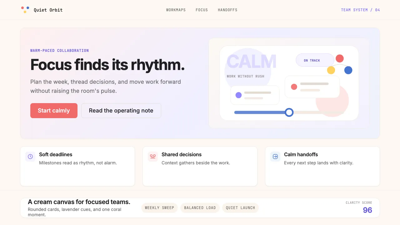
Asana's visual identity is a masterclass in calm productivity. Born from a 2020 Wolff Olins rebrand, it pairs a dusty lavender purple with warm coral accents on a cream canvas — selling "clarity of focus" through generous whitespace, soft gradient hero panels, and rounded geometry that never raises its voice.
The three-dots triangle mark anchors the system: coral, blue, and yellow converging in balance. Every surface breathes. Every interaction feels unhurried. It's SaaS that borrowed its temperament from a meditation app.
- Origin
- San Francisco, California
- Era
- 2008 founded; current visual identity since 2020 rebrand (Wolff Olins)
- Key figures
- Dustin Moskovitz · Justin Rosenstein · Wolff Olins · Sagi Haviv
- Movements
- Productivity SaaS · post-flat tinted optimism branding · wellness-adjacent work design
Asana design spec
Colors
Typography
The other 11 sections — buttons, cards, spacing, motion, techniques and more — open once you unlock. Download the DESIGN.md or send it to your AI in one click. Unlock once, yours forever.
Sign up nowStyles similar to Asana
Also inspired by brands & products, with a close feel.
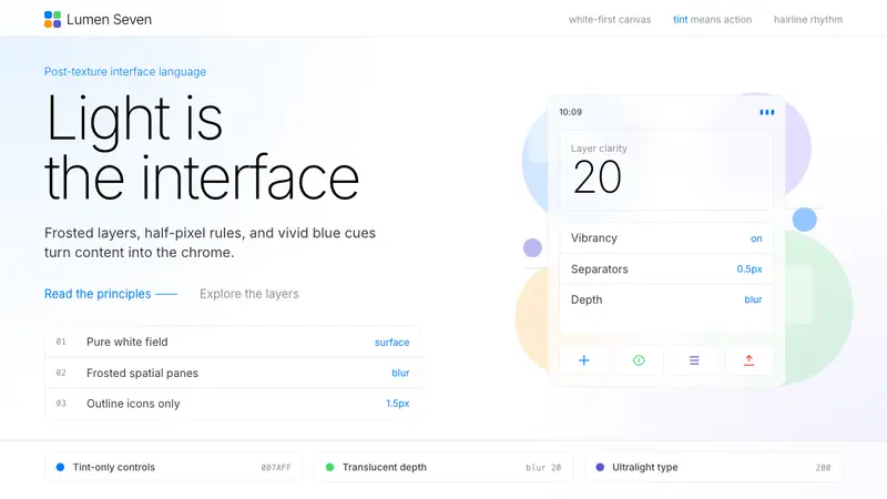 iOS 7 FlatThe day skeuomorphism died. Bright tints on white, hairline separators, frosted-glass layers.
 Intercom ModernWarm chat, sharp software. Electric blue bubbles on a daylit white grid.
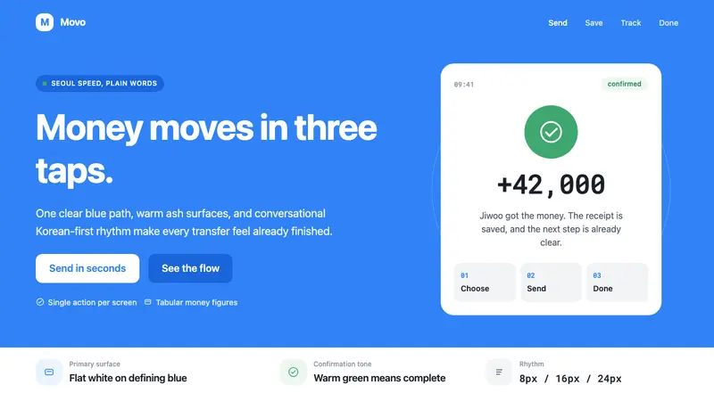 Toss Korean Fintech BlueMoney feels instant. Signature blue, Pretendard scale, and one-screen transfer rhythm.
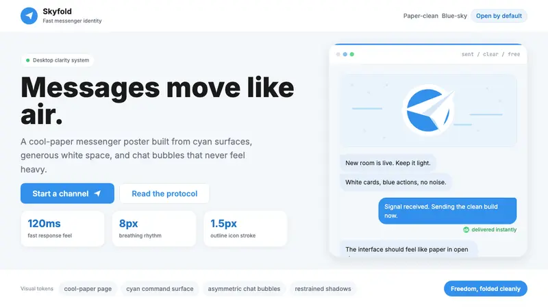 Telegram Blue Paper PlanePaper-clean speed. Cyan planes, white cards, and chat bubbles carry the identity.