What is GitLab 2023?什么是 GitLab 2023?
GitLab 2023 proves that enterprise DevOps software can be warm, daylit, and distinctly human — anchored by a tanuki's iconic orange-to-purple gradient and generous, readable typography.GitLab 2023 证明了企业级 DevOps 软件可以温暖、明亮且富有人情味——以标志性的狸猫橙紫渐变与宽松易读的排版为锚点。
GitLab 2023 in briefGitLab 2023 速览
GitLab 2023 is the visual design system behind the GitLab DevSecOps platform as it matured through its post-IPO era. It is a light-first, gradient-accented interface language built to wrap an entire software development lifecycle — from code commit to security scan to deployment pipeline — in a single, coherent visual experience. Its most recognizable element is the tanuki gradient: a sweep from the brand's signature warm orange into a complementary purple, used across hero sections, primary calls to action, and brand touchpoints.GitLab 2023 是 GitLab DevSecOps 平台在上市后走向成熟阶段所使用的视觉设计体系。这是一套以亮色为基础、以渐变为点缀的界面语言,旨在将整个软件开发生命周期——从代码提交到安全扫描再到部署流水线——包裹于单一、连贯的视觉体验之中。其最具辨识度的元素是狸猫渐变:从品牌标志性的暖橙色流向互补的紫色,出现在英雄区块、主要行动号召与品牌触点之上。
Unlike the dark, terminal-aesthetic interfaces that dominated developer tooling through the early 2020s, GitLab's design deliberately chose the opposite direction: high ambient brightness, warm neutral backgrounds, clean open spacing, and a typographic hierarchy built for long-form reading. The system had to perform equally well across dense pipeline dashboards, multi-column merge-request threads, and long-form documentation pages — a range of information density that few design systems are asked to handle.与二十一世纪初主导开发者工具领域的暗色终端美学截然不同,GitLab 的设计刻意选择了相反的方向:高环境亮度、暖调中性背景、干净开阔的间距,以及为长篇阅读构建的排版层级。这套系统必须在密集的流水线仪表盘、多列合并请求线程以及长篇文档页面之间同样出色——这种信息密度跨度几乎没有任何设计系统能够被要求同时应对。
The resulting visual language sits in a distinct position within the enterprise software landscape. It is professional enough for procurement decisions at large organizations, yet approachable enough for individual contributors who spend hours per day inside it. The warmth of the orange accent, the generous line-height decisions, and the consistent use of soft structural dividers rather than heavy borders all signal a company that thinks of its tool as something people live in, not merely use.最终呈现的视觉语言在企业软件领域占据了一个独特的位置。它足够专业,能够经受大型组织采购决策的审视;又足够亲和,适合每天在其中花费数小时的个人贡献者。橙色强调色的温暖感、宽松的行高决策,以及始终采用柔和结构分割线而非粗重边框的一贯做法——这一切都在传递一个信号:这家公司将自己的工具视为人们所居住的空间,而非仅仅使用的器具。
Where does GitLab 2023 come from?GitLab 2023 从何而来?
GitLab was founded in 2011 by Sytse 'Sid' Sijbrandij and Dmytro Zaporozhets, initially as an open-source alternative to GitHub for self-hosted code collaboration. For most of its first decade, GitLab's interface was functional and developer-centric but not especially considered as a visual system — it was built to work, not to express a brand identity. That changed meaningfully as the company scaled through successive funding rounds and began positioning itself as a complete DevSecOps platform rather than a code-hosting tool.GitLab 由 Sytse「Sid」Sijbrandij 与 Dmytro Zaporozhets 于 2011 年创立,最初作为 GitHub 的开源替代品,专注于自托管代码协作。在其第一个十年的大部分时间里,GitLab 的界面是功能性的、以开发者为中心的,但在视觉体系上并没有特别的讲究——它被构建用于工作,而非用于表达品牌个性。随着公司经历多轮融资并开始将自身定位为完整的 DevSecOps 平台而非代码托管工具,这一状况才发生了实质性改变。
The visual identity that would become recognizable as 'GitLab 2023' began consolidating around 2022 as the company moved through the period following its 2021 IPO. The tanuki — the Japanese raccoon dog that has been GitLab's mascot from the earliest days — moved from a quirky logo to a full brand anchor. The orange-to-purple gradient encoding its warm fur and expressive eyes became systematized as the primary brand expression, applied consistently across marketing materials, conference presence, and increasingly within the product interface itself.那套后来被认知为「GitLab 2023」的视觉识别体系,大约从 2022 年开始凝聚成形,彼时公司正经历 2021 年 IPO 之后的发展阶段。狸猫——这只自最早期就担任 GitLab 吉祥物的日本貉——从一个古灵精怪的标志演变为完整的品牌锚点。编码着它温暖皮毛与生动眼神的橙紫渐变被系统化为主要品牌表达,一致地应用于营销材料、会议现场,以及越来越多地融入产品界面本身。
The design team's central challenge during this period was coherence across an enormous product surface area. GitLab's single-application philosophy — the commitment that one platform should handle the entire DevSecOps lifecycle rather than requiring a patchwork of integrations — meant the design system had to serve radically different use contexts: a project manager reviewing milestone burndown charts, a security analyst triaging vulnerability findings, a developer reading pipeline logs at two in the morning. The 2023-era system addressed this by establishing a warm neutral foundation that could recede when density was needed and assert itself when brand expression was called for.设计团队在此期间面临的核心挑战是跨越庞大产品表面积的一致性。GitLab 的单一应用理念——承诺由一个平台处理整个 DevSecOps 生命周期,而非拼凑集成方案——意味着设计体系必须服务于截然不同的使用场景:正在审阅里程碑燃尽图的项目经理、正在分类漏洞发现的安全分析师、凌晨两点阅读流水线日志的开发者。2023 年前后成型的系统通过建立一套暖调中性基础来应对这一挑战——在需要信息密度时隐退,在需要品牌表达时显现。
Remote-first culture shaped the design in ways that are easy to overlook. As a company that operated without a physical headquarters and employed contributors across dozens of countries, GitLab's interface was the primary shared space of its community. This placed unusual demands on accessibility and readability — the system needed to work well on a wide range of monitor qualities, in varied ambient lighting, and for users whose primary language was not English. The generous line-heights, restrained color contrasts, and clear typographic hierarchy all reflect a system designed to be read for long stretches, not merely glanced at.远程优先的文化以容易被忽视的方式塑造了这套设计。作为一家没有实体总部、雇用遍布数十个国家贡献者的公司,GitLab 的界面是其社区最主要的共同空间。这对可及性和可读性提出了不寻常的要求——这套系统需要在各种质量的显示器上、不同的环境光线下、以及对母语非英语的用户同样有效。宽松的行高、克制的色彩对比与清晰的排版层级,均折射出一套为长时间阅读而设计的系统,而非仅供一瞥。
What defines the GitLab 2023 look?GitLab 2023 的视觉特征是什么?
Tanuki Gradient狸猫渐变
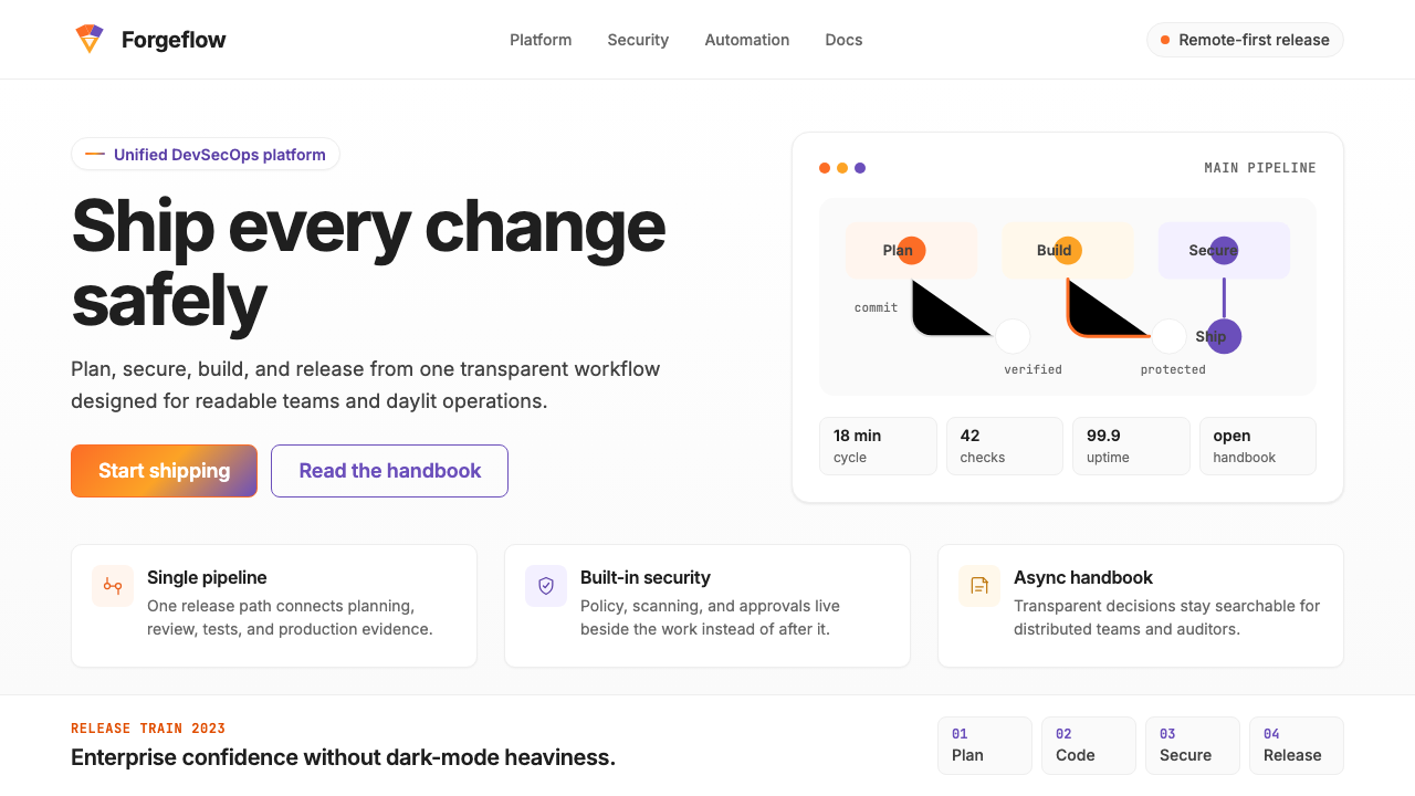
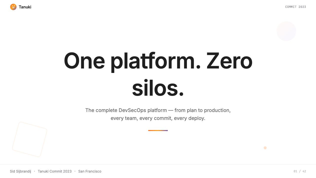
The defining visual signature is a warm orange flowing into a mid-range purple — a gradient arc that references the tanuki mascot's coat and serves as the primary brand differentiator across all surfaces. It appears on hero section backgrounds, primary button states, illustration backdrops, and conference materials. The gradient is never flat or mechanical; it retains warmth even at its purple terminus, avoiding the cold shift that often afflicts orange-to-blue gradients. When used at full strength it commands attention; when tinted or desaturated it becomes a unifying wash behind otherwise neutral content.最具定义性的视觉标志是从暖橙色流向中调紫色的渐变弧线——这一色彩过渡呼应了狸猫吉祥物的皮毛,并在所有载体上充当首要品牌区分符。它出现在英雄区块背景、主要按钮状态、插图底衬与会议材料之上。这个渐变从不平板或机械;即使到达紫色端点,它依然保有温暖感,避免了橙蓝渐变常见的冷漠偏移。全强度使用时,它统领视线;淡化或降饱和度后,它成为中性内容之后的统一底色。
Light-First Foundation亮色优先基础
GitLab's interface is built on a near-white canvas with warm undertones, in deliberate contrast to the dark-mode-first tooling culture of its competitive set. Backgrounds are airy without being stark, allowing ink-dark text to sit at comfortable reading contrast without the harshness of a pure black-on-white relationship. Section dividers and card containers use subtle warm-tinted backgrounds rather than heavy borders, creating structural separation without visual noise. The light foundation makes the orange accent colors feel energetic and the purple touches feel rich rather than heavy.GitLab 的界面建立在带有暖调底色的近白画布之上,与其竞品集以暗色模式优先的工具文化形成刻意对比。背景通透而不刺眼,让墨黑色文字以舒适的阅读对比度落座,同时避免了纯黑白关系的生硬感。区块分割与卡片容器采用微妙的暖色调背景,而非粗重边框,以此实现结构分离而不制造视觉噪声。亮色基础让橙色强调色感觉充满活力,让紫色点缀感觉丰富而非沉重。
Readable Typography System可读性排版体系
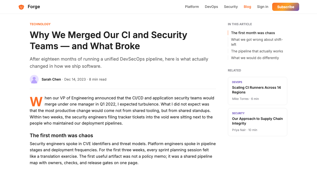
Inter — a screen-optimized sans-serif designed for clarity at small sizes and in extended reading — serves as the typographic backbone. The system deploys it at a range of weights and sizes calibrated for GitLab's specific information density demands: comfortable body sizes with generous line-height for documentation, more compact settings for table and sidebar contexts, and confident display scales for empty states and onboarding moments. Heading hierarchies are clear and sequential; users navigating long merge-request threads or lengthy YAML configuration files can orient themselves typographically without relying on color or iconography.Inter——一款为屏幕阅读优化、在小字号和长篇阅读中均保持清晰度的无衬线字体——担任排版骨干。这套系统将其以多种字重和字号部署,精确校准以适应 GitLab 特定的信息密度需求:文档场景采用舒适的字号配以宽松行高,表格与侧边栏语境则采用更紧凑的设置,空白状态与引导时刻使用自信的展示字号。标题层级清晰且有序;用户在浏览冗长的合并请求线程或大篇幅 YAML 配置文件时,可以仅凭排版层级定位自身,无需依赖色彩或图标。
Functional Color Hierarchy功能性色彩层级
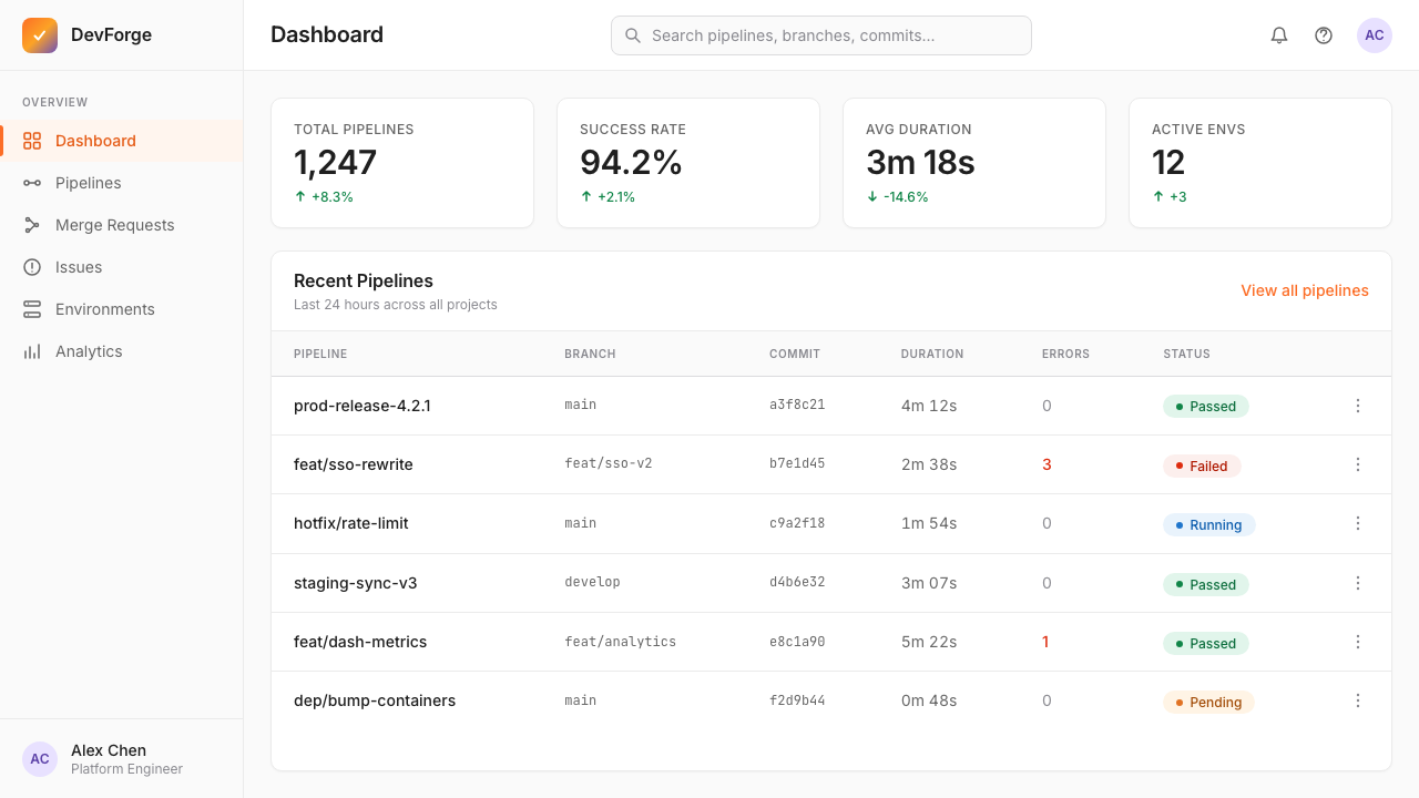
Color is assigned roles rather than applied decoratively. The tanuki orange anchors primary interactive elements: main action buttons, active navigation states, progress indicators, and key status highlights. Purple complements as a secondary brand voice, appearing in illustrative contexts and secondary accents. A semantic layer sits beneath: greens signal successful pipeline runs and passing checks, reds flag failures and critical alerts, yellows mark warnings and pending states, blues indicate informational and navigational contexts. This functional color map means that a developer reading a pipeline output can parse status at a glance without reading each label.色彩被赋予角色,而非装饰性地使用。狸猫橙锚定主要交互元素:主行动按钮、激活导航状态、进度指示器与关键状态高亮。紫色作为次要品牌声音加以补充,出现在插图情境与次要强调中。其下还有一层语义色:绿色表示流水线运行成功与检查通过,红色标记失败与严重告警,黄色标记警告与待处理状态,蓝色表示信息性与导航性语境。这套功能性色彩映射意味着,开发者阅读流水线输出时无需逐一读取标签,便可一目了然地解析状态。
Warm Spatial Rhythm暖调空间节奏
Spacing decisions throughout the system favor breathing room over compactness. Content areas sit within comfortable margins; related items group visibly without crowding; form fields and table rows carry enough vertical space that scanning does not feel like parsing compressed code. This spatial generosity is a deliberate UX position: GitLab's interface is one that users return to hundreds of times per week, and fatigue compounds over long sessions. The warm spatial rhythm — consistent, predictable, unhurried — reduces that cognitive load in ways that highly compressed interfaces cannot.整个系统的间距决策偏向呼吸感而非紧凑感。内容区域置于舒适的边距之内;相关元素在不显拥挤的情况下清晰归组;表单字段与表格行保留足够的垂直空间,使扫描阅读不至于像解析压缩代码。这种空间慷慨是一个刻意的用户体验立场:GitLab 的界面是用户每周回访数百次的场所,疲劳感会在长时间使用中积累。这种暖调空间节奏——一致、可预测、不急促——以高度压缩的界面所无法实现的方式降低了认知负担。
Illustrative Warmth插图温度
Empty states, onboarding flows, and error pages feature custom illustrations that extend the tanuki character family. These illustrations use a rounded, approachable drawing style rendered in the brand's gradient palette — orange and purple feature prominently, with supporting warm neutrals. The illustrative register is notably warmer and more playful than the product UI it accompanies, creating tonal contrast that makes functional interfaces feel less mechanical. The tanuki appears in various roles: as a developer, a security analyst, a collaborator — reflecting GitLab's commitment to representing its diverse contributor community.空白状态、引导流程与错误页面采用延续狸猫角色家族的定制插图。这些插图以圆润、亲切的绘画风格呈现,着色于品牌渐变色板——橙色与紫色占据主导,辅以暖调中性色。插图的调性明显比其伴随的产品 UI 更温暖、更富趣味,制造出一种声调对比,让功能性界面感觉不那么机械。狸猫以多种角色出现:作为开发者、安全分析师、协作者——折射出 GitLab 对呈现其多元贡献者社区的承诺。
Structured Information Density结构化信息密度
DevOps tooling is inherently data-dense: pipeline stages, CI/CD logs, merge request diff views, vulnerability matrices. GitLab 2023 manages this density through a clear component hierarchy — primary data lives in full-width content wells, secondary metadata tucks into right-column sidebars, tertiary context collapses into expandable sections. Tables use alternating warm-tinted row backgrounds rather than heavy grid lines, making rows scannable without visual noise. Status badges, pipeline stage chips, and severity labels use compact but legible scales with consistent color-coding, allowing expert users to read status states in seconds.DevOps 工具本质上是数据密集的:流水线阶段、CI/CD 日志、合并请求差异视图、漏洞矩阵。GitLab 2023 通过清晰的组件层级管理这种密度——主要数据置于全宽内容井中,次要元数据收入右列侧边栏,第三级上下文折叠进可展开区块。表格采用交替的暖色调行背景,而非粗重网格线,使行扫描清晰而无视觉噪声。状态徽章、流水线阶段芯片与严重程度标签采用紧凑但清晰的字号,配以一致的色彩编码,允许专家用户在数秒内读取状态信息。
Who shaped GitLab 2023?谁塑造了 GitLab 2023?
As co-founder and CEO, Sid Sijbrandij established GitLab's foundational design philosophy through the company's values: transparency, collaboration, efficiency, diversity, iteration, and results — the acronym CREDIT. These values shaped the visual system directly: transparency informed the preference for light, open interfaces over obscuring dark modes; iteration meant the design system evolved incrementally and publicly, with every change logged in GitLab's famously open handbook. Sid's remote-first conviction — GitLab operated without a central office from the earliest days — meant the interface had to function as the primary shared space for thousands of contributors worldwide, raising the stakes for readability and accessibility across diverse environments.作为联合创始人兼首席执行官,Sid Sijbrandij 通过公司价值观确立了 GitLab 的基础设计哲学:透明、协作、效率、多元、迭代与结果——缩写为 CREDIT。这些价值观直接塑造了视觉体系:透明性催生了对明亮、开放界面而非遮蔽性暗色模式的偏好;迭代意味着设计体系以渐进且公开的方式演进,每一处变化均记录在 GitLab 广为人知的开放手册中。Sid 的远程优先信念——GitLab 从最早期就在没有中央办公室的情况下运营——意味着界面必须作为全球数千名贡献者的主要共享空间发挥作用,这在多元环境下的可读性与可及性上提高了赌注。
Co-founder Dmytro Zaporozhets built GitLab's first interface and established the technical architecture that the visual system would eventually have to serve. His early decisions about the structure of projects, pipelines, merge requests, and issues created the information hierarchy that the 2023 design system needed to express clearly. Zaporozhets represents the engineering-first context in which GitLab's design evolved: the visual system was always in dialogue with deeply complex underlying data structures, and its clarity achievements are partly a function of understanding what those structures actually required from a layout and navigation standpoint.联合创始人 Dmytro Zaporozhets 构建了 GitLab 的第一个界面,并确立了视觉体系最终需要服务于的技术架构。他关于项目、流水线、合并请求与议题结构的早期决策,创造了 2023 年设计体系需要清晰表达的信息层级。Zaporozhets 代表了 GitLab 设计演进所在的工程优先背景:视觉体系始终与极度复杂的底层数据结构处于对话之中,它在清晰性上的成就,部分源于对这些结构在布局与导航层面真正需要什么的深刻理解。
The internal brand and design team responsible for Pajamas — GitLab's open-source design system — built one of the few enterprise design systems that is itself a public product. Pajamas documents components, design principles, and usage guidelines openly on the web, inviting community contribution and external scrutiny. This open-design-system approach means the visual decisions behind GitLab 2023 are unusually well-documented: every component has a rationale, every pattern has a named author or working group, and the evolution from earlier interface generations is publicly traceable. The team's work demonstrates that a design system can be simultaneously a product discipline and a form of brand transparency.负责 Pajamas——GitLab 开源设计体系——的内部品牌与设计团队,打造了为数不多的本身即为公开产品的企业设计体系之一。Pajamas 在网络上公开记录组件、设计原则与使用指南,欢迎社区贡献与外部审视。这种开放设计体系的做法意味着 GitLab 2023 背后的视觉决策有着异乎寻常的详尽文档:每个组件都有理由说明,每种模式都有具名作者或工作组,从早期界面版本到今日的演进轨迹均可公开追溯。这个团队的工作证明,一套设计体系可以同时是一种产品纪律,也是一种品牌透明度的表现形式。
Pajamas is GitLab's publicly available component library and design language documentation. It serves simultaneously as the internal handbook for GitLab's own product teams and as an open resource for the wider community building on or integrating with GitLab. The system is notable for its practical completeness: it covers not just visual components but also content guidelines, icon usage, accessibility requirements, and motion principles. For designers studying GitLab's visual language, Pajamas provides primary-source access to the reasoning behind design decisions — a level of transparency that is uncommon in proprietary enterprise design systems and that makes GitLab's aesthetic choices particularly well-understood and learnable.Pajamas 是 GitLab 公开可用的组件库与设计语言文档。它同时担任 GitLab 内部产品团队的参考手册,以及面向更广泛的在 GitLab 上构建或与之集成的社区的开放资源。这个体系以其实用的完整性著称:它涵盖的不仅是视觉组件,还包括内容指南、图标用法、可及性要求与动效原则。对于研究 GitLab 视觉语言的设计师来说,Pajamas 提供了对设计决策背后推理的一手资料访问途径——这种透明程度在专有企业设计体系中并不多见,也使 GitLab 的美学选择特别易于理解与学习。
How do you use GitLab 2023 today?今天怎么用 GitLab 2023?
GitLab 2023 translates naturally into presentation design, particularly for technology, developer tools, and infrastructure products. A cover slide benefits from the tanuki gradient at full expression: sweep it diagonally or horizontally across the upper half or the entire background, set the title in a clean sans-serif at generous weight in white, and let the gradient carry the brand statement without additional illustration. The warmth of the orange-to-purple arc avoids the cold, generic feel of many technology gradient covers. For content slides, shift to the light foundation — near-white background, near-black body text, with the orange reserved for section labels, callout figures, or progress indicators. This contrast between gradient-forward covers and light-ground content pages creates a satisfying visual rhythm through a deck.GitLab 2023 能够自然地转化为演示设计,尤其适用于技术、开发者工具与基础设施产品。封面幻灯片适合以完整强度展现狸猫渐变:将其对角或水平扫过上半部分或整个背景,以干净的无衬线字体、充足的字重、白色文字设置标题,让渐变承载品牌宣言而无需额外插图。橙紫渐变弧的温暖感避免了许多技术类渐变封面常见的冷漠、通用感。内容幻灯片则应转向亮色基础——近白背景、近黑正文,将橙色保留给段落标签、引用数字或进度指示器。渐变强调的封面页与亮底内容页之间的对比,为一套演示文稿创造出令人满意的视觉节奏。
Data slides in this system work best when status semantics are respected. Pipeline diagrams, deployment timelines, and infrastructure charts should use the system's green-red-yellow-blue color logic rather than introducing arbitrary palette choices. Bar and line charts benefit from the orange as the primary data series color, with supporting series in purple or neutral grays. Avoid applying the tanuki gradient to data visualization fills — the gradient implies brand or hero-level emphasis and reads as decorative rather than informational when applied to chart elements. Keep chart backgrounds near-white and let the data colors speak at full saturation against the quiet ground.数据幻灯片在这套系统中,最好遵循语义色彩的逻辑。流水线图表、部署时间线与基础设施图应使用系统的绿-红-黄-蓝色彩逻辑,而非引入任意的调色板选择。柱状图与折线图以橙色作为主要数据系列颜色效果最佳,辅助系列则使用紫色或中性灰。避免将狸猫渐变应用于数据可视化填充——渐变暗示品牌或英雄级别的强调,应用于图表元素时会显得装饰性而非信息性。保持图表背景近白,让数据颜色在安静的底色上以全饱和度表达。
For web interfaces and dashboards, the system's strengths are most visible in information-dense contexts. A developer dashboard built in this language should establish a light warm-neutral sidebar for navigation, a full-width content area with generous vertical spacing between items, and a right-rail or inline sidebar for metadata. Status chips — build passing, merge conflict detected, pipeline running — should use the semantic color layer consistently. The orange gradient works well as a top-of-page header band that contextualizes which project or pipeline is in focus. Pricing and marketing pages benefit from alternating light-section and gradient-section layouts, using the brand arc to mark tier differentiation or feature highlights.对于网页界面与仪表板,这套系统的优势在信息密集的场景中最为突出。用这套语言构建的开发者仪表板,应建立一个亮色暖调侧边栏用于导航、一个各条目之间保留充足垂直间距的全宽内容区域,以及一个用于元数据的右侧边栏或内联侧栏。状态芯片——构建通过、检测到合并冲突、流水线运行中——应一致地使用语义色彩层。橙色渐变作为页面顶部的标题条效果良好,能够清晰说明当前聚焦于哪个项目或流水线。定价页与营销页适合交替使用亮色区块与渐变区块的布局,用品牌弧线标记等级区分或功能亮点。
In editorial and marketing contexts, the visual language supports strong hierarchy and brand confidence. Long-form articles or technical documentation pages should use the typographic system's generous line-height settings, a comfortable measure for body text, and clearly differentiated heading scales. Pull quotes and callout boxes work well with a subtle warm-tinted background rather than a colored border — consistent with the system's preference for background treatment over edge treatment. Marketing layouts can deploy the tanuki gradient more boldly: full-bleed gradient hero sections, gradient-accented feature cards, and section transitions that use the orange-to-purple arc as a structural divider. The key is keeping the gradient purposeful — an event, not a wallpaper.在编辑与营销场景中,这套视觉语言支持强劲的层级感与品牌自信。长篇文章或技术文档页应使用排版系统宽松的行高设置、舒适的正文行宽,以及清晰区分的标题字号层级。引用块与标注框适合采用微妙暖色调背景,而非彩色边框——与系统偏好背景处理而非边缘处理的惯例一致。营销版面可以更大胆地部署狸猫渐变:全出血渐变英雄区块、渐变强调的功能卡片,以及用橙紫弧线作为结构分割线的区块过渡。关键在于保持渐变的目的性——它是一个事件,而非一张墙纸。
A common mistake when applying GitLab 2023 is using the tanuki gradient everywhere it can fit, which quickly dilutes its impact and reads as visual noise. The gradient earns its authority through restraint: when it appears, it should feel like a deliberate brand moment. Similarly, the warm-neutral background system can drift toward being too beige if warm undertones are applied without calibration — the correct register is barely perceptible warmth, not a cream or off-white that competes with the accent colors. Another frequent error is treating the semantic color layer as decorative: green should not appear on success-adjacent elements that are not actually status indicators, and red should be reserved for genuine error and alert states rather than used as an accent for visual variety.应用 GitLab 2023 时最常见的错误,是在所有能放下渐变的地方都使用狸猫渐变,这会迅速稀释其冲击力并呈现为视觉噪声。渐变的权威感来自克制:当它出现时,应该感觉是一个刻意的品牌时刻。同样,暖调中性背景体系在未经校准地施加暖底色时,容易滑向过于米黄的方向——正确的档位是几乎无法察觉的温暖感,而非与强调色竞争的奶油色或米白色。另一个常见错误是将语义色彩层作为装饰性使用:绿色不应出现在并非真正状态指示器的成功相邻元素上,红色应保留给真实的错误与告警状态,而非作为视觉多样性的强调色。
GitLab 2023 — FAQGitLab 2023 · 常见问题
Is GitLab 2023 only suitable for developer tools and DevOps products?GitLab 2023 风格只适合开发者工具和 DevOps 产品吗?
Not exclusively, though that is its native context. The underlying qualities of the system — light, warm, readable, with a clear semantic color layer — transfer well to any information-dense product that values clarity over decoration: project management platforms, data observability tools, security dashboards, enterprise analytics interfaces. The tanuki gradient is specifically GitLab's, and direct use of it in unrelated products would feel derivative, but the spatial rhythm, typographic generosity, and functional color logic are transferable principles. Products outside the developer tooling space should adapt the approach — warm neutral foundation, restrained accent usage, readable type scales — without importing the gradient as a signature element.并非专属,尽管那是其原生语境。这套系统的底层特质——明亮、温暖、易读,配以清晰的语义色彩层——能够良好地迁移至任何重视清晰度胜于装饰的信息密集产品:项目管理平台、数据可观测性工具、安全仪表板、企业分析界面。狸猫渐变是 GitLab 专属的,在无关产品中直接使用会显得衍生,但空间节奏、排版慷慨感与功能性色彩逻辑是可迁移的原则。开发者工具领域之外的产品应当采纳这种方法——暖调中性基础、克制的强调色使用、可读的字号层级——而无需将渐变作为标志性元素引入。
How does GitLab 2023 differ from other modern enterprise SaaS design systems like Salesforce Lightning or Atlassian Design?GitLab 2023 与 Salesforce Lightning 或 Atlassian Design 等其他现代企业 SaaS 设计体系有何不同?
The primary differentiator is warmth. Salesforce Lightning leans toward a cooler, bluer corporate palette and a denser component grid; it prioritizes enterprise formality. Atlassian's design language is also cooler in temperature and places heavier emphasis on iconography and color-coded product differentiation across its suite. GitLab's warmer orange-purple axis and its documentary openness through Pajamas give it a more approachable register. All three systems share the functional color logic — semantic greens, reds, and yellows for status — but GitLab's gradient-anchored brand expression is less conservative than either alternative, and its open-source-friendly transparency is part of its design identity in a way that the others' are not.主要区别在于温暖感。Salesforce Lightning 倾向于更冷、更蓝的企业调色板与更密集的组件网格,优先强调企业正式性。Atlassian 的设计语言在色调上也更冷,并在其套件中对图标和色彩编码产品区分给予更重的比重。GitLab 更暖的橙紫色轴线,以及通过 Pajamas 实现的文档透明度,赋予它更亲和的调性档位。三套系统都共享功能性色彩逻辑——用于状态的语义绿、红、黄——但 GitLab 以渐变为锚的品牌表达比其他两者更少保守,其对开源友好的透明性也以另外两者所不具备的方式成为其设计身份的组成部分。
Can the GitLab 2023 approach work in dark mode?GitLab 2023 的视觉方式能在深色模式下运用吗?
GitLab itself provides a dark mode within the product, and the system's approach to dark inversion is instructive. Rather than simply inverting the light palette, GitLab's dark mode uses deep warm-neutral backgrounds — closer to a very dark warm gray than to pure black — which maintains the warmth register even at low brightness. The tanuki gradient retains its orange-to-purple character in dark mode because both colors hold their luminance well against dark grounds. The semantic color layer requires most adjustment: success greens and warning yellows both need their saturation lowered to avoid appearing to glow against dark backgrounds. The overall lesson is that the system's warm character can survive dark inversion if the background warmth is preserved and the accent saturation is managed.GitLab 本身在产品中提供深色模式,其深色反转的处理方式颇具参考价值。GitLab 的深色模式并非简单地反转亮色调色板,而是使用深暖调中性背景——更接近非常深的暖灰色,而非纯黑——即使在低亮度下也维持着温暖感的档位。狸猫渐变在深色模式下保留了其橙紫特征,因为这两种颜色在深色底面上都能良好保持其明度。语义色彩层需要最多调整:成功绿与警告黄都需要降低饱和度,以避免在深色背景上显得发光。总体教训是:如果背景温暖感得以保留,强调色饱和度得到管理,这套系统的温暖特质能够在深色反转中存活。
What makes the tanuki mascot unusual as a design system anchor?狸猫吉祥物作为设计体系锚点,有何不寻常之处?
Most enterprise design systems deliberately suppress character and personality in favor of neutral professionalism. GitLab went the other direction: the tanuki is not a secondary brand element but a structural component of the visual system. The gradient derives from the mascot; the illustrative style extends the mascot's character across empty states and onboarding; conference and marketing materials feature the tanuki in context-specific roles. This mascot-anchored approach is more common in consumer products than enterprise software, and it creates a tonal tension that is, in GitLab's case, generative rather than dissonant: the playful character gives the interface warmth that pure UI components cannot, and it signals cultural values — openness, humor, community — that the more formal aspects of the system cannot express alone.大多数企业设计体系刻意抑制个性与特质,以换取中性的专业感。GitLab 走向了相反的方向:狸猫不是次要的品牌元素,而是视觉体系的结构性组成部分。渐变源自这个吉祥物;插图风格将吉祥物的特质延伸至空白状态与引导流程;会议与营销材料中,狸猫以具体情境角色出现。这种以吉祥物为锚点的方式在消费类产品中比企业软件更为常见,它创造出一种声调张力——在 GitLab 的案例中,这种张力是生产性的而非不和谐的:这个富有趣味的角色赋予界面纯粹 UI 组件无法给予的温暖感,并传递出文化价值观——开放、幽默、社区——这是体系中更正式的部分无法单独表达的。
How should the orange-to-purple gradient be used without overusing it?如何使用橙紫渐变而不过度使用它?
The gradient earns its power through scarcity. A reliable heuristic: use it in one place per screen or layout section, and treat that use as the most important visual event on the surface. On a landing page, the hero section gradient should be the only gradient; everything below it runs on flat, light, warm-neutral backgrounds. In a presentation, gradient covers and section dividers should not compete with gradient chart fills or gradient button styles — the latter two should be flat. In a dashboard, a gradient header band contextualizes the page without needing gradient treatment at the component level. When the gradient appears on an interactive element such as a primary button, it should be the most prominent interactive element on the page, not one among several. The rule of thumb: if the gradient appears more than twice in a single view, it has likely been overused.渐变的力量来自稀缺性。一个可靠的启发原则是:每屏或每个版面区块中只在一处使用它,并将该处视为整个界面最重要的视觉事件。在一个落地页上,英雄区块渐变应该是唯一的渐变;其下的所有内容运行在平色、明亮、暖调中性背景上。在演示文稿中,渐变封面与区块分割线不应与渐变图表填充或渐变按钮样式竞争——后两者应保持平色。在仪表板中,渐变标题条为页面提供上下文,而无需在组件层面进行渐变处理。当渐变出现在主要按钮等交互元素上时,它应该是页面上最突出的交互元素,而非众多中的一个。经验法则:如果渐变在单一视图中出现超过两次,则很可能已经过度使用。
Related design styles相关设计风格
 Android Bugdroid GreenFriendly tech, reduced to geometry. Vivid green pops from Grey 900 and rounde…友好科技化为几何:明绿从 Grey 900 与圆润字形中跃出。
 AsanaCalm productivity breathes. Cream canvas, lavender panels, coral-blue-yellow…安静生产力会呼吸:奶油画布、薰衣草面板与三色圆点。
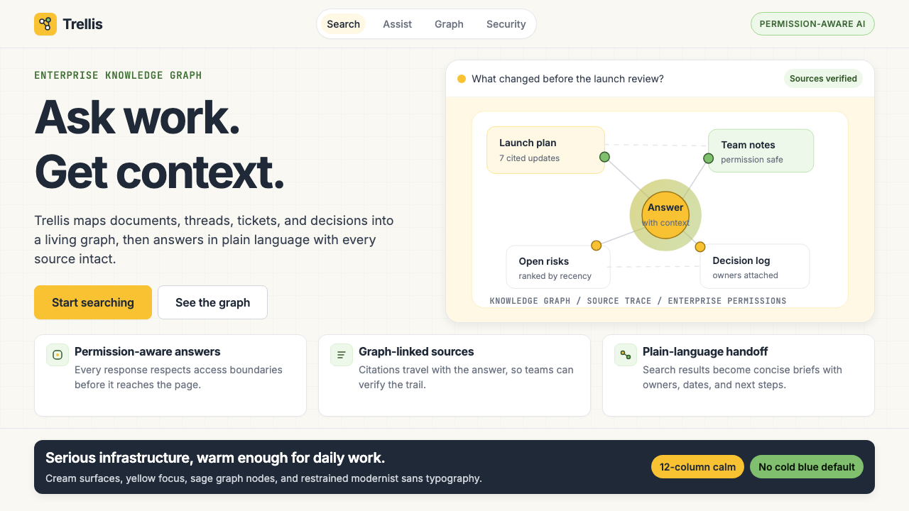 Glean Enterprise-SearchWarm enterprise AI. Cream ground, yellow focus, sage graph nodes, and sans ca…温暖的企业 AI:奶油底、黄焦点、鼠尾草节点与无衬线克制。
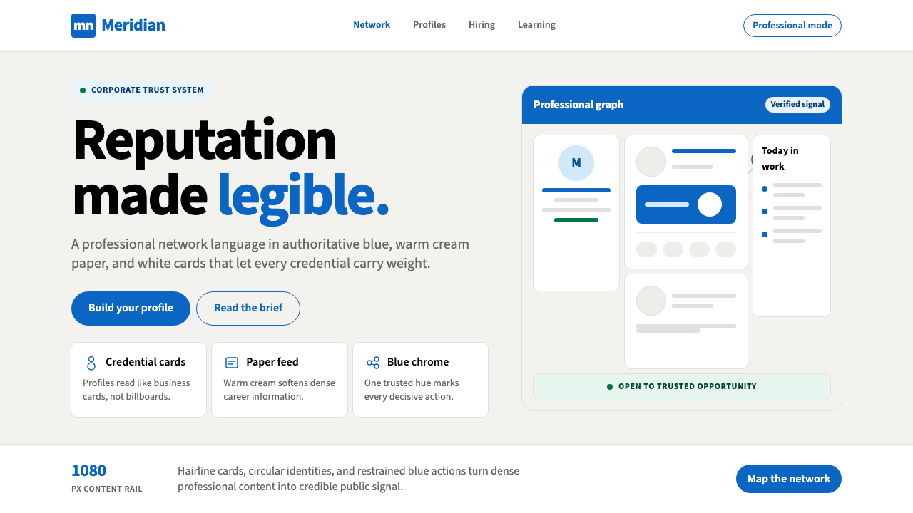 LinkedInCorporate trust, digitized. Authoritative blue frames white cards on warm cre…企业信任数字化:权威蓝框住暖奶油纸面上的白卡。
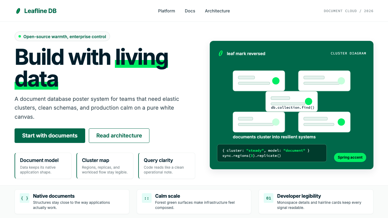 MongoDB Leaf GreenDisciplined green, open warmth. Forest leaf forms and Spring accents breathe…克制的绿有开源温度:森林绿叶形与春绿点缀,留白呼吸。
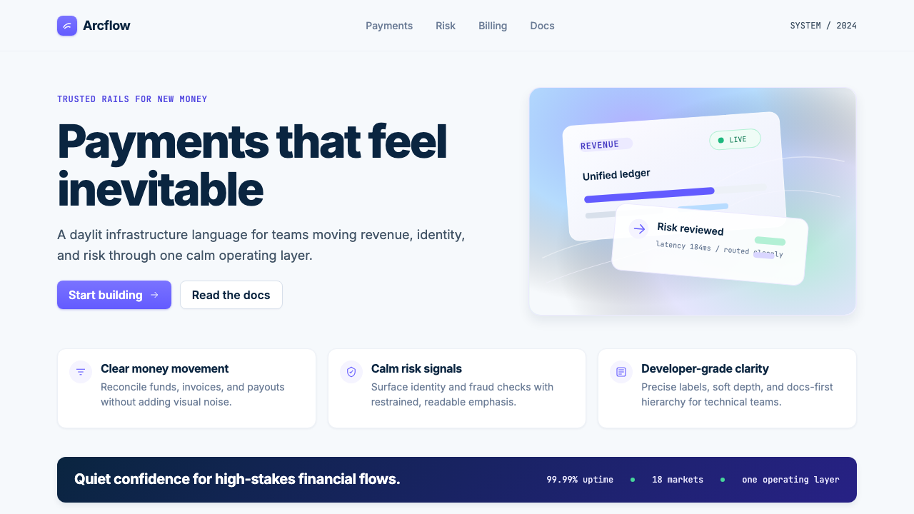 Stripe 2024Trust earns its glow. Indigo mesh, neutral type, and whisper cards float on n…信任自带微光:近白底上的靛蓝渐变、中性字体与轻影卡片。