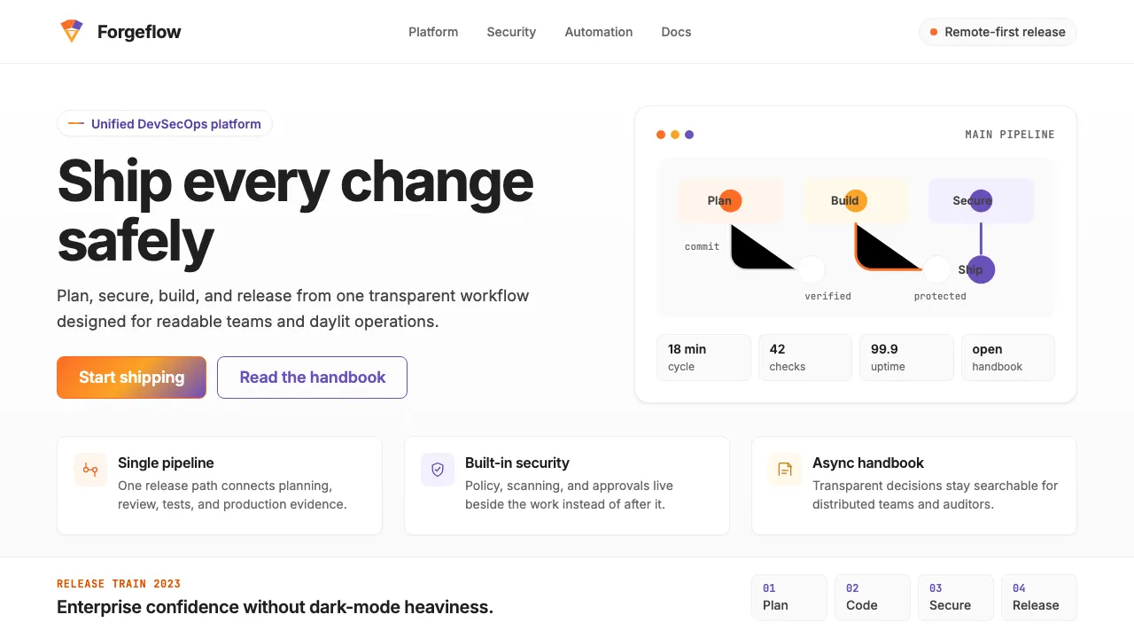
About GitLab 2023
GitLab wraps the entire DevSecOps lifecycle in a single, light-filled interface anchored by the tanuki's iconic orange-to-purple gradient. The design system radiates corporate confidence without heaviness — generous line-heights, clean Inter typography, and warm accent colors keep long-form documentation and dense dashboards equally readable.
Where competitors lean dark and developer-edgy, GitLab stays daylit and approachable, using its signature tanuki orange for primary actions and a complementary purple for secondary touches. The result is a visual language that feels enterprise-ready yet distinctly warmer than most DevOps tooling.
- Origin
- Remote-first, incorporated San Francisco, USA
- Era
- 2011 founded; current visual ~2022–2024
- Key figures
- Sytse 'Sid' Sijbrandij · Dmytro Zaporozhets · GitLab Brand team
- Movements
- DevSecOps platform · All-in-one developer tooling · Remote-first culture
GitLab 2023 design spec
Colors
Typography
The other 11 sections — buttons, cards, spacing, motion, techniques and more — open once you unlock. Download the DESIGN.md or send it to your AI in one click. Unlock once, yours forever.
Sign up nowStyles similar to GitLab 2023
Also inspired by brands & products, with a close feel.
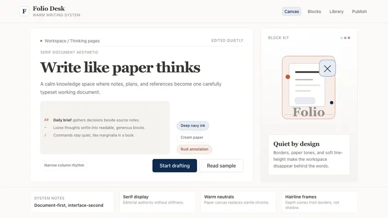 Notion ModernWriting feels papery. Source Serif on warm cream, navy ink, and hairline borders.
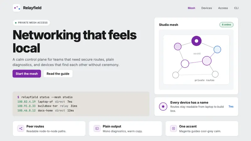 Tailscale Mesh VPN 2024Friendly infrastructure. Cool grey cards, magenta mesh nodes, and mono CLI blocks.
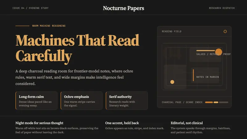 Claude / Anthropic Warm 2024Warm intelligence at night. Ochre rules and Source Serif glow on deep charcoal.
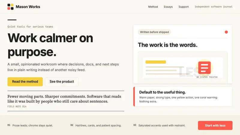 Basecamp / 37signalsQuiet craft, strong opinions. Cream paper, tight sans type, yellow and coral restraint.