What is MongoDB Leaf Green?什么是 MongoDB Leaf Green?
MongoDB Leaf Green distills the philosophy of a generation-defining database company into a single disciplined gesture: a deep forest green leaf breathing against generous white space.MongoDB 叶绿将一代定义性数据库公司的哲学,凝缩进一个克制的姿态:深沉的森林绿叶,在宽裕的留白中呼吸。
MongoDB Leaf Green in briefMongoDB Leaf Green 速览
MongoDB Leaf Green is the visual identity system of MongoDB, Inc. — the company that popularized the document-oriented database model and helped define the NoSQL era of modern data infrastructure. The style is anchored by a deep, organic forest green that evokes growth and technical reliability in equal measure, paired with a luminous spring-green accent reserved for moments of energy and emphasis. Between these two greens and a neutral white-and-grey structure, the system articulates an entire world of developer-facing communication without raising its voice.MongoDB 叶绿是 MongoDB 公司的视觉识别系统。MongoDB 推广了文档导向数据库模型,并帮助定义了现代数据基础设施的 NoSQL 时代。这套风格以深沉的有机森林绿为锚点——这种绿色同等程度地唤起生长与技术可靠性——搭配只在强调时刻出场的亮春绿色。在这两种绿与白灰中性结构之间,整套系统传达出完整的开发者向沟通语汇,却从不提高嗓门。
What distinguishes this aesthetic from generic tech-brand minimalism is its combination of organic warmth and modernist discipline. The leaf motif at the heart of the MongoDB mark is not a decorative flourish — it is a load-bearing symbol that carries associations of living systems, growth, and open-source community. This organic gesture is then held in tension with modernist geometric sans-serif typography, precise grid-based layout, and highly restrained color deployment. The result is a system that feels simultaneously approachable and authoritative: an enterprise platform that a developer would trust on a Friday afternoon.这种美学有别于通用科技品牌极简主义的地方,在于它将有机温度与现代主义纪律合而为一。MongoDB 标志核心的叶片造型并非装饰性点缀——它是一个承重符号,携带着对活态系统、生长与开源社区的联想。这一有机姿态,被几何无衬线字体的现代主义严谨、精准的网格化版面与极度克制的配色纪律所制衡。结果是一套既亲切又权威的体系:一个开发者在周五下午也愿意信任的企业级平台。
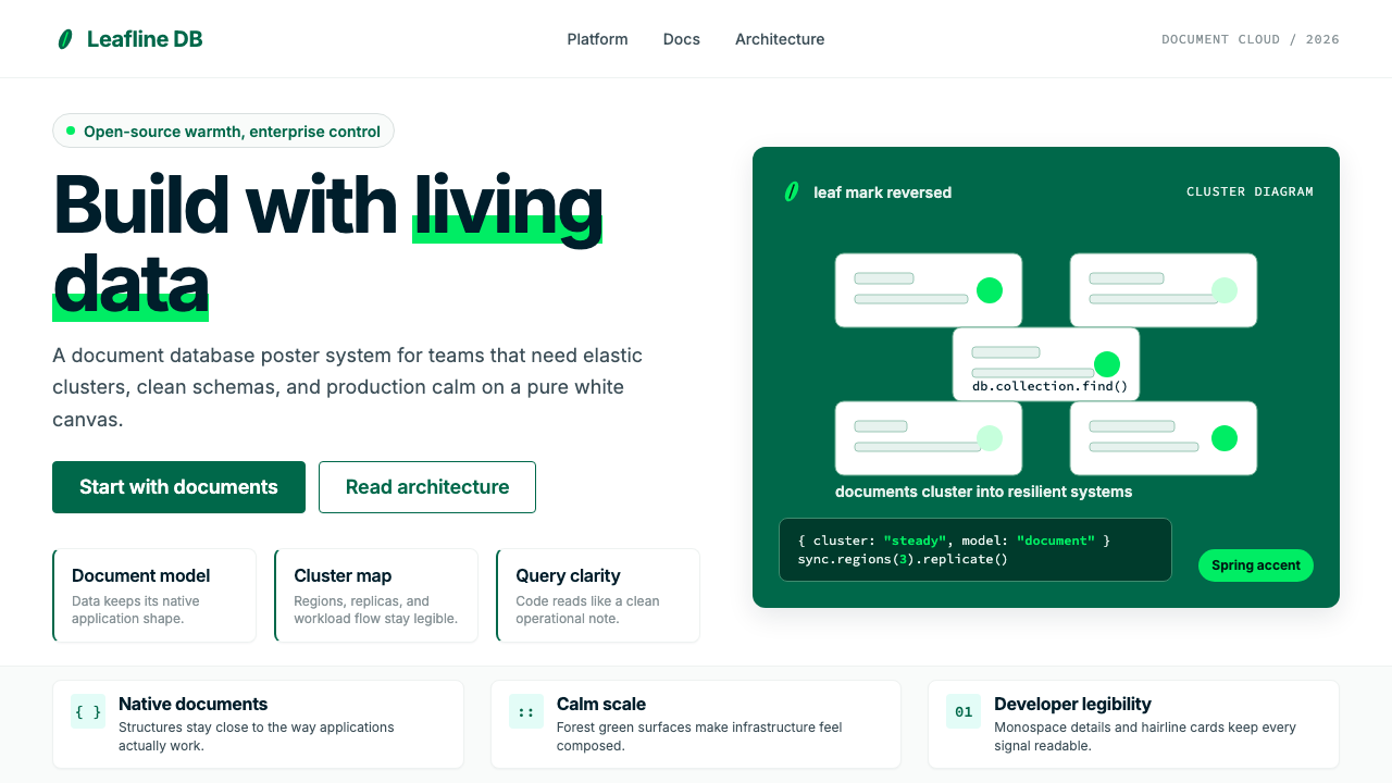
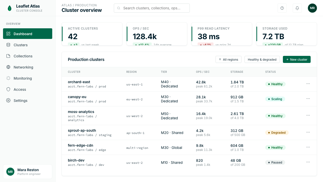
The palette strategy is deliberately asymmetric. A single deep green dominates the brand identity as its anchoring hue — dark enough to read as stable and serious, green enough to signal vitality and differentiation from the grey-and-blue conventions of legacy enterprise software. The spring-green accent is deployed sparingly, almost surgically, to direct attention, mark interactive states, or highlight a key data point. Neutrals — white, light grey, and dark charcoal — do the structural work of layout without competing. The overall effect is open and breathable rather than dense or assertive.调色板策略刻意呈非对称设计。单一的深绿色主导品牌识别,作为锚定色调——深到足以读作稳定与严肃,绿到足以传递活力,并将自身与传统企业软件的灰蓝惯例区分开来。春绿色以克制乃至精准的方式部署,用于引导视线、标记交互状态或突出关键数据点。白色、浅灰与深炭色等中性色承担版面的结构工作,而不参与竞争。整体效果开阔而有呼吸感,而非密集或强势。
See the MongoDB Leaf Green design system查看 MongoDB Leaf Green 完整设计系统
Where does MongoDB Leaf Green come from?MongoDB Leaf Green 从何而来?
MongoDB was founded in New York City in 2007 by Dwight Merriman, Eliot Horowitz, and Kevin Ryan — all veterans of DoubleClick, the advertising technology company that Google would later acquire. The founding context matters for understanding the aesthetic: DoubleClick was a data-intensive engineering organization, and its alumni brought to MongoDB a sensibility shaped by systems thinking, developer pragmatism, and the specific visual culture of New York's early-2000s tech scene. The original MongoDB brand reflected this heritage — functional, engineer-friendly, without the showiness of consumer software.MongoDB 于2007年在纽约市由 Dwight Merriman、Eliot Horowitz 和 Kevin Ryan 创立,三人均是广告技术公司 DoubleClick(后被 Google 收购)的老将。创立背景对理解其美学至关重要:DoubleClick 是一个数据密集型工程组织,其校友将系统思维、开发者务实主义以及纽约千禧年代初科技圈特有的视觉文化带入了 MongoDB。早期 MongoDB 品牌正是这一传承的体现——功能至上,对开发者友好,没有消费软件的炫耀感。
The company's early visual identity was modest, as is typical for developer-tools startups focused on adoption rather than marketing. The leaf mark — a stylized single green leaf — appeared from early on as a quiet reference to the document metaphor at the heart of MongoDB's data model. Documents are living, nested, organic structures, as opposed to the rigid rows and columns of relational databases. The green leaf embodied this contrast: something that grows and branches, rather than something ruled and fixed. The name itself — MongoDB, from 'humongous' — signals scale and organic sprawl rather than classical order.公司早期的视觉识别是低调的,这与专注于用户增长而非营销的开发者工具创业公司的常态相符。叶片标志——一片风格化的单片绿叶——从早期便以静默的方式指向 MongoDB 数据模型核心的文档隐喻。文档是活态的、嵌套的、有机的结构,与关系型数据库的刚性行列截然对立。绿叶恰好体现了这一对比:某种生长与分支的事物,而非某种被划定与固化的事物。公司名称本身——MongoDB,源自「humongous」(巨大的)——也传递出规模与有机蔓延,而非古典秩序。
MongoDB went public on the NASDAQ in October 2017 under the ticker MDB, a milestone that brought new expectations of brand coherence and professional visual identity. The IPO era refined the system without fundamentally changing its character. The leaf mark became cleaner and more geometric; the typography became more consistently modernist; the color palette sharpened from a family of greens into a tightly controlled two-green system. Dev Ittycheria, who became CEO in 2014, presided over a period of sustained growth in which the brand had to serve both the developer community that had built MongoDB's early momentum and the enterprise buyers who were now central to its business.MongoDB 于2017年10月以代码 MDB 在纳斯达克上市,这一里程碑带来了对品牌一致性与专业视觉识别的全新期待。IPO 时代对系统进行了精炼,但未从根本上改变其性格。叶片标志变得更简洁、更几何;字体排印更一致地走向现代主义;调色板从一系列绿色收紧为严格管控的双绿系统。2014年接任 CEO 的 Dev Ittycheria 主持了一段持续增长期,品牌需要同时服务于推动 MongoDB 早期势头的开发者社区,以及如今成为核心业务的企业采购方。
The most significant refinement came with the 2023 brand refresh, which aligned the visual system with the company's matured product portfolio — spanning Atlas (the cloud database platform), Realm (mobile data sync), and a growing suite of data services. The refresh clarified the hierarchy between the two greens, standardized the use of white space as a structural element rather than an afterthought, and introduced more systematic guidance for developer documentation, marketing, and product interfaces. The result was a visual language capable of spanning a conference keynote, a technical documentation page, and a product billing screen with equal fluency. It is this post-2023 system that defines what designers today reference as MongoDB Leaf Green.最重要的精炼发生在2023年的品牌焕新,这次更新将视觉系统与公司成熟的产品矩阵对齐——涵盖 Atlas(云数据库平台)、Realm(移动数据同步)及一系列不断扩展的数据服务。焕新厘清了两种绿色之间的层级关系,将留白的使用标准化为结构性元素而非事后补充,并为开发者文档、营销与产品界面引入了更系统性的规范。结果是一套能以同等流畅度跨越大会主题演讲、技术文档页面与产品账单界面的视觉语言。正是这套2023年后的系统,定义了今天设计师所指称的「MongoDB 叶绿」。
What defines the MongoDB Leaf Green look?MongoDB Leaf Green 的视觉特征是什么?
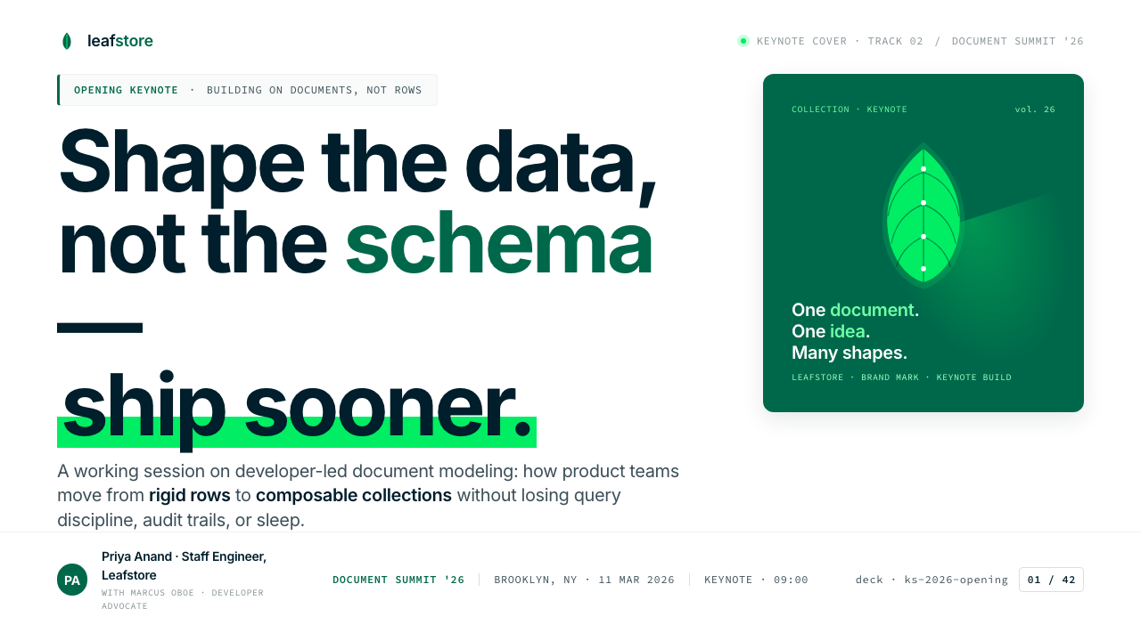
Anchoring Green锚定绿
The primary green is a deep, forest-floor hue — dark enough to carry the weight of headlines and primary brand marks, yet warm enough to read as organic rather than corporate. It avoids the cold teal of fintech or the bright Kelly green of consumer apps. This green has depth and seriousness without severity. In practice it functions as both a color and a structural element: it anchors navigation bars, primary buttons, and the brand mark with equal confidence.主绿色是深沉的林底色调——深到足以承载标题与品牌标志的视觉重量,却又温暖到读作有机而非机构。它回避了金融科技的冷色调蓝绿,也回避了消费应用的鲜亮草绿。这种绿有深度与严肃性,却不失温度。在实践中,它既是颜色,也是结构性元素:以同等的自信锚定导航栏、主按钮与品牌标志。
Electric Accent电光强调色
The spring-green accent is the system's most distinctive and most easily misused element. It is a luminous, almost electric hue — noticeably brighter and more saturated than the primary green — that immediately draws the eye wherever it appears. The discipline of the system depends on using this accent sparingly: one call-to-action button per screen, one data series in a chart, one highlighted metric on a dashboard. When overused, it collapses from an accent into background noise.春绿强调色是系统中最具辨识度也最容易被滥用的元素。它是一种明亮、几乎带电的色调——明显比主绿色更亮更饱和——无论出现在哪里都会立即吸引目光。这套系统的纪律依赖于克制地使用这种强调色:每屏一个行动号召按钮、图表中一条数据系列、仪表板上一个高亮指标。一旦过度使用,它就从强调色崩塌为背景噪音。
White Space as Architecture留白即建筑
White space in the MongoDB system is not the absence of design — it is the primary structural material. Generous margins, generous line height, and generous padding around components are not wasteful; they give each element the breathing room to communicate clearly. This approach is particularly evident on the mongodb.com documentation pages, where complex technical content is made navigable through spatial generosity rather than visual compression.MongoDB 系统中的留白并非设计的缺席——它是首要的结构性材料。宽裕的边距、宽裕的行高、组件周围宽裕的内边距并非浪费,而是赋予每个元素以呼吸空间,使其能够清晰传达。这一理念在 mongodb.com 文档页面上尤为明显:复杂的技术内容通过空间的慷慨而非视觉的压缩变得可导航。
Geometric Modernist Typography几何现代主义字体排印
The typographic system is built on geometric sans-serif letterforms that feel both technical and humanist — precise in their construction, but rounded enough to avoid severity. Headlines carry significant visual weight and size contrast relative to body text, establishing hierarchy through scale rather than decoration. Monospace typefaces appear in code samples and terminal contexts, reinforcing the developer-facing honesty of the system: this is software for people who read source code.字体系统建立在几何无衬线字形之上——这种字形既有技术感又有人文气息,构造精准,却因圆润而不失温度。标题相对于正文具有显著的视觉重量与尺寸对比,以尺度而非装饰建立层级。等宽字体出现在代码样本与终端语境中,强化了系统面向开发者的诚实感:这是为阅读源代码的人设计的软件。
Abstract Document Iconography抽象文档图标语言
The illustration and iconography system abstracts database concepts into organic, flowing shapes that suggest clusters of documents, branching data structures, and interconnected nodes. These forms are never literal — no filing cabinets, no server racks — but they are not purely geometric either. They occupy a middle ground between organic flow and technical diagram, rendered in the brand's green palette with soft curves and layered depth. They make complex data architecture legible without reducing it to clipart.插图与图标系统将数据库概念抽象为有机的、流动的形态——暗示文档集群、分支数据结构与互联节点。这些形态从不直白——没有档案柜,没有机架——但也不纯粹几何。它们占据有机流动与技术示意图之间的中间地带,以品牌绿色调、柔和曲线与层叠深度呈现。它们让复杂的数据架构变得可读,却不将其简化为剪贴画。
Neutral Structure中性色结构
White and a carefully graded range of light-to-dark greys carry the load of most interface and layout surfaces. These neutrals are warm rather than cool — they tend toward ivory and stone rather than blue-grey — which prevents the system from feeling sterile. Dark charcoal replaces pure black in most body text applications, softening the visual weight without reducing legibility. This neutral foundation is what allows the two greens to remain expressive rather than exhausting.白色与精心分级的浅至深灰色承担了大多数界面与版面表面的工作。这些中性色偏暖而非偏冷——倾向于象牙与石色,而非蓝灰——防止系统显得无菌感过重。深炭色在大多数正文应用中取代纯黑,在不降低易读性的前提下软化视觉重量。正是这一中性色底座,使两种绿色能够保持表现力,而非令人疲倦。
Developer Documentation Clarity开发者文档清晰度
A distinctive feature of the MongoDB aesthetic is how well it scales from marketing to technical documentation. Code blocks are visually set apart without heavy chrome — a subtle background shift and monospace typography are sufficient. Syntax highlighting in code samples uses a limited color set drawn from the brand palette. Navigation structures use indentation and weight rather than borders and icons. The documentation aesthetic is an extension of the brand language, not a separate system grafted on.MongoDB 美学的一个显著特征,是它从营销到技术文档的缩放能力。代码块在视觉上被分隔,但不依赖厚重的装饰框——微妙的背景色变化与等宽字体已然足够。代码样本中的语法高亮使用从品牌色板抽取的有限色集。导航结构用缩进与字重而非边框与图标来组织。文档美学是品牌语言的延伸,而非嫁接上去的独立系统。
See the MongoDB Leaf Green design system查看 MongoDB Leaf Green 完整设计系统
Who shaped MongoDB Leaf Green?谁塑造了 MongoDB Leaf Green?
As co-founder and founding chairman of MongoDB, Merriman brought the high-scale engineering culture of DoubleClick into the database world. His background in building internet advertising infrastructure at massive scale directly shaped MongoDB's technical ambitions and, by extension, its brand positioning as a system built for the real demands of modern data. The practical, no-nonsense engineering sensibility he helped establish at the company is legible in the visual identity's preference for clarity over showiness.作为 MongoDB 联合创始人与创始主席,Merriman 将 DoubleClick 的大规模工程文化带入了数据库领域。他在超大规模互联网广告基础设施方面的从业背景,直接塑造了 MongoDB 的技术抱负,进而决定了其品牌定位——一个为现代数据真实需求而生的系统。他帮助公司确立的务实、不事张扬的工程文化,在视觉识别对清晰度而非浮夸的偏好中清晰可读。
Co-founder and original CTO, Horowitz led the technical vision that made MongoDB the most widely adopted NoSQL database of its era. His developer-centric thinking — the conviction that databases should be expressive, flexible, and pleasant to work with — carried directly into the brand's communication style. The warmth and openness that the visual identity projects toward the developer community reflects the company culture that Horowitz, as a technical founder, helped establish from the ground up.联合创始人兼首任 CTO,Horowitz 主导了使 MongoDB 成为其时代被采用最广的 NoSQL 数据库的技术愿景。他以开发者为中心的思维——数据库应当具有表现力、灵活性,且令人愉悦——直接渗透进了品牌的沟通风格。视觉识别对开发者社区投射的温度与开放感,正是 Horowitz 作为技术创始人从零开始帮助确立的公司文化的映射。
As CEO from 2014 through the company's IPO and its subsequent maturation as a publicly traded enterprise, Ittycheria oversaw the brand's evolution from developer-community darling to enterprise-grade platform. Under his leadership, the visual identity had to simultaneously retain its open-source warmth and meet the expectations of Fortune 500 procurement teams. The 2023 brand refresh — which achieved exactly this balance — took place during his tenure and reflects his vision of MongoDB as both technically credible and commercially serious.作为2014年至今的 CEO,Ittycheria 主导了公司自上市前后、乃至作为上市企业持续成熟的整个历程,期间品牌从开发者社区的宠儿演进为企业级平台。在他的领导下,视觉识别需要同时保留开源温度,并满足财富500强采购团队的期待。2023年的品牌焕新——恰好实现了这一平衡——在他的任期内完成,折射出他对 MongoDB 既具技术公信力又具商业严肃性的愿景。
As co-founder and experienced entrepreneur who had built and sold multiple technology companies, Ryan contributed the commercial and strategic instincts that helped MongoDB balance its open-source identity with sustainable business growth. His background in building scalable internet businesses brought an understanding of how visual brand credibility translates to enterprise sales trust — a concern that runs through every iteration of the MongoDB visual system from its earliest days to the current design language.作为联合创始人与曾创建并出售多家科技公司的资深企业家,Ryan 贡献了帮助 MongoDB 平衡开源身份与可持续商业增长的商业与战略直觉。他构建可扩展互联网业务的背景,带来了对视觉品牌公信力如何转化为企业销售信任的理解——这一关切贯穿了 MongoDB 视觉系统从最初到当前设计语言的每一次迭代。
How do you use MongoDB Leaf Green today?今天怎么用 MongoDB Leaf Green?
MongoDB Leaf Green is a style that rewards restraint above all else. Its two-green system only works when the roles of each green are kept strictly separate: the deep forest green as the structural anchor, the spring green as the single point of emphasis per composition. Before applying this style to any project, it helps to answer one question: where is the single most important thing the viewer should notice? That is where the spring green belongs. Everything else either recedes into the neutral ground or adopts the deep green's stability.MongoDB 叶绿是一种奖励克制的风格。它的双绿系统只有在每种绿的角色被严格区分时才能奏效:深森林绿作为结构锚点,春绿色作为每个构图中唯一的强调点。在将这种风格应用于任何项目之前,先回答一个问题会很有帮助:观看者最应该注意到的单一最重要的事物在哪里?那才是春绿色的归属。其他一切要么退入中性底色,要么采用深绿的稳定感。
For presentation slides, the style excels at both cover and content formats. A cover slide works best with an asymmetric composition: the deep green used as a large bold shape or color field on one side, the title in clean geometric sans-serif set against white or the forest green itself, and the spring green reserved for a single accent — a line, a word, a small mark. Content slides should treat white space as the primary design element: wide margins, generous line spacing, and no more than two levels of text hierarchy differentiated by size and weight alone. Data slides become powerful when charts and diagrams are rendered with the deep green as the primary series and the spring green to highlight the key data point the slide is making its argument around. Avoid filling multiple chart series with greens — use neutral greys for secondary series, reserving both greens for what matters.对于演示文稿,这种风格在封面与内容页面上都表现出色。封面幻灯片最适合非对称构图:深绿色作为一侧的大胆色块或色彩区域,标题以简洁的几何无衬线字体置于白色或森林绿底面上,春绿色保留给单一强调元素——一条线、一个词、一个小标记。内容幻灯片应将留白视为首要设计元素:宽裕的边距、宽裕的行间距,以及仅通过尺寸与字重区分的两级文字层级。当图表与示意图以深绿为主数据系列、以春绿高亮幻灯片所论证的关键数据点时,数据页面变得极具说服力。避免用多种绿色填充图表的多个系列——对次要系列使用中性灰,将两种绿色保留给真正重要的内容。
For web interfaces, particularly dashboards and developer portals, the system translates directly. Navigation and primary structural elements carry the deep forest green; interactive states, alerts, and primary call-to-action buttons use the spring green. The background should be white or the lightest neutral in the palette, with component surfaces slightly elevated through a subtle warm-grey distinction rather than heavy shadow. Card components work well with minimal borders — a single fine line in a light neutral — rather than drop shadows, which are inconsistent with the style's preference for structural flatness. Code and terminal sections should use a monospace typeface and a slightly warm dark background, creating a contained environment distinct from the documentation prose around it.对于网页界面,尤其是仪表板与开发者门户,这套系统可以直接移植。导航与主要结构元素采用深森林绿;交互状态、警示与主要行动号召按钮使用春绿色。背景应为白色或调色板中最浅的中性色,组件表面通过微妙的暖灰区分略微提升,而非使用厚重的投影。卡片组件配合浅中性色的细线边框效果最佳,而非投影——投影与此风格偏向结构性平面的倾向不符。代码与终端区块应使用等宽字体与略带暖意的深色背景,形成一个与周围文档散文明确区隔的独立环境。
For editorial and marketing content — long-form articles, technical reports, product launch pages — the style supports strong information hierarchy without visual noise. Body text should read comfortably at a moderate measure, set in a clean geometric or humanist sans-serif at normal weight. Section breaks are best marked with a subtle rule or a shift in background neutral, not with decorative elements. Marketing pages can use full-width alternating sections: white background with deep green accents, then a deep green background with white typography and spring green highlights. The boldness of the contrast replaces the need for complex visual decoration. Pull quotes and callouts look strongest in the deep green with white type, not in the spring green, which should remain reserved for interactive and action elements.对于编辑与营销内容——长篇文章、技术报告、产品发布页面——这种风格在无视觉噪音的前提下支持强劲的信息层级。正文应以适中的行宽舒适地排版,选用常规字重的简洁几何或人文无衬线字体。段落分隔最好用细线或背景中性色的切换来标记,而非装饰性元素。营销页面可以使用全宽交替区块:白底配深绿强调,再接深绿底配白色字体与春绿高亮。对比的大胆感取代了复杂视觉装饰的需求。引用与标注语以深绿底白字最为有力,而非春绿色——春绿色应始终保留给交互与行动元素。
The most common mistake when applying this style is conflating the two greens — using the spring green for large surfaces, or deploying both greens at high saturation in the same compositional zone. A second common error is introducing additional colors from outside the system: neither warm orange nor bright blue blends naturally with this palette, and adding them typically produces the visual incoherence of a brand that has not decided what it is. A third pitfall is using the leaf or organic illustration elements decoratively, as wallpaper or background texture, rather than purposefully. In the MongoDB system, organic forms earn their place through meaning — they represent data, documents, clusters — not through aesthetics alone.应用这种风格时最常见的错误,是混淆两种绿色——将春绿色用于大面积表面,或在同一构图区域内同时以高饱和度部署两种绿色。第二个常见错误是引入系统之外的额外颜色:无论暖橙还是亮蓝都无法自然地融入这个调色板,加入它们通常会产生一个尚未决定自己是什么的品牌的视觉失调感。第三个陷阱是将叶片或有机插图元素用作装饰性壁纸或背景纹理,而非有目的地使用。在 MongoDB 系统中,有机形态因意义而获得其位置——它们代表数据、文档、集群——而非仅凭美学。
See the MongoDB Leaf Green design system查看 MongoDB Leaf Green 完整设计系统
MongoDB Leaf Green — FAQMongoDB Leaf Green · 常见问题
What makes MongoDB Leaf Green different from other green-primary tech brands?MongoDB 叶绿与其他以绿色为主的科技品牌有何不同?
Most green-primary tech brands either lean into bright, saturated consumer greens — energetic but shallow — or adopt dark military greens that read as serious but cold. MongoDB's system is distinctive because it uses two greens in a strict hierarchical relationship: one deep and anchoring, one luminous and active, with the discipline to keep them from competing. The leaf motif also gives the system an organic specificity that generic green palettes lack. The combination of forest depth, electric accent, and symbolic organic form is what makes this system recognizable rather than generic.大多数以绿色为主的科技品牌,要么倾向明亮饱和的消费品绿——充满能量却流于表面——要么采用深沉的军绿色,读作严肃却失于冷漠。MongoDB 系统的独特之处在于以严格的层级关系使用两种绿色:一种深沉而锚定,一种明亮而活跃,并具备防止两者相互竞争的纪律。叶片造型也赋予了系统一种通用绿色调色板所缺乏的有机特殊性。正是林深感、电光强调与象征性有机形态的组合,使这套系统具有辨识度而非通用感。
Can MongoDB Leaf Green work for a non-technical brand or product?MongoDB 叶绿适合非技术类品牌或产品吗?
The style can work outside its original technical context if the product values align — specifically, if the product wants to communicate reliability, growth, and organic intelligence rather than playfulness, warmth, or sensory richness. It suits analytics tools, sustainability platforms, financial planning services, and developer education products well. It is poorly suited to consumer wellness, food, children's products, or anything requiring emotional softness. The test is not whether the brand is technical, but whether the brand's values — precise, trustworthy, growing, forward — match what the palette and typographic system communicate.如果产品价值观契合,这种风格可以在其原始技术语境之外发挥作用——具体来说,如果产品想要传递可靠性、成长感与有机智能,而非趣味性、温暖感或感官丰富性。它非常适合分析工具、可持续发展平台、财务规划服务和开发者教育产品。它不适合消费健康类、食品类、儿童产品,或任何需要情感柔软度的场景。测试标准不是品牌是否技术性,而是品牌的价值观——精准、可信、成长中、向前看——是否与调色板和字体系统所传达的信息匹配。
How should the style handle data visualization with many series or categories?当数据可视化涉及多个系列或类别时,这种风格该如何处理?
This is where the two-green discipline gets tested. With more than two data series, using both greens for the two most important series and neutral greys for the rest is the correct approach — it maintains the palette's hierarchy while accommodating complexity. When categories require more differentiation than two greens and greys can provide, a warm neutral and a cool neutral can expand the range without introducing foreign hues. Avoid borrowing colors from outside the palette. The rule is: the viewer's eye should travel to the most important data series first, and the color system should enforce that journey.这正是双绿纪律受到考验的地方。当数据系列超过两个时,正确的做法是将两种绿色用于最重要的两个系列,其余用中性灰——这在容纳复杂性的同时维护了调色板的层级。当类别区分需求超出两种绿色与灰色所能提供的范围时,可以用一种暖中性色和一种冷中性色扩展范围,而无需引入外来色调。避免从调色板之外借用颜色。规则是:观看者的目光应首先落向最重要的数据系列,而颜色系统应强制执行这一视线路径。
Is a dark-mode version of this style possible, and how should it be approached?这种风格有暗色模式版本吗?应该如何处理?
A dark-mode version is not only possible but is already central to MongoDB's developer-facing products, where dark terminal and editor environments are the natural habitat. The approach inverts the ground — deep charcoal or near-black replaces white as the primary surface — while keeping the two greens active. The deep forest green, however, risks disappearing against a dark background, so in dark contexts it often lightens toward a mid-forest tone to maintain its anchoring role. The spring green becomes even more prominent in dark mode and must be used even more sparingly. White or light-grey handles all body text, and the overall contrast ratio should be generous for accessibility.暗色模式版本不仅可行,而且已是 MongoDB 面向开发者产品的核心——深色终端与编辑器环境是其自然栖息地。这一处理方式将底色倒置——深炭色或近黑色取代白色作为主要表面——同时保持两种绿色的活跃度。然而,深森林绿在深色背景上有消失的风险,因此在暗色语境中,它往往向中等森林色调提亮,以维持其锚定角色。春绿色在暗色模式下变得更为突出,必须以更加克制的方式使用。白色或浅灰色处理所有正文,整体对比度应宽裕以满足无障碍访问需求。
How does this style handle the tension between open-source warmth and enterprise formality?这种风格如何处理开源温度与企业正式感之间的张力?
This tension is the defining creative challenge of the MongoDB brand, and the visual system resolves it through the leaf motif and the specific character of its two greens. The leaf is organic, non-corporate, and associated with natural growth — it signals community and approachability. The deep forest green, however, carries institutional authority: it is not the green of a startup, but of a company that has been around long enough to mean something. The spring green injects energy and modernity. Together, these three elements — organic form, deep anchor, luminous accent — hold both registers simultaneously. The typographic and spatial discipline then ensures the whole reads as professionally composed rather than energetically casual.这一张力是 MongoDB 品牌最核心的创意挑战,视觉系统通过叶片造型与两种绿色的具体性格来化解它。叶片是有机的、非机构化的,与自然生长相关联——它传递社区感与亲近感。然而,深森林绿承载着机构权威:这不是初创公司的绿色,而是一家存在够久、足以代表某种意义的公司的绿色。春绿色注入能量与现代感。三者共同——有机形态、深沉锚色、明亮强调色——同时持守两种调性。字体排印与空间纪律则确保整体读作专业构成,而非充满活力的随意。
Related design styles相关设计风格
 Android Bugdroid GreenFriendly tech, reduced to geometry. Vivid green pops from Grey 900 and rounde…友好科技化为几何:明绿从 Grey 900 与圆润字形中跃出。
 AsanaCalm productivity breathes. Cream canvas, lavender panels, coral-blue-yellow…安静生产力会呼吸:奶油画布、薰衣草面板与三色圆点。
 GitLab 2023DevOps in daylight. Tanuki orange-to-purple gradient, Inter, warm enough for…DevOps 走出暗色房间:标志性狸猫橙紫渐变、宽松行高、Inter 字体——…
 Glean Enterprise-SearchWarm enterprise AI. Cream ground, yellow focus, sage graph nodes, and sans ca…温暖的企业 AI:奶油底、黄焦点、鼠尾草节点与无衬线克制。
 LinkedInCorporate trust, digitized. Authoritative blue frames white cards on warm cre…企业信任数字化:权威蓝框住暖奶油纸面上的白卡。
 Shopify ModernMerchant ally, not corporate SaaS. Emerald actions on bordered white cards ca…商户盟友而非企业感:翡翠绿动作与白色描边卡片承载密集商业。