What is Shopify Modern?什么是 Shopify Modern?
Shopify Modern is the rare commerce design system that feels equally at home in a merchant's back-office dashboard and a glossy brand billboard — professional warmth engineered for conversion.Shopify Modern 是少有的能在商户后台仪表盘与光鲜品牌广告牌上同样自如的商业设计系统——专为转化而生的专业温度。
Shopify Modern in briefShopify Modern 速览
Shopify Modern is the visual and interaction language that Shopify formalized into its Polaris design system — a comprehensive set of components, patterns, and principles that govern how the platform communicates with millions of independent merchants worldwide. At its core, the style pairs a signature emerald green against daylight-white surfaces to deliver a tone that is at once businesslike and humane: serious about commerce, but unmistakably on the merchant's side.Shopify Modern 是 Shopify 通过其 Polaris 设计系统正式化的视觉与交互语言——一套覆盖组件、模式与原则的完整体系,规范着这个平台如何与全球数百万独立商户沟通。其核心是将标志性的翡翠绿与日光白的界面相配,传递出一种既专业又人性化的基调:认真对待商业,却毫不掩饰地站在商户这一边。
The aesthetic balances two seemingly opposed registers. In the admin and product interface, the system is dense and utilitarian — compact data tables, tightly spaced action cards, and a hierarchy that surfaces the information a merchant needs without ceremony. In brand marketing contexts, the same visual language opens up into editorial generosity: real merchant photography, ample breathing room, and a warmth rarely associated with enterprise SaaS. This dual fluency is what makes Shopify Modern distinctive rather than merely competent.这套美学在两种看似对立的语境之间取得平衡。在后台与产品界面中,系统是紧凑而实用的——压缩的数据表格、间距紧密的操作卡片,以及一种无需繁文缛节便能将商户所需信息浮出水面的层级结构。在品牌营销语境中,同一套视觉语言则舒展为编辑式的开阔:真实的商户摄影、充裕的呼吸空间,以及在企业级 SaaS 中罕见的人情温度。这种双重流利性,正是 Shopify Modern 与众不同而非仅仅称职的原因。
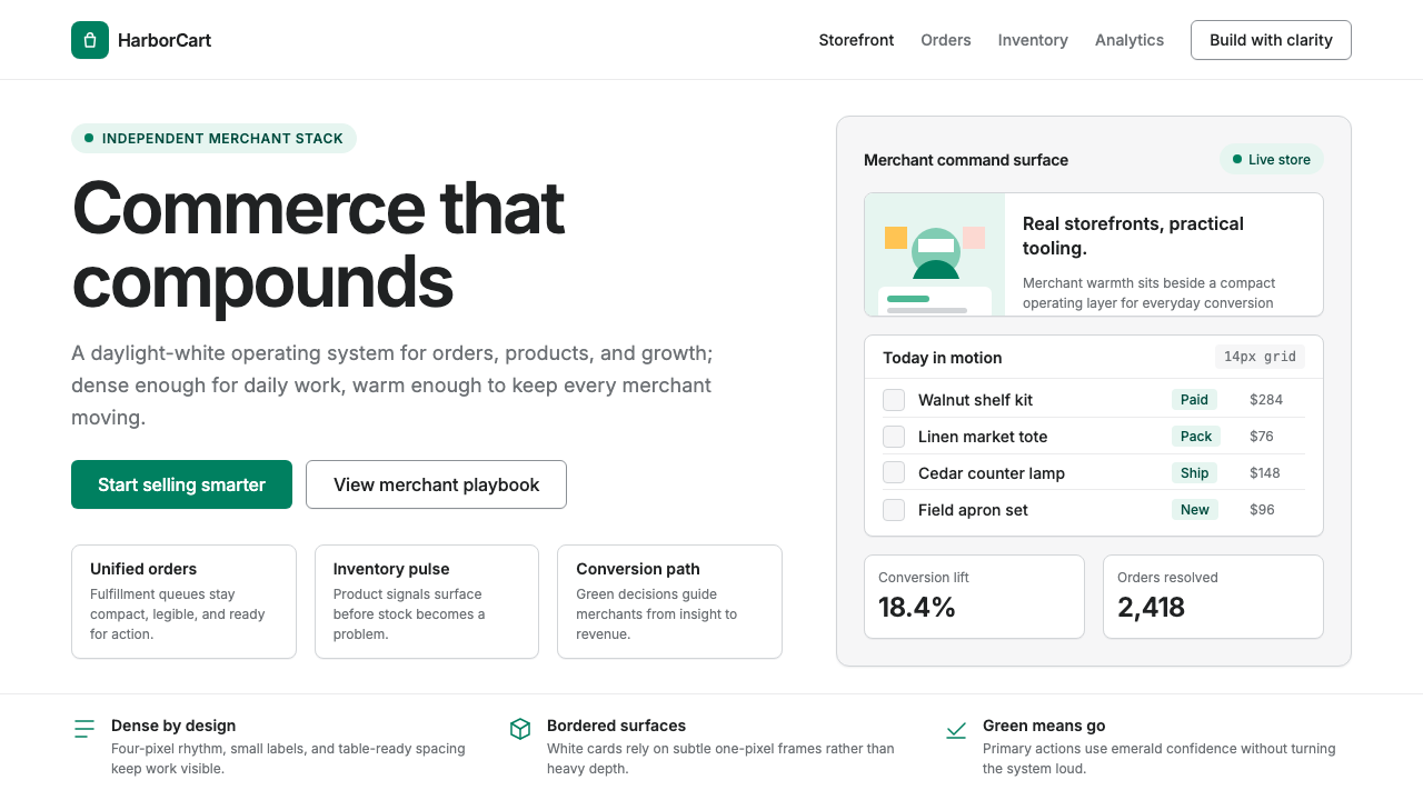
The system is not purely minimalist. It embraces visible structure — bordered cards, clear section dividers, explicit state indicators — because merchants often arrive under pressure, checking an order on a phone between customer interactions. Every affordance must be legible at a glance. The result is a design language that earns trust through clarity and sustains loyalty through warmth.这套系统并非纯粹的极简主义。它拥抱可见的结构——描边卡片、清晰的段落分隔线、明确的状态指示器——因为商户往往在压力下抵达,在接待顾客的间隙拿着手机查看一个订单。每一个交互线索都必须一眼即懂。由此形成的设计语言以清晰建立信任,以温度维系忠诚。
See the Shopify Modern design system查看 Shopify Modern 完整设计系统
Where does Shopify Modern come from?Shopify Modern 从何而来?
Shopify was founded in Ottawa, Canada, in 2006 by Tobi Lütke and Daniel Weinand, two developers who had set out to sell snowboards online and found every existing platform inadequate for the task. Their frustration became the product: a commerce infrastructure that would give independent merchants access to the same selling capabilities as large retailers. The original interface was functional but unresolved — a patchwork of third-party components and ad-hoc decisions that reflected the company's scrappy startup origins more than any coherent visual philosophy.Shopify 由 Tobi Lütke 和 Daniel Weinand 于 2006 年在加拿大渥太华创立。两位开发者最初是为了在网上卖滑雪板,却发现所有现有平台都不够用。挫败感催生了产品:一套商业基础设施,让独立商户也能拥有大型零售商一样的销售能力。最初的界面功能可用,但视觉散乱——一堆第三方组件与临时决策的拼凑,更多地反映了公司草创期的务实心态,而非任何连贯的视觉哲学。
As Shopify scaled through the early 2010s and its merchant base diversified from hobbyists to mid-market businesses, the accumulated design debt became a genuine product problem. Merchants were navigating an interface that varied in tone and behavior across different sections. Onboarding new employees to the codebase was slow because UI patterns were reinvented from page to page. The answer was not a visual refresh but a system — a shared language that could govern everything from a tiny inline error message to the architecture of a full-page data view.随着 Shopify 在 2010 年代初期快速扩张,商户群体从爱好者扩展到中型企业,积累的设计债务演变为真实的产品问题。商户在不同页面间切换时,会遭遇风格与行为各异的界面。让新员工熟悉代码库也很费时,因为 UI 模式从页面到页面各自为战。解决方案不是视觉翻新,而是一套系统——一种共同语言,能够规范从小小的内联错误提示到全页数据视图架构的一切。
In 2018, Shopify publicly released Polaris, its design system, making it one of the first major commerce platforms to open-source the principles underlying its interface. Polaris defined not just components but the reasoning behind them: accessibility requirements, interaction patterns, content guidelines, and the underlying values — merchant empowerment, clarity, and efficiency — that every design decision should serve. The emerald green that had been a brand color became a systematic signal: it appears on primary actions and calls to action, never on decorative elements, so merchants always know where agency lives.2018 年,Shopify 公开发布了 Polaris 设计系统,成为最早将界面底层原则开源的主要商业平台之一。Polaris 定义的不只是组件,还有其背后的理由:无障碍要求、交互模式、内容准则,以及每一个设计决策都应服务的核心价值——赋能商户、清晰与效率。此前作为品牌色存在的翡翠绿,在系统中获得了精确的语义:它只出现在主要操作与行动号召上,从不用于装饰元素,让商户始终知道主动权在哪里。
The visual identity reached its current form through iterative refinement across the period from roughly 2022 to 2024. The system absorbed influences from several parallel trends in product design — the resurgence of visible borders and explicit structure as a counter-movement to the borderless, shadow-only interfaces of the mid-2010s; the elevation of photography as a brand asset rather than mere illustration; and the growing recognition in the design-system-first product organizations that the marketing surface and the product surface should share a common visual vocabulary. Shopify became a case study in how a commerce platform could extend a single coherent identity from a pricing-page hero image to a data-table row state.视觉识别在大约 2022 年至 2024 年间通过迭代打磨达到了当前形态。系统吸收了产品设计领域几股并行趋势的影响——可见描边与显式结构的回归(作为对 2010 年代中期无边框、纯阴影界面的反拨);摄影作为品牌资产而非单纯插图的地位提升;以及「设计系统优先」型产品组织日益形成的共识:营销界面与产品界面应共享同一套视觉词汇。Shopify 由此成为一个范例,展示商业平台如何将单一连贯的视觉身份从定价页英雄图延伸到数据表格的行级状态。
What defines the Shopify Modern look?Shopify Modern 的视觉特征是什么?
Emerald as Semantic Anchor翡翠绿作为语义锚点
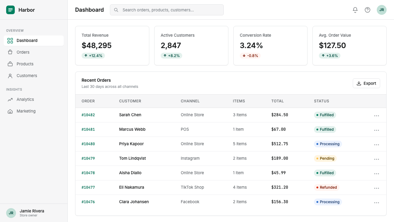
The signature green is not applied freely across the interface — it is reserved for primary actions, calls to action, and interactive affordances that require merchant agency. This restraint transforms the color from a decorative choice into a reliable signal: wherever the green appears, something consequential can happen. The rest of the palette is deliberately neutral, allowing the green to carry full weight without competition.标志性的翡翠绿并非随意铺满界面——它被保留给主要操作、行动号召,以及需要商户主动参与的交互线索。这种克制将颜色从装饰性选择转化为可靠的信号:凡翡翠绿出现之处,必有重要操作可执行。其余色板刻意保持中性,让翡翠绿不受竞争地承担全部语义分量。
Bordered Card Structure描边卡片结构
Where many contemporary product interfaces rely on elevation and shadow to define containers, Shopify Modern uses explicit borders. Cards have visible strokes that clearly demarcate sections without demanding that users perceive subtle depth differences. This makes the interface readable under adverse conditions — bright sunlight on a phone screen, a quick glance between tasks — and gives the system a honest, workmanlike quality distinct from the softer, more atmospheric interfaces of consumer apps.许多当代产品界面依靠海拔与阴影来定义容器,而 Shopify Modern 选用显式描边。卡片具有可见的边框线,清晰地划定各个区块,无需用户感知微妙的深度差异。这让界面在不利条件下依然清晰可读——手机屏幕上的强光,任务间隙的匆匆一瞥——并赋予系统一种诚实、务实的气质,有别于消费类应用更柔和、更氛围化的界面。
Merchant Photography as Warmth Engine商户摄影作为温度引擎
Shopify's marketing surfaces integrate real photographs of merchants, their products, and their workspaces — not generic stock imagery. The photography is warm in color temperature, documentary in feel, and often shows hands at work. This humanizes what would otherwise be a purely functional system and communicates the brand's core promise: that the platform exists to serve real people building real businesses. In editorial contexts, the photography takes on a generous scale, often bleeding to the edge of the layout.Shopify 的营销界面融入了真实的商户照片——他们的产品、工作空间——而非通用的图库图片。这些照片色温温暖,纪实感强烈,常常呈现劳作中的双手。这让一套本可能纯粹功能性的系统充满人情味,传递了品牌的核心承诺:这个平台的存在,是为了服务正在建立真实业务的真实的人。在编辑语境中,摄影以宽裕的尺度呈现,常常铺满版面边缘。
Information Density at Admin Scale后台尺度的信息密度
The product interface is designed for professionals who spend hours each day inside it — not casual visitors who need to be hand-held. Type is set compact, tables are dense, and the spacing between elements is deliberately tight so that more information fits in a single viewport without scrolling. This density is not a compromise; it is a design value. Merchants who run their businesses in Shopify's admin need to see their orders, inventory, and analytics at a glance, not scroll through generous whitespace.产品界面是为每天在其中工作数小时的专业人士而设计的——而非需要被牵手引导的偶然访客。字号紧凑,表格密集,元素间距经过刻意收紧,让更多信息在单个视口内无需滚动即可呈现。这种密度并非妥协,而是一种设计价值。在 Shopify 后台运营业务的商户,需要一眼看到订单、库存与分析数据,而非在充裕的留白间上下滚动。
Dual Register: Admin and Brand双重语境:后台与品牌
Shopify Modern operates in two distinct registers that share an underlying language. The admin register is compact, structured, and task-focused — every element earns its place by serving a merchant action. The brand register, used in marketing, homepages, and campaign materials, is open, editorial, and aspirational — generous whitespace, large photography, and headlines that carry emotional weight. The system's coherence comes from the consistent use of color, the shared type sensibility, and the same honest directness of voice across both registers.Shopify Modern 在两种截然不同却共享底层语言的语境中运作。后台语境紧凑、结构化、以任务为中心——每个元素都因服务于商户操作而存在。品牌语境,用于营销、首页与活动素材,则是开阔的、编辑式的、充满抱负的——充裕的留白、大幅摄影,以及承载情感分量的标题文案。系统的一致性来自色彩的统一运用、共同的字体感知,以及贯穿两种语境的同一种诚实直接的表达风格。
Accessible Contrast and Color Use无障碍对比度与色彩运用
The Polaris system was built with accessibility as a foundational constraint rather than an afterthought. Text meets rigorous contrast requirements against its backgrounds. Interactive states — hover, focus, disabled, error — each have distinct visual treatments that do not rely solely on color to communicate status. The green, rather than a purely decorative brand color, was chosen and calibrated partly for its legibility across a range of screen conditions and the accessibility of its contrast ratios against white.Polaris 系统将无障碍作为基础约束而非事后补救。文本与背景之间满足严格的对比度要求。交互状态——悬停、聚焦、禁用、错误——各有独特的视觉处理,不单纯依赖颜色来传达状态。翡翠绿的选择与校准,部分原因正在于它在各种屏幕条件下的清晰度,以及其与白色底面的对比度比率满足无障碍标准。
Typographic Directness字体排印的直接性
The system's typographic sensibility favors clarity and utility over elegance. Headlines are set with enough weight to anchor page sections but not so decorative as to slow reading. Body type is sized for sustained reading in a professional context — not so small it strains, not so large it wastes space. The hierarchy is expressed through size and weight contrast alone; there are no decorative typographic treatments such as all-caps display sections, swash characters, or editorial ligatures.系统的字体排印感知以清晰与实用为先,而非以优雅为重。标题的字重足以锚定页面各节,却不以装饰性妨碍阅读速度。正文字号适合在专业语境下持续阅读——不小到令人费力,不大到浪费空间。层级仅通过字号与字重的对比来表达;没有全大写展示区、花体字符或编辑性连字等装饰性排版处理。
See the Shopify Modern design system查看 Shopify Modern 完整设计系统
Who shaped Shopify Modern?谁塑造了 Shopify Modern?
Lütke co-founded Shopify after experiencing firsthand the inadequacy of existing commerce tools when trying to sell snowboards online in the early 2000s. As CEO, he shaped the company's foundational philosophy — that Shopify should function as a merchant ally rather than an extractive platform — and this philosophy permeates the design system. His engineering background influenced Polaris's emphasis on systematic consistency over one-off visual flair, and his framing of Shopify as 'arming the rebels' against large retail gave the design team a clear value hierarchy to design against.Lütke 在 2000 年代初亲身经历了现有商业工具的不足——彼时他正尝试在网上卖滑雪板——随后联合创立了 Shopify。作为 CEO,他塑造了公司的根本哲学:Shopify 应作为商户的盟友而非抽成的平台。这一哲学渗透进设计系统。他的工程师背景影响了 Polaris 对系统一致性而非一次性视觉亮点的强调;他将 Shopify 定位为「武装反叛者」对抗大型零售商,也为设计团队提供了清晰的价值层级。
Weinand, who co-founded Shopify with Lütke, served as the company's first designer and Chief Design Officer. In the early years, when the entire interface was built by a handful of people, Weinand established the tone and visual character that would later be systematized into Polaris. His insistence that commerce software could be both functional and visually considered — rather than accepting the drab utility common to enterprise tools of the era — set the expectation that the design team would later formalize.Weinand 与 Lütke 共同创立 Shopify,担任公司首位设计师及首席设计官。在早期,整套界面由寥寥数人搭建,Weinand 奠定了后来被系统化为 Polaris 的基调与视觉个性。他坚持认为商业软件既可以功能完备,也可以视觉考究——而非接受当时企业工具惯常的乏味实用风格——这一期待,后来被设计团队正式化为系统。
The Polaris design system team — a cross-functional group of designers, engineers, and content strategists at Shopify — built and maintains the open-source component library and guidelines that constitute the formal expression of Shopify Modern. Their decision to publish Polaris publicly in 2018 was both a practical move, enabling third-party app developers to build consistent experiences within the Shopify ecosystem, and a philosophical one: making the reasoning behind design decisions legible and debatable. The team's ongoing work on accessibility, internationalization, and the dual admin-plus-brand register has kept Polaris current through multiple cycles of platform evolution.Polaris 设计系统团队——由 Shopify 的设计师、工程师与内容策略师组成的跨职能团队——构建并维护着构成 Shopify Modern 正式表达的开源组件库与设计准则。他们在 2018 年决定公开发布 Polaris,既是务实之举(让第三方应用开发者能在 Shopify 生态中构建一致的体验),也是哲学表态:让设计决策背后的推理变得可见、可讨论。团队在无障碍、国际化,以及后台与品牌双重语境上的持续工作,使 Polaris 在多轮平台演进中始终保持现代。
Shopify Modern did not emerge in isolation. It was shaped by the broader rise of direct-to-consumer brands in the 2010s and the parallel maturation of SaaS product design. The DTC movement created a new class of merchant — visually sophisticated, brand-conscious, unwilling to accept the drab utility of traditional retail back-office software — whose expectations forced Shopify's interface to meet a higher visual standard. The design-system-first product organizations that proliferated in the same period provided both a methodology and a vocabulary for formalizing what Shopify's team had been building intuitively.Shopify Modern 并非在孤立中诞生。它被 2010 年代直面消费者(DTC)品牌的兴起,以及同期 SaaS 产品设计的成熟所塑造。DTC 运动催生了新一代商户——视觉上成熟、品牌意识强烈、不愿接受传统零售后台软件的乏味实用——他们的期待迫使 Shopify 的界面达到更高的视觉标准。同期涌现的「设计系统优先」型产品组织,为 Shopify 团队一直在凭直觉构建的东西提供了方法论与词汇。
How do you use Shopify Modern today?今天怎么用 Shopify Modern?
Shopify Modern is a highly practical reference for anyone designing commerce-adjacent products — checkout flows, merchant dashboards, inventory management tools, or any application where the user is a professional working under time pressure rather than a casual consumer browsing at leisure. The aesthetic communicates competence, trust, and respect for the user's time, which are the right values for a wide range of B2B and B2C-on-behalf-of-B-products.Shopify Modern 是设计商业相关产品的高度实用参考——收银流程、商户仪表盘、库存管理工具,或任何用户是在时间压力下工作的专业人士、而非悠闲浏览的普通消费者的应用。这套美学传达出能力、信任与对用户时间的尊重,这些正是众多 B2B 及代表商家服务消费者(B2C-on-behalf-of-B)产品所需要的价值观。
For presentation slides, the style translates well in both cover and content contexts. A cover slide in this register benefits from a clean white or light-ground layout with a single strong emerald accent on the headline or a key visual element — a product photograph, a merchant scene — set at generous scale. Content slides should commit to visible structure: cards or bordered sections to separate data clusters, clear typographic hierarchy with a single dominant heading and subordinate body text, and any charts or data visualizations treated as clean geometric objects with color used only to distinguish categories rather than to decorate. Data slides gain credibility from the system's native density: tight tables with clear column headers and aligned values read as professional and considered rather than sparse.在演示文稿中,这种风格在封面与内容页都表现良好。这种语境下的封面幻灯片,适合采用干净的白色或浅色底面,以单一醒目的翡翠绿强调标题或关键视觉元素——产品照片或商户场景——以宽裕的尺度呈现。内容幻灯片应坚守可见结构:用卡片或描边分区来区隔数据群组,用清晰的字体层级(单一主标题配从属正文)来组织信息,将图表或数据可视化处理为干净的几何对象,色彩只用于区分类别而非装饰。数据幻灯片因系统原生的密度而获得可信度:紧凑的表格配清晰的列标题和对齐的数值,读来专业有质感,而非空洞稀疏。
For web interfaces — especially dashboards, admin panels, pricing pages, and SaaS product trials — Shopify Modern's principles translate directly. Define an explicit grid and commit to it; use bordered containers rather than shadow-only cards to define sections; reserve the green for primary calls to action and interactive elements so the color carries semantic weight rather than decorative warmth. Pricing pages benefit from the system's honest directness: clear tier labels, explicit feature lists, and a primary action button that uses the green without ambiguity. Avoid using the green as a background fill on large areas; its power comes from selectivity.对于网页界面——尤其是仪表盘、管理后台、定价页和 SaaS 产品试用页——Shopify Modern 的原则可以直接转化。定义明确的网格并坚守它;使用描边容器而非纯阴影卡片来定义分区;将翡翠绿保留给主要行动号召与交互元素,让这种颜色承载语义重量而非装饰温度。定价页得益于系统诚实直接的风格:清晰的套餐标签、明确的功能列表,以及一个毫不模糊地使用翡翠绿的主要操作按钮。避免将翡翠绿大面积用作背景填充;它的力量来自稀缺性。
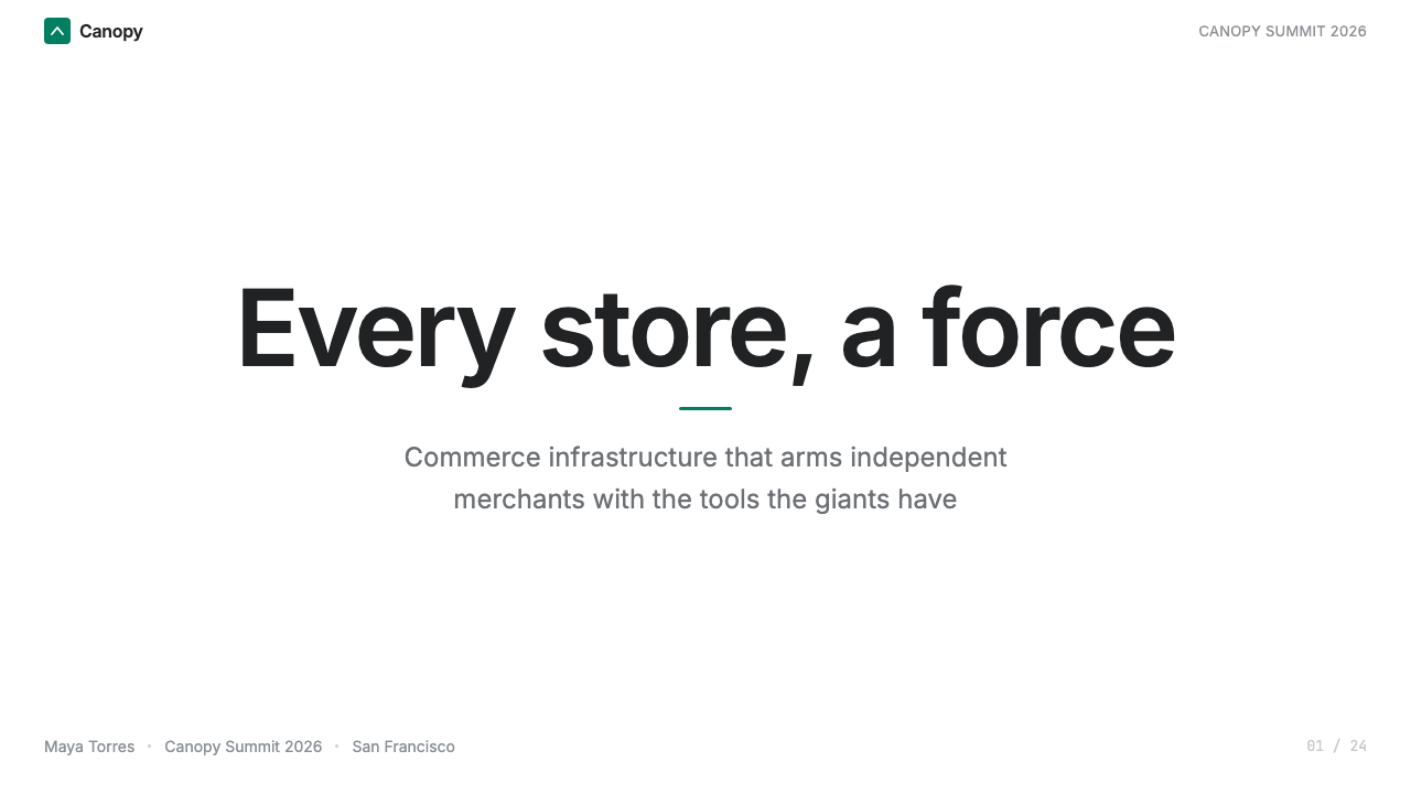
For editorial and marketing work — campaign pages, brand stories, product announcements — the key is to embrace the brand register of the system rather than the admin register. This means generous whitespace, large-format photography featuring real people and real work, and headlines with enough weight and scale to carry the emotional freight of the message. Section breaks can be marked by a horizontal rule or a shift in background tone from white to a very light warm neutral rather than decorative ornaments. The emerald green appears here primarily as a button or link treatment, never as a tint fill behind long-form text.对于编辑与营销工作——活动页、品牌故事、产品公告——关键是拥抱系统的品牌语境而非后台语境。这意味着充裕的留白、以真实人物与真实劳动为主题的大幅摄影,以及足够分量与尺度来承载信息情感重量的标题文案。段落分隔可用水平线或背景色从白色过渡到极浅暖中性色来标示,而非装饰性元素。翡翠绿在此主要作为按钮或链接处理,绝不作为长文本背后的色调填充。
A common mistake when referencing Shopify Modern is applying the green too liberally — using it as a background color on banners, as a tint on card surfaces, or as a fill behind navigation items. The entire system's credibility as a semantic language depends on the green remaining scarce and purposeful. A second common error is importing the admin's density into marketing contexts where it reads as cluttered rather than professional. The two registers require switching deliberately: tight and structured for product, open and photographically generous for brand. Mixing them within a single surface without clear purpose produces a hybrid that has neither the utility of the admin view nor the warmth of the brand view.参考 Shopify Modern 时最常见的错误,是过于随意地使用翡翠绿——将其用作横幅的背景色、卡片表面的色调,或导航项的填充色。整套系统作为语义语言的可信度,完全依赖翡翠绿保持稀缺且有目的。第二个常见错误是将后台的密度引入营销语境,在那里密度读来是杂乱而非专业。两种语境需要有意识地切换:产品界面紧凑有结构,品牌界面开阔而摄影丰富。在同一个界面上不加区分地混用两者,会产生一种既缺乏后台视图的实用性又缺乏品牌视图的温度的混合体。
See the Shopify Modern design system查看 Shopify Modern 完整设计系统
Shopify Modern — FAQShopify Modern · 常见问题
Is Shopify Modern a style or just a corporate brand guide?Shopify Modern 是一种风格,还是只是一份企业品牌规范?
It is both, but its influence extends well beyond Shopify itself. Polaris was published as an open-source design system, and its patterns — bordered cards, emerald primary actions, admin-scale density, the dual admin-and-brand register — have been widely adopted by commerce-adjacent SaaS products, fintech platforms, and internal tool builders who needed a visual language that reads as competent and trustworthy without being stiff. When designers reference Shopify Modern as a style, they mean the aesthetic principles distilled from Polaris: high structural honesty, selective use of a signature color, and the balance between professional density and human warmth.两者都是,但其影响远超 Shopify 本身。Polaris 以开源设计系统的形式发布,它的模式——描边卡片、翡翠绿主要操作、后台级密度、双重语境——已被众多商业相关 SaaS 产品、金融科技平台和内部工具构建者广泛采用,这些产品需要一种既显能力与可信度、又不显刻板的视觉语言。设计师将 Shopify Modern 作为风格引用时,指的是从 Polaris 中提炼出的美学原则:高度的结构诚实、特征色的选择性运用,以及专业密度与人情温度之间的平衡。
How does Shopify Modern differ from other SaaS design systems like Stripe or Linear?Shopify Modern 与 Stripe 或 Linear 等其他 SaaS 设计系统有何不同?
Each system reflects the values of its product and user base. Stripe's design language is polished and developer-elegant — refined type, restrained color, and a sense of architectural precision that speaks to technical users comfortable with abstraction. Linear's interface is dense and near-monochromatic, optimized for speed and focus in a way that prioritizes function over any warmth signal. Shopify Modern is warmer and more photographically grounded — it serves merchants who may not be technical, who need to feel that the platform is on their side, and who benefit from visual signals that are explicit and unmistakable rather than subtle. The emerald green and the merchant photography are expressions of that different user relationship.每套系统都反映了其产品与用户群的价值观。Stripe 的设计语言精致而具开发者式的优雅——精炼的字体、克制的色彩,以及一种向技术用户传达抽象思维舒适感的建筑精确性。Linear 的界面密集而近乎单色,以一种将功能优先于任何温度信号的方式为速度与专注而优化。Shopify Modern 更温暖,摄影基础更丰厚——它服务于那些可能没有技术背景的商户,他们需要感受到平台站在自己这边,并从明确而非微妙的视觉信号中获益。翡翠绿与商户摄影,正是这种不同用户关系的表达。
Can the Shopify Modern aesthetic work for a non-commerce product?Shopify Modern 的美学能用于非商业类产品吗?
Yes, with some adaptation. The underlying principles — structural honesty, explicit containment, selective use of a signature color for primary actions, and the balance between density and warmth — apply broadly to any professional tool where trust and clarity are design goals. The specific emerald green is so strongly associated with Shopify that using it directly would read as imitation; a designer should substitute a different signature color calibrated for their product's brand while retaining the semantic discipline that makes Shopify's system coherent. The photography-as-warmth principle transfers to any product serving human practitioners — a medical platform, a creative tool, a logistics application — where showing real humans doing real work humanizes the interface.可以,需要适当调整。底层原则——结构诚实、显式容器、为主要操作选择性地使用特征色,以及密度与温度之间的平衡——广泛适用于任何以信任与清晰为设计目标的专业工具。翡翠绿本身与 Shopify 的关联太强,直接使用会显得是在模仿;设计师应替换为针对自身产品品牌校准的其他特征色,同时保留使 Shopify 系统连贯的语义纪律。「摄影即温度」的原则可以迁移到任何服务真实从业者的产品——医疗平台、创意工具、物流应用——在那里,展示真实的人在做真实的工作,让界面充满人情味。
What is the biggest risk when applying this style to a presentation or marketing piece?将这种风格应用于演示或营销内容时,最大的风险是什么?
The largest risk is overusing the signature green to the point where it loses semantic meaning. In the Polaris system, the green is powerful because it is scarce — it appears only where primary action lives. When designers extract the green from that systematic context and use it as a general accent or background, the piece may look like it references Shopify Modern, but it has abandoned the principle that makes the color work. The second risk is applying the admin-register density — tight spacing, small type, compressed tables — to a context that calls for the brand register's generosity, producing something that reads as cramped rather than efficient. The discipline of deciding which register applies to a given surface, and then committing to that register, is the most important skill in working with this style.最大的风险是过度使用特征绿,直到它失去语义意义。在 Polaris 系统中,翡翠绿之所以有力量,是因为它稀缺——它只出现在主要操作所在之处。当设计师将翡翠绿从这一系统语境中剥离,用作通用强调色或背景色时,作品可能看起来在引用 Shopify Modern,却已放弃了让这种颜色奏效的原则。第二个风险是将后台语境的密度——紧凑的间距、小号字体、压缩的表格——应用于呼唤品牌语境宽裕感的场合,产生读来局促而非高效的结果。判断哪种语境适用于特定界面、然后坚守这种语境,是运用这种风格时最重要的技能。
Does Shopify Modern work well in dark-mode contexts?Shopify Modern 适合深色模式语境吗?
The canonical Shopify Modern system is a light-mode aesthetic: daylight white surfaces, the green-on-white contrast, and the warmth of natural-light photography all depend on a light ground. A dark inversion is technically possible — and Shopify has explored dark surfaces in some contexts — but it requires careful recalibration. The emerald green, which reads as a confident accent against white, can shift toward an aggressive or oversaturated feel against very dark backgrounds. The photography that provides warmth in the light register loses some of that quality against dark surfaces. A dark-mode adaptation works best when it commits to a dark but not fully saturated background, chooses a slightly lighter or warmer variant of the signature green calibrated for that surface, and leans more heavily on structural elements and typographic hierarchy to do the work that photography and whitespace do in the canonical form.Shopify Modern 的标准形态是浅色模式的美学:日光白的界面、绿色对白色的对比,以及自然光摄影的温度,都依赖于浅色底面。深色反转在技术上可行——Shopify 在某些语境中也探索过深色表面——但需要仔细重新校准。翡翠绿在白色上读来是自信的强调,在非常深的背景下可能转变为攻击性或过饱和的感觉。在浅色语境中提供温度的摄影,在深色表面上会失去部分这一品质。深色模式的适配效果最好的情形是:选用深色但非完全饱和的背景,为该表面校准一个略浅或略暖的特征绿变体,并更多依赖结构元素与字体层级来完成标准形态中摄影与留白所承担的工作。
Related design styles相关设计风格
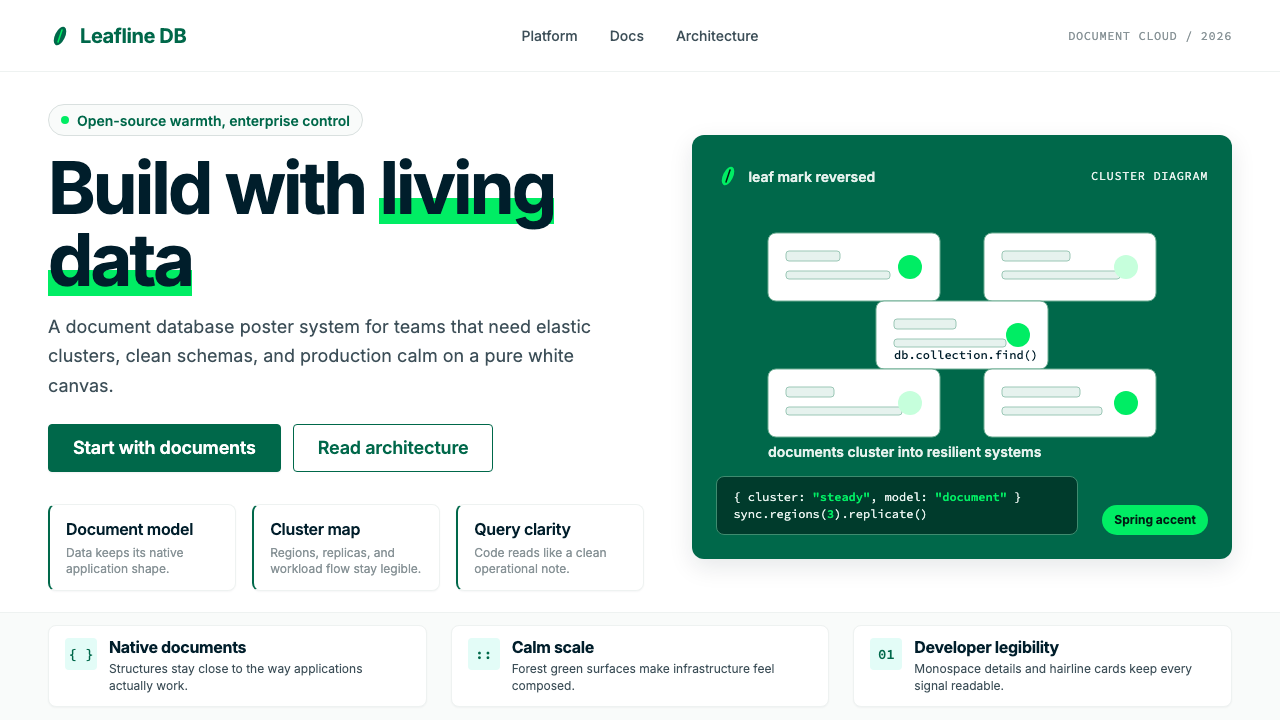 MongoDB Leaf GreenDisciplined green, open warmth. Forest leaf forms and Spring accents breathe…克制的绿有开源温度:森林绿叶形与春绿点缀,留白呼吸。
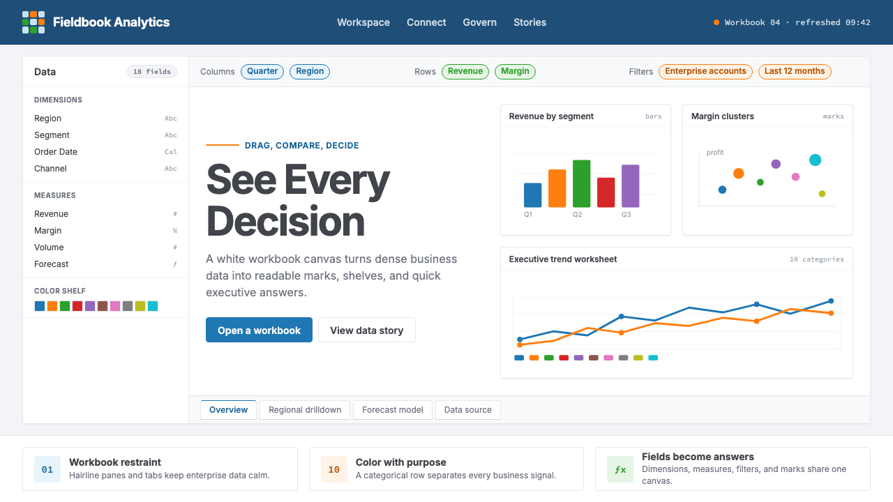 Tableau (Business Intelligence)Enterprise clarity. Navy workbook chrome, hairline panes, and 10-color marks…企业级清晰感:海军蓝工作簿框架、细线分栏与十色数据标记驯服密集信息。
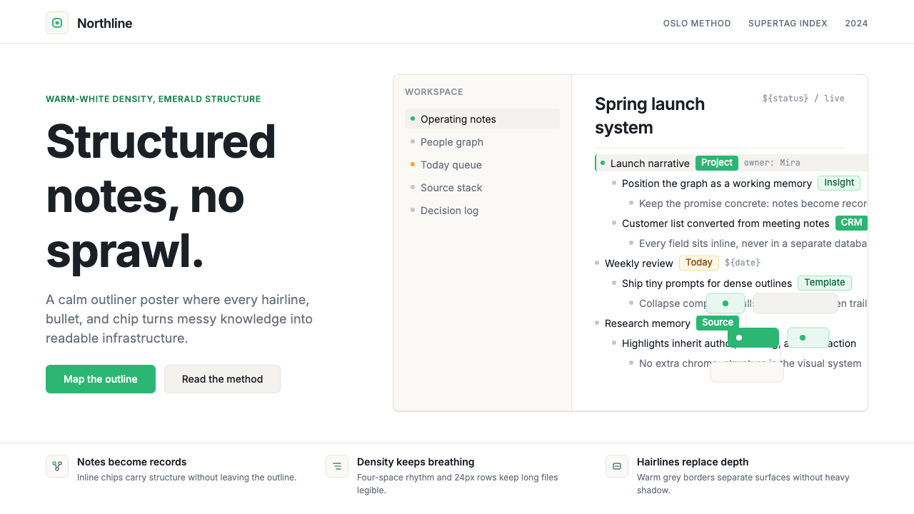 Tana SupertagsCalm density wins. Inter outlines and emerald chips punctuate pure white stru…冷静密度取胜:Inter 大纲与翡翠标签点亮纯白结构。
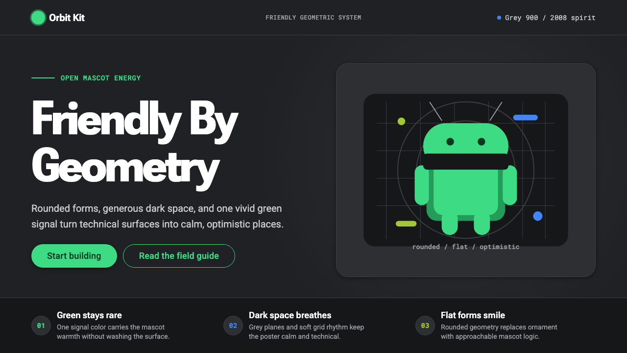 Android Bugdroid GreenFriendly tech, reduced to geometry. Vivid green pops from Grey 900 and rounde…友好科技化为几何:明绿从 Grey 900 与圆润字形中跃出。
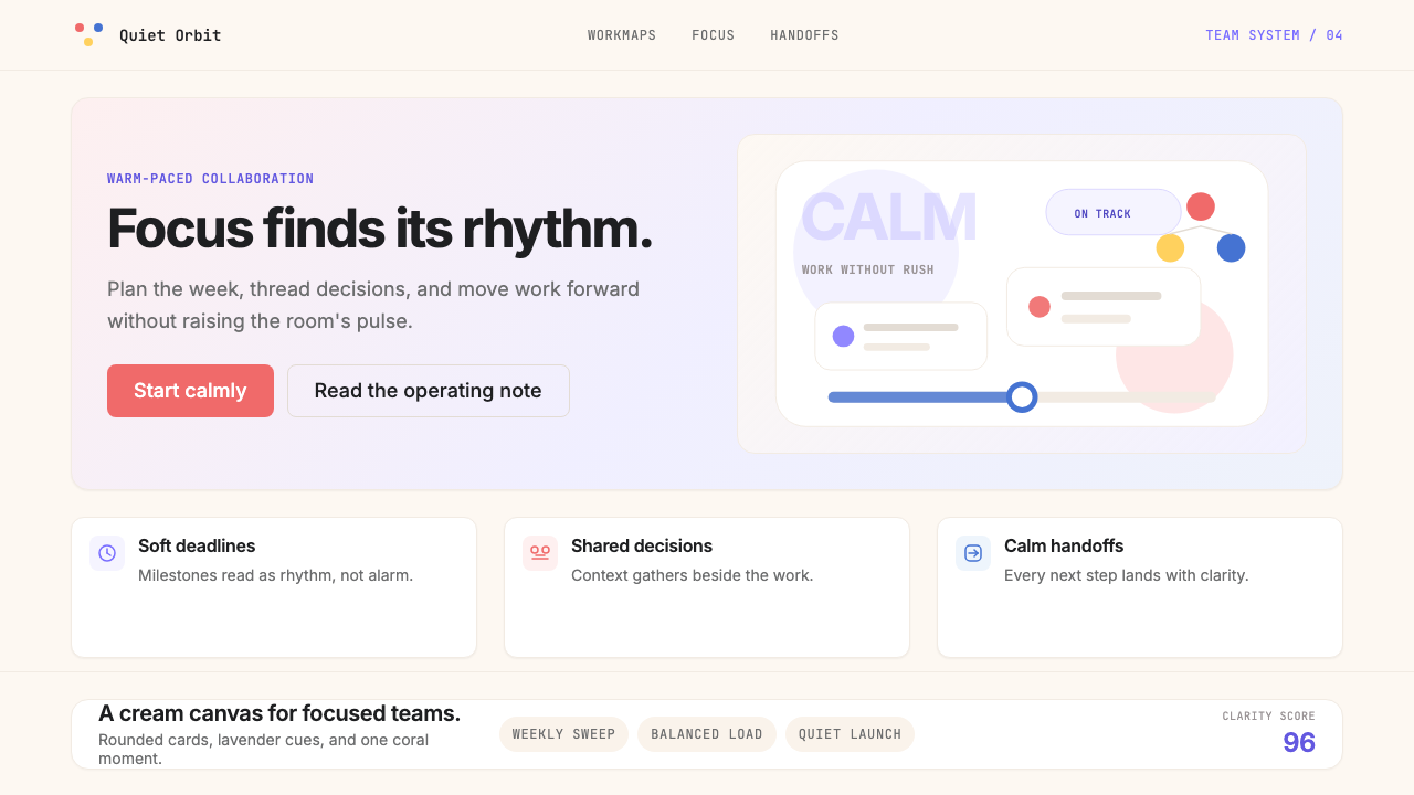 AsanaCalm productivity breathes. Cream canvas, lavender panels, coral-blue-yellow…安静生产力会呼吸:奶油画布、薰衣草面板与三色圆点。
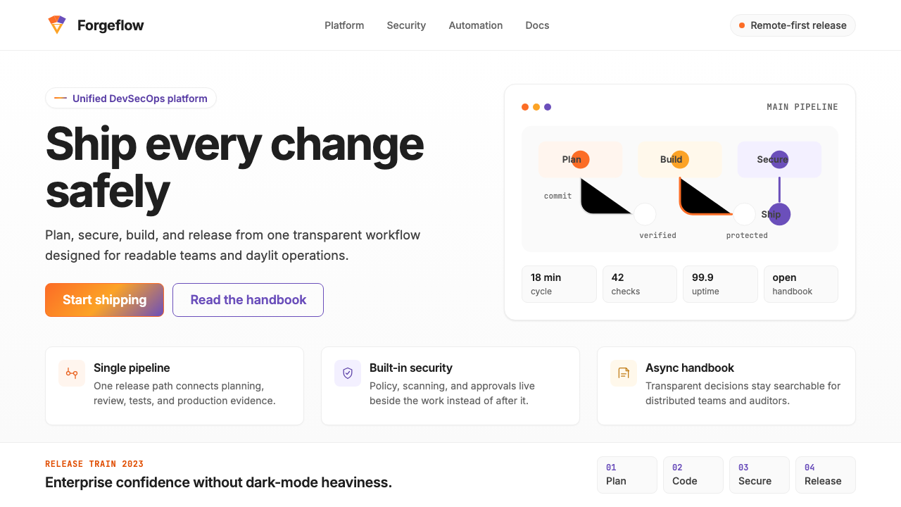 GitLab 2023DevOps in daylight. Tanuki orange-to-purple gradient, Inter, warm enough for…DevOps 走出暗色房间:标志性狸猫橙紫渐变、宽松行高、Inter 字体——…