
About Shopify Modern
Shopify's visual identity is professional warmth distilled into a design system. Polaris green on daylight-white surfaces says "we're serious about commerce but we're on your side." Every pixel serves conversion — merchant-photography adds human warmth while the component library stays utilitarian and dense.
The system balances admin-product density (14px type, tight data tables, action cards) with marketing openness (editorial photography, generous whitespace). It's the rare brand that feels equally at home in a dashboard and a billboard.
- Origin
- Ottawa, Canada
- Era
- 2006 founded; Polaris design system 2018; current visual ~2022–2024
- Key figures
- Tobi Lütke · Daniel Weinand · Polaris design team
- Movements
- SaaS commerce platforms · design-system-first product orgs · post-WooCommerce DTC stack
Shopify Modern design spec
Colors
Typography
The other 11 sections — buttons, cards, spacing, motion, techniques and more — open once you unlock. Download the DESIGN.md or send it to your AI in one click. Unlock once, yours forever.
Sign up nowStyles similar to Shopify Modern
Also inspired by brands & products, with a close feel.
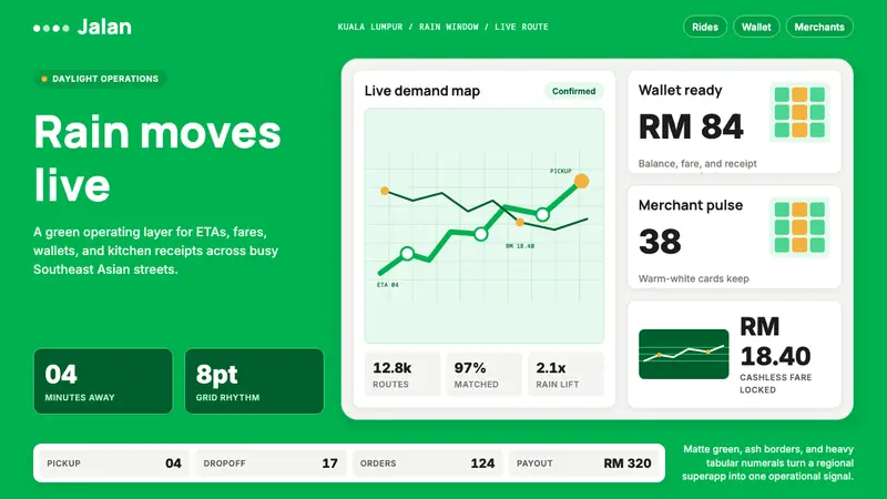 Grab SEA Superapp 2018Operational warmth. Saturated green, Inter numerals, and tight dashboard cards move the brand.
 MongoDB Leaf GreenDisciplined green, open warmth. Forest leaf forms and Spring accents breathe in white space.
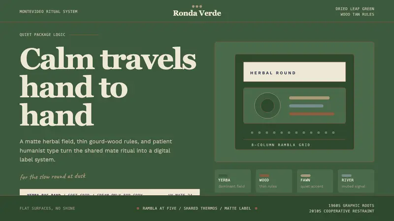 Uruguayan Yerba MateCalm in deep green. Wood-tan rules, Recoleta type, and cream bands keep the ritual slow.
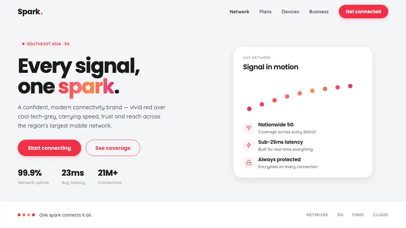 Singtel Modern BrandKeeps the red loudest on screen. Vivid Singtel red on cool tech-grey, with a gradient dot spark arc.