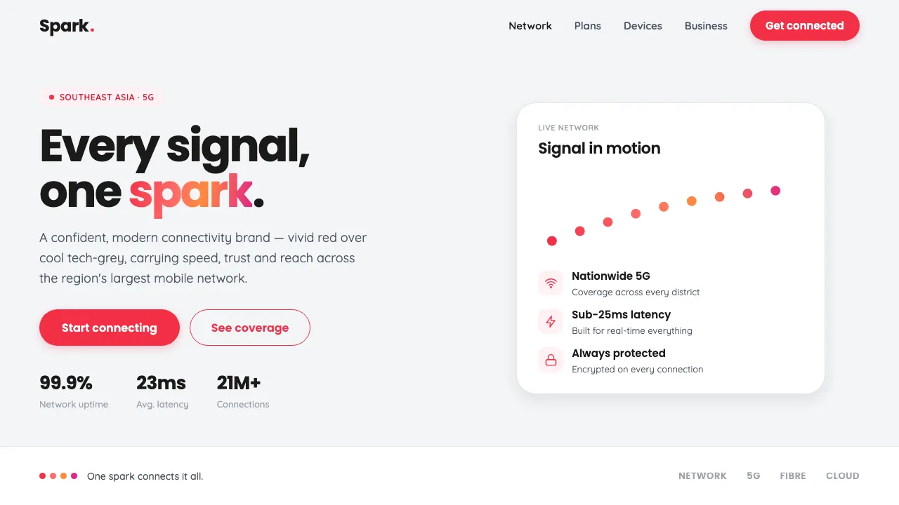
About Singtel Modern Brand
Singtel's refreshed telco identity pairs a signature vivid red with a clean, tech-minimal surface. The "spark" — an arc of red dots — runs a gradient from red into warm coral and magenta-pink. Rounded geometric sans typography and generous white space define a confident, contemporary connectivity brand from Southeast Asia's largest mobile operator.
- Origin
- Southeast Asia — Singapore
- Era
- 2010–now (2015 Ogilvy rebrand → 2021 refresh)
- Key figures
- Ogilvy · Singtel brand team
- Movements
- Tech minimalism · Rounded geometric sans branding · Gradient spark motion identity
Singtel Modern Brand design spec
Colors
Background
Surface
Primary
Secondary
Accent
Text
Typography
PoppinsHeadings
QuicksandBody
Unlock for 1 credit
The other 11 sections — buttons, cards, spacing, motion, techniques and more — open once you unlock. Download the DESIGN.md or send it to your AI in one click. Unlock once, yours forever.
Sign up nowHave an account? Sign in
Styles similar to Singtel Modern Brand
Also inspired by brands & products, with a close feel.
 Strava Orange FitnessData becomes trophy. Inter numerals, gray metric grids, and one orange route line.
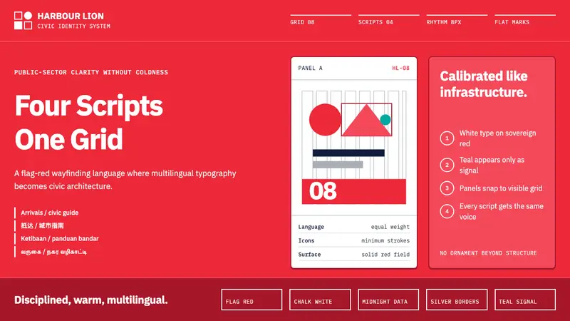 Singapore Merlion BrandPrecision with civic warmth. Flag red and geometric sans lock into a four-script grid.
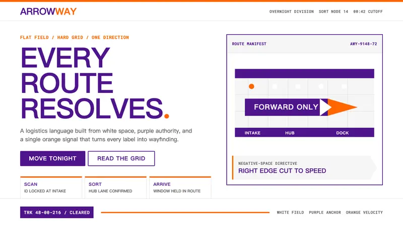 FedExDirections, not decoration. Purple authority and one orange bar organize a flat white grid.
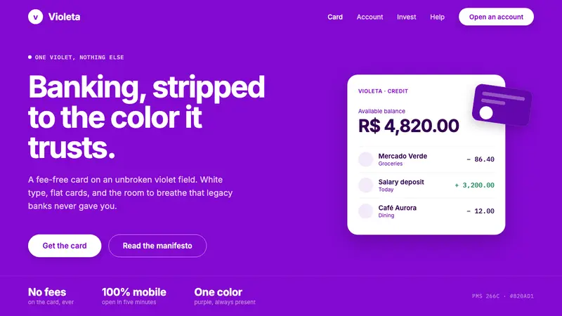 Nubank PurpleBanking stripped to one color. Full-bleed Nupurple ground, white type, generous negative space.