What is Singtel Modern Brand?
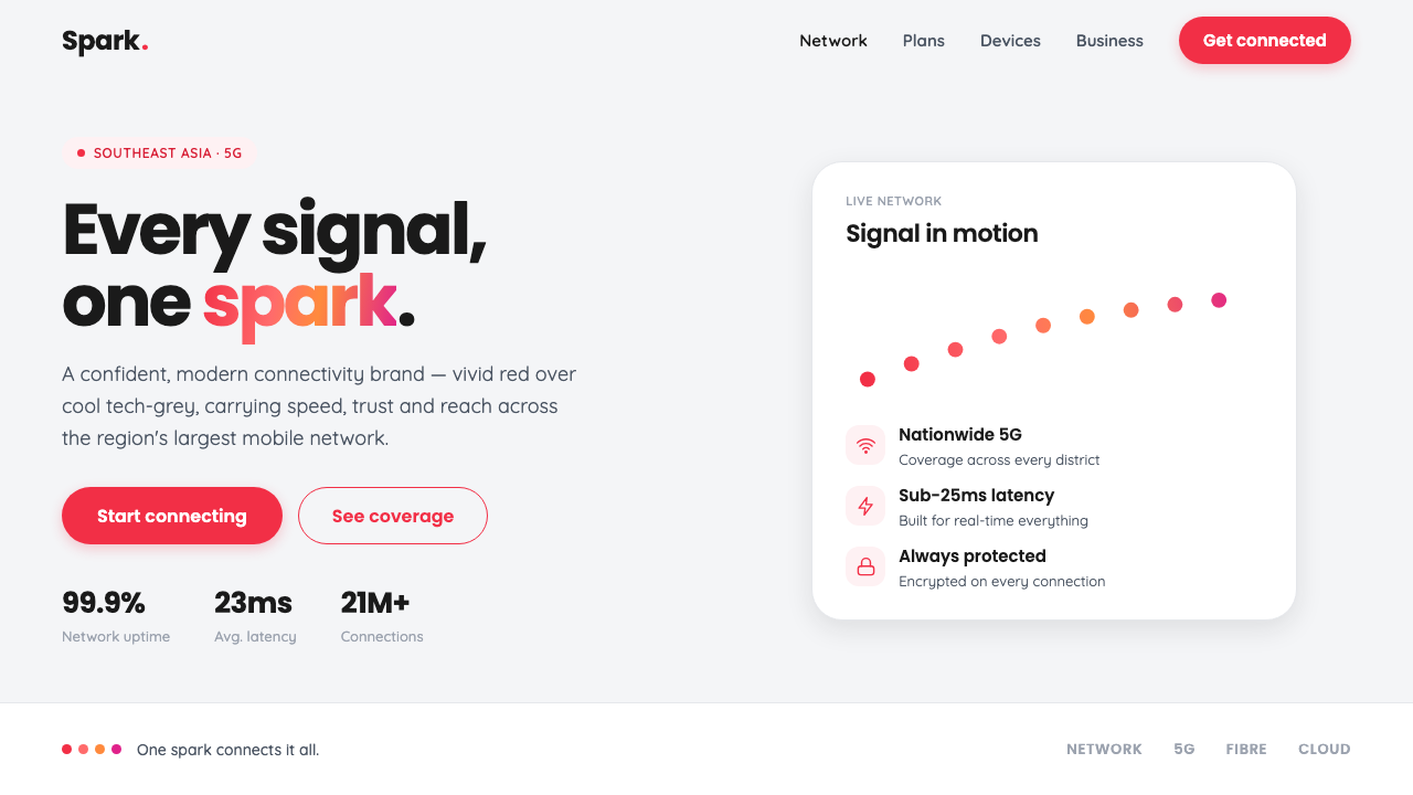
Singtel Modern Brand turns connectivity into a visible pulse: vivid telecom red, cool technology grey, and a dotted spark arc that carries energy across a quiet surface.
Singtel Modern Brand in brief
Singtel Modern Brand is a refreshed telecommunications identity built around one deliberate contrast: a signature vivid red made louder by a cool, restrained technology-grey environment. The result is clean without becoming anonymous, contemporary without relying on visual excess. Red supplies recognition and confidence; grey creates the calm technical field against which that recognition can operate.
Its defining gesture is the spark, an arc formed from red dots that moves through a gradient from vivid red into warm coral and magenta-pink. The device is simple but expressive. A single dot would feel static; a connected arc suggests movement, transmission, and a network becoming visible. The gradient gives the identity warmth and liveliness while preserving the red-led hierarchy.
Around the spark, the system depends on rounded geometric sans typography, generous white space, and a generally light surface. Shapes are clean and approachable rather than severe. The identity feels suited to a contemporary connectivity brand from Singapore and Southeast Asia: fast, reliable, digitally fluent, and confident enough to let one strong color carry the screen.
Where does Singtel Modern Brand come from?
The identity belongs to the period from 2010 to the present, a moment when telecommunications brands increasingly needed to express more than infrastructure. Connectivity had to feel immediate, human, and digitally present. Singtel Modern Brand answers that need through a visual language that combines a strong signal color with a quiet technical ground and a graphic gesture for connection.
The first major stage was the 2015 brand rework led by Ogilvy. The work established the core relationship that still defines the system: vivid Singtel red against cool technology grey, supported by rounded geometric sans typography and generous white space. The design did not treat technology as a reason for visual hardness. Instead, it used softened forms and clear spacing to make a telecommunications identity feel accessible while retaining authority.
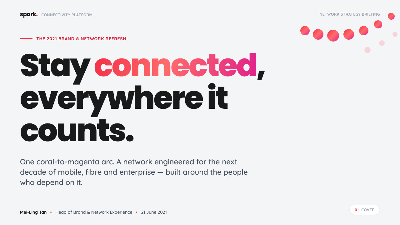
In 2021, the brand was refreshed again by the Singtel brand team. The spark became the central expressive device: an arc of red dots whose color travels toward coral and magenta-pink. This added a more dynamic layer to the identity without abandoning its minimal surface. The refreshed system therefore balances continuity and movement: the red remains unmistakably Singtel, while the spark gives that red a sense of transmission and forward motion.
The regional setting is Singapore and Southeast Asia, and that context matters to the character of the identity. Singtel is presented as the region’s largest mobile operator, yet the visual system avoids the visual heaviness often associated with large infrastructure brands. Its confidence comes from clarity, repetition, and a controlled contrast between the cool field and the vivid signal. The result is a brand language that feels technologically capable but not distant.
What defines the Singtel Modern Brand look?
Red-Led Color
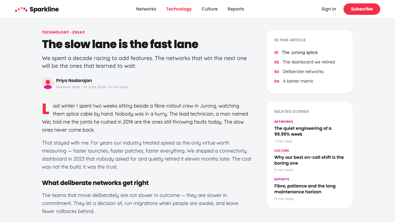
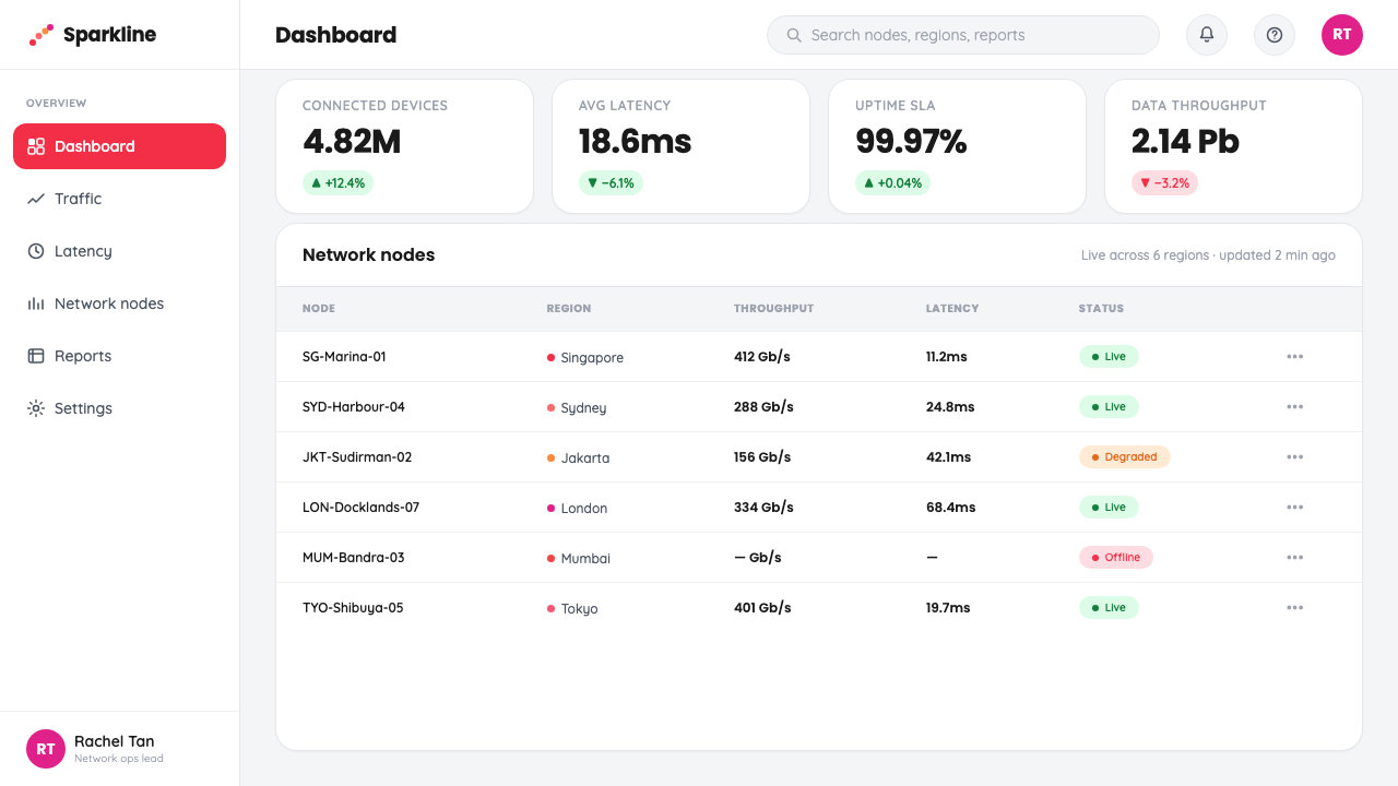
Vivid Singtel red is the loudest color in the system and should remain the first thing the eye registers. Cool technology grey provides the surrounding field, preventing the red from becoming visually noisy. Coral and magenta-pink appear through the spark gradient, adding warmth and movement without competing with the signature red.
The Spark Arc
The spark is an arc made from individual red dots. Its strength lies in the tension between discrete points and continuous direction: each dot is separate, yet the curve reads as one connected movement. The device can signal connection, transmission, or energy while staying abstract enough to work across communication contexts.
Gradient Warmth
The spark gradient travels from red into warm coral and magenta-pink. This is not a general-purpose rainbow treatment; it is a narrow, brand-specific transition that gives the dotted arc a sense of flow. The warmer colors should support the red-led hierarchy, appearing as a continuation of the signal rather than as independent decoration.
Cool Technical Ground
The background is cool technology grey rather than casual paper white. That choice gives the identity a digital and engineered atmosphere while preserving a light overall feel. Grey should remain calm and supportive, creating enough contrast for red to feel vivid without forcing every surface into stark black and white.
Rounded Geometric Type
Typography uses rounded geometric sans forms to make the system feel contemporary and approachable. The geometry provides clarity and consistency; the softened corners prevent the technology message from becoming overly severe. Type should carry the identity through confident hierarchy and clean alignment, not through ornamental lettering or decorative effects.
Generous White Space
Generous white space gives the red signal room to register. It also makes the system feel dependable rather than frantic, which is important for a connectivity brand balancing speed with trust. Content should be grouped clearly, with open areas used as active structural space instead of being filled merely to avoid emptiness.
Contemporary Connectivity
The complete language combines signal, motion, softness, and restraint. It feels made for a modern connectivity brand because the visual system does not illustrate technology literally; it gives technology a recognizable rhythm. Red announces presence, dots imply exchange, the arc supplies direction, and the grey surface keeps the experience composed.
Who shaped Singtel Modern Brand?
Ogilvy led the 2015 Singtel brand rework and established the visual foundation of vivid red, cool technology grey, rounded geometric sans typography, and generous white space. Its contribution is best understood as the creation of a disciplined contrast: a strong telecom signal held inside a clean and contemporary surface.
The Singtel brand team carried the identity into its 2021 refresh. The team developed the spark as a more central expression, using a dotted arc and a controlled transition from red into coral and magenta-pink. This extended the system from static recognition toward a more active language of connection and movement.
The Singtel spark is the identity’s most memorable graphic figure: a curved field of dots that turns color transition into a sign of connection. It is neither a literal network diagram nor a decorative flourish. Its value comes from remaining simple, repeatable, and expressive enough to organize a screen or add energy to an otherwise quiet composition.
How do you use Singtel Modern Brand today?
For presentation slides, use the cool grey surface as a calm field and let vivid red establish the cover immediately. A cover can place the title in rounded geometric sans type with the spark arc entering from an edge or sweeping through the composition. Content slides should preserve the same confidence through clear alignment, generous spacing, and a restrained red accent. The spark should appear as a purposeful connector between sections, not as a repeated ornament on every page.
On data slides, treat information as a signal that needs to travel quickly. Keep charts and diagrams clean, use red for the primary finding or action, and allow coral or magenta-pink to appear only where the spark-like transition helps distinguish movement or relationship. Cool grey can hold secondary information and supporting structure. The visual priority should remain obvious even when the slide contains several kinds of evidence.
For web interfaces, the system suits dashboards and pricing pages that need to feel technical but approachable. Use the cool grey environment to separate functional areas, rounded geometric type for labels and headings, and vivid red for active states, important actions, or the leading plan. Borders and containers should stay quiet so the interface does not compete with its own signal. A spark arc can introduce a section or mark a relationship, but the core experience should remain spacious and easy to scan.
For editorial and marketing work, the identity supports a strong opening moment followed by calm reading space. A feature page can lead with a vivid red statement, a cool grey information field, and a spark arc that carries the reader toward the next section. The same language works for campaign panels, announcements, and brand stories: use the gradient as a controlled expression of energy, keep typography rounded and direct, and let empty space make the message feel confident.
The common mistake is allowing the spark gradient or secondary warm colors to overpower the signature red. When red, coral, and magenta-pink all speak at equal volume, the identity loses its signal hierarchy. Another mistake is filling the cool grey surface with excessive decoration or compressing the generous spacing that gives the brand its confidence. The system works best when one red-led message is clear, the spark has a reason to exist, and every surrounding element remains supportive.
Singtel Modern Brand — FAQ
Is Singtel Modern Brand simply a red-and-grey color scheme?
No. Red and cool technology grey establish the main contrast, but the identity also depends on the dotted spark arc, the controlled gradient into coral and magenta-pink, rounded geometric sans typography, and generous white space. Removing those relationships would leave recognizable colors without the system’s distinctive sense of connection and movement.
Why is the spark made from dots rather than a continuous line?
The separate dots make connection visible as a sequence of points rather than a single rigid stroke. They retain the clarity of geometry while suggesting exchange and transmission. The curved arrangement gives direction, and the gradient adds flow. Together, these qualities make the spark feel active without turning it into a literal technical diagram.
Can this style work on a dark background?
The approved identity is light and deliberately built around cool technology grey, so a dark background changes its character. If a darker adaptation is necessary, it should preserve the red-led hierarchy and keep the spark gradient controlled. The background must still provide a composed field; darkness should not become an excuse to make every color brighter or more aggressive.
What keeps the identity feeling trustworthy rather than merely energetic?
The answer is the balance between energy and restraint. Vivid red and the spark provide movement, while cool grey, rounded typography, clear grouping, and generous white space slow the composition down. The identity does not ask every element to perform. It lets the signal be energetic because the surrounding system remains calm and dependable.
Where does the style work best, and where can it struggle?
It works best where clarity, contemporary technology, connection, and confident communication are central values: presentations, dashboards, pricing experiences, editorial systems, and marketing campaigns. It can struggle when the design needs dense ornament, historical atmosphere, or a highly tactile surface. Its strength is disciplined signal and open space, so applications that depend on visual abundance may fight against its natural character.
Related design styles
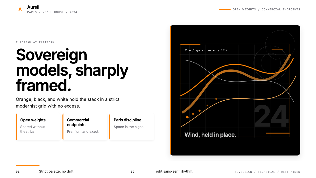 Mistral AI OrangeSovereign AI with restraint. Orange, black, and white lock the grid.
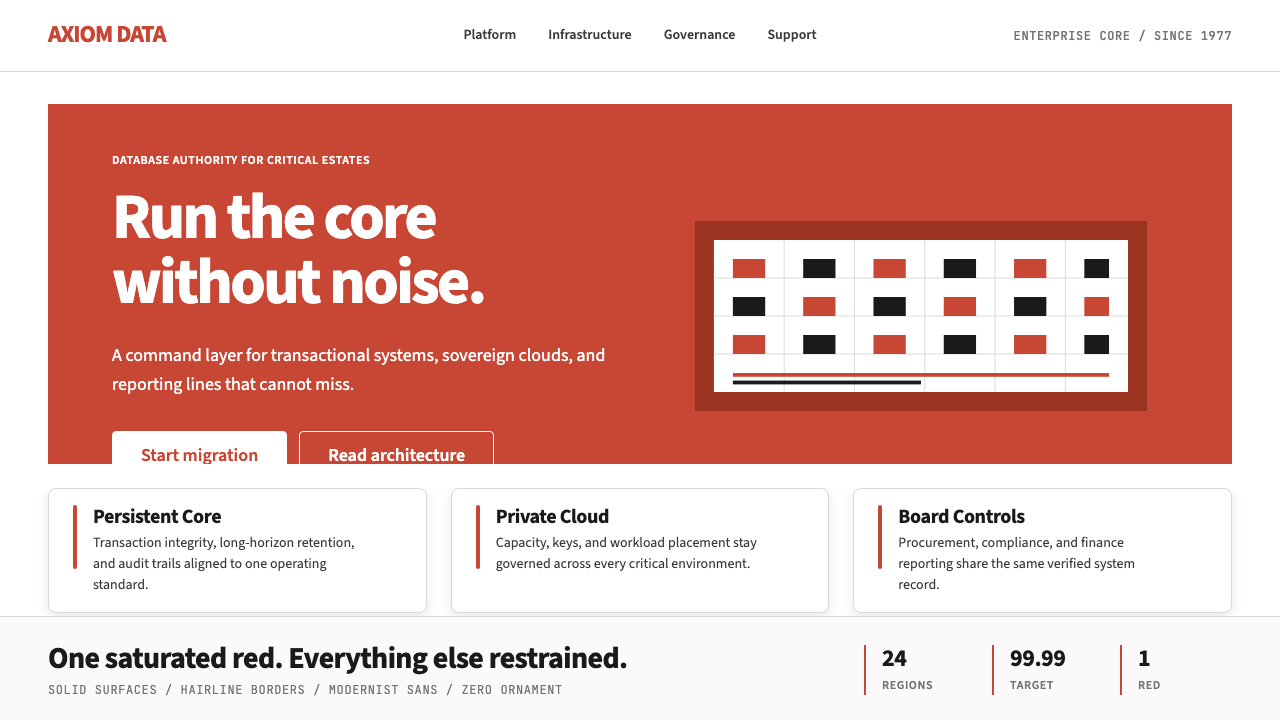 Oracle Corporate RedEnterprise certainty. Saturated red, tight sans, and white space do all the w…
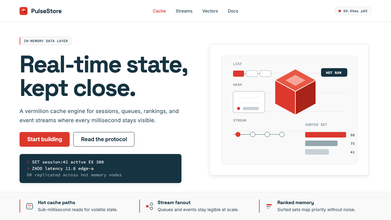 Redis Cache RedWarm database rigor. Vermilion cube, slate type, and white-space grids make s…
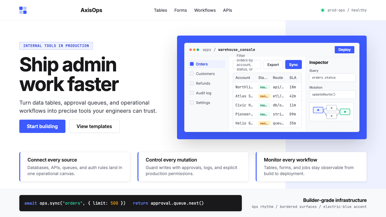 Retool Internal-Tools RedPrecision ships fast. Electric blue panels, Inter type, and bordered UI mocku…
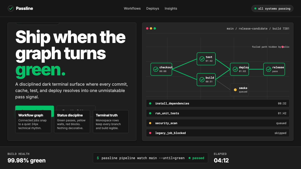 CircleCI Pipeline-GreenConfidence goes green. Emerald status lines cut through terminal-black pipeli…
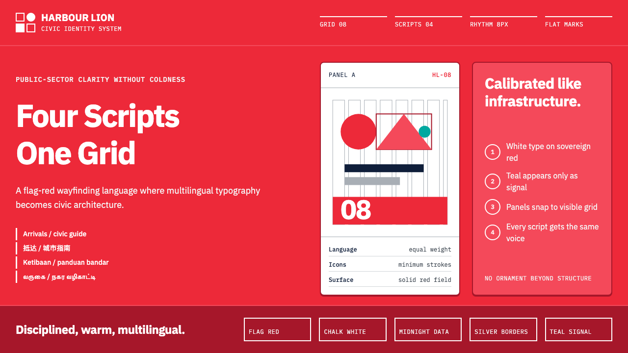 Singapore Merlion BrandPrecision with civic warmth. Flag red and geometric sans lock into a four-scr…