What is Oracle Corporate Red?什么是 Oracle Corporate Red?
Oracle Corporate Red says 'we have run the world's databases since 1977' — through a single saturated anchor color, disciplined neutrals, and an almost aggressive rejection of ornament.甲骨文红只用一种饱和的品牌红、克制的中性灰阶与对装饰的彻底拒绝,静静宣告:「从1977年起,我们就在运行这个世界的数据库。」
Oracle Corporate Red in briefOracle Corporate Red 速览
Oracle Corporate Red is the visual identity system of Oracle Corporation — the enterprise software and database giant founded in 1977. Its defining quality is concentration: where most corporate brands accumulate accent colors, supporting palettes, and expressive type families over time, Oracle has done the opposite. The system anchors everything to a single saturated red, pairs it with deep charcoal and pure white, and lets generous white space do the organizational work. The result is one of the most immediately recognizable technology identities in the world.甲骨文红是甲骨文公司(Oracle Corporation)的视觉识别系统。甲骨文于1977年创立,是全球最重要的企业软件与数据库公司之一。这套系统的核心特质是「浓缩」:大多数企业品牌会随时间累积多个强调色、辅助色板和富有表现力的字体家族,而甲骨文恰恰相反——它将一切锚定于一种饱和的红色,与深炭灰和纯白配对,让慷慨的留白承担所有组织性工作。最终形成的,是全球最易辨识的科技品牌视觉之一。
The aesthetic is enterprise-conservative by design. Deep saturated red serves as the sole brand anchor; all other tones are restrained slate neutrals, near-black, or pure white. Typography relies on bold, tightly-set geometric sans-serif wordmarks that convey authority rather than friendliness. There is no playfulness, no approachability signaling, no gradient transitions — just the weight of institutional confidence built over decades of running mission-critical infrastructure.整套美学是经过设计的「企业级保守主义」。深饱和红色是唯一的品牌锚点,其余所有色调均为克制的石板中性灰、近乎纯黑或纯白。字体排印依赖粗重、紧排的几何无衬线字标,传递权威感而非亲和力。没有俏皮感,没有「易接近」的信号,没有渐变过渡——只有数十年运行关键业务基础设施所积累的机构分量。
What makes the system coherent rather than merely severe is its internal logic. The red is not used decoratively — it marks boundaries, signals navigation, and identifies the brand at a glance. The white space is not emptiness — it is structure, giving each element room to assert itself. The type does not charm — it informs. Every choice eliminates ambiguity, which is precisely the message an enterprise database company needs to send to the IT departments and procurement officers who are its actual audience.这套系统之所以内聚而非仅仅严肃,在于其内在逻辑。红色不是用于装饰的——它划定边界、标示导航、让品牌一眼可辨。留白不是空洞——它是结构,让每个元素都有空间自我彰显。字体不是用来取悦人的——它是用来传达信息的。每一个选择都在消除歧义,而这正是一家企业数据库公司需要向其真实受众——IT 部门和采购决策者——传递的核心信息。
See the Oracle Corporate Red design system查看 Oracle Corporate Red 完整设计系统
Where does Oracle Corporate Red come from?Oracle Corporate Red 从何而来?
Oracle Corporation was founded in 1977 in Santa Clara, California, by Larry Ellison, Bob Miner, and Ed Oates — then operating under the name Software Development Laboratories. The company's initial product was a relational database based on a research paper by IBM's Edgar Codd, and it reached market before IBM's own implementation of the same concept. From those early years, Oracle's identity was built around technical primacy: the company that got there first, that ran faster, that handled more data with more reliability than any competitor. The visual language that emerged over the following decade reflected this positioning — nothing soft, nothing tentative, nothing that would look out of place in a data center.甲骨文公司由拉里·埃里森(Larry Ellison)、鲍勃·迈纳(Bob Miner)和埃德·欧茨(Ed Oates)于1977年在加利福尼亚州圣克拉拉创立,最初以「软件开发实验室」的名义运营。公司的最初产品是基于 IBM 研究员埃德加·科德(Edgar Codd)一篇论文的关系数据库,并在 IBM 自己实现同一概念之前率先推向市场。从早年起,甲骨文的身份认同就建立在技术优先性上:那家最先到达、跑得最快、以比任何竞争对手更高的可靠性处理更多数据的公司。此后十年间逐渐形成的视觉语言正是这一定位的反映——没有柔软感,没有迟疑感,没有任何在数据中心里显得格格不入的元素。
The distinctive red-and-black wordmark identity took shape through the 1980s and 1990s as Oracle expanded from a single database product into a global enterprise software empire covering middleware, applications, hardware, and cloud infrastructure. The red — a deeply saturated, warm-leaning crimson — was not an arbitrary choice. Red in corporate contexts carries connotations of urgency, confidence, and dominance; in the context of enterprise software, it reads as a declaration rather than an invitation. As Oracle grew through aggressive acquisitions — PeopleSoft, Siebel Systems, Sun Microsystems, and many others — the brand absorbed new product lines while the core red-and-charcoal-on-white identity held firm, serving as a unifying force across an increasingly sprawling portfolio.标志性的红黑字标身份在1980年代至1990年代逐渐成形,彼时甲骨文从单一数据库产品扩张为涵盖中间件、应用软件、硬件和云基础设施的全球企业软件帝国。那种深度饱和、偏暖的深红色并非随意的选择。红色在企业语境中承载着紧迫感、自信心与主导地位的内涵;在企业软件语境中,它读来像是一种宣告,而非一份邀请。随着甲骨文通过激进的收购——仁科软件(PeopleSoft)、Siebel Systems、太阳微系统(Sun Microsystems)等——不断扩大版图,品牌吸纳了越来越多的产品线,而红黑配白的核心视觉身份始终坚守,成为一个日益庞大的产品组合的统一力量。
A significant refinement came in 2014 with the introduction of Oracle Sans, a custom typeface developed specifically for the brand. Oracle Sans replaced the mix of licensed geometric sans-serif faces that had been in use and gave the identity a single, consistent typographic voice — tightly spaced, moderately weighted, with the slight humanist warmth of its predecessor Source Sans 3 tempered by engineering precision. The typeface introduction was part of a broader brand consolidation effort as Oracle shifted its marketing emphasis from on-premise enterprise software to cloud services, competing directly with Salesforce, SAP, and Microsoft Azure. The goal was to appear simultaneously modern and institutional — newer than the mainframe era, more dependable than a startup.2014年推出专属字体 Oracle Sans,是品牌形象的一次重要精炼。Oracle Sans 取代了此前混用的多种授权几何无衬线字体,赋予品牌单一、一致的排印声音——紧密字距,适中字重,源自 Source Sans 3 的淡淡人文温度被工程精确性所调和。字体的引入是更大范围品牌整合工作的组成部分,彼时甲骨文正将营销重心从本地部署企业软件转向云服务,直接与 Salesforce、SAP 和微软 Azure 竞争。目标是同时呈现现代感与机构厚重感——比大型机时代更新,比初创公司更可靠。
Oracle's headquarters relocated from Redwood Shores, California, to Austin, Texas, in 2020, part of a broader corporate migration that reshaped its workforce and reinforced its identity as a company operating at continental scale. Through all of these transitions — from database startup to database monopoly to cloud contender — the visual identity has remained remarkably stable. The saturated red, the white ground, the tight sans-serif wordmark: these have been constants across nearly five decades of product evolution, acquisition cycles, and market repositioning. That stability is itself a strategic asset, communicating institutional endurance to an enterprise customer base that values predictability above almost everything else.2020年,甲骨文总部从加利福尼亚州红木海岸迁往德克萨斯州奥斯汀,这是重塑其劳动力结构并强化「大陆级运营公司」形象的更大规模企业迁移的组成部分。在所有这些转变中——从数据库初创企业到数据库垄断者再到云计算竞争者——视觉识别始终保持着非凡的稳定性。饱和红色、白色底面、紧凑的无衬线字标:这些元素在近五十年的产品演进、并购周期和市场重新定位中始终如一。这种稳定性本身就是一种战略资产,向那些将可预测性置于一切之上的企业客户传递着机构持久性的信号。
What defines the Oracle Corporate Red look?Oracle Corporate Red 的视觉特征是什么?
Brand-Anchor Red品牌锚点红
The entire system pivots on a single deeply saturated, warm-leaning crimson. It appears on wordmarks, navigation bars, primary call-to-action buttons, and structural dividers — never as decoration, always as a functional marker. The saturation level is unusually high by corporate standards, projecting confidence and finality rather than approachability. Because the red is used so sparingly in context (deployed against white or near-white grounds), it commands attention whenever it appears without needing to compete for it.整套系统以一种深度饱和、偏暖的深红色为轴心。它出现在字标、导航栏、主要行动按钮和结构性分割线上——从不作为装饰,始终作为功能性标记。这种饱和度按企业标准而言异常之高,传递的是自信与终结感,而非亲和力。因为红色在实际运用中极为节制(始终铺设于白色或接近白色的底面上),它每次出现都能无需竞争地获取注意力。
Controlled Neutral Palette受控的中性色板
Beyond the brand red, the palette is strictly neutral: a range of cool-leaning grays from near-white through mid-slate to deep charcoal, with pure white serving as the dominant ground. These neutrals do not carry visual interest — they recede, creating a stage for red and black to perform. The restraint is total; warm tints, beige undertones, and anything that suggests informality or human warmth are absent. The coolness of the neutrals reinforces the impression of machine precision.品牌红之外,色板严格保持中性:从接近纯白到中石板灰再到深炭灰的一系列偏冷灰阶,以纯白为主导底面。这些中性色不承载视觉趣味——它们退隐,为红色和黑色构建表演的舞台。克制是彻底的;暖色调、米色底调,以及任何暗示随意感或人文温度的元素均缺席。中性色的冷感强化了机器精确性的印象。
Geometric Sans-Serif Authority几何无衬线的权威感
Oracle's typographic voice is built on bold, tightly tracked geometric sans-serif letterforms. Wordmarks sit at heavy weights with minimal spacing, projecting solidity rather than elegance. Body text drops to a lighter weight and more open tracking, but the overall typographic temperature remains cool and institutional. There are no script flourishes, no humanist warmth curves, and no decorative ligatures. The typeface system does one thing: communicate hierarchy and information without ambiguity.甲骨文的排印声音建立在粗重、紧密字距的几何无衬线字形上。字标以大字重、极小字距呈现,投射坚固感而非优雅感。正文降至较轻字重和更开放的字距,但整体排印气温依然冷静而具机构感。没有手写花饰,没有人文主义温度曲线,没有装饰性连字。整套字体系统只做一件事:毫无歧义地传达层级与信息。
White Space as Structure留白即结构
Generous white space is one of the system's most consistent features, and it serves a structural rather than merely aesthetic function. Margins are wide, padding around interactive elements is ample, and sections are separated by clear breathing room rather than decorative dividers. This space communicates that Oracle does not need to fill the screen to prove its worth — it can afford restraint because its authority is assumed. The white space also improves scannability for enterprise users who need to locate information quickly across complex interfaces.慷慨的留白是这套系统最一贯的特征之一,且服务于结构功能而非仅仅是美学功能。边距宽阔,交互元素周围的内边距充足,段落之间以清晰的呼吸空间而非装饰性分割线分隔。这种留白传递出一种信号:甲骨文无需填满屏幕来证明自身价值——它有能力保持克制,因为它的权威是被预设的。留白也提升了需要在复杂界面中快速定位信息的企业用户的可扫描性。
Flat, Hard-Edged Surfaces平面、硬边的界面语言
Oracle's interface surfaces are flat and hard-edged. Card components, button borders, and table rows use crisp, defined boundaries rather than soft shadows or rounded corners that might suggest friendliness. When depth cues appear, they are minimal and structural — a subtle border, a slight background tint — never a diffuse glow or a skeuomorphic lift. This flatness is not a concession to trend; it is consistent with the brand's decades-long refusal to signal approachability over competence.甲骨文的界面表面是平面的、硬边的。卡片组件、按钮边框和表格行使用清晰、明确的边界,而非可能暗示亲和力的柔和阴影或圆角。当深度线索出现时,它们是极简且结构性的——一条细边框,一种轻微的背景色调——绝不是漫射光晕或拟物化的悬浮感。这种平面性不是对潮流的妥协,而是与品牌数十年来拒绝将亲和力置于能力之上的一贯立场保持一致。
Zero Decorative Embellishment零装饰修饰
There are no gradients, no illustrative motifs, no ambient textures, no expressive icon styles, and no brand mascots anywhere in the Oracle corporate identity system. Every visual element justifies its presence through function alone. This is not minimalism as a fashion choice — it is a deliberate communication that Oracle is a company for serious enterprise work, not a consumer product competing for emotional engagement. The absence of decoration is itself a statement of institutional confidence.在甲骨文企业视觉识别系统中,没有渐变,没有插图母题,没有环境纹理,没有表现性图标风格,也没有品牌吉祥物。每一个视觉元素都仅凭功能性来证明自己存在的正当性。这不是时尚选择意义上的极简主义——这是一种刻意的传达:甲骨文是一家服务于严肃企业工作的公司,而非争夺情感共鸣的消费品。装饰的缺席本身就是机构自信的表态。
Typographic Hierarchy by Scale以尺度建立的排印层级
Information hierarchy in Oracle materials is achieved almost entirely through typographic scale and weight contrasts, not through color or decorative separators. A large, bold section header sits against compact, light-weight body text with a visible but not dramatic size jump between levels. This reliance on scale rather than color for hierarchy means that the brand red remains uncontested when it does appear — it is never competing with multiple colored hierarchy markers. The result is a reading experience that feels organized and efficient rather than expressive.甲骨文材料中的信息层级几乎完全通过排印的尺度与字重对比来实现,而非通过颜色或装饰性分隔符。大而粗重的段落标题与紧凑、轻字重的正文并置,层级之间的字号跳跃清晰可辨但不夸张。这种依赖尺度而非色彩来建立层级的方式,意味着品牌红色一旦出现便无需竞争——它从不与多个彩色层级标记争夺注意力。最终呈现的阅读体验感觉是有序而高效的,而非表现性的。
See the Oracle Corporate Red design system查看 Oracle Corporate Red 完整设计系统
Who shaped Oracle Corporate Red?谁塑造了 Oracle Corporate Red?
Co-founder and long-serving CEO of Oracle, Ellison shaped the company's identity through his own persona as much as through product strategy. His confrontational competitive style — famously targeting IBM as the primary enemy in Oracle's early marketing — translated directly into a brand voice that never apologized, never hedged, and never softened its claims. The saturated red of Oracle's identity reflects the aggressive confidence Ellison embodied: a brand that occupies space rather than requests it. After stepping down as CEO in 2014 while remaining executive chairman and CTO, his influence on the company's posture toward enterprise customers remained central.作为甲骨文联合创始人和长期 CEO,埃里森通过自己的个人形象和产品战略共同塑造了公司的身份认同。他对抗性的竞争风格——在甲骨文早期营销中将 IBM 作为首要敌人的著名做法——直接转化为一种从不道歉、从不含糊、从不软化主张的品牌声音。甲骨文品牌识别中的饱和红色折射出埃里森所体现的进攻性自信:一个占据空间而非请求空间的品牌。2014年他卸任 CEO 但继续担任执行董事长和 CTO 后,其对公司面向企业客户姿态的影响依然核心。
Catz joined Oracle in 1999 and became co-CEO in 2014, taking on primary responsibility for the company's financial operations and many of its landmark acquisitions. Her leadership style — precise, operationally focused, and publicly understated — mirrors the brand's own aesthetic logic: authority communicated through competence and discipline rather than charisma or warmth. Under her tenure as sole CEO from 2019, Oracle's cloud transformation accelerated, and the brand identity she inherited maintained its core vocabulary even as the product portfolio expanded dramatically.卡茨于1999年加入甲骨文,2014年成为联席 CEO,主要负责公司的财务运营和众多标志性收购。她的领导风格——精准、以运营为核心、在公众场合低调内敛——与品牌自身的美学逻辑相互映照:通过能力与纪律而非个人魅力或温度来传递权威。在她自2019年起担任唯一 CEO 的任期内,甲骨文的云转型加速推进,而她所继承的品牌视觉身份即便在产品组合大幅扩展的情况下,也保持了核心词汇的稳定。
The technical co-founder of Oracle, Miner was the primary architect of Oracle's early database engine, overseeing the engineering work that gave the company its foundational claim to technical superiority. While Ellison handled sales and marketing, Miner focused on building software that worked — reliably, at scale, on hardware the competition considered inadequate. His engineering-first ethos became embedded in Oracle's institutional DNA, which in turn influenced the brand's rejection of decorative or emotive identity elements in favor of functional clarity. Miner died in 1994, but his technical legacy shaped Oracle's self-presentation for decades afterward.作为甲骨文的技术联合创始人,迈纳是甲骨文早期数据库引擎的主要架构师,监督了赋予公司技术优越性这一根本主张的工程工作。埃里森负责销售和营销,而迈纳专注于构建真正运行良好的软件——可靠、规模化,且能在竞争对手认为不足的硬件上运行。他的「工程优先」精神嵌入了甲骨文的机构基因,进而影响了品牌对装饰性或情感性识别元素的拒绝,转而选择功能性清晰。迈纳于1994年去世,但他的技术遗产在此后数十年间持续塑造着甲骨文的自我呈现方式。
The third co-founder of Oracle, Oates contributed to the company's early technical and strategic direction before departing in the 1980s to pursue other ventures. His role in Oracle's founding reflects the collaborative technical origin of an identity that would later become synonymous with institutional scale and corporate dominance. The fact that Oracle's brand endured so consistently across decades — outlasting its founders' active involvement — speaks to how deeply the visual and cultural identity became self-sustaining once established.作为甲骨文第三位联合创始人,欧茨在1980年代离开公司去追求其他事业之前,为公司早期的技术与战略方向做出了贡献。他在甲骨文创立中的角色体现了一个后来成为机构规模与企业主导地位代名词的身份认同的协作性技术起源。甲骨文品牌数十年来如此一贯地延续——甚至超越了其创始人的主动参与——这一事实正说明,视觉与文化身份一旦确立,便会获得多么深刻的自我维持力量。
The in-house design organization responsible for Oracle Sans, the current UI component libraries, and the overall coherence of Oracle's brand across thousands of product surfaces. The development of Oracle Sans in 2014 represented a significant institutional commitment: rather than licensing existing geometric sans-serif faces, Oracle invested in a custom typeface that could carry the brand's specific tonal requirements — professional but not cold, modern but not fashionable — consistently across print, screen, and marketing materials at global scale. This kind of in-house typographic investment is rare among enterprise software companies and reflects the seriousness with which Oracle treats its visual identity as a competitive asset.负责 Oracle Sans、当前 UI 组件库以及甲骨文品牌在数千个产品界面上整体一致性的内部设计团队。2014年 Oracle Sans 的开发代表了一种重要的机构承诺:甲骨文没有授权现有的几何无衬线字体,而是投资于一款定制字体,使其能够在全球范围内的印刷、屏幕和营销材料上,一致地承载品牌特定的音调需求——专业但不冷漠,现代但不时髦。这种内部排印投资在企业软件公司中是罕见的,反映了甲骨文将视觉身份视为竞争资产的严肃态度。
How do you use Oracle Corporate Red today?今天怎么用 Oracle Corporate Red?
Oracle Corporate Red is most effective when the design brief calls for enterprise authority, institutional trust, and a deliberate signal that the product is for serious professional use rather than consumer engagement. It belongs to a narrow category of corporate identities that communicate through restraint: every element that does not belong is removed, and what remains carries concentrated weight. Applying the style correctly requires internalizing its logic — function justifies presence, and anything that cannot be functionally justified should not be there.甲骨文红在设计简报要求企业权威感、机构信任感,以及刻意传递「这款产品面向严肃专业使用而非消费者娱乐」这一信号时最为有效。它属于一类通过克制来传达信息的企业视觉身份:所有不属于此处的元素都被移除,而留下的一切都承载着浓缩的分量。正确应用这种风格需要内化其逻辑——功能性证明存在的正当性,任何无法以功能性证明的元素都不应存在。
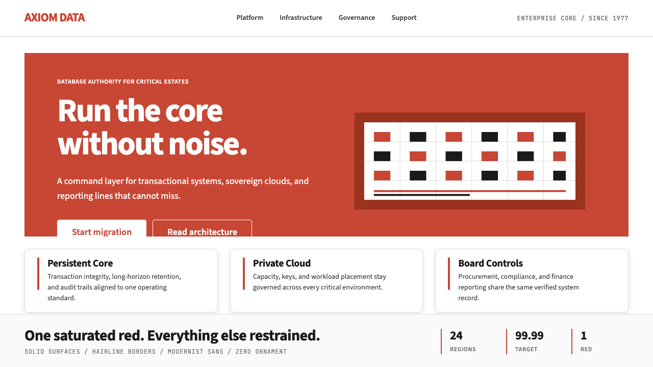
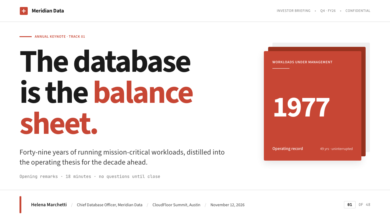
For presentation slides, the system works well on both cover and content pages, but the logic differs between them. A cover page benefits from bold, single-color asymmetry: the brand red occupies a structural area — a header band, a sidebar, a geometric block — while the title sits in large, tightly tracked type against a white or near-white field. The composition should feel declarative, not exploratory. Content slides should be treated as information grids: two or three type hierarchies defined entirely by scale and weight, no decorative rules or icon clusters, and data visualized as clean geometric objects — bar charts and tables treated as structural diagrams rather than expressive graphics. A common error is using red as a highlight color on content slides, which fragments the brand anchor's authority; red should remain reserved for structural framing, not for calling out individual data points.在演示文稿中,这套系统在封面页和内容页上都运作良好,但两者的逻辑有所不同。封面页适合运用大胆的单色非对称构图:品牌红占据某个结构性区域——页眉色带、侧边栏、几何色块——标题以大字号、紧密字距的字体置于白色或接近白色的底面上。构图应感觉是宣告性的,而非探索性的。内容页应被当作信息网格处理:完全以尺度和字重定义的两到三级文字层级,无装饰性分割线或图标簇,数据以简洁的几何对象可视化——柱状图和表格被当作结构性图表而非表现性图形。一个常见错误是在内容页上将红色作为高亮色使用,这会分散品牌锚点的权威感;红色应始终保留给结构性框架,而非用于标出个别数据点。
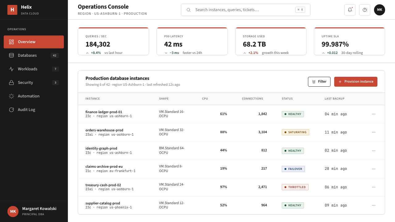
For web interfaces — especially dashboards, pricing pages, and product documentation — Oracle Corporate Red provides a strong framework for information density. The approach: a strict column grid, near-white background, black body text, and the brand red deployed only for navigation states, primary action buttons, and tier-labeling. Table-heavy interfaces benefit from the style's clean border logic: defined rows and columns with minimal padding variation, no alternating row colors beyond a very subtle tint, and sortable column headers marked by weight and position rather than icon decoration. Pricing page architectures work particularly well under this system because the visual hierarchy supports rapid comparison: tier names in red, feature lists in body text, and call-to-action buttons in solid red with white type — the only moments of color intensity on an otherwise restrained page.在网页界面上——尤其是仪表板、定价页面和产品文档——甲骨文红为信息密度提供了强有力的框架。方法如下:严格的列网格,接近白色的背景,黑色正文,品牌红仅用于导航状态、主要行动按钮和等级标签。表格密集型界面受益于这种风格清晰的边框逻辑:明确的行列划分、极小的内边距变化、除极细微色调之外无交替行颜色,可排序列标题以字重和位置而非图标装饰来标示。定价页面架构在这套系统下尤为出色,因为视觉层级支持快速对比:等级名称用红色,功能列表用正文字体,行动按钮用实心红底白字——这是原本克制页面上仅有的色彩强度时刻。
For editorial and marketing applications, the style supports large-scale layouts where the red functions as a structural headline element. Full-width section blocks that alternate between white-ground and deep-charcoal-ground create rhythm without requiring additional accent colors; the brand red appears only at section entry points — headers, labels, navigation anchors — rather than distributed throughout. Marketing headlines should be set at genuinely large scale, with the type weight doing the work that decorative effects would otherwise accomplish. Photography, when used, should be high-contrast and cropped tightly to geometric proportions — treated as a flat graphic element rather than an atmospheric image. Avoid lifestyle photography or any image that imports warmth and human softness into a visual system built on precision and institutional confidence.在编辑和营销应用中,这种风格支持红色作为结构性标题元素的大尺度版面。白色底面和深炭灰底面交替的全宽段落区块在不需要额外强调色的情况下制造节奏;品牌红仅出现在段落入口点——标题、标签、导航锚点——而非分布于整体之中。营销标题应设置在真正大的尺度上,让字重承担装饰效果原本会完成的工作。摄影图像若被使用,应为高对比度并裁切为几何比例——作为平面图形元素而非氛围图像处理。应避免生活方式摄影或任何向建立于精确性与机构自信之上的视觉系统中引入温度与人文柔软感的图像。
The most common mistake when applying Oracle Corporate Red is misunderstanding the function of the saturated red. Many designers treat it as a general accent color — using it for hover states, inline highlights, decorative dividers, icon fills, and data chart segments simultaneously. This distributes the red's visual weight so broadly that it loses its authority. Authentic to the system, the red should appear in very few places: the wordmark or logo area, primary navigation, and primary call-to-action surfaces. A second common error is importing softness — rounded corners, soft drop shadows, gradient backgrounds — in an attempt to make the style more approachable for a consumer audience. This hybrid approach satisfies neither the enterprise authority the style is built for nor the warmth a consumer product requires. When a softer visual register is genuinely needed, the honest solution is to choose a different design system rather than diluting this one.应用甲骨文红时最常见的错误是误解饱和红色的功能。许多设计师将其视为通用强调色——同时用于悬停状态、行内高亮、装饰性分割线、图标填充和数据图表分区。这种做法将红色的视觉重量分散得如此之广,以至于它失去了权威感。忠于这套系统,红色应该只出现在极少数地方:字标或标志区域、主要导航和主要行动面。第二个常见错误是引入柔软感——圆角、软阴影、渐变背景——试图让风格对消费者受众更为亲近。这种混合做法既无法满足这套风格为之构建的企业权威感,也无法提供消费品所需的温度感。当真正需要更柔和的视觉语调时,诚实的解决方案是选择不同的设计系统,而不是稀释这套系统。
See the Oracle Corporate Red design system查看 Oracle Corporate Red 完整设计系统
Oracle Corporate Red — FAQOracle Corporate Red · 常见问题
Is Oracle Corporate Red the same as any other tech company red?甲骨文红和其他科技公司的红色是一回事吗?
Not in system terms. Many technology companies use red as an accent or signal color, but Oracle's identity is unusual in making a deeply saturated, warm-leaning crimson the single primary brand anchor rather than one color among several. The closest structural parallels are other mono-color enterprise identities — IBM's blue, Salesforce's cloud blue — where a single hue carries the full weight of brand recognition. What distinguishes Oracle's approach is the specific temperature and saturation of its red: darker and more serious than the candy-bright reds used by consumer brands, but warmer and more assertive than the corporate maroons used by financial institutions. The system also differs in pairing its red with near-pure black and white rather than complementary tones, which maximizes the contrast and institutional weight.从体系意义上说,不是。许多科技公司使用红色作为强调或信号色,但甲骨文的身份识别不同寻常之处在于:它将一种深度饱和、偏暖的深红色设定为唯一的主要品牌锚点,而非多种颜色之一。结构上最接近的类比是其他单色企业身份——IBM 的蓝色、Salesforce 的云蓝——其中单一色相承载着品牌识别的全部重量。甲骨文做法的独特之处在于其红色的特定色温和饱和度:比消费品牌使用的糖果亮红更深沉、更严肃,但比金融机构使用的企业栗红更温暖、更有力。这套系统也因将其红色与近乎纯粹的黑色和白色配对(而非互补色调)而有别于其他,这使对比度和机构重量感最大化。
Can Oracle Corporate Red work for a startup or small company that wants to appear credible?甲骨文红适合想要显得可信的初创企业或小公司使用吗?
With significant caution. The visual language works because of the institutional weight behind it — decades of enterprise credibility, global brand recognition, and an audience that already understands what Oracle is. A startup applying the same palette and typographic severity without that context risks reading as cold rather than authoritative, impersonal rather than reliable. The style can work if the product genuinely targets enterprise buyers and the team can back its visual confidence with substance — in sales collateral, customer references, and product depth. Where it breaks down is in consumer-facing contexts or early-stage products where building trust through warmth and personality matters more than projecting establishment credibility. A thoughtful borrowing of the system's structural logic — its white space, its typographic hierarchy, its functional color discipline — will produce better results than a wholesale adoption of its austere tone.需要相当谨慎。这套视觉语言之所以有效,是因为背后有机构分量的支撑——数十年的企业信誉、全球品牌认知度,以及一个已经理解甲骨文是什么的受众群体。一家初创企业在没有这种背景的情况下应用相同的色板和排印严肃性,有被解读为冷漠而非权威、冷淡而非可靠的风险。如果产品真正面向企业买家,团队能够以实质内容——销售材料、客户参考案例和产品深度——支撑其视觉自信,这种风格是可行的。它失效的地方是面向消费者的语境,或早期阶段产品——在那些场合,通过温度和个性建立信任比投射机构信誉更重要。借鉴这套系统的结构逻辑——其留白、其排印层级、其功能性色彩纪律——将比全盘采用其严峻基调产生更好的结果。
How should data visualizations be handled within this system?在这套系统中应如何处理数据可视化?
Data visualizations in Oracle's system are treated as structural diagrams rather than expressive graphics. The primary approach is to use the neutral palette — various grays and the near-white background — for the bulk of a chart's visual surface, with the brand red used sparingly and strategically to highlight the single most important data series or the primary call-out value. Bar charts, line charts, and area charts all benefit from this discipline: when most series are rendered in distinct grays and only one is red, the eye goes immediately to what matters. Pie and donut charts work less well under this constraint because they typically require multiple differentiated segments — in that case, a sequential gray scale with a red highlight for the primary segment is more coherent than attempting to apply the full neutral palette. Avoid color-coding systems that require more than four distinct hues; the system's authority breaks down when it starts to look like a category-coding exercise rather than a structural representation.在甲骨文的体系中,数据可视化被视为结构性图表而非表现性图形。主要方式是:用中性色板——各种灰阶和接近白色的背景——覆盖图表视觉表面的大部分,将品牌红色节制而策略性地用于突出单一最重要的数据系列或主要标注值。柱状图、折线图和面积图都受益于这种纪律:当大多数系列以不同灰色呈现而只有一个是红色时,视线会立即锁定要点所在。饼图和圆环图在这种约束下效果较差,因为它们通常需要多个区分明确的分区——在这种情况下,以顺序灰阶加主要分区的红色高亮,比尝试应用完整中性色板更为连贯。避免需要超过四种不同色相的颜色编码系统;当系统开始看起来像一项类别编码练习而非结构性呈现时,其权威感就会崩解。
Does the system work for dark-mode or dark-background applications?这套系统适用于深色模式或深色背景应用吗?
Dark-mode inversion is possible but requires careful rebalancing. On a deep charcoal or near-black ground, the brand red behaves differently than on white: it can become more aggressive and harder to deploy at the same density without overwhelming the composition. The approach that works best is treating the dark ground as the stage — deep charcoal or near-black as the dominant — and allowing white and light gray to perform the roles that red and charcoal fill on light grounds. The brand red should appear even more sparingly in dark contexts than in light ones: primarily for wordmarks, primary navigation, and critical action states. A deep-charcoal-on-near-black hierarchy of tones, rather than multiple grays on white, is the structural substitute for the light-mode neutral palette. The result feels consistent with the brand's authority without importing the same saturation problems that arise when heavy red meets a black ground at the same proportions used against white.深色模式反转是可行的,但需要谨慎的重新平衡。在深炭灰或近黑色的底面上,品牌红色的表现与在白色上不同:它可能变得更具攻击性,且更难以相同密度部署而不压倒构图。最有效的方式是将深色底面视为舞台——以深炭灰或近黑作为主导——让白色和浅灰承担红色和炭灰在浅色底面上扮演的角色。在深色语境中,品牌红色应该比在浅色中出现得更为节制:主要用于字标、主要导航和关键行动状态。以近黑底面上的深炭灰层级色调——而非白色底面上的多种灰色——作为浅色模式中性色板的结构性替代。最终结果与品牌权威感保持一致,而不会引入当大面积红色与黑色底面以与白色底面相同的比例相遇时产生的饱和度问题。
What kinds of products or sectors are a poor match for this visual system?哪些类型的产品或行业与这套视觉系统不匹配?
Oracle Corporate Red is a poor match for any product or sector where emotional warmth, human approachability, sensory pleasure, or cultural expressiveness are primary values. Consumer wellness and health applications need visual systems that communicate care and gentleness — this system communicates precision and power, which are wrong signals. Children's educational products need warmth and playfulness; the severe typographic hierarchy and the single-anchor saturated red would read as intimidating rather than inviting. Food and hospitality brands depend on sensory richness and warmth cues that this palette structurally excludes. Creative agencies, fashion brands, and cultural institutions need expressive identity systems that reflect personality — the deliberate personality-suppression in Oracle's system would undermine the message. The fundamental test: if your product's value proposition includes warmth, joy, creativity, or sensory richness, this is not the right system. If it includes reliability, scale, authority, and professional competence, the system is a strong match.甲骨文红与任何以情感温度、人文亲和力、感官愉悦或文化表现力为核心价值的产品或行业都不匹配。消费者健康和保健应用需要传递关怀与温柔的视觉系统——这套系统传递的是精确性与力量,这是错误的信号。儿童教育产品需要温度和趣味感;严肃的排印层级和单锚点饱和红色读来会是威慑性的而非邀请性的。食品和餐饮品牌依赖感官丰富性和温暖线索,而这套色板从结构上就排除了这些。创意机构、时尚品牌和文化机构需要反映个性的表现性身份系统——甲骨文体系中刻意的个性压制会破坏这类品牌的信息传递。根本性的检验标准:如果你的产品价值主张包含温度、喜悦、创造力或感官丰富性,这不是合适的系统。如果它包含可靠性、规模、权威和专业能力,这套系统则是高度匹配的。
Related design styles相关设计风格
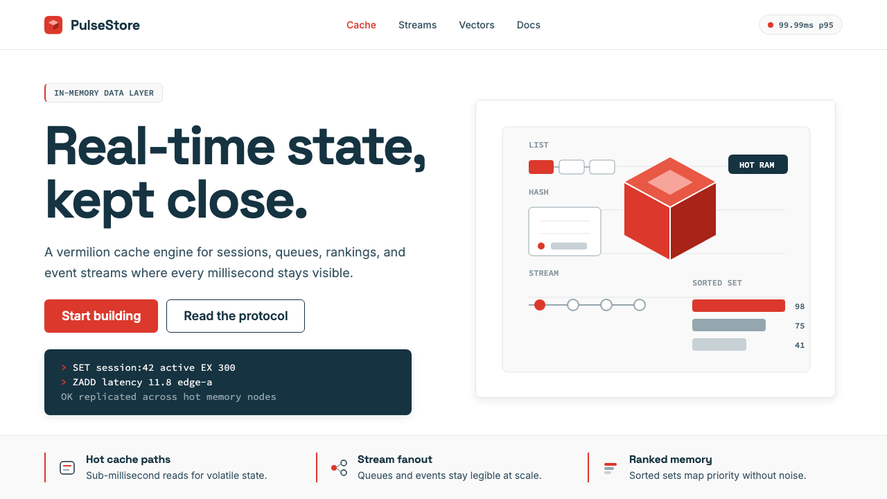 Redis Cache RedWarm database rigor. Vermilion cube, slate type, and white-space grids make s…温热的数据库秩序:朱红立方、板岩字色与留白网格,让速度可读。
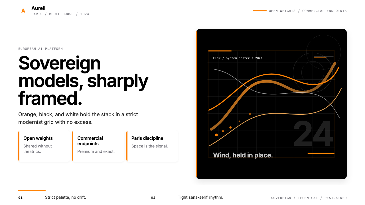 Mistral AI OrangeSovereign AI with restraint. Orange, black, and white lock the grid.主权AI很克制。橙黑白锁定网格。
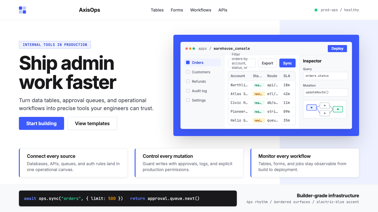 Retool Internal-Tools RedPrecision ships fast. Electric blue panels, Inter type, and bordered UI mocku…精准而快速。电光蓝面板、Inter 字体和边框 UI 模型撑起气质。
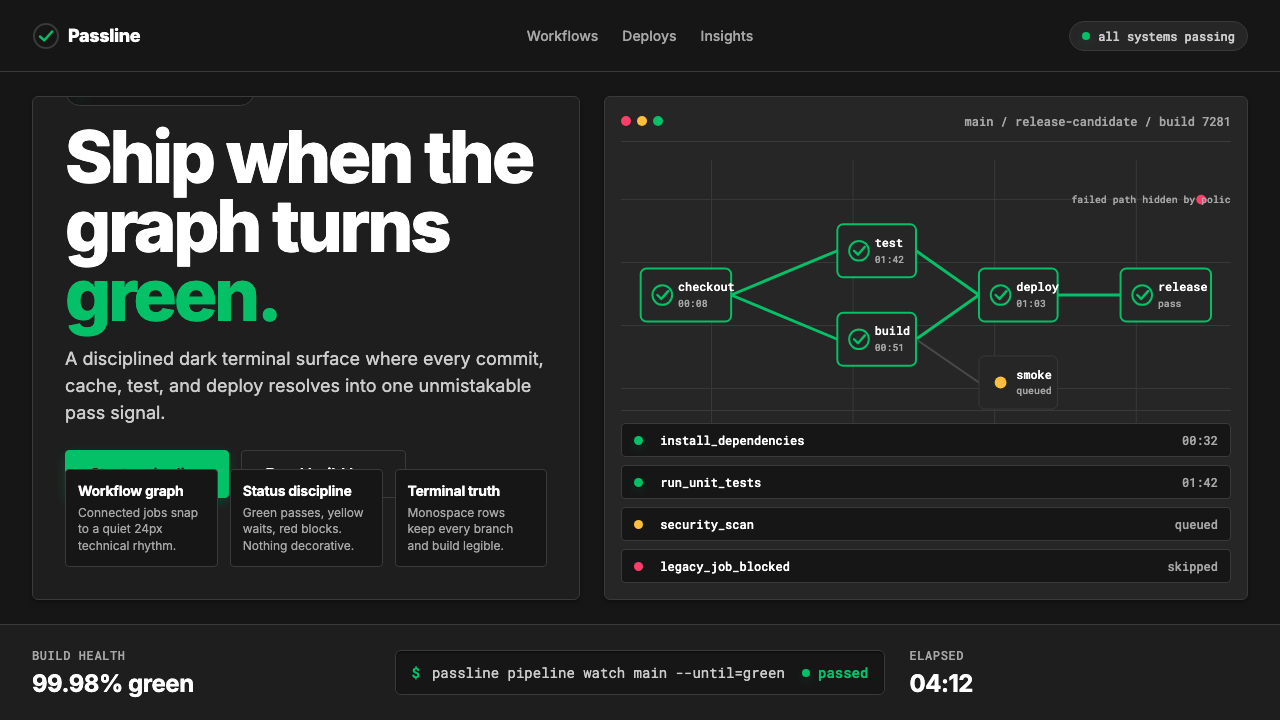 CircleCI Pipeline-GreenConfidence goes green. Emerald status lines cut through terminal-black pipeli…信心变绿。翠绿状态线切过终端黑流水线网格。
 Adobe Creative CloudUnified, not uniform. Red anchor, white space, and saturated app tiles organi…统一而不单一:红色锚点、留白与高饱和应用方块组织整套工具。
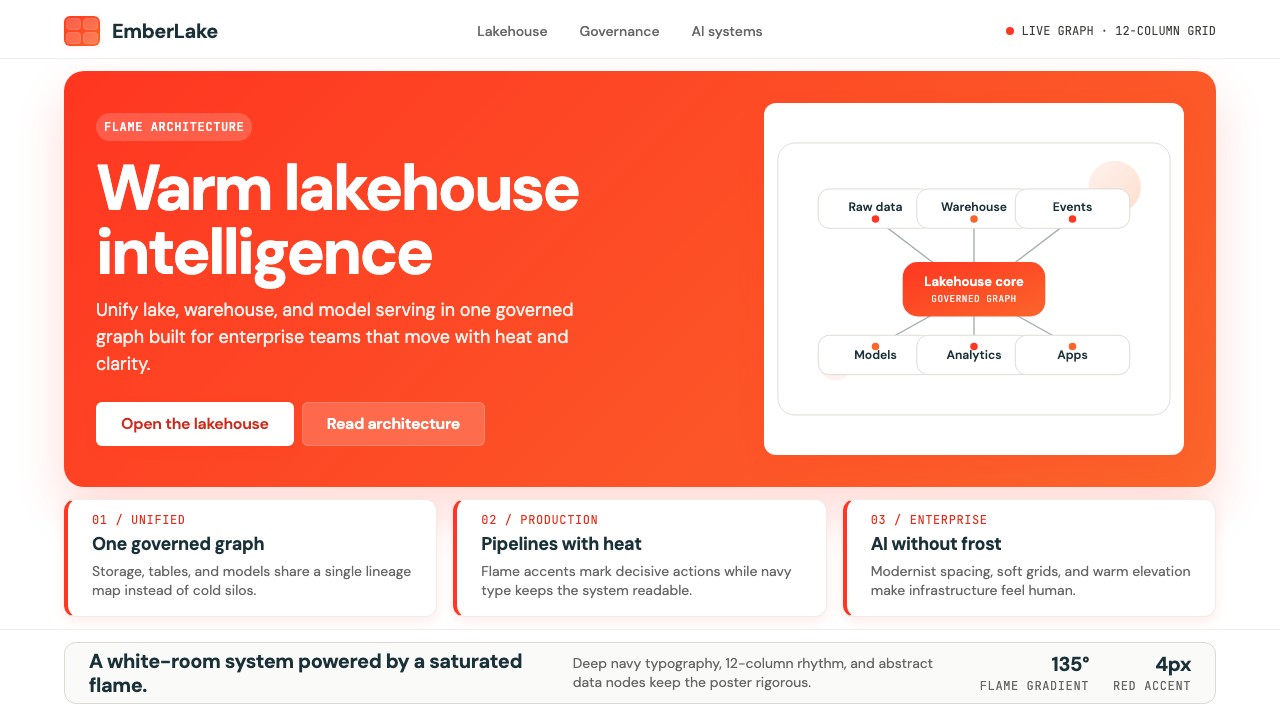 Databricks LakehouseWarm enterprise confidence. Flame red-orange gradients meet DM Sans and clean…温暖的企业信心:红橙火焰渐变配 DM Sans 与洁净数据图。