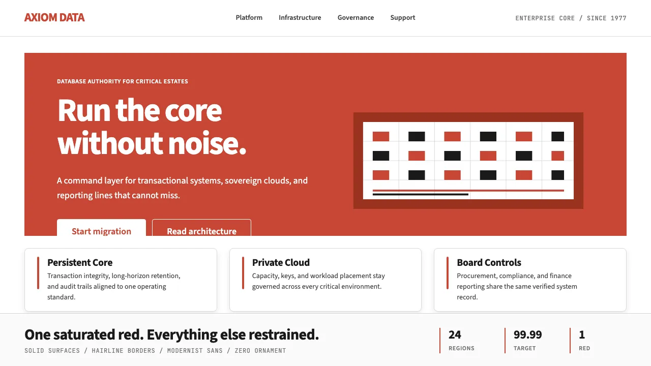
About Oracle Corporate Red
Oracle Corporate Red is the most concentrated corporate-red identity in software. Built on a single saturated brand-anchor — Oracle-red `#C74634` — paired with bold modernist sans-serif wordmarks in pure black or pure white, the system rejects embellishment in favor of establishment-confidence.
The aesthetic is enterprise-conservative by intent: deep saturated red, deep charcoal, restrained slate-neutrals, generous white space, and zero playfulness. It says "we have run the world's databases since 1977" without raising its voice.
- Origin
- Austin, Texas, USA (formerly Redwood Shores, California)
- Era
- Oracle founded 1977; current red-wordmark identity 1980s onward; Oracle Sans typeface 2014
- Key figures
- Larry Ellison · Safra Catz · Bob Miner · Ed Oates
- Movements
- enterprise database software · 1980s corporate-software gravitas · Oracle in-house brand discipline
Oracle Corporate Red design spec
Colors
Typography
The other 11 sections — buttons, cards, spacing, motion, techniques and more — open once you unlock. Download the DESIGN.md or send it to your AI in one click. Unlock once, yours forever.
Sign up nowStyles similar to Oracle Corporate Red
Also inspired by brands & products, with a close feel.
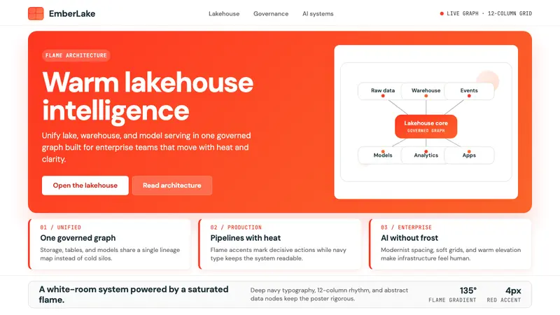 Databricks LakehouseWarm enterprise confidence. Flame red-orange gradients meet DM Sans and clean data diagrams.
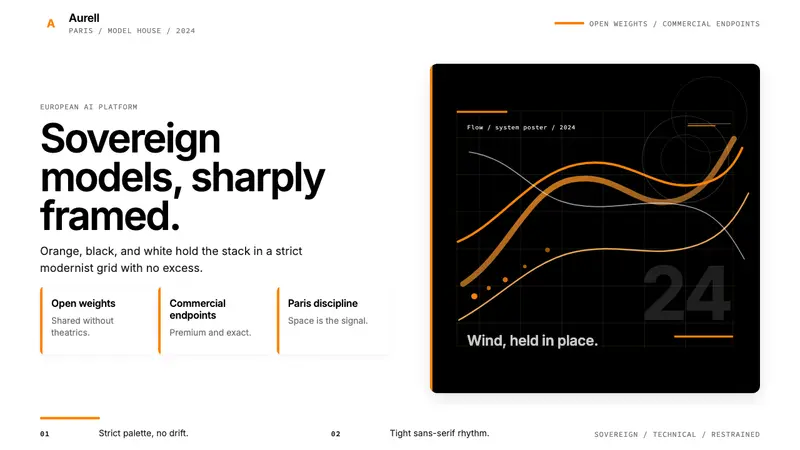 Mistral AI OrangeSovereign AI with restraint. Orange, black, and white lock the grid.
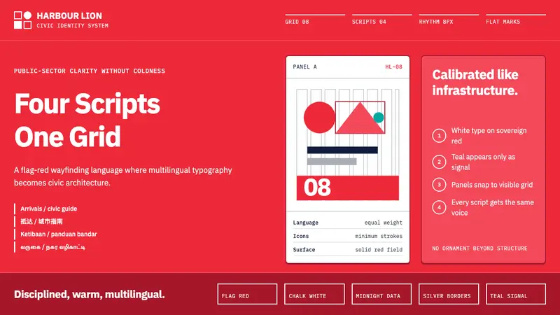 Singapore Merlion BrandPrecision with civic warmth. Flag red and geometric sans lock into a four-script grid.
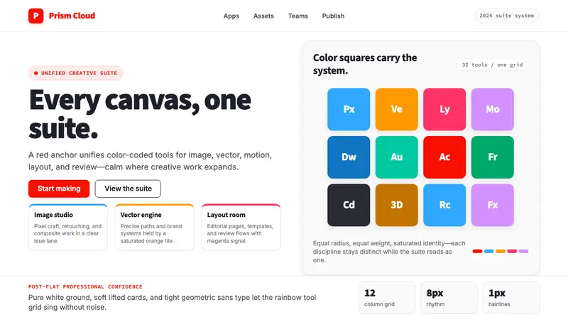 Adobe Creative CloudUnified, not uniform. Red anchor, white space, and saturated app tiles organize the suite.