What is CircleCI Pipeline-Green?什么是 CircleCI Pipeline-Green?
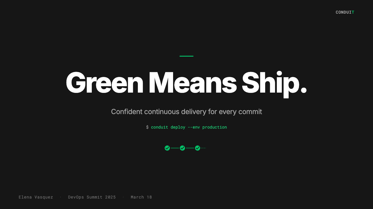
One saturated emerald against terminal black — CircleCI's Pipeline-Green is the visual shorthand for a build that passed.一抹饱和翠绿落在终端黑底上——CircleCI 的 Pipeline-Green,是流水线通过这个状态最直接的视觉语言。
CircleCI Pipeline-Green in briefCircleCI Pipeline-Green 速览
CircleCI Pipeline-Green is the design language of one of the most influential cloud continuous-integration platforms ever built. Its defining gesture is radical restraint: nearly every surface in the interface is deep developer-terminal black or clean white, while a single saturated bright emerald acts as the system's pulse — appearing on success badges, status indicators, and progress rings. This is not a decorative choice; it is a functional one. In a workflow dashboard where developers scan dozens of job states at a glance, a single high-confidence green reading means everything is clear.CircleCI Pipeline-Green 是现代最具影响力的云端持续集成平台之一的设计语言。它最核心的姿态是极度克制:界面中几乎所有表面都是深沉的开发者终端黑或干净的白色,而唯一的那一抹饱和鲜亮翠绿则作为整个系统的脉搏——出现在成功徽章、状态指示器和进度圆环上。这不是装饰性的选择,而是功能性的选择。在一个开发者一眼扫过数十条任务状态的工作流仪表板中,那一点高可信度的绿色意味着一切已然就绪。
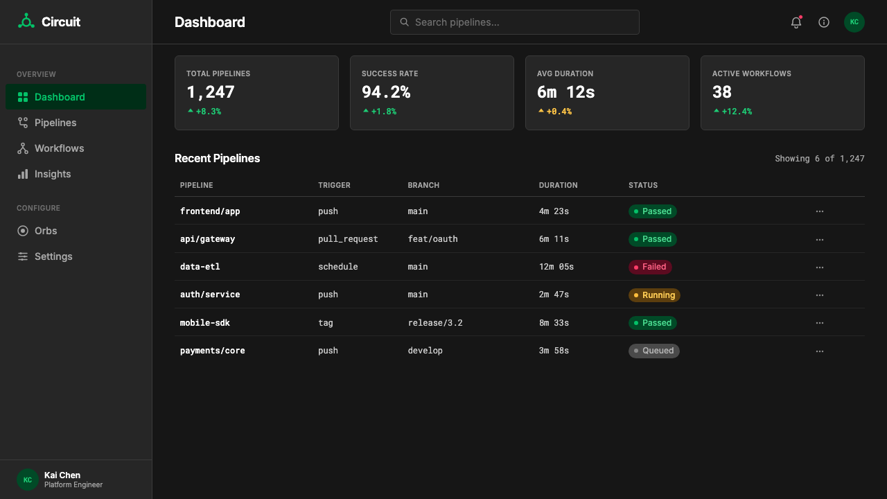
The system extends that core signal into a strict status-color discipline. Green means passed. A warm amber signals a warning or a queued state. Red marks failure. Everything else — labels, secondary metadata, structural dividers — resolves to white, slate, or near-black. The result is a visual grammar that is as close to machine communication as human-facing interface design gets: unambiguous, hierarchical, and entirely free of decorative noise.这套系统将核心信号延伸为严格的状态色纪律:绿色表示通过,暖琥珀色表示警告或等待,红色标记失败,其余一切——标签、次级元数据、结构性分割线——统统归于白色、石板灰或近黑。最终呈现的是一套尽可能接近机器通信的视觉语法:无歧义、有层级、完全摒弃装饰噪音。
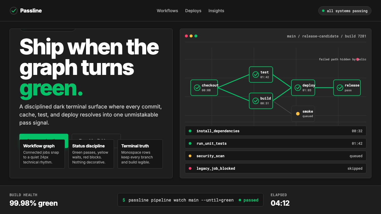
CircleCI's typographic register reinforces the terminal aesthetic. Monospace type appears wherever code, commit hashes, or pipeline identifiers are displayed, grounding the interface in the developer's native environment. Workflow pipeline diagrams — horizontal chains of nodes connected by directional lines — are the compositional backbone of the product's data visualization layer, treating software build processes as visual objects in their own right.CircleCI 的字体选择进一步强化了终端美学。等宽字体出现在所有展示代码片段、提交哈希或流水线标识符的地方,将界面锚定于开发者的母语环境。工作流管线图——由方向线连接的水平节点链——是产品数据可视化层的构图骨干,将软件构建流程本身作为可视化对象来处理。
See the CircleCI Pipeline-Green design system查看 CircleCI Pipeline-Green 完整设计系统
Where does CircleCI Pipeline-Green come from?CircleCI Pipeline-Green 从何而来?
CircleCI was founded in 2011 by Paul Biggar and Allen Rohner in San Francisco. The company arrived at a moment when software development teams were beginning to move version control and build infrastructure to the cloud, and when the idea of continuous integration — automatically building and testing every code change — was transitioning from enterprise luxury to expected practice. CircleCI's early interface was utilitarian in the way most developer tooling of that era was: functional, dark-themed where developers preferred it, with color used only incidentally.CircleCI 由 Paul Biggar 与 Allen Rohner 于 2011 年在美国旧金山创立。公司诞生于软件开发团队开始将版本控制与构建基础设施迁移到云端的时代节点,彼时「持续集成」——自动构建并测试每一次代码变更——正从企业级奢侈品演变为行业通行实践。CircleCI 早期的界面与那个时代大多数开发者工具一样务实:功能至上,在开发者偏好的地方使用深色主题,色彩的运用仅是偶发性的。
The platform's visual identity consolidated through the 2010s as the cloud CI/CD category itself matured. Jim Rose, who became CEO in 2018, presided over an era in which developer tools began receiving the same design investment as consumer products. The competitive landscape — including Jenkins, Travis CI, GitHub Actions, and later GitLab CI — made differentiation through brand clarity increasingly important. CircleCI's brand team leaned into the single-color signal that had always been implicit in the product: the green checkmark, the green status badge, the green ring completing its circuit.随着 2010 年代云端 CI/CD 赛道本身走向成熟,平台的视觉形象逐渐凝固。2018 年出任 CEO 的 Jim Rose 主持了一个开发者工具开始获得与消费品同等设计投入的时代。竞争格局——包括 Jenkins、Travis CI、GitHub Actions 以及后来的 GitLab CI——使通过品牌清晰度实现差异化变得日益重要。CircleCI 的品牌团队选择强化那个在产品中始终隐性存在的单色信号:绿色勾选标记、绿色状态徽章、完成一圈的绿色进度环。
The current visual identity, substantially refreshed in the early 2020s, made explicit what had been implicit for years. The bright emerald became the official brand color — saturated, confident, and chosen precisely because it is the color most associated with successful system states in developer culture. The dark-mode-first orientation of the design system reflected both user preference data from the developer community and the wider industry shift toward interfaces that felt native to the terminal. The result was a brand that felt less like a website and more like a well-designed command-line tool.2020 年代初的品牌视觉焕新使多年以来一直隐性存在的东西变得明确。鲜亮翠绿成为官方品牌色——饱和、自信,被选择的原因恰恰是它在开发者文化中与系统成功状态关联最深。设计系统以深色优先的取向,既反映了来自开发者社区的用户偏好数据,也回应了行业向终端原生感界面迁移的整体趋势。最终结果是一个感觉不像网站、更像一款设计精良的命令行工具的品牌。
The aesthetic influences are a specific lineage within developer-tool design: the dark theme conventions pioneered by editors like Sublime Text and VS Code, the structured badge systems of open-source platforms like GitHub and npm, and the functional minimalism of monitoring dashboards from tools like Grafana and Datadog. Pipeline-Green distills these influences into a single coherent product identity — one that signals technical credibility without requiring the user to read a single word.这套美学有其清晰的传承谱系:Sublime Text 与 VS Code 等编辑器开创的深色主题惯例、GitHub 与 npm 等开源平台的结构化徽章体系,以及 Grafana、Datadog 等监控工具仪表板的功能极简主义。Pipeline-Green 将这些影响提炼为单一连贯的产品身份——无需用户阅读一个字,就能传递技术可信度的信号。
What defines the CircleCI Pipeline-Green look?CircleCI Pipeline-Green 的视觉特征是什么?
Signal Green信号绿
The system is organized around a single dominant hue — a saturated, highly legible bright emerald — that carries one unambiguous meaning: success. It appears at full intensity only on passed states, completed progress indicators, and positive confirmation elements. The brightness and saturation are calibrated to remain instantly readable against both deep terminal backgrounds and light white surfaces, ensuring the signal reads correctly across every context in which it appears.整套系统以一种单一的主导色调为核心——饱和度高、辨识度强的鲜亮翠绿——承载着一个明确无误的含义:成功。它仅以全强度出现于通过状态、完成进度指示器和正向确认元素上。亮度与饱和度经过校准,确保在深色终端背景和明亮白色表面上均能被即时识别,保证信号在它出现的每一个场景中都能被正确读取。
Status-Color Discipline状态色纪律
Pipeline-Green imposes a strict semantic grammar on color: each hue maps to exactly one state and is never used decoratively. The emerald anchors success and affirmation. A warm amber shade handles warnings, queued jobs, and transitional states. A vivid red marks failures and errors. No additional colors enter the system for ornamental purposes. This discipline means that a user who has internalized the system can read a pipeline dashboard without processing any text — the color field alone communicates the complete state of every job.Pipeline-Green 对色彩施加了严格的语义语法:每种色调恰好对应一种状态,绝不被用于装饰目的。翠绿锚定成功与确认;暖琥珀色处理警告、排队中的任务和过渡状态;鲜红标记失败与错误。系统中不引入任何额外的装饰性色彩。这种纪律意味着,已内化这套系统的用户无需处理任何文字,仅凭色彩字段就能读取每个任务的完整状态。
Terminal-Black Ground终端黑底
The background register is drawn from the developer terminal tradition: deep, near-black darks that eliminate ambient glare and allow status colors to read at maximum contrast. Surfaces are not purely black but carry subtle warmth or slight neutral undertones that prevent the aesthetic from feeling harsh. The darkness is not dramatic — it is functional, a canvas calibrated to make the signal colors do exactly what they are supposed to do.背景底色源自开发者终端的传统:深沉的近黑色,消除环境眩光,让状态色以最大对比度呈现。表面并非纯黑,而带有微妙的暖意或轻微的中性底调,防止整体感觉过于刺目。这种深色不是戏剧性的——它是功能性的,是一块经过校准的画布,让信号色精确地发挥它们应有的作用。
Monospace Typography等宽字体排印
Code values, commit hashes, pipeline identifiers, build numbers, and command-line output all appear in monospace type, visually grounding interface content in the developer's native environment. This is not a stylistic flourish — it carries information. Monospace letterforms communicate that a given string is machine-generated, unique, and precise. Proportional typefaces handle all human-facing labels and marketing copy, creating a clear register distinction between data and description.代码值、提交哈希、流水线标识符、构建编号和命令行输出均以等宽字体呈现,从视觉上将界面内容锚定于开发者的母语环境。这不是风格上的点缀——它承载信息。等宽字形传达出某个字符串是机器生成的、唯一的、精确的。比例字体则处理所有面向人类的标签与营销文案,在数据与描述之间制造清晰的语域区分。
Pipeline Diagram as Primary Visual Form管线图作为主要视觉形式
The central data structure of the CircleCI interface is the workflow pipeline diagram: a horizontal graph of node circles connected by directed lines, where each node represents a job and its color reflects its current state. This form is not decorative infographics — it is the literal structure of the product's core abstraction. Applying the Pipeline-Green aesthetic means treating connected node diagrams as a first-class visual element, with the same weight that a Bauhaus designer would give to geometric form.CircleCI 界面的核心数据结构是工作流管线图:由有向线连接的水平节点圆圈图,每个节点代表一个任务,其色彩反映当前状态。这种形式不是装饰性的信息图表——它是产品核心抽象结构的字面呈现。应用 Pipeline-Green 美学意味着将连接节点图视为一等视觉元素,给予它与包豪斯设计师赋予几何形态同等的分量。
Functional Minimalism功能极简主义
Every element present in a Pipeline-Green composition must earn its place through informational function. There are no gradient fills for visual richness, no ambient glow effects for atmosphere, no decorative borders or ornamental dividers. The spare quality of the aesthetic is not the result of insufficient effort but of principled removal — the same logic that makes a well-written shell script more maintainable than a sprawling one. Negative space between elements is treated as structure, not gap.Pipeline-Green 构图中的每个元素都必须通过信息功能来证明自身存在的正当性。没有用于视觉丰富感的渐变填充,没有用于营造氛围的环境光晕效果,没有装饰性边框或装饰性分割线。这种克制美学不是努力不足的结果,而是原则性删减的产物——与让一个写得好的 shell 脚本比臃肿脚本更易维护的逻辑相同。元素之间的留白被视为结构,而非空隙。
High-Contrast Legibility高对比度易读性
The system is engineered for legibility under adverse conditions: small type against dark backgrounds, quick-scan dashboards, side-by-side terminal windows. This requires that every text element clears a high contrast threshold against its ground, that interactive affordances are visually distinct from passive ones, and that the bright emerald signal color reads correctly even in peripheral vision. No element earns decorative contrast at the expense of informational contrast.这套系统为在不利条件下的易读性而生:深色背景上的小号文字、快速扫描的仪表板、并排的终端窗口。这要求每个文字元素与其底面之间保持足够高的对比度,交互性元素与被动元素在视觉上截然可辨,而那抹鲜亮翠绿的信号色即便在余光中也能被正确识别。没有任何元素以牺牲信息对比度为代价换取装饰性对比度。
See the CircleCI Pipeline-Green design system查看 CircleCI Pipeline-Green 完整设计系统
Who shaped CircleCI Pipeline-Green?谁塑造了 CircleCI Pipeline-Green?
Biggar co-founded CircleCI in 2011 and served as CEO during its formative years, shaping the early product philosophy that put developer experience at the center of every decision. His background as a compiler researcher at Mozilla informed the technical credibility of the platform's initial design — an interface designed by engineers for engineers, where utility preceded aesthetics. The developer-native values he embedded in the early product became the foundation on which the current visual identity was later built.Biggar 于 2011 年联合创立 CircleCI 并在公司成形期担任 CEO,塑造了以开发者体验为每个决策核心的早期产品哲学。他在 Mozilla 担任编译器研究员的背景赋予了平台初期设计以技术可信度——一个由工程师为工程师设计的界面,实用性先于美学。他在早期产品中嵌入的开发者原生价值观,成为后来当前视觉形象得以建立的地基。
Rohner co-founded CircleCI alongside Biggar and served as CTO, defining the technical architecture that made the platform's speed and reliability its primary differentiators. The visual emphasis on status confidence — on knowing immediately whether a build passed — is inseparable from the engineering culture Rohner helped establish, in which build speed and outcome clarity were treated as first-order values rather than afterthoughts.Rohner 与 Biggar 共同创立 CircleCI 并担任 CTO,定义了使平台速度与可靠性成为主要差异化优势的技术架构。对状态可信度的视觉强调——对立即知晓构建是否通过的强调——与 Rohner 帮助确立的工程文化密不可分:在那种文化中,构建速度与结果清晰度是头等价值,而非事后考量。
Rose became CEO of CircleCI in 2018 and led the company through a period of significant expansion and brand maturation. Under his leadership, CircleCI invested in the visual coherence of its product and brand, sharpening the pipeline-green signal from an incidental element into a deliberate brand identifier. The 2020s visual refresh that transformed the saturated emerald into a canonical brand asset occurred during the era Rose shaped — one in which developer tools competed as much on perceived quality and brand clarity as on technical performance.Rose 于 2018 年出任 CircleCI CEO,带领公司经历了重要的扩张与品牌成熟期。在他的领导下,CircleCI 对产品与品牌的视觉连贯性进行了投入,将流水线绿从一个偶发性元素磨砺成一个经过深思熟虑的品牌识别符号。将那抹饱和翠绿转化为标志性品牌资产的 2020 年代视觉焕新,正发生在 Rose 所塑造的时代——那个时代里,开发者工具在感知品质与品牌清晰度上的竞争,与在技术性能上的竞争同等激烈。
Pipeline-Green did not emerge in isolation. The early 2020s saw a wave of developer-tool companies — including Vercel, Linear, Raycast, and Fly.io — invest seriously in product design as a differentiator, treating interface quality as a signal of engineering quality. This movement established that developer audiences respond strongly to aesthetic intentionality when it is expressed through their native vocabulary: dark themes, monospace type, dense information layouts, and status-color discipline. CircleCI's brand occupies the CI/CD niche within this broader movement, the same way a specialist craftsman occupies a guild.Pipeline-Green 并非孤立诞生。2020 年代初,一波开发者工具公司——包括 Vercel、Linear、Raycast 和 Fly.io——将产品设计作为差异化优势进行了认真投入,将界面品质视为工程品质的信号。这场运动确立了一个事实:当美学意图通过开发者的母语词汇来表达时——深色主题、等宽字体、高密度信息布局和状态色纪律——开发者受众会产生强烈共鸣。CircleCI 的品牌在这场更广泛的运动中占据了 CI/CD 的细分位置,就像一位专业工匠在行会中的位置。
How do you use CircleCI Pipeline-Green today?今天怎么用 CircleCI Pipeline-Green?
Pipeline-Green is a high-discipline system — its power comes from what it refuses to do as much as from what it does. Before applying it, the designer must commit to a single operating rule: color carries only semantic weight. The bright emerald appears exclusively to signal success or positive completion. No other element in the composition may borrow that hue for decoration, emphasis, or brand visibility. Once that constraint is accepted, the system rewards the discipline with exceptional visual clarity.Pipeline-Green 是一套高纪律性的系统——它的力量同样来自它拒绝做什么,而不仅仅是它做什么。在应用它之前,设计师必须接受一条核心操作原则:色彩只承载语义重量。鲜亮翠绿仅用于信号成功或正向完成,构图中没有任何其他元素可以借用这种色调来做装饰、强调或提升品牌存在感。一旦接受了这个约束,这套系统便以非凡的视觉清晰度回报这份纪律。
For presentation slides, Pipeline-Green suits technical and data-driven decks — product launch decks for developer audiences, engineering roadmap reviews, CI/CD workflow explainers, and infrastructure architecture presentations. Cover slides work best with a deep terminal-black background, the emerald used selectively for a single focal element or status indicator, and a title in clean, high-contrast type. Content slides should lean into the dashboard aesthetic: horizontal pipeline diagrams replace bullet points where possible, status-color coding distinguishes categories in tabular data, and monospace type handles all code references and identifiers. Data visualization should be treated as functional rather than decorative — charts and graphs use the status-color palette (green for target states, amber for caution zones, red for failure thresholds) and avoid chartjunk entirely.对于演示文稿,Pipeline-Green 适合技术性与数据驱动型内容——面向开发者受众的产品发布演示、工程路线图评审、CI/CD 工作流说明,以及基础设施架构演示。封面幻灯片最适合深色终端黑背景,翠绿仅被选择性地用于单一焦点元素或状态指示器,标题以干净高对比度字体呈现。内容幻灯片应充分利用仪表板美学:水平管线图在可能的情况下取代项目符号列表,状态色编码区分表格数据中的类别,等宽字体处理所有代码引用与标识符。数据可视化应被视为功能性而非装饰性——图表使用状态色色板(绿色代表目标状态,琥珀色代表警戒区间,红色代表失败阈值),并彻底回避图表垃圾。
For web and product interfaces, Pipeline-Green is most naturally at home in dashboards, status pages, developer documentation portals, and SaaS pricing pages aimed at engineering buyers. The approach: commit to a dark-mode primary layout or a clean white-mode alternative, with the emerald appearing only on active, complete, or selected states. Navigation systems should be typographic and legible with no decorative iconography beyond functional status indicators. Card components should use crisp borders rather than ambient shadows, keeping the aesthetic close to the structured, scannable quality of a terminal window.对于网页和产品界面,Pipeline-Green 最自然地适用于仪表板、状态页面、开发者文档门户,以及面向工程采购者的 SaaS 定价页面。方法是:选定深色模式主布局或干净的白色模式替代方案,翠绿仅出现于激活、完成或选中状态。导航系统应为字体性和易读性优先,除功能性状态指示器外无装饰性图标。卡片组件应使用清晰边框而非环境投影,使美学尽量接近终端窗口那种结构化、可扫描的品质。
For editorial and marketing applications, the style works well for technical content aimed at developer or engineering audiences — case studies showing pipeline performance improvements, developer experience reports, conference keynote materials, and social cards announcing new platform features. The visual grammar: pair the deep background with the emerald only on elements carrying affirmative meaning (achieved metrics, successful outcomes, positive comparisons), and use slate or white for all neutral content. Marketing pages benefit from the style's poster-like contrast — alternating dark and light sections, with the emerald appearing as a consistent accent on calls to action and feature highlights.对于编辑和营销应用,这种风格适合面向开发者或工程师受众的技术内容——展示流水线性能提升的案例研究、开发者体验报告、技术大会主题演讲材料,以及宣布新平台功能的社交卡片。视觉语法:将深色背景与翠绿配对,且翠绿仅出现在承载肯定性含义的元素上(已达成的指标、成功的结果、正向的对比),所有中性内容使用石板灰或白色。营销页面受益于这种风格的海报式对比感——深浅交替的区块,翠绿作为行动号召和功能亮点上的一致性强调色。
The most common mistake when applying Pipeline-Green is using the emerald as a general-purpose brand accent rather than as a semantic status signal. This error typically manifests as emerald headlines, emerald decorative dividers, emerald background sections, or emerald icon fills — all of which dilute the one thing the color is actually doing. A second frequent error is introducing soft gradients or ambient glow effects behind the signal green, treating it as atmospheric decoration rather than a hard functional indicator. The style reads as authentic only when the emerald appears sparingly, contextually, and always in the role of confirmation.应用 Pipeline-Green 时最常见的错误,是将翠绿用作通用品牌强调色,而非语义性状态信号。这个错误通常表现为:翠绿的标题文字、翠绿的装饰性分割线、翠绿的背景区块或翠绿的图标填色——所有这些都稀释了这种颜色正在实际执行的唯一功能。第二个常见错误是在信号绿背后引入柔和渐变或环境光晕效果,将其当作氛围装饰而非硬性功能指示器来处理。只有当翠绿出现得克制、有语境、且始终扮演确认角色时,这种风格才能呈现出真实感。
See the CircleCI Pipeline-Green design system查看 CircleCI Pipeline-Green 完整设计系统
CircleCI Pipeline-Green — FAQCircleCI Pipeline-Green · 常见问题
Can Pipeline-Green be applied in a light-mode layout?Pipeline-Green 可以应用于浅色模式布局吗?
Yes, but with adjustment. The style's canonical form is dark-ground, and the saturated emerald was calibrated against deep backgrounds. On a white or light-gray ground, the emerald remains highly readable but loses some of its punch because it no longer benefits from the contrast amplification of a near-black surround. A light-mode version works best when the background is a clean, cool white rather than warm cream, when the emerald is used even more sparingly than in the dark version, and when the amber and red status colors are confirmed to pass accessibility contrast standards against the light ground. Avoid ivory or warm-toned backgrounds — they introduce a color temperature conflict with the cool-leaning emerald.可以,但需要调整。这种风格的标准形式是深色底面,饱和翠绿是针对深色背景校准的。在白色或浅灰色底面上,翠绿依然可读性高,但会失去一些力度,因为它不再受益于近黑色环境带来的对比度放大效应。浅色模式版本最有效的做法是:背景选用干净、偏冷的白色而非暖色奶油色;翠绿的使用比深色版本更加克制;确认琥珀色和红色状态色在浅色底面上符合无障碍对比度标准。避免使用象牙色或暖调背景——它们会与偏冷的翠绿产生色温冲突。
How should the amber and red status colors be handled alongside the pipeline green?琥珀色和红色状态色应如何与流水线绿配合使用?
The three status colors — green, amber, and red — form a complete semantic system, and they should always appear together only when all three states are genuinely present in the same view. Using all three decoratively in a layout that does not actually represent multiple job states corrupts the semantic contract. When designing a static composition such as a slide or a marketing visual, choose one status color to anchor the composition and treat the others as absent unless they serve a direct illustrative purpose. The amber and red should maintain their own saturation and brightness levels — they are not muted accent colors, but they are also never used at areas of the composition equal to the green's prominence.三种状态色——绿、琥珀和红——构成一套完整的语义系统,它们应仅在同一视图中真实存在三种状态时才同时出现。在实际上并不呈现多种任务状态的布局中将三色同时装饰性地使用,会破坏语义契约。在设计静态构图(如幻灯片或营销视觉)时,选择一种状态色锚定构图,除非其他两种状态色服务于直接的说明目的,否则视其为缺席。琥珀色和红色应保持各自的饱和度和亮度——它们不是低调的强调色,但也绝不在构图中以等同于绿色显著度的面积出现。
How does Pipeline-Green differ from general tech-company dark-mode aesthetics?Pipeline-Green 与一般科技公司的深色模式美学有何不同?
Most dark-mode tech interfaces use darkness as an aesthetic preference — it looks sleek, reduces eye strain, and signals technical seriousness. Pipeline-Green uses darkness as a functional decision: the deep background exists to maximize the legibility and signal strength of the status colors. A generic dark-mode interface might use a dozen accent colors, soft gradient glows, layered translucencies, and multiple typeface families. Pipeline-Green uses one dominant signal color, hard-edged structural elements, monospace type for data, and absolute consistency in the semantic assignment of every hue. The difference is between darkness as style and darkness as system.大多数深色模式科技界面将深色作为美学偏好——看起来简洁、减少视疲劳、传递技术严肃性。Pipeline-Green 将深色视为功能性决定:深色背景的存在是为了最大化状态色的可读性和信号强度。通用深色模式界面可能使用十几种强调色、柔和渐变光晕、多层半透明度和多个字体家族。Pipeline-Green 使用一种主导信号色、硬边结构元素、数据用等宽字体,以及对每种色调语义分配的绝对一致性。区别在于:深色作为风格,与深色作为系统。
Is Pipeline-Green appropriate for consumer-facing products outside of developer tools?Pipeline-Green 适合开发者工具以外的面向消费者的产品吗?
It depends on what the product needs to communicate. Pipeline-Green reads as authoritative, technical, and precision-oriented — qualities that are highly valued in developer tools, infrastructure software, monitoring platforms, and B2B SaaS for engineering teams. Applied to a consumer product in a warm or social category — a food ordering app, a social network, a wellness platform — those same qualities would likely feel cold, clinical, or alienating. The style's status-color system also depends on users understanding what green means, which works reliably in developer culture but may not transfer to general consumer contexts. A useful test: does the product need to communicate 'this worked' as a primary message? If yes, Pipeline-Green is worth considering. If the primary message is warmth, community, or delight, choose a different system.这取决于产品需要传达什么。Pipeline-Green 传递出权威、技术性和精确导向的气质——这些品质在开发者工具、基础设施软件、监控平台和面向工程团队的 B2B SaaS 中极受重视。但若应用于温暖或社交类别的消费品——外卖应用、社交网络、健康平台——同样的品质很可能让人感觉冷漠、临床化或产生疏离感。这种风格的状态色系统还依赖用户理解绿色的含义,这在开发者文化中可靠地成立,但未必能移植到普通消费场景。一个有用的测试:这个产品是否需要以「这成功了」作为主要信息传递?如果是,Pipeline-Green 值得考虑。如果主要信息是温暖、社区感或愉悦感,则应选择另一套系统。
What makes the pipeline diagram such a central visual element in this style?为什么管线图在这种风格中是如此核心的视觉元素?
Because it is the literal diagram of the product's core abstraction — a CI/CD workflow is a directed graph of jobs, and the pipeline diagram makes that graph visible and scannable. In this way it functions like the grid in Swiss International Style or the geometric form in Bauhaus: it is both the underlying organizational logic and the primary visual surface. When using Pipeline-Green in non-product contexts, the pipeline diagram can be adapted as a general visual metaphor for sequential processes, dependency chains, or workflow stages — provided that the nodes are colored strictly according to the status-color grammar and that the diagram reads from left to right in a clear directional flow.因为它是产品核心抽象的字面图示——一个 CI/CD 工作流就是一个有向任务图,而管线图让这个图变得可见、可扫描。从这个意义上说,它的功能类似于瑞士国际主义风格中的网格,或包豪斯中的几何形态:它既是底层的组织逻辑,也是主要的视觉表面。在非产品语境中使用 Pipeline-Green 时,管线图可以被用作序列流程、依赖链或工作流阶段的通用视觉隐喻——前提是节点严格按照状态色语法着色,且图示以清晰的方向性从左向右读取。
Related design styles相关设计风格
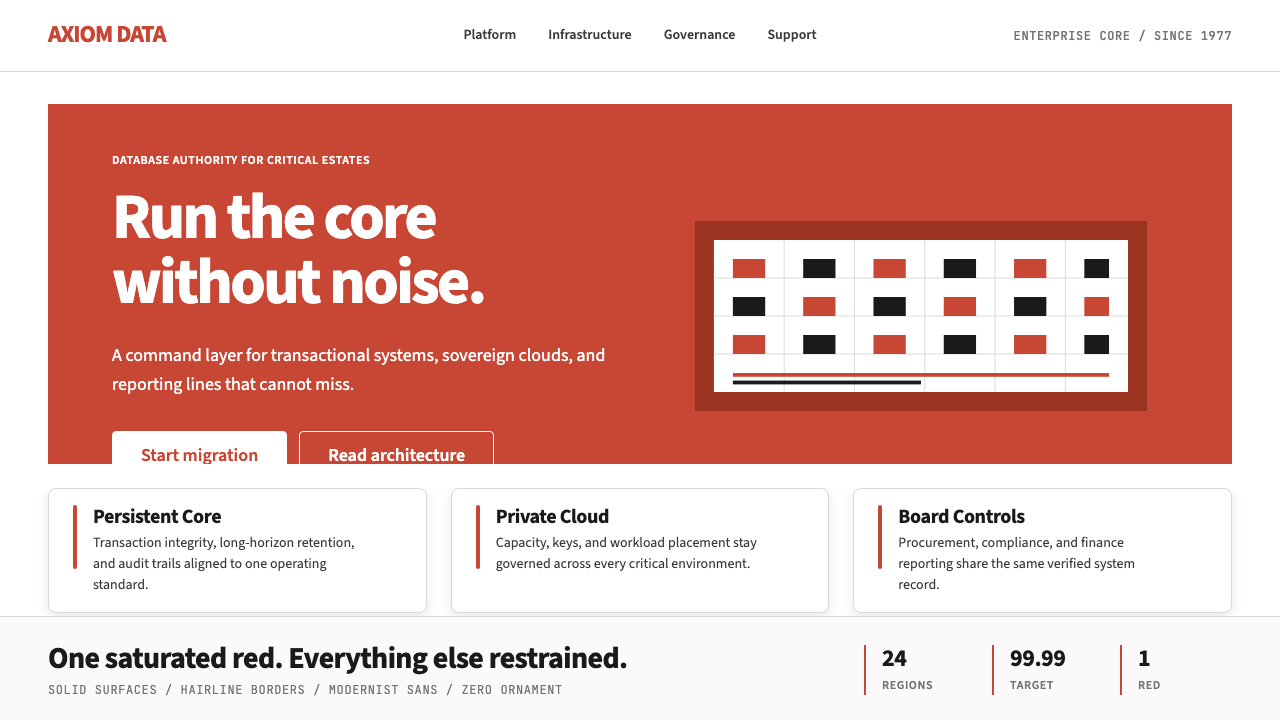 Oracle Corporate RedEnterprise certainty. Saturated red, tight sans, and white space do all the w…企业级确定感:饱和红、紧排无衬线与大留白撑起全部气场。
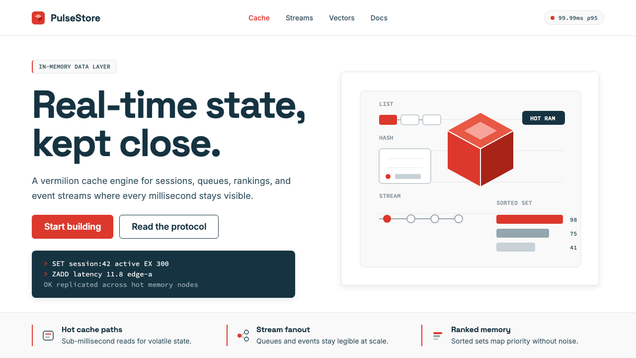 Redis Cache RedWarm database rigor. Vermilion cube, slate type, and white-space grids make s…温热的数据库秩序:朱红立方、板岩字色与留白网格,让速度可读。
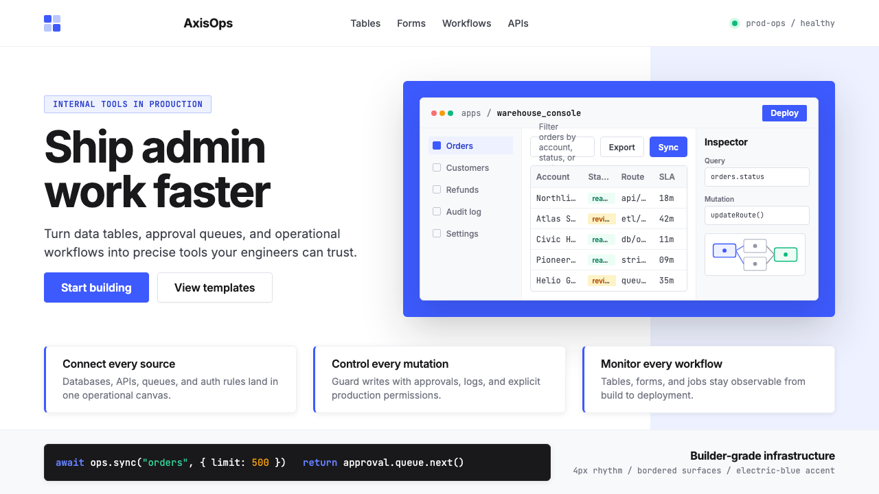 Retool Internal-Tools RedPrecision ships fast. Electric blue panels, Inter type, and bordered UI mocku…精准而快速。电光蓝面板、Inter 字体和边框 UI 模型撑起气质。
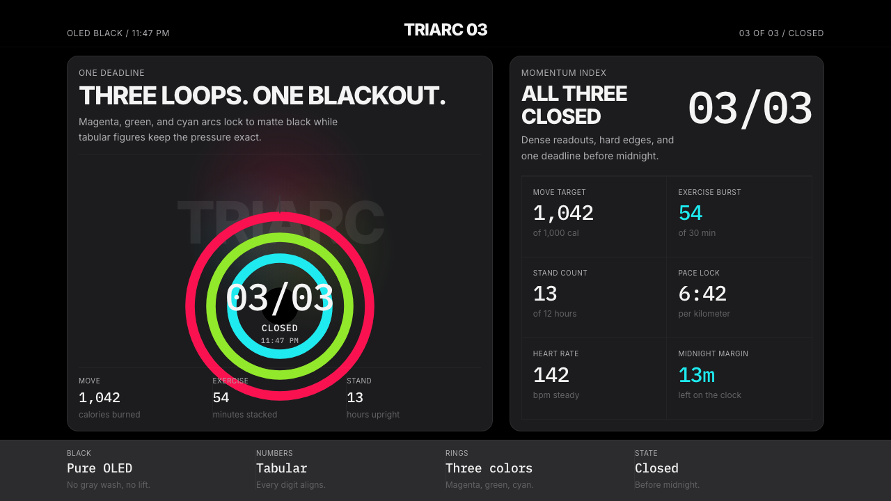 Apple Fitness Rings Closed (2024)Midnight feels exact. Magenta, green, and cyan rings lock onto OLED black.午夜像被校准。洋红、绿、青三环锁在黑底上。
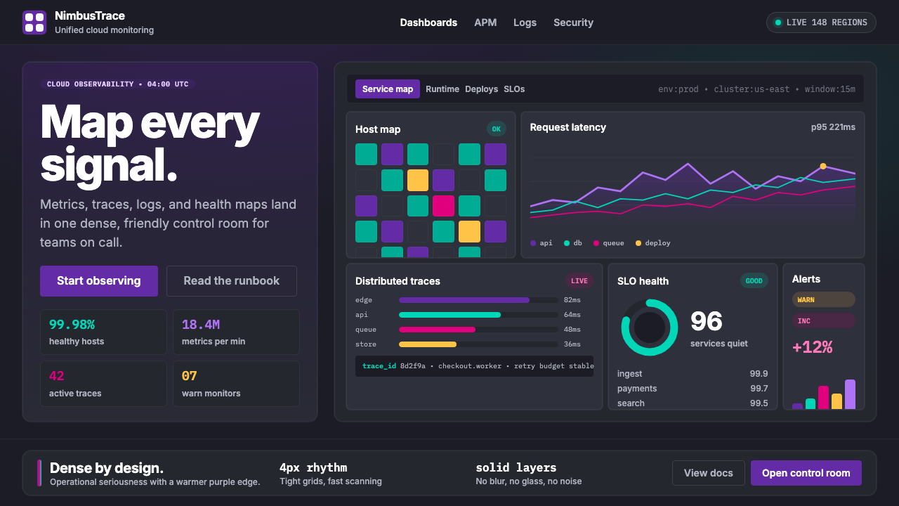 DatadogSerious telemetry, friendly pulse. Purple dark grids pack charts, badges, and…严肃监控也亲近:紫色暗网格塞满图表、徽章与追踪。
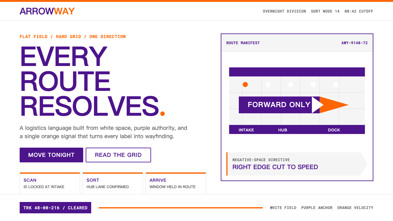 FedExDirections, not decoration. Purple authority and one orange bar organize a fl…只做指引不装饰:紫色权威与橙色单条信号,压在纯白硬网格上。