About CircleCI Pipeline-Green
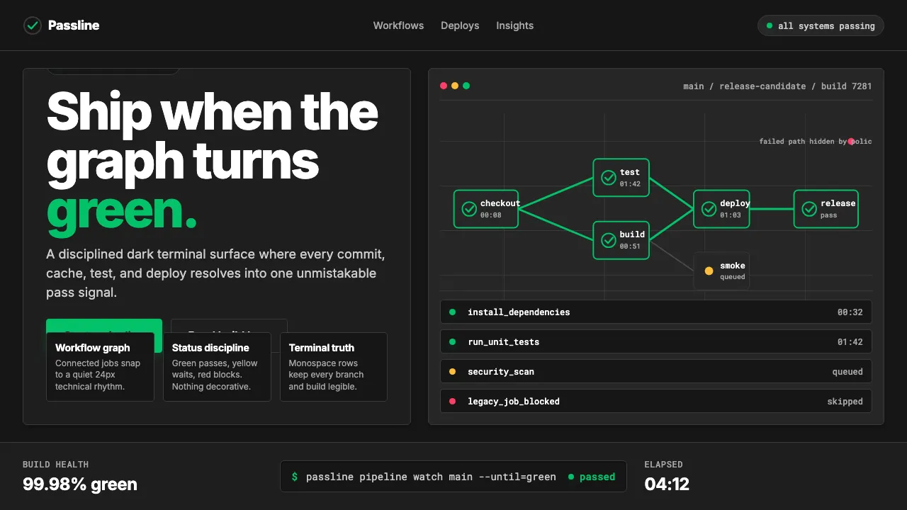
CircleCI's visual identity is built around a single saturated bright-emerald — #04C168 — set against deep developer-terminal blacks. Founded in 2011 by Paul Biggar and Allen Rohner, the platform helped define the modern cloud CI/CD category and its brand language now reads as the canonical "green checkmark" of pipeline confidence.
The current 2020+ refresh leans into monospace code-snippet display, workflow-pipeline diagrams, and a strict status-color discipline: green for pass, yellow for warning, red for failure. Everything else is white or slate. It looks like a terminal that finally got designed.
- Origin
- San Francisco, USA
- Era
- 2011 founded; current visual identity 2020+ refresh
- Key figures
- Paul Biggar · Allen Rohner · Jim Rose
- Movements
- Cloud CI/CD developer tools · 2020s dev-tool dark-mode aesthetic · Contemporary DevOps platform design
CircleCI Pipeline-Green design spec
Colors
Typography
The other 11 sections — buttons, cards, spacing, motion, techniques and more — open once you unlock. Download the DESIGN.md or send it to your AI in one click. Unlock once, yours forever.
Sign up nowStyles similar to CircleCI Pipeline-Green
Also inspired by brands & products, with a close feel.
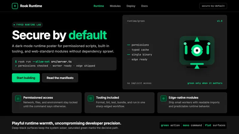 Deno Runtime-GreenWarm precision on black. Saturated green, Inter, and mono code turn security into the hero.
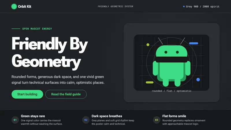 Android Bugdroid GreenFriendly tech, reduced to geometry. Vivid green pops from Grey 900 and rounded type.
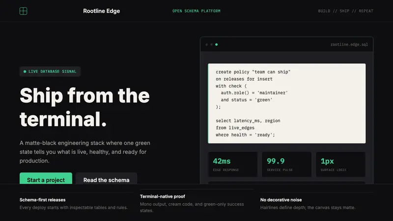 Supabase Postgres Green (2024)Midnight-terminal confidence. Matte black, Inter, mono code, and one electric green signal.
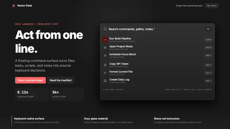 Raycast Spotlight Launcher (2023)Obsidian confidence. Sharp red cuts through Inter rows and mono shortcut chips.