What is Datadog?什么是 Datadog?
Datadog turned enterprise observability into something you actually want to look at — dense purple dashboards where every chart, trace, and metric earns its pixel.Datadog 让企业级可观测性变成了真正值得凝视的东西——紫色深色仪表盘中,每张图表、每条追踪、每个指标都值得占用那一个像素。
Datadog in briefDatadog 速览
Datadog is a cloud monitoring and observability platform whose visual identity — deep purple backgrounds, saturated accent colors, tightly packed rectangular tiles, and a friendly cartoon dog mascot — has become one of the most recognizable aesthetics in enterprise software. Where most infrastructure tooling defaulted to grey utility panels, Datadog introduced a palette that is simultaneously readable under stress and visually compelling at a glance.Datadog 是一个云监控与可观测性平台,其视觉识别——深紫色背景、高饱和度强调色、紧密排列的矩形磁贴,以及友好的卡通小狗吉祥物——已成为企业软件领域辨识度最高的美学之一。在大多数基础设施工具默认使用灰色功能面板的年代,Datadog 引入了一套在压力下仍可读、一眼扫过仍引人注目的色彩体系。
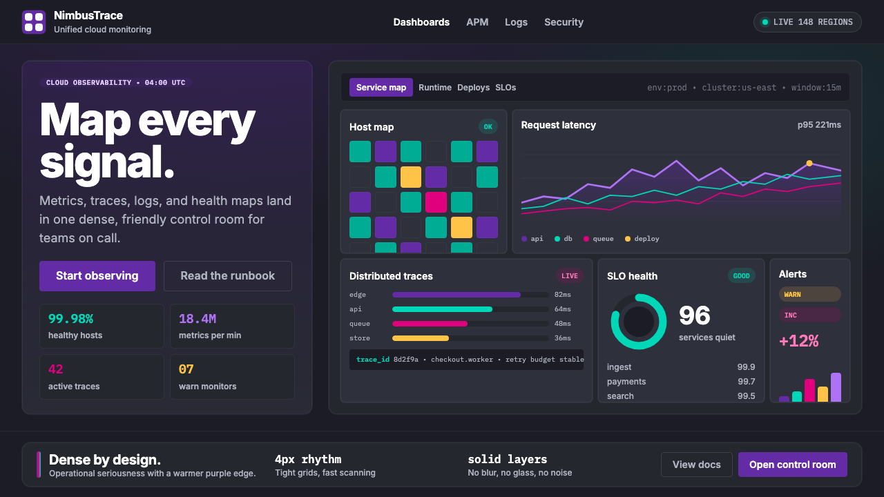
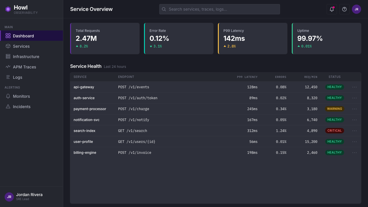
The design system is built for information density. Flame charts, host maps, distributed traces, log streams, and service topology diagrams coexist within the same dashboard canvas, organized into tight rectangular cards that share a common dark ground. Saturated purple anchors the brand while magenta, teal, yellow, and green are deployed as semantic signal colors — each assigned a consistent meaning across chart types, alert states, and product lines.这套设计系统为信息密度而生。火焰图、主机地图、分布式追踪、日志流、服务拓扑图——这些元素共存于同一个仪表盘画布中,以紧凑的矩形卡片为单位,共享同一个深色底面。饱和的紫色锚定品牌,品红、青绿、金黄与绿色作为语义信号色被部署——每种颜色在各类图表类型、告警状态与产品线之间被赋予一致的含义。
What distinguishes the Datadog aesthetic from generic dark-mode software is its intentional warmth. The cartoon dog mascot named Bits appears across loading screens, empty states, and marketing materials, softening a product whose core subject matter — infrastructure failures, latency regressions, anomaly detection — is inherently stressful. The overall character of the system is: serious data, approachable presentation.将 Datadog 美学与泛泛的深色模式软件区分开来的,是其有意为之的亲和感。名为 Bits 的卡通小狗吉祥物出现在加载画面、空状态界面与营销素材中,柔化了一款以基础设施故障、延迟退化、异常检测为核心主题——本质上充满压力——的产品。整套系统的气质是:严肃的数据,平易近人的呈现。
Where does Datadog come from?Datadog 从何而来?
Datadog was founded in New York City in 2010 by Olivier Pomel and Alexis Lê-Quôc, two engineers who had met while working together at a previous startup. The company emerged from a specific frustration: as cloud infrastructure grew more complex and ephemeral — servers spun up and down in minutes, microservices multiplied, deployments happened dozens of times a day — the existing monitoring tools, designed for static on-premises hardware, could not keep pace. Datadog set out to build monitoring for infrastructure that moves.Datadog 由 Olivier Pomel 与 Alexis Lê-Quôc 于2010年在纽约市创立,两位工程师曾在同一家初创公司共事时相识。公司的诞生源于一种具体的挫败感:随着云基础设施变得越来越复杂和短暂——服务器几分钟内启停,微服务不断增殖,每天发生数十次部署——那些为静态本地硬件设计的既有监控工具已无法跟上节奏。Datadog 着手为会移动的基础设施构建监控系统。
The visual identity that the company is known for today took shape gradually across the 2010s and was substantially consolidated between roughly 2018 and 2024, as the company grew from a developer tool into a publicly traded observability platform. The deep purple that anchors the brand was a deliberate departure from the blue that dominated enterprise software at the time — a color choice that signaled differentiation while retaining the authority associations that darker, saturated hues carry in professional contexts.该公司今日所呈现的视觉识别在整个2010年代逐步成形,大约在2018至2024年间基本定型——彼时公司已从一个开发者工具成长为一家上市的可观测性平台。锚定品牌的深紫色是对当时主导企业软件的蓝色的刻意背离——这一色彩选择传递了差异化信号,同时保留了深色、饱和色调在职业语境中所承载的权威感。
The choice of dark-mode dashboards as the primary product surface was not purely aesthetic. Engineers monitoring production infrastructure typically work across long sessions, often at night or during incident response, where a dark background reduces eye strain and allows bright signal colors — the reds of critical alerts, the greens of healthy services — to carry maximum perceptual weight. Dashboard maximalism, the practice of fitting as much meaningful information as possible into the visible canvas, became a defining characteristic of the Datadog approach, distinguishing it from products that prioritized white space and visual simplicity over data density.将深色模式仪表盘作为主要产品界面,并非纯粹出于美学考量。监控生产基础设施的工程师通常需要长时间作业,往往在夜间或事故响应期间进行——深色背景减轻眼部疲劳,并让鲜亮的信号色——严重告警的红色、健康服务的绿色——具备最大的感知权重。仪表盘最大化主义,即将尽可能多的有意义信息塞进可见画布的实践,成为 Datadog 方法论的定义性特征,使其与优先考虑留白和视觉简洁胜过数据密度的产品区分开来。
The brand's personality was shaped in part by its mascot, a cartoon dog conceived to humanize a product operating in one of enterprise software's most anxiety-inducing domains. Infrastructure monitoring is a discipline associated with 3 a.m. incident pages and cascading failure alerts; a friendly, slightly absurd mascot creates psychological permission to engage with the product's complexity without dread. This balance — rigorous data presentation alongside deliberate levity — reflects broader trends in the DevOps tooling renaissance of the 2010s, when a generation of developer tools consciously rejected the cold corporate design vocabulary of earlier enterprise software.品牌个性的塑造,部分源于其吉祥物——一只卡通小狗,被设计用于人格化一款在企业软件最令人焦虑的领域中运作的产品。基础设施监控是一个与凌晨三点告警和级联故障相关联的领域;一个友好、略带荒诞感的吉祥物,创造出一种心理许可,让人得以在不带恐惧的情况下与产品的复杂性打交道。这种平衡——严谨的数据呈现与刻意的轻松感并存——折射出2010年代 DevOps 工具复兴的更广泛趋势:那一代开发者工具有意识地拒绝了早期企业软件那套冰冷的公司设计词汇。
What defines the Datadog look?Datadog 的视觉特征是什么?
Dark Ground with Saturated Purple深色底面与饱和紫色
The primary product surface is a near-black background — dark enough to provide maximum contrast for colored chart elements, but with a subtle warm undertone that prevents the harshness of pure black. Against this ground, a deeply saturated purple serves as the brand's structural color: navigation bars, selected states, primary buttons, and branded surfaces are all anchored in this hue. The overall effect is one of depth and authority, with the purple acting as a calm organizing force rather than an aggressive accent.主要产品界面以近黑色为底——足够深以为彩色图表元素提供最大对比度,同时带有微妙的暖色调,避免纯黑的刺眼感。在此底面上,一种高度饱和的紫色作为品牌的结构性色彩:导航栏、选中状态、主要按钮和品牌化界面都锚定于这一色调。整体效果传递出深度与权威,紫色作为一种平静的组织力量存在,而非侵略性的强调色。
Semantic Signal Colors语义信号色彩
A tightly controlled palette of accent colors — magenta, teal, yellow, green, and orange — is assigned semantic meaning and applied consistently across the entire product. These colors do not decorate; they communicate. Green signals healthy or nominal states, red signals critical failure, yellow signals warning or degraded, teal marks infrastructure elements, and magenta often distinguishes a highlighted series in a multi-line chart. The discipline of this system means that a user who has internalized the color logic can scan a complex dashboard and extract its meaning in seconds.一组严格控制的强调色——品红、青绿、金黄、绿色与橙色——被赋予语义意义,并在整个产品中一致应用。这些颜色不用于装饰,而用于传达信息。绿色表示健康或正常状态,红色表示严重故障,黄色表示警告或降级,青绿色标记基础设施元素,品红色通常在多折线图中区分高亮序列。这套系统的纪律性意味着,一个已将色彩逻辑内化的用户,可以在数秒内扫过复杂仪表盘并提取其含义。
Tile-Based Dashboard Maximalism磁贴式仪表盘最大化主义
The dashboard canvas is organized into a modular grid of rectangular tiles, each containing a single visualization: a time-series graph, a numeric counter, a flame chart, a distribution histogram, or a log stream. Tiles are edge-to-edge with minimal internal padding, maximizing the ratio of data to chrome. The composition has a mosaic quality — each tile is self-contained and legible, but the full canvas reads as a unified status picture. This tile maximalism is the antithesis of the whitespace-first design philosophy common in consumer software.仪表盘画布组织为矩形磁贴的模块化网格,每块磁贴包含一个单独的可视化对象:时间序列图、数字计数器、火焰图、分布直方图或日志流。磁贴之间边对边排列,内部留白最小,最大化数据与界面装饰的比例。整体构图呈现出马赛克般的品质——每块磁贴自成一体且清晰可读,但完整画布作为一幅统一的状态图像被读取。这种磁贴最大化主义,是消费软件中普遍的留白优先设计哲学的对立面。
Clean Headline Typography against Dark深色底面上的清爽标题排印
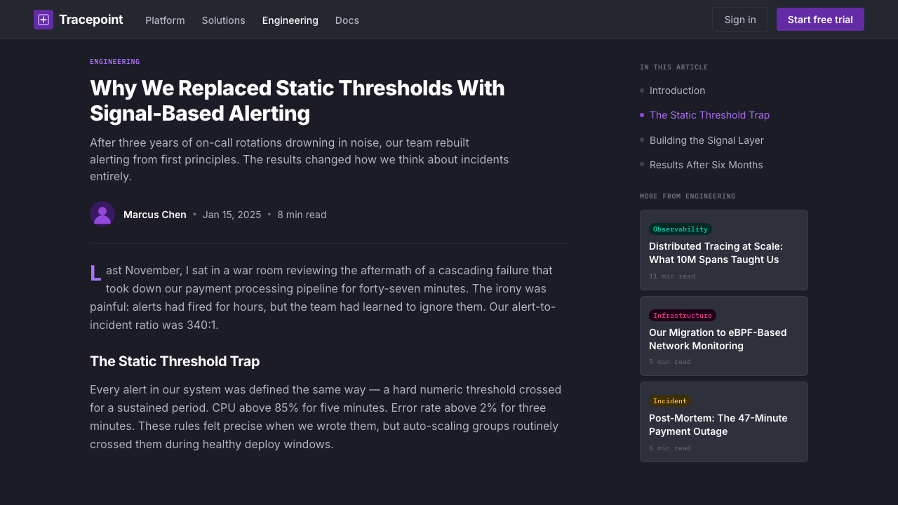
Marketing and product surfaces pair a geometric sans-serif headline typeface — assured and contemporary in character — with a highly legible neutral sans-serif for body and UI text. The headline face is set large and with generous tracking on campaign pages, giving the brand a confident editorial quality. Inside the product, type is predominantly small and tight, optimized for information density rather than expressiveness. The contrast between these two registers — expressive marketing type and utilitarian product type — is a deliberate brand decision.营销与产品界面将一款几何无衬线标题字体——气质笃定而当代——与一款高可读性的中性无衬线字体配对,后者用于正文与界面文字。标题字体在宣传页面上以大字号、宽字距设置,赋予品牌自信的编辑气质。产品内部,字体以小号紧凑为主,优化信息密度而非表现力。这两种字体语域之间的对比——富表现力的营销字体与实用主义的产品字体——是一个刻意的品牌决策。
Cartoon Mascot as Emotional Counterweight卡通吉祥物作为情感平衡锤
The Datadog mascot — a cartoon dog named Bits, rendered in a simple, friendly illustration style — appears at moments of low data density: loading screens, empty states, error pages, and marketing imagery. The mascot's visual style is intentionally distinct from the product's data-dense aesthetic; it is soft, rounded, and playful where the dashboards are sharp, angular, and dense. This contrast is functional: the mascot signals a non-critical moment, providing psychological relief within a product whose primary use context involves operational stress.Datadog 吉祥物——一只名为 Bits 的卡通小狗,以简洁友好的插画风格呈现——出现在数据密度较低的时刻:加载画面、空状态界面、错误页面与营销图像。吉祥物的视觉风格与产品数据密集型美学有意保持区别:在仪表盘锐利、棱角分明、密集之处,吉祥物柔和、圆润、活泼。这种对比是功能性的:吉祥物标志着非关键时刻,在一款主要使用场景涉及运维压力的产品中提供心理缓解。
Consistent Iconography and Badge System一致的图标体系与徽章系统
Service integrations, infrastructure components, and product categories are identified through a comprehensive icon and badge system. Integration icons use a consistent visual treatment — typically a recognizable logomark or a simplified geometric symbol — displayed against a lightly colored or dark square badge. The badge dimensions and corner rounding are uniform across the product, giving the integration catalog a visual coherence that allows hundreds of service logos to coexist without chaos. Color in the badge system is drawn from the main semantic palette, with badge backgrounds using muted or mid-tone variants to avoid competing with active chart data.服务集成、基础设施组件与产品类别通过完整的图标与徽章系统加以识别。集成图标使用一致的视觉处理——通常是一个可识别的标志图形或简化的几何符号——展示于轻色或深色方形徽章上。徽章尺寸和圆角弧度在整个产品中保持统一,使集成目录呈现视觉连贯性,允许数百个服务标志共存而不陷入混乱。徽章系统中的色彩取自主要语义色板,徽章背景使用柔和或中间调变体,避免与活跃图表数据产生竞争。
Purple-to-Neutral Brand Gradient in Marketing营销中紫色至中性的品牌渐变
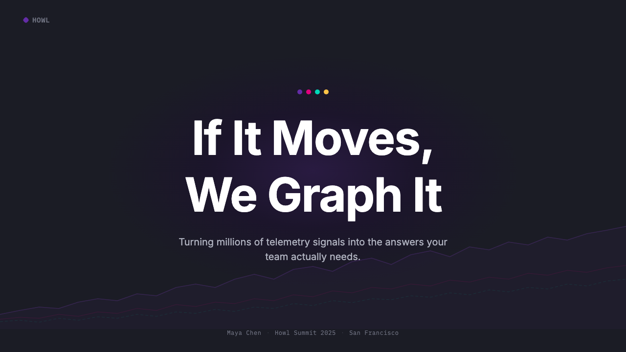
While the product dashboards are predominantly flat and grid-based, marketing surfaces — campaign pages, conference displays, and social graphics — use sweeping color gradients that blend the core purple with adjacent dark blues or near-black, creating a sense of depth and movement. These gradients are applied to large background fields rather than to typographic or data elements, so they function as atmospheric framing rather than informational encoding. The practice marks a clear distinction between the marketing layer, where emotional impression matters most, and the product layer, where precise information density is paramount.虽然产品仪表盘以平面网格为主,营销界面——宣传页面、会议展示与社交图形——使用将核心紫色与相邻深蓝或近黑色融合的大面积渐变,营造出深度与动感。这些渐变应用于大面积背景区域,而非字体或数据元素,因此发挥的是氛围框架的作用,而非信息编码。这种做法清晰划定了营销层(情感印象最为重要)与产品层(精确的信息密度才是关键)之间的分界。
Who shaped Datadog?谁塑造了 Datadog?
Pomel co-founded Datadog and serves as its CEO. As the company's technical co-founder, he shaped the product philosophy that underpins the visual system: monitoring tools should be as pleasant to use as they are powerful, and operational data should be presented in a way that makes patterns immediately visible rather than buried in tables. His insistence on a product that engineers actually enjoy using — not merely tolerate — is reflected in the design team's investment in visual quality at a level unusual for infrastructure software.Pomel 是 Datadog 的联合创始人,担任 CEO。作为公司的技术联合创始人,他塑造了支撑视觉系统的产品哲学:监控工具应当像功能强大一样令人愉快使用,运维数据的呈现方式应使规律立即可见,而非埋藏于表格之中。他坚持打造工程师真正享受使用——而非仅仅忍受——的产品,这一理念体现在设计团队对视觉品质的投入上,其程度在基础设施软件领域实属罕见。
Lê-Quôc co-founded Datadog and served as its CTO. His engineering background informed the product's commitment to presenting complex distributed systems data in human-legible form — a challenge that is as much a design problem as an engineering one. The distributed tracing visualizations and flame charts that are central to Datadog's identity required innovations in how time-series and hierarchical data could be rendered within a constrained, tile-based canvas without losing analytical fidelity.Lê-Quôc 是 Datadog 的联合创始人,担任 CTO。他的工程背景推动了产品对以人类可读形式呈现复杂分布式系统数据的承诺——这一挑战既是设计问题,也是工程问题。分布式追踪可视化与火焰图是 Datadog 身份认同的核心,它们要求在受约束的磁贴画布内呈现时间序列与层级数据时进行创新,同时不损失分析准确性。
The internal brand team, whose design decisions solidified across multiple major identity refreshes through the 2018–2024 period, is responsible for the coherent system that connects product dashboards, developer documentation, marketing pages, and conference presence under a single visual language. The team's most consequential decisions include the commitment to deep purple as a brand anchor at a time when most enterprise software was still in blue, the development of the semantic color system that spans all product areas, and the integration of the mascot into product empty states — a choice that humanized operational software in an unexpected way.内部品牌团队在2018至2024年间经历多次重要身份更新后,形成了将产品仪表盘、开发者文档、营销页面与会议展示整合在单一视觉语言之下的连贯系统,并对此负责。团队最具影响力的决策包括:在大多数企业软件仍停留于蓝色的时代,将深紫色确立为品牌锚点;建立横跨所有产品领域的语义色彩系统;以及将吉祥物整合进产品空状态界面——这一选择以出人意料的方式将运维软件人性化。
The broader design movement toward information-dense dark dashboards — sometimes called dashboard maximalism — emerged from the needs of site reliability engineering and DevOps culture in the 2010s. Tools including Grafana, Kibana, and Datadog collectively established an aesthetic vocabulary in which dark backgrounds, small tight type, and high-saturation accent colors became the expected visual register for observability tooling. Datadog distinguished itself within this movement by pairing the maximalist data surface with strong brand personality, whereas many competitors kept their visual identity minimal or generic.更广泛的信息密集型深色仪表盘设计运动——有时被称为仪表盘最大化主义——源于2010年代站点可靠性工程与 DevOps 文化的需求。Grafana、Kibana 与 Datadog 等工具共同建立了一套美学词汇,在这套词汇中,深色背景、小号紧凑字体与高饱和度强调色成为可观测性工具的预期视觉语域。Datadog 在这场运动中的独特之处,在于将最大化数据界面与强烈的品牌个性相结合,而许多竞争对手的视觉识别仍保持简约或通用。
How do you use Datadog today?今天怎么用 Datadog?
Applying the Datadog visual style is most effective when the context genuinely shares its values: information density, operational clarity, and a dark viewing environment. The system is designed for users who need to extract meaning quickly from complex data, not for users browsing at leisure. Before applying the aesthetic, confirm that the audience and context actually call for dense, dark, data-rich presentation — otherwise the style's severity will work against rather than for the communication goal.应用 Datadog 视觉风格最有效的情形,是场景真正与其价值观相符:信息密度、运营清晰度,以及深色观看环境。这套系统为需要快速从复杂数据中提取意义的用户而设计,而非为悠闲浏览的用户服务。在应用这套美学之前,先确认受众与场景是否真正需要密集、深色、富数据的呈现方式——否则这种风格的严肃性会与传达目标相悖,而非为其服务。
For presentation slides, the Datadog palette works powerfully on both cover and data-heavy content pages. A cover slide benefits from the brand's sweeping gradient approach: a deep purple-to-near-black background field, a single bold headline in a large, clean sans-serif, and the product or company logomark positioned with confident whitespace. Content slides should embrace the tile metaphor — organizing data visualizations, key metrics, and supporting text into clear rectangular zones that share a common dark ground. Chart legends should use the semantic color sequence rather than arbitrary hues. Avoid light backgrounds within this system; a single cream or white slide breaks the visual continuity of a dark-mode deck.在演示文稿中,Datadog 色板在封面页与数据密集型内容页上都极具冲击力。封面幻灯片适合运用品牌标志性的扫掠渐变处理:深紫色至近黑色的背景场,一行大号、简洁无衬线字体的粗体标题,以及以自信留白定位的产品或公司标志。内容幻灯片应拥抱磁贴隐喻——将数据可视化、关键指标与辅助文本组织进共享同一深色底面的清晰矩形区域。图表图例应使用语义色彩序列而非任意色调。在这套系统内避免使用浅色背景;单张奶油或白色幻灯片会破坏深色模式幻灯片组的视觉连贯性。
For web UI dashboards and product interfaces, the Datadog style is directly applicable wherever monitoring, analytics, or operational data is the primary content. Define a strict grid of equal-width columns, use a near-black base surface, and reserve the saturated purple for structural UI elements like the primary navigation, selected tabs, and call-to-action buttons. Data visualization colors should be drawn from the semantic palette and applied consistently — a color that means warning on one chart should mean warning everywhere. Avoid introducing decorative gradients into chart areas; keep data surfaces flat so that color carries unambiguous informational weight. Pricing and tier-differentiation pages benefit from the badge and card system, using accent color fills to distinguish tiers without needing illustrative decoration.对于网页 UI 仪表盘与产品界面,Datadog 风格在监控、分析或运维数据为主要内容的场景中可直接应用。定义严格的等宽列网格,使用近黑色基础界面,将饱和紫色保留给结构性 UI 元素,如主导航栏、选中标签与操作按钮。数据可视化颜色应取自语义色板并一致应用——在一张图表中表示警告的颜色,应在所有地方都表示警告。避免在图表区域引入装饰性渐变;保持数据界面平整,使色彩承载明确无歧义的信息权重。定价与等级区分页面受益于徽章和卡片系统,使用强调色填充来区分等级,无需借助插图装饰。
For editorial and marketing applications, the style's most transferable quality is its confident use of purple at scale. A marketing page benefits from alternating full-width sections: deep purple with white type, near-black with lighter purple type, and occasional neutral sections for body content. The mascot or friendly illustration elements can be introduced in low-information moments — section transitions, scroll breaks, or feature callouts — to add warmth without disrupting the overall authoritative tone. Social media graphics and conference materials should use the gradient background treatment combined with large, clean typography and a single highlighted data point or product screenshot.对于编辑与营销应用,这种风格最具可移植性的品质是其在大尺度上对紫色的自信运用。营销页面适合交替使用全宽分区:深紫色配白色文字、近黑色配浅紫色文字,以及偶尔用于正文内容的中性色分区。吉祥物或友好插画元素可以在低信息密度时刻引入——章节过渡、滚动间隙或功能标注——在不破坏整体权威基调的前提下增添温度。社交媒体图形与会议材料应结合渐变背景处理、大号简洁字体,以及单一突出的数据点或产品截图。
A common mistake when adapting this style is overusing the full range of semantic colors as decoration. In the original system, magenta, teal, yellow, and green are reserved for data meaning — they signal status, not visual interest. Deploying all of them in a presentation background or a marketing illustration strips them of their communicative value and produces visual noise. A second frequent error is pairing the dark product aesthetic with light-weight or script typefaces, which undermine the system's technical authority. The style is built on clean, geometric sans-serifs at confident weights; any typographic choice that reads as soft or informal will create a contradiction the eye reads as inconsistency.改编这种风格时常见的错误,是将语义色彩的全部范围用作装饰。在原始系统中,品红、青绿、金黄与绿色被保留用于数据含义——它们传达状态,而非视觉趣味。将它们全部部署在演示背景或营销插图中,会剥夺其传达价值并产生视觉噪声。另一个常见错误是将深色产品美学与细字重或脚本字体搭配,这会破坏系统的技术权威感。这套风格建立于简洁、几何无衬线字体的稳健字重之上;任何读起来柔和或非正式的字体选择,都会制造出视觉上可感知为不一致性的矛盾。
Datadog — FAQDatadog · 常见问题
Can the Datadog style work on a light background?Datadog 风格能在浅色背景上使用吗?
The style can be adapted to light backgrounds, but it requires significant recalibration. The deep purple that functions as a background color in the dashboard context becomes a strong foreground or accent color on a light ground. The semantic signal colors — especially the saturated greens, reds, and yellows — remain effective on white or near-white backgrounds because they were originally designed to stand out against dark surfaces. However, the overall character shifts considerably: the authoritative depth of the dark-background version gives way to a lighter, more conventional enterprise software feeling. Datadog's own marketing pages use a mix of light and dark sections, which is a reasonable model for contexts where full dark-mode is impractical.这种风格可以适配浅色背景,但需要大幅重新校准。在仪表盘语境中作为背景色使用的深紫色,在浅色底面上成为强烈的前景色或强调色。语义信号色——尤其是饱和的绿色、红色与黄色——在白色或近白色背景上依然有效,因为它们最初就是为在深色界面上脱颖而出而设计的。然而,整体气质会发生显著转变:深色背景版本的权威纵深感,让位于更轻盈、更常规的企业软件感受。Datadog 自身的营销页面混合使用了浅色与深色分区,这对于全深色模式不切实际的场景来说是合理的参考模型。
How does this style differ from generic dark-mode software design?这种风格与通用深色模式软件设计有何不同?
Generic dark-mode design typically uses dark grey or near-black backgrounds with muted accent colors and prioritizes visual quietness — reducing eye strain over long sessions by keeping saturation low and contrast moderate. The Datadog style inverts this priority: it uses high-saturation accent colors deliberately because those colors carry semantic meaning that must be readable at a glance across a dense canvas. The purple brand color is also notably warmer and more characterful than the neutral dark greys that most dark-mode design systems use. Additionally, the presence of the cartoon mascot and the confident marketing typography give the system a personality that generic dark-mode tooling lacks.通用深色模式设计通常使用深灰或近黑背景配合低饱和度强调色,优先考虑视觉安静感——通过保持低饱和度和适中对比度来减少长时间作业的眼部疲劳。Datadog 风格倒置了这一优先级:它刻意使用高饱和度强调色,因为这些颜色承载着必须在密集画布上一眼可读的语义意义。紫色品牌色也明显比大多数深色模式设计系统使用的中性深灰色更温暖、更有个性。此外,卡通吉祥物的存在与自信的营销排版,赋予了系统一种通用深色模式工具所缺乏的个性。
Is dashboard maximalism appropriate for audiences who are not engineers?仪表盘最大化主义适合非工程师受众吗?
Dashboard maximalism in its full form — dozens of tiles, multiple chart types, dense small type — is designed for expert users who have already internalized the data model and need peripheral awareness of many metrics simultaneously. For executive audiences, business users, or first-time viewers, the same canvas would be overwhelming. A responsible adaptation reduces the tile count dramatically, increases the type size on key numbers, and strips the color palette down to three or four colors with clear legend explanations. The Datadog-style dark ground and purple anchor can remain, but the density must be calibrated to the audience's familiarity with the underlying data.完整形态的仪表盘最大化主义——数十块磁贴、多种图表类型、密集小字——是为已将数据模型内化、需要同时对众多指标保持外围意识的专家用户而设计的。对于高管受众、业务用户或初次观看者来说,同样的画布会令人不知所措。负责任的改编方式是大幅减少磁贴数量,增大关键数字的字号,将色板精简至三四种颜色并配以清晰的图例说明。Datadog 风格的深色底面与紫色锚点可以保留,但密度必须根据受众对底层数据的熟悉程度加以校准。
What kinds of products should avoid the Datadog aesthetic entirely?哪些类型的产品应该完全避免使用 Datadog 美学?
Any product where warmth, organic texture, or cultural specificity are central to the experience should avoid this aesthetic. Consumer wellness applications, food and beverage brands, children's products, travel experiences, luxury goods, and creative platforms all depend on visual qualities — softness, natural materials, handcraft signals, photographic richness — that are antithetical to the Datadog visual language. The dark-ground, high-saturation, data-dense aesthetic communicates expertise, technical authority, and operational seriousness; it does not communicate comfort, delight, or sensory pleasure. Misapplying it to consumer emotional contexts is likely to create a product that feels cold or alienating rather than authoritative.任何以温暖感、有机质感或文化特殊性为核心体验的产品都应避免使用这套美学。消费者健康应用、食品饮料品牌、儿童产品、旅行体验、奢侈品与创意平台,都依赖于与 Datadog 视觉语言相对立的视觉品质——柔和感、自然材质、手工艺信号、摄影的丰富性。深色底面、高饱和度、数据密集型美学传达的是专业技术、技术权威与运维严肃性;它不传达舒适感、愉悦感或感官愉悦。将其误用于面向消费者的情感语境,很可能打造出一款让人感到冰冷或疏离而非权威的产品。
How should the mascot be used without undermining the professional tone?如何使用吉祥物而不损害专业基调?
The mascot works precisely because it appears at moments of low operational stakes — loading screens, empty states, onboarding flows, and marketing imagery — not during active data analysis. The design logic is that the mascot provides psychological relief exactly where the product is not asking the user to make decisions. Placing the mascot within an active dashboard tile, alongside live chart data, or adjacent to a critical alert would create a tonal contradiction: playfulness at a moment requiring concentration. The rule of thumb is that the mascot belongs where there is nothing yet to analyze, and data belongs where there is something to act on.吉祥物之所以奏效,恰恰是因为它出现在运维风险较低的时刻——加载画面、空状态界面、引导流程与营销图像——而非主动数据分析期间。设计逻辑是:吉祥物在产品不要求用户作出决策的确切时刻提供心理缓解。将吉祥物置于活跃的仪表盘磁贴中、与实时图表数据并列,或紧邻严重告警,会制造出语调矛盾:在需要专注的时刻出现玩乐感。经验法则是:吉祥物属于尚无内容可分析之处,数据属于有内容需要采取行动之处。
Related design styles相关设计风格
 Adobe Creative CloudUnified, not uniform. Red anchor, white space, and saturated app tiles organi…统一而不单一:红色锚点、留白与高饱和应用方块组织整套工具。
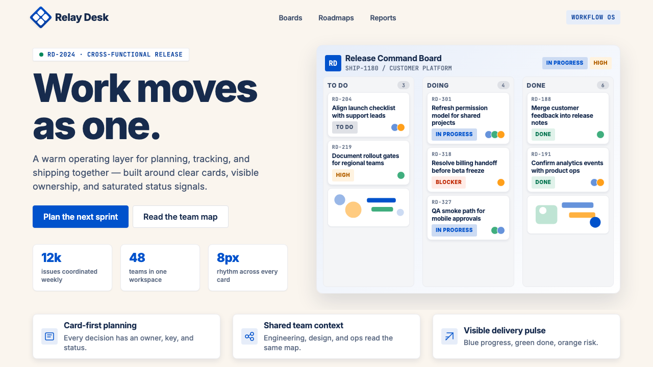 Atlassian Jira BlueWarm enterprise teamwork. Saturated blue cards on cream make status feel huma…温暖的企业协作:奶油底上的饱和蓝卡片,让状态更有人味。
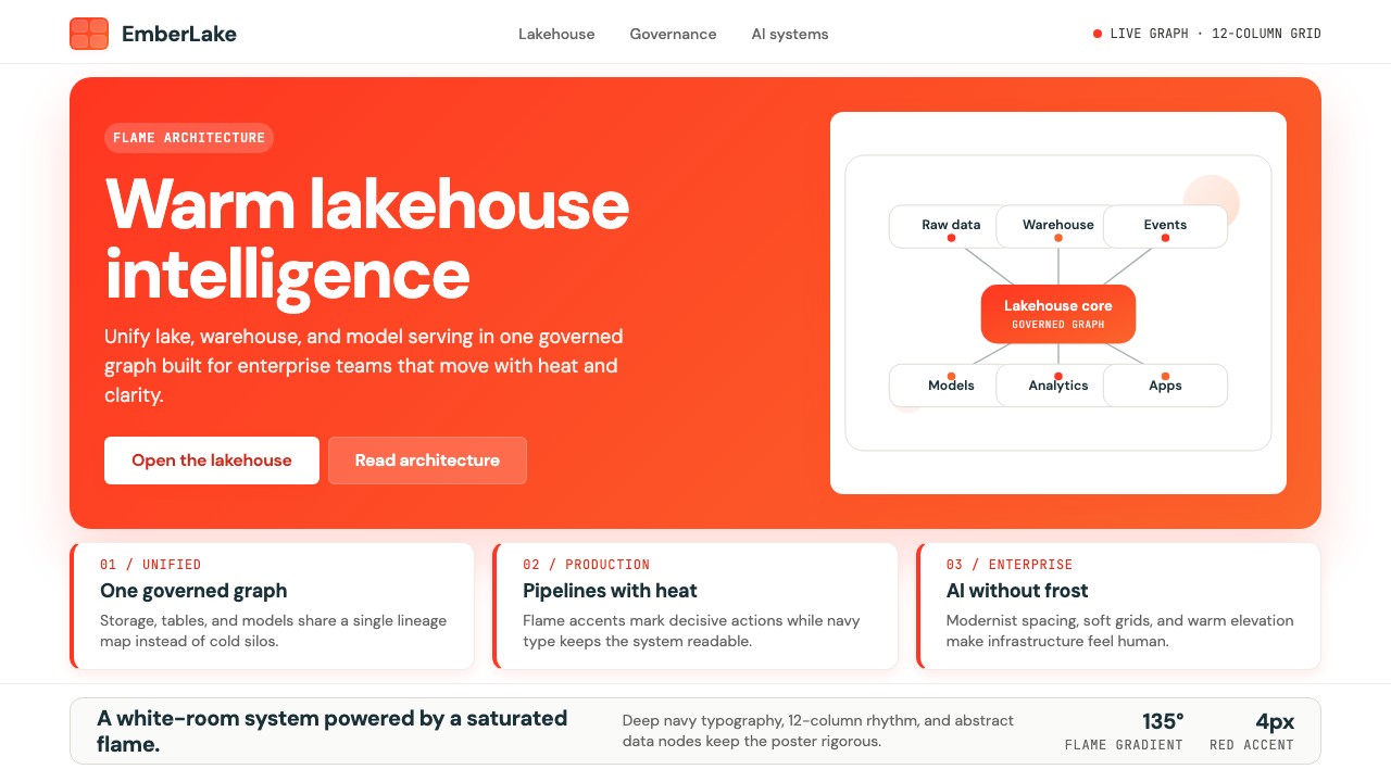 Databricks LakehouseWarm enterprise confidence. Flame red-orange gradients meet DM Sans and clean…温暖的企业信心:红橙火焰渐变配 DM Sans 与洁净数据图。
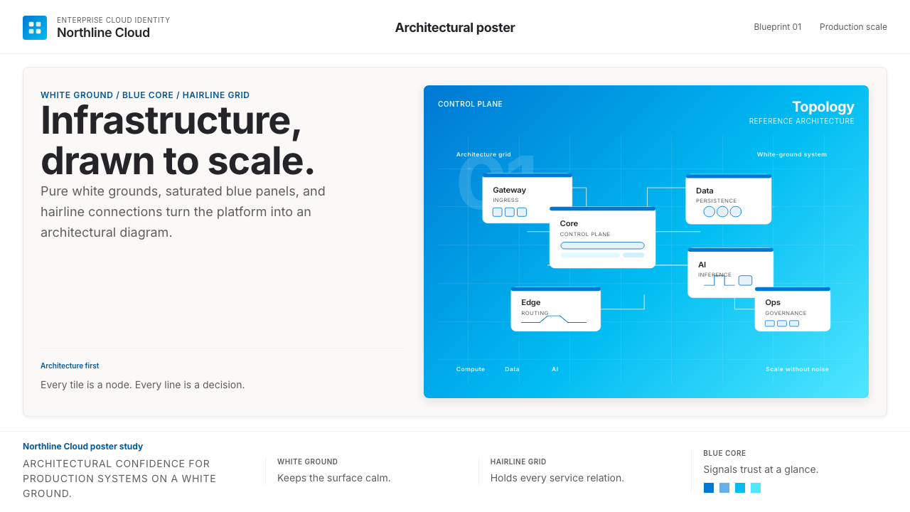 Microsoft AzureEnterprise calm, sharply diagrammed. White ground, saturated blue, hairline l…企业气质很稳。白底、饱和蓝和细线构成架构图。
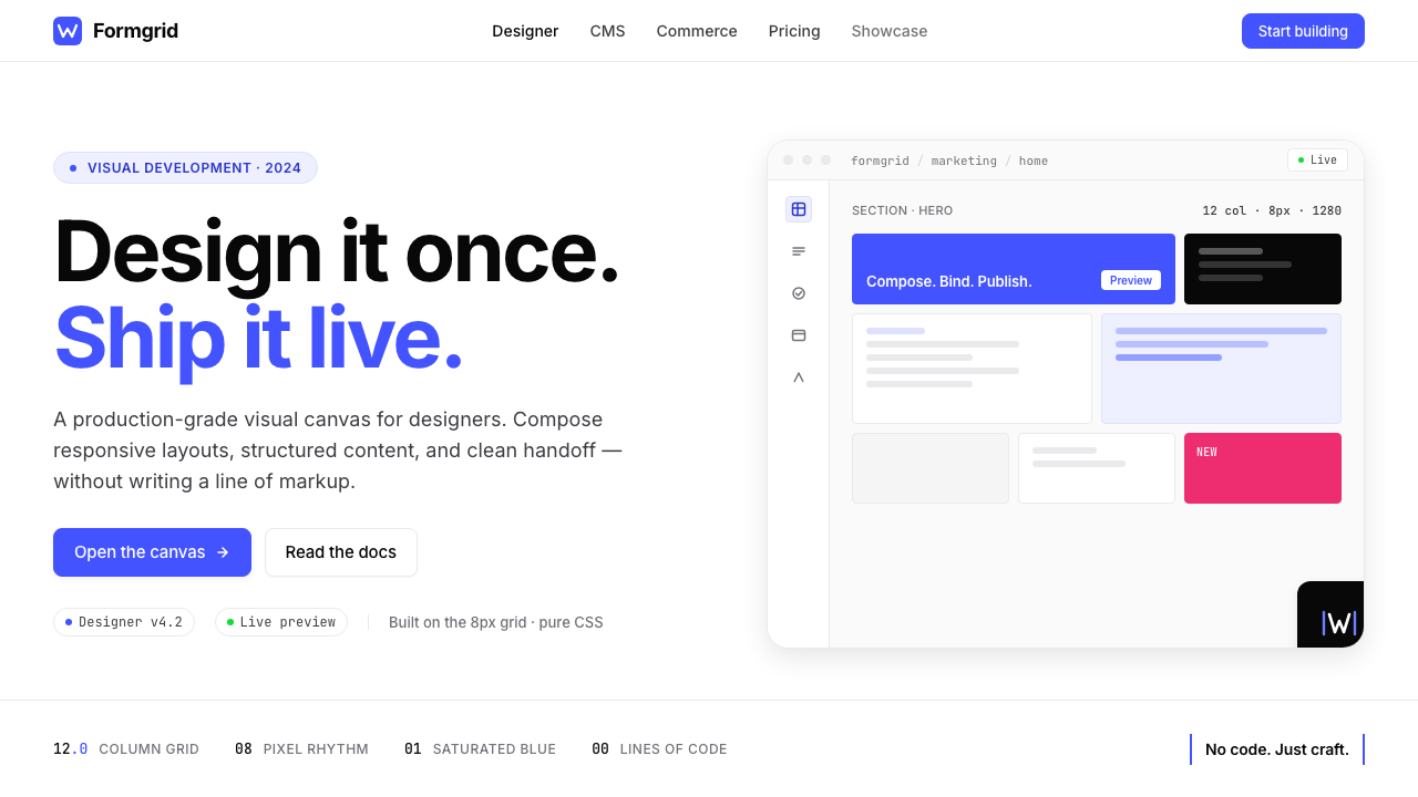 Webflow No-CodeA designer's tool, dressed like one. Saturated electric cobalt on pure white,…设计师的工具,长得也像:饱和电光蓝落在纯白底上,Inter 紧排,抽象网格分块。
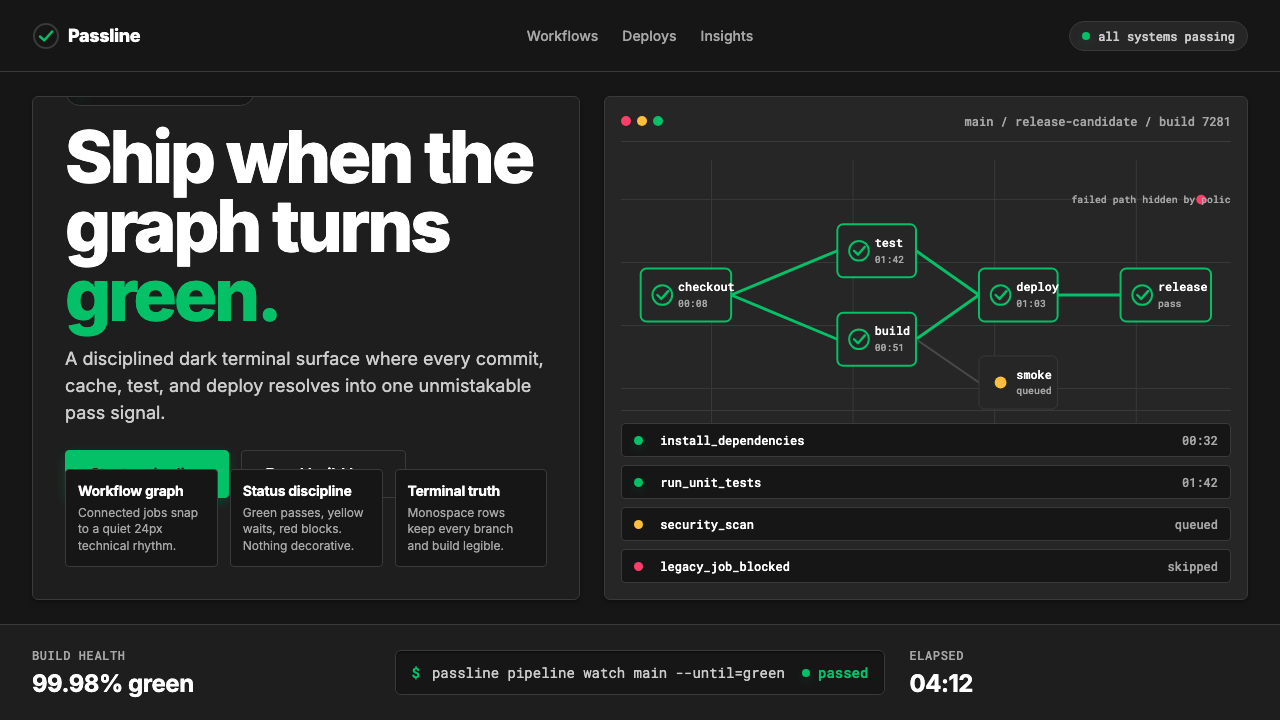 CircleCI Pipeline-GreenConfidence goes green. Emerald status lines cut through terminal-black pipeli…信心变绿。翠绿状态线切过终端黑流水线网格。