What is Webflow No-Code?什么是 Webflow No-Code?
Webflow made production-grade web design a designer's game — no code required, no aesthetic compromises allowed.Webflow 让生产级网页设计成为设计师的主场——无需代码,也不允许任何审美妥协。
Webflow No-Code in briefWebflow No-Code 速览
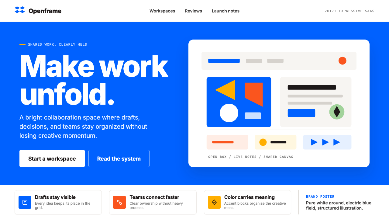
Webflow No-Code is the visual identity and design language of Webflow, the San Francisco-based visual-development platform founded in 2013. Its aesthetic is immediately recognizable: a saturated electric blue set against pure white grounds, a refined modernist sans-serif typeface at tight tracking, and a compositional vocabulary built from abstract block-grid arrangements, generous white space, and crisp UI mockups as primary imagery. The overall effect is that of a designer's canvas turned into a brand — confident, precise, and uncluttered.Webflow No-Code 是 Webflow 这一可视化建站平台的视觉识别与设计语言。Webflow 于 2013 年在旧金山创立,其美学辨识度极强:饱和的电光蓝落在纯白底面上,一套修炼极深的现代主义无衬线字体以紧凑字距排布,构图词汇由抽象网格分块、大量留白和精确的 UI 截图组合而成。整体效果如同一张被精心装裱的设计师画稿——自信、精准、不留赘余。
What distinguishes the Webflow aesthetic from generic tech-company design is its pointed coherence. The color palette is almost ascetic in its restraint: one dominant electric blue, pure white, and a near-black anchor the entire system, with secondary accent colors — a warm pink and a fluorescent green — deployed only in celebratory or special-use contexts. The bracket-W logomark anchors the identity, and the visual grammar refuses decoration that does not serve information hierarchy. Every design decision communicates the platform's core proposition: that building for the web should feel like designing, not engineering.Webflow 美学区别于泛泛科技公司设计的关键,在于它极度一致的内部逻辑。色板近乎苦行式地克制:一种主导性的电光蓝、纯白与接近黑色的锚点色撑起整套系统,次级强调色——一种暖粉和一种荧光绿——仅在庆祝性或特殊场景中出场。方括号 W 标志锚定整体识别,视觉语法拒绝一切不服务于信息层级的装饰。每一个设计决定都在传递平台的核心主张:为网页而建,应该感觉像是在设计,而不是在写工程代码。
The style belongs to the 2020s designer-tool aesthetic — a cluster of visual languages produced by tools aimed at creative professionals who happen to need engineering-grade output. It sits in conversation with other refined SaaS identities of the period, sharing their commitment to typographic precision and systematic color use, while distinguishing itself through a particular brightness of blue and a poster-like boldness in layout that reads as simultaneously editorial and technological.这种风格归属于 2020 年代的设计师工具美学——一组由面向创意专业人士的工具所产生的视觉语言,这些工具的用户需要工程级的输出,却以设计师的眼光审视一切。它与同时期其他精雕细琢的 SaaS 视觉识别彼此对话,共享着对排印精度与系统性色彩使用的承诺,同时以那种特有的蓝色亮度和海报般的版面大胆感标明自身——既像编辑出版物,又像科技产品。
See the Webflow No-Code design system查看 Webflow No-Code 完整设计系统
Where does Webflow No-Code come from?Webflow No-Code 从何而来?
Webflow was founded in 2013 by three brothers — Vlad Magdalin, Sergie Magdalin, and Bryant Chou — who shared a conviction that the gap between visual design and working web production was an unnecessary one. Vlad Magdalin's early pitch was stark: designers sketch in one tool, hand the files to developers, and spend the next weeks negotiating what gets built versus what gets compromised. Webflow proposed to collapse that handoff entirely, letting a designer manipulate layout, interactions, and responsive behavior with direct visual control, generating clean production code underneath without the designer ever touching it.Webflow 由三兄弟 Vlad Magdalin、Sergie Magdalin 和 Bryant Chou 于 2013 年共同创立,他们的共同信念是:视觉设计与网页生产之间的鸿沟是不必要的。Vlad Magdalin 早期的立论直截了当——设计师在一个工具里出图,把文件交给开发者,接下来几周反复协商哪些东西能被还原、哪些只能妥协。Webflow 的提案是彻底折叠这个交接环节:让设计师通过直接的视觉控制操纵布局、交互和响应式行为,底层自动生成干净的生产代码,设计师全程不必碰一行代码。
The platform's early years were defined by survival and iteration rather than aesthetic coherence. The founding team posted a demo video to Hacker News in 2013 and received a mixture of enthusiasm and skepticism — many developers argued that visual web-building tools had always produced inferior code, a reputation earned by early-generation WYSIWYG editors. Webflow differentiated itself by targeting designers first and producing genuinely clean semantic HTML and CSS output, a commitment that gradually built trust among the professional design community.平台的早年被生存与迭代所定义,远谈不上审美的自洽。创始团队于 2013 年在 Hacker News 上发布了一段演示视频,收到的反应是热情与怀疑并存——许多开发者认为可视化建站工具历来产出劣质代码,这个恶名源于早一代所见即所得编辑器。Webflow 的差异化在于:优先服务设计师,并真正产出干净的语义化 HTML 与 CSS,这一承诺逐渐在专业设计社区中积累起信任。
The current brand identity took clearer shape in the years around 2020, as Webflow matured from a scrappy startup into a venture-backed platform with enterprise ambitions. The visual refresh that defined the contemporary Webflow aesthetic leaned into the designer-not-developer premise more explicitly: the electric blue became more saturated and deliberate, the grid-block hero compositions more abstract and poster-like, and the typography more rigorously systematized. The identity was designed to feel like proof of concept — a demonstration that the platform's own visual output reflected the quality it enabled.现有的品牌视觉识别在 2020 年前后逐渐清晰成形——彼时 Webflow 已从一家挣扎求存的初创公司成长为有企业级野心的风投支持平台。那次定义当代 Webflow 美学的视觉刷新,更明确地拥抱了「设计师主场,而非开发者主场」的前提:电光蓝变得更饱和、更刻意,网格分块的主视觉构图更抽象、更具海报质感,字体排印更系统化、更有章法。这套识别被设计成一种概念证明——展示平台自身的视觉产出能够代表它所赋能的品质。
The timing of the identity's maturation coincided with a broader cultural moment in which no-code and low-code tools were being recognized as a legitimate category rather than a transitional compromise. Tools like Webflow, Figma, Notion, and Linear were all developing strong visual identities that positioned design software as a discipline worthy of the same aesthetic seriousness as any other professional domain. The Webflow look — electric blue, tight type, structural white space — became one of the defining expressions of that moment, standing for the proposition that power-user tools need not look utilitarian.这套识别成熟的时机,恰与一个更广泛的文化时刻重叠——无代码与低代码工具被认可为一个合法的品类,而非一种过渡性妥协。Webflow、Figma、Notion、Linear 等工具都在建立强烈的视觉识别,将设计软件定位为一个值得像其他专业领域同等认真对待的学科。Webflow 的面貌——电光蓝、紧凑字体、结构性留白——成为那个时刻最具代表性的视觉表达之一,代言着这样一个主张:面向高阶用户的工具,不必看起来像工业设备。
What defines the Webflow No-Code look?Webflow No-Code 的视觉特征是什么?
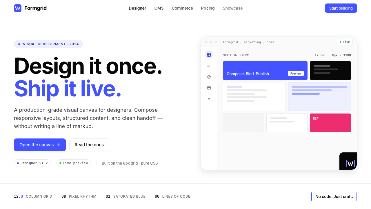
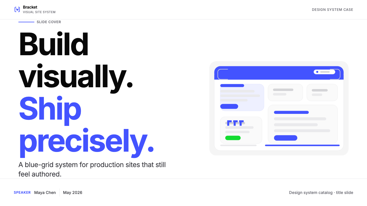
Electric Blue Dominance电光蓝主导
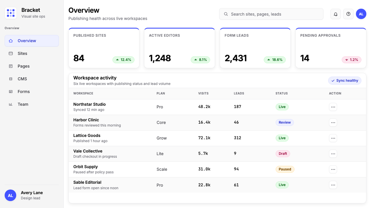
The central color in the Webflow palette is a highly saturated electric blue — vivid, confident, and distinctly non-corporate in its brightness. It appears on calls to action, interactive elements, and brand hero moments with an intensity that reads as both technological and editorial. The blue is not a safe mid-tone but a deliberate signal of the platform's identity: bright enough to arrest attention, saturated enough to carry weight against the white ground that surrounds it. All other colors in the system defer to it.Webflow 色板的核心是一种高度饱和的电光蓝——鲜亮、自信,在明度上带着一种明显非企业感的锐利。它出现在行动召唤、交互元素和品牌主视觉的关键时刻,以一种既有科技感又有编辑气质的强度出场。这不是一个保险的中性调,而是一种刻意的品牌信号:亮到足以截住视线,饱和到足以在周围纯白底面上稳住重量。系统中所有其他颜色都向它让步。
Pure White Grounds纯白底面
Webflow compositions are built on pure white grounds — not cream, not off-white, not light grey. The white is clean and total, functioning as a kind of infinite canvas that gives every element maximum definition. Against this white, the electric blue reads at full intensity and the near-black type achieves maximum legibility. White space is not treated as absence but as active compositional element, giving the layouts an open, spacious quality that conveys both confidence and precision.Webflow 的构图建立在纯白底面上——不是奶油色,不是米白,不是浅灰。这种白是洁净而彻底的,像一张无限延伸的画布,赋予每个元素最大程度的清晰轮廓。在这片白面上,电光蓝以完整的强度呈现,接近黑色的文字获得最高可读性。留白不被视为缺席,而是被当作主动的构图元素,赋予版面开阔、宽松的质感,同时传递出自信与精准。
Modernist Sans-Serif Typography现代主义无衬线排印
Typography in the Webflow system is refined, systematic, and tightly tracked. The typeface of choice belongs to the humanist sans-serif family — rational in structure, legible at small sizes, and disciplined in its stroke weight variation. Tracking is tight by default, reinforcing a sense of precision and control. Scale contrast between headline and body levels is pronounced, with headlines commanding architectural scale while body text maintains measured restraint. The typographic system carries most of the visual work: hierarchy, rhythm, and emphasis are established through type alone, without decorative support.Webflow 系统中的字体排印是精炼的、系统性的、紧凑的。所选字体属于人文主义无衬线系列——结构理性,小字号下仍具良好可读性,笔画粗细变化克制有序。字距默认偏紧,强化了一种精准与掌控感。标题与正文之间的尺度对比显著,标题占据建筑般的尺度,正文保持审慎的节制。字体系统承担了大部分视觉工作——层级、节奏与强调全部通过文字本身建立,无需装饰的辅助。
Abstract Block-Grid Compositions抽象网格分块构图
Hero sections and feature illustrations in the Webflow aesthetic are built from abstract rectangular blocks arranged in loose grid configurations — evocative of website layouts, design canvases, and UI wireframes, but simplified to near-geometric abstraction. These block-grid compositions appear in varying scales and color distributions, always implying the idea of structured design space without depicting any specific interface literally. They function as metaphors for the platform itself: organized, modular, and open to content.Webflow 美学中的主视觉区和功能示意图,由松散网格排列的抽象矩形色块构成——令人联想到网页布局、设计画布和 UI 线框,却被简化到近乎几何抽象的程度。这些网格分块构图以不同尺度和色彩分布呈现,始终暗示着「结构化设计空间」这一意象,却不具体描绘任何特定界面。它们作为平台本身的隐喻而存在:有组织、模块化、对内容开放。
Crisp UI Mockups as Imagery精确 UI 截图即图像
Where other brands use lifestyle photography or decorative illustration, Webflow uses its own interface as primary visual content. Product mockups — screenshots of the Webflow editor, published websites built on the platform, and dashboard views — are presented with precision and pride, treated as design objects in their own right. They are cropped deliberately, framed with generous white space, and often shown at angles that emphasize their geometric quality. The message is implicit: the tool's output is the most compelling thing the brand can show.在其他品牌使用生活方式摄影或装饰性插图的地方,Webflow 以自己的界面作为主要视觉内容。产品截图——Webflow 编辑器界面、用该平台发布的网站、仪表板视图——以精准和自豪的姿态呈现,被当作独立的设计对象对待。它们被有意裁剪,以充足的留白框住,常以强调几何感的角度展示。这个信息是隐含的:工具的产出,是这个品牌最有说服力的展示。
Restrained Accent Colors克制的强调色
Beyond the electric blue, white, and near-black that constitute the core system, Webflow uses a warm pink and a fluorescent green as secondary accents. These colors appear sparingly — in celebration animations, milestone graphics, special campaigns — and their rarity gives them weight when they do appear. The discipline is notable: the brand resists the temptation to deploy secondary colors across general interface contexts, reserving them for moments where a departure from the core palette itself carries communicative meaning.在构成核心系统的电光蓝、白色和接近黑色之外,Webflow 以一种暖粉和一种荧光绿作为次级强调色。这些颜色出现得极为稀少——用于庆祝动画、里程碑图形、特殊活动——正是这种稀缺性赋予了它们在出场时的分量。这种自律是值得注意的:品牌克制住了在常规界面语境中部署次级色彩的冲动,将它们保留给那些「偏离核心色板本身就具有传达意义」的时刻。
Structural White Space结构性留白
White space in Webflow layouts is not a byproduct of sparse content — it is a structural decision made with deliberateness. Margins are wide and consistent. Elements do not crowd each other. Section breaks are established by space rather than lines or dividers. This spatial generosity creates a sense of precision and intentionality: nothing is crammed, nothing is accidental. The layouts model the very quality of design thinking the platform enables — considered, breathing, organized.Webflow 版面中的留白不是内容稀少的副产品,而是经过深思熟虑的结构性决定。边距宽阔而一致,元素之间互不拥挤,段落分隔由空间而非线条或分割符建立。这种空间上的慷慨制造出一种精准与刻意感:没有任何东西是被塞进去的,没有任何东西是偶然的。这些版面示范了这个平台所赋能的设计思维品质——经过考量、有呼吸空间、组织有序。
See the Webflow No-Code design system查看 Webflow No-Code 完整设计系统
Who shaped Webflow No-Code?谁塑造了 Webflow No-Code?
As co-founder and long-serving CEO of Webflow, Vlad Magdalin shaped the platform's core premise and, by extension, the aesthetic philosophy embedded in its brand. His conviction that designers should have direct control over production-quality web output — without engineering intermediaries — drove every major product and identity decision. Magdalin's background in design-adjacent engineering gave him a particular sensitivity to the visual quality of tools, and the refined, anti-compromise aesthetic of the Webflow brand reflects that sensibility directly.作为 Webflow 联合创始人和长期 CEO,Vlad Magdalin 塑造了平台的核心前提,进而也塑造了嵌入其品牌中的审美哲学。他的信念——设计师应当对生产级网页产出拥有直接控制权,无需工程师居中传话——驱动了每一个重大产品与识别决策。Magdalin 兼具设计敏感度的工程背景,使他对工具的视觉品质有着特别的感知力,Webflow 品牌那种精炼的、拒绝妥协的美学直接反映了这种感知。
Vlad's brother Sergie Magdalin served as a co-founder and early creative director, responsible for much of Webflow's initial visual identity and the design language that would later be refined into the current system. His background as a designer — as opposed to a developer — was central to the team's ability to build a product that genuinely looked and felt like a designer's tool. The visual precision and aesthetic coherence that define Webflow's brand personality trace back to his early influence on the product's look and feel.Vlad 的兄弟 Sergie Magdalin 作为联合创始人兼早期创意总监,主导了 Webflow 早期大量视觉识别工作,以及后来被精炼为现有系统的设计语言。他的设计师背景——而非开发者背景——对团队打造一个真正在外观与感受上像设计师工具的产品至关重要。定义 Webflow 品牌个性的视觉精准与审美自洽,可以追溯到他对产品外观早期的深刻影响。
The third co-founder, Bryant Chou, provided the engineering architecture that made the Webflow premise possible — a platform that could accept visual design input and produce high-quality semantic code output. His technical decisions, particularly around how Webflow models CSS and layout in its visual editor, created the conditions under which the brand's clean, grid-rigorous aesthetic could be used to build real production websites. Without the technical integrity Chou established, the brand's visual promises would have been hollow.第三位联合创始人 Bryant Chou 提供了使 Webflow 前提成为可能的工程架构——一个能够接受视觉设计输入并产出高质量语义化代码的平台。他的技术决策,尤其是关于 Webflow 如何在可视化编辑器中建模 CSS 和布局的决策,创造了让品牌那种干净、严格遵守网格的美学真正用于构建生产级网站的条件。若没有 Chou 所奠定的技术完整性,品牌的视觉承诺将会是空洞的。
Webflow's visual identity did not emerge in isolation — it was shaped by and contributed to the broader no-code movement of the 2010s and 2020s. This movement, which encompassed tools for building apps, databases, automations, and websites without writing code, developed its own aesthetic conventions: clean interfaces, systematic design, and a visual language that communicated both approachability and professional power. Webflow's particular contribution was demonstrating that no-code could produce output indistinguishable from hand-coded work in terms of quality, a proof that the brand's refined aesthetic was specifically engineered to make visible.Webflow 的视觉识别并非在真空中生成——它由 2010 年代和 2020 年代更广泛的无代码运动所塑造,也反过来塑造了这场运动。这场运动囊括了用于构建应用、数据库、自动化和网站的各类工具,发展出了自己的美学惯例:干净的界面、系统化的设计,以及同时传递「亲切可近」与「专业实力」的视觉语言。Webflow 特有的贡献是证明了无代码能够产出在质量上与手写代码无从区分的成果——而这个证明,正是品牌精炼美学被专门设计出来加以彰显的核心目的。
How do you use Webflow No-Code today?今天怎么用 Webflow No-Code?
The Webflow No-Code aesthetic is a highly coherent design system, which makes it both powerful and specific: it rewards consistent application and punishes selective borrowing. Before applying it, the essential question is whether the product or communication benefits from the associations the style carries — technological authority, design-forward thinking, professional-grade precision. Landing pages for SaaS tools, design portfolios, digital product launches, and technology editorial content all sit naturally in the style's territory.Webflow No-Code 美学是一套高度自洽的设计系统,这使它既有力量又具特殊性:一致的应用会得到回报,选择性的借用则会带来惩罚。应用它之前,核心问题是:这个产品或传播内容,是否能从这种风格所承载的联想中获益——技术权威感、设计师思维、专业级精准。SaaS 工具的落地页、设计作品集、数字产品发布、科技类编辑内容,都自然地落在这种风格的领地之内。
For presentation slides, the style works best on covers and section dividers that adopt its compositional logic wholesale. A cover built in this aesthetic centers on the electric blue as a hero color — not as a background wash but as a deliberate anchoring element against white. Abstract block-grid shapes, assembled loosely, suggest the platform's structural metaphor and provide visual interest without requiring illustration. Typography handles hierarchy: one oversized headline in a humanist sans-serif, a tight subtitle two levels below it, nothing else on the slide. Data slides lean into diagrammatic precision — clean bar charts with bars filled in the core blue, pie segments distinguished by the blue and near-black only, with labels in tight type directly adjacent to the elements they name.在演示文稿中,这种风格最适合整体采用其构图逻辑的封面和章节分隔页。在这套美学中打造的封面,以电光蓝作为主角色——不是作为背景铺底,而是作为纯白底面上刻意的锚定元素。松散组合的抽象网格分块暗示平台的结构隐喻,提供视觉趣味而不需要借助插图。字体处理层级关系:一个超大标题以人文主义无衬线字体书写,一个紧凑的副标题在两级之下,幻灯片上不再有其他元素。数据页以示意图式的精准度呈现——干净的柱状图,柱条填充核心蓝色;饼图扇区仅用蓝色与接近黑色区分,标注以紧凑字体直接毗邻所标注的元素。
For web UI — dashboards, pricing tables, feature comparison pages — the style provides a disciplined framework. The approach is grid-first: establish a twelve-column structure, use the full width deliberately, and let structural white space do the work of visual breathing room that padding alone cannot achieve. Interactive elements — buttons, toggles, active states — receive the electric blue. Everything static: near-black on white. Card components in this style should have crisp, defined borders or hard-offset shadows rather than soft-diffuse shadows, preserving the visual vocabulary's flatness and structure. Navigation is typographic and minimal — no icon-only navigation, no decorative flourishes.在网页 UI 方面——仪表板、定价表、功能对比页——这种风格提供了一套有纪律的框架。方法是网格优先:建立十二列结构,有意识地使用全幅宽度,让结构性留白完成单靠内边距无法实现的视觉呼吸工作。交互元素——按钮、开关、激活状态——采用电光蓝。所有静态元素:纯白底面上的接近黑色文字。这种风格中的卡片组件应有清晰轮廓的边框或硬边偏移投影,而非柔和漫射投影,以保持视觉词汇的平面性与结构感。导航以字体为主、极度精简——不使用纯图标导航,不使用任何装饰性细节。
For editorial and marketing contexts — feature announcement posts, case study pages, newsletter headers, social cards — the style's poster-like boldness comes into full expression. Full-width content blocks alternate between white-ground and blue-ground, with the blue sections reversed out in white type. Pull quotes and statistics get oversized typographic treatment, commanding architectural scale against white space. When a campaign requires a secondary accent — celebrating a product milestone, for instance — the warm pink or fluorescent green can appear sparingly, always as a single departure rather than an additional palette layer.在编辑与营销语境中——功能发布公告、案例研究页面、通讯标头、社交卡片——这种风格海报般的大胆感得到充分表达。全宽内容区块在白底和蓝底之间交替,蓝底部分以反白文字呈现。引用语和关键数字获得超大号字体处理,在留白上展现建筑般的尺度。当某个活动需要次级强调色——例如庆祝产品里程碑——暖粉或荧光绿可以稀少地出现,始终作为单次偏离而非新增的色板层次。
The most common mistake when applying this aesthetic is confusing its confidence with permission for complexity. The style's power comes from reduction: one dominant color, one typeface family, one compositional logic applied consistently. Designers who add a second typeface, introduce soft shadows alongside hard ones, or deploy the secondary accent colors in general interface contexts will find that the coherence dissolves rapidly. The electric blue is also frequently misapplied by being used everywhere — on backgrounds, icons, body text, and calls to action simultaneously. In the authentic system, the blue is rare enough that its appearance registers as meaningful. Keeping it on no more than one or two elements per composition is essential to preserving its signal value.应用这套美学时最常见的错误,是将它的自信误解为允许复杂性的许可证。这种风格的力量来自于削减:一种主导色、一个字体家族、一套构图逻辑,持续一致地应用。当设计师添加第二种字体、将柔和投影与硬边投影混用,或在常规界面语境中部署次级强调色,会发现自洽感迅速瓦解。电光蓝也经常被误用——同时出现在背景、图标、正文和行动召唤上。在真实的系统中,蓝色出现得足够稀少,它的出现才能被读取为有意义的信号。每个构图中将它控制在不超过一到两个元素上,是维持其信号价值的关键。
See the Webflow No-Code design system查看 Webflow No-Code 完整设计系统
Webflow No-Code — FAQWebflow No-Code · 常见问题
Is the Webflow aesthetic the same as generic SaaS design?Webflow 美学和通用 SaaS 设计风格是一回事吗?
They overlap but are distinct. Generic SaaS design of the 2020s tends toward soft gradients, rounded cards with diffuse shadows, illustrated characters, and a wide palette of semi-saturated accent colors. Webflow's aesthetic is considerably more rigorous: harder geometry, a near-monochromatic core palette centered on one electric blue, typographic hierarchy doing work that illustration handles in softer SaaS brands, and a categorical rejection of soft shadows and gradient fills. The Webflow look is designer-tool aesthetic, not consumer-tech aesthetic — it assumes a viewer who respects systematic precision and reads absence of decoration as confidence rather than poverty.两者有重叠,但并不相同。2020 年代的通用 SaaS 设计倾向于柔和渐变、带漫射投影的圆角卡片、插图人物角色,以及一套宽泛的半饱和强调色。Webflow 的美学要严格得多:更硬朗的几何感,以一种电光蓝为核心的近乎单色系色板,靠排印层级完成软性 SaaS 品牌依赖插图来完成的视觉工作,以及对柔和投影和渐变填充的彻底拒绝。Webflow 的面貌是设计师工具美学,而非消费科技美学——它预设观看者会尊重系统性的精准,并把缺少装饰读取为自信,而非匮乏。
Can this style work for non-tech products and brands?这种风格适用于非科技类产品和品牌吗?
It can, but the fit requires deliberate evaluation. The Webflow aesthetic carries strong associations with technological precision, visual professionalism, and systematic thinking — values that transfer well to architecture firms, high-end creative agencies, professional tools of any kind, and educational platforms aimed at practitioners. It works less naturally for products that rely on sensory warmth, cultural specificity, or emotional softness: food brands, hospitality, children's products, wellness, or any context where users need to feel welcomed before they feel impressed. The diagnostic question is whether the brand's authority comes from being rigorous or from being warm. If rigorous, the style fits. If warm, it will likely read as cold.可以,但是否合适需要认真评估。Webflow 美学携带着与技术精准、视觉专业主义和系统性思维密切相关的联想——这些价值观很好地迁移到建筑事务所、高端创意代理机构、任何类型的专业工具,以及面向从业者的教育平台。它不那么自然地适用于依赖感官温度、文化特殊性或情感柔软度的产品:食品品牌、酒店与餐饮、儿童产品、健康领域,或任何用户需要先感到被欢迎才会感到被震撼的语境。诊断问题是:这个品牌的权威感来自严格,还是来自温暖?如果是严格,这种风格合适;如果是温暖,它很可能会被读取为冷漠。
How should the electric blue be used — as background, accent, or type?电光蓝应该如何使用——作为背景色、强调色,还是文字颜色?
Primarily as accent and interactive signal, not as type color or general background fill. In the Webflow system, the blue appears on primary calls to action, brand hero moments, and selected feature highlights — it is the color that fires when something demands attention or invitation. Using it as type color makes most content harder to read and dilutes the blue's signal power. Using it as a full-page background works only for deliberate feature sections — an alternate color field, not a default ground. The most effective deployments give the blue a single, prominent role per composition and let white carry the rest of the page.主要作为强调色和交互信号,而非文字颜色或常规背景填充。在 Webflow 系统中,蓝色出现在主要行动召唤、品牌主视觉时刻和特定功能高亮处——它是当某件事需要引起注意或发出邀请时才触发的颜色。将它用作文字颜色会使大部分内容更难阅读,并稀释蓝色的信号能量。将它用作整页背景,只适用于刻意设置的功能区块——作为交替的色彩场,而非默认底面。最有效的用法是在每个构图中给蓝色一个单一、突出的角色,让白色承载页面其余部分。
Does this aesthetic work in dark mode?这套美学在深色模式下有效吗?
Dark mode presents genuine challenges for this aesthetic. The system was designed around the tension between electric blue and pure white — a tension that reverses unpredictably on dark grounds. On a very dark background, the electric blue can either dominate aggressively or appear to recede depending on its saturation level, and the tight typographic tracking that reads as refined on white can become claustrophobic on dark. A dark variant works best when the near-black ground is used as a deliberate brand moment — a hero section or campaign, not a persistent app theme. In that context, reducing typographic density, introducing more white space, and using the electric blue more sparingly than in light mode preserves the style's structural logic without fighting the reversal.深色模式对这套美学构成真正的挑战。这个系统是围绕电光蓝与纯白之间的张力设计的——而这种张力在深色底面上的反转是难以预测的。在非常深的背景上,电光蓝可能会以攻击性的方式主导全局,也可能会根据其饱和程度显得退缩,而在白底上读起来精炼的紧凑字距,在深色底上可能变得压抑憋闷。深色变体最有效的用法是将接近黑色的底面作为刻意的品牌时刻——一个主视觉区或活动,而非持续的应用主题。在这种语境下,降低字体密度、引入更多留白,并比浅色模式更节制地使用电光蓝,能够在不对抗色彩反转的前提下保留这种风格的结构逻辑。
What is the most important single rule to follow when applying this aesthetic?应用这套美学时,最重要的单一原则是什么?
Commit to white space above all else. The Webflow aesthetic can survive a less-than-perfect typeface choice, a slightly less saturated blue, or a composition that is not quite as bold as the canonical examples. What it cannot survive is crowding. The moment elements begin competing for territory — when type is too close to an image, when cards are packed edge to edge, when the grid's columns are all occupied simultaneously — the style's central quality, its sense of confident, considered precision, collapses. In a crowded layout, the electric blue loses its signal value, the type hierarchy becomes noise, and the block-grid compositions read as clutter rather than structure. Give everything room, and the rest of the system falls into place.将留白置于一切之上。Webflow 美学可以承受一个不够完美的字体选择、一种稍欠饱和的蓝色,或者一个不及典范案例那般大胆的构图。但它无法承受拥挤。当元素开始争夺空间的那一刻——当文字与图像靠得太近,当卡片紧挨着边缘堆放,当网格列被同时占满——这种风格的核心品质,那种自信、经过思考的精准感,就会崩塌。在拥挤的版面中,电光蓝失去了信号价值,字体层级变成噪音,网格分块构图读起来像杂乱堆砌而非结构组织。给每个元素足够的空间,系统的其余部分自然会落入正确的位置。
Related design styles相关设计风格
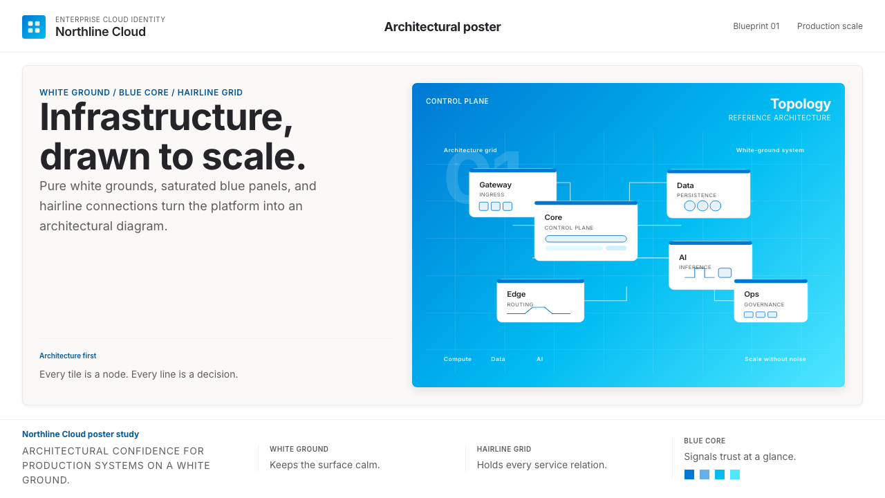 Microsoft AzureEnterprise calm, sharply diagrammed. White ground, saturated blue, hairline l…企业气质很稳。白底、饱和蓝和细线构成架构图。
 Adobe Creative CloudUnified, not uniform. Red anchor, white space, and saturated app tiles organi…统一而不单一:红色锚点、留白与高饱和应用方块组织整套工具。
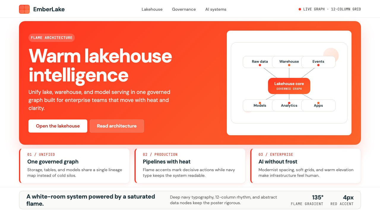 Databricks LakehouseWarm enterprise confidence. Flame red-orange gradients meet DM Sans and clean…温暖的企业信心:红橙火焰渐变配 DM Sans 与洁净数据图。
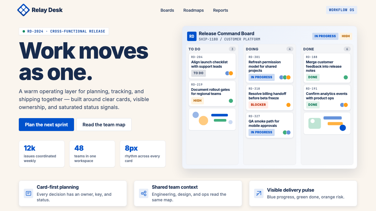 Atlassian Jira BlueWarm enterprise teamwork. Saturated blue cards on cream make status feel huma…温暖的企业协作:奶油底上的饱和蓝卡片,让状态更有人味。
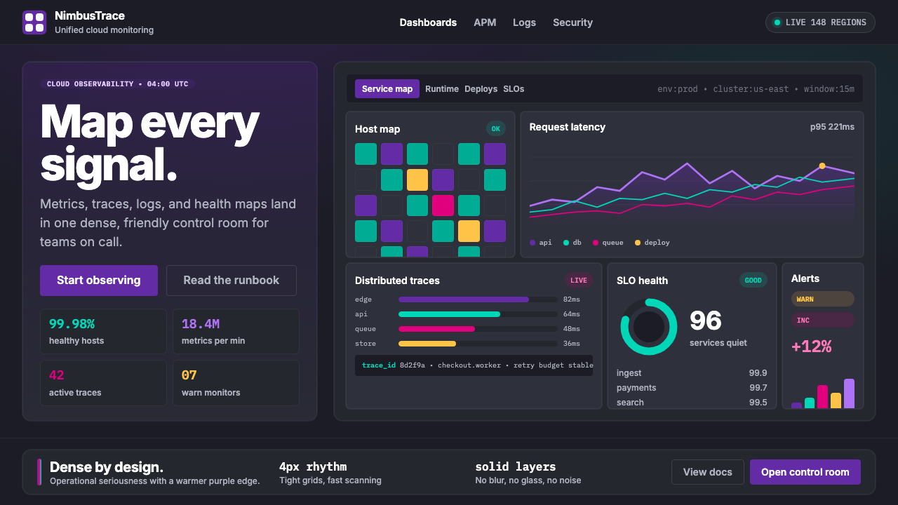 DatadogSerious telemetry, friendly pulse. Purple dark grids pack charts, badges, and…严肃监控也亲近:紫色暗网格塞满图表、徽章与追踪。
 Dropbox ModernFriendly SaaS gets loud. Electric blue and Sharp Sans drive a structured geom…友好 SaaS 变响亮:电蓝与 Sharp Sans 推动几何网格。