What is Microsoft Azure?什么是 Microsoft Azure?
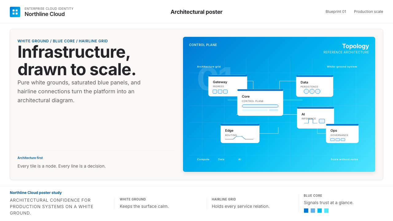
Azure's visual identity speaks the language of infrastructure — saturated cobalt blue on pure white, geometric icons, and hairline connectors that make even the most complex cloud architecture look like a well-reasoned diagram.Azure 的视觉语言是基础设施的语言——纯白底上的饱和钴蓝、几何图标、细如发丝的连接线,让最复杂的云架构看起来都像一张条理清晰的示意图。
Microsoft Azure in briefMicrosoft Azure 速览
Microsoft Azure is the enterprise-cloud visual identity developed by Microsoft for its global cloud computing platform. Launched in 2010 as Windows Azure and rebranded in 2014, the platform's visual design has evolved into one of the most disciplined and widely recognized corporate technology aesthetics of the current era. The system is built around a single canonical hue — a saturated, slightly cyan-shifted cobalt blue — deployed against pure white grounds with generous whitespace, rounded-rectangle service icons, and thin connecting lines that trace logical relationships between infrastructure components.Microsoft Azure 是微软为其全球云计算平台打造的企业级视觉体系。2010 年以 Windows Azure 之名上线,2014 年更名,历经多年演进,已成为当代最具辨识度的企业科技美学之一。整套体系围绕一种规范色调展开——偏青的饱和钴蓝——铺陈在纯白底面上,配以慷慨的留白、圆角矩形的服务图标,以及勾勒基础设施逻辑关系的细线连接。
The Azure aesthetic speaks directly to its audience of enterprise architects, cloud engineers, and IT decision-makers — not to consumers. Every visual choice reflects this orientation: restraint over warmth, geometric precision over organic illustration, confident whitespace over visual density. The result is a design language that feels authoritative and calm at the same time, communicating that the underlying infrastructure is equally trustworthy.Azure 的视觉语汇直接服务于它的受众——企业架构师、云工程师和 IT 决策者,而非消费者。每一个视觉选择都映射着这种定位:克制而非温暖,几何精准而非有机插图,自信的留白而非视觉密度。由此生成的设计语言同时传达权威与沉静,暗示底层基础设施同样值得信赖。
What separates Azure's visual identity from generic corporate design is its systematic coherence. The icon library — representing hundreds of individual cloud services — follows a unified geometric vocabulary: each service icon lives inside a consistently shaped container, uses the same stroke weight, and occupies the same visual weight within an architecture diagram. This consistency allows engineers to compose detailed technical diagrams that remain visually readable, a quality that directly serves the platform's core use case.将 Azure 视觉识别与一般企业设计区别开来的,是其系统性的整体连贯。代表数百项云服务的图标库遵循统一的几何词汇:每个服务图标居于形状一致的容器内,使用相同的描边粗细,在架构图中占据相同的视觉分量。这种一致性使工程师得以绘制细节丰富的技术示意图,同时保持视觉可读性——这一品质直接服务于平台的核心使用场景。
See the Microsoft Azure design system查看 Microsoft Azure 完整设计系统
Where does Microsoft Azure come from?Microsoft Azure 从何而来?
Microsoft Azure was announced at the Professional Developers Conference in October 2008 and became commercially available in February 2010 under the name Windows Azure. The name change to Microsoft Azure in March 2014 coincided with a broader strategic shift under CEO Satya Nadella, who repositioned Microsoft from a Windows-centric software company into a cloud-first, mobile-first enterprise platform. This reorientation had deep consequences for visual identity: the brand needed to move away from the consumer-facing warmth of Windows and toward the architectural confidence expected by enterprise buyers.微软于 2008 年 10 月的专业开发者大会上发布 Azure 预告,2010 年 2 月以 Windows Azure 之名正式商用。2014 年 3 月更名为 Microsoft Azure,恰与 Satya Nadella 出任 CEO 后微软战略重心转移同步——从以 Windows 为核心的软件公司,转型为云优先、移动优先的企业平台。这一转型对视觉识别产生了深远影响:品牌需要从 Windows 面向消费者的亲和温度中抽离,转向企业采购者所期待的架构师式自信。
The early visual language of Azure was relatively undifferentiated — drawing on the broader Microsoft corporate palette and design conventions of the early 2010s. The decisive refinement came with the sustained investment in what would become the Fluent Design System, a Microsoft-wide design language formalized around 2017 that introduced systematic thinking about light, depth, motion, and material. While Fluent Design served Microsoft's full product portfolio, Azure adapted it with a narrower and more disciplined palette — eliminating the warmer tones and playful illustration styles appropriate for consumer products and amplifying the structured, diagrammatic qualities suited to enterprise infrastructure.Azure 早期的视觉语言尚未充分分化,大体沿用微软整体企业色板与 2010 年代初的通用设计惯例。决定性的精炼发生在 Fluent Design System 的持续投入期——这套覆盖微软全产品线的设计语言在 2017 年前后正式成型,系统性地引入了关于光线、深度、动态与材质的设计思考。Azure 在采纳 Fluent Design 时做了更窄、更严格的筛选:剔除适合消费级产品的暖调与趣味插图风格,强化适合企业基础设施的结构性与示意图品质。
The 2023 introduction of Azure Sans marked the most visible single milestone in the platform's typographic maturity. Azure Sans is a custom typeface developed specifically for the platform, characterized by generous letter-spacing, open apertures, and stroke proportions calibrated for legibility at the small sizes used in interface labels, architecture diagrams, and dense data displays. Its design reflects the specific readability demands of technical communication — where a misread character in a service name or a configuration value carries real consequences — while maintaining the clean, unpretentious tone appropriate to the platform's professional audience.2023 年推出的 Azure Sans 是这套视觉语言在字体排印层面最显眼的单一里程碑。Azure Sans 是专为该平台开发的定制字体,以宽裕的字距、开放的字腔,以及针对界面标签、架构图和密集数据展示等小号使用场景精心校准的笔画比例为特征。其设计回应了技术传达的特殊可读性要求——在服务名称或配置值中读错一个字符,可能带来真实后果——同时保持符合专业受众期待的干净、不张扬的气质。
The Azure icon system — perhaps the most operationally significant part of the visual identity — has grown from a small set of early service icons into a library spanning hundreds of distinct services, each requiring a recognizable visual form while maintaining harmony with the whole. The design team's solution was to establish a strict container system: service icons are organized into color-coded categories, with the icon's primary hue signaling its functional domain. This categorical color logic transforms the icon library from a collection of individual marks into a navigational system, allowing users to read architecture diagrams at a glance and quickly identify service types without reading labels.Azure 图标体系——也许是整套视觉识别中最具操作意义的组成部分——从早期少量服务图标成长为涵盖数百项独立服务的庞大库,每一项都需要有可辨识的视觉形态,同时与整体保持和谐。设计团队的解法是建立严格的容器体系:服务图标按色码归类,图标主色暗示其功能领域。这种类别色彩逻辑将图标库从单个标识的集合,转化为一套导航系统,让用户得以一眼扫读架构图,无需逐一阅读标签就能快速识别服务类型。
What defines the Microsoft Azure look?Microsoft Azure 的视觉特征是什么?
Color色彩
The Azure palette is anchored by a single dominant hue: a deeply saturated cobalt blue that tilts slightly toward cyan — clear and confident without being aggressive. This canonical blue appears on nearly every Azure surface: primary buttons, active navigation states, the platform's wordmark, and the fill of the platform's own hero icon. It is deployed against pure white or very light neutral grounds, with a near-black slate tone reserved for body text and secondary interface elements. Accent colors within the icon system are categorical rather than decorative — they signal service domain rather than create visual interest for its own sake.Azure 色板以单一主导色为锚:一种略偏青的深饱和钴蓝——清澈而自信,却不咄咄逼人。这一规范蓝色出现在几乎每一个 Azure 界面表面:主要按钮、活跃导航状态、平台文字标识,以及平台自身主图标的填充。它铺设在纯白或极浅的中性底面上,接近黑色的板岩调则保留给正文与次级界面元素。图标体系中的强调色是类别性的而非装饰性的——它们传递服务领域,而非单纯制造视觉趣味。
Typography字体排印
Azure's typographic system is built for technical legibility above all else. The custom Azure Sans typeface, introduced in 2023, uses generous letter-spacing and carefully proportioned strokes that remain distinguishable at the small sizes common in interface labels, code snippets, and architecture diagram callouts. The broader Microsoft Segoe family serves as a companion in general interface contexts. Type hierarchies are established through scale and weight contrast rather than decorative treatment — headings are set large and light, body text is set at a comfortable reading size with ample line-height, and data labels are set tight and compact. The overall texture is open, unhurried, and confident.Azure 的排印体系首先服务于技术可读性。2023 年发布的定制字体 Azure Sans 以宽裕的字距和经过精心比例校准的笔画构成,在界面标签、代码片段和架构图标注等小号使用场景中保持字形可辨性。更广泛的 Microsoft Segoe 字体家族在通用界面语境中充当辅助。字体层级通过字号与字重的对比来建立,而非依赖装饰性处理——标题设得大而轻盈,正文以舒适的阅读字号配以充足行高,数据标签则紧凑而密集。整体质感开放、从容、自信。
Geometry and Iconography几何与图标
The Azure icon system is one of the most extensively developed corporate icon libraries in enterprise software. Every service icon is housed within a consistent rounded-rectangle container, giving the entire system a unified silhouette when icons appear at scale in architecture diagrams. Individual icons use simple, readable geometric forms — avoiding pictorial complexity that would become illegible at small sizes. The result is a library where hundreds of distinct marks coexist without visual cacophony, because every mark obeys the same underlying formal grammar.Azure 图标体系是企业软件中开发最为全面的企业级图标库之一。每个服务图标居于统一的圆角矩形容器内,使整套体系在架构图中大规模排布时呈现统一的外轮廓。单个图标采用简洁、可读的几何形态,回避在小尺寸下会丧失可读性的图像复杂度。结果是:数百个各异的标识得以共存而不产生视觉喧嚣,因为每一个标识都服从同一套底层形式语法。
Whitespace and Breathing Room留白与呼吸空间
Generosity with whitespace is one of the most distinctive qualities of the Azure visual language. Architecture diagrams, documentation pages, and the Azure Portal interface all share a commitment to giving each element room to exist independently before being read in relation to its neighbors. This is not minimalism as an aesthetic posture — it is a functional choice. In a context where users regularly work with diagrams containing dozens of connected service icons, visual congestion is a usability failure. Whitespace is load-bearing in the Azure system.慷慨的留白是 Azure 视觉语言最具辨识度的品质之一。架构图、文档页面和 Azure Portal 界面都恪守同一信念:让每个元素在被置于邻近元素的语境中解读之前,拥有独立存在的空间。这不是美学姿态上的极简主义——而是功能性选择。在用户日常处理包含数十个互连服务图标的图表的场景中,视觉拥挤是可用性失败。留白在 Azure 体系中承载着结构重量。
Line Weight and Connectors线重与连接线
Hairline connectors — thin, precise lines linking service icons in architecture diagrams — are one of the most characteristic visual signatures of Azure design. These lines are deliberately slender: their thinness signals that they are relationships, not objects. In the Azure visual vocabulary, thick forms are services and resources; thin forms are connections and flows. This weight hierarchy is applied consistently enough that experienced users internalize it and can read complex diagrams rapidly. The connectors are typically rendered in a neutral mid-gray, ensuring they do not compete with the colored service icons they connect.细如发丝的连接线——在架构图中连接服务图标的纤细精准线条——是 Azure 设计最具特征的视觉签名之一。这些线条刻意纤细:细度本身在传达它们是关系,而非实体。在 Azure 的视觉词汇中,粗形是服务与资源,细形是连接与流向。这套粗细层级被持续稳定地执行,以至于有经验的用户将其内化,得以快速阅读复杂图表。连接线通常以中性的中灰色渲染,确保不与被连接的彩色服务图标竞争视觉注意力。
Depth and Surface深度与表面
Azure's interface aesthetic is largely flat, but not in the severe sense of early flat-design orthodoxy. Subtle surface differentiation — light card backgrounds lifted slightly from the page ground, gentle borders rather than heavy drop shadows — creates the mild spatial layering needed to distinguish interactive components from static content without introducing visual noise. When elevation is used, it is restrained: barely perceptible at a casual glance, but present enough to orient the user. This calibrated approach to depth is part of the Fluent Design lineage and distinguishes Azure from both the purely flat look of earlier enterprise dashboards and the heavily shadowed skeuomorphism it replaced.Azure 的界面美学大体是扁平的,但并非早期扁平设计正统主义那种严苛的扁平。微妙的表面区分——从页面底面轻微浮起的浅色卡片背景、柔和的边框而非厚重的投影——制造出恰到好处的空间层次,足以将可交互组件与静态内容区别开来,而不引入视觉噪音。当高度差被使用时,是克制的:随意浏览时几乎察觉不到,但存在得足以为用户定向。这种经过校准的深度处理是 Fluent Design 传承的一部分,将 Azure 与早期企业仪表板的纯扁平外观,以及它所取代的厚重拟物风格同时区别开来。
Grid and Structural Discipline网格与结构纪律
Azure documentation, marketing pages, and interface screens share a strong underlying grid discipline. Content is organized into clean columns with consistent gutters; sections are separated by whitespace rather than decorative dividers; data is presented in well-structured tables and cards rather than freeform prose. This structural rigor reflects the platform's audience: engineers and architects who work in environments where spatial precision carries meaning. A misaligned column in an Azure architecture diagram is not an aesthetic failure — it is potentially a logical error. The grid is not decoration; it is communication.Azure 的文档、营销页面和界面屏幕共享一套强健的底层网格纪律。内容以一致间距的整洁列组织;各节之间以留白分隔,而非装饰性分割线;数据以结构良好的表格和卡片呈现,而非自由散文。这种结构严格性反映了平台的受众:在空间精准度承载语义的环境中工作的工程师和架构师。Azure 架构图中一列错位,不是美学失误——而可能是一个逻辑错误。网格不是装饰,它是传达。
See the Microsoft Azure design system查看 Microsoft Azure 完整设计系统
Who shaped Microsoft Azure?谁塑造了 Microsoft Azure?
Nadella became Microsoft CEO in February 2014, and his tenure transformed the company's strategic identity from a Windows-centric software maker into a cloud-first enterprise platform. The rebranding from Windows Azure to Microsoft Azure occurred in the same month he took office, and his sustained investment in Azure's commercial and technical development made it one of the two dominant global cloud platforms. Nadella's influence on Azure's visual identity is indirect but foundational: his positioning of Azure as a serious enterprise infrastructure brand — not a consumer product — established the strategic direction that the design language had to serve.Nadella 于 2014 年 2 月出任微软 CEO,其任期将公司战略身份从以 Windows 为核心的软件制造商,彻底转型为云优先的企业平台。Windows Azure 更名为 Microsoft Azure 恰在他就任当月完成。他对 Azure 商业与技术发展的持续投入,使其成为全球两大主导云平台之一。Nadella 对 Azure 视觉识别的影响是间接但奠基性的:他将 Azure 定位为严肃的企业基础设施品牌而非消费品,确立了设计语言需要服务的战略方向。
Russinovich joined Microsoft in 2006 after the acquisition of Sysinternals and became Azure's Chief Technology Officer. As one of the most technically visible figures associated with the platform, he has played a significant role in shaping how Azure communicates its technical depth and architectural philosophy to the engineering community. His public presence — through talks, blog posts, and technical deep-dives — has helped establish the platform's reputation for architectural transparency, a quality that the visual design system reinforces through its emphasis on diagrammatic clarity and structural honesty.Russinovich 于 2006 年随 Sysinternals 被收购而加入微软,后成为 Azure 首席技术官。作为与该平台关联最具技术可见度的人物之一,他在塑造 Azure 向工程师社区传达其技术深度与架构哲学的方式上发挥了重要作用。他通过演讲、博客文章和技术深度解析建立的公众形象,帮助确立了平台架构透明的声誉——而视觉设计体系通过对示意图清晰度和结构诚实性的强调,正是对这一声誉的视觉强化。
The Azure design organization — working within the broader Microsoft Design group and in close collaboration with Fluent Design System teams — is responsible for the platform's sustained visual coherence across an extremely complex product surface. The team's output includes the Azure icon system (now spanning hundreds of service icons), the Azure Portal interface, documentation design standards, architecture diagram templates, and the specifications that govern how third-party partners represent Azure services in their own materials. The 2023 Azure Sans typeface is among the team's most visible recent contributions to the platform's maturing visual identity.Azure 设计团队——在微软 Design 大组织内工作,与 Fluent Design System 团队密切协作——负责在极为复杂的产品界面中维持平台持续的视觉连贯性。团队的产出包括 Azure 图标体系(现已涵盖数百个服务图标)、Azure Portal 界面、文档设计规范、架构图模板,以及约束第三方合作伙伴在其自身材料中呈现 Azure 服务方式的规格标准。2023 年发布的 Azure Sans 字体是团队对这套持续成熟的视觉识别体系最具可见度的近期贡献之一。
While not a single person, the Fluent Design System represents the design-language lineage from which Azure's visual identity directly descends. Fluent was Microsoft's response to the need for a coherent cross-platform design language spanning Windows, Office, Xbox, and cloud products. Its core principles — light, depth, motion, material, scale — gave Azure's design team a formal vocabulary to work within, and the subsequent Azure-specific refinements (narrower palette, stronger diagrammatic emphasis, technical typographic standards) represent how that vocabulary was adapted for an infrastructure-facing audience. Understanding Fluent as Azure's parent language is essential to understanding why Azure looks the way it does.Fluent Design System 虽非某一个人,却代表了 Azure 视觉识别直接源出的设计语言谱系。Fluent 是微软对跨平台连贯设计语言需求的回应,覆盖 Windows、Office、Xbox 与云产品。其核心原则——光线、深度、动态、材质、尺度——为 Azure 设计团队提供了可供操作的形式词汇;而此后 Azure 特有的精炼(更窄的色板、更强的示意图强调、技术性排印标准)则代表了这套词汇针对基础设施受众的适配。将 Fluent 理解为 Azure 的母语言,是理解 Azure 为何呈现出现有面貌的关键前提。
How do you use Microsoft Azure today?今天怎么用 Microsoft Azure?
Azure's visual system translates naturally into presentation work, but it requires understanding that the aesthetic's power comes from restraint and structure rather than from decoration. For a slide deck cover, the canonical approach is a dominant field of the platform's deep cobalt blue — occupying most or all of the slide — with the title set in clean, generously spaced type in white. A single geometric icon or simplified architectural motif can anchor the composition without cluttering it. The key discipline: resist adding gradients, glows, or secondary accent colors. The blue field should be flat and confident.Azure 的视觉系统可以自然地移植到演示文稿制作中,但这要求理解:这套美学的力量来自克制与结构,而非装饰。对于幻灯片封面,规范做法是以平台标志性的深钴蓝占据大部分或全部页面,标题以干净、字距宽裕的白色字体叠印其上。单个几何图标或简化的架构母题可以锚定构图而不造成拥挤。关键纪律:抵制添加渐变、光晕或次级强调色的冲动。蓝色底面应当是平整而自信的。
For content slides, the Azure approach treats each slide as a diagram surface. Text hierarchies are established through size and weight contrast alone — no decorative rules or colored label backgrounds needed. When data appears, it should be handled with the same diagrammatic logic as an architecture chart: bar and line charts rendered as clean geometric objects, with the canonical blue reserved for the primary data series and neutral tones for secondary series. Tables benefit from alternating row tints in very light neutral values rather than aggressive banding. Throughout, whitespace is a structural element, not empty space to be filled.对于内容页幻灯片,Azure 的做法是将每张幻灯片视为一个图表界面。文字层级仅通过字号与字重的对比来建立——不需要装饰性分割线或彩色标签背景。当数据出现时,应以与架构图相同的示意图逻辑处理:折线图与柱状图以干净的几何形呈现,规范蓝色保留给主数据系列,中性调用于次要系列。表格适合以极浅的中性值交替着色行,而非激进的条纹。自始至终,留白是结构性元素,不是待填充的空白。
For web UI work — particularly dashboards, cloud service pricing pages, and developer portals — the Azure language is exceptionally well-suited. The grid should be strict and consistent; the background ground should be a very light neutral approaching white; body text should sit in a dark near-black. Interactive states — hover, focus, active — are signaled by the canonical blue, which provides immediate and unambiguous affordance cues. Card components should use thin borders or very subtle elevation rather than heavy shadows. Navigation elements should be typographic and understated, with icon use limited to the service-icon context where categorical meaning is needed.在网页 UI 工作中——尤其是仪表板、云服务定价页和开发者门户——Azure 语言极为适用。网格应当严格一致;页面底面应当是接近白色的极浅中性色;正文应当以深色近黑色呈现。交互状态——悬停、聚焦、激活——以规范蓝色传达,提供即时且无歧义的可供性线索。卡片组件应使用细边框或极微妙的高度差,而非厚重投影。导航元素应当是排印性的、低调的,图标使用仅限于需要类别意义的服务图标语境。
In editorial and marketing applications — product announcements, whitepapers, technical blog posts, event materials — Azure's aesthetic supports strong information hierarchy without feeling promotional. Feature sections work well in a two-column grid alternating a visual element (an architecture diagram, an icon cluster, a clean product screenshot) with explanatory text. Section breaks are marked by whitespace or a thin rule, never by decorative ornaments. Color is used sparingly: the canonical blue for interactive calls to action, a very light blue tint for background differentiation between sections, and neutral tones for everything else. Marketing headlines should be set large and confident, not playful.在编辑与营销应用中——产品公告、白皮书、技术博客、活动材料——Azure 的美学支持强劲的信息层级,同时不显得过于促销。特性介绍段落适合在双栏网格中交替排布视觉元素(架构图、图标集群、干净的产品截图)与说明文字。各节分隔以留白或细线标记,绝不用装饰性饰物。色彩使用克制:规范蓝用于交互行动号召,极浅的蓝色调用于各节背景区分,其余皆用中性调。营销标题应当设得大而自信,而非俏皮轻浮。
A common mistake when applying the Azure aesthetic is treating the canonical blue as a general-purpose accent color and scattering it across every interactive and decorative element simultaneously. In authentic Azure design, the blue is reserved primarily for primary actions, active states, and categorical signaling in the icon system. When blue appears everywhere, it loses its navigational meaning and becomes wallpaper. A second frequent error is using the rounded-rectangle icon container style for non-Azure-service content, which imports a technical, diagrammatic register into contexts that call for something warmer or more narrative. The Azure system works best when its diagrammatic vocabulary is applied where diagrammatic logic actually applies — infrastructure, data, and technical decision contexts — and stepped back from where it does not.应用 Azure 美学时最常见的错误,是将规范蓝作为通用强调色,同时散布于每一个交互与装饰元素上。在真实的 Azure 设计中,蓝色主要保留给主要操作、活跃状态和图标体系中的类别信号。当蓝色无处不在时,它便丧失了导航意义,沦为背景壁纸。另一个频繁出现的错误是将圆角矩形图标容器样式应用于非 Azure 服务内容,这会把技术性、示意图式的语域引入需要更温暖或更叙事性表达的语境中。Azure 体系在其示意图词汇真正适用的地方表现最佳——基础设施、数据和技术决策语境——而在这些场景以外,则应适度收手。

See the Microsoft Azure design system查看 Microsoft Azure 完整设计系统
Microsoft Azure — FAQMicrosoft Azure · 常见问题
How does Azure's visual style relate to the broader Microsoft design language?Azure 的视觉风格与微软更广泛的设计语言是什么关系?
Azure's visual identity descends directly from Microsoft's Fluent Design System, which serves as the parent language for all Microsoft products. However, Azure applies Fluent with a significantly narrower and more disciplined palette than consumer-facing products like Windows or Microsoft 365. Where consumer products use Fluent's full expressive range — including warmer tones, softer surfaces, and more illustrative visual elements — Azure strips these back in favor of the structured, diagrammatic, and architecturally rigorous qualities appropriate to an enterprise infrastructure platform. Think of Azure's visual language as Fluent Design with the warmth reduced and the precision amplified.Azure 的视觉识别直接源自微软的 Fluent Design System——这套语言是微软全产品线的母语言。然而,Azure 对 Fluent 的应用,比 Windows 或 Microsoft 365 等面向消费者的产品更窄、更严格。消费级产品使用 Fluent 的完整表现范围——包括更暖的色调、更柔和的表面和更具插图性的视觉元素——Azure 则将这些大幅收敛,以换取适合企业基础设施平台的结构性、示意图性与架构严谨性。可以这样理解 Azure 的视觉语言:Fluent Design 去除了温度、放大了精度。
Why does Azure rely so heavily on a single dominant blue rather than using a richer color palette?Azure 为何如此依赖单一主导蓝,而不使用更丰富的色彩系统?
The reliance on a single canonical blue is both strategic and functional. Strategically, a single dominant color creates immediate brand recognition — the Azure blue is now as strongly associated with enterprise cloud infrastructure as any color in the technology sector. Functionally, restricting the primary palette to one assertive hue and deploying additional colors only for categorical purposes in the icon system means that color always carries meaning rather than being decorative. In complex architecture diagrams containing dozens of service icons, a color-rich palette would create visual chaos; a single dominant hue with categorical accent colors creates a readable system.对单一规范蓝的依赖既是战略选择也是功能选择。从战略层面,单一主导色创造即时的品牌识别度——Azure 蓝如今与企业云基础设施的关联强度,已在科技行业的色彩中无出其右。从功能层面,将主色板限制为一种强势色调、仅在图标体系中将附加色用于类别目的,意味着色彩始终承载意义而非充当装饰。在包含数十个服务图标的复杂架构图中,色彩丰富的色板会制造视觉混乱;单一主导色配以类别性强调色,则生成一套可读的系统。
Can Azure's aesthetic work for dark-mode or dark-background interfaces?Azure 的美学能用于深色模式或深色背景界面吗?
Yes, and Azure Portal itself includes a dark theme as a user-selectable option. Dark-mode Azure applies the same structural principles on a very dark near-black ground: the canonical blue retains its primary interactive role, text shifts to a light near-white, and the icon system maintains its color categories with brightness adjustments for contrast. The key challenge in dark-mode Azure is maintaining the same sense of spaciousness and clarity that the light version achieves — dark surfaces tend to compress perceived space. The solution is to be even more disciplined with whitespace (or dark-space) and to avoid introducing additional colors beyond the canonical blue and strict neutrals.可以,Azure Portal 本身就提供深色主题作为用户可选项。深色模式的 Azure 在接近纯黑的深色底面上应用相同的结构原则:规范蓝保留其主要交互角色,文字转为接近纯白的浅色,图标体系在亮度调整以保证对比度的前提下维持其色彩类别。深色模式 Azure 的关键挑战是维持浅色版本所实现的宽敞感与清晰感——深色表面倾向于压缩感知空间。解法是对留白(或深色空间)保持更严格的纪律,并避免在规范蓝与严格中性调之外引入额外色彩。
How should Azure-style architecture diagrams handle complexity without becoming illegible?Azure 风格的架构图应如何处理复杂度而不失可读性?
The Azure icon and diagramming system addresses complexity through hierarchical grouping and categorical color rather than by reducing the number of elements shown. Service icons are grouped into named boundary boxes — representing resource groups, virtual networks, or logical tiers — that use very light tint fills or simple dashed outlines to indicate membership without visual noise. Within those groups, hairline connectors trace relationships, with directionality indicated by minimal arrowheads rather than decorative elements. The discipline is to use whitespace inside and between groups as generously as the content allows, accepting that a legible diagram may need to span multiple pages rather than compressing everything onto one.Azure 的图标与图表体系通过层级分组和类别色彩来应对复杂度,而非通过减少显示元素数量。服务图标被归入命名的边界框——代表资源组、虚拟网络或逻辑层——这些边界框使用极浅的色调填充或简单的虚线轮廓来指示归属关系,而不引入视觉噪音。在各组内部,细线连接器追踪关系,方向性以最简洁的箭头而非装饰性元素标示。纪律是:在内容允许的范围内,尽量慷慨地在组内和组间使用留白,并接受一张可读的图表可能需要跨越多页,而非将所有内容压缩于一张之上。
Is Azure's visual style suited for non-technical audiences, or does it work only for engineers?Azure 的视觉风格适合非技术受众吗,还是只适用于工程师?
Azure's visual style was designed for a technical and enterprise audience, and it works best in contexts where that audience's values — precision, clarity, structural authority — are what the design needs to communicate. For executive-level presentations about cloud strategy, the style transfers well: the clean, architectural quality reads as competent and trustworthy even to non-technical viewers. Where it struggles is in contexts requiring genuine warmth, consumer-facing storytelling, or emotional resonance — onboarding flows aimed at non-technical end users, consumer marketing campaigns, or community content aimed at developers as people rather than as engineers. In those contexts, leaning fully into the Azure aesthetic without adaptation risks communicating coldness or inaccessibility rather than confidence.Azure 的视觉风格是为技术与企业受众设计的,在那些受众的价值观——精准、清晰、结构权威——恰好是设计需要传达的场景中表现最佳。对于关于云战略的高管级演示,这套风格同样适用:干净的架构质感即使在非技术观众眼中也传递出能力与可信赖感。它力有不逮的是需要真实温度、面向消费者叙事或情感共鸣的场景——面向非技术终端用户的新手引导流程、消费者营销活动,或把开发者当作完整的人而非工程师来对话的社区内容。在这些语境中,不加适配地全面沿用 Azure 美学,有可能传达冷漠或距离感,而非自信。
Related design styles相关设计风格
 Webflow No-CodeA designer's tool, dressed like one. Saturated electric cobalt on pure white,…设计师的工具,长得也像:饱和电光蓝落在纯白底上,Inter 紧排,抽象网格分块。
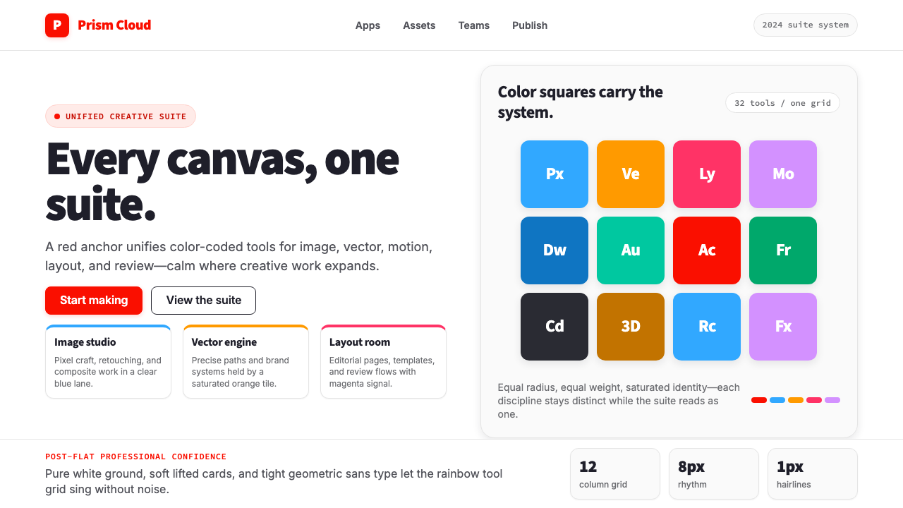 Adobe Creative CloudUnified, not uniform. Red anchor, white space, and saturated app tiles organi…统一而不单一:红色锚点、留白与高饱和应用方块组织整套工具。
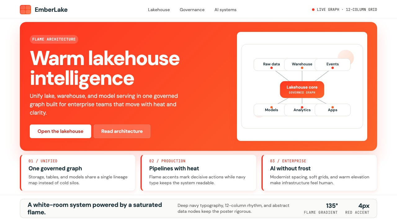 Databricks LakehouseWarm enterprise confidence. Flame red-orange gradients meet DM Sans and clean…温暖的企业信心:红橙火焰渐变配 DM Sans 与洁净数据图。
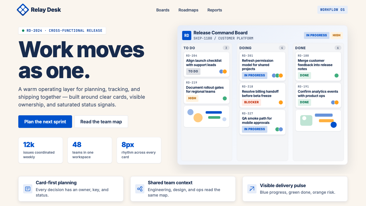 Atlassian Jira BlueWarm enterprise teamwork. Saturated blue cards on cream make status feel huma…温暖的企业协作:奶油底上的饱和蓝卡片,让状态更有人味。
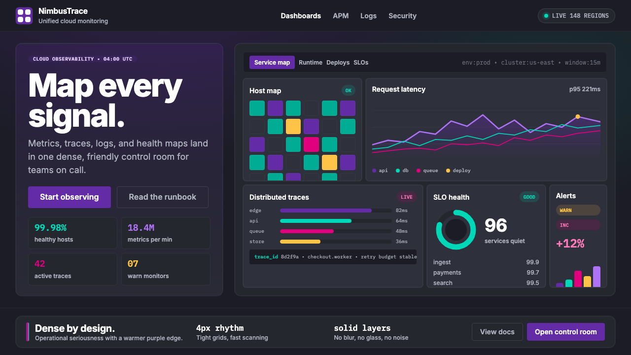 DatadogSerious telemetry, friendly pulse. Purple dark grids pack charts, badges, and…严肃监控也亲近:紫色暗网格塞满图表、徽章与追踪。
 Dropbox ModernFriendly SaaS gets loud. Electric blue and Sharp Sans drive a structured geom…友好 SaaS 变响亮:电蓝与 Sharp Sans 推动几何网格。