About Microsoft Azure
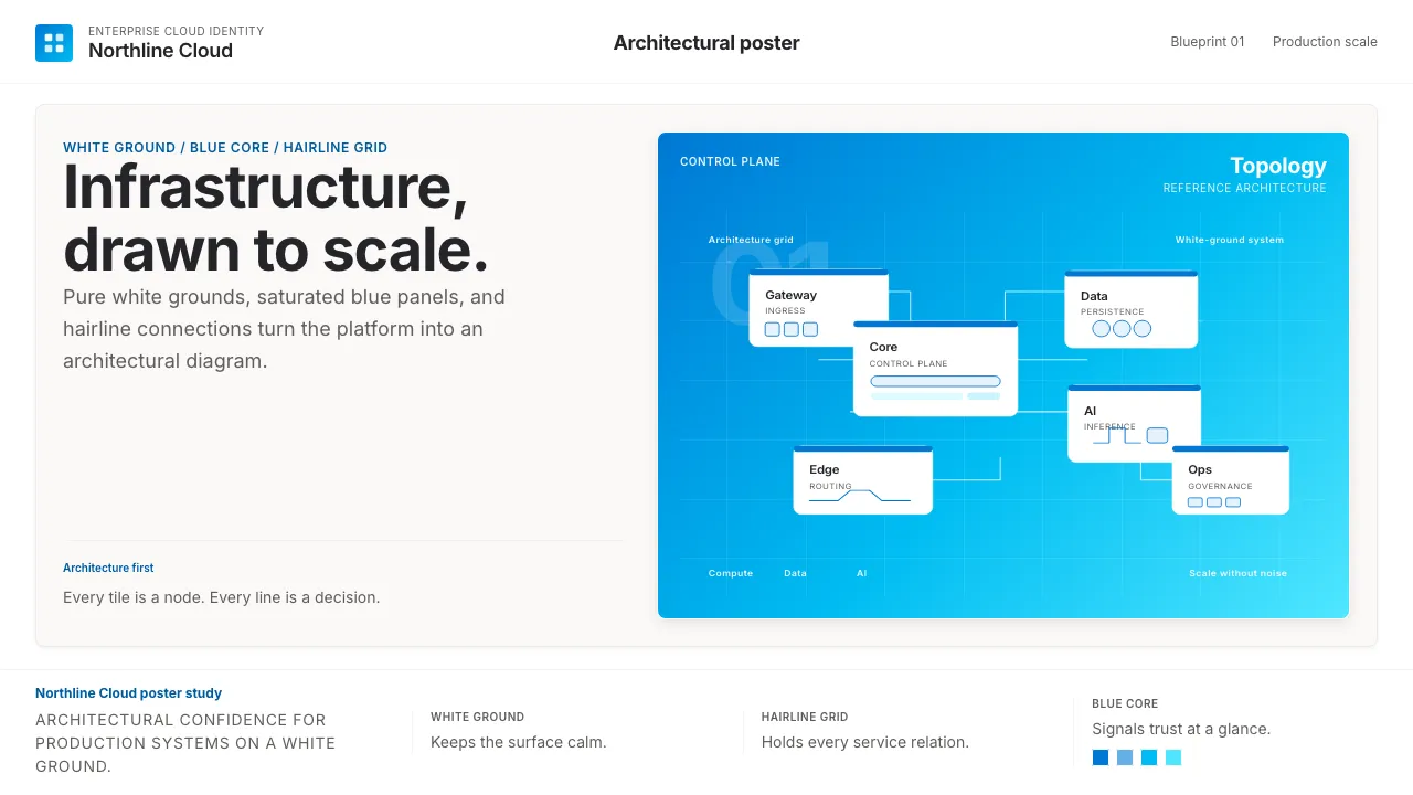
Microsoft Azure is the enterprise-cloud wing of Microsoft — a sober, saturated visual identity built on a single canonical color: Azure-blue #0078D4 on pure white. It speaks to infrastructure architects, not consumers.
The aesthetic is architectural: rounded rectangles, generous whitespace, geometric service-icons connected by hairlines, and Azure Sans set with generous tracking. Confidence comes from restraint and grid discipline, not ornament.
- Origin
- Redmond, USA
- Era
- 2010 founded as Windows Azure; rebranded Microsoft Azure 2014; current visual ~2018–2024; Azure Sans typeface 2023
- Key figures
- Satya Nadella · Mark Russinovich · Microsoft Azure design team
- Movements
- Enterprise cloud platform · Microsoft Fluent Design lineage · Modernist corporate identity
Microsoft Azure design spec
Colors
Background
Surface
Primary
Secondary
Accent
Text
Typography
Azure SansHeadings
Segoe UIBody
Cascadia CodeMono
Unlock for 1 credit
The other 11 sections — buttons, cards, spacing, motion, techniques and more — open once you unlock. Download the DESIGN.md or send it to your AI in one click. Unlock once, yours forever.
Sign up nowHave an account? Sign in
Styles similar to Microsoft Azure
Also inspired by brands & products, with a close feel.
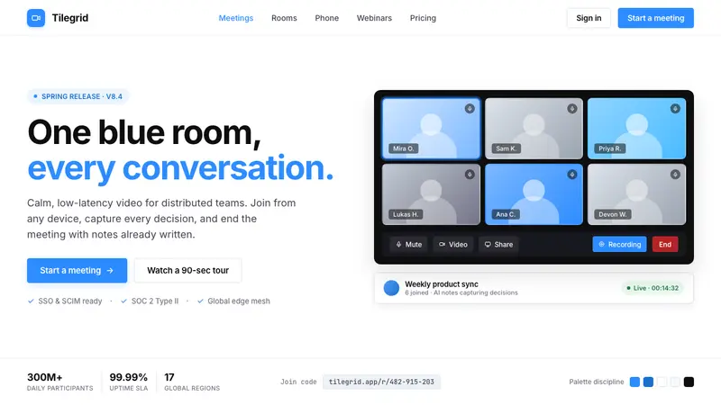 Zoom Meeting BlueRemote work's default discipline. One saturated cobalt on pure white, Inter sans, soft 4px corners.
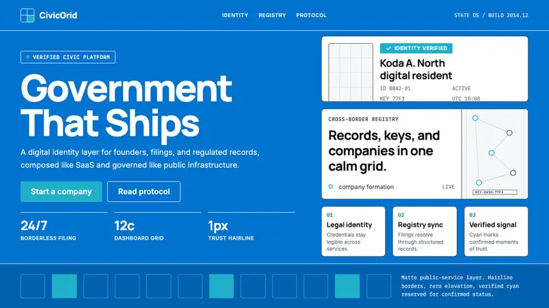 Estonia e-Residency Digital (2014)Trust without weight. Cornflower blue, 12-column grids, and cyan verified signals.
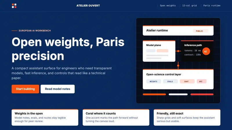 Mistral Le Chat French AIOpen science feels engineered. Navy panels, Inter grids, and coral stripes keep it exact.
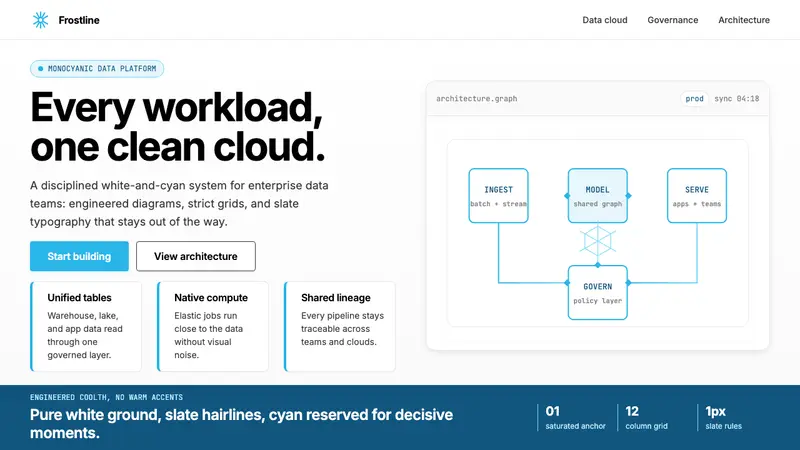 Snowflake Data CloudCool precision wins. Icy cyan, Inter grids, and hex data diagrams stay engineered.