What is Dropbox Modern?什么是 Dropbox Modern?
When Dropbox swapped muted cloud-storage beige for electric blue and bold geometric illustration in 2017, it rewrote what a friendly SaaS brand could look and sound like.2017年,Dropbox用电蓝与大胆几何插画取代了沉闷的云存储米色,重新定义了友好型SaaS品牌的视觉语言。
Dropbox Modern in briefDropbox Modern 速览
Dropbox Modern is the post-2017 visual identity of Dropbox, the cloud-storage and collaboration platform founded in San Francisco in 2007. It was born from a comprehensive brand refresh led by the New York design agency Collins — a deliberate and radical departure from the reserved, utility-first aesthetic that had characterized early cloud-storage software. In its place, the system introduced saturated electric blue, typographically commanding headlines set in a custom geometric sans-serif, and a rich library of abstract geometric illustration that replaced stock photography entirely.Dropbox Modern是Dropbox于2017年后确立的视觉识别体系。Dropbox是2007年在旧金山创立的云存储与协作平台,其品牌全面焕新由纽约设计机构Collins主导完成——这是一次与早期云存储软件那种保守、功能优先审美的彻底决裂。新体系以饱和的电蓝色、由定制几何无衬线字体构成的强势标题,以及一整套取代摄影素材的抽象几何插画库为核心支柱。
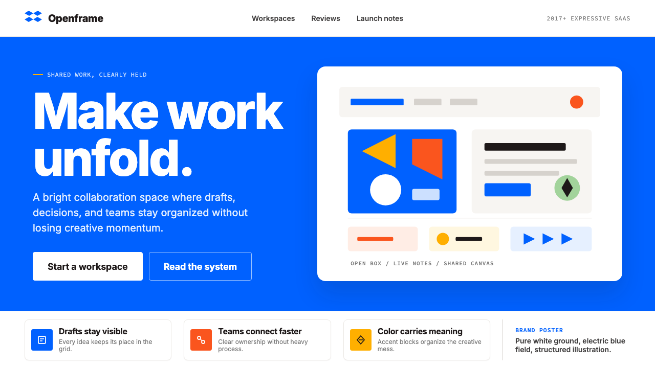
The style pairs a confident corporate-technology backbone with genuine editorial warmth. Pure white grounds dominate, and generous white-space gives each element room to breathe. A structured multi-color secondary palette — warm orange, coral, deep teal, bright yellow, and lime green — provides flexibility without descending into chaos. The open-box logomark, a simple line drawing of a blue box with its lid lifted, acts as connective tissue across every surface: app icons, marketing pages, conference booths, and slide decks. The overall character is direct, luminous, professional but not stiff — a modernist sensibility wearing a friendly face.这套风格将自信的企业科技骨架与真实的编辑温度结合在一起。纯白色底面占主导,充裕的留白让每个元素都有呼吸的空间。一组结构化的辅色阶——暖橙、珊瑚红、深青、亮黄和嫩绿——在不陷入混乱的前提下提供了丰富的表达灵活性。开箱标识作为贯穿所有触点的视觉灵魂,出现在应用图标、营销页面、展台和演示文稿中。整体气质是直率、明亮、专业而不端着——一种穿着友好面孔的现代主义精神。
Crucially, Dropbox Modern is not a minimalist style in the austere sense. It is a maximalist-in-control style: the palette is broad but governed by a clear hierarchy, the illustrations are complex but follow an internally consistent geometric grammar, and the typographic scale is bold but disciplined. Understanding this distinction — structured expressiveness rather than either bare minimalism or undisciplined complexity — is the key to applying it correctly.Dropbox Modern并非苦涩意义上的极简主义风格,而是一种「克制的最大化主义」:色板宽广但层级分明,插画复杂却遵循内部一致的几何语法,字体比例大胆但有纪律。理解这一区别——有结构的表达力,而非赤裸的极简或无序的复杂——是正确运用它的关键。
See the Dropbox Modern design system查看 Dropbox Modern 完整设计系统
Where does Dropbox Modern come from?Dropbox Modern 从何而来?
Dropbox was founded in 2007 by Drew Houston and Arash Ferdowsi as a solution to a problem Houston had experienced personally: forgetting his USB drive and being unable to access his files. The company's early visual identity reflected its startup pragmatism — a simple blue box logo, clean sans-serif type, and an interface aesthetic that prioritized clarity and function over expression. For most of its first decade, Dropbox looked like competent, well-funded utility software: trustworthy and unremarkable.Dropbox由德鲁·休斯顿与阿拉什·费尔多西于2007年创立,灵感来自休斯顿亲身经历的痛点:忘带U盘导致文件无法访问。公司早期的视觉识别折射出其创业阶段的实用主义——一个简单的蓝色方盒标志、干净的无衬线字体,以及一套将清晰和功能置于表达之上的界面美学。在头十年的大部分时间里,Dropbox看起来像一款称职、资金充沛的工具软件:值得信赖,但并不出众。
By 2017, Dropbox was preparing for a public offering and facing a crowded, maturing market. Google Drive, Microsoft OneDrive, and Apple iCloud had commoditized cloud storage as a feature; Dropbox needed to reposition itself as a platform for creative professionals and teams, not merely a folder in the cloud. The company engaged Collins — the agency co-founded by Brian Collins, known for bold, culture-shifting brand work — to conduct a full identity redesign. The brief was not refinement but transformation.到2017年,Dropbox正为上市做准备,同时面对一个拥挤而成熟的市场。谷歌云端硬盘、微软OneDrive和苹果iCloud已将云存储作为一项功能商品化;Dropbox需要将自身重新定位为创意专业人士和团队的协作平台,而不仅仅是「云端的一个文件夹」。公司委托Collins工作室——由布莱恩·柯林斯联合创立、以大胆的文化转型品牌工作著称——完成全面的视觉识别重塑。任务要求不是精修,而是蜕变。
The Collins refresh, unveiled in October 2017, was immediately polarizing. The new identity introduced a much broader and more saturated color palette, replacing the former restrained blue-and-white with a full spectrum anchored by a newly intensified Dropbox blue. The custom typeface, Sharp Sans Display, designed by Lucas Sharp, provided the typographic engine: a geometric sans-serif with rounded details that felt simultaneously rigorous and approachable. Perhaps most controversially, the system abandoned photography entirely in favor of a large library of abstract geometric illustrations created by a roster of artists and illustrators — a decision that made Dropbox visually unlike any other cloud product on the market.Collins于2017年10月揭幕的重塑方案立即引发了两极分化的反响。新的识别系统引入了更宽广、更饱和的色板,用一套以加强版Dropbox蓝为核心的全色谱取代了原来克制的蓝白配色。由卢卡斯·夏普设计的定制字体Sharp Sans Display提供了排印动力:这是一套带有圆润细节的几何无衬线字体,既严谨又亲切。或许最具争议的是,新体系完全放弃了摄影图像,转而采用一批艺术家与插画师创作的抽象几何插画库——这一决定使Dropbox在视觉上与市场上任何其他云产品都截然不同。
The transition was not without friction. Some longtime users found the new look jarring or overly loud. Design commentators debated whether the system was coherent or merely energetic. But in the years that followed, the Dropbox Modern identity proved highly effective as a platform for brand extensions, partnerships, and product lines: it could accommodate Dropbox Paper, HelloSign, DocSend, and Dropbox Spaces while maintaining a recognizable visual family. By the early 2020s, its influence on the broader SaaS design landscape was clear — the generation of product brands that followed borrowed its confidence with color, its commitment to illustration over photography, and its conviction that utility software could have genuine aesthetic character.这一转变并非没有摩擦。一些长期用户觉得新面貌刺眼或过于喧嚣;设计评论者争论这套体系究竟是连贯的还是仅仅充满活力。但在此后数年间,Dropbox Modern识别体系作为品牌延伸、合作伙伴关系和产品线的平台,展现出极高的有效性:它能够容纳Dropbox Paper、HelloSign、DocSend和Dropbox Spaces,同时维持可识别的视觉家族感。到2020年代初,其对更广泛SaaS设计领域的影响已显而易见——随后一代产品品牌借鉴了它对色彩的自信、对插画而非摄影的坚持,以及工具软件同样可以具备真实美学个性的信念。
What defines the Dropbox Modern look?Dropbox Modern 的视觉特征是什么?
Color Hierarchy色彩层级
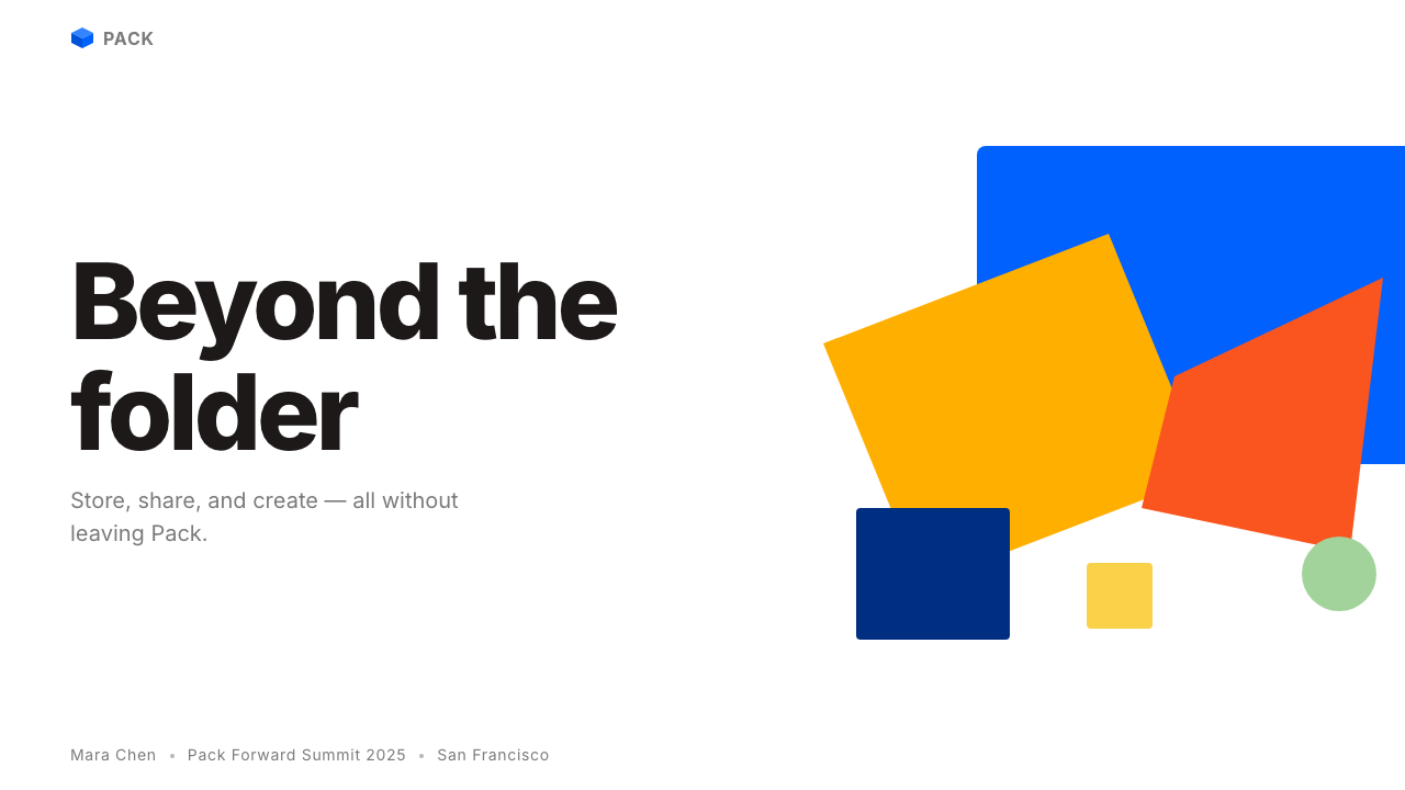
The system is anchored by a single dominant hue — an intense, fully saturated blue that reads as electric rather than corporate — deployed against pure white grounds. This primary blue commands all interactive elements, primary calls to action, and the logomark itself. A structured secondary palette of warm orange, coral, deep teal, bright yellow, and lime green provides variation for illustrations, section accents, and product differentiators, but each secondary color is used in isolation rather than in competition. The effect is a system that feels vibrant and multi-colored at the campaign level while remaining legible and organized at the component level.整个体系以单一主色调为锚点——一种饱和强烈、读来像「电蓝」而非「企业蓝」的色彩——部署在纯白底面上。这一主蓝色统领所有交互元素、核心行动号召和标志本身。结构化的辅色阶——暖橙、珊瑚红、深青、亮黄和嫩绿——为插画、板块强调色和产品差异化提供变化空间,但每种辅色是独立使用而非相互竞争的。效果是:在广告战役层面感觉生动多彩,在组件层面依然清晰有序。
Custom Geometric Typography定制几何字体排印
Headlines are set in a custom geometric sans-serif — designed specifically for the brand — that balances mathematical precision with rounded, approachable terminals. The letterforms are not purely mechanical; they retain subtle optical corrections that make them readable at large display sizes without feeling cold. Typographic scale is used aggressively: headlines dominate compositions at a size that commands attention, while body text retreats to a much quieter register. The result is a typographic voice that is simultaneously loud and legible — confident in a way that generic system fonts cannot replicate.标题使用专为该品牌定制的几何无衬线字体,在数学精确性与圆润友好的末端处理之间取得平衡。字形并非纯机械风格,而是保留了细微的光学校正,确保在大尺寸展示时可读而不冰冷。字体比例被积极使用:标题以命令性的尺寸主导构图,正文则退至更安静的层级。结果是一种既响亮又易读的排印声调——一种通用系统字体无法复制的自信感。
Abstract Geometric Illustration抽象几何插画
The most distinctive and debated feature of the system is its complete replacement of photography with abstract geometric illustration. These illustrations are not diagrams or infographics; they are full-composition artworks in which overlapping circles, rectangles, triangles, and organic curves create dense, layered visual environments. The illustrations use the system's full color range and often juxtapose flat shapes with subtle textures or gradient-like color transitions that stay within the palette's logic. The style is identifiably coherent across different artists because it is governed by a shared grammar of forms rather than a single illustrator's hand.该体系最具辨识度也最受争议的特征,是用抽象几何插画完全取代摄影图像。这些插画不是图表或信息图,而是以重叠的圆形、矩形、三角形和有机曲线构建出密集分层视觉环境的完整构图作品。插画使用体系的全部色彩范围,常将平面色块与细微质感或色调过渡并置,但始终保持在调色板逻辑之内。尽管出自不同插画师之手,风格依然保持可辨认的一致性——因为它由共享的形态语法而非单一手法所约束。
Open-Box Logomark as System Thread开箱标识作为系统线索
The open-box logomark — a simple line drawing of a box with its lid lifted and separated, rendered in the primary blue — functions as much more than a brand identifier. It appears at multiple scales, in multiple colors, and in multiple contexts: as the app icon, as a structural element in marketing compositions, as a repeated motif in illustration backgrounds. Its geometric simplicity allows it to coexist with complex illustrations without competing, and its single-color rendering makes it reproducible across any surface. The open form of the box — lid lifted, implying access and sharing — carries conceptual weight that reinforces the product's core purpose.开箱标识——一个箱体与箱盖分离抬起的简洁线描图形,以主蓝色呈现——功能远不止于品牌识别符号。它以多种尺寸、多种颜色出现在多种语境中:作为应用图标、作为营销构图中的结构性元素、作为插画背景的重复母题。其几何简洁性使它能与复杂插画共存而不产生竞争,单色渲染使它可在任何介质上复制。箱子的开放形态——箱盖抬起,暗示访问与分享——承载着与产品核心用途相呼应的概念重量。
White Space as Structural Element留白作为结构元素
Despite the system's apparent boldness and color richness, it depends fundamentally on generous, even aggressive use of white space. Compositions are not crowded; each element — a headline, an illustration, a call-to-action — has a clear territory that is not compromised by proximity to neighbors. This white-space discipline is what prevents the broad palette and complex illustrations from tipping into visual noise. The white ground is not passive; it is an active structural element that gives color and form their impact. Marketing pages built in this style breathe in a way that makes the colored elements feel chosen rather than accumulated.尽管该体系表面上大胆且色彩丰富,但其根基在于充裕甚至积极的留白使用。构图不拥挤;每个元素——标题、插画、行动号召——都有清晰的领地,不因与邻近元素的接近而受到压缩。这种留白纪律正是防止宽广调色板和复杂插画滑入视觉噪音的关键。白色底面不是被动的;它是赋予色彩和形态以冲击力的主动结构元素。以这种风格构建的营销页面有一种呼吸感,使有色元素看起来是被精选的,而非堆积的。
Flat Geometry over Photography平面几何优于摄影
The commitment to illustration over photography is not merely stylistic preference; it is a structural decision about control and consistency. Photography introduces variables — lighting conditions, color temperatures, compositional conventions — that are difficult to reconcile across a diverse product suite. Geometric illustration, governed by a shared palette and formal grammar, can be produced by different hands and still read as family. It also scales: a geometric illustration looks as resolved at social-media card size as it does on a conference hall banner, without requiring reshooting or recomposition. The flatness of the illustration style — no simulated depth, no photographic realism — also reinforces the visual flatness of the UI environments the brand inhabits.对插画而非摄影的坚持不仅仅是风格偏好;它是关于控制力与一致性的结构性决定。摄影引入了难以在多元产品线中调和的变量——光照条件、色温、构图惯例。由共享调色板和形态语法约束的几何插画,可以出自不同之手却仍然读来如出一脉。它还具有良好的规模化能力:一幅几何插画在社交媒体卡片尺寸和会议大厅横幅上同样显得完整,无需重新拍摄或重新构图。插画风格的平面性——无模拟深度,无摄影写实感——也强化了品牌所处UI环境的视觉平整感。
Structured Expressiveness有结构的表达力
The Dropbox Modern system sits in a deliberately constructed middle ground between the minimal restraint of enterprise software and the expressive freedom of creative-tool branding. It is neither Swiss-grid austerity nor unstructured maximalism. The expressiveness — bold color, complex illustration, large type — is always contained by structural rules: one color dominates per composition, illustration does not crowd type, and white space is non-negotiable. This structured expressiveness is what makes the style feel simultaneously professional and energetic, suited to boardrooms and creative agencies alike. It is a difficult balance to maintain, and imitations that tip either toward over-restraint or over-exuberance quickly cease to read as Dropbox Modern.Dropbox Modern体系刻意占据企业软件的极简克制与创意工具品牌的表达自由之间的中间地带。它既不是瑞士网格式的严肃,也不是无结构的最大化主义。表达力——大胆的色彩、复杂的插画、大号字体——始终被结构性规则所约束:每个构图以一种颜色主导,插画不挤压文字,留白不可妥协。这种有结构的表达力,使这套风格同时显得专业而充满活力,适合董事会会议室也适合创意机构。这是一种难以维持的平衡,向过度克制或过度喧嚣任一方倾斜的仿制品,很快就不再像Dropbox Modern了。
See the Dropbox Modern design system查看 Dropbox Modern 完整设计系统
Who shaped Dropbox Modern?谁塑造了 Dropbox Modern?
Drew Houston co-founded Dropbox in 2007 and served as its CEO through the 2017 brand transformation and the company's 2018 IPO. His vision for Dropbox as a collaboration platform rather than a storage utility was the business rationale behind the aggressive identity redesign. Houston championed the Collins refresh internally at a time when some executives were skeptical of the departure from a trusted, if understated, visual identity — the willingness to risk the brand's familiar face in service of a new strategic positioning was, in retrospect, essential to the redesign's long-term impact.德鲁·休斯顿于2007年联合创立Dropbox,并在2017年品牌转型和2018年公司IPO期间担任首席执行官。他将Dropbox定位为协作平台而非存储工具的愿景,是激进视觉重塑背后的商业逻辑。在部分高管对偏离熟悉(尽管低调)视觉识别持怀疑态度之际,休斯顿在公司内部力挺Collins的重塑方案——这种甘愿以品牌熟悉面孔为代价换取新战略定位的魄力,从事后看来对重塑的长期影响至关重要。
Brian Collins is the co-founder and chief creative officer of Collins, the New York brand design agency responsible for the 2017 Dropbox identity. Collins built a practice around the idea that brand identity should function as cultural signaling, not just organizational labeling — a belief that shaped the Dropbox refresh's ambition to reposition the company in the creative-professional market. The agency's approach of engaging multiple illustrators within a single defined visual system, rather than commissioning a monolithic style from a single hand, was a significant methodological contribution that other brand programs have since adopted.布莱恩·柯林斯是Collins工作室的联合创始人兼首席创意官,该纽约品牌设计机构正是2017年Dropbox视觉识别的主导者。Collins以「品牌识别应作为文化信号而非仅仅是组织标签」的理念构建其实践——这一信念塑造了Dropbox重塑将公司重新定位于创意专业人士市场的雄心。该机构在单一视觉体系框架内委托多位插画师创作(而非从单一之手委托一套铁板一块的风格)的方法论,是一项重要的方法论贡献,此后已被其他品牌项目效仿。
Lucas Sharp is the type designer who created Sharp Sans, the geometric sans-serif typeface family that became the typographic cornerstone of Dropbox Modern. Sharp Sans Display — the variant used for marketing headlines — balances the rational construction of a geometric sans with optical refinements that make it legible at the large scales demanded by bold campaign work. Sharp's work represents a strand of contemporary type design that seeks to reconcile modularity with warmth, producing typefaces suited to tech brands that want to signal precision without feeling mechanical.卢卡斯·夏普是Sharp Sans系列几何无衬线字体的设计师,该字体成为Dropbox Modern排印的基石。用于营销标题的Sharp Sans Display变体,在几何无衬线的理性构造与视觉精修之间取得平衡,确保在大胆广告战役所要求的大尺寸下依然易读。夏普的工作代表了当代字体设计中寻求将模块性与温度感调和的一脉——设计出适合既想传递精准感又不想显得机械的科技品牌的字体。
Arash Ferdowsi co-founded Dropbox alongside Drew Houston and served as the company's CTO through its formative years. His technical architecture decisions — particularly the choice to build Dropbox as a cross-platform client that worked seamlessly across operating systems — defined the product's core value proposition and, indirectly, the identity brief: a tool for professionals who move between Windows, macOS, iOS, and Android needed a visual identity that felt equally at home on all of them. The brand's platform-agnostic, platform-confident visual language reflects this underlying technical philosophy.阿拉什·费尔多西与德鲁·休斯顿共同创立Dropbox,并在公司成长期担任首席技术官。他的技术架构决策——尤其是将Dropbox构建为跨平台客户端、无缝运行于各操作系统的选择——界定了产品的核心价值主张,也间接影响了品牌设计任务书:一款服务于在Windows、macOS、iOS和Android之间切换的专业人士的工具,需要一套在所有平台上都同样自如的视觉识别。该品牌平台无关却充满自信的视觉语言,折射出这一底层技术哲学。
A notable feature of the Dropbox Modern system is that its illustration library was not created by a single artist but by a curated roster of illustrators working within a defined visual framework. This collaborative production model — unusual at the time for a corporate rebrand — allowed the system to generate a large volume of illustrations quickly while maintaining coherence through shared color rules and formal principles rather than stylistic uniformity. The illustrators' individual voices are detectable within the work, but the grammar that binds them creates the impression of a single, expansive visual world. This approach to commissioning has influenced how subsequent SaaS brands structure their illustration programs.Dropbox Modern体系的一个显著特征是,其插画库并非由单一艺术家创作,而是由一批在既定视觉框架内工作的精选插画师共同完成。这种协作生产模式——在当时的企业品牌重塑中颇为罕见——使体系能够在保持通过共享色彩规则和形态原则(而非风格统一)所带来的连贯性的同时,快速生成大量插画。各插画师的个人风格在作品中依然可辨,但将他们联结在一起的语法营造出一个单一、宽阔的视觉世界的印象。这种委托创作方式影响了此后SaaS品牌构建其插画项目的方式。
How do you use Dropbox Modern today?今天怎么用 Dropbox Modern?
Dropbox Modern is among the most applicable SaaS design styles for contemporary presentation and web work because it is a system built for digital-first surfaces at multiple scales. Applying it correctly requires understanding its structural logic — color hierarchy, illustration grammar, typographic scale, and white-space discipline — rather than simply sampling its most recognizable features. A layout that uses the electric blue, a large geometric headline, and a colorful illustration but ignores white-space discipline will read as a noisy imitation rather than a coherent application.Dropbox Modern是当代演示文稿和网页工作中最具实用性的SaaS设计风格之一,因为它是一套为多尺寸数字优先介质构建的体系。正确应用它需要理解其结构逻辑——色彩层级、插画语法、字体比例和留白纪律——而非仅仅采样其最具辨识度的特征。一个使用了电蓝色、大型几何标题和多彩插画、却忽视留白纪律的版面,看起来会像嘈杂的仿制品而非连贯的应用。
For presentation slides, the style excels on both cover and content pages. A cover slide works best with a bold, asymmetric composition: a large abstract geometric illustration occupies one half of the canvas while the title sits in oversized type against a white or electric-blue ground. The illustration and the type should not compete — give each its own zone, separated by generous white space. Content slides should be treated as structured layouts: a clear typographic hierarchy using scale alone to differentiate heading from body, with any data or supporting graphics rendered in the secondary palette. Data slides translate naturally into the geometric vocabulary: bar charts and area charts become colored blocks that feel continuous with the illustration language, and the absence of decorative chart borders reinforces the system's clean confidence.在演示文稿中,这种风格在封面页与内容页上都表现出色。封面幻灯片最适合大胆的非对称构图:一幅大型抽象几何插画占据画布一侧,标题以超大字号置于白色或电蓝色底面上。插画与文字不应相互竞争——以充裕的留白给每者划定各自的区域。内容幻灯片应作为结构化版面处理:使用纯粹以尺寸区分标题与正文的清晰字体层级,所有数据或辅助图形以辅色阶呈现。数据幻灯片能自然融入几何视觉语汇:柱状图和面积图化为与插画语言连续的彩色色块,图表边框的缺失进一步强化体系干净自信的气质。
For web interfaces — particularly dashboards, pricing pages, and feature marketing pages — the style provides a strong foundation for hierarchy and scannability. Use a structured column grid, keep the default background pure white, and reserve the primary blue for interactive states, primary buttons, and key navigation elements. Secondary colors should mark distinct product tiers or feature categories, not appear randomly. Navigation should be typographically led, with the logomark and wordmark doing the primary identification work. Illustration should appear in designated marketing zones — hero sections, empty states, feature callouts — rather than scattered across functional UI areas where it would interfere with task-focused interactions.对于网页界面——尤其是仪表板、定价页面和特性营销页面——这套风格为层级与可扫描性提供了坚实基础。使用结构化列网格,保持默认背景纯白,将主蓝色保留给交互状态、主要按钮和关键导航元素。辅色应标记不同的产品等级或功能分类,而非随机出现。导航应以字体为主导,由标志和品牌名承担主要识别功能。插画应出现在指定的营销区域——英雄区、空状态、特性标注——而非散布在功能性UI区域,以免干扰以任务为中心的交互。
For editorial and marketing work — campaign landing pages, event graphics, social cards, print collateral — the style's poster-like boldness is its greatest asset. A marketing page built in this idiom uses full-width feature blocks that alternate between white-ground-with-illustration and electric-blue-ground-with-white-type, creating rhythm and preventing monotony. The open-box logomark can be used as a structural element — appearing large in background zones or as a repeated motif — without undermining its identity function, because its geometric simplicity prevents it from reading as decorative clutter. Social cards should commit to a single dominant color per card with one concise typographic statement; the temptation to include multiple secondary colors in a single small-format composition should be resisted.对于编辑与营销工作——活动落地页、活动图形、社交卡片、印刷物料——这种风格的海报式大胆感是其最大优势。以这种语汇构建的营销页面使用交替的全宽功能区块:白底配插画与电蓝底配白色字体相互切换,制造节奏感,防止单调。开箱标识可作为结构性元素使用——大幅出现在背景区域或作为重复母题——而不削弱其识别功能,因为其几何简洁性使它不会被解读为装饰性杂乱。社交卡片应坚持每张以一种主色为主导配合一条简洁字体陈述;在单一小尺寸构图中纳入多种辅色的冲动应当克制。
The most common mistake when applying Dropbox Modern is overloading the secondary palette. The system's power comes from restraint within apparent richness: each campaign or product context should lead with one or two colors from the full palette, not attempt to deploy all of them simultaneously. Similarly, illustrations should be given space rather than compressed into tight containers alongside text — an illustration that is too small to read its geometric logic loses its communicative function and becomes decorative noise. A second common mistake is using photography alongside the illustration system; the two visual registers are fundamentally incompatible in this style, and mixing them collapses the visual coherence that makes Dropbox Modern immediately recognizable.应用Dropbox Modern时最常见的错误是过度使用辅色阶。这套体系的力量来自表面丰富之下的克制:每个战役或产品语境应以全色板中的一两种颜色为主导,而非试图同时部署所有色彩。同样,插画应被给予空间,而非被压缩进与文字紧邻的局促容器——一幅小到看不清几何逻辑的插画失去了其传达功能,沦为装饰性噪音。第二个常见错误是将摄影图像与插画体系混用;在这套风格中,两种视觉语域从根本上不兼容,混用会瓦解使Dropbox Modern立即可辨的视觉连贯性。
See the Dropbox Modern design system查看 Dropbox Modern 完整设计系统
Dropbox Modern — FAQDropbox Modern · 常见问题
Is Dropbox Modern suitable for dark-mode or dark-background layouts?Dropbox Modern适合深色模式或深色背景版面吗?
The canonical Dropbox Modern system is light-ground: white backgrounds with electric-blue accents and multi-color illustrations are its native habitat. A dark inversion is possible but requires careful renegotiation of the color relationships. On a dark ground, the secondary palette colors — particularly the bright yellow and lime green — can become visually dominant in ways that destabilize the system's intended hierarchy. A workable dark variant typically selects one secondary color as the foreground accent, keeps the primary blue for interactive elements only, and adjusts the illustration palette to ensure sufficient contrast without the color relationships inverting in meaning. The open-box logomark renders well in white on dark grounds and maintains its identity integrity.典型的Dropbox Modern体系以浅色底面为主:白色背景配电蓝强调色和多彩插画是其原生环境。深色反转在技术上可行,但需要仔细重新协商色彩关系。在深色底面上,辅色阶中的颜色——尤其是亮黄和嫩绿——可能以破坏体系预期层级的方式在视觉上过于突出。一个可行的深色变体通常从辅色中选取一种作为前景强调色,将主蓝色仅用于交互元素,并调整插画调色板以确保足够对比度,同时避免色彩关系的意义发生反转。开箱标识在深色底面上以白色呈现效果良好,且能保持其识别完整性。
How does Dropbox Modern differ from other SaaS brand styles that also use bold color and illustration?Dropbox Modern与同样使用大胆色彩和插画的其他SaaS品牌风格有何区别?
Several SaaS brands adopted bold color and illustration in the years following Dropbox's 2017 refresh, but the Dropbox system has a few distinguishing structural features. First, its primary color is a single, fully saturated blue that is used at full intensity without tinting or modifying — many imitators soften or pastelize their primaries. Second, its illustration style is abstract and geometric rather than character-based or scenario-based; it depicts form and color relationships rather than people using software. Third, the system maintains a strict white-ground default that grounds the expressiveness — brands that attempt Dropbox Modern's palette energy without its white-space discipline tend to feel overwhelming rather than confident. Finally, the open-box logomark provides a geometric anchor that most competing systems lack.2017年Dropbox重塑之后,多个SaaS品牌采用了大胆的色彩和插画,但Dropbox体系具有几个显著的结构性特征。首先,其主色调是单一、完全饱和的蓝色,以全强度使用而不经过色调稀释或修改——许多仿制者会将其主色调柔化或粉色系化。其次,其插画风格是抽象几何的而非基于角色或场景的;它描绘形态与色彩关系,而非人们使用软件的场景。第三,该体系维持严格的白色底面默认值,这为表达力提供了根基——试图复制Dropbox Modern色彩能量却缺乏其留白纪律的品牌,往往给人以压迫感而非自信感。最后,开箱标识提供了大多数竞争体系所缺乏的几何锚点。
Can Dropbox Modern be applied to consumer products, or is it inherently a B2B style?Dropbox Modern可以应用于消费品吗?还是说它本质上是一种B2B风格?
The style sits at an interesting intersection: it is more expressive and warm than typical enterprise B2B branding, but more structured and confident than most consumer-facing playful styles. It was designed for a product used by both individual consumers and professional teams, which gives it genuine flexibility. For consumer applications, the warmth of the secondary palette — particularly the coral, orange, and warm yellow — can be emphasized, while the electric blue takes a supporting rather than dominant role. For B2B or professional-tool contexts, the blue-and-white combination with restrained use of secondaries produces a more authoritative register. The style struggles in contexts that require sensory richness or organic warmth — food, wellness, fashion — where its geometric flatness reads as cold rather than confident.这套风格处于一个有趣的交汇点:它比典型的企业B2B品牌更具表达力和温度,但比大多数面向消费者的趣味风格更有结构和自信。它是为同时服务于个人用户和专业团队的产品设计的,因此具有真正的灵活性。对于消费者应用,可以强调辅色阶中的温度感——尤其是珊瑚红、橙色和暖黄——同时让电蓝色扮演辅助而非主导的角色。对于B2B或专业工具场景,蓝白组合配合辅色的克制使用,能产生更具权威感的语调。这套风格在需要感官丰富性或有机温度的场景中力不从心——食品、健康、时尚——在那些场景中,其几何平面感会被读作冷漠而非自信。
How should illustrations be commissioned or adapted for a Dropbox Modern-inspired project without licensed access to the original library?在无法访问原始插画库的情况下,如何为受Dropbox Modern启发的项目委托或改编插画?
The Collins-era illustration library is proprietary to Dropbox, but the underlying visual grammar is documentable and replicable. When commissioning new illustrations in this style, the brief should specify: abstract geometric forms (circles, rectangles, triangles, arcs, and organic curves) rather than figurative or character-based imagery; a defined palette of three to five colors drawn from the system's range, with one color dominant per composition; flat shapes as the primary building block, with textures or color transitions used sparingly as secondary elements; and compositions that have a clear figure-ground relationship — a dominant central form or color zone, with supporting elements arranged around it. The illustrator's individual style will inevitably show through, which is acceptable as long as the formal grammar is respected — the Collins approach demonstrated that a consistent grammar can unify diverse hands into a recognizable family.Collins时期的插画库归Dropbox所有,但其底层视觉语法是可记录和可复制的。在委托新的同风格插画时,创作说明应指定:抽象几何形态(圆形、矩形、三角形、弧线和有机曲线),而非具象或角色导向的图像;从体系色彩范围中选取三至五种颜色组成确定的调色板,每个构图以一种颜色为主导;以平面色块作为主要构建单元,质感或色调过渡仅作为次要元素克制使用;以及具有清晰图底关系的构图——一个主导的中心形态或色彩区域,辅助元素围绕其排布。插画师的个人风格不可避免地会透过作品显现,这是可接受的,只要形态语法得到遵守——Collins的方法论已经证明,一套一致的语法能够将不同之手统一为可辨认的家族。
What are the most important things to get right when using Dropbox Modern for a slide deck?在制作演示文稿时运用Dropbox Modern,最重要的是做对哪些方面?
Three things determine whether a slide deck reads as Dropbox Modern or merely as a colorful deck with some blue in it. First, white-space discipline: every slide should have at least as much white as content — the temptation to fill space with additional illustration, text, or color should be actively resisted. Second, typographic scale: the headline should be substantially larger than the body text, not just slightly larger, and the typeface used should be a geometric sans-serif with confident letterforms — the slide's typographic voice should be assertive. Third, illustration as a distinct zone: illustration should occupy a defined area of each slide rather than being layered behind text or cropped awkwardly into content areas. When these three principles are respected, even a simplified version of the palette and a modest illustration library will produce slides that feel coherent and confident rather than approximate.有三件事决定一套演示文稿是否读来像Dropbox Modern,还是仅仅像一套配了些蓝色的多彩幻灯片。第一,留白纪律:每张幻灯片的留白面积应不少于内容面积——用更多插画、文字或色彩填满空间的冲动应被主动克制。第二,字体比例:标题应比正文大幅大——不只是略大——所使用的字体应是具有自信字形的几何无衬线字体;幻灯片的排印声调应是果断的。第三,插画作为独立区域:插画应占据每张幻灯片的确定区域,而非被叠层于文字之后或被尴尬地裁入内容区域。当这三条原则得到遵守,即使是调色板的简化版本和有限的插画库,也能产生感觉连贯自信而非似是而非的幻灯片。
Related design styles相关设计风格
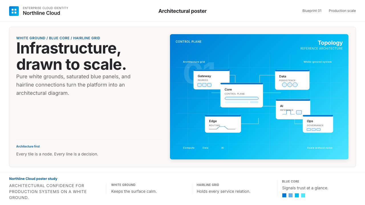 Microsoft AzureEnterprise calm, sharply diagrammed. White ground, saturated blue, hairline l…企业气质很稳。白底、饱和蓝和细线构成架构图。
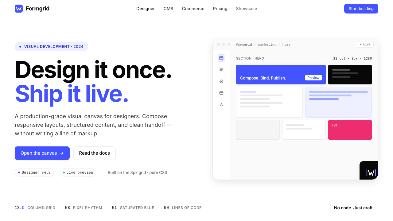 Webflow No-CodeA designer's tool, dressed like one. Saturated electric cobalt on pure white,…设计师的工具,长得也像:饱和电光蓝落在纯白底上,Inter 紧排,抽象网格分块。
 Adobe Creative CloudUnified, not uniform. Red anchor, white space, and saturated app tiles organi…统一而不单一:红色锚点、留白与高饱和应用方块组织整套工具。
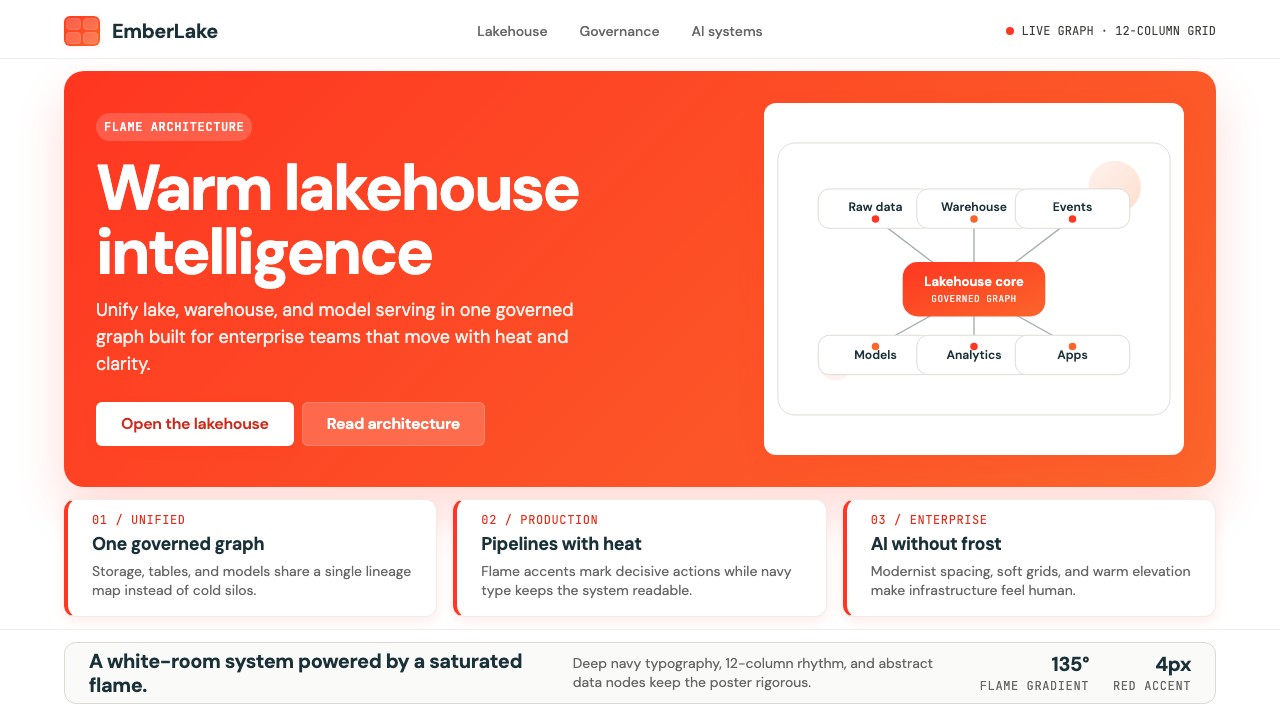 Databricks LakehouseWarm enterprise confidence. Flame red-orange gradients meet DM Sans and clean…温暖的企业信心:红橙火焰渐变配 DM Sans 与洁净数据图。
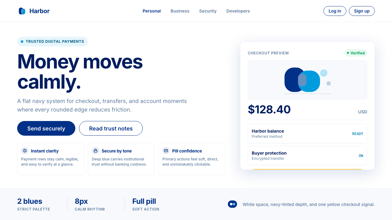 PayPalTrust without coldness. Deep navy, sky cyan, white cards, and pill checkout c…信任却不冰冷:深海军蓝与天青、白卡片和药丸结账提示。
 Atlassian Jira BlueWarm enterprise teamwork. Saturated blue cards on cream make status feel huma…温暖的企业协作:奶油底上的饱和蓝卡片,让状态更有人味。