What is PayPal?什么是 PayPal?
PayPal's visual identity turns the deepest navy in fintech into a signal of trust so complete it made the internet feel safe enough to spend.PayPal 的视觉语言将金融科技领域最深邃的海军蓝转化为一种信任信号——强大到足以让互联网变得值得消费。
PayPal in briefPayPal 速览
PayPal's design system is built on a two-tone blue palette — a deep, almost ink-dark navy anchored by a brighter sky-facing cyan — deployed across a geometry of rounded rectangles, pill-shaped buttons, and white card surfaces that together communicate safety, simplicity, and momentum. Where most financial brands choose severity or coldness to project authority, PayPal chooses depth and warmth: the navy is rich enough to feel trustworthy, and the cyan is light enough to feel approachable.PayPal 的设计体系建立在双调蓝色色板之上——一深一浅:深邃近乎墨色的海军蓝,搭配更为明亮、面向天空的天青色。这套色彩铺展于圆角矩形、药丸形按钮和白色卡片界面之上,共同传递出安全、简洁与向前的动感。大多数金融品牌选择冷峻来彰显权威,PayPal 却选择深度与温度:海军蓝足够厚重以令人信赖,天青色足够轻盈以令人亲近。
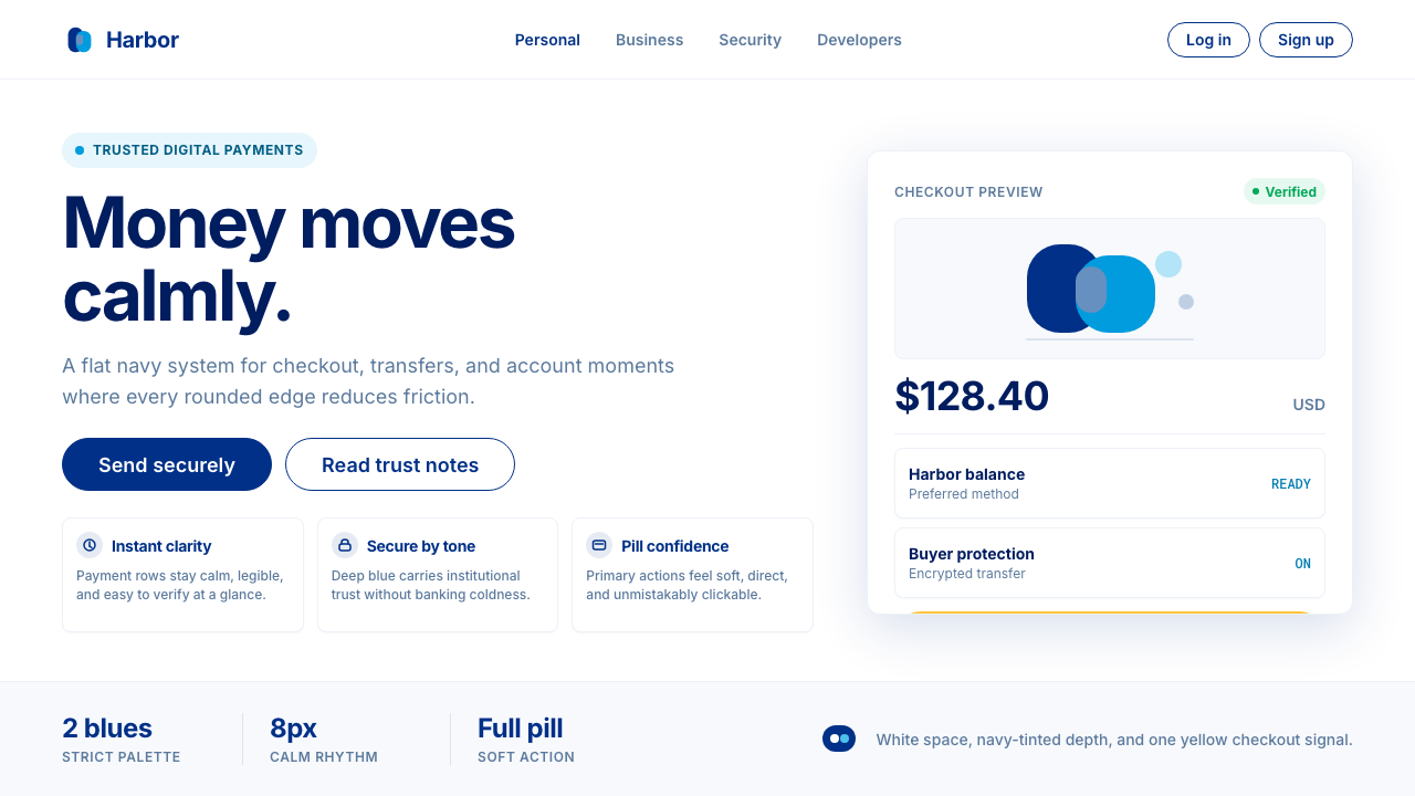
The system's signature interactive elements are pill-shaped — checkout buttons, input fields, and call-to-action units all share the same soft terminus, a rounded edge that implies forward movement rather than containment. This formally distinct choice, combined with generous whitespace and a limited accent palette that reserves yellow exclusively for high-stakes conversion moments, creates a visual rhythm that users have come to associate globally with the act of completing a transaction.这套系统的标志性交互元素是药丸形的——结账按钮、输入框、行动号召单元无不共享同一种圆弧收尾,这种圆润的端点暗示向前的运动感,而非封闭感。这一在形式上极具辨识度的选择,配合大量留白,以及将黄色专门保留给高价值转化时刻的克制配色策略,构建出一套视觉节奏——全球用户已将其与完成一笔交易的动作联系在一起。
Flat surfaces, minimal use of shadow, and a single primary typeface give the system its discipline. Nothing about the visual language asks you to stop and admire it; every element is directed at one goal: reducing the cognitive friction between intention and payment. The result is a design language that is simultaneously institutional — it holds the aesthetic weight of a major financial brand — and consumer-grade friendly, capable of appearing on a market stall's checkout page and on a multinational e-commerce platform with equal credibility.平面化界面、极少使用的阴影,以及单一主字体,赋予了这套系统以纪律。它的视觉语言不要求你停下来欣赏,每一个元素都指向同一目标:降低意图与付款之间的认知摩擦。最终的结果是一套既具机构体量——能撑起一个大型金融品牌的视觉分量——又具消费者亲和力的设计语言,无论出现在集市摊位的结账页面还是跨国电商平台上,都同样可信。
Where does PayPal come from?PayPal 从何而来?
PayPal was founded in 1998 in San Jose, California, by a group that included Max Levchin and Peter Thiel, initially as a cryptography-based security company before pivoting to digital payments. Its early visual identity was a product of late-1990s web aesthetics: beveled buttons, gradient fills, a palette that borrowed the corporate blue conventions of traditional banking. The brand looked like trust because it mimicked the things that had historically looked trustworthy — the visual vocabulary of established financial institutions translated into the browser.PayPal 于1998年在加利福尼亚州圣何塞由马克斯·列夫钦(Max Levchin)和彼得·蒂尔(Peter Thiel)等人共同创立,最初以密码学安全公司的形态起步,后转型为数字支付平台。早期的视觉形象是1990年代末网页美学的产物:倒角按钮、渐变填充,以及借鉴传统银行企业蓝惯例的配色方案。它看起来可信,是因为它模仿了历史上那些让人信任的东西——成熟金融机构的视觉词汇,以浏览器的形式呈现。
The real transformation came in 2014, when PayPal commissioned Fuseproject, the San Francisco design firm led by Yves Béhar, to carry out a comprehensive brand overhaul. By that year the company had been independent from eBay for two years — the corporate parent whose own visual conventions had constrained the brand — and was competing aggressively with a new wave of consumer fintech challengers. Fuseproject's brief was to create a visual identity that felt modern, approachable, and digitally native without sacrificing the institutional weight that kept consumers comfortable handing over payment credentials.真正的蜕变发生在2014年。PayPal 委托旧金山设计公司 Fuseproject——由伊夫·贝阿尔(Yves Béhar)领衔——进行全面的品牌重塑。那一年,公司已从母公司 eBay 独立出来两年,而 eBay 的视觉惯例此前一直制约着这个品牌的自我表达。与此同时,一批消费级金融科技新秀正咄咄逼人。Fuseproject 的任务是:打造一套现代、亲切、原生于数字时代的视觉体系,同时保留足够的机构分量,让消费者安心交出支付凭证。
The Fuseproject rebrand produced three decisive changes. First, the logotype: the overlapping dual-P monogram, in which two blue Ps of slightly different weights nest together, became the primary marque — a mark that is geometrically simple, memorable at any scale, and subtly alludes to the concept of two parties in a transaction. Second, the palette was distilled from a broad legacy blue into the specific two-tone system: the deep navy as the primary anchor and a brighter, more saturated blue-cyan as the secondary. Third, the pill shape was codified as the system's interactive grammar, distinguishing every clickable or tappable element from static content.Fuseproject 的品牌重塑带来三项决定性改变。其一,字标重设:双P重叠字标成为核心标识——两个字重略有差异的蓝色P字母彼此嵌套,在几何上简洁、在任何尺寸下都易于记忆,并微妙地暗示交易双方的概念。其二,色板从宽泛的传统蓝色遗产中提炼为具体的双调体系:深海军蓝作为主锚,更明亮、饱和度更高的蓝青色为辅。其三,药丸形被正式确立为系统的交互语法,将每一个可点击或可轻触的元素从静态内容中清晰区分出来。
Dan Schulman, who became CEO in 2014, championed the accompanying strategic repositioning that the visual identity was designed to support: PayPal as the payments platform for everyone, not just eBay shoppers or early-adopter technologists. The design system therefore had to perform across a vast range of surfaces — mobile apps, merchant checkout flows, physical card terminals, advertising campaigns — while remaining instantly recognizable. The decision to build the entire system around two highly specific blues and a single accent yellow gave it the legibility and distinctiveness needed to anchor that breadth. What began as a Silicon Valley startup's logo evolved into one of the most recognized financial marks on Earth.2014年出任 CEO 的丹·舒尔曼(Dan Schulman)力推配套的战略重新定位——而这正是这套视觉体系所要承托的:PayPal 成为面向所有人的支付平台,而不仅仅是 eBay 购物者或早期技术采用者的专属工具。设计系统因此必须在移动应用、商户结账流程、实体卡终端、广告营销活动等大量不同界面上一致运作,同时保持即刻可辨的识别度。将整套系统围绕两种高度特定的蓝色和单一的黄色强调色来构建,赋予了它跨越这种宽度所需的清晰度与辨识力。从一家硅谷初创企业的标志,演变为地球上最广为人知的金融符号之一。
What defines the PayPal look?PayPal 的视觉特征是什么?
Dual-Blue Palette双蓝配色
The PayPal system lives inside two blues: a deep navy that functions as the brand's primary anchor — carrying the weight of institutional trust — and a brighter, more saturated blue-cyan that signals interactivity and lightness. The two blues are never equivalent in hierarchy; the navy dominates backgrounds and headers while the cyan activates buttons, links, and highlights. Together they cover the emotional spectrum from gravitas to approachability without leaving the brand's chromatic world.PayPal 体系存活于两种蓝色之间:深海军蓝作为品牌主锚,承载机构信任的分量;更明亮、饱和度更高的蓝青色则传递交互感与轻盈感。两种蓝色在层级上绝不等价——海军蓝主导背景与页头,天青色激活按钮、链接与高亮元素。两者共同覆盖了从庄重到亲切的情感区间,却始终不离品牌的色彩世界。
Pill-Shaped Interactive Grammar药丸形交互语法
Every primary interactive element — checkout buttons, primary calls-to-action, certain input containers — is terminated with a fully rounded end, producing the characteristic pill shape that has become synonymous with PayPal's presence in a merchant checkout flow. This is not merely decorative: the pill edge creates a visual signal that is immediately distinguishable from static content, reduces the perceived weight and formality of the action being requested, and implies forward motion. At scale, across billions of checkout sessions, the pill has become a global symbol of safe, imminent payment.每一个主要交互元素——结账按钮、主要行动号召、特定输入框——都以完全圆弧的端点收尾,形成标志性的药丸形,已成为 PayPal 在商户结账流程中存在感的同义词。这绝非纯粹的装饰:药丸边缘创造出一种视觉信号,能立即从静态内容中脱颖而出,降低了所请求动作的感知重量与正式感,并暗示向前的运动。在数十亿次结账会话的规模上,药丸形已成为安全、即将发生的支付的全球符号。
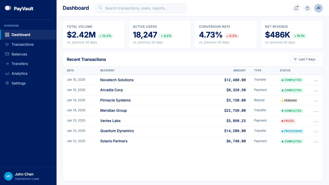
White-Card Surface Architecture白色卡片界面架构
Information is organized into white-background cards that float against slightly cooler off-white or light-gray ground planes. The cards carry a very subtle, low-contrast shadow — almost a suggestion of lift rather than a dramatic depth cue — that separates content from background without introducing the visual noise of hard borders. This layered surface architecture allows complex transaction information (amounts, merchant names, account balances) to be chunked and scanned rapidly, mirroring the cognitive rhythm of reviewing a physical wallet's contents.信息被组织进白色背景的卡片中,漂浮于略显冷调的近白或浅灰底面之上。卡片携带极为微妙、低对比度的阴影——与其说是深度提示,不如说是一种漂浮的暗示——将内容与背景分隔开来,而不引入硬边框的视觉噪声。这种层叠式界面架构允许复杂的交易信息(金额、商户名称、账户余额)被快速分块和扫描,映照出在脑海中翻阅实体钱包内容的认知节奏。
Yellow as Conversion Signal黄色作为转化信号
PayPal's yellow appears sparingly and always at moments of decisive action: the 'Buy Now' or 'Pay' button in a merchant's checkout, the final confirmation that money is about to move. Its warm contrast against the predominantly blue and white system creates an immediate focal point that is distinct from any blue-toned interactive element. The restraint with which yellow is deployed is central to its power — because it appears so rarely, it reads unmistakably as a signal of urgency and confidence rather than decoration.PayPal 的黄色出现得极为克制,始终只在决定性动作的时刻出现:商户结账中的『立即购买』或『付款』按钮,金钱即将流转前的最终确认。它的暖调与以蓝白为主的整体系统形成即时的焦点对比,与任何蓝调的交互元素都明显区别。黄色的克制使用是其力量的核心——因为它极少出现,它所传递的只能是紧迫感与确信感,而非装饰。
Geometric Humanist Typography几何人文无衬线字体
The brand's proprietary typeface sits at the intersection of geometric construction and humanist warmth — letterforms built on precise circular and rectangular underlying geometry, but with enough optical adjustment and stroke variation to read as approachable rather than mechanical. Headlines are set large and with considerable weight to anchor hierarchy; body text drops to a lighter, more open setting that prioritizes legibility in transaction-dense interfaces. The typeface family avoids both the coldness of purely geometric grotesks and the nostalgia of traditional financial serifs.品牌定制字体处于几何构型与人文温度的交汇点——字形建立于精确的圆形与矩形基础几何之上,但拥有足够的视觉调整与笔画变化,读来亲切而非机械。标题字号大、字重重,以锚定层级;正文则切换为更轻盈、更开放的排版设置,在交易信息密集的界面中优先保障可读性。这套字体家族既回避了纯粹几何无衬线字体的冷漠感,也回避了传统金融衬线字体的怀旧感。
Flat Surfaces with Restrained Depth平面化界面与克制的深度
PayPal's interfaces are fundamentally flat — no gradients on primary surfaces, no simulated three-dimensionality, no textures that imply physical material. The single exception is the card shadow described above, which is used structurally rather than decoratively. This flatness is not austere: generous whitespace, large type, and the consistent pill-and-card vocabulary fill the visual field with enough rhythm that the absence of decorative depth goes unnoticed. The flatness also ensures cross-platform consistency: the same components render identically across dark-mode, light-mode, mobile, and web.PayPal 的界面从根本上是平面化的——主要界面上没有渐变,没有模拟三维感,没有暗示物理材质的纹理。唯一的例外是上述卡片阴影,它被用于结构性目的而非装饰性目的。这种平面化并不显得苦涩:大量留白、大号字体,以及一致的药丸-卡片词汇,以足够的节奏感充盈了视觉空间,使装饰性深度的缺席不被察觉。平面化同时确保了跨平台的一致性:相同的组件在深色模式、浅色模式、移动端和网页端上的渲染完全相同。
Trust Through Constraint以约束建立信任
PayPal's design system earns trust not through the complexity of its signals but through the consistency and restriction of them. The palette is narrow, the shapes are few, the type hierarchy is strict, and the accent colors are rationed. This constraint creates predictability, and predictability in a payment context is itself a form of reassurance. Users who have completed hundreds of PayPal checkouts can detect an authentic PayPal interface instantly — and, by extension, detect when something is off. The visual system is so tightly defined that counterfeit interfaces struggle to replicate its specific feel, which has practical security implications beyond aesthetics.PayPal 的设计体系通过约束信号的数量与一致性来赢得信任,而非通过信号的复杂性。色板窄,形状少,字体层级严格,强调色受到配给。这种约束创造出可预见性,而在支付场景中,可预见性本身就是一种安心感。经历过数百次 PayPal 结账的用户能够即刻辨认出真实的 PayPal 界面——并因此感知到任何异常。视觉系统被如此严格地定义,以至于仿冒界面难以复制其特定的质感,这在美学之外有着实际的安全意涵。
Who shaped PayPal?谁塑造了 PayPal?
Béhar is the founder of Fuseproject, the San Francisco industrial and brand design studio commissioned to lead PayPal's 2014 rebrand. His practice is known for fusing product design with brand identity — a sensibility that shaped the PayPal project, where the visual system was designed to behave as coherently on a physical card terminal as on a mobile screen. Béhar's contribution to PayPal was the distillation of a complex legacy brand into a minimal, scalable system whose geometry and palette could be trusted at global scale.贝阿尔是旧金山工业与品牌设计工作室 Fuseproject 的创始人,受托主导 PayPal 2014年的品牌重塑。他的实践以融合产品设计与品牌形象著称——这一感性深刻影响了 PayPal 项目,其中视觉系统被设计为在实体卡终端与移动屏幕上同样连贯地运作。贝阿尔对 PayPal 的贡献,是将一个复杂的传统品牌提炼为一套极简、可扩展的系统,其几何语言与色彩体系能够在全球规模上被信任。
Levchin co-founded PayPal in 1998 and served as its first CTO, responsible for the cryptographic security infrastructure that made digital payments safe enough to trust. His technical conviction — that security could be built into the system at a foundational level rather than bolted on as a warning layer — directly influenced the brand's eventual visual philosophy: the absence of anxiety-inducing security iconography in the interface reflects the confidence that security is embedded, not displayed.列夫钦于1998年联合创立了 PayPal,并担任首任首席技术官,负责使数字支付安全可信的密码学基础设施。他的技术信念——安全可以在系统的基础层面建入,而非作为警示层附加——直接影响了品牌最终形成的视觉哲学:界面中令人焦虑的安全图标的缺席,正反映了安全是嵌入其中而非展示于外的这一自信。
Thiel co-founded PayPal and served as its first CEO, guiding the company through its early growth and its eventual acquisition by eBay in 2002. His conviction that PayPal could become a new global currency — a payment layer independent of governments and banks — informed the boldness of the brand's ambition. Though the company's visual identity evolved significantly after his tenure, the institutional scale that the design system must communicate traces directly to the ambition Thiel articulated in the early years.蒂尔联合创立了 PayPal 并担任首任 CEO,引领公司度过早期成长阶段,直至2002年被 eBay 收购。他相信 PayPal 能够成为一种独立于政府和银行的新型全球货币——这一信念赋予了品牌抱负的大胆程度。尽管公司的视觉形象在他任期之后经历了重大演变,但设计系统所必须传达的机构体量,直接可追溯至他在早年所阐述的那份抱负。
Schulman became PayPal's CEO in 2014, the same year as the Fuseproject rebrand, and championed the repositioning of PayPal as a democratizing payments platform serving the underbanked and all consumers rather than primarily serving eBay's ecosystem. The visual identity he endorsed was built to support that mission: warm enough to welcome first-time users, authoritative enough to satisfy enterprise merchants, and legible enough to function in every market globally. Schulman's tenure saw PayPal's brand achieve near-universal recognition across the digital economy.舒尔曼于2014年——即 Fuseproject 品牌重塑的同年——出任 PayPal CEO,并大力推动将 PayPal 重新定位为服务无银行账户群体和广大消费者的普惠支付平台,而非主要服务于 eBay 生态。他所认可的视觉形象被构建来支撑这一使命:足够温暖以欢迎初次用户,足够权威以满足企业级商户,足够清晰以在全球每一个市场运作。舒尔曼任期内,PayPal 品牌在数字经济领域获得了近乎普遍的认知度。
Hoffman was an early executive at PayPal and part of the founding leadership group that established the company's culture of bold, systems-level thinking about payments infrastructure. He later became a prolific investor and the co-founder of LinkedIn, but his time at PayPal contributed to the intellectual environment that produced the brand's core conviction: that trust, at internet scale, is a design problem as much as a security problem. PayPal's visual restraint and consistency are a direct answer to that conviction.霍夫曼是 PayPal 的早期高管,也是奠定公司文化的创始领导团队成员——那种关于支付基础设施的大胆、系统级思考。他后来成为多产的投资人和领英(LinkedIn)的联合创始人,但在 PayPal 的经历为孕育品牌核心信念的智识环境作出了贡献:在互联网规模上,信任是一个设计问题,与安全问题同等重要。PayPal 视觉语言的克制与一致性,正是对这一信念的直接回应。
How do you use PayPal today?今天怎么用 PayPal?
PayPal's design language is built for contexts where the user must make a consequential decision quickly and with confidence. Applying it correctly means understanding that the system's power comes from its restraint: the narrow palette, the controlled shapes, and the strict typographic hierarchy all work together to reduce visual noise so that the action you need the user to take is the only thing that clearly stands out. Adding decorative complexity undermines the entire logic.PayPal 的设计语言为以下场景而生:用户必须迅速且自信地做出一个有分量的决策。正确应用它意味着理解:这套系统的力量来自克制。窄色板、受控的形状、严格的字体层级——三者协同减少视觉噪声,使你希望用户完成的动作成为唯一清晰突出的事物。添加装饰性复杂度会破坏整套逻辑。
For presentation slides, the PayPal system translates well to both cover and content pages. A cover works best with a deep navy background, a large, weight-forward headline in light type, and the cyan reserved for a single accented word or supporting label. The pill motif can be echoed in section markers or callout boxes — rounded containers that frame key figures or short statements. Content slides should treat the white card as the primary unit: each major point lives in its own card container against an off-white ground, with generous internal padding and a strict two-level type hierarchy. Data visualizations take on a clean, high-contrast quality when bars, segments, and lines are restricted to the two blues plus the yellow accent for the most important value.在演示文稿中,PayPal 体系在封面和内容页上都运作良好。封面最适合以深海军蓝为背景,配合字重厚重、浅色调的大号标题,天青色保留给单一强调词或辅助标签。药丸形母题可在章节标识或引用框中得到呼应——圆角容器框住关键数据或短句陈述。内容页应将白色卡片视为基本单元:每个要点都活在自己的卡片容器里,置于近白色底面上,内部留白充裕,字体层级严格限于两级。数据可视化在只使用双蓝加黄色强调色(用于最重要的数值)的条件下,呈现出干净、高对比度的品质。
For web and product interfaces, the system is particularly effective on payment flows, pricing pages, onboarding sequences, and trust-sensitive dashboards. The approach: a white or near-white base ground, card components with barely-there shadows, pill-shaped primary buttons in the brighter blue or in yellow for the highest-stakes action, and the deep navy for headers, navigation bars, and key brand anchors. Body text in near-black, secondary information in a medium gray, and all interactive affordances clearly distinguished from static content through color and shape. Avoid introducing new shapes or additional accent colors — the system's legibility depends on users already having learned what the pill means.对于网页和产品界面,这套体系在支付流程、定价页、引导流程和涉及信任的仪表板上尤为有效。方法如下:以白色或近白色为底面基调,卡片组件配以若有若无的阴影,主要按钮以较亮的蓝色呈现药丸形,最高价值动作的按钮使用黄色,深海军蓝用于页头、导航栏和品牌核心锚点。正文使用近黑色,次要信息使用中等灰度,所有交互元素通过颜色和形状与静态内容清晰区分。避免引入新形状或额外的强调色——系统的可读性依赖于用户已经学会药丸形的含义。
For editorial and marketing materials, the PayPal palette supports bold, high-contrast layouts suited to advertising, landing pages, and social media assets. Full-width sections alternating between deep navy grounds with light type and white grounds with navy type create a confident visual rhythm without requiring varied photography or illustration. The yellow accent earns its keep on calls-to-action: a single 'Get Started' or 'Send Money' element in yellow on a navy field has the visual authority of a physical button. Avoid deploying the yellow at large scale as a background tone — at that proportion it loses its signal value and shifts the mood toward caution rather than confidence.对于编辑与营销素材,PayPal 色板支撑起大胆、高对比度的版面,适用于广告、落地页和社交媒体内容。全宽区块在深海军蓝底浅色字与白底海军蓝字之间交替,无需借助多样化的摄影或插图,便能创造出自信的视觉节奏。黄色在行动号召上发挥其价值:海军蓝底面上一个黄色的『立即开始』或『发送汇款』按钮,拥有实体按键般的视觉权威。避免将黄色大面积用作背景底色——在那个比例下,它失去信号价值,将氛围从自信推向警示。
A common mistake when working in this system is treating the two blues as interchangeable or combining them at equal visual weight. The deep navy is always dominant; the lighter cyan always subordinate. Reversing this relationship — using the bright cyan as a background tone and the navy as an accent — creates visual confusion that undermines the hierarchy the system depends on. A second frequent error is adding soft, diffuse drop shadows to elements beyond the card layer: PayPal's depth comes from layering flat surfaces, not from simulated lighting. Excessive shadow use makes the interface feel dated and inconsistent with the system's flat, confident character.在使用这套系统时最常见的错误,是将两种蓝色视为可互换的,或以相等的视觉重量同时使用。深海军蓝始终处于主导地位,较亮的天青色始终处于从属地位。颠倒这种关系——以明亮天青色作为背景调,以海军蓝作为强调色——会造成视觉混乱,破坏系统所依赖的层级秩序。另一个常见错误是在卡片层之外大量使用柔和、漫射的投影:PayPal 的深度感来自平面层叠,而非模拟光照。过度使用阴影会使界面显得过时,与这套系统平面化、自信的气质格格不入。
PayPal — FAQPayPal · 常见问题
Can the PayPal visual language be used for non-payment contexts like dashboards or editorial work?PayPal 的视觉语言能用于支付以外的场景——比如仪表板或编辑内容——吗?
Yes, with awareness of what you are importing. The system's core qualities — high contrast, strict hierarchy, restrained palette, pill-based interactive grammar — transfer effectively to any context where the user needs to make a decision confidently and quickly. Dashboards for analytics, financial reporting tools, SaaS pricing pages, and even editorial layouts benefit from the same clarity-first discipline. The challenge is that the palette carries strong PayPal brand associations for most users; if your work is meant to feel novel or distinct from payments specifically, consider shifting one of the blues slightly in warmth or saturation to differentiate while retaining the structural logic.可以,但需要意识到你在引入什么。这套系统的核心品质——高对比度、严格层级、克制色板、基于药丸形的交互语法——能有效迁移到任何需要用户自信、迅速做出决策的场景。分析仪表板、财务报告工具、SaaS 定价页面,甚至编辑版面,都能从同样的『清晰优先』纪律中受益。挑战在于:对大多数用户而言,这套色板携带着强烈的 PayPal 品牌联想。如果你的作品希望感觉新颖,或刻意与支付场景保持距离,可考虑在保留结构逻辑的前提下,将其中一种蓝色在暖度或饱和度上做轻微位移,以建立差异感。
How does the PayPal system handle dark mode or dark-background layouts?PayPal 体系如何处理深色模式或深色背景版面?
The deep navy functions naturally as a dark-mode background — it is dark enough to reduce eye strain in low-light environments while retaining the brand's chromatic identity. In a dark-mode version of the system, the navy becomes the ground, the bright cyan and white become the primary foreground tones for type and cards, and the yellow accent retains its role as the highest-stakes call-to-action. The key discipline is avoiding the introduction of pure black as a background: pure black makes the navy brand elements read as blue rather than as the foundational surface, which breaks the palette's internal coherence. Dark mode works best when every surface that is not a card or active element stays within the navy family.深海军蓝天然地充当深色模式的背景底色——它足够深沉以在弱光环境中减轻眼睛疲劳,同时保留了品牌的色彩特征。在系统的深色模式版本中,海军蓝成为底面,明亮天青色和白色成为文字与卡片的主要前景调,黄色强调色保留其作为最高价值行动号召的角色。关键纪律是避免引入纯黑作为背景:纯黑会使海军蓝品牌元素被读作蓝色而非基础界面色,从而破坏色板的内在一致性。深色模式最有效的做法是:所有非卡片、非活跃元素的界面都保持在海军蓝家族之内。
What makes PayPal's palette feel trustworthy rather than merely corporate?是什么让 PayPal 的配色给人以信任感,而不仅仅是企业感?
The difference lies in the specific quality of the blues chosen and the way they are paired. A flat, low-chroma corporate navy tends to feel institutional in the distant, impersonal sense — think of a government form or a traditional bank statement. PayPal's navy has more depth and a slight warmth that prevents it from reading as purely cold. The brighter cyan it pairs with is decidedly un-corporate: it has the quality of a clear sky or shallow coastal water, carrying connotations of openness and movement that offset the navy's weight. The pill shape contributes the same effect through geometry: rounded terminals feel approachable in a way that squared-off buttons do not. The combination of these factors — color temperature, tonal range, and shape vocabulary — produces something that is authoritative without being forbidding.区别在于所选蓝色的具体质感,以及它们相互搭配的方式。低饱和度、平调的企业海军蓝往往呈现出遥远、非人格化的机构感——想想政府表格或传统银行对账单。PayPal 的海军蓝拥有更多深度和一丝暖意,使其无法被解读为纯粹的冷漠。与之搭配的明亮天青色则决然没有企业气息:它拥有晴空或浅海岸水域的质感,携带着开放与运动的联想,平衡了海军蓝的沉重。药丸形通过几何形态发挥同样的效果:圆弧末端所传递的亲切感,是方角按钮所无法给予的。色彩温度、色调范围与形态词汇这三重因素的组合,产生了一种既有权威又不令人望而生畏的东西。
Is PayPal's style appropriate for startups and early-stage products?PayPal 的风格适合初创企业和早期产品吗?
It is well-suited to early-stage products in fintech, payments, banking, or any other context where the core challenge is building user trust quickly. The style communicates institutional credibility even when the institution is new, because it borrows a visual grammar that users already associate with a platform they trust. The risk is the reverse: in contexts where freshness, personality, or cultural specificity are differentiating values — consumer brands, lifestyle products, creative platforms — the system can read as too generic or too derivative. Used deliberately, the PayPal visual language is a shortcut to trust; used without awareness, it is a costume that says 'payment platform' rather than a personality.它非常适合金融科技、支付、银行或任何核心挑战是快速建立用户信任的早期产品。这种风格即便在机构还是新的情况下也能传达出机构可信度,因为它借用了一套用户已然与他们信任的平台相关联的视觉语法。风险在于相反的方向:在新鲜感、个性或文化特殊性是差异化价值的场景——消费者品牌、生活方式产品、创意平台——这套系统可能显得过于通用或衍生感过强。有意识地使用 PayPal 的视觉语言,是一条通往信任的捷径;缺乏意识地使用,它只是一件写着『支付平台』的戏服,而非一种个性。
How strictly should the pill shape be followed? Can other button shapes coexist?药丸形需要严格遵守吗?其他按钮形状能与之共存吗?
Within a PayPal-informed system, the pill should be reserved for primary actions — the one thing on any given screen that the designer most wants the user to do. Secondary actions can use a softer, partially-rounded rectangle that communicates affordance without competing with the primary. Tertiary or destructive actions (cancel, dismiss, delete) can be fully squared-off to signal a different nature without decoration. The hierarchy of shapes — pill for primary, rounded-rect for secondary, sharp-rect for tertiary — mirrors the hierarchy of the color system and reinforces the system's logic. Introducing a second pill-shaped element at the same visual weight as the primary button collapses the hierarchy and reduces the signal value of the pill itself.在受 PayPal 启发的设计体系中,药丸形应保留给主要动作——任何给定页面上设计者最希望用户完成的那一件事。次要动作可以使用更柔和的部分圆角矩形,传递可操作性但不与主要元素竞争。第三级或破坏性动作(取消、忽略、删除)可以使用完全方角的形态,无需装饰地标示出不同的性质。形状的层级——药丸形用于主要,圆角矩形用于次要,方角矩形用于第三级——与色彩体系的层级相互映照,强化了系统的逻辑。在与主要按钮相同的视觉重量下引入第二个药丸形元素,会压扁层级,削弱药丸形本身的信号价值。
Related design styles相关设计风格
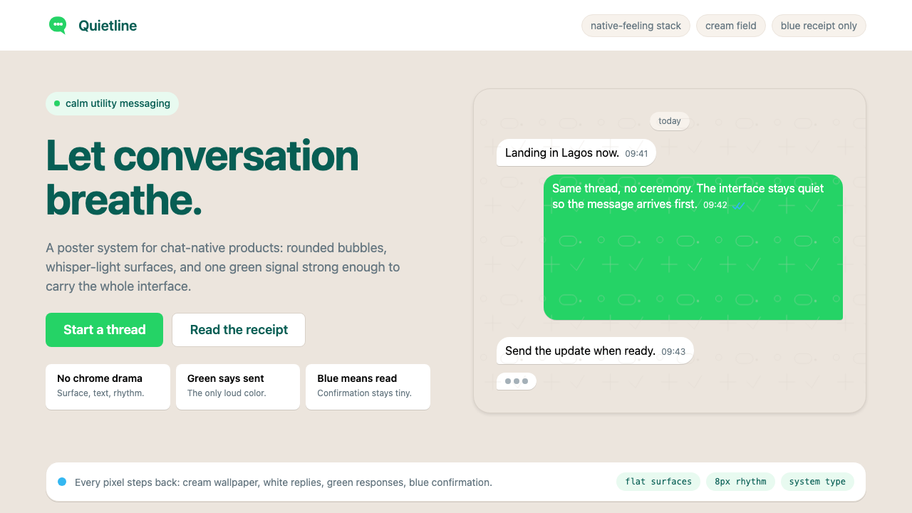 WhatsAppConversation is the interface. Cream wallpaper, green bubbles, and tiny blue…对话就是界面。奶油墙纸、绿色气泡与蓝色小勾让界面退后。
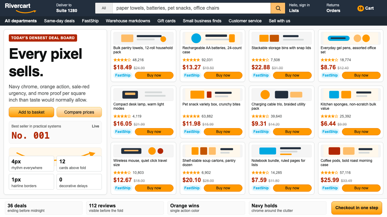 AmazonUgly sells efficiently. Navy chrome, orange buttons, red prices crowd a dense…朴素而高效:深蓝导航、橙色按钮、红价挤满密集网格。
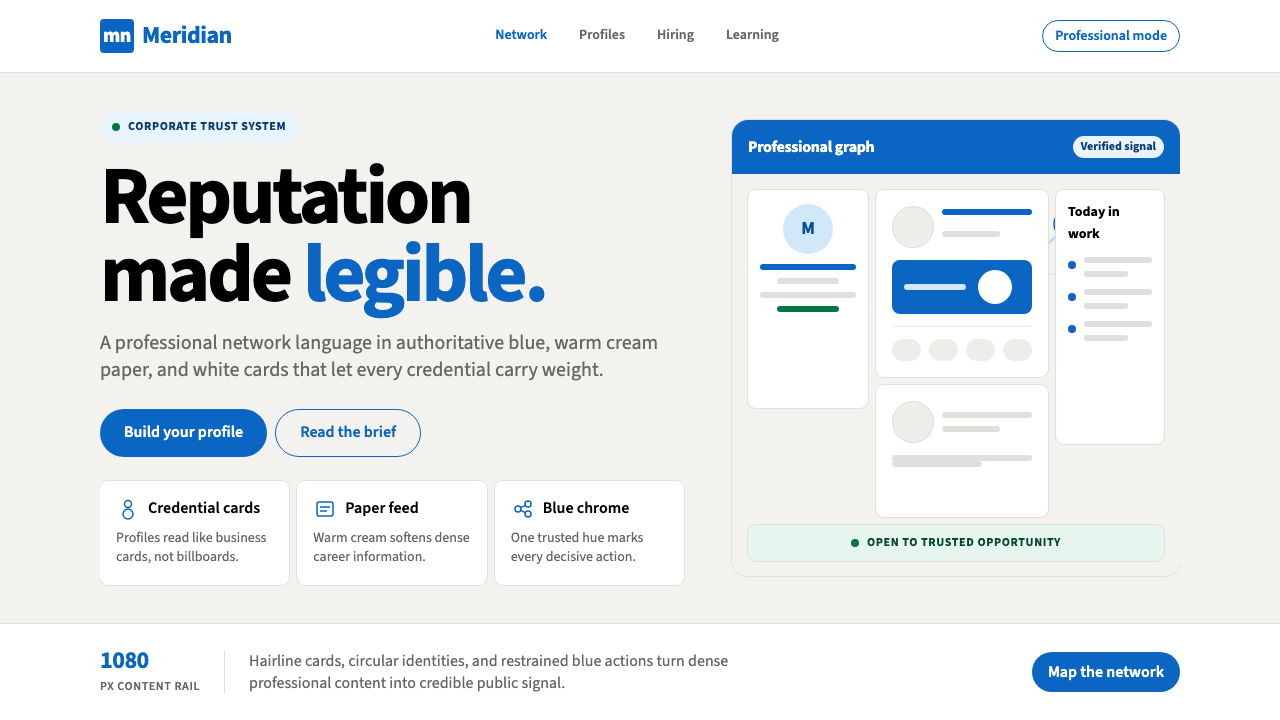 LinkedInCorporate trust, digitized. Authoritative blue frames white cards on warm cre…企业信任数字化:权威蓝框住暖奶油纸面上的白卡。
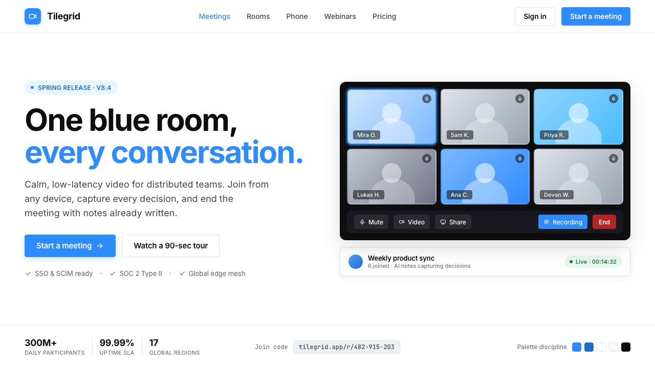 Zoom Meeting BlueRemote work's default discipline. One saturated cobalt on pure white, Inter s…远程办公的默认纪律:饱和电子钴蓝压在纯白底上,Inter 无衬线,4px 柔角。
 Android Bugdroid GreenFriendly tech, reduced to geometry. Vivid green pops from Grey 900 and rounde…友好科技化为几何:明绿从 Grey 900 与圆润字形中跃出。
 AsanaCalm productivity breathes. Cream canvas, lavender panels, coral-blue-yellow…安静生产力会呼吸:奶油画布、薰衣草面板与三色圆点。