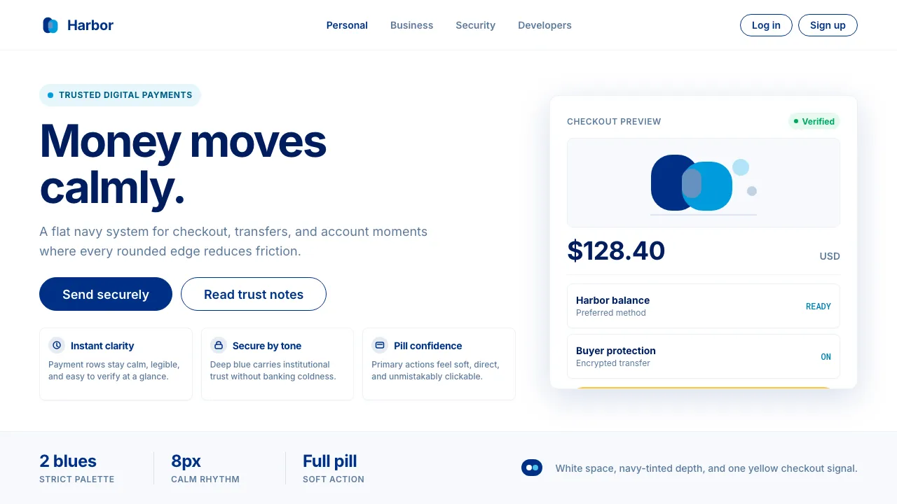
About PayPal
PayPal's visual identity is built on the deepest navy blue in fintech — a color that communicates institutional trust without the coldness of a bank. The 2014 Fuseproject rebrand distilled the brand to its essentials: the overlapping dual-P monogram, a proprietary geometric humanist sans-serif, and a strict two-blue palette softened by generous whitespace and pill-shaped interactive elements.
Every surface is flat, every corner softly rounded, every interaction designed to feel as frictionless as sending money should be. The iconic yellow "Buy Now" button has become a universal symbol of checkout confidence.
- Origin
- San Jose, California
- Era
- 1998 founded; current visual identity since 2014 Fuseproject rebrand
- Key figures
- Yves Behar · Max Levchin · Peter Thiel · Dan Schulman
- Movements
- Late-90s digital payments · Post-eBay e-commerce infrastructure · Bay Area fintech
PayPal design spec
Colors
Typography
The other 11 sections — buttons, cards, spacing, motion, techniques and more — open once you unlock. Download the DESIGN.md or send it to your AI in one click. Unlock once, yours forever.
Sign up nowStyles similar to PayPal
Also inspired by brands & products, with a close feel.
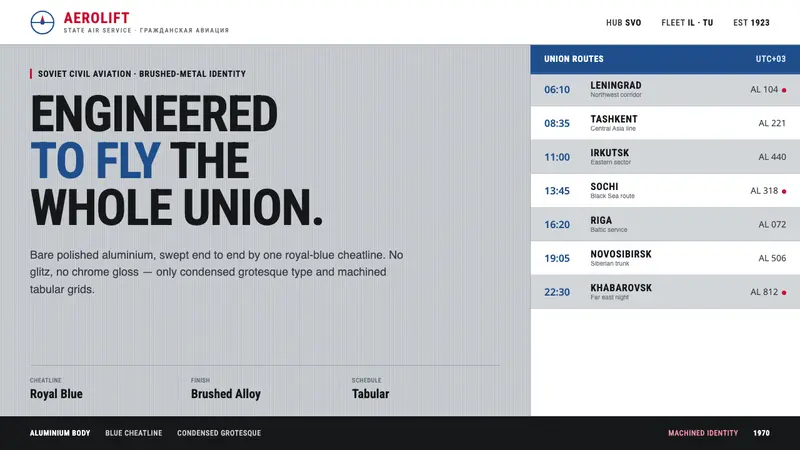 Aeroflot Soviet AirlineEngineered restraint rules. Silver ground, royal-blue cheatlines, and flat grotesque type set order.
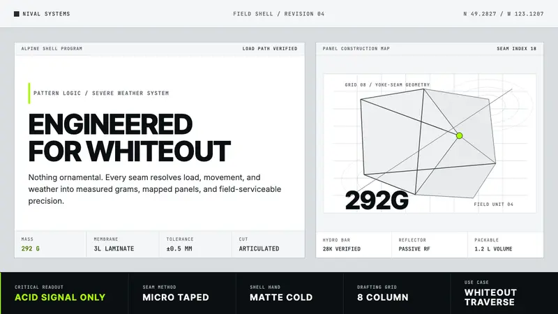 Arc'teryx Technical OutdoorEngineered, never ornamental. Glacier silver grid, mono specs, one acid-green signal.
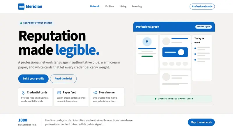 LinkedInCorporate trust, digitized. Authoritative blue frames white cards on warm cream paper.
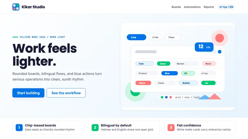 Tel Aviv Silicon WadiEnterprise feels sunny. Azure chips and Poppins grids soften flat SaaS surfaces.