What is WhatsApp?什么是 WhatsApp?
WhatsApp proved that a single shade of green, a cream wallpaper, and rounded bubbles could become the visual shorthand for two billion human conversations.WhatsApp 用一抹信号绿、一块奶油壁纸和圆润的气泡,让二十亿人的对话拥有了共同的视觉语言。
WhatsApp in briefWhatsApp 速览
WhatsApp is a global messaging system whose visual identity is built on an almost radical degree of restraint. The interface consists of a warm off-white background, a signature green used for outgoing message bubbles and primary interactive elements, white bubbles for incoming messages, and nearly nothing else. There are no decorative borders, no gratuitous illustration, no ornamental color accents competing for attention. The chrome — buttons, headers, navigation — is kept so quiet that the conversation itself becomes the interface.WhatsApp 是一套建立于极度克制之上的全球通讯视觉系统。界面由温暖的米白色背景、用于发送气泡与主要交互元素的标志性绿色、用于接收气泡的白色,以及几乎别无他物构成。没有装饰性边框,没有多余的插图,没有争夺注意力的点缀色彩。导航栏、按钮、标题栏——一切「界面铬」都被压至最低,让对话本身成为界面的主角。
What distinguishes the WhatsApp aesthetic from mere minimalism is its warmth. The background is not a cold clinical white but a soft cream, evoking the faint texture of paper. The green is vivid and confident — a communicative signal, not a corporate badge — balanced by the gentleness of rounded bubble geometry that feels approachable on any device, from an entry-level handset in Lagos to a flagship phone in São Paulo. The famous blue double-check mark for read receipts layers one more layer of considered utility: a chromatic signal that carries information without introducing visual noise.WhatsApp 美学区别于单纯极简主义的,是其内在的温度。背景不是冰冷的临床白,而是一种柔和的奶油色,隐隐唤起纸张的质感。那抹绿色鲜明而自信——是一种传达信号,而非企业徽章——被圆润的气泡几何所平衡,在任何设备上都显得亲切自然,从拉各斯的入门级手机到圣保罗的旗舰机型皆如此。标志性的蓝色双勾「已读」标记再叠加一层经过深思熟虑的实用性:这个色彩信号传递信息,却不引入视觉噪音。
The system is a masterclass in calm-tech design — a philosophy that holds that technology should serve human needs quietly, drawing attention to the task rather than to itself. Every element in the WhatsApp visual language can be justified by communication utility. Nothing is there for decoration, and the result is a design that has aged exceptionally well across more than a decade of changing platform conventions and screen resolutions.这套系统是「平静技术」设计哲学的范本——该哲学主张技术应当安静地服务于人的需求,将注意力引向任务本身而非界面自身。WhatsApp 视觉语言中的每一个元素都能以传达功能为正当理由。没有任何元素是为装饰而存在的,这也使得这套设计在超过十年的平台惯例更迭与屏幕分辨率变化中,依然保持着出色的耐久性。
Where does WhatsApp come from?WhatsApp 从何而来?
WhatsApp was founded in 2009 by Jan Koum and Brian Acton, both former Yahoo engineers who had grown frustrated with the advertising-driven web. Koum, who had emigrated from Ukraine as a teenager and remembered what it meant to communicate across borders without reliable infrastructure, wanted to build something simple, fast, and private. The original application launched as a status-update tool — the name itself derives from the colloquial greeting 'What's up?' — before pivoting to messaging in 2009 when Apple introduced push notifications. From the beginning, the product philosophy was anti-chrome: no ads, no games, no social feed, and a visual identity that stayed entirely out of the way of the message.WhatsApp 由 Jan Koum 与 Brian Acton 于 2009 年创立,两人均为前 Yahoo 工程师,对广告驱动的互联网深感厌倦。Koum 青少年时期从乌克兰移民美国,深知跨越国境、在没有可靠基础设施的条件下沟通意味着什么——他想打造一样简单、快速、私密的东西。最初的应用以状态更新工具的形态上线——名字本身源自口语问候语「What's up?」——随后在 2009 年苹果推出推送通知后转型为即时通讯。从一开始,产品哲学就是反「界面铬」的:没有广告、没有游戏、没有社交信息流,视觉身份完全为消息让路。
The visual language that would become globally recognizable took shape gradually across the early 2010s. The signature green — a vivid mid-green that sits between the cool blue-greens of enterprise software and the saturated limes of consumer games — was chosen for its legibility at small size and its cross-cultural neutrality. Unlike red, which carries danger connotations in many markets, or blue, which was already the dominant color of the social-networking era, green read as fresh, communicative, and universal. The rounded speech-bubble icon, rendered in that green, became one of the most recognized app icons in the world within a few years of launch.这套如今举世可辨的视觉语言在 2010 年代初期逐步成形。那抹标志性的绿色——一种生动的中绿,介于企业软件的冷蓝绿与消费游戏的高饱和黄绿之间——被选中,因为它在小尺寸下清晰易辨,且在跨文化语境中保持中性。不同于在许多市场具有危险含义的红色,或已成为社交网络时代主导色的蓝色,绿色传递出一种清新、富有沟通感、跨文化通行的印象。以这种绿色渲染的圆润对话气泡图标,在上线数年内便成为全球辨识度最高的应用图标之一。
In 2014, Facebook — now Meta — acquired WhatsApp for approximately nineteen billion dollars, the largest technology acquisition at that time. Koum remained as CEO until 2018, preserving much of the original design philosophy through the transition. The years following the acquisition saw incremental refinements rather than overhauls: the wallpaper system was polished, dark mode was introduced in 2020, and the interface was progressively simplified across Android and iOS to align with each platform's evolving design conventions. Throughout these changes, the core visual DNA — green bubbles, cream ground, rounded geometry, blue ticks — remained intact.2014 年,Facebook(现为 Meta)以约一百九十亿美元收购 WhatsApp,创下彼时最大科技并购记录。Koum 留任 CEO 至 2018 年,在过渡期间保留了大量原始设计哲学。收购后数年间,变化是渐进式的精炼而非颠覆:壁纸系统得到打磨,深色模式于 2020 年上线,界面在 Android 与 iOS 两端持续简化,以与各平台演进中的设计规范保持一致。贯穿这一切变化,核心视觉 DNA——绿色气泡、奶油底色、圆润几何、蓝色双勾——始终完好无损。
The Meta-era consolidation, led by design teams in Menlo Park, brought WhatsApp's visual identity into closer alignment with Instagram and Messenger while preserving its distinct utilitarian character. Designer Antônio Padial and colleagues worked to ensure that the interface scaled gracefully across a vast range of devices and network conditions, reflecting the reality that WhatsApp's largest user bases are in markets where bandwidth is constrained and handset hardware is modest. This constraint-driven design discipline — building for the slowest connection and the smallest screen first — reinforced the aesthetic of radical restraint that had defined the product from its inception.Meta 时代的整合由门洛帕克的设计团队主导,将 WhatsApp 的视觉身份与 Instagram、Messenger 拉近的同时,保留了其独特的实用主义气质。设计师 Antônio Padial 与同事们致力于确保界面在种类繁多的设备与网络条件下均能优雅地呈现——这折射出一个现实:WhatsApp 最大的用户群体所在的市场,带宽受限、硬件配置有限。这种由约束驱动的设计纪律——优先为最慢的连接与最小的屏幕而建——强化了从产品诞生之初便定义了它的那份极致克制美学。
What defines the WhatsApp look?WhatsApp 的视觉特征是什么?
The Signal Green信号绿
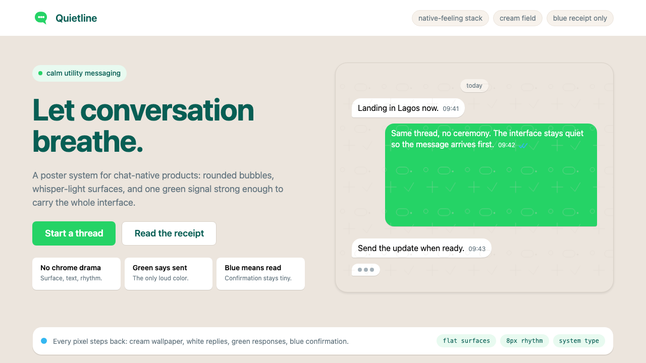
The defining color of WhatsApp is a vivid, confident mid-green that occupies the outgoing message bubble, the app icon, and all primary interactive controls. It sits in a distinctive chromatic register: warm enough to feel human, saturated enough to be immediately legible at small scale, and distinct enough from both teal and lime to be uniquely its own. Against the cream background, it carries the visual weight of a decision — this is your message, marked in green — without ever feeling aggressive or loud. The green is used sparingly: it appears where action or ownership must be indicated, and nowhere else.WhatsApp 最具定义性的色彩是一种生动而自信的中绿,占据着发送气泡、应用图标与所有主要交互控件。它处于一个独特的色彩区间:足够温暖以显得有人情味,足够饱和以在小尺寸下保持清晰,又足够独特以与青绿和黄绿截然有别,自成一格。在奶油底色的衬托下,它承载着一种决定的视觉分量——这是你的消息,以绿色标注——却从未显得咄咄逼人或嘈杂。绿色被节制地使用:它出现在需要标示行动或归属的地方,仅此而已。
Cream Ground奶油底色
The chat background is not white but a warm off-white — a soft, slightly yellowed tone that echoes the surface of aged paper or a blank notebook page. This seemingly minor chromatic choice has significant perceptual consequences: it reduces the harshness of long reading sessions, makes the green and white bubbles read more naturally against the ground, and gives the entire interface an unhurried, tactile quality. The optional doodle-pattern wallpaper — a subtle geometric tiling of outlines in a slightly deeper tone — layers texture without introducing visual noise, functioning almost like a watermark.聊天背景不是纯白,而是一种温暖的米白色——一种柔和的、略带黄调的色彩,呼应着旧纸张或空白笔记本页面的质感。这个看似细微的色彩选择具有显著的感知效果:它降低了长时间阅读的刺激感,使绿色与白色气泡在底面上的呈现更为自然,并赋予整个界面一种从容而富有触感的质地。可选的涂鸦壁纸——以略深色调的轮廓线平铺出微妙的几何图案——在不引入视觉噪音的前提下叠加了纹理,其作用几近于一枚水印。
Bubble Geometry气泡几何
Message bubbles are rounded rectangles whose corner radii are generous enough to feel soft and conversational, yet restrained enough to maintain legibility and avoid cartoonishness. The asymmetry is subtle but meaningful: outgoing bubbles carry a small pointed tail at one corner that anchors them to the right side of the screen, while incoming bubbles are anchored left. This tail is the sole figurative element in the interface — a tiny speech-bubble convention — and it does enormous communicative work in a single pixel cluster, instantly conveying direction and speaker identity without any label.消息气泡是圆角矩形,其圆角半径足够大以显得柔和且富有对话感,又足够收敛以维持可读性而不显卡通化。不对称性微妙却意味深长:发送气泡在一角有一个小小的尖角尾部,将其锚定在屏幕右侧,接收气泡则锚定在左侧。这个尾部是界面中唯一的具象元素——一个微型对话气泡的惯例符号——在寥寥数个像素点上完成了巨大的传达工作,无需任何标签,便即刻传递了方向与发言者身份。
The Blue Tick System蓝色双勾系统
The delivery and read-receipt system — single grey tick for sent, double grey tick for delivered, double blue tick for read — is among the most elegant pieces of information design in consumer software. It introduces a third color into the palette (blue) without disrupting the visual balance, because the ticks appear only at small scale and in a single, consistent location within each bubble. The shift from grey to blue carries emotional weight disproportionate to its visual footprint: the moment the ticks turn blue is one of the most observed micro-interactions in the history of mobile communication.消息投递与已读回执系统——单灰勾表示已发送,双灰勾表示已送达,双蓝勾表示已读——是消费类软件中最优雅的信息设计之一。它在调色板中引入了第三种颜色(蓝色),却不破坏视觉平衡,因为双勾仅在每个气泡内的固定位置以极小尺寸出现。从灰色转变为蓝色所承载的情感分量,与其视觉体量完全不成比例:双勾变蓝的那一刻,是移动通讯史上被观察次数最多的微交互之一。
Typographic Quietness排印的安静
WhatsApp has historically used the system typeface of each platform — the typeface your phone already uses for its own interface — rather than imposing a custom brand font. This decision is philosophically consistent with the broader design ethos: the typography should feel native and unobtrusive, never calling attention to itself. Text size, weight, and color are deployed with single-minded clarity — message body text sits at comfortable reading size in near-black, timestamps appear in a visibly smaller and lighter tone, and sender names in group chats are distinguished by gentle color variation rather than bold weight.WhatsApp 历来使用各平台的系统字体——即你的手机用于自身界面的字体——而非强加一种定制品牌字体。这个决定与更广泛的设计理念在哲学上高度一致:排版应当感觉原生而不引人注目,绝不将注意力吸引到自身。文字大小、字重与颜色以专一的清晰度部署——消息正文以舒适的阅读字号呈现于接近黑色的色调中,时间戳以明显更小、更浅的色调显示,群聊中的发言者姓名则以柔和的色彩变化而非加粗字重来区分。
Shadow as Touch, Not Depth投影作为触感而非深度
Shadows in the WhatsApp interface are whisper-light and diffuse — barely perceptible elevations that separate the message bubble from the ground without creating any theatrical sense of three-dimensionality. The effect is more tactile than spatial: bubbles feel like paper slips placed on a surface rather than objects floating above it. This approach contrasts deliberately with the heavier drop-shadow conventions of other messaging applications and reflects a broader preference for restraint over demonstration.WhatsApp 界面中的投影极为轻柔而漫散——几乎难以察觉的微微抬升,将消息气泡从底面中分离出来,却不营造任何戏剧性的立体感。效果更多是触感性的而非空间性的:气泡感觉像是放置在某个表面上的纸片,而非漂浮于其上的物体。这种处理方式与其他通讯应用更沉重的投影惯例形成了刻意的对比,折射出一种对克制而非炫示的更广泛偏好。
Radical Removal of Chrome界面铬的彻底移除
Perhaps the most distinctive structural characteristic of the WhatsApp visual system is what is absent: there are no decorative dividers between messages, no background illustrations behind active conversations, no persistent branding or logo within the chat view, no color-coded categories or tag systems in the default experience. The interface does not announce itself. Navigation elements are present but understated — icon-driven and kept to a single bar — so that the user's attention rests entirely on the content of the conversation rather than the apparatus surrounding it.WhatsApp 视觉系统最具特色的结构性特征,也许正是那些缺席之物:消息之间没有装饰性分割线,活跃对话背后没有背景插图,聊天视图内没有持续出现的品牌标识或 Logo,默认体验中没有色彩编码的分类或标签系统。界面不会自我宣示。导航元素存在但极为低调——以图标驱动,收纳于单一导航栏——使用户的注意力完全落在对话内容上,而非围绕它的那套装置。
Who shaped WhatsApp?谁塑造了 WhatsApp?
Koum co-founded WhatsApp and served as its CEO until 2018. His personal history — immigrating from Soviet Ukraine as a teenager, growing up on food stamps, and later working as a cleaner at Yahoo before being hired as an engineer — shaped his conviction that communication tools should be simple, private, and accessible to everyone regardless of economic circumstance. He insisted that WhatsApp would never carry advertising, a position he defended through the Facebook acquisition and his eventual departure from the company when disagreements over privacy and monetization grew irreconcilable. The design restraint of the product is inseparable from the values he brought to it.Koum 是 WhatsApp 的联合创始人,担任 CEO 至 2018 年。他的个人经历——少年时从苏联乌克兰移民美国、靠食品券长大、后来在 Yahoo 做清洁工后被聘为工程师——塑造了他的信念:通讯工具应当简单、私密,且无论经济状况如何都应对所有人可及。他坚持 WhatsApp 永不投放广告,这一立场贯穿了 Facebook 的收购过程,直至他因隐私与变现问题上的分歧无法弥合而最终离开公司。产品的设计克制与他带来的价值观密不可分。
Acton co-founded WhatsApp with Koum after both were rejected by Facebook and Twitter in 2009. He served as the technical and business counterpart to Koum's product vision, and shared his partner's fierce commitment to a no-advertising model. After the Facebook acquisition, Acton stayed until 2017 before departing — forfeiting hundreds of millions of dollars in unvested stock — and subsequently co-founded Signal, the end-to-end encrypted messaging application, donating fifty million dollars to seed the Signal Foundation. His trajectory underlines how much the WhatsApp design philosophy was rooted in a specific set of ethical commitments rather than commercial expediency.Acton 在 2009 年与 Koum 同被 Facebook 和 Twitter 拒绝后,共同创立了 WhatsApp。他是 Koum 产品愿景的技术与商业搭档,同样坚定地恪守无广告模式。Facebook 收购后,Acton 留任至 2017 年后离职——放弃了数亿美元尚未归属的股票——随后共同创立了端对端加密通讯应用 Signal,并捐出五千万美元为 Signal 基金会提供种子资金。他的人生轨迹表明,WhatsApp 的设计哲学深深植根于一套具体的伦理承诺,而非商业上的权宜之计。
Padial served as a principal designer at WhatsApp during the Meta era and was instrumental in the interface refinements that carried the product through its transition to Material Design on Android and various iOS design evolutions. His work focused on ensuring that the visual system scaled gracefully across the extraordinary diversity of hardware and network conditions that characterizes WhatsApp's global user base — a design challenge fundamentally different from designing for a predominantly high-end Western device market. This constraint-first orientation kept the interface anchored to its core utilitarian values during a period when the parent company was pushing toward richer, more feature-laden product experiences.Padial 在 Meta 时代担任 WhatsApp 首席设计师,在引领产品完成 Android 端 Material Design 过渡及各阶段 iOS 设计演进的界面精炼工作中发挥了关键作用。他的工作重点是确保视觉系统能够在 WhatsApp 全球用户群所呈现的极度多样化的硬件与网络条件下优雅地呈现——这是一个与针对西方高端设备市场进行设计有着根本差异的设计挑战。这种约束优先的取向,在母公司致力于推动更丰富、功能更密集的产品体验的时期,使界面得以坚守其核心实用主义价值观。
As Meta's CEO, Zuckerberg oversaw the acquisition of WhatsApp in 2014 and subsequently shaped its strategic direction, including the introduction of end-to-end encryption by default in 2016, the launch of WhatsApp Business, and the gradual integration of Meta's cross-platform infrastructure. His decisions created the conditions under which WhatsApp's design evolved — or, more precisely, the conditions under which it was protected from evolving too rapidly. The product's visual identity remained more stable through the Meta years than that of Instagram or Facebook, in part because Zuckerberg recognized that the calm, utilitarian character of the interface was itself a key differentiator in markets where WhatsApp is the dominant communication layer.作为 Meta CEO,Zuckerberg 主导了 2014 年对 WhatsApp 的收购,并随后塑造了其战略方向,包括 2016 年默认启用端对端加密、推出 WhatsApp Business,以及逐步整合 Meta 的跨平台基础设施。他的决策创造了 WhatsApp 设计演进的条件——更准确地说,是保护其不过度快速演变的条件。在 Meta 时代,这款产品的视觉身份比 Instagram 或 Facebook 保持了更高的稳定性,部分原因在于 Zuckerberg 意识到,界面平静而实用的气质本身,就是 WhatsApp 作为主导通讯层的市场中的关键差异化因素。
How do you use WhatsApp today?今天怎么用 WhatsApp?
The WhatsApp visual system is deceptively transferable. Its power comes not from the green itself but from the underlying logic: maximum informational clarity with minimum interface decoration. Applying it well means committing to that logic first, and letting the palette follow. For any context where the content — the message, the data, the decision — should dominate over the container, this system offers a tested template.WhatsApp 视觉系统具有欺骗性的可移植性。它的力量不来自绿色本身,而来自其底层逻辑:以最少的界面装饰实现最高的信息清晰度。正确应用它,意味着首先承诺这套逻辑,让色板随之而来。对于任何内容——消息、数据、决策——应当凌驾于容器之上的场景,这套系统提供了一个经过检验的模板。
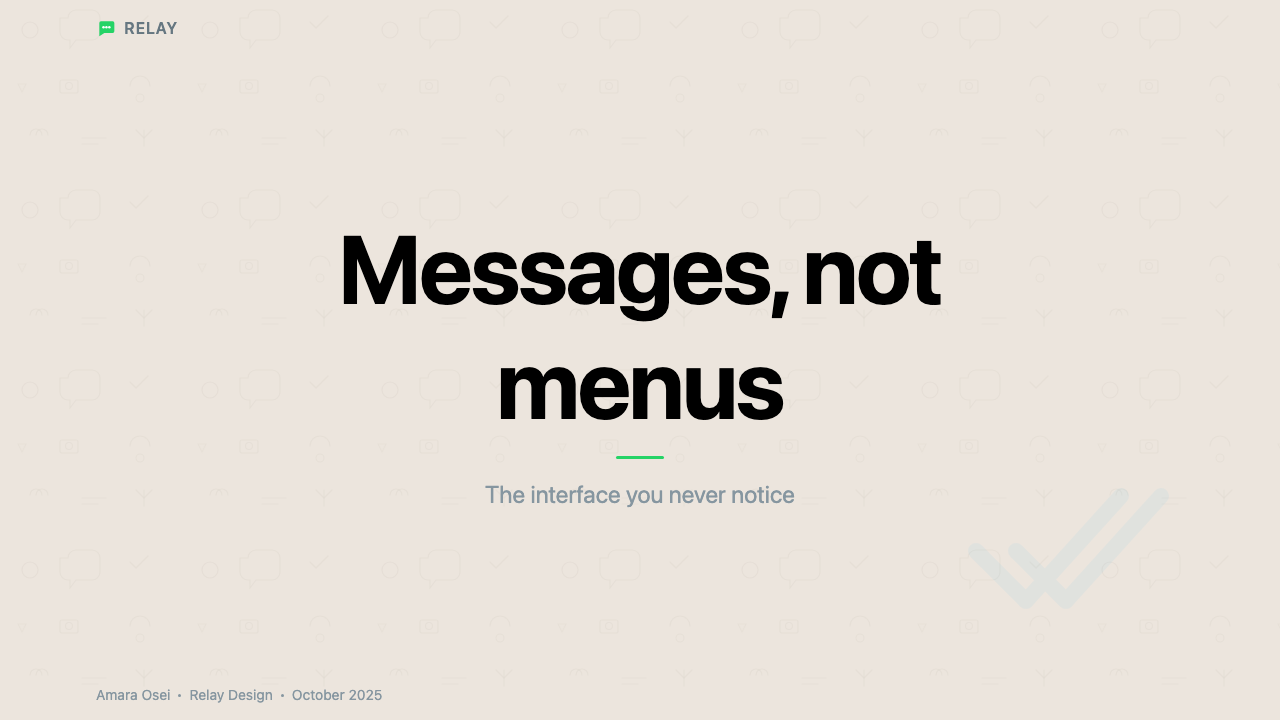
For presentation slides, the WhatsApp aesthetic works best when the designer resists the temptation to fill empty space. A cover slide benefits from a single bold element — the title or a large numeral — placed against the cream ground, with the signal green used only for a single accent line, label, or background panel. Content slides should treat each piece of information as a message bubble: bounded, readable, and adequately spaced from its neighbors. Data slides can adopt the bubble geometry literally — wrapping key statistics in rounded rectangles on the cream ground — or translate it more abstractly into clean bar and line charts where the green is reserved for the primary data series and all annotation is rendered in a quiet grey.对于演示文稿幻灯片,WhatsApp 美学在设计师抵制填满空白的诱惑时效果最佳。封面幻灯片适合将单一的醒目元素——标题或一个大号数字——置于奶油底色上,信号绿仅用于单一的强调线、标签或背景色块。内容页应当将每条信息视为一个消息气泡:有边界、可读、与相邻内容保持充分间距。数据页可以字面意义上借用气泡几何——将关键统计数字包裹在奶油底色上的圆角矩形中——或将其更抽象地转化为简洁的柱状图与折线图,绿色仅保留给主要数据系列,所有注释以安静的灰色呈现。
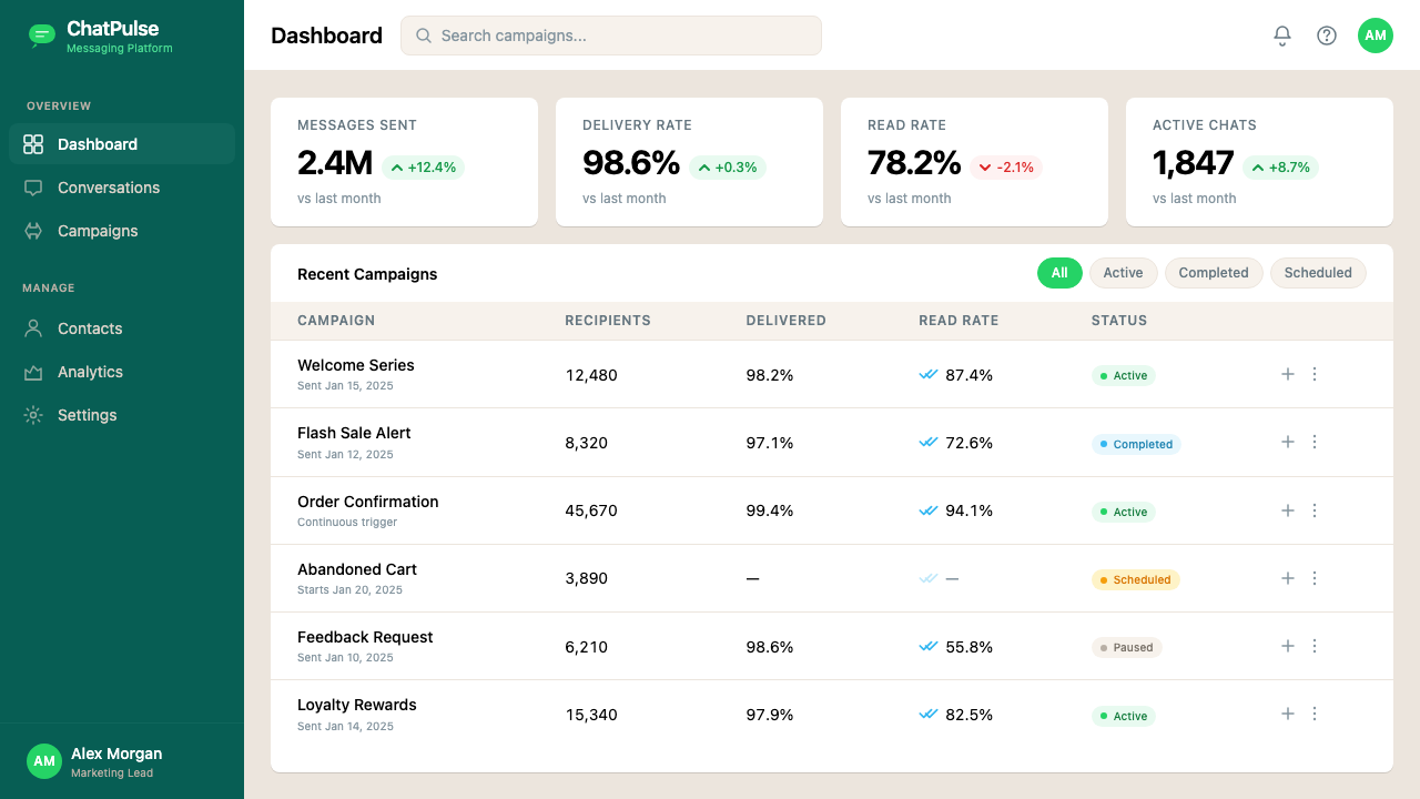
For web UI, dashboards, and pricing pages, the system excels at conveying trustworthiness and focus. A dashboard built on this aesthetic uses the cream or off-white as the page background, renders card components with the lightest possible shadow to suggest elevation without depth, and deploys the signal green exclusively for active states, confirmation indicators, and primary call-to-action buttons. Pricing pages benefit from the bubble-inspired card layout: each tier is a rounded container, the recommended tier distinguished by green instead of the standard background, all in a layout that prioritizes scannability over persuasive decoration.对于网页界面、仪表板和定价页面,这套系统在传递可信赖感与专注感上表现出色。基于这种美学构建的仪表板,以奶油色或米白色作为页面背景,以尽可能轻的投影呈现卡片组件以暗示层次而不制造深度,信号绿仅用于激活状态、确认指示器与主要行动号召按钮。定价页面适合借用气泡启发的卡片布局:每个等级是一个圆角容器,推荐等级以绿色而非标准背景色区分,整个布局优先保证可扫描性而非说服性装饰。
For editorial and marketing contexts, the WhatsApp visual language translates into a design sensibility that is warm and direct without being casual. An editorial layout built on this system keeps the typographic hierarchy simple — two or three sizes, one weight distinction — and uses the cream ground as a breathing field rather than filling it with background graphics. Marketing materials can leverage the global recognizability of the green-bubble-on-cream motif as a shorthand for direct, person-to-person communication: useful for campaigns involving messaging, accessibility, or human connection. The rounded corner geometry, applied to image crops and container elements, gives marketing layouts a conversational quality that distinguishes them from more formal corporate visual systems.对于编辑内容与营销场景,WhatsApp 视觉语言转化为一种温暖而直接却不失正式感的设计感性。基于这套系统的编辑版面保持排版层级简洁——两到三个字号、一种字重区分——将奶油底色用作呼吸场域而非填满背景图形。营销物料可以利用绿色气泡于奶油底色上的全球可辨认性,作为直接的人与人之间通讯的速记符号:适用于涉及即时通讯、可及性或人际连接的营销活动。圆角几何应用于图片裁切与容器元素,赋予营销版面一种对话感,使其区别于更正式的企业视觉系统。
A common mistake when working in this system is over-saturating the palette or multiplying accent colors. The WhatsApp aesthetic depends on the signal green being used sparingly — if every button, every tag, every data highlight, and every interactive element is green, the color loses its ability to direct attention. A second common mistake is using pure white as the ground instead of the characteristic warm off-white: the shift is small but perceptually significant, and pure white makes the interface feel colder and more generic. Preserve the warmth of the cream, keep the green rare and purposeful, and resist adding secondary accent colors that the original system never needed.在使用这套系统时,常见的错误是过度饱和色板或增加强调色。WhatsApp 美学依赖于信号绿的节制使用——如果每个按钮、每个标签、每个数据高亮和每个交互元素都是绿色,这种颜色就会失去引导注意力的能力。另一个常见错误是以纯白色替代底色,而非使用其特征性的温暖米白色:这个转变看似细微,感知上却意义重大——纯白色会让界面显得更冷、更通用。保留奶油色的温度,让绿色保持稀少而有目的,拒绝添加原始系统从未需要的次级强调色。
WhatsApp — FAQWhatsApp · 常见问题
Is the WhatsApp visual system the same as Material Design?WhatsApp 视觉系统与 Material Design 是同一回事吗?
They overlap but are not equivalent. WhatsApp runs on Android and therefore implements Material Design conventions for system-level interactions — navigation gestures, notification behavior, and certain animation patterns. However, the WhatsApp visual identity predates Material Design and has a distinct character: the cream background, the specific mid-green, the rounded bubble geometry, and the extreme economy of decoration are WhatsApp-specific choices that sit on top of, rather than being derived from, the Material Design system. Think of Material Design as the operating layer and WhatsApp's visual identity as the product layer built above it.两者有重叠,但并不等同。WhatsApp 运行于 Android 平台,因此在系统级交互上实现了 Material Design 规范——导航手势、通知行为与特定动画模式。然而,WhatsApp 的视觉身份早于 Material Design,且具有独特的气质:奶油色背景、特定的中绿色、圆润的气泡几何,以及极度节制的装饰,这些都是 WhatsApp 特有的选择,叠加于 Material Design 系统之上,而非衍生自它。可以将 Material Design 理解为操作系统层,而 WhatsApp 的视觉身份是构建于其上的产品层。
Can this aesthetic work in a dark mode context?这种美学能用于深色模式吗?
WhatsApp introduced its own dark mode in 2020, and the result is instructive. Rather than simply inverting to black, the dark variant uses a very dark, desaturated green-grey as the chat background — a tone that nods to the brand's green identity while remaining easy on the eyes in low-light conditions. Outgoing bubbles shift to a darker but still distinctly green tone, and the cream of incoming bubbles darkens to a soft, warm grey. The key principle carries over: the background is never pure black, the green is still the signature but becomes more muted, and the blue ticks remain legible. This approach — dark but warm, restrained but identifiable — is the right model for applying this aesthetic in dark contexts generally.WhatsApp 于 2020 年推出了自己的深色模式,结果颇具启发性。深色变体并非简单地将界面反转为黑色,而是以一种极深、去饱和的绿灰色作为聊天背景——这种色调既呼应品牌的绿色身份,又在低光环境下对眼睛友好。发送气泡转变为更深但仍然明显偏绿的色调,接收气泡的奶油色加深为柔和的暖灰色。核心原则得以延续:背景绝不是纯黑,绿色仍是标志但变得更为低调,蓝色双勾保持清晰可辨。这种处理方式——深沉但温暖、克制但可辨认——是在深色语境中应用这种美学的正确范本。
Why does WhatsApp use system fonts instead of a custom typeface?WhatsApp 为什么使用系统字体而非定制字体?
The decision reflects the product's foundational philosophy: the interface should feel native and frictionless, never calling attention to itself as a designed artifact. A custom brand typeface, however well executed, introduces a moment of mild foreignness — the sense that you have entered a branded environment rather than a neutral communication layer. System fonts feel like the phone speaking, not a brand speaking. There is also a practical dimension: system fonts are pre-loaded, require no network request to render, and are guaranteed to cover every character set needed by a truly global user base. The typographic quietness of the interface is not an accident of budget — it is a deliberate expression of the same philosophy that drives every other restraint in the system.这个决定折射出产品的基础哲学:界面应当感觉原生而无摩擦,绝不将注意力吸引到自身作为一个被设计的物件。定制品牌字体,无论执行得多么出色,都会引入一丝轻微的陌生感——让人感到进入了一个品牌化的环境,而非一个中性的通讯层。系统字体感觉是手机在说话,而非品牌在说话。这也有实用层面的考量:系统字体预加载于设备中,渲染无需网络请求,且保证覆盖真正全球化用户群所需的每一套字符集。界面在排版上的安静并非预算有限的偶然结果——它是与系统中所有其他克制选择同出一源的有意表达。
What kinds of products or brands benefit most from this aesthetic?哪类产品或品牌最能从这种美学中获益?
Products that position themselves around directness, reliability, and human connection are the strongest candidates. Communication tools, productivity applications, healthcare and financial services platforms targeting everyday users, and any product whose trust proposition depends on the interface not getting in the way. The warmth of the cream ground and the friendliness of the rounded geometry make it more approachable than colder utilitarian systems, so it works in consumer contexts where complete clinical austerity would alienate users. It struggles in contexts that require sensory richness — food, fashion, luxury, entertainment — where the absence of decoration reads as blandness rather than confidence. It also struggles when brand differentiation depends on a distinctive visual signature, because the WhatsApp aesthetic's greatest virtue — its self-effacement — is also its limitation as a brand identity system.以直接、可靠和人际连接为定位的产品是最强的候选对象。通讯工具、效率应用、面向普通用户的医疗健康与金融服务平台,以及任何信任主张依赖于界面不妨碍用户的产品。奶油底色的温度和圆润几何的亲切感,使其比更冷峻的实用主义系统更具亲和力,因此在完全的临床简约会疏远用户的消费者场景中同样适用。它在需要感官丰富性的场景中则力不从心——食品、时装、奢侈品、娱乐——在这些场景中,装饰的缺席被解读为平淡而非自信。当品牌差异化依赖于独特的视觉标志时,它也会受到局限,因为 WhatsApp 美学最大的美德——自我隐退——同样是它作为品牌识别系统的制约所在。
How does this aesthetic relate to other messaging app visual systems?这种美学与其他通讯应用的视觉系统有何关联?
WhatsApp, iMessage, Telegram, and Signal all share the same foundational metaphor — the chat bubble — but their visual languages express very different values. iMessage is polished, platform-native, and leans into translucency and blur effects that assert Apple's premium hardware positioning. Telegram is denser, more feature-forward, and uses color more liberally across UI elements, reflecting its design-savvy power-user audience. Signal, co-founded by WhatsApp's Brian Acton, deliberately mirrors WhatsApp's restraint as a statement of shared values, but its color signature — a different shade of green-blue — gives it a slightly colder, more technical character. WhatsApp's specific warmth — cream, rounded, quietly green — occupies a position that is more human than technical and more universal than premium, which explains both its extraordinary global reach and its visual distinctiveness within the category.WhatsApp、iMessage、Telegram 和 Signal 都共享同一个基础隐喻——聊天气泡——但它们的视觉语言表达了截然不同的价值观。iMessage 精致、原生于平台,并借助半透明与模糊效果强调 Apple 的高端硬件定位。Telegram 信息密度更高、功能更前置,在界面元素上使用更多样的色彩,折射出其设计敏感型高级用户群体。Signal 由 WhatsApp 的 Brian Acton 共同创立,刻意镜像 WhatsApp 的克制风格以表达共同价值观,但其色彩标志——一种不同的蓝绿色调——赋予它略为冷峻的技术气质。WhatsApp 特有的温度——奶油色、圆润、安静的绿——占据了一个比技术更具人情味、比高端更具普遍性的位置,这既解释了它非凡的全球覆盖范围,也解释了它在这一品类中的视觉独特性。
Related design styles相关设计风格
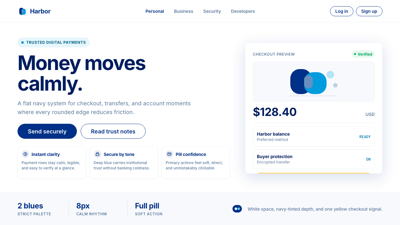 PayPalTrust without coldness. Deep navy, sky cyan, white cards, and pill checkout c…信任却不冰冷:深海军蓝与天青、白卡片和药丸结账提示。
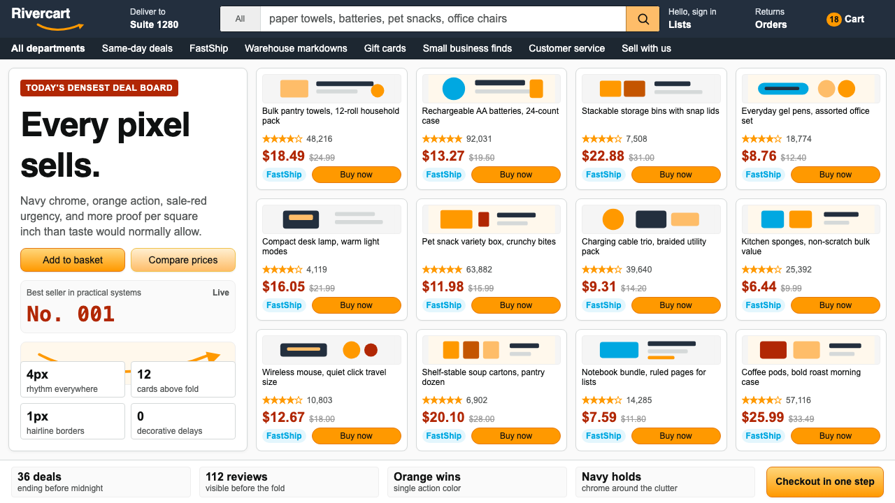 AmazonUgly sells efficiently. Navy chrome, orange buttons, red prices crowd a dense…朴素而高效:深蓝导航、橙色按钮、红价挤满密集网格。
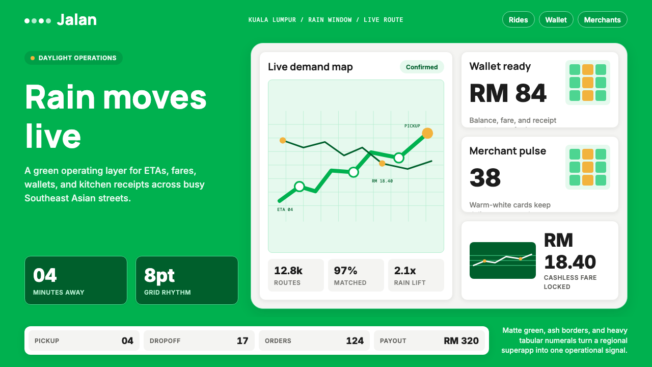 Grab SEA Superapp 2018Operational warmth. Saturated green, Inter numerals, and tight dashboard card…高效而温暖。饱和绿、Inter数字与紧密卡片塑造实时感。
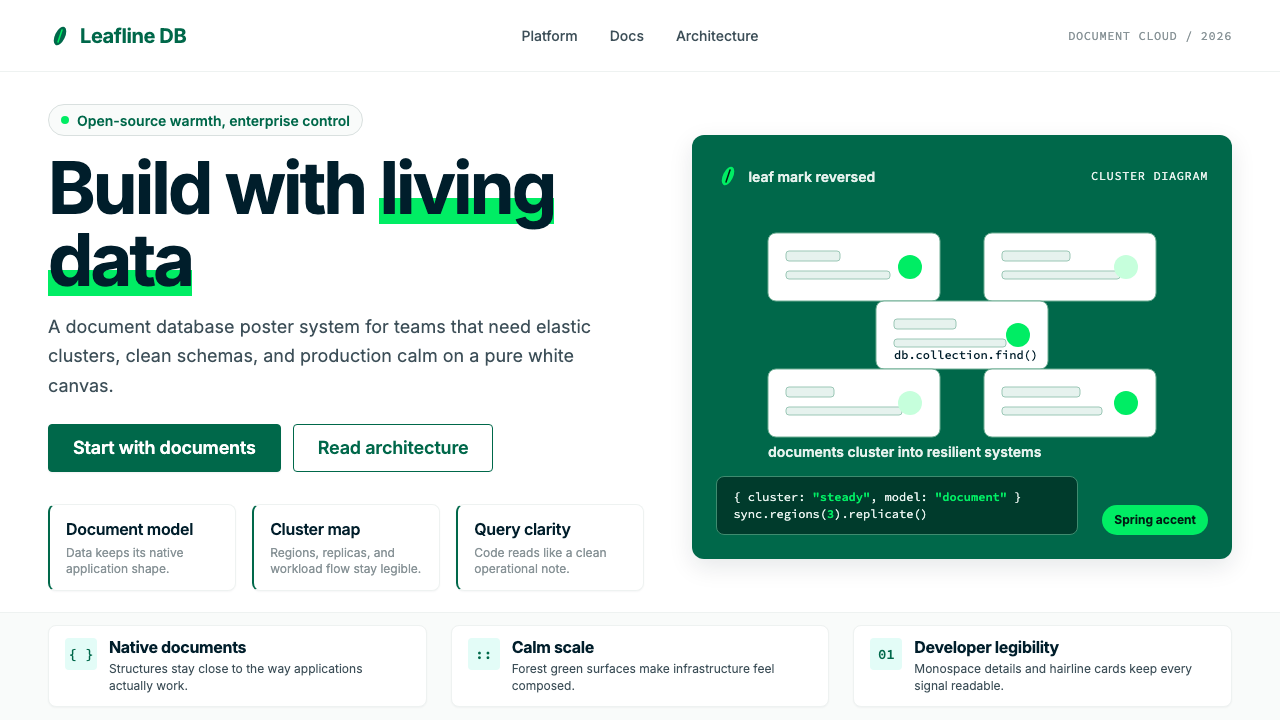 MongoDB Leaf GreenDisciplined green, open warmth. Forest leaf forms and Spring accents breathe…克制的绿有开源温度:森林绿叶形与春绿点缀,留白呼吸。
 Android Bugdroid GreenFriendly tech, reduced to geometry. Vivid green pops from Grey 900 and rounde…友好科技化为几何:明绿从 Grey 900 与圆润字形中跃出。
 AsanaCalm productivity breathes. Cream canvas, lavender panels, coral-blue-yellow…安静生产力会呼吸:奶油画布、薰衣草面板与三色圆点。