What is Amazon?什么是 Amazon?
Amazon's visual language proves that relentless A/B optimization, not aesthetic theory, can itself become a design doctrine — one where every pixel earns its place by driving a conversion.亚马逊的视觉语言证明:无止境的A/B测试优化,而非美学理论,本身也能成为一种设计信条——其中每一个像素都靠推动转化来证明自身的存在价值。
Amazon in briefAmazon 速览
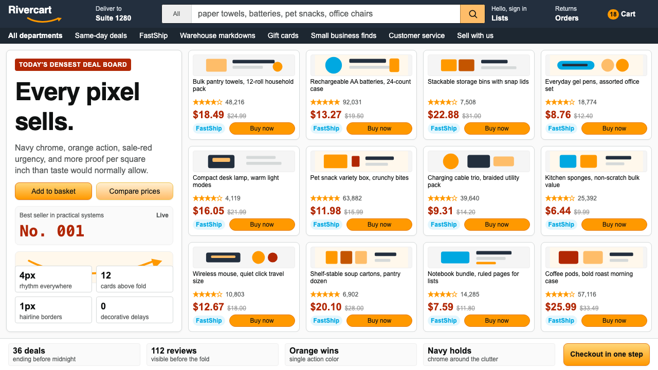
Amazon's visual identity is one of the most recognizable and most deliberately unglamorous in the history of commercial design. The orange smile-arrow logo, the deep navy navigation bar, the dense product grid crowded with star ratings, Prime badges, and red sale prices — these elements have remained largely unchanged since approximately 2003, not because Amazon neglected its interface, but because A/B testing consistently showed that the accumulated visual noise outperformed cleaner alternatives in conversion rates. The result is a design system that treats ugliness, or at least denseness, as a performance feature.亚马逊的视觉识别是商业设计史上辨识度最高、也最刻意拒绝光鲜的系统之一。橙色微笑箭头标志、深蓝导航栏、挤满星级评分与Prime徽章和红色促销价的密集商品网格——这些元素自2003年前后便几乎一成不变,并非因为亚马逊忽视了界面设计,而恰恰是因为A/B测试反复证明:这套积累已久的视觉喧嚣,在转化率上持续优于更整洁的替代方案。结果是一套将拥挤——或者说信息密度——视为性能特征的设计系统。
The core logic of the Amazon visual system is what might be called Walmart-aisle thinking applied to a screen. A physical retail aisle maximizes the number of products a shopper can see and compare within a single glance; Amazon's product grid does the same thing digitally, sacrificing whitespace and breathing room in favor of information saturation. Every element on a page — the price, the rating, the number of reviews, the shipping badge, the button color — has been individually tested and retained because removing it measurably reduced sales. This is design by elimination of everything except what works.亚马逊视觉系统的核心逻辑,可以称之为将沃尔玛货架思维搬上屏幕。实体货架以单次扫视能看到并比较的商品数量为最大化目标;亚马逊的商品网格在数字空间里做的是同一件事,以牺牲留白和呼吸感换取信息饱和度。页面上的每个元素——价格、评分、评论数量、配送徽章、按钮颜色——都经过单独测试并因证明其删除会可量化地降低销量而被保留下来。这是一种通过消除一切无效内容来演化的设计。
Unlike design systems rooted in a formal aesthetic movement — Bauhaus functionalism, Swiss rationalism, Muji restraint — the Amazon style has no founding manifesto and no named visual director who shaped it from the top down. It is the aggregate product of millions of user interactions, each one casting a vote through click-through rates and purchase completions. Its consistency comes not from a style guide enforced by designers but from the sheer inertia of a system too profitable to break.与根植于正式美学运动的设计系统不同——包豪斯功能主义、瑞士理性主义、无印良品式克制——亚马逊风格没有创始宣言,也没有一位从顶层塑造它的知名视觉总监。它是数百万次用户交互的集合产物,每一次点击率和购买完成都在投票。它的一致性不是来自设计师执行的风格指南,而是来自一个盈利能力过于强大以至于无法轻易打破的系统本身的惰性。
Where does Amazon come from?Amazon 从何而来?
Amazon was founded by Jeff Bezos in July 1994 in Bellevue, Washington, initially as an online bookstore operating out of a garage. The earliest Amazon website, launched in 1995, had the functional spareness of most early commercial web pages — simple text links, minimal imagery, and a utilitarian structure driven entirely by what the web technology of the era could support. The orange and black color pairing appeared early, though its precise meaning was more practical than symbolic: high contrast for readability, warm accent for commercial urgency.亚马逊由杰夫·贝索斯于1994年7月在华盛顿州贝尔维尤创立,最初是在一间车库里运营的网络书店。1995年上线的最早版亚马逊网站,具备那个时代大多数早期商业网页的功能性简朴——纯文字链接、极少图片,结构完全由当时的网络技术能力决定。橙色与黑色的配色组合很早便已出现,其含义更多是实用性的而非象征性的:高对比度确保可读性,暖色调强调商业紧迫感。
Through the late 1990s and early 2000s, as Amazon expanded from books into music, electronics, toys, and eventually almost every consumer category imaginable, the visual system evolved not through formal redesign campaigns but through continuous incremental adjustment. The company developed an early and intense commitment to data-driven decision-making under Bezos, who famously insisted that every product and interface decision be backed by measurable outcomes. This philosophy, combined with the company's scale, made A/B testing the de facto design methodology. By the time Amazon's visual identity stabilized around 2003, it had been shaped less by any individual creative vision than by the cumulative effect of thousands of small experiments.在1990年代末至2000年代初,随着亚马逊从图书扩展至音乐、电子产品、玩具,最终几乎覆盖所有消费品类,其视觉系统的演化并非通过正式的重新设计运动,而是通过持续的渐进式调整。贝索斯领导下的公司很早便形成了对数据驱动决策的强烈信仰——他以坚持每项产品与界面决策都必须有可测量结果为人所知。这一哲学加上公司的规模,使A/B测试成为事实上的设计方法论。到亚马逊视觉识别于2003年前后趋于稳定时,塑造它的与其说是某一个体创意愿景,不如说是数千次小型实验的累积效应。
The smile-arrow logo — a curved orange line running from the letter A to the letter Z in the Amazon wordmark, suggesting both a smile and the breadth of the product catalog — was refined by Turner Duckworth, a brand design agency, in the early 2000s. The logo encapsulates the Amazon brand philosophy in a single mark: friendliness (the smile), comprehensiveness (A to Z), and directional momentum (the arrow pointing forward and slightly upward). It remains one of the most globally recognized logos in commercial history, notable for communicating multiple meanings without a word of explanation.微笑箭头标志——一条从亚马逊字标中字母A延伸至字母Z的橙色曲线,同时暗示微笑与商品目录的广度——由品牌设计机构特纳·达克沃斯(Turner Duckworth)在2000年代初精炼成型。这个标志用单一符号浓缩了亚马逊的品牌哲学:亲切感(微笑)、全面性(从A到Z)与方向动能(箭头指向前方略微上扬)。它是商业史上全球辨识度最高的标志之一,以无需任何文字说明即能传达多重含义而著称。
The current visual identity, centered on what is informally called the Amazon Smile system, reflects a broader design culture that was consolidated during the company's expansion into cloud computing, streaming media, devices, and logistics. Andy Jassy, who succeeded Bezos as CEO in 2021, has overseen a period of refinement rather than reinvention — the core visual logic has proven durable enough to persist across Amazon's retail site, AWS console, Prime Video interface, Kindle ecosystem, and Alexa device packaging, each adapting the palette and density to its specific context while retaining the core vocabulary. Ben Kiel and other typographers have contributed to the typographic refinement of the broader brand system, though the retail interface specifically has remained closer to its A/B-tested roots than to any formal typographic system.以非正式称谓「亚马逊微笑系统」为核心的当前视觉识别,反映了公司在向云计算、流媒体、设备与物流扩张过程中形成的更广泛设计文化。2021年接替贝索斯出任CEO的安迪·贾西主导了一段精炼而非重塑的时期——核心视觉逻辑已被证明足够耐久,得以贯穿亚马逊零售站点、AWS控制台、Prime Video界面、Kindle生态与Alexa设备包装,每个场景在保留核心词汇的同时,对色板与密度做出适应性调整。本·基尔等排印师为更广泛的品牌系统贡献了排版层面的精炼,但零售界面本身始终比任何正式排版系统都更接近其A/B测试出的根源。
What defines the Amazon look?Amazon 的视觉特征是什么?
Color System色彩系统
Amazon's palette operates around three functional tiers. The primary navigation chrome uses a deep navy that reads as authoritative and institutional, providing a stable frame for the chaotic density below. The call-to-action orange — most visible in the 'Add to Cart' and 'Buy Now' buttons — is warm, high-urgency, and distinct enough from the rest of the interface that it consistently draws the eye. Red is reserved for price signals: sale prices, countdown timers, and lightning deal markers use red specifically because it triggers urgency and loss-aversion instincts in shoppers. Together these three colors function less as a coherent aesthetic palette and more as a traffic-control system, directing attention in a deliberate sequence.亚马逊的色板围绕三个功能层级运作。主导航栏使用深蓝色,传递权威感与机构感,为其下方的密集混乱提供稳定的框架。行动召唤橙色——在「加入购物车」和「立即购买」按钮上最为显眼——色调温暖、紧迫感强,且与界面其余部分区分度足够高,能持续吸引视线。红色则专用于价格信号:促销价、倒计时器和闪购标记专门使用红色,因为它触发购物者的紧迫感和损失厌恶本能。这三种颜色组合在一起,与其说是一套连贯的美学色板,不如说是一套交通管制系统,以蓄意设计的顺序引导注意力。
Information Density信息密度
The Amazon product grid deliberately resists the whitespace conventions of contemporary design. Where most modern e-commerce and editorial interfaces reserve significant breathing room between elements, Amazon's grid maximizes the number of products visible within a single viewport and layers each product tile with multiple data points: star rating with review count, price with any applicable discount, Prime eligibility badge, estimated delivery date, and brief description text. This density is not an oversight or a legacy artifact — it has been repeatedly tested against sparser alternatives and has survived because users in a comparative-shopping mindset benefit from seeing more information faster, even at the expense of visual comfort.亚马逊的商品网格刻意抵制当代设计中的留白惯例。多数现代电商和编辑界面在元素之间保留充裕的呼吸空间,而亚马逊的网格则最大化单一视口内的可见商品数量,并在每个商品卡片上叠加多个数据点:带评论数量的星级评分、含适用折扣的价格、Prime资格徽章、预计配送日期和简短描述文字。这种密度既非疏失也非历史遗留——它反复经受了与更简洁替代方案的对比测试,并因为处于比价购物心态的用户从更快速看到更多信息中受益而存活下来,即便以牺牲视觉舒适度为代价。
Trust Signals信任信号
A distinctive feature of the Amazon visual system is its dense layer of social-proof and trust signals, each with its own visual treatment. Star ratings use a familiar five-point scale rendered in a warm amber that echoes the orange brand accent. The Prime badge — a small mark combining the Amazon smile with the word 'prime' — functions as a quality and speed guarantee recognized globally. 'Amazon's Choice' and 'Best Seller' ribbons overlay product images using contrasting colors that stand out against any product photography. Customer review counts are displayed numerically and are hyperlinked, making the data feel live and verifiable. These elements collectively create what behavioral economists call social validation — the sense that a purchase decision is confirmed by the aggregated wisdom of previous buyers.亚马逊视觉系统的一个显著特征,是其密集的社会证明与信任信号层,每种信号都有自身独特的视觉处理。星级评分使用耳熟能详的五分制,以呼应橙色品牌强调色的暖琥珀色呈现。Prime徽章——将亚马逊微笑与「prime」字样组合的小标记——作为速度与质量保证在全球范围内被认知。「Amazon精选」和「畅销品」色带以对比鲜明的颜色叠加在商品图片上,能在任何商品摄影背景上突显出来。顾客评论数量以数字显示并带超链接,使数据感觉实时且可核实。这些元素共同创造了行为经济学家所称的社会认可——即一项购买决策经由此前买家集体智慧背书的感受。
Typography字体排印
Amazon's typographic approach is functional rather than expressive. The interface uses clean, neutral sans-serif letterforms that prioritize legibility at small sizes across diverse screen resolutions. Hierarchy is established through scale and weight rather than dramatic contrast or stylistic variation — a product title reads larger than metadata, which reads larger than supplemental details, in a clear descending stack. Price figures are typically given extra visual emphasis through larger size and sometimes bolder weight to ensure they register immediately. The system avoids decorative type treatments entirely; every typographic decision serves scanability above all else.亚马逊的排版取向是功能性的而非表达性的。界面采用干净、中性的无衬线字形,优先保证在各种屏幕分辨率下的小尺寸可读性。层级通过大小和字重建立,而非通过戏剧性对比或风格变化——商品标题大于元数据,元数据大于补充信息,形成清晰的递降结构。价格数字通常通过更大的尺寸和有时更粗的字重获得额外视觉强调,以确保它们被即时识别。系统完全回避装饰性排版处理;每一个排版决策首先服务于可扫描性。
Button Hierarchy按钮层级
The Amazon interface maintains a clear and consistent button hierarchy that users learn to navigate without conscious thought. Primary conversion buttons — 'Add to Cart', 'Buy Now', 'Subscribe & Save' — use the signature orange background, making them immediately identifiable as the highest-priority actions on any page. Secondary actions, such as adding to a wish list or comparing products, use a more subdued styling that competes less aggressively for attention. This hierarchy is applied with unusual consistency across the Amazon product suite, ensuring that the behavioral patterns users develop on the retail site transfer with minimal friction to other Amazon services.亚马逊界面维持着一套清晰且一致的按钮层级,用户无需有意识思考便能驾驭。主要转化按钮——「加入购物车」、「立即购买」、「订阅并节省」——使用标志性橙色背景,使其在任何页面上都能被即时识别为优先级最高的操作。次要操作,如添加至心愿单或比较商品,采用更内敛的样式,对注意力的争夺不那么积极。这一层级在亚马逊整个产品系列中以罕见的一致性被执行,确保用户在零售站点上形成的行为模式能以最小摩擦迁移到其他亚马逊服务。
Photography and Imagery摄影与图像
Product photography on Amazon follows strict standardized guidelines: main product images on a pure white background, consistent aspect ratios, and multiple-angle coverage. This standardization serves the grid's density — when every product image shares the same background treatment, the eye can compare products across the grid without the noise of competing photographic styles. Category and promotional imagery, used in hero banners and seasonal campaigns, follows a more conventional retail advertising idiom: lifestyle photography, seasonal color themes, and aspirational framing. These promotional images tend to be more visually polished than the product grid itself, marking a deliberate tonal shift between browsing mode and editorial marketing mode.亚马逊的商品摄影遵循严格的标准化规范:纯白背景上的主商品图、统一的宽高比、多角度覆盖。这种标准化服务于网格的密度——当每张商品图都共享相同的背景处理时,眼睛能在网格中比较商品,而不受相互竞争的摄影风格所产生的噪音干扰。用于英雄横幅和季节性活动的品类与促销图像,则遵循更传统的零售广告惯例:生活场景摄影、季节性色彩主题和向往式取景。这些促销图像在视觉上往往比商品网格本身更为精致,标志着浏览模式与编辑营销模式之间刻意为之的基调转换。
Conversion Architecture转化架构
What distinguishes the Amazon visual system most fundamentally from design systems built around aesthetic intent is its explicit subordination of visual form to conversion architecture. Every interface element — the placement of the price relative to the button, the size of review star ratings, the prominent display of shipping timelines — has been positioned and sized to minimize friction in the path from product discovery to purchase completion. This is not a layout built around a visual idea; it is a funnel rendered as a page. The visual system's coherence derives from the consistency of this underlying purpose rather than from any shared aesthetic vocabulary.将亚马逊视觉系统与那些围绕美学意图构建的设计系统最根本地区别开来的,是其对视觉形式的明确从属关系——一切视觉形式都服务于转化架构。每一个界面元素——价格相对于按钮的位置、评论星级的大小、配送时间线的突出展示——都被定位和调整以最小化从商品发现到购买完成路径上的摩擦。这不是围绕一个视觉理念构建的布局,而是以页面形式呈现的购买漏斗。这套视觉系统的连贯性源于这一底层目的的一致性,而非任何共同的美学词汇。
Who shaped Amazon?谁塑造了 Amazon?
Bezos founded Amazon in 1994 and served as CEO until 2021, during which time he established the data-driven, customer-obsession culture that shaped every aspect of the company's design approach. His insistence on working backwards from customer needs rather than from technological or aesthetic possibilities produced the A/B testing culture that effectively made Amazon's users, in aggregate, the designers of its interface. Bezos's famous two-pizza team structure and his emphasis on long-term thinking over short-term metrics also shaped the design system's unusual willingness to maintain visual choices that look unconventional but perform reliably.贝索斯于1994年创立亚马逊并担任CEO直至2021年,在此期间他确立了数据驱动、以客户为中心的文化,这种文化塑造了公司设计方式的方方面面。他坚持从用户需求而非技术或美学可能性出发的「向后工作」方法,催生了A/B测试文化,从而有效地使亚马逊用户在整体上成为其界面的设计者。贝索斯著名的「两块披萨」团队结构以及他对长期思维超越短期指标的强调,也塑造了这套设计系统在维护看似非常规却表现可靠的视觉选择时的罕见意愿。
Jassy succeeded Bezos as Amazon CEO in July 2021, having previously founded and led Amazon Web Services from its early days into the world's largest cloud computing platform. Under his leadership, Amazon has continued to extend its visual identity across new service categories and physical retail formats, including Amazon Go cashierless stores and Amazon Fresh. Jassy's AWS background is reflected in the more design-conscious treatment of the AWS console, which applies the Amazon color and typographic vocabulary to a professional tool context that demands greater clarity and less commercial urgency than the retail environment.贾西于2021年7月接替贝索斯出任亚马逊CEO,此前他曾从亚马逊云服务(AWS)创立之初便主导其发展,直至将其打造为全球最大的云计算平台。在他的领导下,亚马逊持续将视觉识别延伸至新的服务品类与实体零售形态,包括Amazon Go无收银员商店和Amazon Fresh。贾西的AWS背景体现在对AWS控制台更注重设计感的处理方式上——它将亚马逊的色彩与排版词汇应用于一个专业工具语境,而该语境对清晰度的要求高于零售环境,对商业紧迫感的强调则相对较少。
Turner Duckworth is the London- and San Francisco-based brand design agency credited with refining the Amazon smile-arrow logo that became the defining mark of the company's global identity. The agency's work distilled the Amazon proposition — breadth, friendliness, forward momentum — into a single curved orange line, a mark remarkable for communicating multiple layered meanings with minimal visual complexity. Turner Duckworth has also worked on brand identity for other major consumer companies, but the Amazon smile represents their most globally pervasive output, appearing on hundreds of millions of packages annually.特纳·达克沃斯是总部位于伦敦和旧金山的品牌设计机构,以精炼出亚马逊微笑箭头标志而著称——这一标志成为公司全球身份的标志性符号。该机构的工作将亚马逊的品牌主张——广度、亲切感、向前动能——提炼为一条弯曲的橙色线条,这个标志以最低限度的视觉复杂度传达了多层含义,令人称道。特纳·达克沃斯也为其他主要消费品公司做过品牌识别,但亚马逊微笑是其传播最广的产出,每年出现在数亿个包裹上。
Ben Kiel is a type designer associated with typographic work within the broader Amazon brand system. His contributions represent the ongoing effort to bring greater typographic coherence and intentionality to a visual identity that evolved primarily through optimization rather than design planning. Work at this level of the Amazon system — the formal typographic layer beneath the A/B-tested retail interface — reflects the tension between the company's data-driven heritage and the more considered typographic thinking that a global brand of Amazon's scale increasingly demands for contexts beyond the retail storefront.本·基尔是一位排印师,与亚马逊更广泛品牌系统中的排版工作相关联。他的贡献代表了一种持续努力——为一套主要通过优化而非设计规划演化而来的视觉识别带来更强的排版一致性与意图性。在亚马逊系统这一层面上的工作——位于A/B测试零售界面之下的正式排版层——折射出公司数据驱动传统与更深思熟虑的排版思维之间的张力,而随着亚马逊在零售店面以外的语境不断扩展,这种思维对于亚马逊规模的全球品牌而言愈发不可或缺。
Jeff Wilke served as Amazon's CEO of Worldwide Consumer from 2016 until his retirement in 2021, overseeing the retail, operations, and consumer device divisions that constitute the core of the Amazon customer experience. His operational focus on reducing friction in the purchase path — from one-click ordering to same-day delivery infrastructure — shaped the design culture of the consumer-facing product in ways that reinforced the primacy of conversion and convenience over aesthetic ambition. Wilke represents the operational and business logic that has always governed Amazon's visual choices as much as any creative director.杰夫·威尔克于2016年至2021年退休前担任亚马逊全球消费者CEO,监管构成亚马逊用户体验核心的零售、运营和消费设备部门。他对减少购买路径摩擦的运营专注——从一键下单到当日达配送基础设施——以强化转化与便利优先于美学抱负的方式,塑造了消费者产品的设计文化。威尔克代表了一直以任何创意总监同样程度支配亚马逊视觉选择的运营与商业逻辑。
How do you use Amazon today?今天怎么用 Amazon?
Applying the Amazon visual style to designed artifacts requires understanding its underlying purpose before replicating its surface characteristics. The style is not a set of aesthetic choices to be admired and imitated; it is a conversion optimization system, and its visual properties make sense only in the context of that purpose. When adapting it for presentations, interfaces, or marketing materials, the designer's task is to identify which principles transfer to the new context and which are specific to the high-density e-commerce environment where they originated.将亚马逊视觉风格应用于设计作品,需要在复制其表面特征之前理解其底层目的。这种风格不是一套供欣赏和模仿的美学选择,而是一套转化优化系统,其视觉属性只有在这一目的的语境下才有意义。在将其应用于演示文稿、界面或营销材料时,设计师的任务是判断哪些原则能迁移到新语境,哪些仅属于其诞生的高密度电商环境。
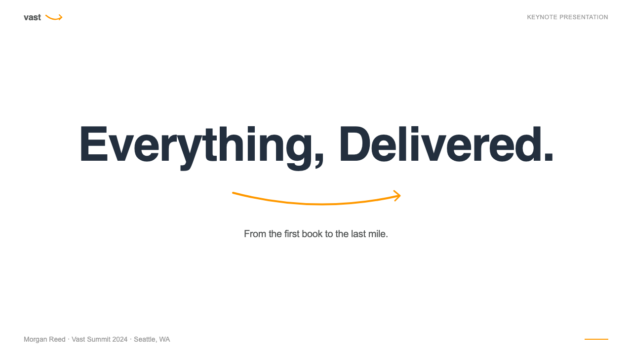
For presentation slides, the Amazon approach works best when the goal is to communicate maximum information with minimum visual decoration. A cover slide in this idiom might use a deep navy background with orange typographic accent and a single high-contrast wordmark or title — establishing the tone of authoritative efficiency before content begins. Content slides benefit from the approach's emphasis on trust signals and data visibility: star ratings, percentage metrics, comparison tables, and review-style callout quotes rendered in a structured grid communicate a sense of validated, evidence-based argument. Data slides can adopt the 'orange for the most important number' logic, where the key metric is visually isolated in a warm accent color against a neutral field, with supporting figures in a smaller, more subdued treatment.对于演示文稿,亚马逊方式在目标是以最少视觉装饰传达最大量信息时效果最佳。这种风格的封面页面可能使用深蓝背景配橙色排版强调色和单一高对比度字标或标题——在内容开始前便建立权威高效的基调。内容页面受益于该方式对信任信号与数据可见性的强调:以结构化网格呈现的星级评分、百分比指标、比较表格和评价式引用语,传达出一种经过验证的、基于证据的论证感。数据页面可以采用「最重要数字用橙色」的逻辑,将关键指标以暖调强调色从中性底面中视觉隔离,辅助数据则采用更小、更内敛的处理。
For web interfaces — particularly dashboards, pricing pages, and product comparison pages — the Amazon visual system offers a proven model for information-dense environments where users arrive in a comparative-shopping mindset. The approach: use a structured column grid to organize product or feature cards, apply orange selectively to primary action buttons and the single most important data point per card, use navy or dark grey for navigation and structural chrome, and reserve red strictly for urgency signals such as limited availability or time-sensitive pricing. Star-rating components and numerical review counts add social proof to any evaluation-oriented interface. The key adaptation is to resist the full density of Amazon's retail environment and instead use the vocabulary at a slightly lower saturation, appropriate to the specific context.对于网页界面——尤其是仪表板、定价页面和商品比较页面——亚马逊视觉系统为信息密集型环境提供了一个经过验证的模型,适用于用户以比价心态到来的场合。方法是:使用结构化列网格组织商品或功能卡片,将橙色选择性地应用于主要操作按钮和每张卡片最重要的单一数据点,用深蓝或深灰处理导航与结构框架,将红色严格保留给紧迫性信号,如限量供应或限时定价。星级评分组件和数字评论数量为任何以评估为导向的界面增添社会证明感。关键的适应性调整是抵制亚马逊零售环境的全部密度,转而以略低饱和度使用这套词汇,以适应具体语境。
For editorial and marketing work, the Amazon style is most useful as a vocabulary for establishing commercial authority and consumer trust rather than as a complete aesthetic system. A product launch page might use the deep navy and orange pairing in a hero section, with clean typographic hierarchy communicating the key value propositions in descending importance. Marketing emails can adopt the orange call-to-action button convention, which users associate with reliable e-commerce purchase flows, to increase click-through rates on promotional content. The trust-signal vocabulary — ratings, review counts, delivery promises — can be adapted for service businesses and subscription products to provide the same sense of social validation that drives conversion on the retail site.对于编辑与营销工作,亚马逊风格最有价值的用途是建立商业权威感与消费者信任,而非作为完整的美学系统。产品发布页面可以在英雄区域使用深蓝与橙色组合,配以清晰的排版层级,以重要性递降顺序传达关键价值主张。营销邮件可以采用橙色行动召唤按钮惯例——用户将其与可靠的电商购买流程相关联——以提高促销内容的点击率。信任信号词汇——评分、评论数量、配送承诺——可以为服务业和订阅产品所改用,提供与零售站点驱动转化的同等社会认可感。
A common mistake when working in the Amazon visual idiom is conflating information density with visual clutter. Amazon's density works because every element has a specific function within the conversion architecture; removing any one element reduces conversion, which is why A/B testing has preserved them. In a context without that optimization infrastructure, reproducing the density without the function creates visual noise rather than useful information saturation. The discipline is to include only those elements that serve a specific purpose in the new context, applying the style's functional logic rather than its surface appearance. Similarly, the orange accent color loses its power if applied too broadly; it works precisely because it is reserved for the highest-priority action in any given view.使用亚马逊视觉风格时最常见的错误是将信息密度等同于视觉混乱。亚马逊的密度之所以有效,是因为每个元素在转化架构中都有特定功能;删除任何一个都会降低转化率,这正是A/B测试保留它们的原因。在没有这种优化基础设施的语境中,复制密度而不复制功能,产生的是视觉噪音而非有用的信息饱和。应有的自律是只纳入在新语境中服务于特定目的的元素,应用这种风格的功能逻辑而非其表面外观。同样,橙色强调色若使用过于宽泛便会失去其效力;它的力量恰恰在于它被保留给任何给定视图中优先级最高的操作。
Amazon — FAQAmazon · 常见问题
Is Amazon's visual style a design system in the conventional sense?亚马逊的视觉风格是传统意义上的设计系统吗?
Not in the way most designers use the term. A conventional design system is a documented, intentional set of visual and interaction principles created by designers and applied consistently across products. Amazon's visual identity emerged primarily through A/B testing optimization rather than top-down design direction, which means its principles are implicit in the interface's performance history rather than explicitly documented in a design philosophy. Amazon does maintain internal design guidelines and component libraries for its product teams, but the visual choices that define the brand publicly — the orange buttons, the dense grids, the trust signals — were selected and retained because they convert, not because they express a coherent design vision.并非大多数设计师所理解的那种形式。传统设计系统是由设计师创建、在产品间一致应用的有文档记录的、有意图的视觉与交互原则集合。亚马逊的视觉识别主要通过A/B测试优化而非自上而下的设计方向涌现而成,这意味着其原则隐含在界面的性能历史中,而非明确记录于某个设计哲学文件。亚马逊确实为其产品团队维护了内部设计指南和组件库,但公开定义品牌的视觉选择——橙色按钮、密集网格、信任信号——是因为它们能转化而被选择和保留,而非因为它们表达了连贯的设计愿景。
Why hasn't Amazon redesigned its interface to be more visually modern?亚马逊为什么没有将界面重新设计得更具现代视觉感?
Amazon has in fact updated its interface iteratively over the years, but the underlying visual logic has remained stable because changing any significant element risks disrupting the conversion patterns that current users have internalized. The company has publicly discussed how even small interface changes can produce measurable revenue impacts at Amazon's scale. There is also a well-documented phenomenon where the visual density that appears cluttered to a design-trained eye reads as information-rich and trustworthy to shoppers accustomed to it — Amazon's interface has trained its users as much as its users have shaped the interface. A dramatic visual overhaul would carry enormous commercial risk for a company where the interface is the revenue engine.亚马逊实际上多年来一直在迭代更新界面,但底层视觉逻辑保持稳定,因为改变任何重要元素都有打乱当前用户已内化的转化模式的风险。该公司曾公开讨论在亚马逊的规模下,即便微小的界面变化也会产生可量化的营收影响。还有一个有据可查的现象:在受过设计训练的眼睛看来显得杂乱的视觉密度,在已习惯它的购物者看来是信息丰富且值得信赖的——亚马逊的界面已经训练了它的用户,正如它的用户塑造了界面一样。对于一家界面即营收引擎的公司而言,大幅度的视觉改造将承担巨大的商业风险。
Can the Amazon visual approach work for luxury or premium brands?亚马逊视觉方式适合奢侈品或高端品牌吗?
Almost certainly not in its full expression. The Amazon visual system is optimized for mass-market comparison shopping, where the goal is to help a user find the best value among many similar options quickly. Luxury branding operates on an almost opposite logic: it uses restraint, whitespace, and the deliberate withholding of information (such as prominently displaying prices) to signal exclusivity and aspiration. A luxury brand that adopted Amazon's dense grid, orange call-to-action buttons, and prominent star ratings would actively undermine its positioning. Individual elements — a clear typographic hierarchy, a consistent call-to-action color — can be borrowed at the principle level, but the system as a whole is deeply incompatible with luxury positioning.几乎可以肯定,在完整表达上行不通。亚马逊视觉系统针对大众市场比价购物进行了优化,其目标是帮助用户在众多类似选项中快速找到最佳性价比。奢侈品牌运作的逻辑几乎截然相反:它使用克制、留白和刻意的信息缺省(如突出展示价格)来传递独特性与向往感。一个采用亚马逊密集网格、橙色行动召唤按钮和突出星级评分的奢侈品牌会主动损害其定位。可以在原则层面借鉴个别元素——清晰的排版层级、一致的行动召唤颜色——但整套系统从根本上与奢侈品定位不相容。
How does the Amazon visual system translate across Amazon's different product lines?亚马逊视觉系统如何在其不同产品线之间转译?
Amazon operates several distinct visual sub-systems under the broader brand umbrella, each calibrated to its context. The AWS console uses the Amazon color vocabulary in a more restrained configuration appropriate to professional developer tools — navy navigation, orange for the most critical actions, but significantly less density and commercial urgency than the retail site. Prime Video and Amazon Music adopt streaming-service conventions — darker backgrounds, cinematic imagery, hero-format content cards — while retaining the orange accent as a connective thread. Alexa and Echo device packaging uses clean product photography and a minimal typographic approach that aligns more with consumer electronics conventions than with the retail website. The smile logo and the orange-navy palette function as the connective tissue across all these contexts.亚马逊在更广泛的品牌旗帜下运营着几个截然不同的视觉子系统,每个子系统都根据其语境进行了校准。AWS控制台以更克制的方式使用亚马逊色彩词汇,适合专业开发者工具——深蓝导航、橙色用于最关键的操作,但密度和商业紧迫感远低于零售站点。Prime Video和亚马逊音乐采用流媒体服务惯例——较暗的背景、电影感图像、英雄格式内容卡片——同时保留橙色强调色作为连接线索。Alexa和Echo设备包装使用干净的商品摄影和简约排版方式,这与消费电子产品惯例的契合度高于零售网站。微笑标志和橙蓝色板在所有这些语境中发挥着连接组织的作用。
Is there an ethical dimension to Amazon's conversion-optimized design approach?亚马逊以转化优化为核心的设计方式是否存在伦理维度?
This is a legitimately contested question within UX and design ethics communities. Proponents argue that Amazon's system is honest: it surfaces all available information — prices, reviews, shipping costs, seller identity — and gives users the tools to compare and decide. Critics point to patterns such as the visual treatment of Subscribe and Save subscriptions, the difficulty of canceling Prime membership, and the use of urgency signals like 'Only 3 left in stock' as examples of design choices that exploit psychological vulnerabilities rather than serving user interests. The regulatory concept of 'dark patterns' — interface designs that manipulate users into actions they would not otherwise take — has been applied to some Amazon interface elements by consumer protection authorities in Europe and the United States. A design practitioner working in this visual idiom should be aware of where the line between conversion optimization and manipulation lies.这在用户体验和设计伦理社群中是一个真正存在争议的问题。支持者认为亚马逊系统是诚实的:它呈现所有可获得的信息——价格、评论、运费、卖家身份——并给予用户比较和决策的工具。批评者则指出一些模式,如「订阅并节省」订阅的视觉处理、取消Prime会员资格的困难、以及「仅剩3件」等紧迫性信号的使用,将其视为利用心理弱点而非服务用户利益的设计选择的例证。「暗黑模式」这一监管概念——指操纵用户采取其本不会采取的行动的界面设计——已被欧美消费者保护机构应用于部分亚马逊界面元素。在这种视觉风格中工作的设计从业者应当清楚转化优化与操控之间的边界所在。
Related design styles相关设计风格
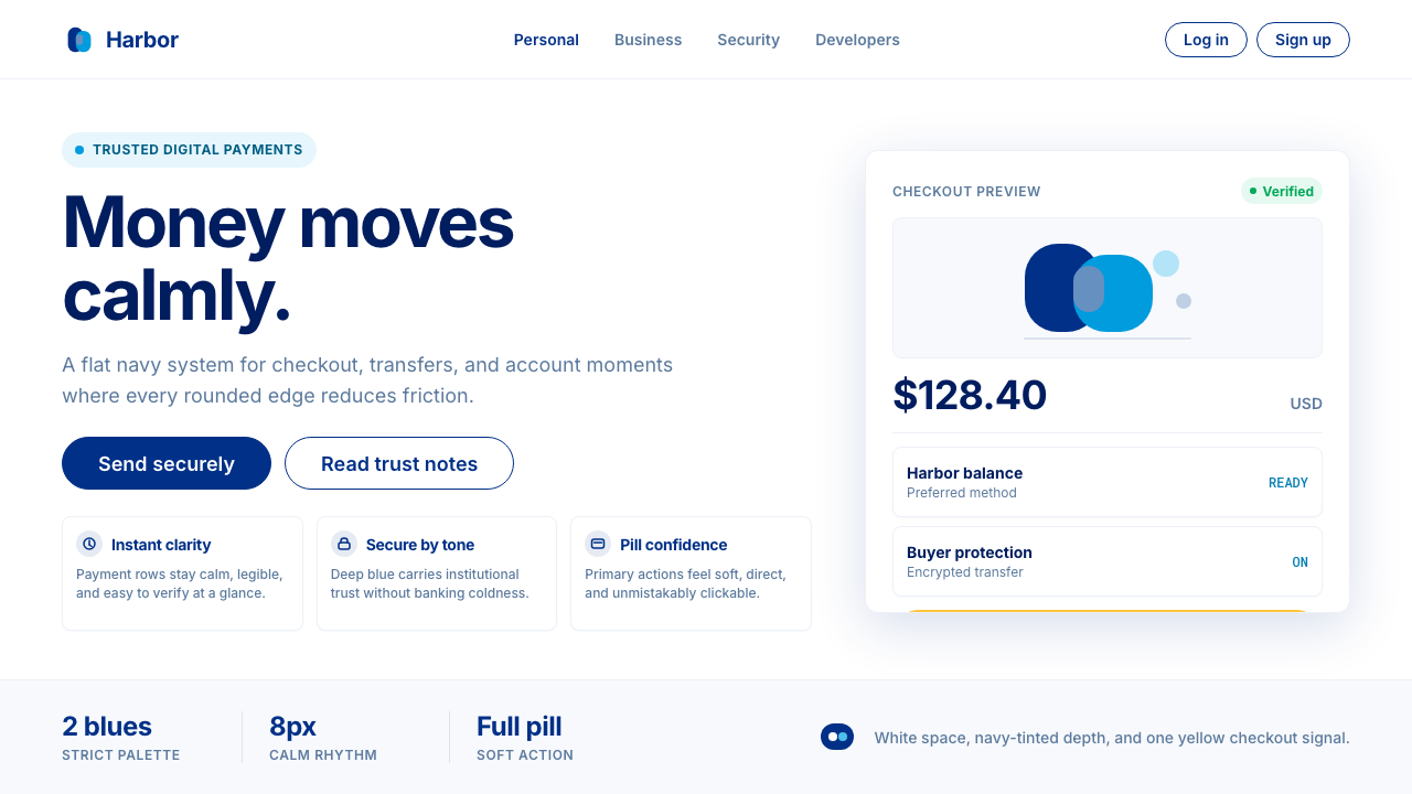 PayPalTrust without coldness. Deep navy, sky cyan, white cards, and pill checkout c…信任却不冰冷:深海军蓝与天青、白卡片和药丸结账提示。
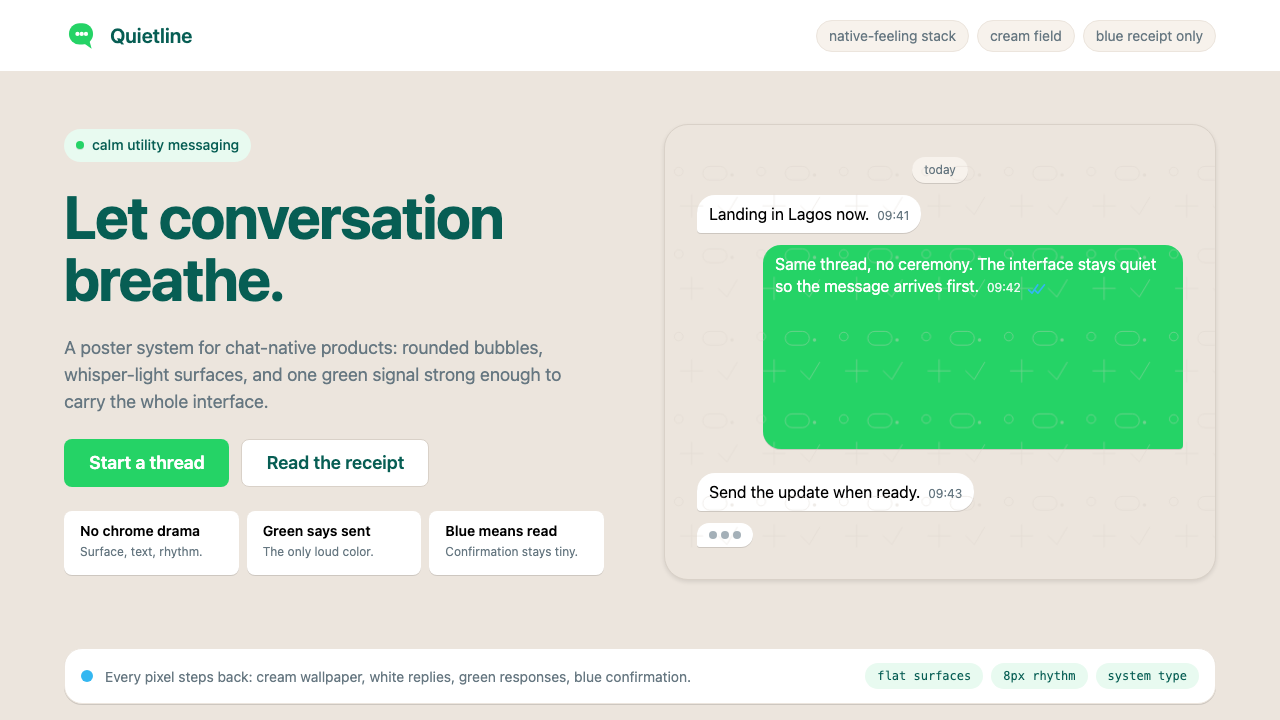 WhatsAppConversation is the interface. Cream wallpaper, green bubbles, and tiny blue…对话就是界面。奶油墙纸、绿色气泡与蓝色小勾让界面退后。
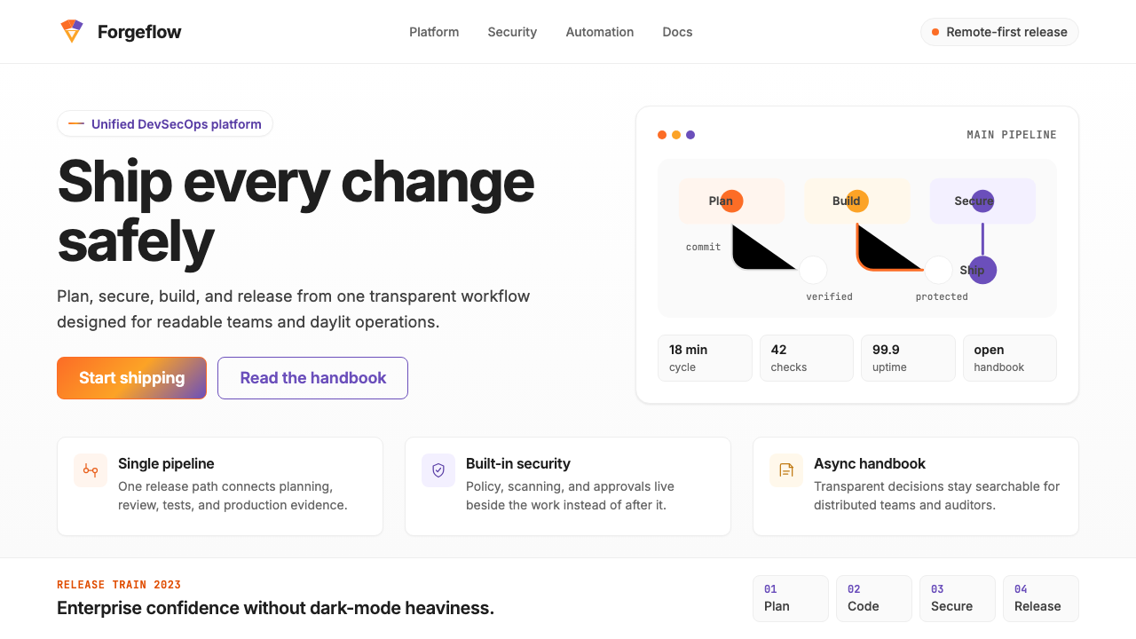 GitLab 2023DevOps in daylight. Tanuki orange-to-purple gradient, Inter, warm enough for…DevOps 走出暗色房间:标志性狸猫橙紫渐变、宽松行高、Inter 字体——…
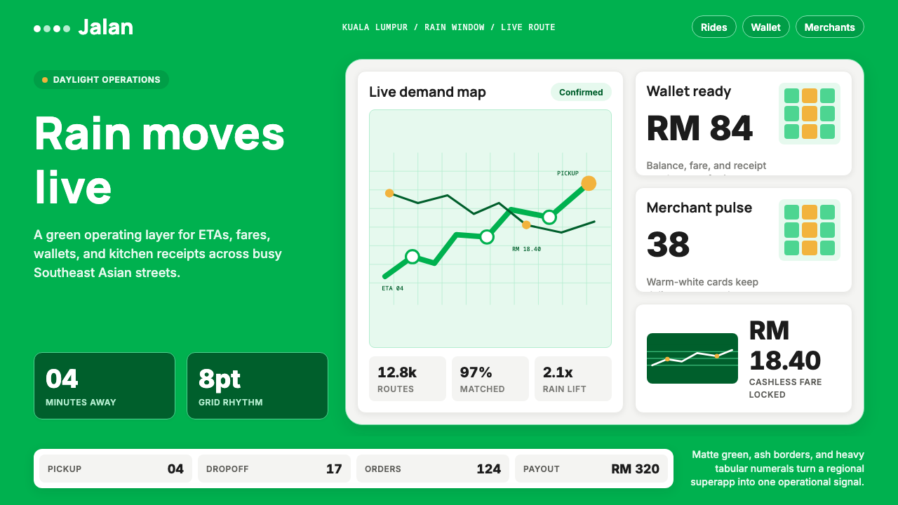 Grab SEA Superapp 2018Operational warmth. Saturated green, Inter numerals, and tight dashboard card…高效而温暖。饱和绿、Inter数字与紧密卡片塑造实时感。
 Airbnb 2014Coral red, soft pill cards, Cereal type. The Bélo wraps strangers in warm, da…Bélo 时代的珊瑚红与圆润 Cereal 字体——把陌生人之间的房间包装成阳…
 Android Bugdroid GreenFriendly tech, reduced to geometry. Vivid green pops from Grey 900 and rounde…友好科技化为几何:明绿从 Grey 900 与圆润字形中跃出。