Design style guide设计风格指南
What is Grab SEA Superapp 2018?什么是 Grab SEA Superapp 2018?
Grab's visual system distills six countries, a million motorcycle jackets, and an entire superapp economy into one unmistakable green — and the design logic behind it is as purposeful as the color itself.Grab 的视觉系统将六个国家、百万骑手外套和整套超级应用经济浓缩为一抹无可混淆的绿色——而这背后的设计逻辑,与这抹颜色本身一样深思熟虑。
Grab SEA Superapp 2018 in briefGrab SEA Superapp 2018 速览
The Grab SEA Superapp visual identity, as consolidated and formalized around 2018, is a dashboard-dense, daylight-first design language built for real-time operational clarity. Its visual grammar — a saturated signature green, matte surfaces, tight information cards, and typography that foregrounds numerals — emerged from the specific demands of a multi-country mobility and fintech platform serving users who range from daily commuters to first-time digital-wallet adopters.Grab 东南亚超级应用的视觉识别系统——于 2018 年前后整合并正式确立——是一套以高密度仪表盘和日光模式为核心的设计语言,专为实时操作清晰度而生。其视觉语法——饱和的标志性绿色、哑光表面、紧凑的信息卡片,以及突出数字的排版——源自一个横跨多国的出行与金融科技平台的具体需求,其用户从日常通勤者到初次使用数字钱包的新手一应俱全。
Where many consumer technology brands of the era leaned on gradients, illustration, and soft UI, Grab's identity is grounded in immediacy and trust. The design speaks in the register of a live dashboard: fares, estimated arrival times, and payment amounts are the real content, and every layout decision serves their legibility. Photography of actual riders and hawker-stall operators replaces decorative illustration, anchoring the brand in the specific textures of Southeast Asian daily life rather than generic global tech.彼时许多消费科技品牌倾向于渐变、插画与柔软的界面语言,而 Grab 的品牌识别却扎根于即时感与信赖感。这套设计以实时仪表盘的语调发声:车费、预计到达时间、支付金额才是真正的内容,每一个版面决策都服务于这些信息的可读性。真实骑手与小贩摊位的照片替代了装饰性插画,将品牌锚定于东南亚日常生活的具体质感,而非泛泛的全球科技美学。
The result is a style that feels simultaneously operational and warm — the warmth of a familiar neighborhood app, the precision of a logistics control room. It is a design language calibrated for the back of a motorcycle in the rain, for a merchant checking settlement figures on a budget handset, and for a first-generation smartphone user navigating a digital wallet with no prior banking relationship.由此形成的风格,既高效又温暖——熟悉街区应用的温度,加上物流控制室的精准。这是一套为雨中摩托车后座、为商户在低端手机上核查结算数字、为没有银行账户却初涉数字钱包的用户量身校准的设计语言。
See the Grab SEA Superapp 2018 design system →查看 Grab SEA Superapp 2018 完整设计系统 →
Where does Grab SEA Superapp 2018 come from?Grab SEA Superapp 2018 从何而来?
Grab began in 2012 as MyTeksi, a taxi-hailing app founded in Malaysia by Anthony Tan and Tan Hooi Ling while they were students at Harvard Business School. The name reflected its origins: a local solution to the notoriously unreliable and often unsafe taxi market in Kuala Lumpur. The founding insight was not just that ride-hailing could be digitized, but that Southeast Asian urban mobility had specific characteristics — fragmented infrastructure, a large two-wheeler market, cash-first consumers — that required a regionally native approach rather than a copy of Western models.Grab 的前身是 MyTeksi,于 2012 年由安东尼·陈(Anthony Tan)和陈慧玲(Tan Hooi Ling)在哈佛商学院就读期间创立于马来西亚。这个名字映照着它的起点:针对吉隆坡出了名不可靠、往往不够安全的出租车市场而生的本地解决方案。创业的洞察不仅在于网约车可以被数字化,更在于东南亚城市出行有其独特性——基础设施碎片化、两轮车市场庞大、消费者以现金为主——这些都需要一套本土原生的方案,而非照搬西方模型。
Through the mid-2010s, the company expanded across six Southeast Asian countries and rebranded from MyTeksi to GrabTaxi and then simply to Grab, signaling its ambition beyond ride-hailing into food delivery, payments, and financial services. The visual identity during this phase was functional but not yet coherent — a product of rapid growth across engineering and market teams rather than a unified design strategy. The brand had a recognizable green, but the system around it was inconsistent.2010 年代中期,公司陆续进入东南亚六个国家,品牌从 MyTeksi 更名为 GrabTaxi,再到简洁的 Grab,昭示着其从网约车向外卖、支付和金融服务扩张的野心。这一阶段的视觉识别是功能性的,但尚未形成内聚的体系——更多是工程和市场团队在快速扩张中各自为政的产物,而非统一的设计战略。品牌有一抹可辨认的绿色,但围绕它的体系并不一致。
The pivotal moment for the visual identity came in March 2018, when Grab completed the acquisition of Uber's entire Southeast Asian operation — the largest tech deal in the region's history at that point. Overnight, Grab absorbed Uber's driver partners, rider base, and operational infrastructure across eight countries. With that scale came the urgency of brand clarity: Grab was no longer just a ride-hailing challenger but the dominant superapp in the region, handling daily transactions for tens of millions of people. To establish the identity at that new scale, Grab partnered with DesignStudio London — the firm also known for rebranding Airbnb in 2014 — to formalize and elevate the visual system.视觉识别的转折点发生于 2018 年 3 月。Grab 完成了对 Uber 东南亚全部业务的收购——彼时该地区历史上规模最大的科技并购。一夜之间,Grab 接手了 Uber 在八个国家的司机伙伴、乘客基础和运营基础设施。随之而来的规模,带来了品牌清晰度的迫切需求:Grab 不再只是一个挑战者,而是该地区的主导超级应用,每日承载着数千万人的交易。为了在这一新规模上建立品牌识别,Grab 与伦敦 DesignStudio 合作——这家公司也以 2014 年为 Airbnb 重塑品牌而知名——正式打磨并提升了视觉系统。
The design work with DesignStudio produced what became the recognizable Grab system: a singular, deeply saturated green elevated from a functional app color to a brand signature; a typographic approach that centered the numerals and data displays that were the true content of the product; and a photography direction grounded in real Southeast Asian environments rather than aspirational lifestyle imagery. The green itself is deliberate — it needed to read clearly in the bright ambient light of tropical cities, to stand out on a motorcycle jacket at dusk, and to convey reliability and forward motion. It is a working color, not a decorative one.与 DesignStudio 的设计工作产出了如今可辨认的 Grab 体系:一抹从功能性应用色升华为品牌签名的深度饱和绿;一套以数字和数据显示为核心的排版方法——那才是产品的真正内容;以及一个根植于真实东南亚环境而非格调生活方式的摄影方向。这抹绿色本身是深思熟虑的选择——它需要在热带城市的强烈环境光下清晰可辨,在黄昏时分的摩托车外套上突出醒目,同时传递可靠性与前进感。它是一抹实用的颜色,而非装饰性的颜色。
What defines the Grab SEA Superapp 2018 look?Grab SEA Superapp 2018 的视觉特征是什么?
Signature Green标志性绿色
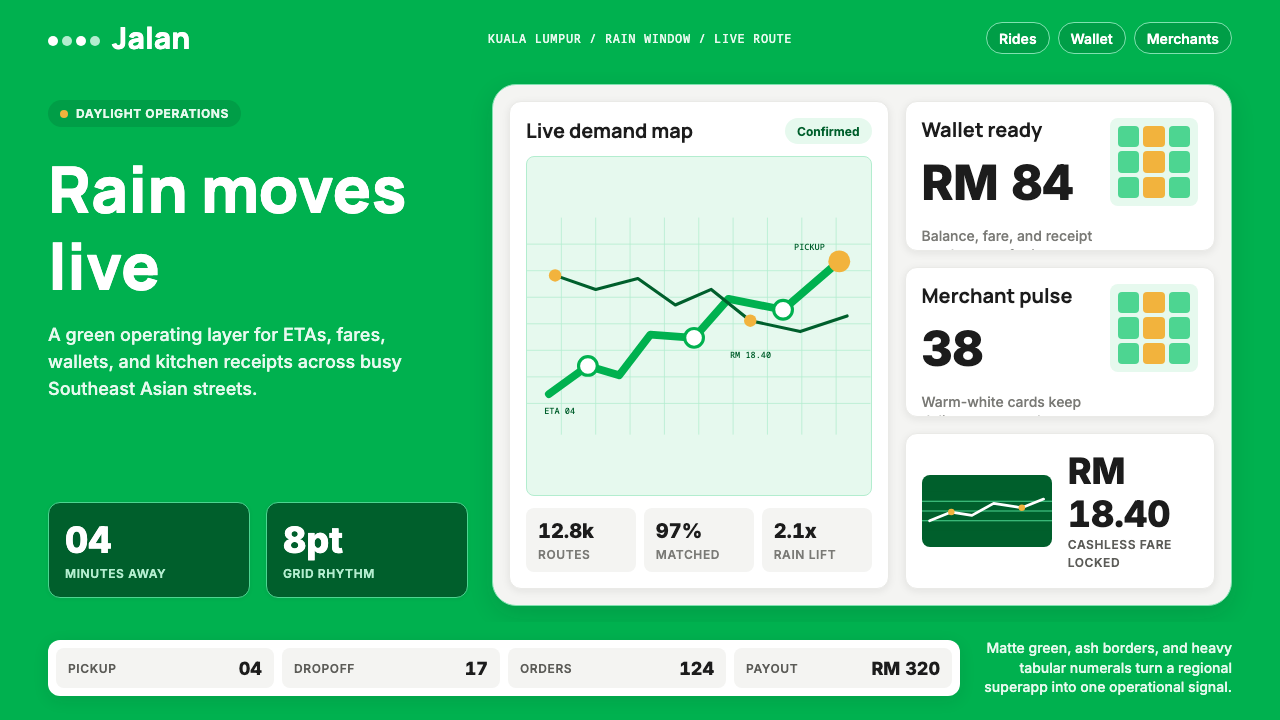
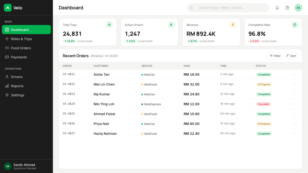
The defining element of the Grab visual system is its single, deeply saturated green. Unlike the muted or sage greens common in wellness and organic branding, Grab green is vivid and unambiguous — calibrated for high ambient light, small screen sizes, and the need to read clearly against the varied visual noise of Southeast Asian street environments. It functions as both a brand signal and a wayfinding color: on a jacket, on a map pin, on a payment confirmation screen, the green is always doing work. Secondary colors are sparse and subordinate; the green carries almost all the chromatic weight.Grab 视觉系统最具决定性的元素,是那抹深度饱和的单一绿色。不同于健康与有机品牌常用的哑光或鼠尾草绿,Grab 绿鲜明而毫不含混——为强环境光、小屏幕尺寸,以及在东南亚街头环境多样视觉噪声中保持清晰可辨而校准。它同时担当品牌信号与导向色:在骑手外套上、在地图标点上、在支付确认界面上,这抹绿色始终在做功。次要色系稀少且居从属地位;几乎全部色彩重量由绿色承担。
Numerals First数字优先
Grab's core product content is numerical: fares, estimated minutes, distances, wallet balances, merchant settlement figures. The typography system treats these numbers as the primary typographic event. They are set at generous scale, with generous weight, in a neutral sans-serif that prioritizes clarity at small sizes on mid-range screens. Prose labels and supporting text step back to serve the numbers rather than competing with them. This hierarchy — data first, context second — is unusually explicit and reflects a design philosophy built around operational legibility rather than brand expressiveness.Grab 核心产品内容是数字性的:车费、预计分钟数、距离、钱包余额、商户结算数字。排版系统将这些数字视为最主要的排版事件。它们以充裕的字号、充裕的字重排设,字体是优先保证中等屏幕小尺寸下清晰度的中性无衬线体。文字标签与辅助信息退居其后,服务于数字而非与之竞争。这种层级——数据优先、语境其次——异常明确,折射出一套围绕操作可读性而非品牌表达力构建的设计哲学。
Matte Surfaces and Flat Cards哑光表面与扁平卡片
The Grab interface language is built on matte, non-glossy surfaces. Cards that contain trip information, merchant details, or payment summaries are flat-edged with subtle depth cues rather than heavy shadow or gloss effects. This flatness serves practical ends: matte surfaces are easier to read in bright outdoor light, they render consistently across a wide range of screen qualities, and they age better as display technology changes. The density of information within each card is high — Grab cards typically surface multiple data points simultaneously — but the flat surface keeps visual temperature cool and navigable.Grab 的界面语言建立在哑光、无光泽的表面之上。包含行程信息、商户详情或支付摘要的卡片,以平直边缘和细腻的深度提示呈现,而非依赖厚重阴影或光泽效果。这种扁平性服务于实际目的:哑光表面在强烈户外光线下更易阅读,在各种屏幕质量上渲染一致,且随显示技术变化具有更强的时效性。每张卡片内部的信息密度很高——Grab 卡片通常同时呈现多个数据点——但扁平的表面使视觉温度保持冷静、易于浏览。
Real Photography, Real Environments真实摄影,真实环境
Illustration is conspicuously absent from the Grab identity. In its place is documentary-style photography: drivers in their actual vehicles, hawker operators at their actual stalls, riders on actual city streets in Kuala Lumpur, Jakarta, Ho Chi Minh City. The images are not aspirational lifestyle shots — they are specific, humid, textured with the visual reality of Southeast Asian cities. This photographic direction communicates authenticity and regional rootedness, distinguishing Grab from global tech competitors whose imagery tends toward abstraction or universal aspiration. The photography reads as evidence of actual presence, not brand promise.插画在 Grab 品牌识别中明显缺席。取而代之的是纪实风格的摄影:司机在自己真实的车辆中,摊贩经营者在自己真实的摊位上,骑手穿行于吉隆坡、雅加达、胡志明市真实的街道上。这些图像不是格调生活方式的写真——它们是具体的、潮湿的、充满东南亚城市视觉现实质感的。这一摄影方向传递真实性与地域根植感,将 Grab 与那些倾向于抽象或泛化格调的全球科技竞争对手区分开来。摄影读起来像是真实存在的证据,而非品牌承诺。
Operational Warmth高效中的温度
Perhaps the most distinctive tonal quality of the Grab design system is what might be called operational warmth — a quality rarely achieved when efficiency and friendliness are both explicit goals. The system is precise and data-forward without feeling clinical; it is approachable without sacrificing legibility. This tone is achieved through the combination of the green's inherent vibrancy, the grounding effect of real human photography, and spacing choices that give content room to breathe even at high density. The system does not condescend — it assumes a user who is competent and busy — but it also does not exclude newcomers.Grab 设计系统最独特的调性品质,或许可以称为「高效中的温度」——这是一种在效率与亲切感同时成为明确目标时极难实现的品质。系统精准且以数据为先,却不给人冰冷的临床感;亲切易近,却不牺牲可读性。这种调性通过绿色固有的活力、真实人物摄影的接地效果,以及即使在高密度下也给内容留出喘息空间的间距选择共同实现。系统不居高临下——它预设用户是能干且忙碌的——但也不将新手拒之门外。
Daylight Optimization日光模式优先
The Grab visual system is fundamentally a light-mode design, calibrated for the conditions in which it is most often used: bright daylight, direct sun on a phone screen, outdoor environments where contrast and color saturation need to work harder than in a controlled interior. The primary backgrounds are white or very light neutral, ensuring text and data remain readable under strong ambient light. Dark mode variants exist, but they are secondary; the baseline experience is a screen designed to function in a tropical street, not a Northern European office.Grab 视觉系统从根本上是一套浅色模式设计,针对其最频繁的使用场景进行了校准:明亮日光、手机屏幕上的直射阳光、户外环境——在那里,对比度和色彩饱和度需要比受控室内更加努力地发挥作用。主要背景为白色或非常浅的中性色,确保文字和数据在强烈环境光下仍然可读。深色模式变体存在,但处于次要地位;基准体验是一个为热带街道而非北欧办公室设计的屏幕。
Inclusive Complexity包容性的复杂度
Grab serves a user base that spans from tech-native young professionals to first-generation smartphone users with no prior banking relationship. The design system manages this range through a consistent principle: the most important action is always the most visually prominent, regardless of the screen's total information load. Flows that involve financial decisions — paying, topping up a wallet, confirming a fare — are never buried or ambiguous. This is not simplification for its own sake; the system can carry genuine complexity, but the critical path through any task is always clear.Grab 的用户群从科技原生的年轻专业人士,跨越至从未拥有银行账户的初代智能手机用户。设计系统通过一条一贯的原则驾驭这一跨度:最重要的操作始终是视觉上最突出的,无论屏幕承载多少信息总量。涉及财务决策的流程——付款、充值钱包、确认车费——从不被埋藏或模糊处理。这不是为简单而简单;系统可以承载真实的复杂度,但任何任务的关键路径始终清晰。
See the Grab SEA Superapp 2018 design system →查看 Grab SEA Superapp 2018 完整设计系统 →
Who shaped Grab SEA Superapp 2018?谁塑造了 Grab SEA Superapp 2018?
Anthony Tan co-founded MyTeksi with Tan Hooi Ling in 2012, drawing on his family's automotive industry background in Malaysia. His decision to build a Southeast Asia-native ride-hailing platform — rather than attempting to adapt Western models — shaped both the business strategy and the eventual design direction. As CEO through the company's rapid expansion and the Uber-SEA acquisition, Tan's emphasis on regional authenticity and trust as brand values directly informed the visual identity's prioritization of real photography, local context, and operational reliability over aspirational lifestyle aesthetics.安东尼·陈于 2012 年与陈慧玲共同创立 MyTeksi,以其家族在马来西亚汽车行业的背景为基础。他选择打造一个东南亚原生的网约车平台——而非照搬西方模型——这一决策既塑造了商业战略,也影响了最终的设计方向。在公司快速扩张及完成 Uber 东南亚收购的整个过程中,陈的品牌核心——地域真实性与信赖感——直接影响了视觉识别的取向:优先考虑真实摄影、本地语境和操作可靠性,而非格调生活方式的美学。
Tan Hooi Ling co-founded the company and served in senior operational and product roles through its growth phase. Her focus on the user experience for Southeast Asian consumers — including riders, driver-partners, and merchant partners — kept the design and product development grounded in the specific realities of the region's cities and economies. The emphasis on accessible financial services design within the Grab ecosystem, including wallet and payment interfaces for users with limited banking history, reflects priorities she championed throughout the company's evolution.陈慧玲共同创立了公司,并在公司成长阶段担任运营和产品方面的高级职务。她对东南亚消费者用户体验的关注——包括乘客、司机伙伴和商户伙伴——使设计和产品开发始终扎根于该地区城市与经济体的具体现实。Grab 生态系统中面向银行历史有限用户的钱包与支付界面设计对普惠性的重视,折射出她在公司整个演进过程中所倡导的优先事项。
DesignStudio is the brand design agency that partnered with Grab around the time of the Uber-SEA acquisition to formalize and elevate the visual identity. Previously known for rebranding Airbnb in 2014, DesignStudio brought the experience of building global-scale consumer brand systems at a moment when Grab needed to signal that it had graduated from regional challenger to dominant superapp. Their work on the Grab identity — codifying the green, establishing the photographic direction, and structuring the design system — produced the recognizable visual language the brand uses today.DesignStudio 是在 Uber 东南亚收购前后与 Grab 合作,对其视觉识别进行正式打磨和提升的品牌设计机构。该机构此前因 2014 年为 Airbnb 重塑品牌而为人熟知。在 Grab 需要向外界宣示自己已从地区挑战者晋升为主导超级应用的关键时刻,DesignStudio 带来了打造全球规模消费品牌体系的经验。他们在 Grab 识别系统上的工作——将绿色体系化、确立摄影方向、构建设计系统框架——产出了该品牌沿用至今的可辨认视觉语言。
While not a single individual, the driver-partner community deserves recognition as a genuine influence on the Grab visual system. The distinctive green jacket worn by Grab's two-wheeler partners became one of the most recognized visual signals in Southeast Asian cities — a real-world manifestation of the brand color that predated and informed the formalized identity work. The jacket's practical requirements (visibility in traffic, readability in rain) aligned with the same concerns that shaped the digital brand: high contrast, real-world legibility, unmistakable presence.虽非单一个体,骑手伙伴群体理应被视为 Grab 视觉系统的真实影响力之一。Grab 两轮车骑手身着的标志性绿色外套,成为东南亚城市中最具辨识度的视觉信号之一——这是品牌色在真实世界的具现,早于并影响了正式的品牌识别工作。外套的实用要求(在车流中的可见度、在雨中的可读性)与塑造数字品牌的关切高度契合:高对比度、现实世界的可读性、无可忽视的存在感。
The design system's specific character cannot be fully explained without acknowledging the physical and infrastructural context that shaped it: congested tropical cities with fragmented public transport, a dominant motorcycle and informal taxi culture, a large population of cash-first and newly banked consumers, and a diversity of device types from budget Android handsets to flagship phones. The Grab visual identity is an engineered response to this environment — the green for visibility, the flat surfaces for screen performance, the numerical emphasis for transaction clarity, the real photography for trust-building in a market where brand authenticity is hard-won.这套设计系统的独特性格,离不开塑造它的物理与基础设施语境:交通拥堵的热带城市、碎片化的公共交通、主导性的摩托车与非正规出租车文化、大量以现金为主或刚刚获得银行账户的消费者,以及从低端安卓手机到旗舰机型的多样化设备。Grab 视觉识别是对这一环境的工程化回应——绿色为了可见度,扁平表面为了屏幕性能,数字重点为了交易清晰度,真实摄影为了在品牌信赖来之不易的市场中建立信任。
How do you use Grab SEA Superapp 2018 today?今天怎么用 Grab SEA Superapp 2018?
The Grab superapp visual style is applicable well beyond mobility and fintech contexts. Its core logic — dense information delivered at high speed, with trust signals foregrounded and hierarchy made immediately legible — translates to any design context where users need to make decisions quickly on the basis of numerical data. The style's discipline is structural: before applying any visual element, it asks what the user actually needs to read and act on, and builds hierarchy from that answer.Grab 超级应用的视觉风格远不限于出行和金融科技场景。其核心逻辑——高速传递密集信息,将信任信号置于前台,令层级立即可辨——可以迁移至任何用户需要基于数字数据迅速决策的设计场景。这套风格的纪律是结构性的:在运用任何视觉元素之前,先问用户实际需要读取和操作什么,再从这个答案出发建立层级。
For presentation slides, the Grab approach works especially well for data-heavy decks in operational, financial, or business-review contexts. Cover slides benefit from a bold single-color field — ideally the brand's primary color at full saturation — with the title set in a clean sans-serif at substantial scale. Section headers can use a stripe or band of the primary color to divide content zones. Data slides should treat charts and tables as the primary visual event: give them generous space, remove gridlines and decorative chart furniture, and let the numbers carry their own visual weight. Slide backgrounds should stay light and neutral; the data itself provides the visual interest.对于演示文稿,Grab 的方式尤其适用于运营、财务或业务复盘语境中数据密集型的幻灯片。封面页适合运用大面积单色底——理想情况下是品牌主色的全饱和度——标题以整洁的无衬线字体大号呈现。章节标题可用主色的色带或色条划分内容区域。数据页应将图表和表格视为最主要的视觉事件:给予充裕空间,去除网格线和装饰性图表附件,让数字承载自身的视觉重量。幻灯片背景应保持浅色和中性;数据本身提供视觉趣味。
For web and app dashboards, the Grab design logic is directly applicable. Use a clear card system with flat or very low-relief surfaces: each card contains one cluster of related data, with the most critical number at the largest scale. Navigation should be minimal and text-first. Status indicators — active, pending, completed, error — should be conveyed primarily through color, with the primary brand color reserved for active or positive states. Keep the overall palette narrow: one dominant color, one neutral, one alert color, and white or near-white as the base.对于网页和应用仪表板,Grab 的设计逻辑可以直接应用。使用清晰的卡片系统,表面扁平或仅有极低浮雕:每张卡片包含一组相关数据,最关键的数字以最大字号呈现。导航应简洁且以文字为主。状态指示器——活跃、待处理、已完成、错误——应主要通过色彩传达,品牌主色保留给活跃或正面状态。保持整体色板窄:一种主色、一种中性色、一种警示色,以及白色或近白色作为基底。
For marketing and editorial work, the style's photographic ethic is its most transferable quality. Rather than stock imagery that projects aspiration, use photography that shows actual users doing actual things — the specificity creates authenticity. Pair this with typographic layouts that lead with a key number or fact: a large numeral at the top of a page or slide carries more conviction than a headline alone. Color fields behind text should use the brand's primary color at full strength, not diluted or tinted, to maintain the visual boldness that makes the style legible at distance.对于营销和编辑内容,这套风格的摄影理念是其最具可移植性的品质。不使用投射格调感的素材库图片,而是使用展示真实用户在做真实事情的摄影——具体性创造真实性。将此与以关键数字或事实领衔的排版布局结合:页面或幻灯片顶部的大号数字比单独的标题更具说服力。文字底部的色块应使用品牌主色的完整强度,而非稀释或加浅色调,以维持使这套风格在远处也清晰可辨的视觉力度。
A common mistake when applying a Grab-inspired system is over-indexing on density. The style accommodates high information density, but that density is always organized — each piece of data occupies a defined zone, with consistent internal margins and a clear reading sequence. Filling a screen with data without this structural discipline produces visual noise rather than operational clarity. The other frequent error is diluting the primary color: the style depends on a single fully saturated signature color, and using lighter tints or less saturated variants breaks the visual logic that makes the system work. When in doubt, use less color overall and more white space, with the primary color appearing only where it does real work.应用 Grab 式系统时最常见的错误,是过度追求密度。这套风格能容纳高信息密度,但这种密度始终是有组织的——每条数据占据一个明确区域,内边距一致,阅读顺序清晰。在没有这种结构纪律的情况下塞满数据,产生的是视觉噪声而非操作清晰度。另一个常见错误是稀释主色:这套风格依赖于单一的全饱和度标志色,使用更浅的色调或饱和度不足的变体会打破使系统运作的视觉逻辑。有疑问时,整体少用颜色、多用留白,主色只在真正需要发挥作用之处出现。
See the Grab SEA Superapp 2018 design system →查看 Grab SEA Superapp 2018 完整设计系统 →
Grab SEA Superapp 2018 — FAQGrab SEA Superapp 2018 · 常见问题
Is the Grab design style specific to Southeast Asia, or is it broadly applicable?Grab 的设计风格是东南亚特有的,还是具有广泛适用性?
The style originated from Southeast Asian conditions — tropical light, diverse device quality, cash-first consumers, two-wheeler culture — but the design principles it embodies are broadly applicable. Any product that handles real-time data, high transaction frequency, or users with limited digital experience will benefit from the same logic: numerical hierarchy, matte legible surfaces, a single strong color for orientation, and photography that shows real users rather than ideal ones. The regional flavor comes from the photographic choices and the specific hue of green; the structural logic transfers anywhere.这套风格起源于东南亚的具体条件——热带光线、多样的设备质量、以现金为主的消费者、两轮车文化——但它所体现的设计原则具有广泛适用性。任何处理实时数据、高频交易,或面向数字经验有限用户的产品,都能从同样的逻辑中受益:数字层级、哑光可读表面、用于定向的单一强色,以及展示真实用户而非理想化形象的摄影。地域风味来自摄影选择和那抹特定的绿色;结构逻辑可以迁移到任何地方。
How does the Grab style differ from other ride-hailing brands like Uber or DiDi?Grab 的风格与 Uber 或滴滴等其他网约车品牌有何不同?
Uber's identity, particularly from its 2018 redesign onward, favors a tightly constrained black-and-white palette with carefully calibrated neutrals, leaning toward a global premium positioning. DiDi uses an orange that is similarly saturated but sits in a warmer register, and its design language has historically been denser and more layered. Grab's green is distinct from both — it operates in the cool-to-neutral range of the color spectrum and is calibrated for tropical outdoor visibility rather than indoor digital elegance. More importantly, Grab's photographic direction toward real Southeast Asian environments sets it apart from both competitors, which tend toward more universal imagery.Uber 的品牌识别——尤其是 2018 年重新设计后——倾向于以精确控制的中性色为辅的高度克制的黑白色板,整体偏向全球高端定位。滴滴使用的橙色同样饱和,但处于更暖的色域,其设计语言历来更为密集和分层。Grab 的绿色与两者截然不同——它处于色谱的冷到中性范围,为热带户外可见度而非室内数字精致感而校准。更重要的是,Grab 面向真实东南亚环境的摄影方向,使其有别于两个竞争对手,后者倾向于更为普世化的图像语言。
Can this style work for a light-touch consumer brand, or is it only suited to operational products?这套风格能用于轻量级消费品牌吗,还是只适合操作型产品?
The style is optimized for operational products, and applying it to contexts that call for sensory warmth, playfulness, or decorative richness will produce tension. A food or lifestyle brand that adopts the Grab structure without modification risks feeling clinical and impersonal. However, the underlying logic — a single strong color, real photography, numerical confidence — can be adapted. The key adjustment is softening the information density: fewer data points per screen, more generous white space, and photography that foregrounds the sensory experience of the product rather than its transactional mechanics. Used this way, the structural honesty of the style becomes a trust asset rather than a visual liability.这套风格针对操作型产品进行了优化,将其应用于需要感官温度、趣味感或装饰丰富性的场景会产生张力。不加修改地采用 Grab 结构的食品或生活方式品牌,有沦为冰冷和缺乏个性的风险。然而,底层逻辑——单一强色、真实摄影、数字自信——是可以适配的。关键调整是软化信息密度:每个屏幕更少的数据点,更慷慨的留白,以及将产品的感官体验而非交易机制置于前景的摄影。这样运用时,这套风格的结构诚实感成为信任资产,而非视觉负担。
Why did Grab choose to work with a London agency rather than a Southeast Asian one?Grab 为何选择与一家伦敦机构而非东南亚本地机构合作?
The decision to partner with DesignStudio London for the 2018 brand formalization reflected Grab's strategic moment: following the Uber acquisition, the company needed to signal both regional dominance and global legitimacy simultaneously. DesignStudio, with its Airbnb rebrand as a reference point, had demonstrated the ability to build globally scalable brand systems. The goal was not a locally inflected identity but a world-class design system that happened to be deeply rooted in Southeast Asian reality — a distinction that the final identity largely achieves through its photographic direction and color calibration rather than through stylistic references to regional visual traditions.2018 年品牌正式化选择与伦敦 DesignStudio 合作,折射出 Grab 当时的战略时刻:完成 Uber 收购后,公司需要同时传递地区主导地位与全球合法性的双重信号。以 Airbnb 重塑品牌为参照,DesignStudio 已证明自己有能力打造全球可扩展的品牌系统。目标不是一套带有本地腔调的识别,而是一套恰好深度根植于东南亚现实的世界级设计系统——最终识别在很大程度上通过摄影方向和色彩校准实现了这一区分,而非通过对地区视觉传统的风格引用。
How should the style handle dark mode or nighttime use cases?这套风格如何处理深色模式或夜间使用场景?
The Grab visual system is fundamentally a light-mode design, and dark mode requires deliberate adaptation rather than simple color inversion. On a dark background, the signature green retains its recognizability but shifts in relative weight — it reads as a bright accent rather than a dominant field. The key principle is maintaining the same hierarchy: the most critical number or status remains the most prominent element, regardless of the background value. Supporting text and labels should use off-white or light neutral tones rather than pure white, which can feel harsh. The flat surface logic still applies; avoid adding glow effects or gradient halos to compensate for the dark background, as these undermine the operational clarity that defines the style.Grab 视觉系统从根本上是浅色模式设计,深色模式需要有意识的适配,而非简单的色彩反转。在深色背景上,标志性绿色保留了其可辨识性,但相对重量发生了改变——它作为明亮强调色而非主导色场被感知。关键原则是维持同样的层级:最关键的数字或状态无论背景明暗,始终是最突出的元素。辅助文字和标签应使用带有暖意的白色或浅中性色调,而非纯白——纯白在深色背景上会显得刺眼。扁平表面的逻辑仍然适用;避免为补偿深色背景而添加发光效果或渐变光晕,因为这会破坏定义这套风格的操作清晰度。
Related design styles相关设计风格
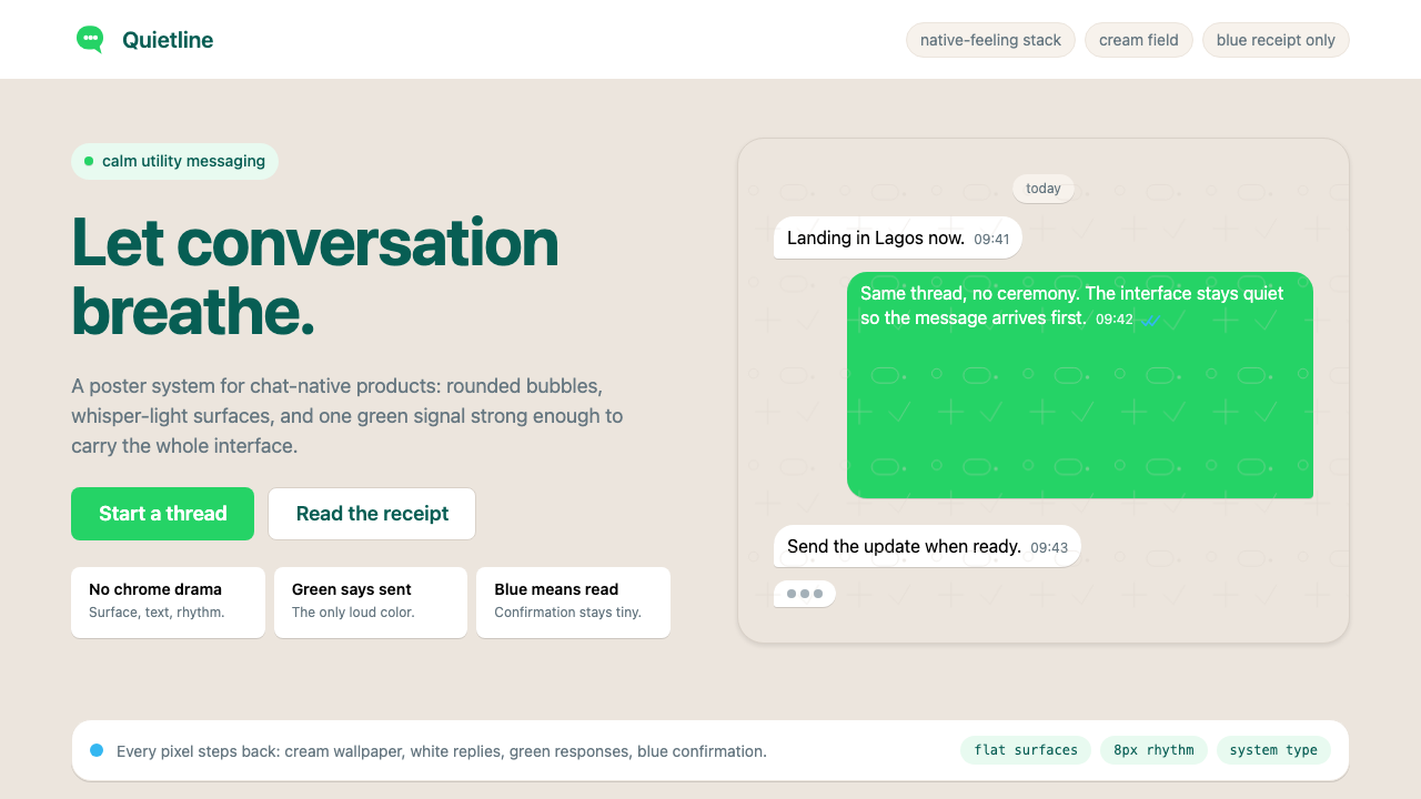 WhatsAppConversation is the interface. Cream wallpaper, green bubbles, and tiny blue…对话就是界面。奶油墙纸、绿色气泡与蓝色小勾让界面退后。
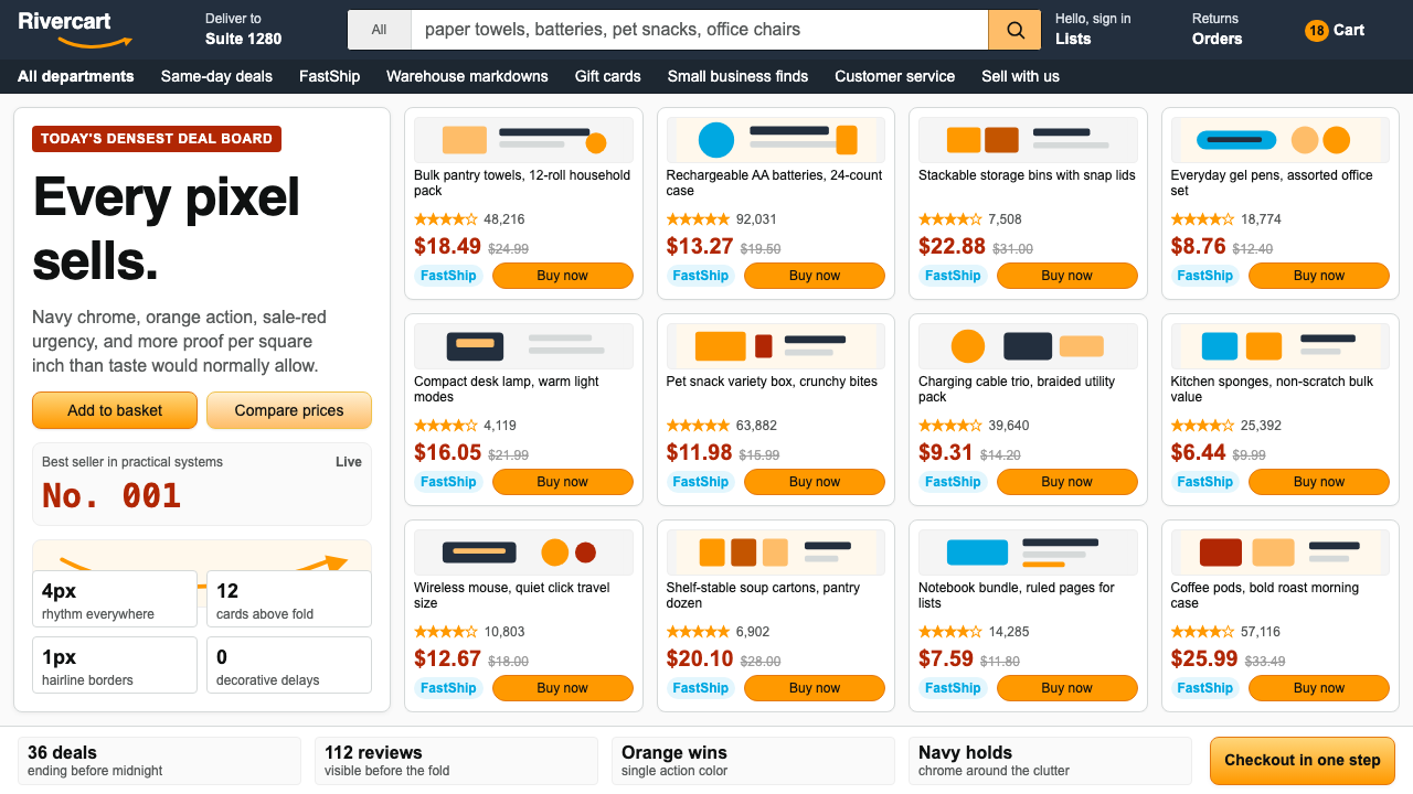 AmazonUgly sells efficiently. Navy chrome, orange buttons, red prices crowd a dense…朴素而高效:深蓝导航、橙色按钮、红价挤满密集网格。
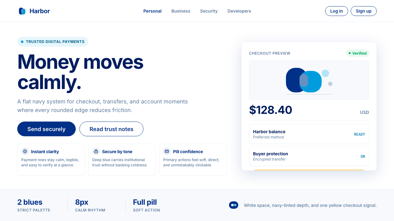 PayPalTrust without coldness. Deep navy, sky cyan, white cards, and pill checkout c…信任却不冰冷:深海军蓝与天青、白卡片和药丸结账提示。
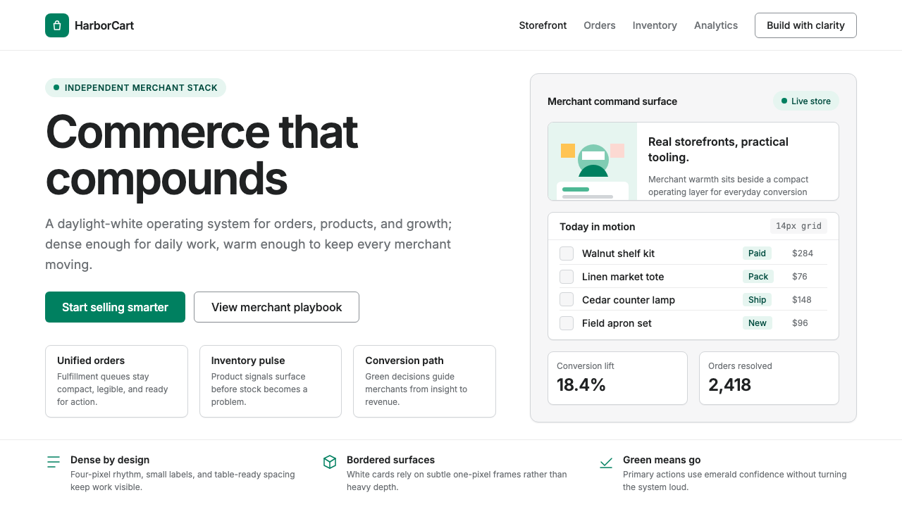 Shopify ModernMerchant ally, not corporate SaaS. Emerald actions on bordered white cards ca…商户盟友而非企业感:翡翠绿动作与白色描边卡片承载密集商业。
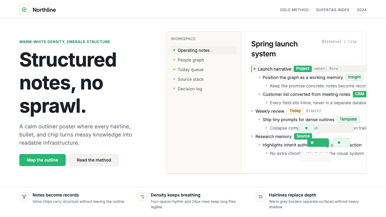 Tana SupertagsCalm density wins. Inter outlines and emerald chips punctuate pure white stru…冷静密度取胜:Inter 大纲与翡翠标签点亮纯白结构。
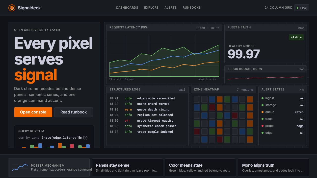 GrafanaData first, chrome last. Orange accent cuts through dense dark panels and sem…数据优先,界面退后:橙色强调穿透深色密集面板与语义图表。