What is Grafana?什么是 Grafana?
Grafana turned the darkened operations room into a design language — where every orange highlight is an alarm and every silent panel is a promise kept.Grafana 将运维室的深色屏幕变成了一种设计语言——每一抹橙色都是告警,每一块静默的面板都是系统正常运行的承诺。
Grafana in briefGrafana 速览
Grafana is the open-source observability dashboard that became the de facto visual standard for engineering infrastructure worldwide. Its aesthetic — deep navy or charcoal backgrounds, tightly packed grid panels, a signature orange flame accent, and semantic color coding tuned for data distinguishability — is as recognizable to a site reliability engineer as a Bloomberg Terminal layout is to a financial trader. Unlike decorative design systems built from an artistic vision outward, Grafana's visual language was engineered inward from a single constraint: operators must extract accurate signal from dense, fast-moving data under pressure.Grafana 是开源可观测性领域的仪表盘标准,已成为全球工程基础设施可视化的事实规范。它的视觉语言——深海军蓝或炭灰底色、紧密排列的网格面板、标志性的橙色火焰强调色、以数据可辨性为首要目标的语义配色——对于一位站点可靠性工程师来说,如同彭博终端布局对金融交易员一样一眼可辨。与从艺术愿景出发向外构建的装饰性设计系统不同,Grafana 的视觉语言是从一个单一约束向内工程化而来的:操作员必须在压力之下从密集、快速变化的数据中提取准确信号。
The style sits at the intersection of functional instrument design and modern open-source software culture. It inherits the flat, grid-bound information density of scientific dashboards while softening that severity with thoughtful accent colors and panel-level typography that never competes with the data it frames. The result is an aesthetic that feels at once utilitarian and considered — a friendlier Bloomberg Terminal, as one observer put it, or a flight deck designed by engineers who also cared about usability.这种风格处于功能性仪器设计与现代开源软件文化的交汇处。它继承了科学仪表盘的平面化、网格化信息密度,同时以精心设计的强调色和面板级排版软化了这种严峻感——这些排版元素从不与它所框架的数据竞争注意力。结果是一种既实用又经过深思熟虑的美学:有人称之为「更友好的彭博终端」,或一个由同样关心可用性的工程师设计的驾驶舱。
Applying the Grafana aesthetic deliberately — in presentations, product interfaces, or editorial design — communicates a specific set of values: precision, transparency, real-time awareness, and a deep respect for the data consumer's cognitive load. It signals infrastructure credibility without resorting to sci-fi decoration or gratuitous darkness.在演示文稿、产品界面或编辑设计中刻意运用 Grafana 美学,传达出一套特定的价值观:精准、透明、实时感知,以及对数据消费者认知负荷的深切尊重。它传递出基础设施层面的可信度,而无需借助科幻装饰或哗众取宠的黑暗感。
Where does Grafana come from?Grafana 从何而来?
Grafana began in 2014 as a personal fork. Torkel Ödegaard, a Swedish software engineer then at Orbitz, found Kibana — the dominant visualization front-end for Elasticsearch at the time — too tightly coupled to its data source and insufficiently flexible for time-series work. He forked it, rewrote the panel and plugin architecture from scratch, and released Grafana as an independent open-source project. The early interface was closer to Kibana's light-background aesthetic than the dark canvas that would later become iconic, but the architectural decision to be data-source-agnostic planted the seed of Grafana's eventual dominance: any data source, one visual language.Grafana 始于 2014 年的一次个人分叉。瑞典软件工程师 Torkel Ödegaard 当时就职于 Orbitz,他发现 Kibana——彼时 Elasticsearch 的主流可视化前端——与数据源耦合过深,在时间序列工作中灵活性不足。他将其分叉,从零重写了面板与插件架构,以独立开源项目的形式发布了 Grafana。早期界面在美学上更接近 Kibana 的浅色背景风格,与后来成为标志的深色画布相去甚远。但数据源无关性这一架构决策埋下了 Grafana 最终主导市场的种子:任意数据源,同一视觉语言。
The visual identity crystallized alongside the rise of the cloud-native observability stack. As Prometheus emerged as the standard metrics layer for Kubernetes clusters in the mid-to-late 2010s, Grafana became its canonical frontend. The dark background — practical in low-light operations centers and easier on the eyes during long on-call shifts — solidified as the default. The orange accent color, evoking both a flame and an alert, distinguished Grafana's chrome from the data colors used inside panels. Raj Dutt and Anthony Woods joined the project's leadership and helped Grafana Labs formalize the aesthetic and grow the product into a commercial platform without abandoning the open-source core.Grafana 的视觉标识随着云原生可观测性技术栈的崛起而逐渐结晶。2010 年代中后期,随着 Prometheus 成为 Kubernetes 集群的标准指标层,Grafana 成为其事实前端。深色背景——在弱光运维中心实用,在漫长的值班轮次中护眼——固化为默认风格。橙色强调色同时唤起火焰与告警的联想,将 Grafana 界面框架与面板内部的数据色彩明确区分。Raj Dutt 与 Anthony Woods 加入项目领导层,帮助 Grafana Labs 将这一美学正式化,并在不放弃开源核心的前提下将产品发展为商业平台。
The Grafana 8 release series (approximately 2021 onward) introduced a modernized theme system that codified what had evolved organically: a unified dark and light mode, a constrained set of semantic colors for panel states, and a panel border and spacing language that made dense dashboards feel intentional rather than cluttered. This period also saw the visual language become a recognized design idiom beyond its own product — dashboard builders across the industry began designing toward the Grafana look as a shared vocabulary for engineering observability.Grafana 8 系列版本(大约自 2021 年起)引入了现代化的主题系统,将有机演化而来的东西加以编纂:统一的深色与浅色模式、用于面板状态的受限语义配色集,以及使密集仪表盘感觉经过刻意设计而非杂乱无章的面板边框与间距语言。这一时期,这套视觉语言也开始作为公认的设计习语超越其自身产品——行业内的仪表盘构建者开始将 Grafana 外观视为工程可观测性领域的共同词汇而主动靠近。
The movements that shaped Grafana's aesthetics include cloud-native observability as a discipline, the open-source DevOps tooling culture that valued radical transparency and shared defaults, and dashboard-as-code culture in which infrastructure teams version-control their visualization configurations alongside their application code. The result is a design language that carries the epistemological values of its community: show the data honestly, minimize chrome, and trust the operator to interpret what they see.塑造 Grafana 美学的运动包括:作为一门学科的云原生可观测性、重视彻底透明与共享默认值的开源 DevOps 工具文化,以及将可视化配置与应用代码一起纳入版本控制的仪表盘即代码文化。其结果是一种承载着社区认识论价值观的设计语言:诚实地展示数据,最小化界面框架,相信操作员能够自行解读所见之物。
What defines the Grafana look?Grafana 的视觉特征是什么?
Dark Ground and Signal Contrast深色底面与信号对比
The canonical Grafana surface is a deep navy or near-black ground that absorbs ambient light and makes colored data signals pop with minimal eye fatigue. This is not darkness for dramatic effect but an engineering choice rooted in on-call operations: operators staring at screens for hours benefit from reduced brightness, and high-contrast panel data reads faster under stress. Every color applied over this ground is evaluated for its legibility against that dark field, making contrast the organizing principle of the entire palette.Grafana 的经典底面是深海军蓝或近黑色,能够吸收环境光,让彩色数据信号以最低眼疲劳跳脱而出。这种深色并非追求戏剧感,而是根植于值班运维场景的工程选择:长时间盯屏幕的操作员受益于降低的亮度,而高对比度的面板数据在压力下读取更快。覆盖在这块底面上的每种颜色都要经过可读性评估——对比度因此成为整个调色盘的组织原则。
Orange Accent as Identity and Alert橙色强调:品牌标识与告警语义
Grafana's signature orange serves a dual function that distinguishes it from purely decorative accent colors. On the chrome level — navigation, logos, selected states, interactive highlights — it acts as brand identity. Within data visualization, orange is reserved for threshold-adjacent states and warnings, so the eye is already trained to treat it as meaningful rather than decorative. This semantic double duty makes orange feel earned rather than arbitrary: every instance of it carries intentional weight.Grafana 标志性的橙色承担着双重功能,这使其有别于纯装饰性强调色。在界面框架层面——导航、标志、选中状态、交互高亮——它作为品牌标识发挥作用。在数据可视化层面,橙色被保留给接近阈值的状态与警告,因此眼睛被训练为将其视为有意义的信号而非装饰。这种语义上的双重功能使橙色感觉是被赋予的而非随意的:它的每一次出现都承载着刻意的分量。
Semantic Panel Color Vocabulary语义化面板配色词汇
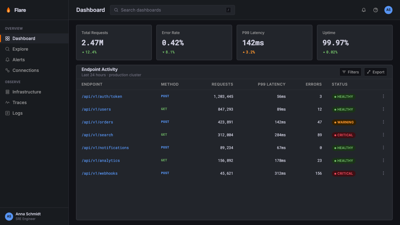
Inside panels, colors are chosen for distinguishability across many simultaneously visible series rather than for visual harmony. A Grafana dashboard might display a dozen time-series lines in a single panel, so each color must remain identifiable when lines cross or when a small percentage of the chart area is that color. The palette prioritizes perceptual distance between adjacent colors over any coherent decorative story. State colors — green for healthy, yellow for degraded, red for critical, orange for warning — carry fixed meaning and are never repurposed for decoration.在面板内部,色彩的选择标准是在大量同时可见的系列间保持可辨性,而非追求视觉和谐。一块 Grafana 仪表盘面板可能同时展示十几条时间序列折线,因此每种颜色在线条交叉时或占据图表面积的比例很小时都必须保持可识别性。调色盘优先考虑相邻颜色间的感知距离,而非任何连贯的装饰叙事。状态色彩——绿色代表健康,黄色代表降级,红色代表严重,橙色代表警告——承载固定含义,绝不被挪用于装饰目的。
Grid Density and Panel Architecture网格密度与面板架构
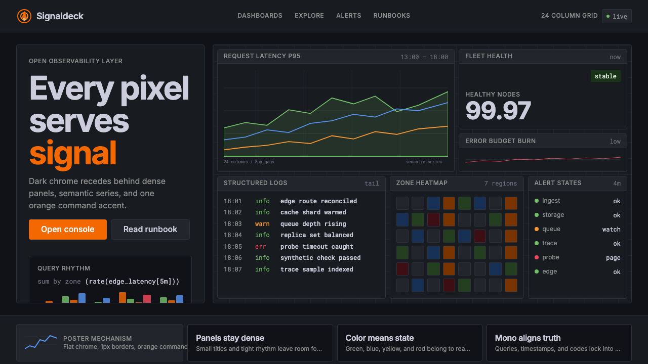
Grafana dashboards are built on a dense multi-column grid — historically described as a twenty-four-column system — that allows panels of varying widths and heights to tile together without wasted whitespace. The panel is the fundamental compositional unit: a bordered or subtly backgrounded rectangle containing a single visualization, a title, and minimal metadata. Panels butt up against each other with tight gutters, and the overall visual impression is one of comprehensive coverage rather than airy openness. This density is not a failure of breathing room — it is a deliberate expression of comprehensiveness.Grafana 仪表盘建立在密集的多列网格上——历史上常被描述为二十四列系统——允许不同宽度和高度的面板拼接在一起,不浪费空白。面板是基本的构图单元:一个带边框或背景微妙的矩形,包含单一可视化内容、标题和极少量元数据。面板之间以紧凑的沟槽彼此紧邻,整体视觉印象是全面覆盖而非通透开阔。这种密度不是呼吸空间的失败——它是对全面性的刻意表达。
Typography as Data Substrate字体排印作为数据底层
Type in Grafana performs a substrate role: it labels, annotates, and provides time-axis context without drawing attention away from the visualization it accompanies. Panel titles are kept short and use a moderate scale relative to the panel body. Axis labels and legend entries use small, regular-weight letterforms in a muted tone so they recede when the eye is tracking a data line. Big-number panels — which display a single metric value at large scale — are the one exception, inverting the usual hierarchy to make the number itself the visual event.Grafana 中的字体承担底层角色:标注、注释、提供时间轴上下文,同时不分散对所伴随可视化内容的注意力。面板标题保持简短,相对于面板内容以适中的尺度呈现。坐标轴标签与图例条目使用小号、常规字重、色调偏哑的字形,当眼睛追踪数据线时这些元素自然退入背景。大数字面板——以大尺度展示单一指标值——是唯一的例外,它反转了通常的层级,使数字本身成为视觉事件。
Minimal Chrome, Maximum Data最小化框架,最大化数据
The navigational and structural elements of the Grafana interface — sidebars, toolbars, breadcrumbs, time pickers — are deliberately compressed and kept dark so they disappear at peripheral vision. The goal is that when an operator opens a dashboard, their eye goes immediately to the panel content rather than the interface scaffolding. This chrome-minimization principle applies even within panels: gridlines are light and sparse, axes are thin, borders are subtle. Every structural element that can recede does recede.Grafana 界面的导航与结构元素——侧边栏、工具栏、面包屑、时间选择器——被刻意压缩并保持深色,以便在外围视野中消失。目标是:当操作员打开仪表盘时,视线立即落在面板内容上,而非界面框架。这种框架最小化原则甚至延伸至面板内部:网格线浅淡稀疏,坐标轴纤细,边框克制。每一个可以退后的结构性元素都在退后。
State-Driven Color Shifts状态驱动的色彩变化
One of Grafana's most distinctive features is that the same panel can shift its entire color character based on data state. A stat panel showing latency might sit in its neutral muted tone at normal values, shift toward yellow when approaching a threshold, and turn red when a threshold is breached — all without any designer manually specifying each state. This dynamic, data-driven color behavior means the dashboard itself becomes a real-time alert surface. Applying this principle to designed artifacts means color transitions carry meaning rather than mood.Grafana 最具辨识度的特征之一,是同一面板可以根据数据状态改变其整体色彩性格。一个显示延迟的统计面板,在正常值时呈现中性哑光色调,在接近阈值时偏向黄色,在阈值被突破时转为红色——这一切无需设计师手动指定每种状态。这种动态的、数据驱动的色彩行为意味着仪表盘本身成为实时告警界面。将这一原则应用于设计物,意味着色彩过渡承载意义而非情绪。
Who shaped Grafana?谁塑造了 Grafana?
Ödegaard created Grafana in 2014 as a fork of Kibana while working at Orbitz, frustrated by that tool's tight coupling to Elasticsearch. His architectural decision to build Grafana as a data-source-agnostic visualization platform — capable of connecting to Prometheus, Graphite, InfluxDB, and eventually hundreds of other sources through a plugin system — is the single decision most responsible for Grafana's ubiquity. The visual language that emerged under his stewardship prioritized operator clarity above all else, establishing the dark-ground, orange-accent aesthetic that became the project's identity.Ödegaard 在 2014 年就职于 Orbitz 期间,因不满 Kibana 与 Elasticsearch 的紧密耦合,将其分叉创建了 Grafana。他将 Grafana 构建为数据源无关可视化平台——能够通过插件系统连接 Prometheus、Graphite、InfluxDB 乃至数百种其他数据源——这一架构决策是 Grafana 得以无处不在的最根本原因。在他的主导下形成的视觉语言将操作员的清晰感置于一切之上,确立了深色底面、橙色强调的美学风格,使之成为项目的视觉标识。
Dutt co-founded Grafana Labs and served as CEO through the company's growth from open-source project to enterprise platform. His leadership shaped the business model that allowed Grafana to remain genuinely open-source — the core dashboard engine and most plugins available to anyone — while building a commercial layer around managed hosting, enterprise features, and professional support. This model influenced the aesthetic strategy: the visual language had to work as well in polished enterprise contexts as in self-hosted scrappy environments, giving it a disciplined restraint that avoided both startup casualness and corporate over-production.Dutt 联合创立了 Grafana Labs,并在公司从开源项目成长为企业平台的过程中担任 CEO。他的领导力塑造了一种商业模式:核心仪表盘引擎和大多数插件对所有人开放,同时围绕托管服务、企业功能和专业支持构建商业层——使 Grafana 得以保持真正的开源属性。这一模式影响了美学策略:视觉语言必须在精心打磨的企业场景与自托管的粗粝环境中同样有效,赋予它一种克制的自律感,既不显得随意,也不过度精致。
Woods contributed to Grafana's early plugin and panel architecture, helping establish the extensible system through which the visual language could be applied consistently across dozens of visualization types. The consistency of Grafana's look across line charts, bar gauges, heatmaps, table panels, and alerting views — all using the same dark ground, the same type scale, the same border logic — is a product of careful architectural choices about where visual decisions live in the codebase. Woods's technical work made aesthetic consistency possible at scale across a community-driven project.Woods 为 Grafana 早期的插件与面板架构做出了贡献,帮助建立了可扩展系统,使视觉语言能够在数十种可视化类型中一致应用。Grafana 外观在折线图、条形仪表、热力图、表格面板和告警视图之间的一致性——全部使用相同的深色底面、相同的字型层级、相同的边框逻辑——是关于视觉决策在代码库中位置的精心架构选择的产物。Woods 的技术工作使美学一致性在一个由社区驱动的项目中得以规模化实现。
Grafana's visual identity cannot be understood apart from the Prometheus monitoring system and the broader cloud-native community that standardized around it. The Prometheus data model — time-series metrics labeled by key-value pairs — demanded a visualization approach that could display many overlapping series at once with clear legend differentiation. The community's conventions for naming, labeling, and alerting thresholds flowed into Grafana's interface defaults, and the community's preference for open, auditable systems reinforced the aesthetic value of showing all the data rather than hiding complexity behind curated summaries.Grafana 的视觉标识无法脱离 Prometheus 监控系统以及围绕它形成标准的更广泛云原生社区来理解。Prometheus 数据模型——以键值对标记的时间序列指标——要求一种可以同时展示大量重叠序列并清晰区分图例的可视化方法。社区关于命名、标注和告警阈值的惯例流入了 Grafana 的界面默认值,而社区对开放、可审计系统的偏好强化了展示全部数据而非将复杂性隐藏在精选摘要后面的美学价值观。
How do you use Grafana today?今天怎么用 Grafana?
Grafana's visual language translates into deliberate design choices across slide presentations, product interfaces, and editorial work. The key to applying it well is understanding that every visual decision in the Grafana system exists to serve data legibility under high cognitive load — not to decorate, not to impress, not to signal sophistication. When you borrow from it, you borrow that discipline along with the aesthetic.Grafana 的视觉语言可转化为幻灯片演示、产品界面和编辑设计中的刻意设计选择。正确应用它的关键在于理解:Grafana 系统中的每一个视觉决策都是为了在高认知负荷下服务于数据可读性——不是为了装饰,不是为了给人留下深刻印象,也不是为了彰显精致。当你借用它时,你同时借用了这套美学背后的自律。
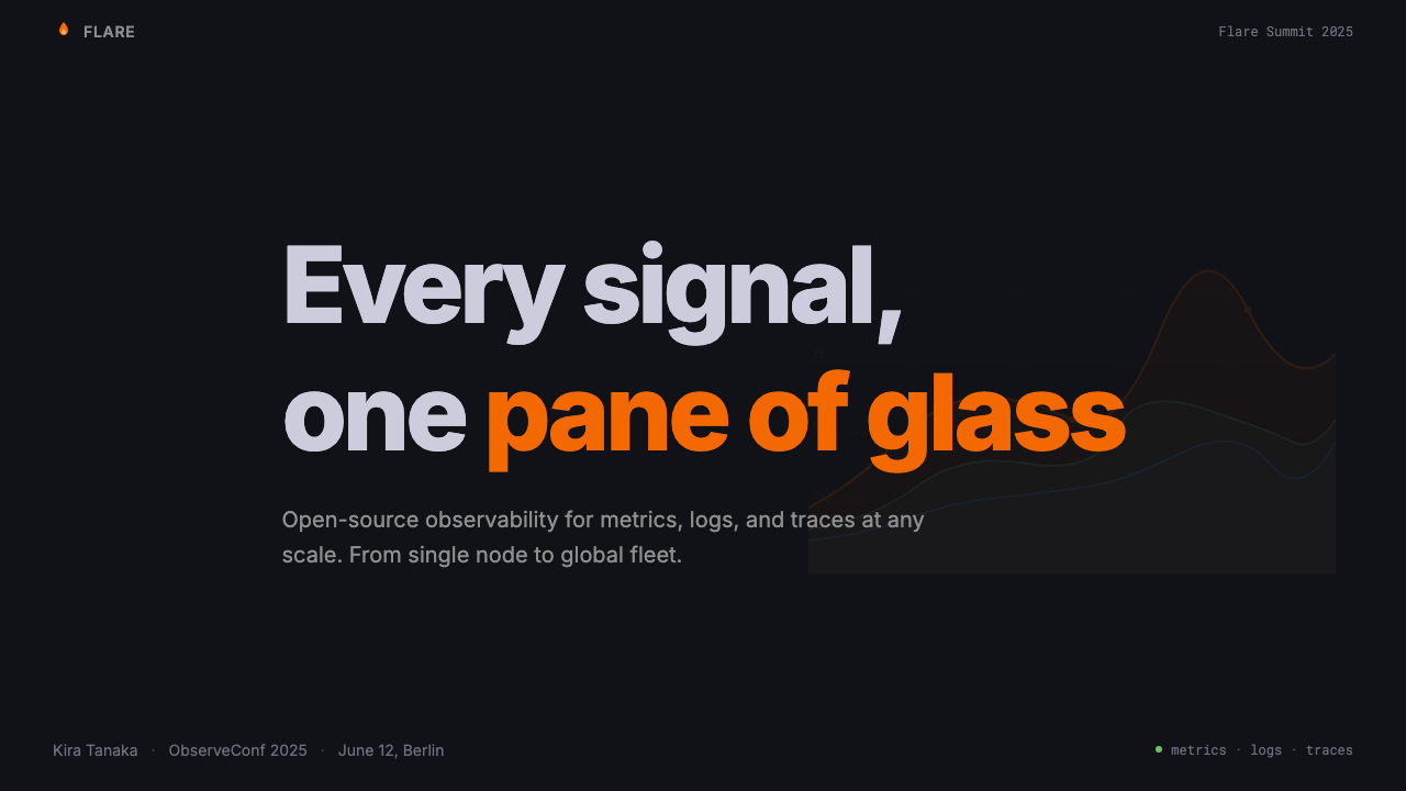
For presentation slides, Grafana's approach works especially well for technical or data-heavy decks aimed at engineering, infrastructure, or data science audiences. A cover slide in this aesthetic uses a deep dark background with the title in clean high-contrast type and a single accent-colored geometric element — an underline, a bar, or a bordered data callout — to anchor the composition. Content slides follow the panel metaphor: each major point sits in a visually distinct region with a short label above it, mimicking the panel-title pattern. Data slides should lean fully into the visualization: large, uncluttered charts with the dark ground, semantic colors for distinct series, and a deliberately thin axis and legend so the chart data dominates. Avoid mixing decorative imagery with this style — photographs and illustrations fight against its data-first logic.对于演示文稿,Grafana 的方法尤其适合面向工程、基础设施或数据科学受众的技术性或数据密集型幻灯片组。这种美学的封面幻灯片使用深色背景,标题以清晰高对比度的字体呈现,并以单一强调色几何元素——下划线、色条或带边框的数据标注——锚定构图。内容幻灯片遵循面板隐喻:每个主要观点位于视觉上独立的区域,上方有简短标签,模拟面板标题模式。数据幻灯片应完全拥抱可视化:以深色底面呈现大而整洁的图表,不同系列使用语义配色,坐标轴和图例刻意纤细以使图表数据主导画面。避免将装饰性图像与这种风格混用——照片和插图与其数据优先的逻辑相互冲突。
For web product interfaces, the Grafana visual language is particularly well-suited to dashboards, monitoring views, pricing comparison tables, and any page where the user needs to scan structured information quickly. Apply the approach by committing to a dark theme throughout the interface or section, using the orange accent exclusively for primary actions and alert states, and treating all other interactive elements with muted, border-defined styling. Card components should have clear border definition rather than soft shadows. Status indicators should use the standard state palette — healthy, degraded, critical — without decorative variation. Navigation should be typographically minimal, with icon usage limited to functional indicators rather than decorative fills.对于网页产品界面,Grafana 视觉语言尤其适合仪表盘、监控视图、定价对比表,以及任何需要用户快速扫描结构化信息的页面。应用方法是:在整个界面或特定区块中贯彻深色主题,橙色强调色专用于主要操作和告警状态,所有其他交互元素以低饱和度、边框定义的样式呈现。卡片组件应有清晰的边框定义而非柔和阴影。状态指示器应使用标准状态调色盘——健康、降级、严重——不作装饰性变体。导航应在排版上尽量精简,图标使用限于功能性指示而非装饰性填充。
For editorial and marketing design, the Grafana aesthetic signals engineering credibility and data-driven culture. Feature announcements for developer tools, technical case studies, and infrastructure product marketing all benefit from the style's restraint. Full-width dark sections can alternate with lighter analysis sections, with the orange accent reserved for key statistics, call-to-action elements, or threshold-exceeded moments in the data story. Pull quotes and callout figures should be treated like stat panels: large metric value, short label beneath, semantic color for the metric's status. Avoid using the dark background for warm or emotional content — the aesthetic's emotional register is cool, analytical, and authoritative, not welcoming or playful.对于编辑和营销设计,Grafana 美学传递出工程可信度和数据驱动文化的信号。开发者工具的功能公告、技术案例研究和基础设施产品营销都受益于这种风格的克制。全宽深色区块可与浅色分析区块交替出现,橙色强调色保留给关键统计数据、行动号召元素,或数据叙事中阈值被突破的高潮时刻。引述和标注数字应像统计面板一样处理:大尺度指标值,下方简短标签,指标状态用语义颜色标示。避免将深色背景用于温暖或情感性内容——这种美学的情感基调是冷静、分析性的和权威的,而非热情或趣味性的。
The most common mistake when applying the Grafana aesthetic is importing the darkness without importing the discipline. A dark background covered in colorful decorative elements or gradients misrepresents the style entirely — Grafana's darkness is productive emptiness, a space that recedes so data can advance. A second frequent error is treating the orange accent as a general brand color to apply broadly across interactive elements, decorative shapes, and background sections. In authentic Grafana-derived work, orange appears rarely and purposefully: it marks interactive primary actions, alert states, and the brand mark itself. When orange appears on every button and border, it loses its semantic signal and becomes noise — the exact opposite of what the system intends.应用 Grafana 美学时最常见的错误,是引入了深色而没有引入自律。深色背景上覆盖着丰富装饰元素或渐变,完全误解了这种风格——Grafana 的深色是有生产性的空无,是一种退后的空间,让数据得以向前。另一个常见错误是将橙色强调色视为可以广泛应用于交互元素、装饰形状和背景区块的通用品牌色。在真正源自 Grafana 的作品中,橙色出现得罕见而有目的:标记主要交互操作、告警状态和品牌标志本身。当橙色出现在每个按钮和边框上,它就失去了语义信号,变成了噪音——与系统意图恰恰相反。
Grafana — FAQGrafana · 常见问题
Is Grafana's dark aesthetic purely about aesthetics, or does it serve a functional purpose?Grafana 的深色美学纯粹是视觉风格,还是有功能性目的?
Primarily functional, secondarily aesthetic. The dark background originated in operations center environments where screens run continuously and eye fatigue over long shifts is a real concern. Dark surfaces emit less light, reducing the cumulative strain of extended screen exposure. Beyond fatigue reduction, the dark ground serves a signal-detection function: colored data elements — a red alert, a spiking yellow line — read with higher perceptual contrast against a dark field than against a white one, enabling faster anomaly detection under stress. The aesthetic appeal of the dark look is a beneficial side effect, not the design rationale.首先是功能性的,其次才是美学上的。深色背景起源于运维中心环境——那里的屏幕持续运行,长时间值班导致的眼疲劳是真实的担忧。深色界面发射更少的光,减少长时间屏幕暴露的累积压力。除了缓解疲劳,深色底面还承担信号检测功能:彩色数据元素——红色告警、急剧攀升的黄色折线——在深色底面上比在白色底面上呈现出更高的感知对比度,使操作员在压力下能更快地发现异常。深色外观的美学吸引力是一个有益的副产品,而非设计理由。
How does the Grafana aesthetic differ from generic dark-mode design?Grafana 美学与通用深色模式设计有何不同?
Generic dark-mode design typically inverts a light-background interface — replacing white with a dark gray and black text with white — while preserving the original compositional and decorative logic. Grafana's dark aesthetic is structurally different: it was built dark from the beginning, with every visual decision made under the assumption of a dark ground. The orange accent is chosen for its behavior against that dark field specifically. The color vocabulary inside panels is tuned for distinguishability in low-contrast, high-density environments. The panel grid density is calibrated for a dark surface where padding does not need to separate visual complexity from blinding white. The result is a dark system, not a dark mode — a fundamental difference in design intent.通用深色模式设计通常是对浅色背景界面的反转——将白色替换为深灰,将黑色文字替换为白色——同时保留原有的构图和装饰逻辑。Grafana 的深色美学在结构上有根本不同:它从一开始就是在深色前提下构建的,每一个视觉决策都在假定深色底面的情况下做出。橙色强调色正是针对其在深色底面上的表现而特别选择的。面板内部的配色词汇针对低对比度、高密度环境中的可辨性进行了调优。面板网格密度针对深色界面进行了校准——在这种界面中,内边距不需要将视觉复杂性与刺眼的白色隔离。结果是一个深色系统,而非深色模式——这是设计意图上的根本差异。
Can the Grafana aesthetic work on a light background?Grafana 美学能用在浅色背景上吗?
Grafana itself maintains an official light theme, so the answer is yes — but with significant caveats. On a light ground, the orange accent loses much of its drama and can slide toward an ordinary brand orange without the semantic urgency it carries against darkness. The semantic state colors — particularly the greens and reds — also read differently on light grounds, where they carry more conventional connotations (green as positive, red as negative) and less of the pure alert-state significance they hold in dark contexts. The panel grid density that works beautifully on a dark surface can feel cluttered on a light one, because the light background amplifies rather than absorbs visual complexity. A light Grafana-derived design works best when it reduces panel density, increases internal whitespace within panels, and preserves orange strictly for alert and action states rather than letting it expand into general branding.Grafana 本身维护着一个官方浅色主题,所以答案是肯定的——但有重要的注意事项。在浅色底面上,橙色强调色失去了大部分力量感,可能滑向普通的品牌橙,而失去其在深色环境下所携带的语义紧迫感。语义状态色彩——尤其是绿色和红色——在浅色底面上的读取方式也不同:它们承载更多常规内涵(绿色为正面,红色为负面),而失去了在深色环境中更纯粹的告警状态意义。在深色界面上表现精彩的面板网格密度,在浅色界面上可能感觉杂乱,因为浅色背景放大而非吸收视觉复杂性。浅色 Grafana 衍生设计在以下情况下效果最佳:降低面板密度、增加面板内部留白,并将橙色严格保留给告警和操作状态,而非让它扩展为通用品牌色。
What types of products or contexts should avoid the Grafana aesthetic?哪些类型的产品或场景应该避免使用 Grafana 美学?
The Grafana aesthetic carries strong associations with engineering infrastructure, data monitoring, and analytical precision — values that are actively misaligned with several product categories. Consumer-facing emotional products (wellness apps, social platforms, food and beverage brands, children's education) depend on warmth, organic texture, and human relatability that the dark, data-dense, orange-accented visual language actively suppresses. Creative and cultural products — art platforms, fashion brands, experiential services — need visual identities that communicate distinctiveness and sensory richness, neither of which the Grafana system is designed to express. Even within technical products, the aesthetic can feel oppressive in contexts where users are not operators under pressure but explorers making leisurely decisions — onboarding flows, marketing sites aimed at non-technical buyers, or tools designed for casual or occasional use.Grafana 美学与工程基础设施、数据监控和分析精准度有强烈的关联——这些价值观与若干产品类别主动错位。面向消费者的情感产品(健康应用、社交平台、食品饮料品牌、儿童教育)依赖温暖感、有机质感和人文亲和力,而深色、数据密集、橙色强调的视觉语言主动压制了这些特质。创意与文化产品——艺术平台、时尚品牌、体验性服务——需要传达独特性和感官丰富性的视觉标识,而 Grafana 系统并非为表达这些而设计。即使在技术产品内部,当用户不是处于压力下的操作员而是从容做决策的探索者时——新用户引导流程、面向非技术买家的营销网站、或为休闲或偶发性使用而设计的工具——这种美学也可能显得压迫。
How should I handle the orange accent color when adapting this style for a brand that already has its own primary color?当为已有自身主色的品牌调适这种风格时,如何处理橙色强调色?
The orange in Grafana is not arbitrary — it was selected for specific behavioral properties against a dark ground: high visibility, warmth that contrasts with the cool dark background, and a hue that sits between yellow (caution) and red (critical) in the semantic color space. When adapting the aesthetic for a brand with a different primary color, the substitution works best if you preserve those behavioral requirements rather than simply swapping in the brand color. Ask whether the brand color has sufficient contrast against your dark ground, whether it reads as energetic and alert rather than calm and recessive, and whether it occupies a distinct enough position in the semantic color space to avoid confusion with state colors. A brand's cool blue, for instance, often fails as an orange substitute because it reads as calm rather than urgent, and can be confused with informational state colors.Grafana 中的橙色并非任意选择——它因其在深色底面上的特定行为属性而被选中:高可见性、与冷色调深色背景形成对比的暖度,以及在语义色彩空间中介于黄色(警示)与红色(严重)之间的色相位置。为已有不同主色的品牌调适这一美学时,若你保留这些行为要求而非简单地替换为品牌色,替换效果会更好。需要追问:品牌色在深色底面上是否有足够对比度?它读起来是充满活力和警觉感,还是平静和退缩感?它在语义色彩空间中的位置是否足够独特,不会与状态色彩混淆?例如,品牌的冷色调蓝色通常不能作为橙色的有效替代,因为它传递的是平静而非紧迫感,并且可能与信息性状态色彩混淆。
Related design styles相关设计风格
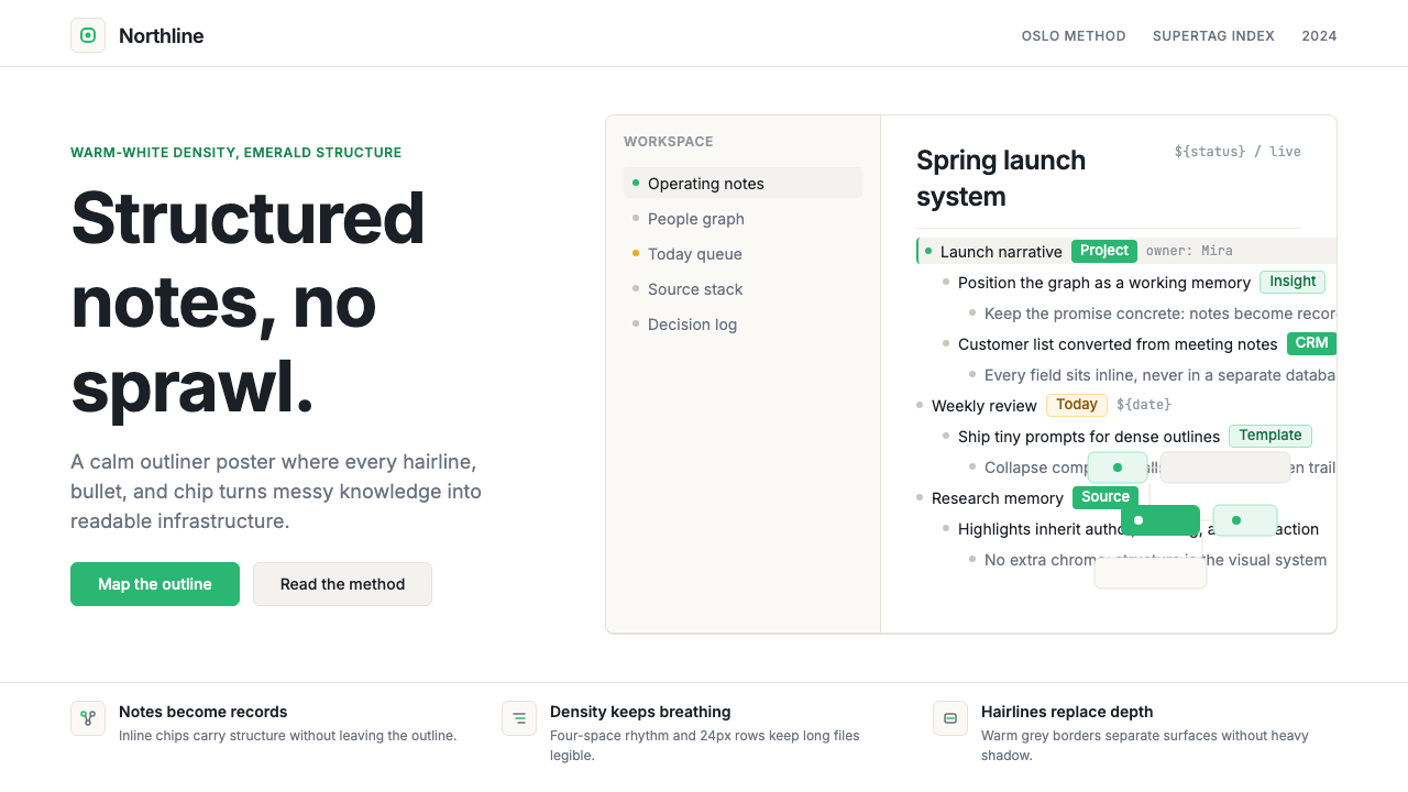 Tana SupertagsCalm density wins. Inter outlines and emerald chips punctuate pure white stru…冷静密度取胜:Inter 大纲与翡翠标签点亮纯白结构。
 Android Bugdroid GreenFriendly tech, reduced to geometry. Vivid green pops from Grey 900 and rounde…友好科技化为几何:明绿从 Grey 900 与圆润字形中跃出。
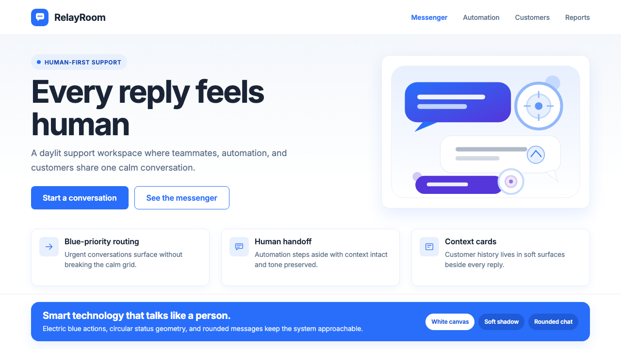 Intercom ModernWarm chat, sharp software. Electric blue bubbles on a daylit white grid.温暖对话,清晰软件。日光白网格托起电光蓝气泡。
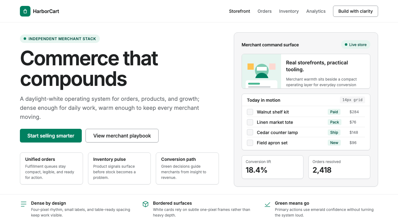 Shopify ModernMerchant ally, not corporate SaaS. Emerald actions on bordered white cards ca…商户盟友而非企业感:翡翠绿动作与白色描边卡片承载密集商业。
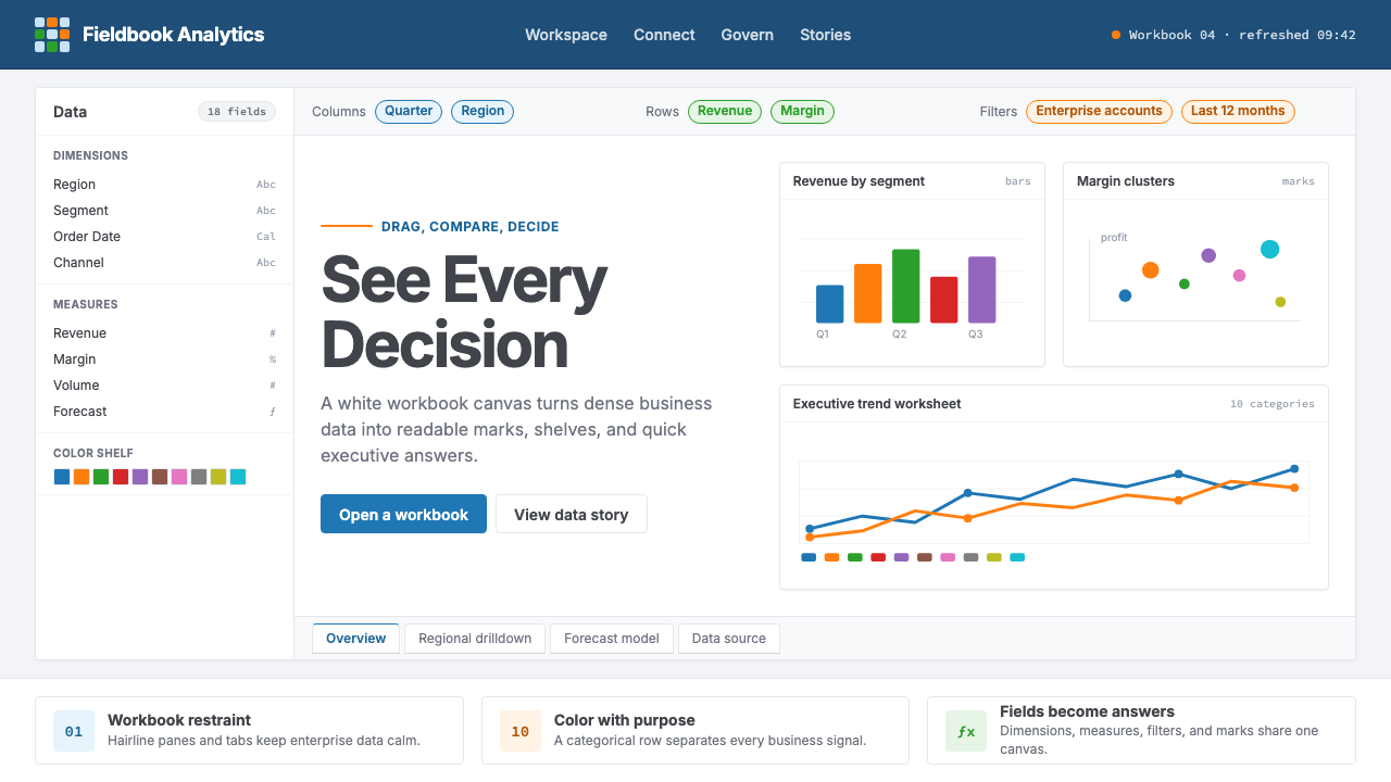 Tableau (Business Intelligence)Enterprise clarity. Navy workbook chrome, hairline panes, and 10-color marks…企业级清晰感:海军蓝工作簿框架、细线分栏与十色数据标记驯服密集信息。
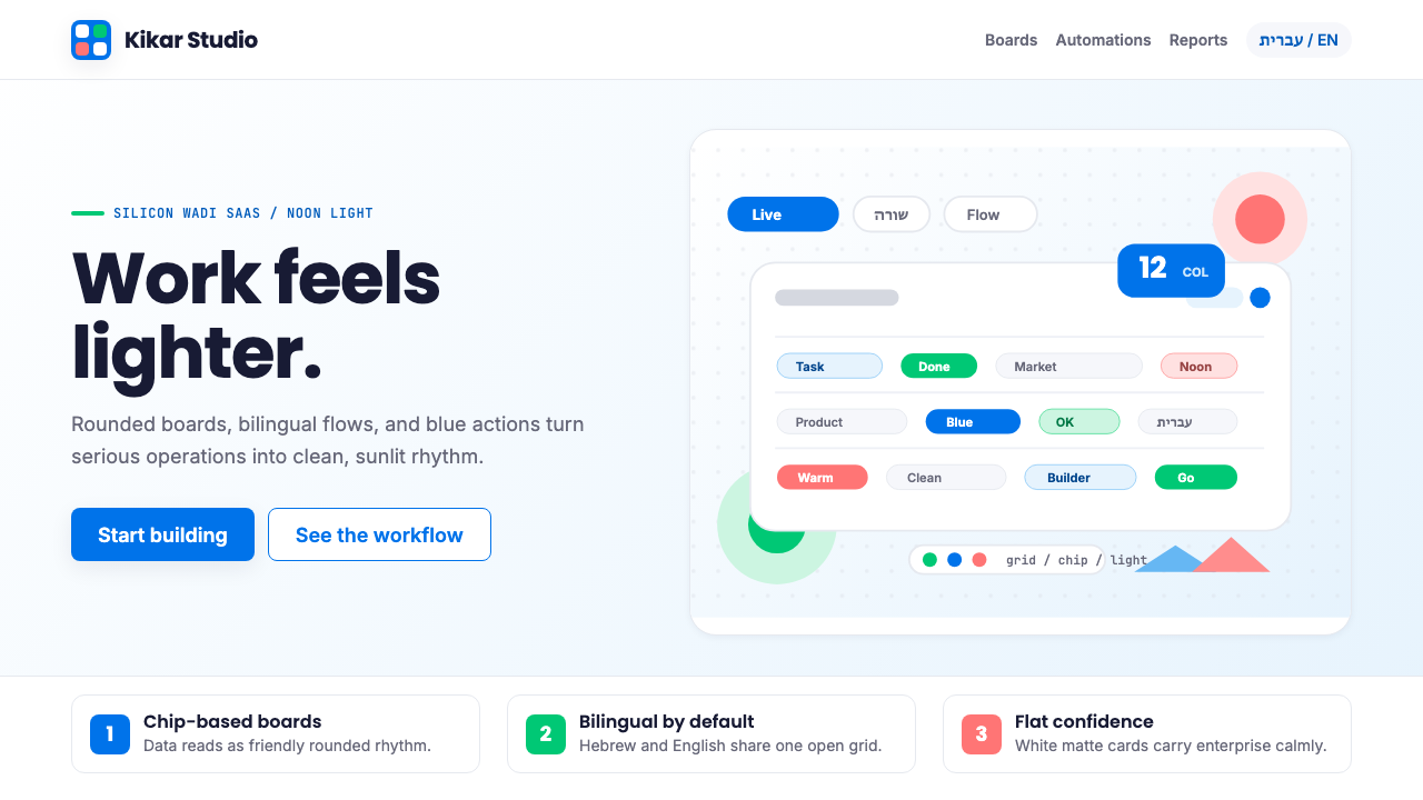 Tel Aviv Silicon WadiEnterprise feels sunny. Azure chips and Poppins grids soften flat SaaS surfac…企业软件也有阳光感:天蓝色芯片与 Poppins 网格软化平面 SaaS。