What is Tel Aviv Silicon Wadi?什么是 Tel Aviv Silicon Wadi?
Silicon Wadi rewired enterprise software — sky-blue rounds, Mediterranean light, and the breezy confidence of a Rothschild Boulevard startup at noon.硅溪重写了企业软件的视觉密码——天蓝圆角、地中海阳光,以及罗斯柴尔德大道正午创业公司般的从容自信。
Tel Aviv Silicon Wadi in briefTel Aviv Silicon Wadi 速览
Tel Aviv Silicon Wadi style is the visual dialect that emerged from Israel's concentrated cluster of SaaS companies in the late 2010s and early 2020s. Companies such as Monday.com, Wix, Lemonade, and Fiverr developed interfaces that share a recognizable family resemblance: sky-blue primary tones, generous rounded geometry on every interactive element, matte-flat surfaces that avoid simulation of depth, and a color saturation strategy that loads illustration and branded chips with warmth while keeping the surrounding chrome near-white and airy.特拉维夫硅溪风格,是以色列SaaS企业集群在2010年代末至2020年代初孕育出的视觉方言。Monday.com、Wix、Lemonade和Fiverr等公司的产品界面共享一套可辨识的家族气质:天蓝色主色调、所有交互元素上都充裕的圆角几何、哑光平面质感(刻意回避深度模拟),以及一种色彩饱和策略——让插画与品牌色块承载情感温度,同时保持周围界面近乎纯白、通透轻盈。
The style sits between American tech minimalism and something distinctly warmer. Where Silicon Valley flat design of the 2010s could feel clinical, Silicon Wadi work reads as approachable — even friendly. Rounded chips replace hard rectangular tables, conversational copy sits in generous type, and hero illustrations carry enough color to serve as the emotional anchor of a page without burdening the data beneath them. The effect is enterprise software that does not feel like a burden.这种风格介于美式科技极简主义与某种更加温暖的美学之间。如果说2010年代硅谷的扁平设计有时显得冷峻,那么硅溪的作品则读来亲切——甚至带着友善感。圆角色块取代了生硬的矩形表格,对话式文案置于宽松的字号中,英雄插画承载足够的色彩以成为页面的情感锚点,同时不给其下方的数据增添负担。结果是一种不让人感到压迫的企业软件体验。
Bilingual Hebrew-English interface conventions are embedded in the style's DNA. Because Hebrew runs right-to-left while English runs left-to-right, Israeli product teams developed layout habits — centered text blocks, symmetrical padding, icon-forward navigation — that translate naturally into globally legible interfaces. This bilingual fluency gives Silicon Wadi products a structural openness uncommon in purely Anglophone SaaS design.希伯来语与英语并行的双语界面约定,深植于这一风格的基因之中。由于希伯来语从右到左书写而英语从左到右,以色列产品团队形成了一套版式习惯——居中文本块、对称内边距、图标优先的导航——这些习惯天然地转化为全球可读的界面。这种双语流畅性赋予硅溪产品一种结构上的开放性,在纯英语SaaS设计中并不多见。
See the Tel Aviv Silicon Wadi design system查看 Tel Aviv Silicon Wadi 完整设计系统
Where does Tel Aviv Silicon Wadi come from?Tel Aviv Silicon Wadi 从何而来?
Israel's technology industry took root in the 1990s, catalyzed by a combination of factors unique to the country: mandatory military service that placed tens of thousands of young people through Unit 8200 and similar intelligence and technology units, a culture of flat hierarchy and direct communication inherited from kibbutz organizational models, and waves of highly educated immigration following the Soviet Union's dissolution. By the early 2000s, Tel Aviv and the adjacent Herzliya Pituach corridor had become the densest startup ecosystem outside Silicon Valley by venture funding per capita.以色列科技产业在1990年代扎根,得益于该国特有的几重催化因素:义务兵役制度将数以万计的年轻人送入8200部队等情报与技术单位;源自基布兹组织模式的扁平等级与直接沟通文化;以及苏联解体后汹涌而至的高学历移民潮。到2000年代初,特拉维夫及毗邻的赫兹利亚走廊,已凭借人均风险投资密度成为硅谷之外全球最密集的创业生态系统。
The visual identity of this ecosystem consolidated noticeably between 2018 and 2024, as the Israeli SaaS cohort — Monday.com, founded 2012; Wix, founded 2006; Lemonade, founded 2015; Fiverr, founded 2010 — matured from scrappy challengers to publicly listed companies. Going public demanded global brand coherence, and the design systems these companies built for their IPO-era products became the de facto visual standard for the next generation of Israeli product teams learning from them.这一生态系统的视觉身份在2018至2024年间完成了显著的整合。随着以色列SaaS梯队——Monday.com(2012年创立)、Wix(2006年创立)、Lemonade(2015年创立)、Fiverr(2010年创立)——从蛮勇的挑战者成长为上市公司,IPO所要求的全球品牌一致性促使这些公司建立了成熟的设计系统。这些设计系统随即成为下一代以色列产品团队竞相学习的事实视觉标准。
Mediterranean geography and culture left a visible mark. The light of Tel Aviv — intense, high in the sky, bouncing off pale limestone and the sea — conditions local visual sensibility toward brightness and contrast rather than the muted, overcast tones common in Northern European or Pacific Northwest design. The city's café culture, its informal dress code even in boardrooms, and the compressed distance between engineers and their managers all contributed to a product culture that resisted the stiff formality of traditional enterprise software aesthetics.地中海的地理与文化在这一风格上留下了可见的印记。特拉维夫的光线——强烈、高悬天际,从苍白的石灰岩建筑与大海上反射而来——塑造了本地视觉感性对明亮与对比的偏好,而非北欧或太平洋西北地区设计常见的柔和阴郁色调。城市的咖啡馆文化、即便在董事会也轻装上阵的穿衣规范,以及工程师与管理者之间被压缩的物理距离,共同催生了一种抵制传统企业软件刻板威严的产品文化。
Typography played a structural role in the style's formation. The need to support Hebrew — a language with its own complex script, requiring dedicated typeface design and bidirectional text rendering — pushed Israeli product teams to develop strong layout systems that did not depend on text direction for their visual coherence. Rounded geometric display typefaces became favored in English-facing contexts partly because their even stroke weight and open counters survived the visual negotiation between left-to-right Latin and right-to-left Hebrew contexts without friction.字体排印在这一风格的形成中扮演了结构性角色。希伯来语的书写系统及其双向文本渲染需求,推动以色列产品团队建立起不依赖文字方向来维持视觉连贯性的强健版式系统。圆润的几何展示字体在英语界面语境中大受青睐,部分原因正在于其均匀的笔画粗细与开放的字母内空间能在从左到右的拉丁文字与从右到左的希伯来文字之间平滑协商,不产生摩擦。
Design figures such as Oded Ezer, one of Israel's most prominent typographers, brought serious typographic thinking into Israeli visual culture. Ezer's experimental Hebrew type work — treating letter-forms as sculptural objects — elevated the status of typography in Israeli design education and indirectly influenced the care with which product companies approached their own type choices. Founders like Avishai Abrahami of Wix and Roy Mann of Monday.com built design-conscious cultures at the leadership level, ensuring that visual quality was a first-class concern rather than an afterthought.设计师奥代德·艾泽尔(Oded Ezer)等人物将严肃的字体思考引入了以色列视觉文化。艾泽尔将希伯来字母形态作为雕塑对象的实验性字体设计,提升了字体排印在以色列设计教育中的地位,间接影响了产品公司在自身字体选择上倾注的心力。Wix创始人阿维沙伊·亚伯拉罕(Avishai Abrahami)与Monday.com创始人罗伊·曼(Roy Mann)等人在领导层建立了设计意识文化,确保视觉品质成为第一优先级的关切,而非事后补贴的附加物。
What defines the Tel Aviv Silicon Wadi look?Tel Aviv Silicon Wadi 的视觉特征是什么?
Sky-Blue Primary Palette天蓝主色调
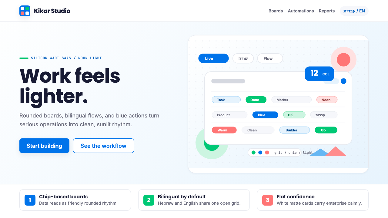
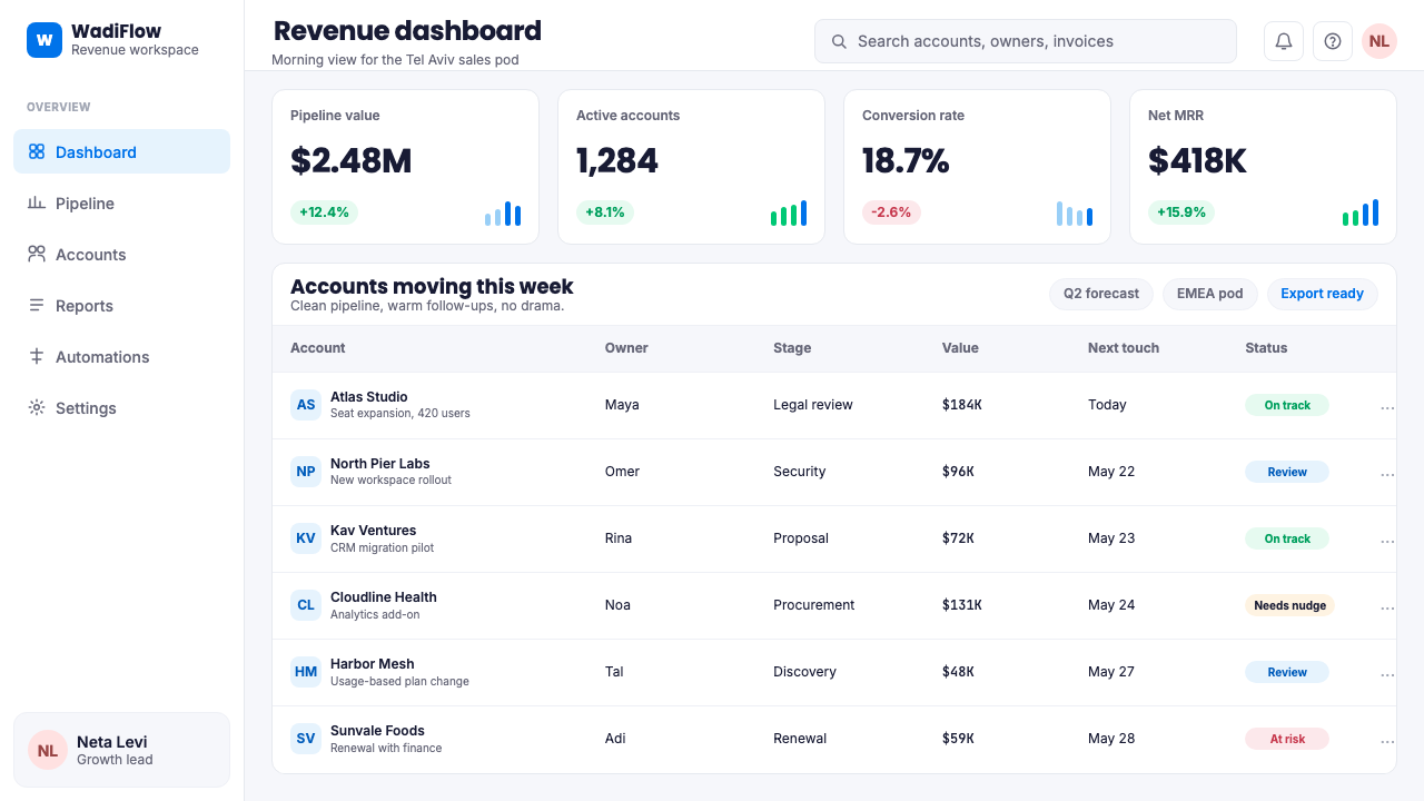
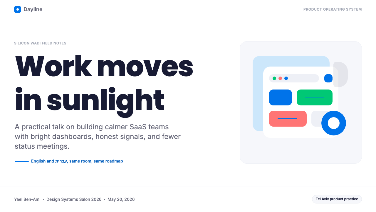
The dominant hue across Silicon Wadi interfaces is a clear, medium-bright blue that evokes open sky and Mediterranean water rather than the darker, more authoritative blue of traditional enterprise software. This blue appears on primary action buttons, progress indicators, selected-state chips, and branded highlights. It reads as confident without feeling heavy, and it pairs naturally with warm white backgrounds to produce the airy quality the style is known for.硅溪界面中主导性的色相是一种清透、中等明亮度的蓝色,令人联想到开阔的天空与地中海海水,而非传统企业软件中更深沉、更具权威感的深蓝。这种蓝色出现在主要操作按钮、进度指示器、选中状态的色块以及品牌高亮处。它读来自信而不沉重,与暖白色背景自然搭配,产生这一风格标志性的通透感。
Generous Rounded Geometry充裕的圆角几何
Every interactive container — buttons, cards, input fields, chips, tags, modal dialogs — carries a corner radius large enough to read as deliberately friendly rather than merely softened. Fully pill-shaped buttons appear frequently, as do round avatar containers and circular status indicators. This commitment to roundness distinguishes the style from both hard-cornered American enterprise design and the subtly rounded aesthetic of Scandinavian minimalism; the curves here are intentional and expressive, not shy.每一个交互容器——按钮、卡片、输入框、色块、标签、模态对话框——都带有足够大的圆角半径,读来是刻意的友善而非仅仅是边角的软化。全药丸形按钮频繁出现,圆形头像容器与圆形状态指示器亦是如此。对圆润感的这种坚持,使该风格有别于美式企业设计的硬直棱角,也有别于斯堪的纳维亚极简主义的含蓄圆角;这里的曲线是有意为之的、富有表现力的,而非羞涩的。
Illustration as Emotional Anchor插画作为情感锚点
Silicon Wadi products invest heavily in custom illustration — particularly on onboarding screens, empty states, and hero sections. These illustrations carry the saturation load for the entire interface: they are warm, often multicolored, and deliberately human-centered, featuring characters in casual collaborative scenes. The surrounding interface can remain near-monochrome precisely because the illustration absorbs the emotional temperature. Removing the illustration from a Silicon Wadi page leaves the chrome feeling correct but cold.硅溪产品在定制插画上投入大量资源——尤其在引导流程页面、空状态和英雄区域。这些插画承担了整个界面的色彩饱和度负荷:它们温暖、往往色彩丰富,刻意以人为中心,呈现轻松协作场景中的人物形象。周围的界面因此得以保持近乎单色——正是因为插画吸收了界面的情感温度。从硅溪页面中移除插画,余下的界面框架感觉正确却冷峻。
Matte-Flat, Shadow-Light Surfaces哑光平面、轻影质感
The style avoids both the deep shadows of skeuomorphic design and the shadow-free flatness of early mobile design systems. Instead, surfaces carry very soft, diffuse, low-contrast shadows that suggest floating without dramatizing depth. Cards hover slightly above the background rather than being flush with it, creating gentle spatial layers. This approach produces hierarchy without weight — the eye knows what is above what without the page feeling heavy or dimensionally exaggerated.这一风格既回避拟物设计的深重投影,也不采用早期移动端设计系统的无阴影纯平面。取而代之的是极柔和、漫散、低对比度的阴影,暗示漂浮感而不戏剧化深度。卡片微微悬浮于背景之上而非与之齐平,形成温柔的空间层次。这种处理制造了层级感而不带来重量感——眼睛知道什么在上什么在下,但页面并不显得沉重或夸张立体。
Multicolored Chip Systems多彩色块体系
Status tags, category labels, and data-classification chips in Silicon Wadi interfaces use a broad, coordinated range of soft tints — coral, lavender, mint, amber, sky blue — each distinct enough to carry meaning but muted enough not to compete with the primary action palette. This chip color system originated in Monday.com's column-color model, where users could assign any of dozens of hues to work items, and spread as a convention across the ecosystem. It creates visual richness without requiring complex data visualization.硅溪界面中的状态标签、分类标签和数据分类色块,采用一套宽泛而协调的柔和色调范围——珊瑚色、薰衣草色、薄荷色、琥珀色、天蓝色——每种颜色足够独特以承载语义,但又足够低调不与主操作色板竞争。这套色块色彩体系源自Monday.com的列色模型,用户可以为工作项目指定数十种色相之一,随后作为一种约定扩散至整个生态系统。它在无需复杂数据可视化的情况下创造了视觉丰富性。
Bilingual Layout Intelligence双语版式智慧
The requirement to support right-to-left Hebrew and left-to-right English simultaneously produced layout conventions that are structurally neutral to text direction. Centered headings, symmetrically padded containers, icon-led navigation labels, and component designs that mirror cleanly on a logical axis all reflect this discipline. Even in purely English-facing products, the legacy shows: Silicon Wadi interfaces tend to use more centering, more icon-text pairing, and more symmetric whitespace than comparable American SaaS products.同时支持从右到左的希伯来语与从左到右的英语的需求,催生了在结构上对文字方向保持中性的版式约定。居中标题、对称内边距的容器、图标引导的导航标签,以及能在逻辑轴上干净镜像的组件设计,都反映了这一设计纪律。即便在纯英语面向的产品中,这种传承依然可见:硅溪界面往往比同类美国SaaS产品使用更多居中对齐、更多图标文字配对,以及更多对称留白。
Friendly Enterprise Typography友善的企业字体排印
Typeface choices favor geometric or humanist sans-serifs with open apertures, even stroke weight, and letterforms that read clearly at the small sizes common in dense data interfaces. Type scale is functional and ample — body text at a comfortable reading size, labels at a clearly smaller scale, headlines bold enough to anchor without dominating. The overall voice is professional but conversational: tight technical specs coexist with marketing-style warmth in the same interface.字体选择偏向具有开放字腔、均匀笔画粗细的几何或人文主义无衬线字体,字母形态在数据密集界面常见的小字号下依然清晰可读。字体尺度实用而充裕——正文保持舒适的阅读字号,标签明显更小,标题足够粗重以起到锚定作用但不至于主宰全局。整体语调专业而富有对话性:紧凑的技术规格与营销式的温暖感在同一界面中并存。
See the Tel Aviv Silicon Wadi design system查看 Tel Aviv Silicon Wadi 完整设计系统
Who shaped Tel Aviv Silicon Wadi?谁塑造了 Tel Aviv Silicon Wadi?
Co-founder and CEO of Monday.com, Mann shaped one of the most widely studied design systems in the Israeli SaaS ecosystem. Under his leadership, Monday.com developed the multicolored chip model, the rounded card-based interface architecture, and a product philosophy that prioritized immediate visual comprehension over feature density. Monday.com's design system became a reference point for dozens of subsequent Israeli product teams, establishing the colorful-friendly-flat combination as a regional standard.Monday.com联合创始人兼CEO。曼恩塑造了以色列SaaS生态系统中被研究最广泛的设计系统之一。在他的领导下,Monday.com开发了多彩色块模型、基于圆角卡片的界面架构,以及将即时视觉理解置于功能密度之上的产品哲学。Monday.com的设计系统成为数十个后续以色列产品团队的参照标准,将「多彩-友善-平面」的组合确立为区域性标准。
Co-founder and CEO of Wix, Abrahami built the company from a simple website builder into a platform serving hundreds of millions of users, with design sensibility as a core pillar of the product proposition. Wix's visual builder interface — with its drag-and-drop canvas, template marketplace, and design-system-driven component library — helped normalize the idea that professional-quality visual design should be accessible to non-designers, a democratizing ethos that runs through the Silicon Wadi style broadly.Wix联合创始人兼CEO。亚伯拉罕将公司从简单的建站工具发展为服务数亿用户的平台,并将设计感性作为产品主张的核心支柱。Wix的可视化构建界面——其拖放画布、模板市集与设计系统驱动的组件库——帮助普及了专业视觉设计应对非设计师开放这一理念,这种设计民主化精神在硅溪风格中广泛延伸。
Co-founder and CEO of Lemonade, Schreiber oversaw the development of one of the most visually distinctive brands in Israeli tech — a bright, high-contrast pink-and-white identity that demonstrated how far the Silicon Wadi warmth aesthetic could be pushed in a consumer-facing financial product. Lemonade proved that the approachable, color-forward Silicon Wadi approach was viable even in regulated, traditionally conservative industries, expanding the perceived range of the style.Lemonade联合创始人兼CEO。施雷伯监督了以色列科技界视觉上最具辨识度的品牌之一的塑造——一套明亮、高对比度的粉红与白色视觉形象,证明了硅溪温暖美学在面向消费者的金融产品中可以被推进至何种程度。Lemonade证明了这种亲切、色彩主导的硅溪方式,即便在受监管的传统保守行业中同样可行,拓展了这一风格被感知的适用范围。
One of Israel's most internationally recognized typographers, Ezer built a practice around experimental Hebrew type — treating letterforms as sculptural and biological forms, combining typography with digital fabrication and speculative design. While his own work is far removed from the commercial SaaS context, his decades of elevating typographic ambition within Israeli design culture contributed to an environment where product companies took their type choices seriously. His influence runs beneath the surface of the Silicon Wadi style as cultural infrastructure.以色列国际知名度最高的字体设计师之一。艾泽尔围绕实验性希伯来字体建立了自己的实践——将字母形态作为雕塑性与生物性形态处理,将字体排印与数字制造及思辨设计相结合。尽管他自身的作品与商业SaaS语境相去甚远,但他数十年来在以色列设计文化中提升字体排印抱负的工作,造就了一种产品公司认真对待自身字体选择的环境。他的影响作为文化基础设施,潜伏在硅溪风格的表面之下。
How do you use Tel Aviv Silicon Wadi today?今天怎么用 Tel Aviv Silicon Wadi?
Silicon Wadi style translates well across multiple output formats because its principles are grounded in approachability and visual hierarchy rather than in period-specific ornamentation. Applying it correctly means understanding the balance at the heart of the style: illustration carries warmth, the surrounding interface carries clarity, and rounded geometry bridges both. When any one of these three elements is missing, the style collapses toward either blandness or visual noise.硅溪风格能在多种输出形式中良好转化,因为它的原则根植于亲切感与视觉层级,而非某个特定时期的装饰语汇。正确应用它,意味着理解这一风格核心的平衡:插画承载温度,周围的界面承载清晰,圆角几何连接两者。当这三个元素中任何一个缺失时,风格就会向平淡或视觉噪声的方向崩塌。
For presentation slides, the style is well suited to both cover and content pages. A cover benefits from a strong hero illustration placed at generous scale alongside a bold, rounded-type headline on a near-white or very soft warm background — the illustration doing the emotional heavy lifting while the type remains clean. Content slides should organize information into card-like blocks with visible breathing room between them; avoid tight tabular grids in favor of chip-and-label systems for categorical data. Data slides can use the multicolor chip palette directly — colored bars, segmented progress rings, and status indicators all fit naturally within the vocabulary. Avoid the common temptation to use gradients on chart elements; the style's surfaces remain matte.在演示文稿中,这种风格适合封面页和内容页。封面适合将一幅英雄插画以充裕的尺度呈现,搭配粗重圆润字体的标题,置于近白或极淡暖色背景上——插画承担情感重量,文字则保持清洁。内容页应将信息组织为类卡片的块状结构,块与块之间保有可见的呼吸空间;避免紧密的表格网格,在分类数据上偏好色块与标签体系。数据页可以直接运用多彩色块色板——彩色柱条、分段进度环和状态指示器都自然融入这套视觉词汇。避免在图表元素上使用渐变的常见诱惑;这一风格的表面保持哑光。
For web interfaces, the style is most naturally at home in dashboards, project management tools, and product marketing pages. The approach: keep the background near-white with generous padding, use the sky-blue primary for interactive elements and calls to action, deploy the soft-tint chip palette for status and category information, and allow at least one prominent illustration to provide emotional warmth on key conversion or onboarding surfaces. Navigation should be clear and labeled rather than icon-only; the style is not spare enough to support heavy icon minimalism without losing its conversational character.对于网页界面,这种风格最自然地栖居于仪表板、项目管理工具和产品营销页面。方法如下:保持背景近白并配以充裕的内边距,将天蓝主色用于交互元素与行动号召,以柔和色调色块色板处理状态与分类信息,并在关键转化或引导页面上允许至少一幅醒目插画提供情感温度。导航应清晰有文字标签,而非纯图标;这一风格不够简约,无法在不失去对话性格的情况下支撑重度图标极简主义。
For editorial and marketing work, the Silicon Wadi approach supports high-energy, benefit-led layouts. Section headers are large and friendly, pull quotes use colored chip-style backgrounds rather than decorative quote marks, and feature grids alternate illustrated panels with clean data or text panels to maintain rhythm. Email templates in this style use generous white space, a single sky-blue call-to-action button, and a hero illustration at the top — keeping the message scannable and warm. Marketing landing pages work well with the style's combination of cheerful illustration, bold section headlines, and a restrained supporting palette.对于编辑与营销内容,硅溪方式支持高能量、以利益为导向的版面。章节标题大而友善,引用句使用彩色色块式背景而非装饰性引号标记,特性网格将插画面板与干净的数据或文字面板交替排列以维持节奏感。这种风格的电子邮件模板使用充裕留白、单一天蓝色行动号召按钮,以及顶部的英雄插画——保持信息可扫描且温暖。营销落地页在这种风格的欢快插画、粗重章节标题与克制的辅助色板组合下效果出色。
A common mistake when applying Silicon Wadi style is over-illustrating — placing custom artwork on every surface until the interface loses hierarchy and everything competes equally for attention. Illustration should be rationed: one hero illustration per major page or section, with the remainder of the interface kept clean and type-led. A second common error is rounding everything indiscriminately; the style calls for generous but consistent corner radii, not maximum rounding on every element regardless of context. Data tables, for instance, may carry lighter rounding than modal containers. Finally, the multicolor chip palette works only when the tints are genuinely soft and coordinated; substituting saturated primaries for the muted tints produces a garish result that reads as a misapplication rather than an evolution of the style.应用硅溪风格时最常见的错误是过度插画——在每个表面都放置定制艺术作品,直到界面失去层级感,所有内容平等地争夺注意力。插画应当被有节制地使用:每个主要页面或区段一幅英雄插画,其余界面保持简洁、以文字为主导。第二个常见错误是不加区分地将所有元素最大化圆角;这一风格要求充裕但一致的圆角半径,而非无论语境地对所有元素施以最大圆角。例如,数据表格的圆角可以比模态容器轻。最后,多彩色块色板只有在色调真正柔和协调时才奏效;用饱和原色替代低调色调,会产生俗艳的结果,读来更像对这一风格的误用,而非演进。
See the Tel Aviv Silicon Wadi design system查看 Tel Aviv Silicon Wadi 完整设计系统
Tel Aviv Silicon Wadi — FAQTel Aviv Silicon Wadi · 常见问题
How is Silicon Wadi different from generic friendly SaaS design?硅溪风格与通用的「友善SaaS设计」有何不同?
Generic friendly SaaS design tends to be a diluted application of principles borrowed from multiple sources — some Material Design, some Apple Human Interface, some Atlassian design system conventions — without the coherent underlying logic that gives Silicon Wadi its recognizable character. The distinctive Silicon Wadi markers are: the specific sky-blue primary (not teal, not indigo), the investment in custom illustration as a structural page element rather than decoration, the multicolored chip system for categorical data, and the bilingual layout intelligence that produces centered, symmetrical structures. When all four are present, the result is unmistakably Silicon Wadi; when only one or two appear, the result is simply friendly.通用的友善SaaS设计往往是从多个来源借用原则的稀释应用——一些Material Design、一些苹果人机界面指南、一些Atlassian设计系统约定——缺乏赋予硅溪风格可辨识性格的连贯内在逻辑。硅溪的标志性特征是:特定的天蓝主色(不是蓝绿,不是靛蓝)、将定制插画作为页面结构元素而非装饰的大量投入、用于分类数据的多彩色块体系,以及产生居中对称结构的双语版式智慧。当四者齐备时,结果无疑是硅溪;当只有一两项出现时,结果仅仅是友善。
Can Silicon Wadi style work for a dark-mode interface?硅溪风格能用于深色模式界面吗?
Dark mode is not the natural habitat of this style. Silicon Wadi's warmth depends significantly on the contrast between near-white backgrounds and colored elements; invert to a dark ground and the sky-blue primary loses some of its Mediterranean lightness, the soft-tint chips can become harder to distinguish, and the warm illustration palette may fight the darker surroundings rather than floating within them. A dark Silicon Wadi variant is possible, but it requires careful recalibration — shifting the blue toward a brighter, more luminous tone, intensifying the illustration palette, and desaturating the chip tints to maintain softness. The result tends to feel more like a mainstream product-design dark mode with Silicon Wadi illustration influence than a true dark-mode expression of the style.深色模式并非这一风格的自然栖息地。硅溪风格的温暖感在很大程度上依赖于近白背景与彩色元素之间的对比;一旦反转为深色底面,天蓝主色会失去部分地中海的明亮感,柔和色调色块可能变得难以区分,而温暖的插画色板也可能与更深的周围环境发生冲突,而非漂浮其中。深色硅溪变体是可能的,但需要仔细重新校准——将蓝色调向更明亮、更发光的色调,强化插画色板,并降低色块色调的饱和度以维持柔和感。结果往往更像一个带有硅溪插画风格影响的主流产品深色模式,而非这一风格的真正深色模式表达。
Is the multicolored chip system appropriate for serious data products?多彩色块体系适合严肃的数据产品吗?
It depends on what 'serious' means in context. For work-management, CRM, and project-tracking data — where items have categorical status, priority, or owner information — the multicolored chip system is not only appropriate but functionally superior to monochrome alternatives, because color encodes meaning at a glance without requiring the user to read every label. For highly analytical data products — financial dashboards, scientific visualization, medical data — the chip system can introduce visual noise that competes with the data's structural relationships. In those contexts, a more restrained palette with color reserved for alerts and critical states typically serves better. The chip system is a tool for categorical navigation, not for quantitative reasoning.这取决于「严肃」在语境中的含义。对于工作管理、CRM和项目跟踪数据——其中条目具有分类状态、优先级或所有者信息——多彩色块体系不仅适合,在功能上还优于单色替代方案,因为颜色能在一瞥之间编码含义,无需用户逐一阅读标签。对于高度分析性的数据产品——金融仪表板、科学可视化、医疗数据——色块体系可能引入与数据结构关系竞争的视觉噪声。在这些语境中,更克制的色板,将颜色保留给警示与关键状态,通常效果更好。色块体系是分类导航的工具,而非定量推理的工具。
What separates authentic Silicon Wadi work from imitations?真正的硅溪风格与仿制品有何区别?
Imitations typically borrow the color palette and the rounded corners while neglecting the structural intelligence underneath. The most common failure mode is using rounded geometry without the underlying layout discipline — placing pill buttons inside rigid grid systems with no breathing room, or using the sky-blue primary for every interactive element without a coherent hierarchy. A second common failure is substituting stock illustration for the custom-illustrated warmth that makes the style work; stock illustration introduces visual inconsistency that fragments the page's coherence. Authentic Silicon Wadi work has a single-author quality to its illustration and a spatial generosity to its layout that signals intentional design rather than style-kit assembly.仿制品通常借用色板和圆角,却忽略了其背后的结构智慧。最常见的失败模式是使用圆润几何却没有底层的版式纪律——在没有呼吸空间的僵硬网格系统中放置药丸按钮,或将天蓝主色不加区分地用于所有交互元素而没有连贯的层级体系。第二个常见失败是用库存插画替代让这一风格奏效的定制插画温度;库存插画引入的视觉不一致性会碎片化页面的连贯性。真正的硅溪作品在插画上有一种单一作者的品质,在版式上有一种空间慷慨性,这些都传递出有意为之的设计,而非风格套件的拼装。
Does this style work outside software — for printed materials or physical branding?这一风格在软件以外也适用吗——比如印刷品或实体品牌?
The Silicon Wadi style transfers reasonably well to print and physical brand contexts, with some adaptation required. The sky-blue primary and the rounded geometry work well on printed conference materials, branded merchandise, and packaging. The illustration system translates naturally to large-format prints and exhibition materials. The main adaptation needed is in the chip system: the soft screen-optimized tints may need to be slightly intensified for print reproduction to maintain their distinctness. Physical signage benefits from the style's generous text scale and clear hierarchy. Where the style struggles in print is in contexts requiring monochrome or very limited color reproduction — the multicolor palette is integral enough that a two-color reduction often produces something that no longer reads as Silicon Wadi at all.硅溪风格能相当顺畅地转化到印刷与实体品牌语境中,但需要一定适配。天蓝主色和圆润几何在印刷会议材料、品牌周边和包装上效果良好。插画体系自然地转化到大幅印刷品和展览材料上。主要需要的适配在于色块体系:针对屏幕优化的柔和色调在印刷复制时可能需要略微加深以保持可辨识性。实体标牌受益于这一风格充裕的字号和清晰的层级。这一风格在印刷中表现欠佳的地方,是需要单色或极有限色彩复制的场景——多彩色板在这一风格中足够核心,以至于两色缩减后往往产生完全不再读来像硅溪风格的结果。
Related design styles相关设计风格
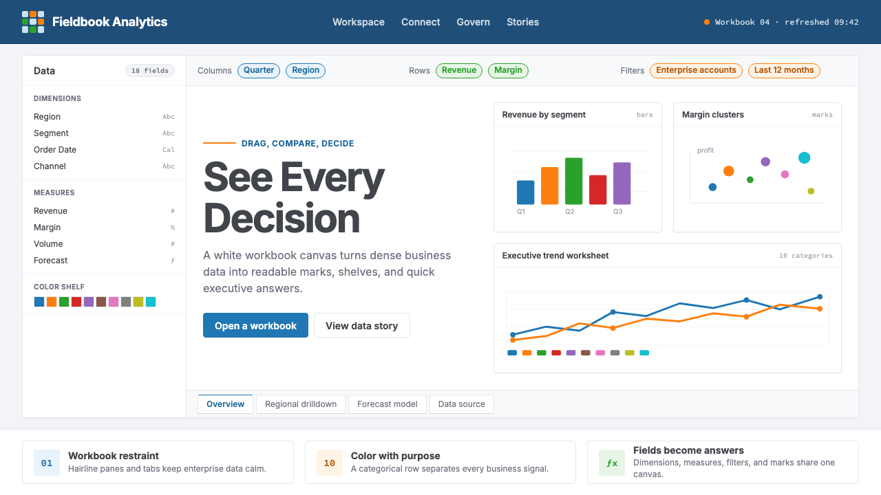 Tableau (Business Intelligence)Enterprise clarity. Navy workbook chrome, hairline panes, and 10-color marks…企业级清晰感:海军蓝工作簿框架、细线分栏与十色数据标记驯服密集信息。
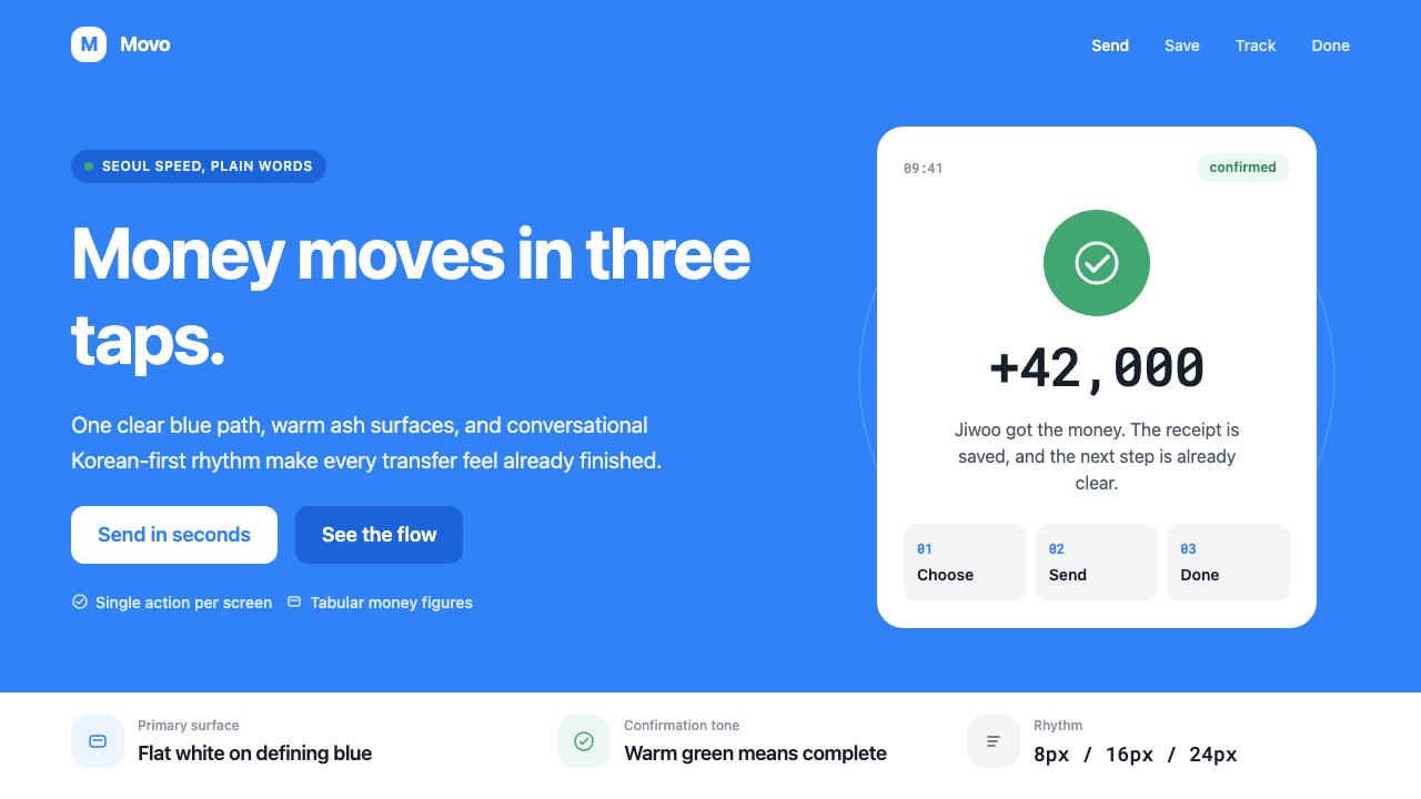 Toss Korean Fintech BlueMoney feels instant. Signature blue, Pretendard scale, and one-screen transfe…转账像短信一样快。标志蓝、Pretendard 与单屏节奏支撑信任。
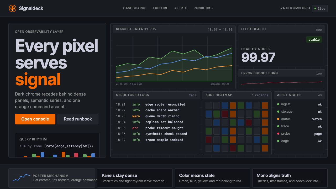 GrafanaData first, chrome last. Orange accent cuts through dense dark panels and sem…数据优先,界面退后:橙色强调穿透深色密集面板与语义图表。
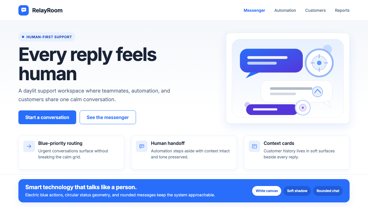 Intercom ModernWarm chat, sharp software. Electric blue bubbles on a daylit white grid.温暖对话,清晰软件。日光白网格托起电光蓝气泡。
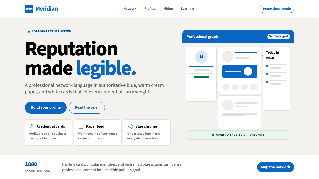 LinkedInCorporate trust, digitized. Authoritative blue frames white cards on warm cre…企业信任数字化:权威蓝框住暖奶油纸面上的白卡。
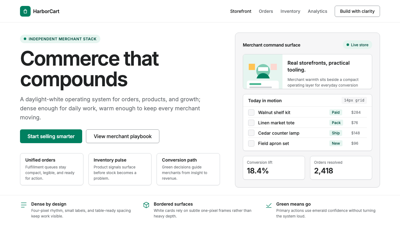 Shopify ModernMerchant ally, not corporate SaaS. Emerald actions on bordered white cards ca…商户盟友而非企业感:翡翠绿动作与白色描边卡片承载密集商业。