What is Toss Korean Fintech Blue?什么是 Toss Korean Fintech Blue?
Toss rewired how Koreans think about money by making a bank transfer feel as effortless as sending a text message.Toss 让银行转账像发短信一样轻盈,从此改写了韩国人对金融的感知方式。
Toss Korean Fintech Blue in briefToss Korean Fintech Blue 速览
Toss Korean Fintech Blue is the visual language pioneered by Viva Republica's Toss super-app, which launched in South Korea in 2015 and redefined mobile finance for a generation that grew up on instant messaging. The style is built around a single, commanding blue — vivid enough to signal confidence and technology, composed enough to project the trustworthiness expected of a financial institution. Against warm ash-tinted neutral surfaces, that blue reads as a friendly authority: not a bank vault, but a smart friend who happens to handle your money.Toss 韩国金融科技蓝是 Viva Republica 旗下 Toss 超级应用所开创的视觉语言。Toss 于2015年在韩国上线,为伴随即时通讯成长的一代人重新定义了移动金融体验。这套风格围绕一个统领全局的蓝色展开——足够鲜亮以传递自信与科技感,又足够沉稳以投射金融机构所必需的可信赖感。在暖灰色调的中性背景衬托下,这抹蓝色读来如同一位友好的权威:不是银行金库,而是恰好帮你管钱的聪明朋友。
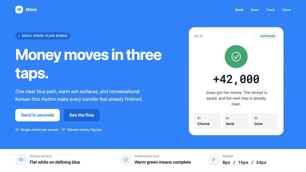
The system's organizing philosophy is one action per screen. Every layout is designed so that the user's eye and thumb arrive at one destination — a large, pill-shaped blue button — without distraction. Generous whitespace cradles money amounts and account balances, giving numbers room to breathe and preventing the visual anxiety associated with traditional banking interfaces packed with fine print and disclaimers. A warm green confirmation mark closes each successful transaction, offering an emotional punctuation mark that says the job is done.这套设计系统的核心哲学是「每屏一个动作」。每个页面布局都让用户的目光与拇指在不受干扰的情况下抵达同一个目的地——一枚大号、药片形状的蓝色按钮。充裕的留白将金额与账户余额托举在空间之中,给数字以呼吸的余地,消解了传统银行界面密布小字与免责声明所带来的视觉焦虑。每笔成功交易结束后,一个暖绿色确认标志画下句点,传递出「搞定了」的情绪感受。
Alongside the blue, the Toss Design System deploys Pretendard — a contemporary Hangul-first typeface — across four weights that cover every level of the hierarchy, from the largest balance display to the smallest legal caveat. Crucially, the copy itself is designed: Toss writes in conversational Korean, addressing users as informal companions rather than account holders, which makes the language as integral to the aesthetic as the color or the spacing.除了主蓝色之外,Toss 设计系统还运用了 Pretendard——一款以韩文为先的当代字体——以四种字重覆盖从最大余额展示到最小法律说明的全部层级。同样关键的是文案本身的设计:Toss 使用日常口语韩语写作,以非正式的平等语气称呼用户,而非将其视为账户持有人。这使语言本身与色彩、间距一样,成为整体美学不可分割的一部分。
See the Toss Korean Fintech Blue design system查看 Toss Korean Fintech Blue 完整设计系统
Where does Toss Korean Fintech Blue come from?Toss Korean Fintech Blue 从何而来?
Toss was founded in 2013 by Lee Seung-gun, a former dental school student turned serial entrepreneur who had failed eight previous startup attempts before hitting on a solution to a problem every Korean with a smartphone understood: domestic bank transfers required a labyrinthine sequence of bank-specific apps, public certificate installations, security card inputs, and pop-up windows that could consume ten minutes for a transaction that should take ten seconds. Lee's insight was not technical novelty — real-time transfer infrastructure already existed in Korea — but experiential: the friction was entirely unnecessary, and removing it was a product design problem as much as a regulatory one.Toss 由李承健创立于2013年。这位曾就读牙医学院的连续创业者,在第九次尝试之前已经历了八次失败。他发现了一个每位韩国智能手机用户都深有体会的痛点:国内银行转账需要经历一套繁琐的流程——各银行专属应用、公共证书安装、安全卡输入、层叠的弹窗——一笔原本十秒可完成的转账,往往耗去十分钟。李承健的洞察并非技术创新——韩国早已具备实时转账基础设施——而是体验层面的:这些摩擦完全没有必要,消除它既是产品设计问题,也是监管沟通问题。
The company spent nearly two years navigating Korea's financial regulators before launching publicly in February 2015. Almost immediately, Toss attracted users at a rate that surprised even its founders: the app's three-tap transfer flow became a cultural reference point, and by 2019 it had grown into a super-app offering insurance, credit scores, investment accounts, and a neobank. With that expansion came the need for a systematic visual identity that could scale across dozens of product surfaces while maintaining the spare, confident feeling of the original transfer experience. The Toss Design System, developed internally by Viva Republica's product and design teams, codified what had worked in the early product into explicit principles.公司花费近两年时间与韩国金融监管机构周旋,终于在2015年2月公开上线。Toss 的增速令创始人自己也感到意外:三次点击完成转账的交互流程迅速成为一个文化参照点。到2019年,它已成长为一款覆盖保险、信用评分、投资账户与数字银行的超级应用。随着业务扩张,品牌需要一套系统化的视觉识别——既能在数十个产品界面上延伸,又能保留最初转账体验那种简洁、自信的气质。Viva Republica 产品与设计团队在内部开发的 Toss 设计系统(TDS),将早期产品中行之有效的设计实践编纂为明确的原则。
The choice of Pretendard as the system's primary typeface was itself a statement of Korean design coming of age. Designed by Kil Hyung-jin and released as open source, Pretendard was built to solve a longstanding problem: Korean digital typography had long suffered from a mismatch between Hangul characters and the Latin characters that appear alongside them in mixed-script contexts — phone numbers, brand names, English loanwords. Pretendard harmonized both scripts at the optical level, producing a typeface where a Korean sentence and an embedded English word feel designed together rather than concatenated. Its adoption by Toss, and subsequently by a large portion of the Korean tech industry, effectively made it the default voice of a generation of Korean digital products.将 Pretendard 选为系统主字体,本身即是韩国设计走向成熟的宣言。Pretendard 由吉亨真(Kil Hyung-jin)设计并以开源形式发布,旨在解决一个长期困扰韩国数字排版的问题:韩文字符与出现在混排语境中的拉丁字符(电话号码、品牌名称、英语外来词)之间长期存在视觉不协调。Pretendard 在光学层面统一了两套文字体系,使韩文句子与嵌入其中的英文词语看起来是被一起设计的,而非简单拼接的。Toss 的采用,加之韩国科技行业大量跟随,事实上使其成为新一代韩国数字产品的默认字体声音。
The visual identity's evolution also reflects the broader trajectory of Korean consumer tech. In the early smartphone era, Korean financial apps were notorious for their complexity — multiple security plugins, mandatory desktop components, and interfaces that seemed designed to satisfy regulators rather than users. Toss's design was a deliberate inversion of that tradition, influenced by the clean interface conventions of global messaging apps and Korean e-commerce platforms that had already proved simplicity could win user trust. The warm neutral backgrounds and conversational tone borrowed from the language of social apps; the commanding blue borrowed from the established color conventions of financial trust. The synthesis was distinctly Korean: technically sophisticated, socially attuned, and built for speed.这套视觉识别的演变,也折射出韩国消费科技的更宏观轨迹。智能手机时代初期,韩国金融类应用以复杂著称——多重安全插件、必须依赖桌面端的组件、以及看起来是为取悦监管者而非服务用户而设计的界面。Toss 的设计是对这一传统的刻意颠覆,受到全球即时通讯应用的简洁界面惯例与韩国电商平台的影响——后者已经证明,简单同样可以赢得用户信任。暖中性色背景与对话式语气借鉴了社交应用的语言;统领视野的蓝色则沿用了金融信任领域已被广泛认可的色彩惯例。这种综合是distinctly韩国式的:技术上精密,社会感知上敏锐,为速度而生。
What defines the Toss Korean Fintech Blue look?Toss Korean Fintech Blue 的视觉特征是什么?
The Signature Blue标志蓝
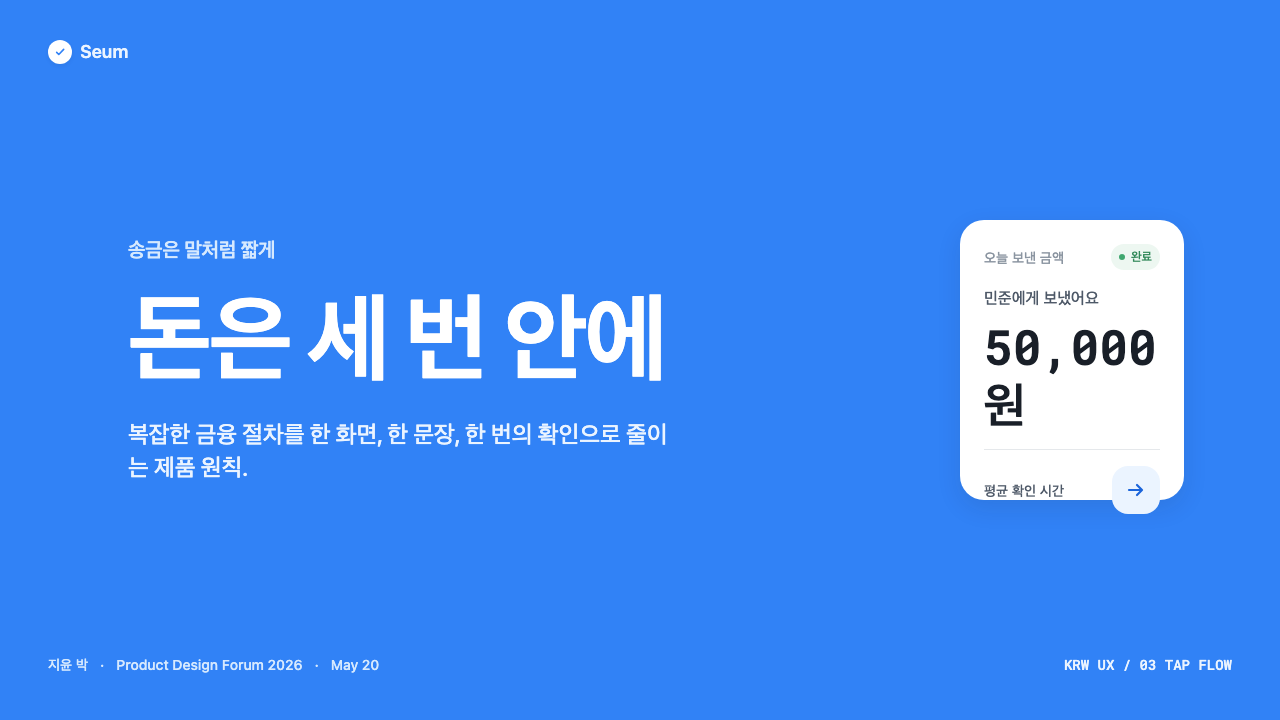
One blue does almost all the work. It is vivid but not electric — saturated enough to command attention on a white or ash-neutral surface, cool enough to read as composed rather than excitable. The blue appears on the primary action button, on active navigation states, on interactive links, and occasionally as a large background fill behind hero content. Everything else retreats to neutral: warm white, ash gray, or near-black for text. The effect of this restraint is that whenever the blue appears, the eye knows something is actionable.一个蓝色几乎承担所有视觉工作。它鲜亮但不刺眼——足够饱和以在白色或灰暖中性面上获得注意,又足够冷静以呈现沉稳而非激动的气质。这个蓝色出现在主操作按钮、激活态导航、可交互链接上,偶尔也作为大面积背景色铺设于主视觉区域之后。其余一切退守中性:暖白、灰调或近黑文字色。这种克制的效果是:每当蓝色出现,用户的眼睛便知道这里有可操作的内容。
One-Action Screens单屏单动作
The defining spatial principle is that each screen in a flow presents exactly one primary action. This is enforced visually through scale: the blue pill button is large relative to the screen, and all surrounding content — labels, secondary information, legal micro-copy — is set at a noticeably smaller scale and lighter weight. Whitespace is not decoration but architecture, creating a gravitational pull toward the single focal point. Users do not scan or parse; they arrive and act.核心空间原则是:每个流程页面只呈现一个主要动作。这一原则通过尺度差异在视觉上强制实现:蓝色药片按钮相对于屏幕尺寸偏大,而周围所有内容——标签、次要信息、法律微文字——均以明显更小的字号和更轻的字重排布。留白不是装饰,而是建筑结构,对唯一的焦点形成引力。用户不需要扫视或解读,他们抵达页面,然后采取行动。
Warm Neutral Surfaces暖中性色界面
Rather than pure cold white, the system's background and card surfaces carry a subtle warmth — an ash tone that sits between white and a very pale gray, leaning slightly toward beige without committing to it. This warmth softens the potential severity of a blue-and-white scheme and aligns the interface emotionally with the conversational, friend-like tone of the copy. Cards that float above the surface use the same warm family, differentiated by a gentle elevation cue rather than a hard border.系统的背景与卡片面并非纯冷白,而是带有微妙的暖意——一种介于白色与极浅灰之间、略微偏向米色但又未完全偏至米色的灰暖色调。这种温度柔化了蓝白搭配可能产生的严峻感,使界面在情绪上与文案那种对话式、朋友般的语气相协调。浮在背景之上的卡片沿用同一暖色系,以轻柔的层次提示加以区分,而非依赖硬边框线。
Pretendard Typographic ScalePretendard 字体层级
Pretendard's four weights — from a lean regular through to a commanding bold — define the entire information hierarchy without requiring a second typeface. Balance and account amounts are set large and heavy, commanding immediate attention; labels and category names drop to a middle weight and smaller size; legal and auxiliary text retreats to the lightest weight at a reduced scale. The optical harmony between Hangul and Latin characters within Pretendard means that Korean sentences, English brand names, and numeric amounts all feel like members of the same designed family.Pretendard 的四种字重——从纤细的 Regular 到有力的 Bold——在无需引入第二款字体的情况下定义了全部信息层级。余额与账户金额以最大字号和最重字重呈现,夺取即时注意力;标签与分类名称降至中等字重与较小字号;法律与辅助文字则以最轻字重在更小的尺度下退至背景。Pretendard 内韩文与拉丁字符之间的光学和谐,使韩语句子、英文品牌名称与数字金额看起来同属一个被一起设计的家族。
Conversational Copy as Visual Element对话式文案作为视觉元素
The writing style is inseparable from the visual design. Toss writes in informal Korean — the register used between friends or peers, not between an institution and a customer. Sentences are short. Instructions are direct. Error messages explain what went wrong and what to do next without legalese. This tone means the text on screen is visually light even when it carries significant information, because short, clear sentences at a readable size take up less space and create less anxiety than longer, denser institutional prose.写作风格与视觉设计不可分割。Toss 使用非正式韩语写作——朋友或同辈之间的语气,而非机构对客户的语气。句子简短。指引直接明了。错误提示说明出了什么问题、下一步该怎么做,不使用法律术语。这种语气意味着屏幕上的文字即使承载重要信息也在视觉上显得轻盈——因为简短、清晰的句子在可读字号下占用的空间更少,带来的焦虑感也远低于更长、更密的机构式行文。
Pill Button as System Signature药片按钮作为系统签名
The fully rounded, pill-shaped primary button is the most recognizable single element in the Toss visual system. Its silhouette — wide enough to span most of the screen width, tall enough to be comfortable for a thumb — gives the blue its most concentrated expression. The pill shape is also culturally legible in the Korean mobile context, where it has become strongly associated with the specific brand of frictionless, confident digital action that Toss introduced. A flat background, no gradient, no shadow: the button is itself, unambiguous and ready.完全圆角的药片形主操作按钮,是 Toss 视觉系统中辨识度最高的单一元素。它的轮廓——宽度几乎横跨屏幕、高度足以让拇指舒适按压——赋予蓝色最集中的表达。在韩国移动语境中,药片形状已积累了强烈的文化可读性,与 Toss 所引入的那种无摩擦、自信的数字操作体验高度关联。纯平背景,无渐变,无投影:按钮就是它本身,清晰无歧义,随时待命。
Green Confirmation Moment绿色确认时刻
After the blue drives the action, a warm green mark closes the loop. The confirmation screen — displaying the green checkmark alongside the transferred amount — is designed to provide emotional resolution, not just informational completion. The green is warmer and slightly less saturated than a pure signal green, making it feel celebratory rather than clinical. It appears briefly, prominently, and then the app returns to its resting state, reinforcing the philosophy that a completed transaction should leave no residue — no prompts, no upsells, no lingering forms.蓝色驱动操作之后,暖绿色的确认标志画下句号。确认页面将绿色对勾与转账金额并置呈现,目的是提供情绪上的完结感,而不仅仅是信息层面的完成反馈。这个绿色比纯信号绿更暖、饱和度略低,让它呈现出庆祝感而非临床感。它短暂而醒目地出现,随后应用回归静默状态,强化了这样一种哲学:一笔完成的交易不应留下任何残余——没有提示,没有追加销售,没有滞留的表单。
See the Toss Korean Fintech Blue design system查看 Toss Korean Fintech Blue 完整设计系统
Who shaped Toss Korean Fintech Blue?谁塑造了 Toss Korean Fintech Blue?
Lee Seung-gun founded Viva Republica and Toss after eight failed startup attempts, identifying the extreme friction in Korean domestic bank transfers as both a cultural frustration and a product opportunity. His decision to address the problem as a user-experience problem first — rather than a technology or compliance problem — set the design philosophy that the Toss visual system would later make explicit. His public communication style, frank and informal, directly influenced the brand's conversational copywriting register.李承健在经历八次创业失败后创立了 Viva Republica 与 Toss,将韩国国内银行转账的极度摩擦识别为既是文化层面的挫败,也是产品机会。他选择首先将这一问题作为用户体验问题来处理——而非技术或合规问题——这奠定了 Toss 视觉系统后来得以明文化的设计哲学。他坦率、非正式的公众沟通风格,也直接影响了品牌对话式文案的语气基调。
The internal team responsible for building and maintaining the Toss Design System codified what had worked in the early product — the commanding blue, the pill button, the one-action screen structure — into a systematic set of components and principles that could scale across a super-app with dozens of feature areas. Their work transformed an intuitive early design into a reproducible visual language, and made the Toss aesthetic recognizable even on surfaces — insurance, credit, investment — far removed from the original transfer experience.负责构建与维护 Toss 设计系统的内部团队,将早期产品中行之有效的设计实践——标志蓝、药片按钮、单屏单动作结构——编纂为一套可在拥有数十个功能领域的超级应用中规模化延伸的组件与原则体系。他们的工作将一种直觉性的早期设计转化为可复现的视觉语言,使 Toss 美学即便在与最初转账体验相距甚远的界面上——保险、信用、投资——也保持清晰的辨识度。
Kil Hyung-jin is the designer of Pretendard, the open-source typeface that became the typographic foundation of the Toss visual system and subsequently one of the most widely used Korean digital typefaces of its era. By solving the long-standing optical tension between Hangul and Latin character sets in mixed-script environments — a problem endemic to Korean digital publishing — Kil produced a typeface whose harmony across scripts made it the natural choice for any Korean digital product that combines Korean copy, English brand names, and numeric data on the same screen.吉亨真(Kil Hyung-jin)是 Pretendard 的设计师。这款开源字体成为 Toss 视觉系统的排版基础,并随后成为其时代最广泛使用的韩国数字字体之一。通过解决混排语境中韩文与拉丁字符之间长期存在的视觉张力——这是韩国数字出版领域的普遍痛点——吉亨真创造了一款跨文字体系高度和谐的字体,使其成为任何需要在同一屏幕上呈现韩语文案、英文品牌名称与数字数据的韩国数字产品的自然之选。
Beyond individual figures, Toss's visual identity reflects an organizational culture that treated design and copy as product — not as decoration applied after engineering decisions were made. The practice of writing conversational Korean at the level of each button label and error message, and of reviewing information architecture before visual styling, produced a design system whose coherence runs deeper than its color palette. This culture, sometimes described as 'product thinking as design thinking,' became influential across the Korean startup ecosystem and is visible in the wave of fintech and consumer apps that followed Toss's design conventions.超越个体人物之外,Toss 的视觉识别折射出一种组织文化——将设计与文案视为产品本身,而非在工程决策完成后附加的装饰。在每个按钮标签和错误提示的层面撰写对话式韩语的实践,以及在视觉风格确定之前先审视信息架构的习惯,产生了一套连贯性深入色板之下的设计系统。这种文化,有时被描述为「产品思维即设计思维」,对韩国创业生态系统产生了广泛影响,并在跟随 Toss 设计惯例的一波金融科技与消费类应用中清晰可见。
How do you use Toss Korean Fintech Blue today?今天怎么用 Toss Korean Fintech Blue?
Toss Blue is one of the most transferable contemporary fintech design languages because its logic is behavioral rather than decorative: every visual decision exists to reduce hesitation, direct attention, and provide emotional closure. Applying it well means understanding that the blue is a signal, the whitespace is a decision, and the copy is part of the design — not a placeholder to be filled in later.Toss 蓝是当代金融科技设计语言中可移植性最强的体系之一,因为它的逻辑是行为性的而非装饰性的:每一个视觉决策都是为了减少犹豫、引导注意力、提供情绪上的完结感。正确运用它,意味着理解:蓝色是信号,留白是决策,文案是设计的一部分——而非日后填充的占位符。
For presentation decks, the style works best when each cover slide commits to a full-bleed blue field with white type — large, minimal, direct — and interior slides are treated as product screens: one primary message per slide, secondary data at a noticeably reduced scale, and the same warm neutral background that grounds the Toss interface. Data slides should follow the single-metric-first principle: the most important number is the largest element on the page, set in a heavy weight, with supporting breakdown appearing below at half the visual weight. Charts use the signature blue for the primary series and warm gray for comparison or secondary series; no decorative fills, no gradients.在演示文稿中,这套风格最适合将封面设计为满版蓝色底面配白色大字——简洁、直接;内容页则应当被当作产品界面处理:每页一个主要信息,次要数据以明显更小的尺度呈现,背景延续与 Toss 界面相同的暖中性色。数据页遵循「最重要的数字最大」原则:核心指标以最重字重呈现为页面最大元素,支撑性明细在其下方以一半的视觉份量出现。图表用标志蓝表示主数列,暖灰色用于对比或次要数列;不使用装饰性填充,不使用渐变。
For web UI, the system is ideally suited to dashboards, account overview pages, and pricing tables where decision-making is the user's primary task. Apply a strict vertical rhythm with generous line height, keep the content column narrower than the screen width to create natural lateral breathing room, and use the blue exclusively for interactive controls and positive states. Card components should float on a warm neutral field without hard borders — a subtle lightening of the surface communicates elevation without adding visual weight. Navigation labels should be typographic rather than iconic wherever legibility permits.在网页界面上,这套系统最适合仪表板、账户概览页与定价表格——用户在这些场景中的主要任务是做决策。应用严格的垂直节奏与宽松的行高,将内容列宽设置窄于屏幕宽度以创造自然的横向呼吸空间,仅将蓝色用于交互控件与正向状态。卡片组件应当浮于暖中性色背景之上,不使用硬边框——表面的微妙提亮即可传达层次感,无需增加视觉重量。在可读性允许的情况下,导航标签应以文字而非图标呈现。
For editorial and marketing contexts, the style's authority and warmth make it effective for long-form financial content — explainers, product announcements, regulatory communications — where trust is the primary persuasive currency. Use wide margins for pull quotes or definitions, set body text at a reading-comfortable scale with generous leading, and deploy the blue only at meaningful moments: a key statistic, a call-to-action, a highlighted term. Marketing hero sections work well with the full blue fill and a single large white statement, echoing the simplicity of the app's own cover states.在编辑与营销场景中,这套风格的权威感与温度感使其对长篇金融内容尤为有效——产品解读、发布公告、监管沟通——信任是这类场景中最核心的说服货币。使用宽边距放置引用语或术语解释,以舒适阅读的字号与宽松的行距排布正文,仅在有意义的时刻使用蓝色:一个关键数据、一个行动号召、一个高亮术语。营销主视觉区域适合满版蓝底配单句大号白色文字,呼应应用自身封面状态的简洁感。
A common mistake when adapting Toss Blue is importing the visual surface without the underlying spatial discipline. Designers sometimes adopt the blue and the pill button but crowd the layout with multiple simultaneous calls to action, dense supporting copy, or competing visual hierarchies — the opposite of the one-action principle that gives the style its power. Similarly, substituting a colder or more electric blue breaks the warmth balance; the original is calibrated to read as trustworthy rather than aggressive. Copy that defaults back to formal or institutional language also undermines the system: the visual and verbal tones are designed together, and separating them produces an interface that looks like Toss but feels like a legacy bank.改编 Toss 蓝时最常见的错误,是引入视觉表面而丢失其底层的空间纪律。设计师有时采用了蓝色与药片按钮,却在布局中同时塞入多个行动号召、密集的辅助文案或相互竞争的视觉层级——这与赋予这套风格力量的「单屏单动作」原则背道而驰。同样,将蓝色替换为更冷或更高饱和度的版本会破坏温度平衡;原始色调经过精心校准,读来可信而非攻击性的。文案若退回到正式或机构化的语气,也会瓦解整个系统:视觉语调与语言语调是被一起设计的,将二者分离会产生一个看起来像 Toss、感觉却像传统银行的界面。
See the Toss Korean Fintech Blue design system查看 Toss Korean Fintech Blue 完整设计系统
Toss Korean Fintech Blue — FAQToss Korean Fintech Blue · 常见问题
Why does Toss use only one blue instead of a full color palette?为什么 Toss 只使用一个蓝色,而不是完整的色板?
The single-blue discipline is a direct expression of the one-action-per-screen philosophy. A richer palette would create more opportunities for the eye to hesitate — to compare, evaluate, and rank competing colors before settling on a destination. By making the blue the only saturated color in the system, Toss ensures that anywhere the blue appears, attention arrives without competition. This is not aesthetic minimalism for its own sake; it is behavioral engineering through color. The warm neutrals, ash grays, and near-black text tones support the blue without challenging it, making every screen a resolved composition with a single clear focal point.单一蓝色的纪律是「每屏单动作」哲学的直接表达。更丰富的色板会制造更多让眼睛停顿的机会——在抵达目的地之前先比较、评估、排列竞争的颜色。通过让蓝色成为系统中唯一的饱和色,Toss 确保了蓝色无论出现在何处,注意力都能无障碍抵达。这不是为了美学极简而极简;这是通过色彩进行的行为工程学。暖中性色、灰调与近黑文字色以不挑战蓝色的方式支撑它,使每个页面成为一个只有一个清晰焦点的完整构图。
Is this style appropriate for non-financial digital products?这套风格适合非金融类数字产品吗?
The Toss aesthetic travels well to any product where a small number of clear, confident actions matter more than browsing or exploration — task management apps, booking flows, onboarding sequences, checkout processes, and notification-heavy mobile products all share the single-action-per-screen logic that Toss embodies. It is less suited to products that reward exploration: editorial platforms with rich imagery, e-commerce surfaces where browsing and discovery are the primary experience, or entertainment products where visual density and sensory richness are features rather than failures. The test is whether the user's task has a clear completion state; if it does, Toss-derived conventions will likely serve it well.Toss 美学在任何「少量清晰、自信的动作比浏览或探索更重要」的产品中都有良好的移植性——任务管理应用、预订流程、新用户引导、结账流程,以及通知密集型移动产品,都与 Toss 所体现的「单屏单动作」逻辑相契合。它对以探索见长的产品则不那么适合:图文丰富的编辑平台、以浏览发现为主要体验的电商界面,或者视觉密度与感官丰富本身是卖点而非失误的娱乐产品。判断标准是:用户的任务是否有清晰的完成状态——如果有,Toss 派生的设计惯例很可能服务得很好。
How does the Toss visual system handle dark mode?Toss 视觉系统如何处理深色模式?
Dark mode in the Toss system maintains the blue-as-primary-action principle while inverting the surface hierarchy. The backgrounds shift to deep charcoal tones that retain warmth — not pure black, which would feel cold — and the blue button remains the primary call to action at a similar saturation level. The warm green confirmation mark transfers naturally because warm hues hold their emotional character against dark grounds. The critical adjustment is that secondary text and surface differentiation require more deliberate control in dark mode, since the ash-neutral differentiations that work on light surfaces can collapse into indistinction on dark ones. The style's strength in dark mode is the same as in light: the blue always tells you where to go.Toss 系统的深色模式在保持「蓝色为主操作色」原则的同时,反转了表面层级。背景转换为带有暖意的深碳灰色调——而非纯黑,后者会显得生冷——蓝色按钮以相近的饱和度保持为主要行动号召。暖绿色确认标志的转移是自然的,因为暖色调在深色背景上同样保持其情绪特质。关键的调整在于:深色模式下,次要文字与表面层次的区分需要更刻意的控制——在浅色界面上有效的灰暖色差异,在深色背景上可能坍缩为难以区分的视觉效果。这套风格在深色模式下的优势与浅色模式相同:蓝色始终告诉你该去哪里。
What distinguishes Toss Blue from other blue-dominant fintech visual systems?Toss 蓝与其他以蓝色为主的金融科技视觉系统有何区别?
Most blue-dominant fintech systems use blue to project corporate authority — a cold, slightly desaturated institutional tone inherited from traditional banking identity design. Toss's blue is warmer and more saturated than this convention, placing it closer to consumer tech than to banking heritage. The pill button shape, the conversational copy, and the warm neutral backgrounds together create a system that reads as friendly authority rather than corporate command. The integration of Hangul-Latin typographic harmony — a specifically Korean design challenge — also gives the system a cultural specificity that distinguishes it from the internationally generic blue-and-white fintech aesthetic that dominates Western markets.大多数以蓝色为主的金融科技系统使用蓝色来投射企业权威——一种偏冷、略微去饱和的机构感色调,继承自传统银行视觉识别设计。Toss 的蓝色比这一惯例更暖、更饱和,使其更接近消费科技而非银行传统。药片按钮的形状、对话式文案,以及暖中性色背景,共同构建了一个读来像「友好的权威」而非「企业命令」的系统。韩文与拉丁字体排印和谐性的整合——这是一个特定于韩国的设计挑战——也赋予了这套系统一种文化特殊性,使其有别于主导西方市场的国际通用蓝白金融科技美学。
Can the Toss style work for print or physical brand applications?Toss 风格能用于印刷或实体品牌应用吗?
The Toss visual language translates reasonably well to print, particularly for materials where the digital brand experience should feel continuous: debit card design, financial statement cover pages, ATM interface graphics, and co-branded retail point-of-sale materials. The pill button translates to a pill-shaped badge or label element; the single-message-per-surface principle works well for wayfinding and transactional signage. The warm neutrals reproduce faithfully in coated stock printing. Where the style encounters limits in print is in materials that require rich photographic imagery, detailed infographics, or a wide tonal range — the system is optimized for clean, high-contrast digital rendering, and its restraint can read as underdeveloped in print contexts where the eye expects more environmental richness.Toss 视觉语言对印刷品的转化尚算顺畅,尤其适合那些需要与数字品牌体验保持连贯的材料:借记卡设计、财务报告封面、ATM 界面图形,以及联名零售终端物料。药片按钮可转化为药片形标签或徽章元素;每个界面单一信息的原则在引导标识和交易类告示上同样有效。暖中性色在涂布纸印刷中能够忠实还原。这套风格在印刷中遭遇局限的场景是:需要丰富摄影图像、详细信息图表或宽泛色调层次的材料——这套系统为干净、高对比度的数字渲染而优化,其克制感在印刷语境中可能显得不够充实,因为在那里,眼睛期待更丰富的视觉环境。
Related design styles相关设计风格
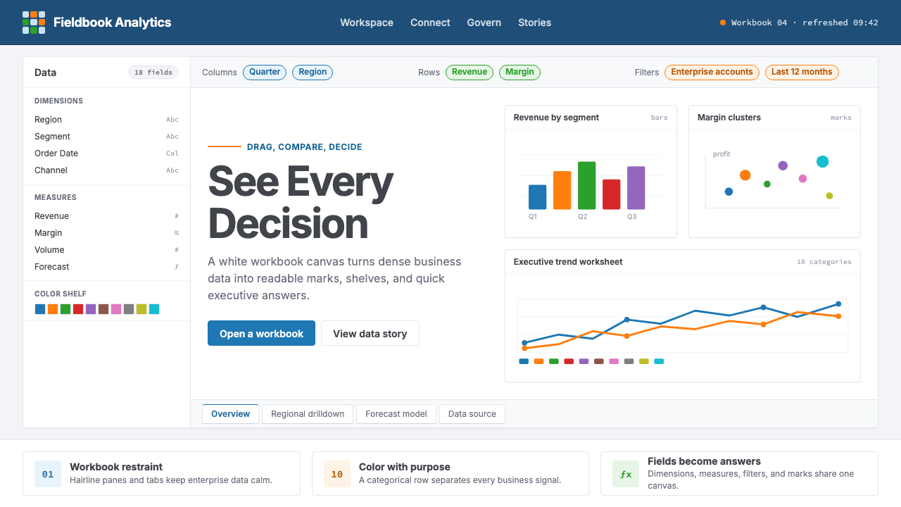 Tableau (Business Intelligence)Enterprise clarity. Navy workbook chrome, hairline panes, and 10-color marks…企业级清晰感:海军蓝工作簿框架、细线分栏与十色数据标记驯服密集信息。
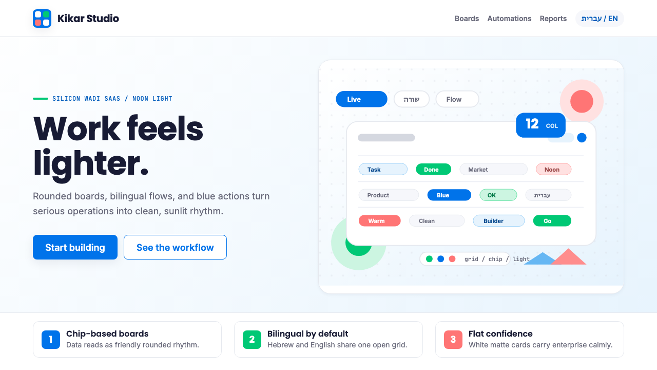 Tel Aviv Silicon WadiEnterprise feels sunny. Azure chips and Poppins grids soften flat SaaS surfac…企业软件也有阳光感:天蓝色芯片与 Poppins 网格软化平面 SaaS。
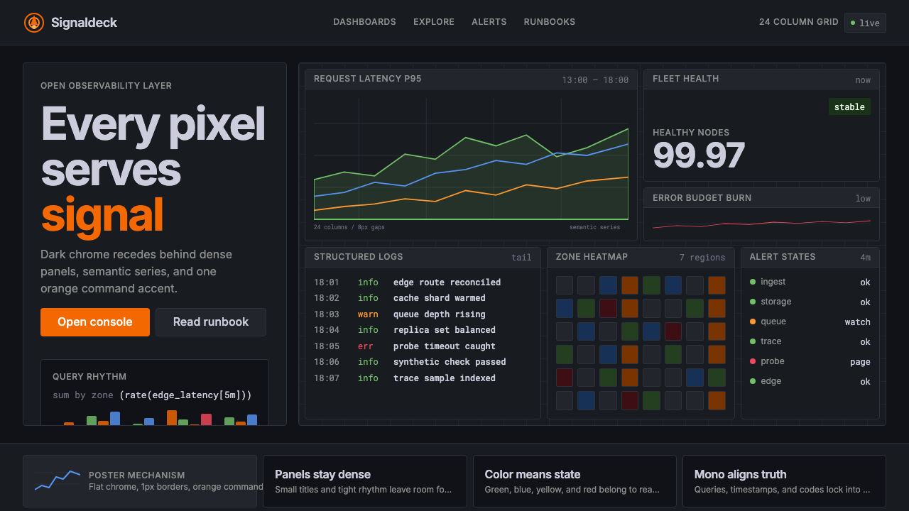 GrafanaData first, chrome last. Orange accent cuts through dense dark panels and sem…数据优先,界面退后:橙色强调穿透深色密集面板与语义图表。
 Intercom ModernWarm chat, sharp software. Electric blue bubbles on a daylit white grid.温暖对话,清晰软件。日光白网格托起电光蓝气泡。
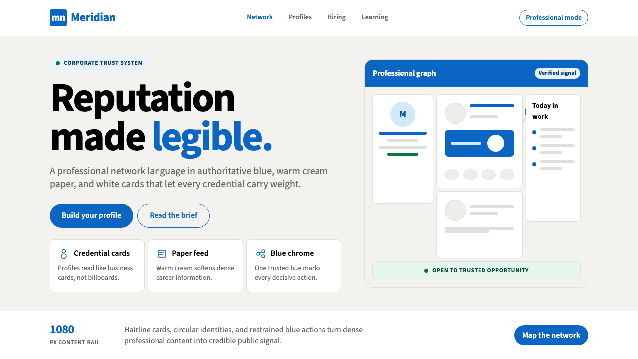 LinkedInCorporate trust, digitized. Authoritative blue frames white cards on warm cre…企业信任数字化:权威蓝框住暖奶油纸面上的白卡。
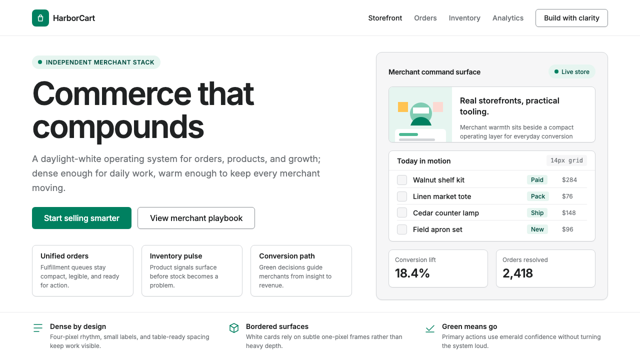 Shopify ModernMerchant ally, not corporate SaaS. Emerald actions on bordered white cards ca…商户盟友而非企业感:翡翠绿动作与白色描边卡片承载密集商业。