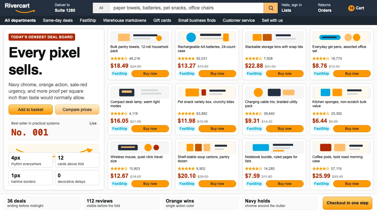
About Amazon
Amazon's visual language is anti-design elevated to doctrine. The orange smile-arrow, navy chrome, and cramped product grids haven't meaningfully changed since 2003 — not from neglect, but from ruthless A/B optimization that proved ugly sells. Every pixel serves conversion.
The system treats information density as a feature: star ratings, Prime badges, sale prices in red, and "Buy Now" buttons in orange compete for attention inside a deliberately cluttered grid. It's Walmart-aisle logic applied to screens.
- Origin
- Seattle, Washington / Arlington, Virginia
- Era
- 1994 founded; current visual identity ~2003–2024
- Key figures
- Jeff Bezos · Andy Jassy · Turner Duckworth · Ben Kiel
- Movements
- E-commerce mass-market scaling · Customer-obsession philosophy · Dense-grid retail UX
Amazon design spec
Colors
Typography
The other 11 sections — buttons, cards, spacing, motion, techniques and more — open once you unlock. Download the DESIGN.md or send it to your AI in one click. Unlock once, yours forever.
Sign up nowStyles similar to Amazon
Also inspired by brands & products, with a close feel.
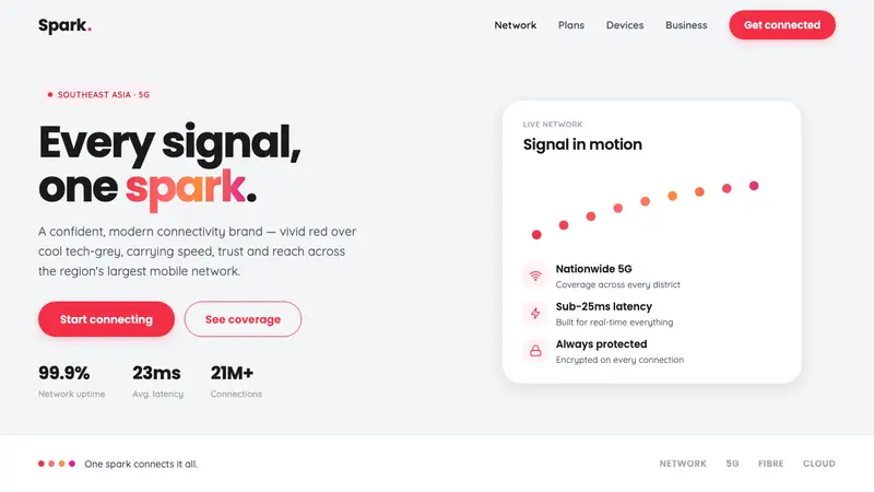 Singtel Modern BrandKeeps the red loudest on screen. Vivid Singtel red on cool tech-grey, with a gradient dot spark arc.
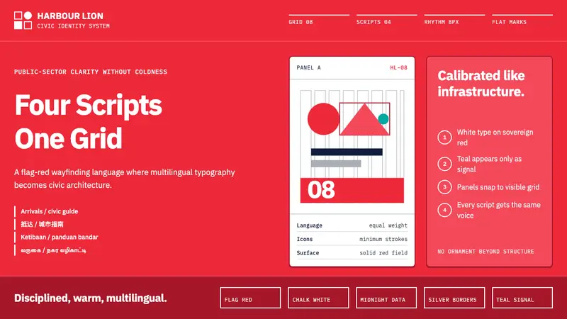 Singapore Merlion BrandPrecision with civic warmth. Flag red and geometric sans lock into a four-script grid.
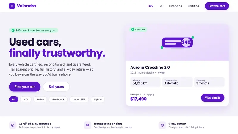 Kavak MarketplaceUsed cars, finally trustworthy. Kavak Purple on violet-tinted white, green certified pills, rounded sans.
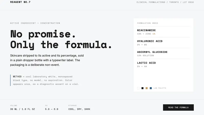 The OrdinaryNo promise, only the formula. Cool lab white, Space Mono labels, color as rare diagnostic accent.