What is Airbnb 2014?什么是 Airbnb 2014?
Coral warmth, generous whitespace, and the Bélo — Airbnb's 2014 redesign taught the internet that strangers could trust each other, one rounded card at a time.珊瑚暖色、充裕留白与 Bélo 符号——Airbnb 2014 年的视觉语言告诉互联网:陌生人之间可以信任彼此,一张圆角卡片接着一张。
Airbnb 2014 in briefAirbnb 2014 速览
Airbnb 2014 is the visual design system that emerged from the company's landmark brand refresh, centered on the launch of the Bélo — a symbol composed of interlocking curves evoking a stylized letter 'A', a heart, a location pin, and two hands in profile. Combined with a warm coral-red primary color, a custom rounded typeface, and photography-first card layouts, it formed a coherent design language that came to define an entire genre: the trust-first marketplace.Airbnb 2014 是该公司里程碑式品牌焕新所催生的视觉设计体系,核心是 Bélo 的发布——一个由交叠曲线构成的符号,同时让人联想到字母'A'的变体、心形、位置标记与两只侧面呈现的双手。与温暖的珊瑚红主色、定制圆润字体和以摄影为主导的卡片布局相结合,它形成了一套连贯的设计语言,并最终定义了一个品类:以信任为首要价值的市场平台。
At the system's core is a deliberate warmth strategy. Where earlier web design relied on cool blues and neutral grays to signal reliability, Airbnb chose a coral that sits between red and orange — energetic enough to draw attention, tempered enough not to alarm. Every supporting decision reinforces the same emotional register: corners are softened into generous curves, imagery is large and daylit, spacing is relaxed, and interactive elements feel approachable rather than clinical.这套体系的核心是刻意经营的温暖策略。过去的网页设计惯用冷蓝与中性灰来传递可靠感,Airbnb 却选择了一种介于红与橙之间的珊瑚色——足够有活力以吸引注意,又足够温和而不令人警惕。每一个配套决策都强化了同一种情感基调:圆角被放大为慷慨的弧度,图像大幅而明亮,间距宽松,交互元素令人感到亲近而非冷峻。
The result was a visual identity so coherent and widely copied that it created a recognizable sub-genre sometimes called 'Airbnb-style' design — characterized by pill-shaped buttons, soft-shadow card components, hero photography framed in rounded containers, and a palette that blends warm neutrals with a single vibrant accent. Understanding the system means understanding that every element is in service of a single value proposition: making the unfamiliar feel safe and inviting.最终呈现的品牌视觉如此连贯且被广泛模仿,以至于催生了一个可识别的子流派——有时被称为'Airbnb 风格'设计:胶囊形按钮、带柔和阴影的卡片组件、装在圆角容器里的英雄式摄影,以及将暖中性色与单一鲜明强调色相融合的色板。理解这套体系,意味着理解每一个元素都服务于同一个价值主张:让陌生的事物感觉安全而宜人。
Where does Airbnb 2014 come from?Airbnb 2014 从何而来?
By 2013, Airbnb had grown from a scrappy air-mattress-rental startup into a global hospitality platform operating in over a hundred countries. The original visual identity — a wordmark in a blocky script — no longer reflected the company's ambitions or the emotional stakes of its product. Strangers were inviting strangers into their homes; the brand needed to earn that trust at a glance. Co-founders Brian Chesky and Joe Gebbia, both trained designers, commissioned London-based brand consultancy DesignStudio to lead the visual overhaul.到2013年,Airbnb 已从一家简陋的气垫床出租初创企业成长为业务覆盖逾百个国家的全球住宿平台。原有的视觉形象——一个粗体花写字标——已无法反映公司的雄心或其产品所承载的情感重量。陌生人邀请陌生人进入自己的家;品牌需要在一瞥之间赢得信任。联合创始人 Brian Chesky 与 Joe Gebbia 均受过专业设计训练,他们委托伦敦品牌咨询公司 DesignStudio 主导视觉改造。
The Bélo, unveiled in July 2014, was the project's centerpiece. DesignStudio described it as a symbol of belonging — the idea that anyone, anywhere, can feel at home. The mark's formal ingenuity lay in its readability on multiple levels: it functioned as an 'A' for Airbnb, a heart for care, a location pin for travel, and a figure formed by two mirrored hands. The launch was accompanied by a campaign inviting the public to draw their own Bélos, a participatory gesture that reinforced the brand's communitarian values. Karri Saarinen, who led product design at Airbnb during this period, guided the translation of the new brand identity into the full digital product experience.Bélo 于2014年7月正式亮相,是整个项目的核心。DesignStudio 将其描述为归属感的符号——任何人、在任何地方都能感受到宾至如归的理念。这个标志的形式智慧在于其多层次的可读性:它同时是 Airbnb 的首字母'A'、代表关怀的心形、旅行的位置标记,以及由两只相对手形构成的人形。发布活动还邀请公众亲手绘制自己的 Bélo,这一参与性姿态进一步强化了品牌的社群价值观。在此期间主导 Airbnb 产品设计的 Karri Saarinen,引导了新品牌形象向完整数字产品体验的转化。
The custom typeface, named Cereal, was developed to match the Bélo's visual warmth. Designed with rounded apertures and friendly terminals, it avoided the cool geometry of contemporary tech typefaces and the old-fashioned warmth of slab serifs — landing instead in a register that felt modern but human. Cereal accompanied the coral palette in establishing a typographic voice that was legible at display sizes on the marketing site and equally functional in small-print listing details.定制字体 Cereal 的开发旨在匹配 Bélo 的视觉温度。它以圆润的字腔与亲切的字端为特征,既回避了当时科技字体惯用的冷峻几何感,也避开了衬线字体带来的旧时代温情,最终落在了一个现代而不失人情味的音域。Cereal 与珊瑚色板共同确立了一种字体声音:在营销网站的大尺寸展示和房源详情的小字印刷中都同样清晰易读。
The visual language arrived at a precise cultural moment. In 2014, the sharing economy was both a genuine cultural phenomenon and a contested idea — questions of safety, accountability, and trust between strangers were live public debates. Airbnb's design responded to this context directly: by making warmth, openness, and welcome visible at every touchpoint, it built trust through aesthetics rather than through policy alone. The system influenced a generation of marketplace, lifestyle, and SaaS companies that adopted coral accents, rounded corners, and photography-first layouts as shorthand for the same set of values.这套视觉语言在一个精准的文化时刻降临。2014年,共享经济既是真实的文化现象,也是充满争议的概念——陌生人之间的安全、责任与信任问题正是彼时活跃的公共辩题。Airbnb 的设计直接回应了这一语境:通过在每一个触点上让温暖、开放与欢迎变得可见,它以美学而非政策建立了信任。这套体系影响了整整一代市场平台、生活方式与 SaaS 公司,它们纷纷将珊瑚强调色、圆角与以摄影为主导的布局作为同一套价值观的视觉简写。
What defines the Airbnb 2014 look?Airbnb 2014 的视觉特征是什么?
Coral Accent珊瑚强调色
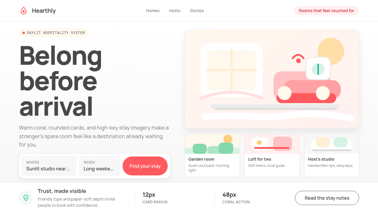
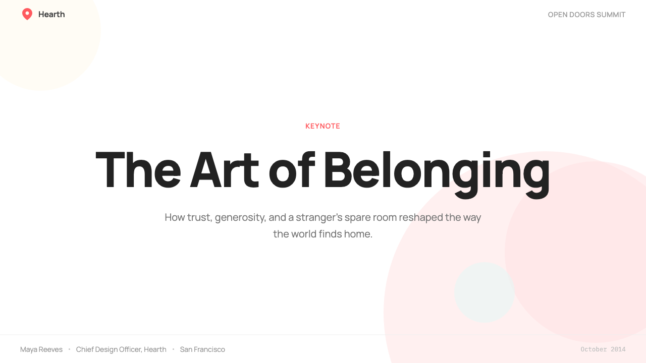
The signature color sits in the warm spectrum between red and orange — energetic enough to read as a call to action, soft enough not to carry alarm. It appears most prominently on primary buttons, key iconography, and the Bélo itself. The rest of the palette is deliberately restrained: warm off-white grounds, neutral mid-tones for secondary text, and near-black for headings. The coral earns its prominence precisely because it is the only high-saturation element in an otherwise quiet field.这抹标志性色彩落在红与橙之间的暖色谱上——足够有活力以承担行动号召的功能,又足够柔和而不带来警示感。它最显眼地出现在主要按钮、关键图标和 Bélo 本身上。其余色板则刻意克制:暖白色的底面、用于次要文字的中性中间色调,以及接近黑色的标题色。珊瑚色之所以获得突出地位,恰恰是因为它是一片安静底色中唯一的高饱和元素。
Rounded Forms圆润形态
Corners are softened throughout the system — on cards, buttons, image containers, and input fields. The degree of rounding is generous rather than token: a button's ends approach a full pill, an image card's corners suggest a friendly envelope rather than a mechanical frame. This consistent softness is not incidental; it is one of the system's primary trust signals, reducing the visual aggression of hard angles and reinforcing a sense of welcome at every interactive touchpoint.整个体系中的圆角无处不在——卡片、按钮、图像容器和输入框皆如此。圆角的幅度是慷慨而非象征性的:按钮的两端接近完整的胶囊形,图像卡片的圆角让人联想到友善的信封而非机械的边框。这种一致的柔和感并非偶然——它是整套体系最核心的信任信号之一,消解了硬角的视觉攻击性,并在每一个交互触点上强化了欢迎感。
Photography-First Layout以摄影为首要的布局
Large, high-quality photography is the primary visual content in the system — not illustration, not icons, and not abstract graphic shapes. Images of homes, neighborhoods, and hosts dominate the layout grid and establish the emotional register of each listing. Photos are cropped to emphasize warmth and daylight: interiors appear bright and inviting, outdoor spaces are shot in golden-hour light, and host portraits lean toward candid over posed. The design system treats the photograph not as decoration but as the product itself.大幅高质量摄影是这套体系的首要视觉内容——而非插图、图标或抽象图形。房屋、社区与房东的照片主导了布局网格,并确立了每条房源的情感基调。图片的裁切方式着重强调温暖与自然光线:室内空间看起来明亮而宜人,户外空间以黄金时刻的光线拍摄,房东肖像倾向于自然随性而非刻意摆拍。这套设计体系将照片视为产品本身,而非装饰物。
Card Architecture卡片架构
Content is organized into discrete card units — each containing a photograph, a title, a location line, a price, and a rating — separated by generous whitespace rather than borders or dividers. Cards carry a subtle soft shadow that lifts them slightly off the ground without creating the heavy depth of skeuomorphic design. The shadow is diffuse and warm-toned, reinforcing the system's overall register. Cards are the primary unit of browsing, and their consistent shape ensures that visual scanning is fast and low-friction.内容被组织成独立的卡片单元——每张包含一张照片、标题、地点行、价格和评分——以充裕的留白而非边框或分割线相互隔开。卡片带有微妙的柔和阴影,使其从底面轻微浮起,却不产生拟物设计那种沉重的深度感。阴影漫射而温暖,强化了整套体系的情感基调。卡片是浏览的基本单元,其一致的形态确保了视觉扫描的快速与低摩擦。
Friendly Custom Typography友善的定制字体排印
The Cereal typeface brings warmth to functional text through rounded terminals and open letterforms that avoid both the cold precision of geometric grotesques and the nostalgic weight of humanist serifs. Typographic hierarchy is established through size and weight contrast rather than color: a prominent heading sits above secondary metadata in a lighter weight, with the coral accent reserved for interactive labels rather than decorative emphasis. Line spacing is generous throughout, lending an unhurried, welcoming pace to the reading experience.Cereal 字体通过圆润的字端和开放的字形为功能性文本注入温度,既回避了几何无衬线的冷峻精确,也远离了人文主义衬线字体的怀旧分量。字体层级通过尺寸与字重的对比来建立,而非依赖色彩:显著的标题位于较轻字重的次要元数据之上,珊瑚色强调保留给交互标签,而非装饰性强调。整体行间距宽松,为阅读体验赋予了一种不急不躁、令人愉悦的节奏。
Generous Whitespace充裕的留白
Airbnb's layouts breathe. Content elements are never crowded; between sections, between cards, and around text blocks, negative space is treated as a design material in its own right rather than an absence of content. This spaciousness is both aesthetic and functional: it signals a brand that is confident, unhurried, and premium without being cold. The whitespace also serves the photography — a listing image surrounded by breathing room carries more emotional weight than one packed alongside competing elements.Airbnb 的版面是会呼吸的。内容元素从不拥挤;在区块之间、卡片之间、文字组件周围,留白被视为一种独立的设计材料,而非内容的缺席。这种宽阔感既有美学意义,也有功能意义:它传递出一个自信、从容、高品质但不冰冷的品牌气质。留白同时服务于摄影——一张被呼吸空间环绕的房源图片,比一张与竞争元素挤在一起的图片承载着更多情感重量。
Bélo as System AnchorBélo 作为体系锚点
The Bélo functions as more than a logo — it is the visual anchor that gives the entire design system its personality. Its interlocking curves establish a design grammar that extends into the system's rounded corners, soft card shadows, and flowing photographic compositions. Appearing in coral against light grounds or in white against coral fills, it carries sufficient visual weight to anchor diverse layouts while remaining simple enough to reproduce at any scale, from a mobile app icon to a billboard.Bélo 的作用不止于标志——它是赋予整套设计体系个性的视觉锚点。其交叠的曲线建立了一套设计语法,延伸至体系中的圆角、柔和卡片阴影和流动的摄影构图之中。它以珊瑚色呈现于浅色底面,或以白色出现于珊瑚色填充之上,既有足够的视觉分量以锚定多样化的版面,又足够简洁以在任何尺寸下清晰再现——从移动应用图标到户外广告牌皆如此。
Who shaped Airbnb 2014?谁塑造了 Airbnb 2014?
Chesky co-founded Airbnb with Joe Gebbia and Nathan Blecharczyk after the three met at the Rhode Island School of Design. A trained industrial designer, Chesky brought genuine design sensibility to the CEO role and made the 2014 brand refresh a personal priority, believing that the visual identity had to convey trust at the same level that the product itself demanded. His insistence on the emotional storytelling dimension of the Bélo — that it should feel human and universal, not corporate — shaped the design brief that DesignStudio ultimately executed.Chesky 与 Joe Gebbia、Nathan Blecharczyk 相识于罗德岛设计学院,随后共同创立了 Airbnb。作为一名接受过专业训练的工业设计师,Chesky 将真实的设计敏感度带入了 CEO 角色,并将 2014 年的品牌焕新视为个人要务,坚信视觉形象必须与产品本身所要求的信任感达到同等高度。他对 Bélo 情感叙事维度的坚持——它应该感觉人性化且普世,而非企业化——塑造了 DesignStudio 最终执行的设计提案。
Gebbia, also a Rhode Island School of Design graduate, served as Airbnb's chief product officer during the rebranding period and was the internal champion for design quality across the company. His RISD background gave him a fluency in visual language that was unusual for a startup founder, and he used it to push the product team toward the premium, photography-forward aesthetic that the 2014 system embodied. Gebbia later founded Samara, Airbnb's in-house design and innovation studio, extending the company's design ambition into physical architecture and community spaces.Gebbia 同样毕业于罗德岛设计学院,在品牌重塑期间担任 Airbnb 的首席产品官,并在公司内部倡导设计品质。他的 RISD 背景赋予了他对视觉语言的敏感与流利,这在创业公司创始人中颇为罕见,他借此推动产品团队走向 2014 年体系所体现的高品质、摄影优先的美学。Gebbia 后来创立了 Samara——Airbnb 的内部设计与创新工作室,将公司的设计抱负延伸至实体建筑与社区空间。
DesignStudio, the London-based brand consultancy led by co-founder Ben Wright, conceived and designed the Bélo and the accompanying visual identity system. The studio was chosen for its experience with ambitious visual identities for digital-first companies, and its approach — rooting the mark in a concept of belonging that could resonate across cultures — proved both commercially successful and critically influential. The Airbnb project became the studio's most visible work and established a template for how consumer technology companies could use brand identity as a trust-building instrument.总部位于伦敦、由联合创始人 Ben Wright 主导的品牌咨询公司 DesignStudio,设计了 Bélo 及配套的视觉识别体系。该工作室因其为数字原生公司打造雄心勃勃的视觉形象的经验而被选中,其方法——将标志植根于一个能跨文化共鸣的归属感概念——在商业上获得了巨大成功,并在专业领域产生了深远影响。Airbnb 项目成为该工作室最具知名度的作品,并为消费科技公司如何将品牌识别作为信任建立工具树立了范本。
Saarinen led product design at Airbnb during the period when the Bélo brand identity was translated into the full digital product experience — the app, the web platform, and the design system that unified them. His work ensured that the warm, trust-forward values of the brand refresh were not lost in translation to functional UI: the card architecture, soft shadows, and rounded interactive elements that became the system's signature emerged from his team's iterative work. Saarinen later co-founded Linear, a product management tool that applied a different but equally systematic approach to interface design.Saarinen 在 Bélo 品牌形象被转化为完整数字产品体验——应用程序、网络平台及统一两者的设计系统——这一关键阶段主导了 Airbnb 的产品设计工作。他的工作确保了品牌焕新所承载的温暖、以信任为先的价值观在转译为功能性 UI 时不会失落:成为整套体系标志的卡片架构、柔和阴影与圆润交互元素,正是出自他团队的迭代打磨。Saarinen 后来联合创立了 Linear——一款产品管理工具,将一种不同但同样系统化的方法应用于界面设计。
Atkin, Airbnb's former head of global community and co-author of a book on cult brand building, shaped the ideological framing that the design system had to express. His theory — that belonging is the most fundamental human need, and that a brand can become a movement by addressing that need — provided the strategic brief for the Bélo and the warmth strategy. Atkin's influence explains why the Airbnb design language reads less like a conventional hospitality brand and more like an invitation to a community: the aesthetic choices were downstream of a deliberate social philosophy.Atkin 曾任 Airbnb 全球社区负责人,也是一本关于品牌崇拜建设著作的共同作者,他塑造了设计体系所必须表达的意识形态框架。他的理论——归属感是人类最根本的需求,而一个品牌可以通过满足这一需求成为一场运动——为 Bélo 和温暖策略提供了战略提案。Atkin 的影响解释了为什么 Airbnb 的设计语言读起来不像一个传统住宿品牌,更像是对一个社群的邀请:那些美学选择,是一套刻意的社会哲学的下游产物。
How do you use Airbnb 2014 today?今天怎么用 Airbnb 2014?
Airbnb 2014 is one of the most practical historical design systems to apply in contemporary work, because its principles are grounded in a specific emotional goal — building trust between strangers — rather than in abstract formal rules. Applying it well means understanding that every decision should communicate warmth, openness, and confident quality. The system rewards consistency: a single out-of-register element (a harsh corner, an aggressive typeface, a cold background tone) can undermine the accumulated warmth of everything else.Airbnb 2014 是当代设计实践中最具可操作性的历史设计体系之一,因为它的原则根植于一个具体的情感目标——在陌生人之间建立信任——而非抽象的形式规则。用好它意味着理解:每一个决策都应传递温暖、开放与自信的品质感。这套体系奖励一致性:单一一个与整体气质不符的元素(一个粗硬的圆角、一个攻击性的字体、一个冷调的背景色)就可能瓦解其他所有元素积累起来的温度。
For presentation slides, the system works at both cover and content scale. A cover slide benefits from a full-bleed photograph framed by generous whitespace, with a title set in a rounded, medium-weight face layered over a translucent warm overlay or set against a clean light ground. The coral accent should appear once — on a key word, a rule, or the logo mark — and nowhere else on the cover. Content slides should feel like well-designed editorial pages: one dominant image or data visual, a two-level text hierarchy using size rather than color to differentiate, and ample breathing room between elements. Data slides translate well into the card format — each data point in its own softly shadowed module, with the coral reserved for the most important callout figure.在演示文稿中,这套体系在封面页与内容页上都同样有效。封面页适合以出血式的照片为基础,搭配充裕的留白,标题以圆润的中等字重字体设置在温暖的半透明叠加层之上,或置于干净的浅色底面上。珊瑚色强调应只出现一次——在一个关键词、一条线或标志上——而不应在封面其他任何地方重复出现。内容页应当感觉像设计精良的编辑页面:一幅主导性图像或数据可视化,仅以尺寸区分两级文字层级,元素之间留有充裕的呼吸空间。数据页面可以很好地转化为卡片格式——每个数据点独立置于带柔和阴影的模块中,珊瑚色保留给最重要的核心数字。
For web interfaces, the system is directly at home in marketplace, booking, and listing contexts, but it transfers effectively to dashboards and pricing pages as well. The approach: establish a warm near-white ground, use a rounded sans-serif for all text, build primary navigation with the coral accent on the active state, and construct the main content area from card units with soft shadows and generous internal padding. Pricing tiers work well in this system — each tier as a card, the recommended option receiving a coral border or background fill to distinguish it from its siblings without resorting to aggressive contrast. Forms and input fields should carry a rounded border with a coral focus state, making the interaction feel gentle rather than transactional.对于网页界面,这套体系在市场平台、预订与房源展示语境中最为自然,但同样能有效应用于仪表板与定价页面。方法如下:建立温暖的近白底面,所有文字使用圆润无衬线字体,主导航以珊瑚色强调激活状态,主要内容区域由带柔和阴影和充裕内边距的卡片单元构成。定价方案在这套体系中表现出色——每档方案作为一张卡片,推荐选项通过珊瑚色边框或背景填充与其他选项区分,而无需诉诸攻击性对比。表单和输入框应带有圆润边框,聚焦状态以珊瑚色呈现,使交互感觉温和而非事务性。
For editorial and marketing applications, the Airbnb aesthetic translates into a photo-essay register: large images, minimal text, and a pace that allows each visual to breathe before the next one arrives. A marketing landing page structured in this system alternates between full-width photography sections and tight copy blocks on a warm white ground, with the coral reserved for primary calls to action and the Bélo or equivalent anchor mark appearing consistently. Social cards and editorial thumbnails work best when they commit to one strong photograph with minimal typographic overlay, using a warm overlay tint rather than a cold dark one when legibility requires it.对于编辑与营销应用,Airbnb 的美学转化为一种图文叙事的基调:大幅图像、简约文字,以及允许每个视觉元素充分呼吸再切换到下一个的节奏。以这套体系构建的营销落地页,在全宽摄影区块与暖白色底面上的简短文案块之间交替出现,珊瑚色保留给主要行动号召,Bélo 或等效的锚定标志始终如一地出现。社交卡片与编辑缩略图最有效的做法是专注于一张强烈的主照片,配以最少的文字叠加——当可读性需要时,使用温暖的叠加色调而非冷暗色调。
A common mistake is reducing the system to its most recognizable surface features — coral buttons and rounded corners — while missing the emotional discipline underneath. The Airbnb aesthetic is not simply a warm color and a generous border-radius applied to a generic layout; it is a system built on photography quality, spacing generosity, and tonal consistency working in concert. Adding coral to a cold, blue-tinted, tightly-spaced layout does not produce an Airbnb-style result. Equally, using multiple competing accent colors alongside the coral, or introducing sharp typographic elements — condensed faces, all-caps aggressive headlines, tight leading — will break the system's warmth register and produce an incoherent result.最常见的错误是将这套体系简化为其最易识别的表面特征——珊瑚按钮和圆角——而忽视了背后的情感纪律。Airbnb 的美学并非只是在一个通用布局上应用温暖色彩和宽圆角;它是一套建立在摄影品质、空间慷慨度和色调一致性协同配合之上的系统。在冷蓝调、紧密排列的布局上添加珊瑚色,并不能产生 Airbnb 风格的结果。同样,在珊瑚色之外引入多种竞争性强调色,或加入尖锐的字体元素——压缩字体、全大写的攻击性标题、紧凑的行距——都会打破整套体系的温暖基调,产生不连贯的结果。
Airbnb 2014 — FAQAirbnb 2014 · 常见问题
Is the Airbnb 2014 style the same as the current Airbnb design?Airbnb 2014 风格与当前的 Airbnb 设计相同吗?
No. The Airbnb design language has evolved considerably since 2014. The core Bélo and coral identity remain, but the product interface has been refined multiple times — most notably with a 2023 overhaul that introduced a more editorial, magazine-like aesthetic with richer photography treatment and a more sophisticated typographic hierarchy. The 2014 system is best understood as the foundational era: when the core values of warmth, belonging, and trust were established in visual form and proved to be commercially and culturally influential. Later evolutions built on this foundation without replacing its core logic.不完全相同。Airbnb 的设计语言自2014年以来已经历了相当大的演变。核心的 Bélo 与珊瑚色身份依然保留,但产品界面已经过多次打磨——最显著的是2023年的改版,引入了更具编辑感、杂志风格的美学,摄影处理更为丰富,字体层级也更为精致。2014年的体系最好理解为奠基时代:温暖、归属与信任这些核心价值被确立为视觉形式,并在商业和文化上都被证明具有深远影响力。此后的演进是在这一基础上的深化,而非对其核心逻辑的取代。
Why did coral become so strongly associated with trust and community in digital products?为什么珊瑚色在数字产品中与信任感和社群感产生了如此强烈的关联?
The association is largely downstream of Airbnb's commercial success. Before 2014, coral and warm orange-reds were not common in technology product design, which tended toward blues (for authority and trust) and greens (for positivity and growth). Airbnb's highly visible rebrand demonstrated that a warm red-adjacent color could carry trust signals when combined with the right supporting elements — generous whitespace, friendly typography, and high-quality photography. Hundreds of marketplace and lifestyle brands subsequently adopted similar palettes, creating a network effect that reinforced the cultural coding. The color itself is not inherently trustworthy; it became trustworthy through association.这种关联在很大程度上是 Airbnb 商业成功的下游效应。2014年之前,珊瑚色与温暖橙红色并不常见于科技产品设计,后者通常倾向于蓝色(传递权威与信任)和绿色(传递积极与成长)。Airbnb 高度曝光的品牌焕新证明了:当一种近红的暖色与恰当的配套元素结合时——充裕的留白、友善的字体和高品质摄影——同样能够承载信任信号。此后数百个市场平台与生活方式品牌相继采用类似的色板,形成了强化这种文化编码的网络效应。这种颜色本身并不天然代表信任——它是通过关联而变得值得信任的。
Can the Airbnb 2014 aesthetic work for products outside hospitality and travel?Airbnb 2014 的美学能用于住宿与旅行领域之外的产品吗?
Yes, with some adjustment to the photography content and brand language. The underlying visual logic — warm palette, rounded forms, card architecture, photography-first layouts, generous spacing — is transferable to any product where the primary value proposition involves human connection, trust between users, or aspirational lifestyle association. It works well for peer-to-peer marketplaces, professional services platforms, community tools, and consumer wellness products. It is less well suited to contexts requiring cold precision — financial infrastructure, medical tools, enterprise security — where the warmth can undermine the credibility the product needs. The key test is whether the values the system communicates align with the values the product needs to communicate.可以,但需要对摄影内容和品牌语言做相应调整。底层的视觉逻辑——暖色板、圆润形态、卡片架构、以摄影为首要的布局、充裕间距——可以迁移到任何以人与人之间的连接、用户间的信任或生活方式向往为核心价值主张的产品中。它适用于点对点市场平台、专业服务平台、社区工具和消费者健康产品。在需要冷峻精确的语境中它则较为逊色——金融基础设施、医疗工具、企业安全——在这些场景里,温暖感可能反而削弱产品所需的公信力。关键的检验是:这套体系所传达的价值观,是否与产品需要传达的价值观相一致。
How do I avoid making my design look like a generic Airbnb clone?如何避免让我的设计看起来像一个通用的 Airbnb 克隆?
The safest approach is to extract the principles rather than copy the surface. The Airbnb system's actual contribution is a set of decisions about emotional register: how warm the palette is, how generous the spacing, how prominent the photography, how inviting the interaction states. These principles can be applied with a different anchor color, a different typeface, different imagery, and a different logo without producing something that reads as derivative. What makes a design feel like a generic clone is the combination of the specific coral, the specific card shadow, and the specific rounded button shape all appearing together — these surface markers without the underlying thoughtfulness produce pastiche rather than inspiration.最稳妥的方法是提取原则,而非复制表面。Airbnb 体系真正的贡献是一套关于情感基调的决策:色板有多温暖、间距有多慷慨、摄影有多突出、交互状态有多宜人。这些原则完全可以用不同的锚定色、不同的字体、不同的图像和不同的标志来应用,而不会产生一个看起来衍生的结果。让设计感觉像通用克隆的,是那种特定的珊瑚色、特定的卡片阴影与特定的圆角按钮形状同时出现的组合——这些表面标记在缺乏底层思考的情况下,产生的是模仿而非灵感。
Does the Airbnb 2014 style work in dark-mode contexts?Airbnb 2014 风格适合深色模式语境吗?
The system was designed for a light ground and performs most naturally there. A dark inversion is possible but requires care. On a dark background, the coral accent tends to vibrate more aggressively, so it should be used more sparingly — perhaps only on the single most important interactive element per screen. Card components in dark mode lose the soft-shadow separation that is central to the system's card architecture; an alternative approach is to use a slightly lighter dark tone for card backgrounds against a deeper dark ground, creating separation through tone rather than shadow. The photography-first principle is actually well-served by dark contexts — images tend to pop more dramatically against dark grounds — but the warm emotional register of the overall system is harder to sustain without the warm near-white field that the original system depends on.这套体系是为浅色底面设计的,在那里表现最为自然。深色反转版本是可行的,但需要谨慎处理。在深色背景上,珊瑚色强调往往会更为激烈地跳跃,因此应更为克制地使用——或许每屏只保留在最重要的单一交互元素上。深色模式中的卡片组件会失去柔和阴影所提供的分隔效果,而这种分隔是整套卡片架构的核心;一种替代方案是对卡片背景使用比底面稍浅的深色调,通过色调而非阴影创造分隔感。摄影优先的原则在深色语境中其实表现良好——图像在深色底面上往往能更戏剧性地弹出——但整套体系的温暖情感基调,在没有原始体系所依赖的暖近白底面的情况下,难以完整维系。
Related design styles相关设计风格
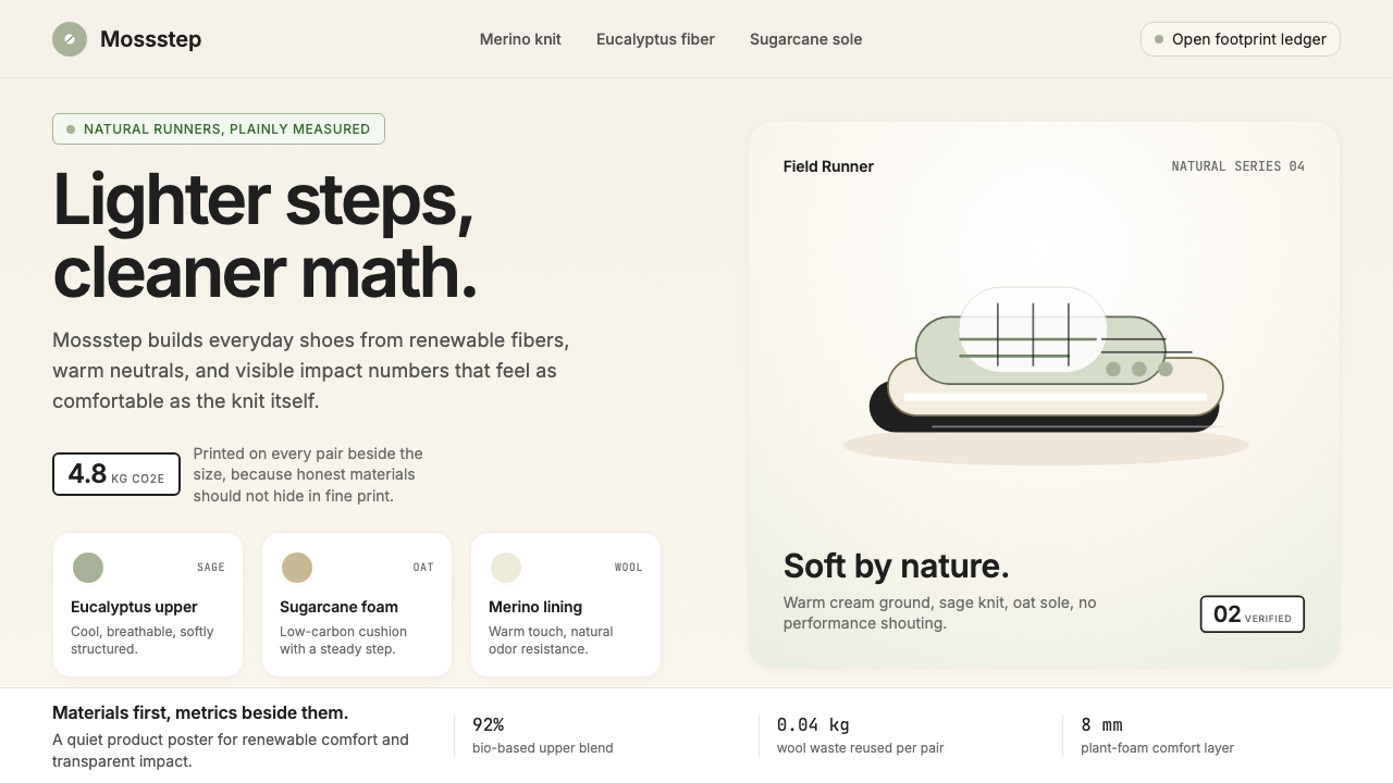 AllbirdsSustainability that breathes. Cream-and-sage tones, carbon labels next to pri…可持续,但绝不说教:奶油色与鼠尾草绿、碳足迹标签与价格并排——一种深呼吸般的诚…
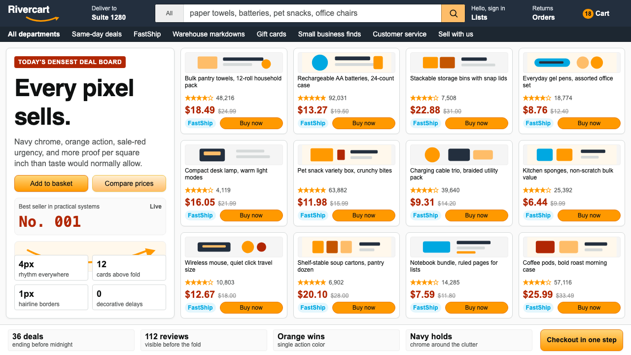 AmazonUgly sells efficiently. Navy chrome, orange buttons, red prices crowd a dense…朴素而高效:深蓝导航、橙色按钮、红价挤满密集网格。
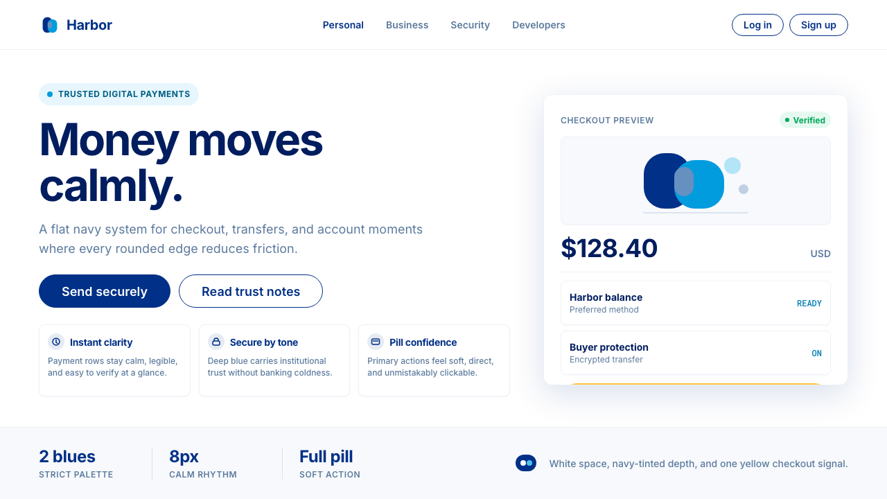 PayPalTrust without coldness. Deep navy, sky cyan, white cards, and pill checkout c…信任却不冰冷:深海军蓝与天青、白卡片和药丸结账提示。
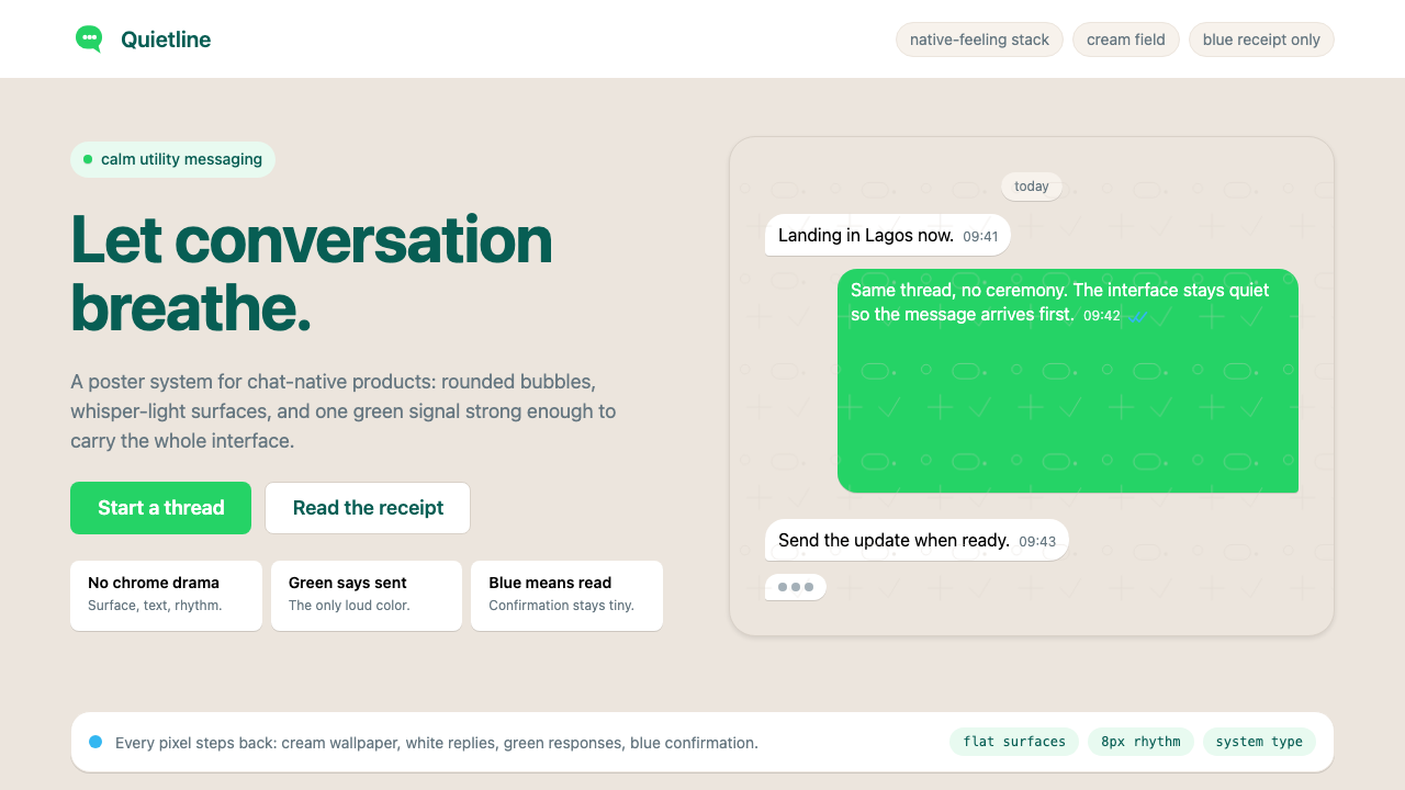 WhatsAppConversation is the interface. Cream wallpaper, green bubbles, and tiny blue…对话就是界面。奶油墙纸、绿色气泡与蓝色小勾让界面退后。
 GitLab 2023DevOps in daylight. Tanuki orange-to-purple gradient, Inter, warm enough for…DevOps 走出暗色房间:标志性狸猫橙紫渐变、宽松行高、Inter 字体——…
 Scandi Hygge (IKEA)Warmth from restraint. Sage, linen white, Work Sans, and wide breathing room.克制中有温度:鼠尾草绿、亚麻白与 Work Sans 留出呼吸感。