What is Scandi Hygge (IKEA)?什么是 Scandi Hygge (IKEA)?
Scandinavian design extracts warmth from restraint — blonde wood, open light, and unhurried whitespace turned into a globally recognized language of liveable calm.斯堪的纳维亚设计从克制中提炼温暖——浅色木材、充沛光线与从容留白,凝结为举世公认的宜居宁静语言。
Scandi Hygge (IKEA) in briefScandi Hygge (IKEA) 速览
Scandi Hygge is the visual and philosophical system that emerged from a century of Scandinavian design thinking and reached global mass recognition through IKEA's retail showrooms and the mid-2010s international enthusiasm for the Danish concept of hygge — a word pointing to cosiness, conviviality, and the deliberate cultivation of comfort. As a design language, it is defined by warmth within austerity: natural materials rendered in pale, desaturated tones; generous whitespace that feels welcoming rather than sterile; soft rounded forms that invite touch; and an insistence on functional purpose balanced with sensory ease.北欧 Hygge 风格是一套视觉与哲学体系,源自百年斯堪的纳维亚设计思想的积淀,并通过宜家的全球零售展厅与 2010 年代中期国际社会对丹麦「hygge」概念的热情追捧而广为人知。Hygge 这个词指向一种温馨、亲密与刻意营造的舒适感。作为设计语言,它的核心是克制中的温暖:以淡雅去饱和色调呈现的天然材质;充裕的留白,令人感到包容而非冷漠;柔软的圆润形态邀请触碰;以及功能目的与感官舒适之间的平衡坚守。
Where Bauhaus strips design to its geometric skeleton, Scandi Hygge softens the same minimalist impulse with human warmth. The palette is drawn from Nordic interiors — linen whites, birch creams, sage greens, dusty clays, slate blues — all muted to a degree that recalls indirect northern light filtering through frosted glass. Typography is humanist rather than geometric, carrying a friendliness that pure sans-serifs lack. Corners are rounded, not sharp. Breathing room is not emptiness but hospitality.如果说包豪斯将设计剥离至几何骨架,北欧 Hygge 则以人文温度柔化了同样的极简冲动。色板取自北欧室内空间——亚麻白、桦木奶油、鼠尾草绿、尘土赤陶、板岩蓝——全部降低饱和度,令人联想到从磨砂玻璃中漫射而入的北欧侧光。字体是人文主义而非几何性质的,携带着纯粹无衬线字体所欠缺的亲切感。转角是圆润的,而非尖锐的。留白不是空洞,而是款待。
On screen, the Scandi system translates seamlessly. Warm white grounds, humanist type set with careful rhythm, generous line-height that slows the eye into reading, soft card elevation that suggests paper rather than glass, and nature-derived accent tones used sparingly to signal warmth or action. The result is a visual environment that feels considered, approachable, and calm — qualities that have made this aesthetic dominant in consumer software, wellness applications, home goods e-commerce, and content platforms worldwide.在屏幕上,北欧体系的转化毫无违和感:温暖的白色底面、节奏考究的人文字体、放宽的行距令视线从容停驻、柔和的卡片层次感令人联想纸张而非玻璃,以及源自自然的强调色调点缀其中以传递温度或引导操作。由此营造的视觉环境是审慎、亲切而宁静的——正是这些品质,使这一美学在全球的消费软件、健康应用、家居电商与内容平台中占据了主导地位。
See the Scandi Hygge (IKEA) design system查看 Scandi Hygge (IKEA) 完整设计系统
Where does Scandi Hygge (IKEA) come from?Scandi Hygge (IKEA) 从何而来?
The foundations of Scandinavian design were laid in the 1930s through the 1960s by a generation of architects and craftspeople who shared a conviction that well-designed objects should be available to everyone, not merely to the wealthy. The Finnish architect Alvar Aalto bent birch plywood into organic curves for chairs and stools, discovering that natural materials need not be rigid. The Danish architect Arne Jacobsen produced the Egg Chair and the Swan Chair — molded shell forms in fabric and foam that defied the era's dominant orthogonal logic. The Danish cabinetmaker Hans Wegner refined the joinery of the Wishbone Chair over hundreds of sketches, seeking a form that was simultaneously beautiful, structurally honest, and comfortable for daily use. Each of these designers worked from a shared premise: simplicity is not the absence of care but the presence of rigorous attention.斯堪的纳维亚设计的基础由1930至60年代的一代建筑师与工艺家共同奠定,他们共享一个信念:设计精良的物品应当人人可及,而非只属富贵阶层。芬兰建筑师阿尔瓦·阿尔托将桦木胶合板弯曲成有机曲线,制成椅子与凳子,发现天然材料无需坚硬。丹麦建筑师阿恩·雅各布森设计了蛋椅与天鹅椅——以织物和泡沫成型的壳体形态,颠覆了那个时代主导的正交几何逻辑。丹麦橱柜师汉斯·韦格纳历经数百张草图,精磨了Y椅的榫卯结构,追求一种同时兼具美感、结构诚实与日常舒适的形态。这些设计师都从一个共同的前提出发:简洁不是关怀的缺席,而是严谨专注的在场。
IKEA was founded in 1943 by Ingvar Kamprad in the Swedish province of Småland. Initially a mail-order business selling small household goods, it pivoted to furniture in 1948 and adopted flat-pack design in the 1950s — not as an aesthetic choice but as a logistical solution to the problem of transporting bulky wooden furniture affordably. The flat-pack format forced designers to rethink how furniture was assembled, which in turn simplified forms, reduced hardware, and concentrated attention on surface and material quality. The first IKEA showroom opened in Älmhult in 1958, and the format of the warehouse-showroom — vast, bright, arranged like a walk-through home — became the sensory template through which millions of people first encountered Scandinavian design principles.宜家由英格瓦·坎普拉德于1943年在瑞典斯莫兰省创立,最初是一家邮购小家居杂货生意,1948年转型为家具,并在1950年代引入平板包装设计——这并非美学抉择,而是解决大件木质家具低成本运输问题的物流方案。平板包装迫使设计师重新思考家具的组装方式,进而简化了形态、减少了五金件,并将注意力集中到表面与材料品质上。1958年,第一家宜家展厅在埃尔姆胡尔特开业,这种仓库式展厅的格局——宽阔、明亮、布置成可穿行的居家空间——成为数百万人初次接触斯堪的纳维亚设计原则的感官模板。
The concept of hygge entered Danish cultural life as a loan word from the Norwegian, derived ultimately from an Old Norse root meaning comfort or consolation. It was in common everyday use in Denmark and Norway for generations, but its international export happened abruptly around 2016, driven by a wave of popular books — most notably Meik Wiking's 'The Little Book of Hygge', published that year — and a broader cultural moment in which digital overload and social fragmentation made the idea of deliberate, slow, candle-lit conviviality feel urgent and desirable. Hygge was not, strictly speaking, a design movement; it was a lifestyle concept. But its visual associations — warm interiors, natural textures, muted wool and ceramics, low amber lighting, the particular warmth of a wooden surface in winter light — mapped directly onto the Scandi design language that IKEA had been distributing for decades.「Hygge」作为借词进入丹麦文化生活,源自挪威语,词根追溯至古诺尔斯语中意为舒适或慰藉的词汇。它在丹麦与挪威的日常用语中延续了几代人,但其国际输出却在2016年前后骤然发生,驱动力是一波流行书籍——最具代表性的是迈克·维金当年出版的《小小的幸福》——以及数字过载与社会疏离感使「刻意营造的、慢节奏的、烛光围绕的亲密感」显得迫切而可欲的更广泛文化时刻。严格来说,Hygge 不是一场设计运动,而是一个生活方式概念。但它的视觉联想——温暖的室内、天然质感、哑光羊毛与陶器、低沉的琥珀光线、冬日光线中木质表面的独特温度——与宜家数十年来向全球传播的北欧设计语言直接对应。
The convergence of mid-century Scandinavian craft, IKEA's global distribution, and the hygge cultural moment produced a design language that is simultaneously rooted in serious functionalist tradition and approachable enough to furnish an apartment in any city on earth. This is unusual: most historically grounded design systems feel either archaic or exclusive. Scandi Hygge feels contemporary and democratic precisely because it was built from the start around the twin commitments of functional honesty and accessible warmth — values that translate across cultural contexts without requiring fluency in a specific national tradition.中世纪斯堪的纳维亚工艺、宜家的全球渠道与 Hygge 文化时刻的汇流,催生了一套同时植根于严肃功能主义传统、又亲切得足以装点地球上任何一座城市公寓的设计语言。这是罕见的:大多数具有历史根基的设计体系要么显得陈旧,要么充满排他感。北欧 Hygge 之所以感觉当代且平民化,恰恰是因为它从一开始就围绕功能诚实与可及温暖两个相互支撑的承诺而建立——这些价值观可以跨越文化语境传递,无需精通某一特定民族传统。
What defines the Scandi Hygge (IKEA) look?Scandi Hygge (IKEA) 的视觉特征是什么?
Palette色板
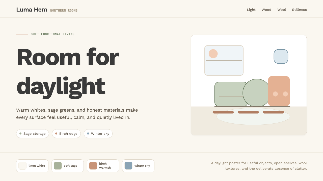
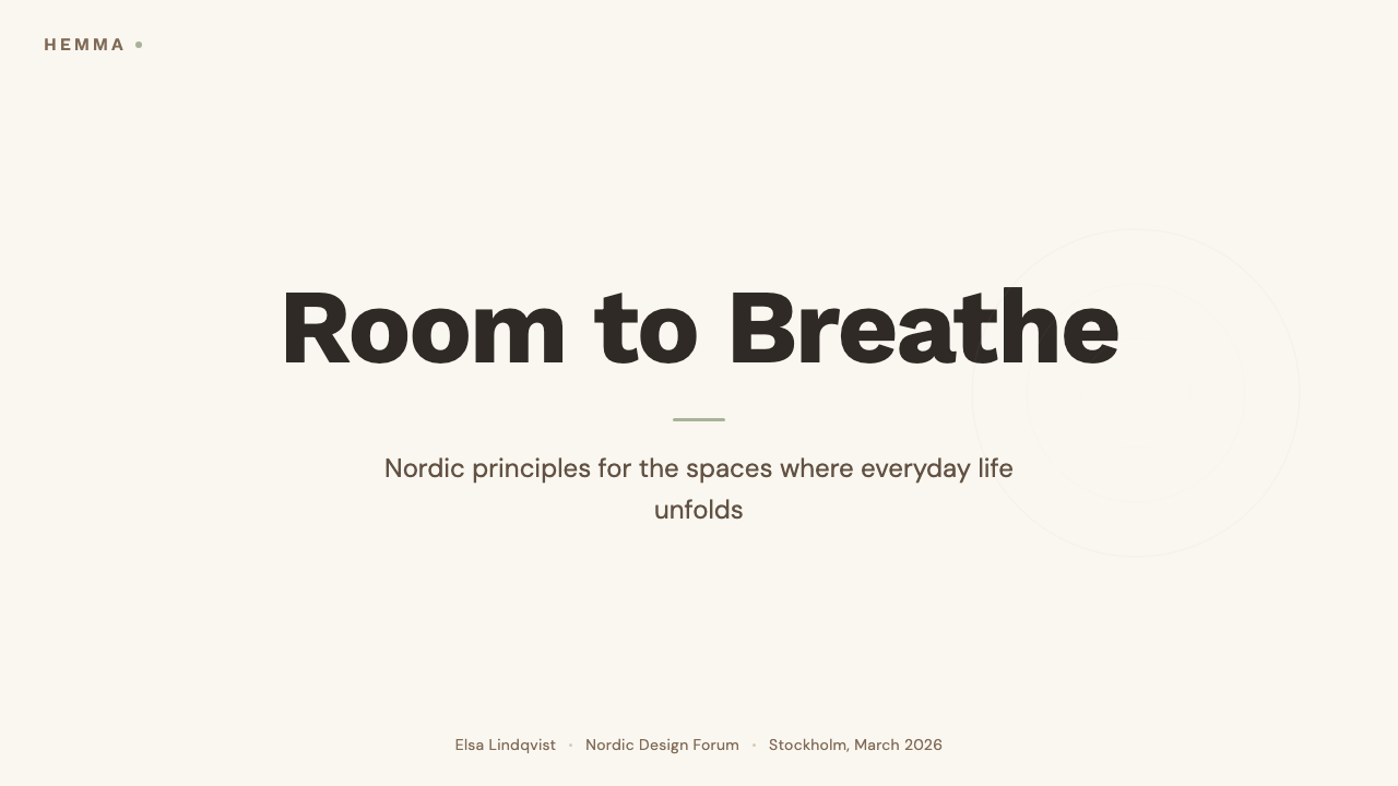
The Scandi Hygge palette is built on warmth and restraint simultaneously. Backgrounds run from linen white to birch cream — never a cold blue-white. Secondary surfaces step down to pale sage, dusty clay, or soft slate. All tones are desaturated, as if seen in the soft, diffuse northern light that filters through clouds rather than striking directly. A single warm accent — terracotta, moss green, or dusty blue — is used sparingly to draw attention or signal warmth. The overall effect recalls a well-curated Nordic interior in winter: light fills the room without dazzling it.北欧 Hygge 的色板同时兼顾温暖与克制。背景从亚麻白延伸至桦木奶油——绝不是带蓝调的冷白。次级表面降至浅鼠尾草绿、尘土赤陶或柔和板岩色。所有色调均经降饱和处理,仿若在云层漫射而非直射的柔和北欧光线中所见。单一的暖调强调色——赤陶、苔绿或尘蓝——被克制地点缀,用于引导注意或传递温度。整体效果令人联想到冬日布置考究的北欧室内:光线盈满房间,却不令人目眩。
Typography字体排印
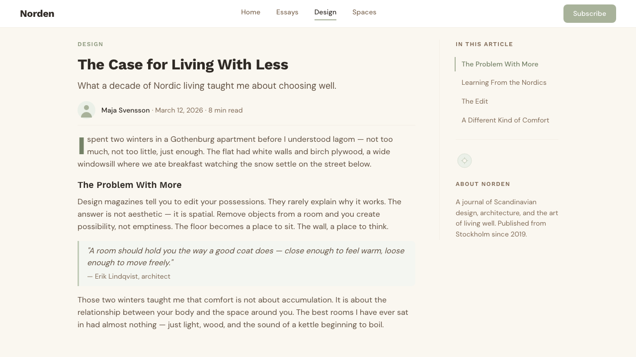
Humanist sans-serifs are the typographic core. Unlike geometric sans-serifs, humanist variants carry subtle calligraphic memory in their letterform proportions — slightly variable stroke widths, friendlier terminals, more open apertures — which gives text a warmth that pure geometry cannot provide. Type is set with generous line-height, giving body text room to breathe without urgency. Hierarchy is established through weight contrast and scale, rarely through color. The overall typographic texture feels unhurried and readable — designed for lingering attention rather than rapid scanning.人文主义无衬线字体是排印的核心。与几何无衬线字体不同,人文主义变体在字形比例中保留着微妙的书法记忆——笔画粗细略有变化、字端更为友善、开口更为通透——赋予文字一种纯粹几何形态无法提供的温度。排版保留充裕的行距,让正文有空间从容呼吸而不显急促。层级通过字重对比与尺度建立,极少借助色彩。整体排版质感从容、易读——为停驻的凝视而设计,而非为快速扫视。
Form and Softness形态与柔和
Where Bauhaus favors hard-edged geometry, Scandi Hygge rounds every corner that can plausibly be rounded. Cards, buttons, input fields, and containers carry a consistent radius that softens their presence without making them feel childlike. This roundness is not merely decorative — it mirrors the rounded edges of wooden furniture, ceramic vessels, and woven textiles that define the physical Scandi interior, and it carries the same connotation of something handmade and considered. Forms feel approachable and stable rather than sharp or confrontational.包豪斯偏爱硬边几何,北欧 Hygge 则将一切可以圆润的转角都加以软化。卡片、按钮、输入框与容器都带有一致的圆角半径,在不显幼稚的前提下柔和其存在感。这种圆润不仅仅是装饰——它映照着木质家具、陶瓷器皿与编织纺织品的圆润边缘,这些正是实体北欧室内空间的定义性要素,并承载着同样的「手工制造、精心考量」的含义。形态令人感到亲切而稳定,而非尖锐或对抗性的。
Whitespace and Breathing Room留白与呼吸感
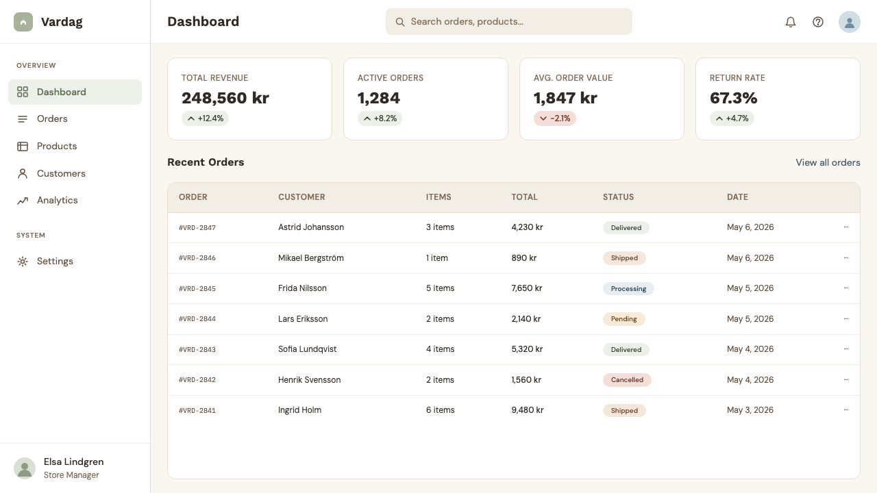
Whitespace in the Scandi system is not the cold, clinical emptiness of minimal modernism — it is the visual equivalent of a well-proportioned room with furniture arranged to encourage conversation and rest. Margins are wide, elements do not crowd one another, and the space between components is consistent and generous. This produces layouts that feel calm and uncluttered without feeling barren. The discipline is similar to that of an IKEA showroom: everything has a place, nothing is superfluous, but the result invites you to stay.北欧体系中的留白并非极简现代主义那种冷峻的临床空白——它是比例匀称的房间的视觉等价物:家具的陈列方式鼓励对话与休憩。边距宽阔,元素之间互不拥挤,组件间距一致而充裕。由此产生的版面感觉宁静整洁,却不荒芜。这种自律与宜家展厅的逻辑相近:一切各有其位,没有多余之物,而结果是邀请你驻足停留。
Material and Texture References材质与质感参照
While the digital Scandi system avoids skeuomorphic surface simulation, it draws on material memory in more subtle ways. Card backgrounds sit at a very slightly warmer tone than the page ground, evoking paper or unbleached linen rather than glass. Subtle grain or noise — applied very lightly — can suggest the texture of a plastered wall or raw cotton, provided it reads as atmosphere rather than decoration. Photography, when used, features natural light, organic materials, and unhurried domestic scenes. The overall effect is of a digital environment that has not forgotten what physical materials feel like.尽管数字北欧体系避免拟物化的表面模拟,它仍以更微妙的方式唤起材质记忆。卡片背景比页面底色温暖一点点,令人联想到纸张或未漂白的亚麻,而非玻璃。非常轻盈的微粒或噪点——以大气感而非装饰感出现——可以暗示粉刷墙壁或原棉的质感。摄影图像(若使用)呈现自然光线、有机材质与从容的居家场景。整体效果是一个没有忘记物理材料触感的数字环境。
Elevation and Shadow层次与投影
Shadows in the Scandi system are soft, diffuse, and low-contrast — the opposite of Bauhaus hard shadows. A card lifts from the page with a barely perceptible shadow that suggests the weight of paper placed on a table rather than an object floating in bright light. Elevation is used sparingly: two or three levels at most, and only where interaction or hierarchy genuinely requires it. The goal is to suggest physical depth without drama, in the same way that a wooden surface sits quietly on a shelf rather than announcing its presence.北欧体系中的投影是柔和、漫射且低对比度的——与包豪斯的硬边投影截然相反。卡片从页面中抬起,带着几乎难以察觉的投影,令人联想到纸张放置在桌面上的重量,而非物体漂浮于强光之中。层次被克制地使用:最多两到三个层级,且仅在交互或层级关系确实需要时才出现。目标是在没有戏剧性的情况下暗示物理深度,正如一块木质表面静静地搁在架子上,而非刻意彰显其存在。
Functional Warmth功能性温暖
The defining tension of Scandi Hygge is that it must be functional without feeling cold. Every layout decision — the slightly warm white, the humanist typeface, the rounded corner, the soft shadow — serves both a structural purpose and an atmospheric one. This dual obligation is more demanding than pure functionalism, because it requires every element to justify itself twice: once for clarity, once for warmth. When the balance is achieved, the result is a visual environment that communicates capability and trust while also making the user feel comfortable and unhurried.北欧 Hygge 的核心张力在于:它必须功能性十足,同时又不显冷漠。每一个版面决策——略带暖调的白色、人文主义字体、圆润的转角、柔和的投影——既服务于结构目的,也服务于氛围目的。这种双重义务比纯粹的功能主义更为严苛,因为它要求每个元素对自身的存在给出双重论证:一次为了清晰,一次为了温暖。当这种平衡实现时,结果是一个传递能力与信任感、同时让用户感到舒适从容的视觉环境。
See the Scandi Hygge (IKEA) design system查看 Scandi Hygge (IKEA) 完整设计系统
Who shaped Scandi Hygge (IKEA)?谁塑造了 Scandi Hygge (IKEA)?
Finnish architect and designer (1898–1976) whose experiments with bent birch plywood in the 1930s established the organic, material-honest approach that became foundational to Scandinavian design. His Stool 60 and Paimio Chair demonstrated that industrial production could yield forms that felt warm and human rather than mechanical. Aalto's insistence on natural materials, indirect natural light, and the body's relationship to furniture continues to inform how Scandi design is understood — as functional but never cold.芬兰建筑师与设计师(1898—1976年),其在1930年代对弯曲桦木胶合板的实验,确立了有机且材料诚实的设计方法,成为斯堪的纳维亚设计的基础。他的凳子60号与帕伊米奥椅证明了工业生产可以产出温暖而富有人性的形态,而非机械冷漠的形态。阿尔托对天然材料、漫射自然光与身体和家具关系的坚守,至今仍塑造着人们对北欧设计的理解——功能性十足,却从不冷漠。
Danish architect (1902–1971) best known for the Egg Chair and the Swan Chair, both designed in 1958 for the SAS Royal Hotel in Copenhagen. These shell-form upholstered works showed that the Nordic commitment to human comfort and organic form could produce objects that were simultaneously architecturally ambitious and intimate. Jacobsen's ability to work across scales — from building facades to door handles and textiles — embodied the Scandinavian principle that every designed object merits the same level of consideration.丹麦建筑师(1902—1971年),以1958年为哥本哈根SAS皇家酒店设计的蛋椅与天鹅椅最为著名。这些包覆软垫的壳体形态作品表明,北欧对人体舒适与有机形态的承诺,可以催生同时具有建筑雄心与亲密感的物品。雅各布森跨越尺度工作的能力——从建筑立面到门把手和纺织品——体现了斯堪的纳维亚的原则:每一个被设计的物品都值得同等程度的关注。
Founder of IKEA (1926–2018), who transformed a mail-order business in rural Sweden into the world's largest furniture retailer and, in doing so, democratized access to Scandinavian design principles. Kamprad's insistence on affordable prices and flat-pack logistics forced constant simplification of form and construction — accidentally reinforcing the Nordic aesthetic of restraint. The IKEA catalogue, distributed in hundreds of millions of copies annually for decades, became the primary medium through which Scandi design sensibility entered homes worldwide.宜家创始人(1926—2018年),将瑞典乡村的一家邮购生意发展为全球最大的家具零售商,并由此使斯堪的纳维亚设计原则得以普及。坎普拉德对低价与平板包装物流的坚持,迫使形态与工艺不断简化——无意间强化了北欧克制的美学。宜家目录册数十年来每年发行数亿册,成为北欧设计感性进入全球家庭的主要媒介。
Danish furniture designer (1914–2007) who created over five hundred chair designs in his career, including the Wishbone Chair and the simply named The Chair — used by Kennedy and Nixon in their 1960 televised presidential debate. Wegner exemplified the Scandinavian craft ethic: relentless iteration toward the simplest, most honest form that a particular material and function allow. His work is important to the Scandi Hygge tradition because it demonstrates that warmth comes not from decoration but from the integrity of material and the precision of proportion.丹麦家具设计师(1914—2007年),一生设计了逾五百把椅子,包括Y椅与简称为「那把椅子」的作品——后者曾出现在1960年肯尼迪与尼克松的电视总统辩论现场。韦格纳体现了斯堪的纳维亚的工艺精神:朝着特定材料与功能所允许的最简洁、最诚实形态不断迭代。他的工作对北欧 Hygge 传统意义重大,因为它证明了温暖来自材料的诚实与比例的精准,而非来自装饰。
Danish author and CEO of the Happiness Research Institute in Copenhagen, whose 2016 book 'The Little Book of Hygge' catalyzed the international adoption of hygge as both a cultural concept and a design aesthetic reference point. Wiking's contribution was not design invention but cultural translation: he articulated the visual and atmospheric qualities of the Nordic interior — warm light, natural materials, unhurried gathering — in language accessible to a global audience, connecting lifestyle aspiration to a design vocabulary that IKEA had already distributed worldwide.丹麦作家,哥本哈根幸福研究所CEO,其2016年著作《小小的幸福》催化了 Hygge 在国际上作为文化概念与设计美学参照的普及。维金的贡献不是设计发明,而是文化翻译:他以全球受众可及的语言,阐明了北欧室内空间的视觉与氛围品质——温暖的光线、天然材料、从容的聚会——将生活方式的向往与宜家早已向全球传播的设计词汇连接在一起。
How do you use Scandi Hygge (IKEA) today?今天怎么用 Scandi Hygge (IKEA)?
Scandi Hygge is among the most versatile historical design systems for contemporary digital work because its warmth and restraint travel well across categories. Applying it correctly requires internalizing the underlying logic rather than copying surface features: the warmth comes from tonal relationships and typographic friendliness, not from adding decorative wood-grain textures or illustration. Every element should be justifiable both functionally and atmospherically — it must work and feel welcoming.北欧 Hygge 是当代数字设计中适用范围最广的历史性设计体系之一,因为它的温暖与克制可以跨类别良好传递。正确应用它需要内化其底层逻辑,而非复制表面特征:温暖来自色调关系与字体亲切感,而非来自添加装饰性木纹纹理或插图。每个元素都应当在功能上与氛围上各有其存在理由——它必须好用,也必须令人感到受欢迎。
For presentation slides, the style excels on both cover and content pages. A cover works well with a single warm-toned image or a clean typographic composition against a linen or birch-cream ground, with the headline set in a humanist sans-serif at a weight and scale that feels confident rather than aggressive. Content slides should breathe: one organizing thought per slide, body text given enough line-height to read without effort, data visualizations using the muted accent palette to distinguish categories rather than to dazzle. The overall deck should feel like a well-organized magazine spread — informative, calm, and easy to stay with.在演示文稿中,这种风格在封面与内容页上均表现出色。封面适合采用单幅暖调图像或干净的字体排印构图,底面用亚麻色或桦木奶油色,标题以人文主义无衬线字体设置,字重与字号带来自信而非攻击性的感受。内容页应当留有余地:每页一个核心思想,正文行距充足、阅读无费力之感,数据可视化使用哑光强调色板区分类别而非炫目夺目。整套演示应当感觉像一份布局考究的杂志展开页——内容丰富、沉稳从容、令人乐于停留。
For web interfaces, Scandi Hygge is especially strong on dashboards, pricing pages, and onboarding flows where trust and approachability matter. The approach: warm white background, consistent generous spacing between all components, humanist type for all labels and body text, rounded card components with soft diffuse shadows, and accent color reserved for primary actions and the single most important data point. Navigation should be clean and wordmark-led. Avoid icon decoration beyond simple, clean line icons at consistent weight. The goal is an interface that a first-time user feels invited into rather than confronted by.对于网页界面,北欧 Hygge 在仪表板、定价页面与引导流程上尤为有力,这些场景中信任感与亲切感至关重要。方法如下:温暖的白色背景,所有组件之间保持一致的充裕间距,所有标签与正文使用人文主义字体,圆角卡片组件配以柔和漫射投影,强调色保留给主要操作与最重要的单个数据点。导航应简洁,以文字标识为主。除风格统一的简洁线条图标外,避免图标装饰。目标是一个让初次访问的用户感到被邀请进入而非被拦截的界面。
For editorial and marketing work, the style supports rich information hierarchy while remaining visually restful. A Scandi-derived article layout places body text in a comfortable reading measure with generous margins, uses the whitespace to create rhythm, and marks section transitions with subtle typographic shifts rather than ornamental dividers. Marketing pages benefit from the style's poster-like restraint: large, quiet feature blocks with minimal text, alternating between warm-white and the palette's softest neutral tones, with a single consistent accent carrying all calls to action. The result reads as considered and trustworthy — never flashy.对于编辑与营销内容,这种风格在保持视觉宁静的同时支持丰富的信息层级。北欧风格的文章版面将正文置于舒适的阅读行宽中,边距充裕,以留白创造节奏,并用微妙的字体变化而非装饰性分割线标记段落过渡。营销页面受益于这种风格的海报式克制:大块、安静的特性区块,文字极少,在温暖白色与色板中最柔和的中性调之间交替,以单一一致的强调色承载所有行动号召。结果读起来是审慎而值得信赖的——绝不炫目。
A common mistake when applying Scandi Hygge is over-reaching toward decoration in the name of warmth. Illustrated characters, hand-lettered accents, and organic blob shapes are tempting because they feel warm — but they introduce noise that the system's restraint cannot absorb. True Scandi warmth comes from tonal precision and spatial generosity, not from illustrative embellishment. Similarly, using a fully saturated green or terracotta as a primary background — rather than as a contained accent — immediately collapses the quiet dignity the system depends on. Restraint is not a constraint to work around; it is the mechanism through which warmth operates.应用北欧 Hygge 时最常见的错误,是以「温暖」之名过度追求装饰。插图人物、手写字体强调色与有机水滴形状看起来很诱人,因为它们感觉温暖——但它们引入了这个体系的克制所无法消化的噪点。真正的北欧温暖来自色调精准与空间慷慨,而非插图装饰。同样,以完全饱和的绿色或赤陶色作为主背景色——而非局限于点缀强调——会立即瓦解这个体系所依赖的那种安静的尊严感。克制不是需要绕过的限制;它是温暖得以运作的机制。
See the Scandi Hygge (IKEA) design system查看 Scandi Hygge (IKEA) 完整设计系统
Scandi Hygge (IKEA) — FAQScandi Hygge (IKEA) · 常见问题
How is Scandi Hygge different from general minimalism?北欧 Hygge 与一般极简主义有何不同?
General minimalism removes until nothing can be further removed; it is defined by absence. Scandi Hygge removes in service of a specific atmospheric goal — warmth, calm, welcome — and stops when that goal is achieved. This means it tolerates elements that pure minimalism would eliminate: a very slightly textured background, a rounded corner, a humanist typeface with calligraphic memory, a soft shadow. The useful test is whether removing an element makes the design feel cleaner or colder. Minimalism always prefers cleaner. Scandi Hygge stops at the point before colder.一般极简主义是不断删减直至无可再减,它以缺席为定义。北欧 Hygge 的删减服务于一个特定的氛围目标——温暖、宁静、受欢迎——并在目标达成时停止。这意味着它容忍纯粹极简主义会消除的元素:轻微的底面质感、圆润的转角、带有书法记忆的人文主义字体、柔和的投影。一个有用的检验方式是:删除某个元素会让设计感觉更干净,还是更冷漠?极简主义总是选择更干净。北欧 Hygge 在变得更冷漠之前停步。
Can Scandi Hygge work for a dark or night-mode interface?北欧 Hygge 能用于深色或夜间模式界面吗?
It can, but the translation is more demanding than for most styles. The canonical Scandi palette is light-ground, so a dark version must be designed rather than simply inverted. The background should shift toward a very dark, slightly warm charcoal — not pure black — to maintain the warmth that defines the system. Mid-tones step up from there in warm desaturated greys. Accent colors should be the softest, warmest members of the palette — sage rather than vivid green, terracotta rather than orange — and used even more sparingly than in the light version. The goal is a dark interface that still feels like a Nordic interior at night: a candle on a dark table, not a monitor in a dark room.可以,但转化难度比大多数风格更高。北欧色板以浅色为标准,因此深色版本需要主动设计,而非简单反转。背景应转向非常深、略带暖调的炭灰——而非纯黑——以维持定义该体系的温暖感。中间调从那里向上以暖调去饱和灰色递进。强调色应选用色板中最柔和、最暖的成员——鼠尾草绿而非明艳绿,赤陶而非橙色——并比浅色版本更为克制地使用。目标是一个深色界面,却仍感觉像夜晚的北欧室内:黑暗桌面上的一根蜡烛,而非黑暗房间里的一台显示器。
How should photography be selected and treated in this style?在这种风格中应如何选择和处理摄影图像?
Photography in the Scandi Hygge system should look like it was taken in natural, diffuse light — ideally the soft overcast daylight of a Nordic morning. Scenes are domestic, unhurried, and material-rich: wooden surfaces, ceramic objects, textiles, plants, hands around warm vessels. Avoid photography with artificial studio lighting, heavily saturated color grading, or dramatic shadows, as these conflict with the muted warmth the palette establishes. In layout, photography is typically given generous breathing room and does not bleed aggressively to the edge. When crops are used, they should be simple and dignified rather than dynamic and urgent.北欧 Hygge 体系中的摄影应当看起来像是在自然漫射光线下拍摄——理想是北欧清晨那种柔和的阴云天光。场景是居家的、从容的、材质丰富的:木质表面、陶器、纺织品、植物、捧着温热容器的双手。避免带有人工棚拍灯光、重度饱和色调调色或戏剧性阴影的摄影,因为这些与色板所建立的哑光温暖相冲突。在版面中,摄影通常被赋予充裕的呼吸空间,不会激进地出血至边缘。若使用裁切,应简洁而庄重,而非动感十足或急迫压迫。
Does IKEA's visual identity accurately represent Scandi Hygge as a design style?宜家的视觉形象能准确代表北欧 Hygge 作为一种设计风格吗?
IKEA's retail visual identity — the yellow and blue logo, the bold promotional typography, the warehouse-scale signage — is a commercial communication system built for legibility at high volume, and it departs significantly from the quieter, more refined Scandi Hygge aesthetic. IKEA's contribution to the style is primarily experiential and curatorial: the products sold, the showroom arrangements, and the catalog photography — which, since the 1970s, has consistently depicted light-filled rooms, natural materials, and unhurried domestic scenes — are far more representative of Scandi Hygge than the brand identity itself. Treat IKEA as a distributor and popularizer of the aesthetic, not its visual embodiment.宜家的零售视觉形象——黄蓝标志、粗犷的促销字体、仓库级别的指示标牌——是为大体量高可读性而构建的商业传播系统,与更安静、更精致的北欧 Hygge 美学有着显著差距。宜家对这种风格的贡献主要是体验性与策划性的:所售产品、展厅陈列,以及自1970年代起一贯呈现充满光线的房间、天然材质与从容居家场景的目录册摄影——这些比品牌形象本身更能代表北欧 Hygge。应将宜家视为这种美学的传播者与普及者,而非其视觉化身。
Where does Scandi Hygge struggle or feel out of place?北欧 Hygge 在哪些场景下表现欠佳或显得格格不入?
The style struggles in contexts that call for urgency, excitement, or cultural specificity. Financial trading platforms, gaming interfaces, sports brands, and entertainment products need energy and drama that Scandi Hygge's deliberate calm actively suppresses. The palette's desaturated warmth can also read as ethnically neutral in ways that feel tone-deaf for products aimed at specific non-Nordic cultural communities, where color and pattern carry their own deep significance. The style also has limits in information-dense enterprise software, where the generous spacing that produces calm in a consumer app can waste real estate at the scale of a complex analytical dashboard. Knowing these boundaries is as important as knowing the system's strengths.这种风格在需要紧迫感、兴奋感或文化特殊性的场景下表现欠佳。金融交易平台、游戏界面、体育品牌与娱乐产品需要北欧 Hygge 刻意的宁静所主动压制的能量与戏剧性。色板的去饱和暖调也可能被读解为「民族中立」,对于面向特定非北欧文化社群的产品——那里的色彩与图案承载着深厚的独特意涵——这种中立感可能显得不够用心。这种风格在信息密集的企业软件中也有局限,在消费应用中营造宁静感的充裕间距,在复杂分析仪表板的规模下可能造成空间浪费。了解这些边界,与了解这套体系的优势同等重要。
Related design styles相关设计风格
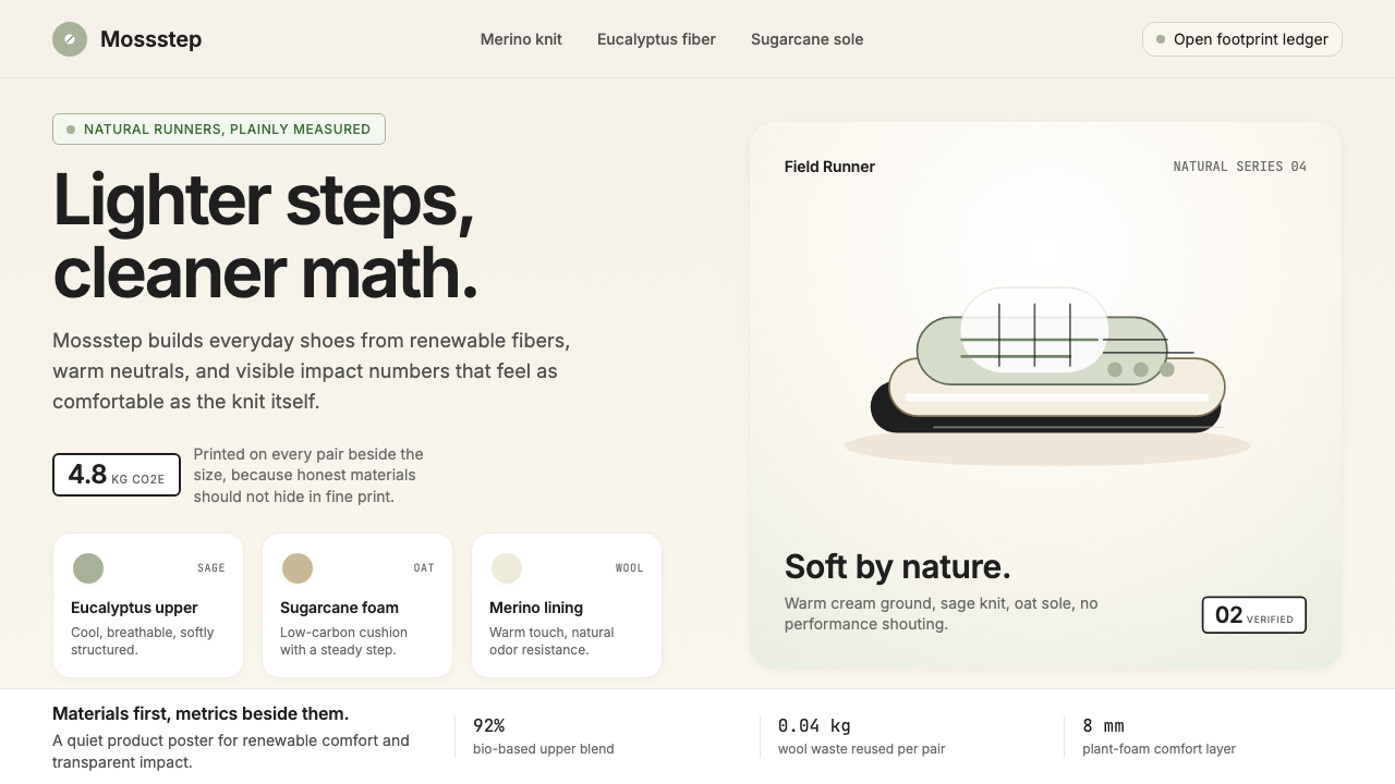 AllbirdsSustainability that breathes. Cream-and-sage tones, carbon labels next to pri…可持续,但绝不说教:奶油色与鼠尾草绿、碳足迹标签与价格并排——一种深呼吸般的诚…
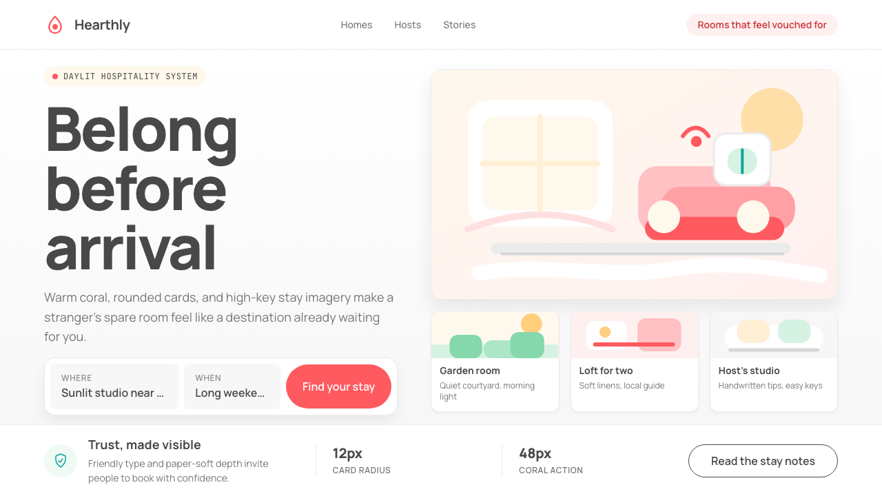 Airbnb 2014Coral red, soft pill cards, Cereal type. The Bélo wraps strangers in warm, da…Bélo 时代的珊瑚红与圆润 Cereal 字体——把陌生人之间的房间包装成阳…
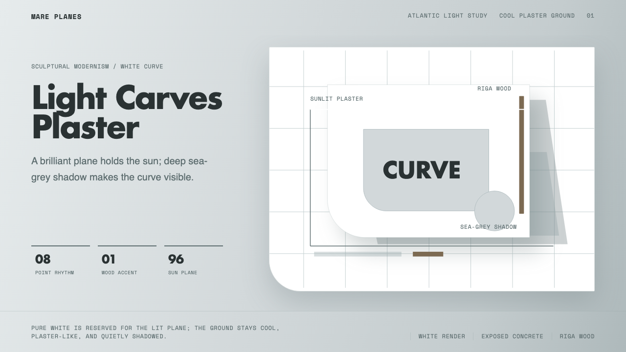 Alvaro Siza WhiteLight makes the form. White planes on cool plaster throw sea-grey shadow and…光塑造体量:冷灰抹灰底上,白色平面投下海灰阴影。
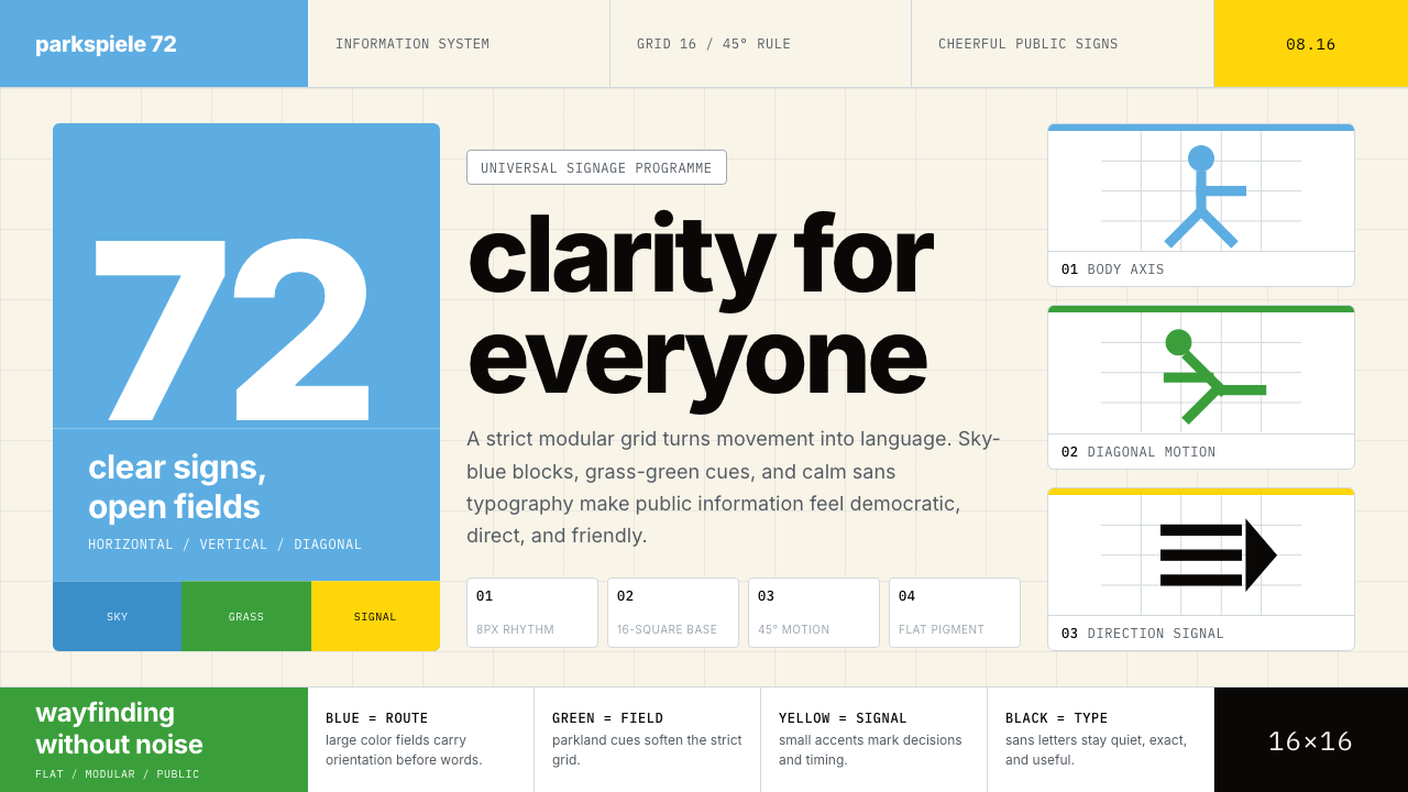 Otl Aicher Munich OlympicsFriendly rigor. Sky-blue grids and straight-line pictograms make public infor…友好的严谨:天蓝网格与直线图标,让公共信息普世清晰。
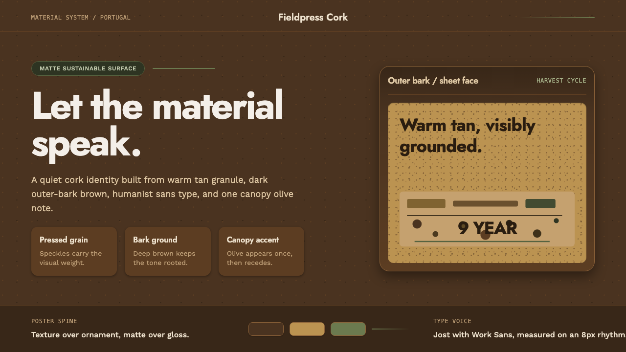 Portuguese CorkGrounded by texture. Cork tan speckles on bark brown, with one olive rule.质感踏实:软木棕斑点落在焦褐树皮底上,一道橄榄绿收束。
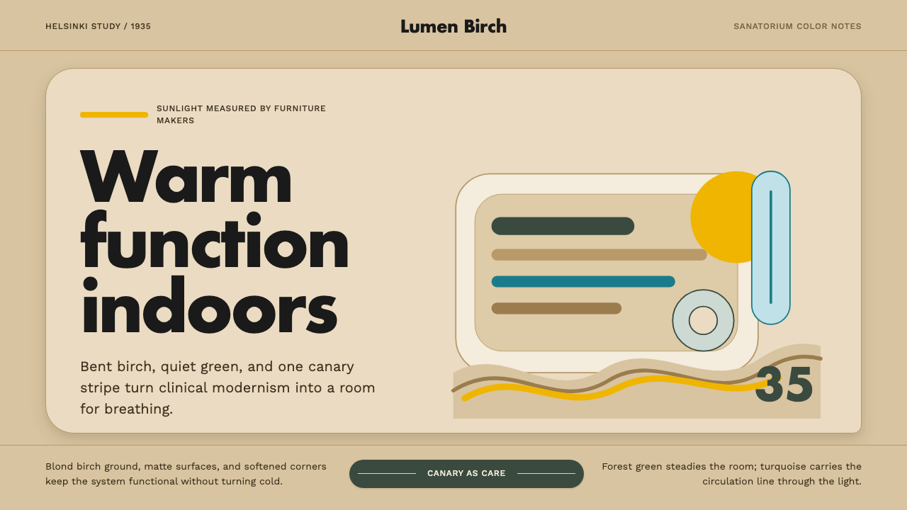 Aalto Finnish ModernModernism made humane. Birch fields, canary yellow, and soft plywood curves b…温柔的现代主义。桦木底、明黄与弯木曲线把阳光带入室内。