What is Otl Aicher Munich Olympics?什么是 Otl Aicher Munich Olympics?
Otl Aicher turned the 1972 Munich Olympics into the world's first truly universal information-design system — proving that public communication can be simultaneously geometric, cheerful, and free of borders.奥特尔·艾舍将1972年慕尼黑奥运会变成世界上第一套真正普世的信息设计系统——证明公共传达可以同时做到几何化、欢快,且不受语言边界束缚。
Otl Aicher Munich Olympics in briefOtl Aicher Munich Olympics 速览
The Otl Aicher Munich Olympics system is the most consequential information-design project of the twentieth century. Commissioned for the 1972 Summer Games in Munich, it established a visual language built from three interlocking components: a restrained palette of sky blue, grass green, silver, and warm white; a family of sport pictograms drawn on a strict grid of horizontal, vertical, and forty-five-degree strokes; and a typographic hierarchy anchored in the Univers type family. Together these components created a system that could guide millions of visitors who spoke dozens of different languages across a vast, unfamiliar venue — without a single word of explanation.奥特尔·艾舍慕尼黑奥运会系统,是二十世纪最具深远影响的信息设计项目。该系统受命为1972年慕尼黑夏季奥运会而创作,由三个相互咬合的部件构成:一套克制的配色——天蓝、草绿、银色与暖白;一套运动图标家族——严格依据水平、垂直与四十五度对角线网格绘制;以及一套以Univers字体为锚点的排版层级。这三个部件共同构成一套系统,能够引导数百万讲着数十种语言的访客穿行于一个庞大而陌生的场馆——无需任何文字解释。
The defining quality of the system is what Aicher called 'functional friendliness.' Unlike earlier wayfinding systems, which borrowed the visual authority of military or industrial signage, the Munich identity was deliberately light, open, and approachable. The palette avoided the heavy saturated primaries associated with ideological design and instead chose colors that read as sky, grass, and daylight — colors that belonged to the outdoor landscape of Bavaria rather than to any nation or institution.这套系统的核心品质,是艾舍所称的「功能性友好」。与早期借鉴军事或工业标识视觉权威感的导视系统不同,慕尼黑奥运的视觉形象刻意轻盈、开放、平易近人。配色方案回避了与意识形态设计相关联的浓重饱和原色,转而选取让人联想到天空、草地与日光的颜色——属于巴伐利亚户外景观的颜色,而非任何国家或机构的颜色。
More than fifty years after the Games, the system's influence is impossible to overstate. The pictogram grammar that Aicher's team developed — the figure reduced to clean geometric limbs, the pose simplified to its most legible angle, each sport rendered in a consistent vocabulary of strokes — became the global template for airport wayfinding, transport maps, public signage, and international sporting events from the 1972 Games forward. The system did not just communicate; it established a method.距奥运会举办已逾五十年,这套系统的影响力仍难以估量。艾舍团队开发的图标语法——将人体简化为干净的几何肢体、将动作姿态简化至最易辨识的角度、以一套统一的笔画词汇呈现每一项运动——成为机场导视、交通地图、公共标识以及此后历届国际运动会的全球范本。这套系统不只是在传达信息,它确立了一套方法。
See the Otl Aicher Munich Olympics design system查看 Otl Aicher Munich Olympics 完整设计系统
Where does Otl Aicher Munich Olympics come from?Otl Aicher Munich Olympics 从何而来?
Otl Aicher came to the Munich Olympics project carrying one of the most rigorous design educations of the postwar period. He was a co-founder of the Hochschule für Gestaltung (HfG) in Ulm — the institution that, in the 1950s and 1960s, took up the Bauhaus ambition of unifying art, science, and industrial production and pushed it further toward systems thinking and semiotics. At Ulm, design was not a matter of personal expression; it was a discipline of analysis, method, and verifiable communication. This pedagogical background made Aicher uniquely suited to the challenge of designing for an audience of many millions across many cultures.奥特尔·艾舍在承接慕尼黑奥运会项目时,已携带着战后最严谨的设计教育背景之一。他是乌尔姆造型学院(HfG)的联合创办人——这所学院在1950至60年代承续了包豪斯将艺术、科学与工业生产统一的抱负,并进一步推进至系统思维与符号学领域。在乌尔姆,设计不是个人表达的事,而是一门分析、方法与可验证传达的学科。这一教育背景使艾舍具备了独特的能力,足以应对为跨越众多文化的数百万观众而设计的挑战。
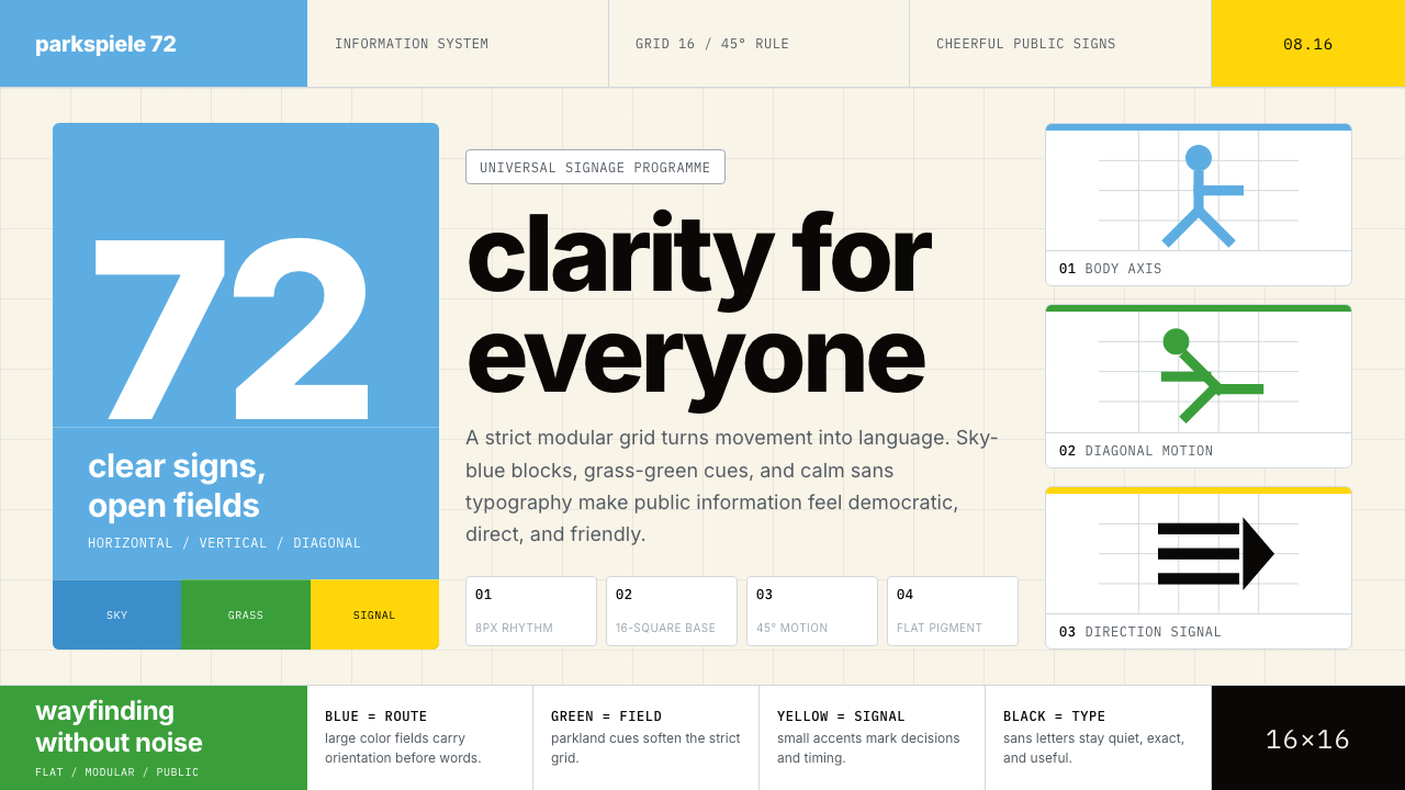
The political stakes of the commission were explicit and heavy. The 1936 Berlin Olympics had been weaponized as Nazi spectacle — a totalitarian display of red, black, and white, of monumental architecture and martial choreography. Munich's organizers, and Aicher himself, were determined to signal something categorically different: a democratic West Germany at ease with itself, open, civilian, and free. The phrase that guided the visual program was 'heitere Spiele' — cheerful games. Aicher's palette of sky blue and grass green was not an arbitrary aesthetic choice; it was a political argument made in color.这项委托的政治分量是明确而沉重的。1936年柏林奥运会曾被纳粹政权当作景观武器——以红、黑、白为色彩、以宏大建筑与军事编舞为手段的极权展示。慕尼黑的组织者与艾舍本人,都下定决心传达出截然不同的信号:一个与自身和解、开放、平民化、自由的民主西德。统领整个视觉项目的短语是「欢乐奥运」(heitere Spiele)。艾舍选用天蓝与草绿,并非任意的美学决定,而是一个以色彩为媒介的政治论断。
Aicher began work on the identity in 1967, five years before the Games opened. His team — which included Rolf Müller and other designers from the Ulm tradition — developed the pictogram system through an unusually rigorous generative process. Early sketches explored many approaches to representing the human figure in sport. The breakthrough was the grid: by constraining every stroke to horizontal, vertical, or forty-five-degree angles, the team achieved a family of pictograms that were visually consistent across all twenty-one sports while remaining distinct enough to be told apart at a distance and at speed. The grid was not decoration; it was the generative rule that made the system a system.艾舍于1967年开始着手这套形象的设计工作,彼时距奥运会开幕尚有五年。他的团队——包括鲁道夫·米勒及其他出身乌尔姆传统的设计师——经由一个极为严格的生成过程发展出图标系统。早期草稿探索了多种表现运动中人体的方式。突破来自网格:通过将每一条笔画约束于水平、垂直或四十五度对角线方向,团队实现了一个在全部二十一项运动中视觉一致、同时又彼此区分足以在远距离和快速移动中辨识的图标家族。网格不是装饰,而是使这套系统成为系统的生成规则。
The broader identity extended far beyond pictograms. Aicher specified the use of Univers — the typeface designed by Adrian Frutiger in 1957 — in a tightly defined hierarchy of weights and sizes. He developed a color palette that was applied consistently across every touchpoint: uniforms, signage, print materials, vehicles, and architectural surfaces. He also regulated the use of photography and illustration, ensuring that the Games' visual environment maintained coherence from the smallest ticket stub to the largest stadium banner. The total integration of all these elements into a single, rule-governed system was the project's real innovation — and it defined the practice of corporate and institutional identity design for the decades that followed.更宏观的视觉形象远不止于图标。艾舍规定了Univers字体——阿德里安·弗鲁提格于1957年设计的字体——的使用,以严格界定的字重与字号层级呈现。他制定了一套色彩方案,并将其一致地应用于每一个触点:制服、标识、印刷物料、车辆与建筑表面。他还规范了摄影与插图的使用,确保奥运会的视觉环境从最小的票根到最大的体育场横幅都保持连贯。将所有这些元素整合为单一的、由规则统治的系统,是这个项目真正的创新所在——也为此后数十年的企业与机构视觉识别设计实践确立了范式。
What defines the Otl Aicher Munich Olympics look?Otl Aicher Munich Olympics 的视觉特征是什么?
Sky-and-Grass Palette天空与草地配色
The system's defining colors are a clear sky blue and a fresh grass green, deployed against fields of warm white and light silver. These are landscape colors rather than symbolic or ideological primaries — they evoke an outdoor summer gathering rather than an institution or a flag. The palette was developed in explicit contrast to the saturated red-black-white of the 1936 Berlin Games. Black is used sparingly, for type and fine rules only; gold and warm ochre occasionally accent ceremonial materials without disrupting the lightness of the overall system.这套系统的标志性色彩是清澈的天蓝与新鲜的草绿,铺设于暖白与浅银的底面上。这些是风景色,而非象征性或意识形态性的原色——它们唤起的是户外夏日聚会,而非某个机构或旗帜。配色方案的确立,是对1936年柏林奥运会高饱和度红-黑-白的明确对比。黑色使用克制,仅用于文字与细线;金色与暖赭色偶尔出现于礼仪性材料,但不破坏整体系统的轻盈感。
The Grid-Constrained Pictogram网格约束的图标
Every sport pictogram was constructed on a modular grid that permitted only horizontal, vertical, and forty-five-degree diagonal strokes. The human figure is abstracted to its structural minimum: a circle for the head, straight and diagonal lines for limbs, with each pose reduced to the single most legible configuration for its sport. No curves, no freehand, no expressive variation from figure to figure. The constraint produces visual unity across the whole family while keeping each symbol unambiguously distinct.每个运动图标都在一个模块化网格上构建,仅允许水平、垂直与四十五度对角线方向的笔画。人体被抽象至结构性最小值:一个圆形代表头部,直线与对角线代表四肢,每个姿势都被简化为该运动中最易辨识的单一构型。没有曲线,没有徒手绘制,人物之间没有表现性的变化。这一约束在整个家族中产生了视觉统一性,同时使每个符号保持明确的可区分性。
Modular System Logic模块化系统逻辑
The Munich identity operates as a rule-governed system rather than a collection of designed objects. Every element — color, typeface choice, pictogram construction, grid structure, spatial relationships — is defined by a set of parameters that can be applied consistently across any medium and any scale. Aicher's approach was essentially algorithmic: given any design problem within the Games, there was a defined method for solving it. This systematic quality is what distinguishes the Munich work from earlier Olympic identities, which were largely composed of individual graphic decisions.慕尼黑奥运形象作为一套由规则统治的系统运作,而非一批单独设计对象的集合。每个元素——色彩、字体选择、图标构建、网格结构、空间关系——都由一套参数定义,可在任何媒介和任何尺寸上一致应用。艾舍的方法本质上是算法式的:面对奥运会范围内的任何设计问题,都有一套既定方法可以解决。正是这种系统性品质,使慕尼黑的工作有别于此前历届奥运形象——那些形象大多由一系列个别的图形决定拼接而成。
Typographic Restraint排版上的克制
The system is anchored by a single humanist sans-serif typeface used across all applications, from monumental venue signage to small-format printed schedules. Type is set in a limited range of weights, with size and weight contrast doing the work of hierarchy rather than decorative variation. Lettering is tightly spaced and always lower-case in directional signage — a choice that reduces visual noise and emphasizes the pictogram as the primary communicative carrier. No display scripts, no italics for emphasis, no mixing of typeface families.整个系统由单一的人文主义无衬线字体锚定,贯穿所有应用场合——从体量巨大的场馆标识到小开本印刷时刻表。字体仅使用有限数量的字重,以尺寸和字重对比承担层级表达,而非依赖装饰性变化。在导向标识中,字母紧密排列,一律使用小写——这一选择减少了视觉噪声,并强调图标作为主要传达载体的地位。没有装饰性字体,没有斜体强调,没有字体家族的混用。
Democratic Accessibility民主式的可及性
The philosophical core of the system is the belief that public information belongs to everyone and should be understood by anyone, regardless of language, education, or cultural background. Aicher and his team worked to ensure that each pictogram communicated its meaning without prior knowledge or training — the figure performing a sport should be instantly identifiable to a visitor from any country. This principle pushed the team toward greater simplification at every stage: when a symbol required explanation, it was redesigned until it did not.这套系统的哲学核心,是一种信念:公共信息属于所有人,应当能够被任何人理解,无论其语言、教育程度或文化背景如何。艾舍和他的团队致力于确保每个图标无需预备知识或培训就能传达其含义——一名正在进行某项运动的人物,应当能够被任何国家的访客即刻辨认。这一原则在每个阶段都推动团队走向更大程度的简化:当一个符号仍需要解释时,就重新设计它,直到不再需要为止。
Landscape Integration与景观的融合
Aicher worked closely with the architect Frei Otto, whose tensile canopy structures over the Munich Olympic Park created one of the most distinctive architectural environments of the twentieth century. The visual identity was designed with that landscape in mind: the palette of sky blue and light silver echoes the translucent tent roofs, and the open, airy quality of the graphics reflects the openness of Otto's architecture. The result is a rare case in which a visual identity system and its physical environment genuinely reinforce each other.艾舍与建筑师弗赖·奥托紧密合作——奥托在慕尼黑奥林匹克公园上方架设的张拉式篷顶结构,是二十世纪最具标志性的建筑环境之一。视觉形象的设计将那片景观纳入考量:天蓝与浅银的色调呼应了半透明的篷顶,而图形系统的开敞、通透品质也映射出奥托建筑的开放性。这是极为罕见的案例:一套视觉识别系统与其物理环境真正地相互强化。
Principled Rejection of Monumentalism对纪念碑式风格的原则性拒绝
Every design decision in the Munich system points away from the monumental and authoritarian. Forms are light rather than heavy, open rather than closed, approximate to human scale rather than overwhelming it. The pictograms show figures in motion — athletes, not heroes or archetypes. The color palette breathes rather than commands. This is not minimalism for aesthetic reasons but restraint for political and ethical ones: a deliberate demonstration that public design in a democratic society should serve people rather than impress them.慕尼黑系统中的每一个设计决定,都指向纪念碑式与威权风格的反面。形态轻盈而非厚重,开放而非封闭,趋近人的尺度而非压倒它。图标呈现的是运动中的人物——运动员,而非英雄或原型。色彩方案呼吸而非命令。这不是出于美学原因的极简主义,而是出于政治与伦理原因的克制:一个刻意的示范,表明民主社会中的公共设计应当服务于人,而非令人印象深刻。

See the Otl Aicher Munich Olympics design system查看 Otl Aicher Munich Olympics 完整设计系统
Who shaped Otl Aicher Munich Olympics?谁塑造了 Otl Aicher Munich Olympics?
Aicher was the principal designer of the Munich Olympics identity and one of the most important information designers of the twentieth century. A co-founder of the HfG Ulm in 1953, he developed a design philosophy rooted in Enlightenment rationalism: design as a form of practical reasoning, not artistic expression. His work for Munich was shaped by his experience designing corporate identity systems for Braun and Lufthansa, both of which established his reputation for rigorous, system-based visual thinking. After Munich, he continued to develop his ideas in books including 'Analogue and Digital' and 'The World as Design,' in which he argued that visual form was inseparable from ethical and political commitment.艾舍是慕尼黑奥运会形象的主创设计师,也是二十世纪最重要的信息设计师之一。他于1953年联合创办乌尔姆造型学院,并在此发展出一套植根于启蒙理性主义的设计哲学:设计是实践性推理的一种形式,而非艺术表达。他在慕尼黑的工作,深受他为博朗和汉莎航空设计企业视觉识别系统的经验塑造——那两项工作奠定了他以严谨系统性视觉思维著称的声誉。奥运会之后,他继续在《模拟与数字》《作为设计的世界》等著作中发展自己的思想,主张视觉形式与伦理和政治承诺不可分割。
Müller was Aicher's key collaborator on the Munich project and took primary responsibility for the execution and systematization of the identity across all printed applications. Trained at the HfG Ulm, he brought the school's rigor to the practical challenge of specifying a system that could be applied consistently by many different hands across five years of production. After the Games, Müller continued as one of Germany's leading practitioners of systematic graphic design and corporate identity, and his work on Munich remained a reference point throughout his career.米勒是艾舍在慕尼黑项目中的核心合作者,主要负责形象在所有印刷应用中的执行与系统化工作。他受训于乌尔姆造型学院,将学校的严谨性带入了一项实际挑战:规定一套能够在五年生产周期中由许多不同的人手一致应用的系统。奥运会后,米勒继续作为德国最重要的系统平面设计与企业形象实践者之一活跃于业界,慕尼黑的工作始终是他整个职业生涯的参照点。
Inge Aicher-Scholl was Otl Aicher's wife and the other co-founder of the HfG Ulm. Her role at Munich was less visible than Otl's but no less essential: it was her advocacy, her institutional relationships, and her ability to build political and financial support that made the HfG possible in the first place, and it was the intellectual environment she helped create at Ulm that shaped the entire approach to the Munich commission. Her earlier work documenting the White Rose resistance movement also gave the Aichers a particular moral relationship to German history — a relationship that inflected the political seriousness behind the Munich project's cheerful surface.英格·艾舍-绍尔是奥特尔·艾舍的妻子,也是乌尔姆造型学院的另一位联合创办人。她在慕尼黑的角色不如奥特尔显眼,但同样不可或缺:正是她的倡导、她的机构关系以及她汇聚政治与财务支持的能力,使乌尔姆造型学院得以建立;而她在乌尔姆帮助塑造的智识环境,又塑造了整个慕尼黑委托项目的方法论。她早年记录白玫瑰抵抗运动的工作,也赋予了艾舍夫妇一种特殊的道德与德国历史的关系——这种关系渗透进慕尼黑项目欢快表面之下的政治严肃性中。
Otto was the structural engineer and architect responsible for the tensile roofscape of the Munich Olympic Park — a lattice of steel cables and acrylic panels that covered the main stadium, the swimming hall, and the sports hall in a continuous translucent canopy. His contribution to the Munich identity is often underestimated: Aicher's palette of sky blue and silver was partly a response to the translucent qualities of Otto's roofs, and the lightness of the graphics echoed the lightness of the architecture. The collaboration between Aicher and Otto produced one of the rare moments in twentieth-century design where graphic identity and architectural environment achieved genuine visual coherence.奥托是慕尼黑奥林匹克公园张拉屋顶景观的结构工程师与建筑师——一片由钢索与丙烯酸板构成的网状结构,将主体育场、游泳馆与体育馆笼罩在连续的半透明篷盖之下。他对慕尼黑视觉形象的贡献常被低估:艾舍天蓝与银色的配色方案,部分是对奥托屋顶半透明品质的回应;而图形设计的轻盈,也呼应了建筑的轻盈。艾舍与奥托之间的合作,产生了二十世纪设计中罕见的时刻:平面视觉形象与建筑环境达到了真正的视觉共鸣。
Frutiger designed the Univers typeface in 1957 as a commission for the Deberny et Peignot type foundry — a systematic family intended to provide a complete range of weights and widths under a single design logic. Aicher's choice of Univers for Munich was deliberate: the typeface's humanist proportions are warmer and more legible at small sizes than the more geometric Helvetica, and its systematic structure — Frutiger's numbering system for weights and widths — aligned naturally with Aicher's preference for rule-governed design. Univers did not appear in Munich because it was fashionable; it appeared because it solved a specific communicative problem with verifiable rigor.弗鲁提格于1957年为德贝尔尼-佩尼奥铸字公司受委设计了Univers字体——一个旨在以单一设计逻辑提供完整字重与字宽范围的系统性字体家族。艾舍为慕尼黑选择Univers是经过深思熟虑的:这款字体的人文主义比例在小尺寸下比几何感更强的Helvetica更温暖、更易读;而其系统化结构——弗鲁提格为字重与字宽设定的编号系统——与艾舍对规则统治设计的偏好天然契合。Univers出现在慕尼黑,不是因为它时髦,而是因为它以可验证的严谨解决了一个具体的传达问题。
How do you use Otl Aicher Munich Olympics today?今天怎么用 Otl Aicher Munich Olympics?
The Munich Olympics system translates exceptionally well into contemporary design work because its principles are structural and replicable rather than ornamental and period-specific. Applying it well requires internalizing the system's operating logic: every element should serve a communicative function that can be stated explicitly, and every element not serving such a function should be removed. The palette, the grid, the pictographic reduction of complex information — these are not decorative choices but solutions to problems. Understanding what problems they solved is the prerequisite for using them correctly.慕尼黑奥运会系统在当代设计工作中具有极强的可移植性,因为它的原则是结构性与可复制的,而非装饰性与特定时代的。正确应用它,需要内化这套系统的运作逻辑:每个元素都应服务于一个可以明确表述的传达功能,而不服务于这种功能的元素都应被去除。配色方案、网格、对复杂信息的图标化简化——这些不是装饰性选择,而是对问题的解答。理解它们解决了哪些问题,是正确使用它们的前提。
For presentation slides, the system is particularly strong on covers and data-heavy content pages. A cover built in this idiom uses the sky-blue field as the dominant ground, with the headline set large in a single humanist sans-serif at a weight that reads clearly across the room. A single pictogram-scale geometric symbol or silhouette shape anchors one quadrant. Content slides should treat every piece of information as a candidate for pictographic simplification: replace bullet-point text with icons where possible, use the grass-green accent exclusively for the most important data point on each slide, and define section structure through a strict typographic hierarchy rather than colored backgrounds or decorative rules. Data visualizations — charts, diagrams, maps — should be treated as pictograms in their own right: simplified to the minimum necessary encoding, colored from the two-color palette, with all non-data ink removed.在演示文稿中,这套系统在封面与数据密集型内容页上尤为出色。以这种语汇构建的封面,以天蓝色作为主导底面,标题以单一人文主义无衬线字体大号排版,字重足以在整个房间内清晰可读。一个图标尺度的几何符号或剪影形状锚定某一象限。内容页应当将每一条信息都视为图标化简化的候选:在可能的情况下用图标替代项目符号文字;将草绿色强调色专用于每张幻灯片上最重要的数据点;通过严格的排版层级而非彩色背景或装饰性线条来界定段落结构。数据可视化——图表、图解、地图——应当被当作图标本身来处理:简化至必要编码的最小值,以双色色板着色,去除所有非数据墨水。
For web and product interfaces, the style is best suited to dashboards, analytics platforms, developer tools, and any product where clarity and navigability are the primary values. The approach mirrors Aicher's original challenge: guide a diverse user population through a complex environment without ambiguity. Define a modular grid and apply it rigorously; use sky blue for primary interactive states and navigational emphasis; reserve grass green for positive system states, progress indicators, or affirmative actions. Icons should be built on the same limited-angle vocabulary as the Olympic pictograms — no organic curves, no decorative detail, maximum legibility at small sizes. Pricing pages and feature comparison layouts benefit from the system's color-coded tier logic: each plan differentiated by its single assigned palette color, with no gradients or shadows to suggest premium status.对于网页与产品界面,这种风格最适合仪表板、分析平台、开发者工具,以及任何以清晰度与导航性为首要价值的产品。这一方法呼应了艾舍最初面对的挑战:引导多元的用户群体穿行于复杂的环境,不留歧义。定义模块化网格并严格应用;将天蓝色用于主要交互状态与导航强调;将草绿色保留给正向系统状态、进度指示或确认性操作。图标应当遵循与奥运图标相同的有限角度词汇——无有机曲线,无装饰细节,在小尺寸下具有最大可读性。定价页面与功能对比版面受益于系统的色彩编码层级逻辑:每个方案以其指定的单一配色区分,不使用渐变或阴影来暗示高级感。
For editorial design, marketing materials, and brand collateral, the system supports a poster-like visual authority that works at both large and small formats. An editorial spread uses a narrow-measure body text column set in a single weight, a wide outer margin carrying pull-quotes or metadata, and section breaks marked by a full-width color rule in sky blue or grass green rather than ornamental dividers. Marketing pages work with the system's inherent boldness: alternate full-width blocks between white-ground and sky-blue-ground sections, use the pictogram vocabulary to represent product features rather than relying on photography or illustration, and keep calls to action in the grass green that carries through the entire system as the signal of affirmative intent.在编辑设计、营销物料与品牌附属材料中,这套系统支持一种海报式的视觉权威感,在大尺寸与小尺寸格式下均有效。一个编辑版面使用单一字重的窄行宽正文栏,宽阔的外侧留白承载引用语或元数据,段落分隔以天蓝或草绿的全宽色彩线条标示,而非装饰性分割元素。营销页面适合这套系统固有的大胆感:在白色底面与天蓝底面的全宽区块之间交替排列,用图标词汇而非摄影或插图来呈现产品特性,将行动号召统一保持在草绿色中——这种绿色作为肯定意图的信号贯穿整个系统。
A common mistake when working in this idiom is treating the palette's restraint as an invitation to add visual interest through other means — soft gradients, photographically textured backgrounds, or mixed typeface families. This immediately undermines the system's logic. The Munich identity's authority comes precisely from the completeness of its restraint: the moment a gradient appears, the viewer's attention shifts from information to decoration. Similarly, introducing a second typeface family — even a complementary one — breaks the visual unity that makes the system legible as a system rather than a collection of design decisions. Stay with one sans-serif family at multiple weights; let size, weight, and the two-color palette do all the work of hierarchy and emphasis.在这种语汇中工作时,最常见的错误是将配色方案的克制理解为通过其他手段增添视觉趣味的邀请——柔和渐变、摄影质感背景,或混用字体家族。这立即破坏了系统的逻辑。慕尼黑形象的权威感,恰恰来自其克制的完整性:一旦渐变出现,观者的注意力便从信息转向装饰。同样,引入第二种字体家族——即便是互补性的——也会打破使系统作为系统而非设计决定集合而可读的视觉统一性。坚持使用单一无衬线字体家族的多种字重;让尺寸、字重与双色色板完成所有层级与强调的工作。
See the Otl Aicher Munich Olympics design system查看 Otl Aicher Munich Olympics 完整设计系统
Otl Aicher Munich Olympics — FAQOtl Aicher Munich Olympics · 常见问题
What makes the Munich pictogram system different from other icon families?慕尼黑图标系统与其他图标家族有何不同?
Most icon families are drawn from a set of stylistic conventions — consistent stroke weight, consistent corner radius, consistent level of detail — but each icon is essentially an individual drawing. Aicher's pictograms are generated from a rule: every stroke must follow the horizontal, vertical, or forty-five-degree grid. This means the system is generative rather than curated. Any figure drawn according to the rule belongs to the family; any figure that departs from it does not. This generative logic is what makes the Olympic pictograms unusually coherent across twenty-one different sports — coherence produced by method rather than by visual matching.大多数图标家族从一套风格惯例中绘制——一致的笔画粗细、一致的圆角半径、一致的细节层级——但每个图标本质上都是独立的绘制。艾舍的图标则由一条规则生成:每条笔画必须遵循水平、垂直或四十五度网格方向。这意味着这套系统是生成式的而非遴选式的。任何按规则绘制的人物形态都属于这个家族;任何偏离规则的则不属于。正是这种生成逻辑,使奥运图标在二十一项不同运动中呈现出不寻常的连贯性——由方法而非视觉匹配产生的连贯性。
Is the Munich color palette the same as Swiss International Style's?慕尼黑奥运的色彩系统与瑞士国际主义风格相同吗?
They are related but distinct in intent. Swiss International Style, as developed by Josef Müller-Brockmann and others in the 1950s and 1960s, tends toward a neutral palette — black type on white or light grounds, with color used only where it carries information. The Munich palette is warmer and more specific: the sky blue and grass green were chosen for their associations with landscape and openness, not for neutrality. Swiss Style is about removing the designer's personality from the work; Munich is about encoding a specific emotional and political message — cheerfulness, democracy, outdoor Bavaria — into the color itself. Both approaches are rigorous, but they are rigorous about different things.两者相关,但意图截然不同。由约瑟夫·米勒-布罗克曼等人在1950至60年代发展起来的瑞士国际主义风格,倾向于中性色板——白色或浅色底面上的黑色文字,色彩仅在承载信息时才使用。慕尼黑的色板则更温暖、更具特定性:天蓝与草绿的选择基于它们与风景和开放感的联想,而非中性原则。瑞士风格是关于将设计师的个性从作品中移除;慕尼黑则是关于将一种特定的情感与政治信息——欢快、民主、户外的巴伐利亚——编码进色彩本身。两种方法都是严谨的,但它们对不同的事物保持严谨。
How does this style handle photography and realistic imagery?这种风格如何处理摄影与写实图像?
The Munich system treats photography as secondary to the graphic system and uses it sparingly. Where photography appears, it is typically cropped to isolate a single subject, printed at high contrast, or positioned within a defined grid field rather than bleeding freely across a layout. The goal is to prevent photography from introducing a naturalistic visual logic that would conflict with the geometric clarity of the pictogram and color system. In contemporary applications of this style, the discipline holds: photography should be used only where it carries information that the graphic vocabulary genuinely cannot convey, and it should always be treated as a geometric element within the grid rather than as an expressive composition.慕尼黑系统将摄影置于图形系统之次,使用上十分克制。摄影出现时,通常被裁切以隔离单一主体,以高对比度印刷,或被置于界定的网格区域内,而非自由出血穿越版面。目的在于防止摄影引入一种自然主义的视觉逻辑,使之与图标和色彩系统的几何清晰度相冲突。在这种风格的当代应用中,这一原则依然成立:摄影只应在图形词汇确实无法传达的信息场景中使用,且应始终被当作网格中的几何元素来处理,而非表现性的构图。
Can this style work for consumer brands, or is it too institutional?这种风格适用于消费者品牌吗,还是太过机构化?
The style works for consumer brands when the brand's values align with what the system communicates: clarity, openness, rational structure, trustworthiness, and a democratic relationship with the user. It is well suited to fintech products, health monitoring tools, productivity applications, educational platforms, and any brand that positions itself as transparent and user-empowering. It struggles where the product experience depends on warmth, sensory richness, playfulness, or cultural specificity — luxury goods, children's brands, food and beverage, or any context where organic texture and emotional softness are competitive advantages. The test is always the same: does the visual language match what the product is actually trying to make its users feel?当品牌价值观与这套系统所传达的内容相契合时——清晰、开放、理性结构、可信赖性,以及与用户的民主关系——这种风格适用于消费者品牌。它非常适合金融科技产品、健康监测工具、生产力应用、教育平台,以及任何将自身定位为透明且赋权用户的品牌。在产品体验依赖温暖感、感官丰富性、趣味性或文化特殊性的场景中,它则力不从心——奢侈品、儿童品牌、食品饮料,或任何有机质感与情感柔软性构成竞争优势的场景。检验标准始终如一:这套视觉语言是否与产品真正希望让用户感受到的东西相匹配?
Why did Aicher choose a humanist sans-serif rather than a geometric one?艾舍为何选择人文主义无衬线字体,而非几何无衬线字体?
This was a considered choice that reflects the system's broader philosophy. Geometric sans-serifs — typefaces built from circles and straight lines — are visually cooler and more mechanical. They reinforce the geometry of the pictogram system, but they do so at the cost of legibility, particularly at small sizes and in continuous text. A humanist sans-serif retains the openness and neutrality of a geometric design but introduces slight optical corrections and proportional variations that improve readability across a wider range of conditions. For a wayfinding system that had to work on signage readable at thirty meters and printed schedules readable at thirty centimeters, those legibility differences mattered. The choice was not about aesthetics — it was about the system performing its communicative function reliably under every condition it would encounter.这是一个深思熟虑的选择,反映了系统更宏观的哲学。几何无衬线字体——由圆形与直线构建的字体——在视觉上更冷峻、更机械。它们强化了图标系统的几何感,但这是以牺牲可读性为代价的,尤其是在小尺寸和连续文本中。人文主义无衬线字体保留了几何设计的开放性与中性,但引入了轻微的视觉修正与比例变化,在更广泛的条件下提升了易读性。对于一套既要在三十米外的标识上可读、又要在三十厘米距离的印刷时刻表上可读的导视系统而言,这些可读性差异至关重要。这一选择无关美学——它关乎系统在所有可能遭遇的条件下可靠地履行其传达功能。
Related design styles相关设计风格
 Pantone Very Peri (2022)Color becomes authority. Periwinkle field, reference codes, and white paper i…色彩即权威:长春花蓝紫色块、色号排版与白纸留白建立纪律。
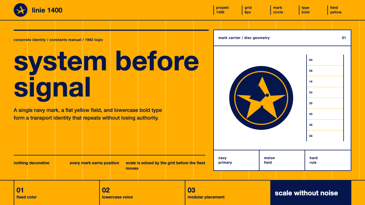 Lufthansa (Aicher)Systems speak first. Melon yellow, navy disc mark, lowercase Helvetica on a h…系统先发声:蜜瓜黄、海军蓝圆标与小写Helvetica钉在硬网格上。
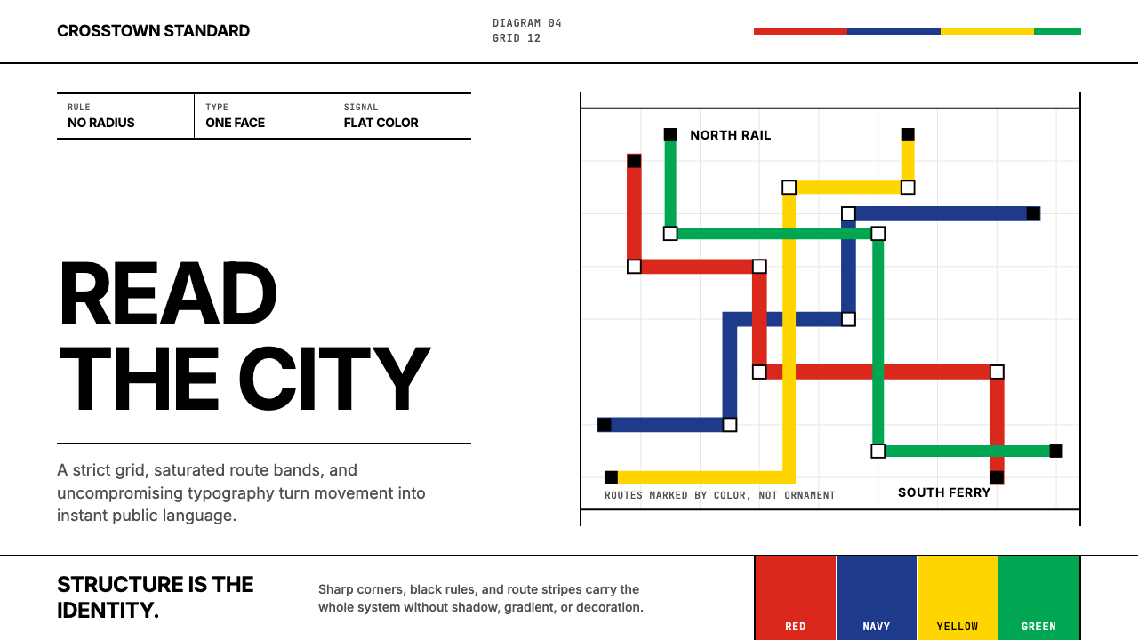 Massimo Vignelli NYCClarity becomes infrastructure. Black rules and route stripes lock the white…清晰即基础设施。白底黑线与路线色带锁定网格。
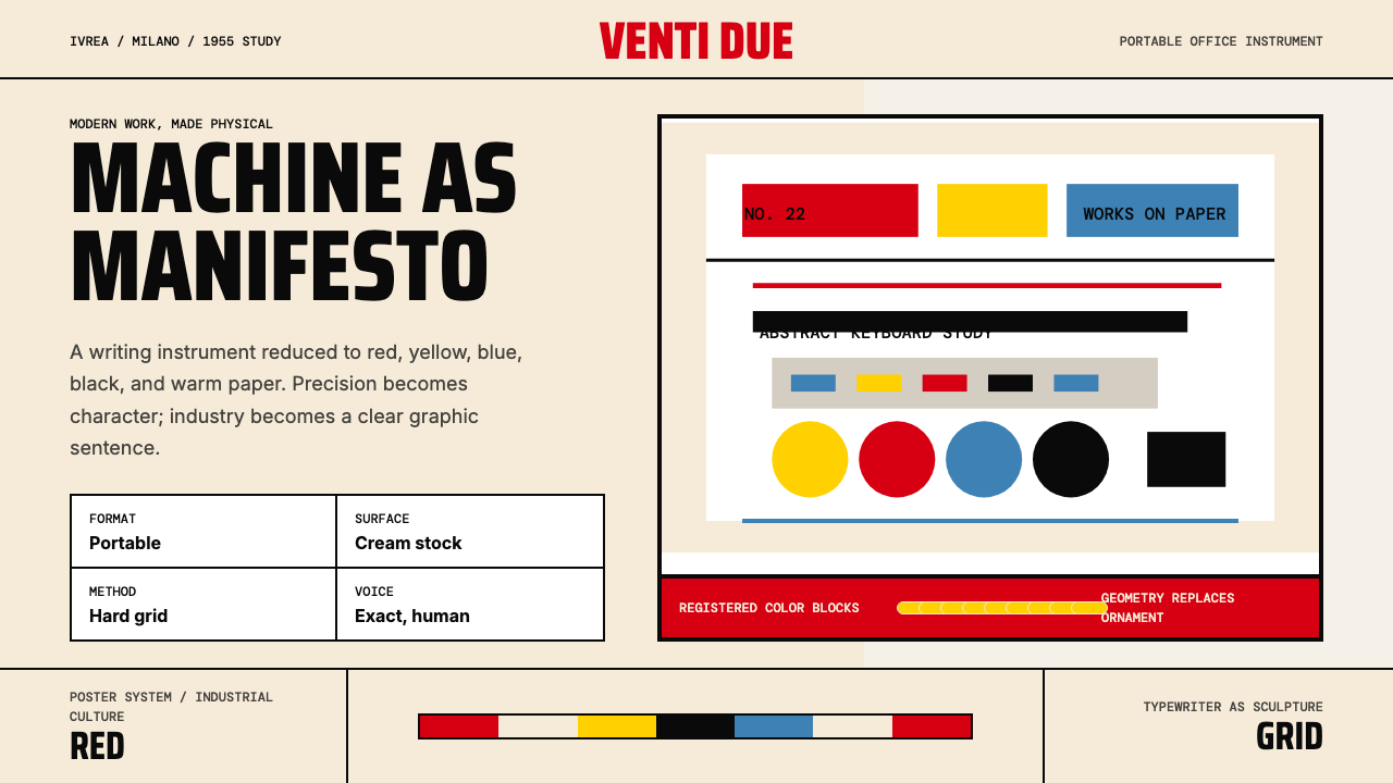 Olivetti Pintori (1955)Industry becomes poetry. Cream paper, machine red, and hard geometry abstract…工业成为诗:奶油纸、机器红与硬朗几何,将打字机抽象化。
 Paul Rand / IBM Corporate IdentityCorporate modernism stays exact. Blue 8-bar stripes, high-contrast serif, har…企业现代主义保持精确:蓝色八条纹、高反差衬线与硬网格色块。
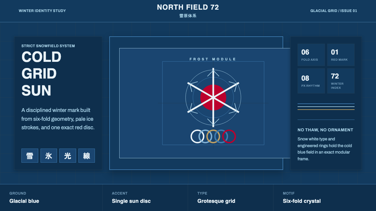 Sapporo Winter 1972Icy order, exact and calm. Glacial blue grid, snow-white type, one red sun di…冰冷秩序:冰川蓝网格、雪白字体与唯一红日圆。