What is Pantone Very Peri (2022)?什么是 Pantone Very Peri (2022)?
Pantone Very Peri is the first Color of the Year ever invented from scratch — a periwinkle blue-violet that declared the era of digital-physical blending had its own authoritative hue.Pantone Very Peri 是有史以来第一个从零创造的年度之色——一种长春花蓝紫,宣告数字与实体交融的时代拥有了属于自己的权威色彩。
Pantone Very Peri (2022) in briefPantone Very Peri (2022) 速览
Pantone Very Peri is the Color of the Year 2022 — and unlike every previous selection in the program's history, it was not drawn from an existing Pantone formula. The company's color experts invented it: a warm blue-violet that sits at the periwinkle register, carrying both the trust and depth of blue and the imaginative energy of violet-red. The name itself was coined for the occasion. Very Peri entered the world already dressed in institutional authority.Pantone Very Peri 是2022年年度之色——与该项目历史上所有先例不同,它并非从现有的Pantone色号中遴选而来。公司的色彩专家将其凭空创造:一种温暖的蓝紫色,落在长春花色域,同时携带蓝色的信赖感与深度,以及紫红的想象力与能量。连这个名字也是为此次发布专门创制的。Very Peri 诞生之初便穿戴着机构权威的加冕。
The visual system built around Very Peri follows Pantone's house idiom, which descends from Swiss International Style filtered through the discipline of industrial color matching. The language is stark and self-assured: a dominant solid-color field occupies most of a composition, Helvetica-adjacent sans-serif typography delivers reference codes and short descriptors with laboratory precision, generous white paper grounds everything, and ornament is categorically absent. The swatch card is the genre, and every design decision refers back to it.围绕 Very Peri 构建的视觉系统遵循 Pantone 的品牌惯例,这套惯例源自瑞士国际主义排版风格,经由工业色彩匹配系统的精确性过滤而成。语言直白而自信:大面积纯色色块占据构图主体,接近 Helvetica 的无衬线字体以实验室般的精准传递色号与简短描述,充裕的白纸底面承托一切,装饰被彻底排除在外。色卡是这套语言的原型,所有设计决策都向它回溯。
What distinguishes Very Peri from earlier Colors of the Year visually is its position in the spectrum. It is not the clear, recessive blue of corporate trust, nor the aggressive warmth of red-adjacent hues. It occupies a liminal zone — simultaneously cool and warm, simultaneously anchored and reaching — which makes it uniquely suited to compositions that want calm authority without coldness, and energy without aggression. The color's ambiguity is a feature, not an accident.Very Peri 在视觉上有别于历届年度之色的地方,在于它在色谱中的位置。它不是企业信任感惯用的清冷内敛蓝,也不是偏红暖色系的进攻性热烈。它占据一片过渡地带——同时冷又暖,同时稳定又延伸——这使它特别适合那些既需要平静权威又不失温度、既需要能量又不显侵略感的构图。这种色彩的模糊性是刻意为之,而非偶然。
See the Pantone Very Peri (2022) design system查看 Pantone Very Peri (2022) 完整设计系统
Where does Pantone Very Peri (2022) come from?Pantone Very Peri (2022) 从何而来?
The Pantone Color of the Year program launched in 1999, emerging from the company's long-established role as the global authority in color standardization for printing, manufacturing, and design. Pantone — founded in 1962 in Carlstadt, New Jersey, by Lawrence Herbert, who bought out the graphics division of M&J Levine Advertising — had spent decades building a proprietary color-matching system that let manufacturers in different countries and industries reproduce identical hues without ever meeting. The Color of the Year extended that authority into culture: an annual declaration that a specific shade carried the mood of the coming year.Pantone 年度之色项目于1999年启动,依托的是该公司长期建立的全球色彩标准化权威地位——这种权威覆盖印刷、制造与设计三大领域。Pantone 由劳伦斯·赫伯特(Lawrence Herbert)于1962年在新泽西州卡尔施塔特创立,他从 M&J Levine Advertising 的图形部门中将其买下,此后数十年间打造出一套专有色彩匹配系统,使不同国家、不同行业的制造商无需见面即可复制完全一致的色调。年度之色将这种权威延伸进了文化领域:每年宣告某种特定色彩承载着来年的时代情绪。
The selection process, overseen by Leatrice Eiseman as executive director of the Pantone Color Institute and Laurie Pressman as vice president, involves monitoring influences across entertainment, art, fashion, travel, consumer products, and socioeconomic conditions. It is simultaneously a cultural observation and a commercial intervention — the announcement generates licensing revenue, design trend coverage, and product partnerships that cement Pantone's relevance in consumer markets well beyond its industrial printing origins.遴选过程由 Pantone 色彩研究院执行主任利特里斯·艾斯曼(Leatrice Eiseman)和副院长劳里·普雷斯曼(Laurie Pressman)主导,涉及对娱乐、艺术、时尚、旅行、消费品及社会经济状况的持续观察。这既是一种文化观察,也是一次商业介入——发布会带来授权收入、设计趋势报道与产品合作,将 Pantone 的影响力从工业印刷的原点延伸至广泛的消费市场。
Very Peri was announced in December 2021, during a period the Pantone team described as a global inflection point: the accelerating merger of physical and digital life, the proliferation of virtual worlds and augmented environments, and a widespread appetite for creative reinvention following pandemic-era constriction. The decision to invent a new color rather than select an existing one was deliberate — it was presented as a formal declaration that the current moment required something that had not previously existed.Very Peri 于2021年12月发布,当时 Pantone 团队将这一时刻描述为全球转折点:实体与数字生活加速融合、虚拟世界与增强现实环境蓬勃兴起,以及经历疫情时代束缚后社会对创造性自我更新的普遍渴求。选择发明一种全新色彩而非遴选既有色号,是经过深思熟虑的——这被明确呈现为一种正式宣告:当下时刻需要一种此前从未存在过的东西。
The color's visual lineage sits partly in the long tradition of periwinkle as a transitional hue — a blue that leans toward violet, historically associated with contemplation and creative ambiguity — and partly in Pantone's own institutional aesthetic. The swatch-card design language it arrived in, with its heavy reliance on clean fields of solid color, precise typographic annotation, and white-paper formality, connects Very Peri to decades of Swiss-influenced corporate color communication. The form and the content reinforce each other: a new color announced with maximum certainty.这种色彩的视觉谱系一方面源自长春花蓝作为过渡色调的悠久传统——一种偏向紫罗兰的蓝,历史上与沉思和创造性模糊相关联——另一方面则源自 Pantone 自身的机构美学。它所搭乘的色卡设计语言,以纯色色块的简洁铺设、精确的字体注释与白纸底面的正式感为核心,将 Very Peri 与数十年来受瑞士风格影响的企业色彩传播实践相连。形式与内容相互强化:一种新色彩,以最大确定性的方式登场。
What defines the Pantone Very Peri (2022) look?Pantone Very Peri (2022) 的视觉特征是什么?
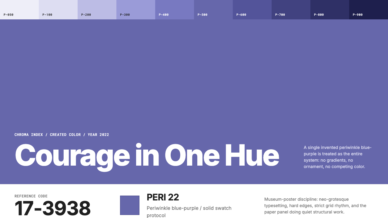
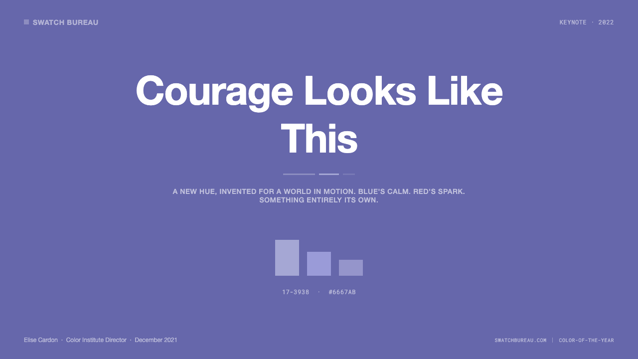
Periwinkle Field长春花色域
The defining characteristic of Very Peri is its position between blue and violet — warm enough to feel approachable, cool enough to command authority. It is not a recessive background hue; it advances from the page, creating immediate visual presence. When used as a dominant field, it establishes mood before a single word is read, functioning the way a theatrical lighting wash functions: everything that sits on it inherits its emotional register.Very Peri 的决定性特征在于它处于蓝色与紫色之间的位置——足够温暖以显亲近,足够清冷以建立权威。它不是退隐的背景色调;它从页面向前推进,创造出即时的视觉存在感。作为主色域使用时,它在任何文字被阅读之前便已建立情绪基调,功能类似舞台灯光的整体色调渲染:置于其上的一切都继承了它的情感调性。
Swatch-Card Formality色卡式正式感
The visual system associated with Very Peri is organized around Pantone's swatch-card idiom: a large solid-color block occupies the dominant zone, precision typography delivers the color's name and reference codes, and white space acts as a formal surround rather than merely empty air. This compositional grammar signals institutional authority — the same authority that makes a paint chip in a hardware store feel definitive. Applied outside color branding, this structure conveys expertise and precision.与 Very Peri 相关联的视觉系统以 Pantone 色卡的形式语言为组织原则:大面积纯色色块占据主导区域,精确的字体传递色彩名称与参考编号,留白作为正式的环绕框架而非单纯的空白。这种构图语法传递机构权威——正是那种让五金店色卡样品显得权威无疑的同款权威。应用于色彩品牌之外时,这套结构同样传递专业性与精确性。
Typographic Restraint字体排印的克制
Typography in the Very Peri system is deliberately subordinate to color. Sans-serif letterforms in a single weight carry color codes, short names, and descriptors — nothing more. Letter-spacing is open, creating breathing room between characters and reinforcing the laboratory-report quality of the annotations. Hierarchy is minimal: the color is the subject, the type is the label. This restraint makes the system immediately scalable — from a small swatch card to a full-bleed poster, the proportional relationship between color field and type annotation remains legible.Very Peri 系统中的字体排印刻意从属于色彩。单一字重的无衬线字形承载色号、简短名称与描述——仅此而已。字符间距宽松,在字母之间创造呼吸空间,强化注释的实验室报告气质。层级最小化:色彩是主体,文字是标签。这种克制使系统具有即时的可缩放性——从小色卡到全出血海报,色彩面积与字体注释之间的比例关系始终清晰可读。
White-Paper Ground白纸底面
The white or near-white ground is not neutral in the Very Peri system — it is a deliberate material reference to paper, the substrate on which Pantone built its original color authority. It functions as both a technical necessity (color perception is relative; a white surround gives the eye a reference point) and a brand signal (this is where certified color lives). Compositions that swap the white ground for a colored or textured background lose the system's clinical precision and slide toward decoration.白色或接近白色的底面在 Very Peri 系统中并非中性存在——它是对纸张的刻意材料指涉,而纸张正是 Pantone 建立其原始色彩权威的基底。它既是技术必要(色彩感知是相对的;白色环境为眼睛提供参照点),也是品牌信号(这是认证色彩所在之处)。以有色或有纹底面替换白色底面的构图,会失去这套系统的临床精确性,滑向纯粹的装饰。
Single-Hue Protocol单色纪律
The Pantone Color of the Year system is built on the premise that one color, used with discipline, can carry an entire composition. Very Peri follows this protocol strictly: the periwinkle field does not share compositional authority with a secondary accent color. Supporting tones, if any, are achromatic — white, cream, or near-black — which allow the primary hue to remain undiluted. This single-hue discipline is the core difference between the Pantone visual language and more broadly chromatic design approaches.Pantone 年度之色系统建立在这样一个前提之上:一种色彩,以纪律使用,足以承托整个构图。Very Peri 严格遵循这一原则:长春花色域不与第二强调色共享构图主导权。支撑色调(若有)是无彩色——白色、奶油色或近黑——让主色调保持未经稀释的纯粹。这种单色纪律是 Pantone 视觉语言与更宽泛多彩的设计方式之间的核心区别。
Zero Ornamentation零装饰原则
Every element in the Very Peri visual system exists because it must. Borders, decorative rules, gradient transitions, textural overlays, and illustrative elements are entirely absent. The aesthetic severity is not minimalism in the contemporary consumer sense — it is the functional austerity of a measurement instrument. A spectrometer does not have decorative flourishes. The color-matching system that Very Peri belongs to inherits this discipline: the color itself is the entire message, and anything added to it is noise.Very Peri 视觉系统中的每一个元素都因必要而存在。边框、装饰性规则线、渐变过渡、纹理叠加与插图元素全部缺席。这种美学严肃性并非当代消费者意义上的极简主义——它是测量仪器的功能性简朴。分光计没有装饰花纹。Very Peri 所属的色彩匹配系统继承了这一自律:色彩本身即是全部信息,任何附加其上的元素都是噪音。
Institutional Tone机构语调
Very Peri arrives with an institutional tone that few designed hues possess: it is a declared standard, not a fashion choice. This gives the color a kind of immovable authority when applied to contexts that benefit from perceived expertise — data presentations, professional reports, certification materials. The institutional tone also creates a specific challenge: applied carelessly, Very Peri can feel bureaucratic rather than visionary, which is why the surrounding white space and typographic restraint are not optional elements but load-bearing ones.Very Peri 带有一种很少设计色彩能够拥有的机构语调:它是宣告的标准,而非时尚的选择。这赋予这种色彩一种在需要感知专业性的场景中——数据演示、专业报告、认证材料——无可撼动的权威感。机构语调同时也带来一项具体挑战:使用不当时,Very Peri 可能显得官僚而非富有远见,这正是为什么周围的白色留白与字体排印的克制不是可选元素,而是承重结构。
See the Pantone Very Peri (2022) design system查看 Pantone Very Peri (2022) 完整设计系统
Who shaped Pantone Very Peri (2022)?谁塑造了 Pantone Very Peri (2022)?
Eiseman has served as executive director of the Pantone Color Institute since its establishment and is the primary public voice of the Color of the Year program. She developed the methodology by which Pantone's color forecasters survey global cultural signals — from runway collections and street photography to automotive design and consumer electronics — to identify a single hue that captures the coming year's collective mood. Her books on color psychology, including work on the relationship between color and emotional response, form the intellectual framework behind the COTY program's cultural claims. Very Peri was announced under her direction as a deliberate act of invention — a declaration that forecasting the present requires creating something new.艾斯曼自 Pantone 色彩研究院成立起便担任执行主任,是年度之色项目最主要的公众声音。她建立了一套方法论,让 Pantone 的色彩预测师得以系统扫描全球文化信号——从T台秀场与街头摄影,到汽车设计与消费电子——从中识别出能捕捉来年集体情绪的单一色调。她关于色彩心理学的著作,包括探讨色彩与情感反应关系的研究,构成了年度之色项目文化主张背后的理论框架。Very Peri 在她的主导下被发布为一次刻意的发明行为——一项宣告:预测当下需要创造全新的东西。
As vice president of the Pantone Color Institute, Pressman oversees the commercial and licensing dimensions of the Color of the Year program — the partnerships with manufacturers, the brand collaborations, and the communication strategy that turns a color announcement into a global trend moment. Very Peri's commercial rollout was notably extensive: collaborations spanned home goods, stationery, apparel, and digital platforms. Pressman's role in bridging Pantone's technical authority and its market positioning makes her central to understanding why Very Peri landed as both a design system and a consumer phenomenon.作为 Pantone 色彩研究院副院长,普雷斯曼主管年度之色项目的商业与授权层面——与制造商的合作、品牌联名,以及将一次色彩发布转化为全球趋势事件的传播策略。Very Peri 的商业推广范围格外广泛:合作涵盖家居用品、文具、服装与数字平台。普雷斯曼在连接 Pantone 的技术权威与市场定位方面的核心作用,使她对于理解 Very Peri 何以同时成为设计系统与消费者现象至关重要。
Herbert founded the modern Pantone system in 1962 when he reorganized and eventually bought the graphics division of M&J Levine Advertising in Carlstadt, New Jersey. His core insight was that color had to be standardized at the level of the formula rather than the sample — a printed swatch could fade, shift under different lighting, and be interpreted differently by different eyes, but a numbered formula with precise ink mixing ratios would produce the same result in Tokyo as in Toronto. This shift from perceptual color to codified color created the institutional authority that the Color of the Year program, launched decades later, continues to trade on. Every Very Peri communication that deploys a reference code rather than a descriptive adjective is an inheritance of Herbert's original systematization.赫伯特于1962年在新泽西州卡尔施塔特重组并最终买下 M&J Levine Advertising 的图形部门,由此创立了现代 Pantone 系统。他的核心洞见是:色彩必须在配方层面而非样本层面实现标准化——印刷色卡可能褪色、在不同光线下偏移、被不同眼睛以不同方式解读,但一套带有精确油墨混合比例的编号配方,在东京和多伦多会产生完全相同的结果。这一从感知色彩到编码色彩的转变,创造了年度之色项目数十年后启动时所继续借重的机构权威。每一份 Very Peri 传播物中部署色彩参考编号而非描述性形容词的决定,都是赫伯特原始系统化工作的遗产。
Though not affiliated with Pantone, Müller-Brockmann's development of the Swiss grid system and his advocacy for white space as an active compositional element in the mid-twentieth century directly inform the visual language that Pantone inherited and institutionalized. His principle that a composition should be reducible to its structural skeleton — with no element present that cannot be justified by the underlying grid — is visible in every Pantone swatch card. Very Peri's austere precision and its reliance on a single dominant field, clean type, and surrounding white are a Swiss International Style inheritance, translated from the editorial page to the color authority context.尽管与 Pantone 没有直接关联,米勒-布罗克曼在二十世纪中叶对瑞士网格系统的发展,以及他倡导将留白作为主动构图元素的主张,直接塑造了 Pantone 所继承并机构化的视觉语言。他的原则——构图应可被还原为其结构骨架,任何无法以底层网格为正当理由的元素都不应存在——在每一张 Pantone 色卡上都清晰可见。Very Peri 的严峻精确性,以及它对单一主色域、干净字体与白色环绕的依赖,是瑞士国际主义风格的遗产,从编辑页面被转译至色彩权威语境。
Birren was a mid-twentieth-century American color consultant and theorist whose work on color forecasting and its application to consumer markets and industrial design established the intellectual scaffolding for the color authority industry that Pantone would eventually come to lead. His books — including work on color psychology and color and human response — argued that color decisions in designed environments are never neutral, and that systematic, research-backed color guidance could and should replace intuitive individual choice. This professionalization of color advice is the direct precursor to the Pantone Color of the Year's cultural authority model, and it explains why Very Peri was released not merely as a trend forecast but as a considered, evidence-backed cultural declaration.伯伦是二十世纪中叶的美国色彩顾问与理论家,他在色彩预测及其应用于消费市场和工业设计方面的工作,为 Pantone 最终领导的色彩权威行业奠定了理论框架。他的著作——包括关于色彩心理学与色彩及人类反应的研究——主张:设计环境中的色彩决策从不是中性的,系统化、有研究支撑的色彩指导可以也应该取代直觉性的个人选择。这种色彩建议的专业化,是 Pantone 年度之色文化权威模式的直接前身,也解释了为何 Very Peri 的发布不仅仅是一次趋势预测,而是一次经过深思熟虑、有据可查的文化宣言。
How do you use Pantone Very Peri (2022) today?今天怎么用 Pantone Very Peri (2022)?
Very Peri's institutional tone and single-hue discipline make it exceptionally well-suited to presentation work — provided the application respects the underlying system rather than treating it as a color accent. A cover slide in the Very Peri register works best with a full-bleed solid field in the primary hue, a title set in a clean sans-serif at substantial scale, a reference-style sub-label in a smaller weight, and nothing else. The white frame or margin around the slide acts as the swatch card's paper ground — remove it and the composition loses its source authority. Content slides should be predominantly white or cream, with the periwinkle reserved for structural accents: a single rule, a section label, a highlighted data point. The color's job on content slides is not to fill space but to mark hierarchy.Very Peri 的机构语调与单色纪律使它在演示工作中表现尤为出色——前提是应用过程尊重底层系统,而非将其作为简单的强调色使用。以 Very Peri 基调制作的封面幻灯片,最佳方案是以主色调满幅纯色底面、简洁无衬线字体大字号设置标题、更小字重的参考风格副标签,仅此而已。幻灯片周围的白色边框或留白充当色卡的纸张底面——去掉它,构图便失去了其权威来源。内容页应主要保持白色或奶油色,长春花蓝紫保留给结构性强调:一条规则线、一个章节标签、一个高亮数据点。这种色彩在内容页的职责不是填充空间,而是标记层级。
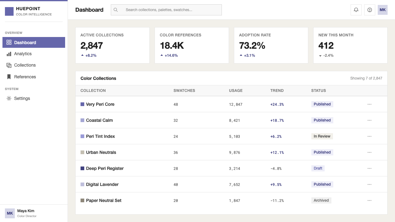
For data visualization, Very Peri follows the single-hue protocol strictly. A dashboard or data slide built in this system uses the primary hue for the most important metric or series, and achromatic tones — ranging from near-black through grays to white — for supporting series and axis labels. This is not a limitation: the contrast between a vivid periwinkle bar and a neutral comparison series produces faster comprehension than a multi-colored chart, because the eye immediately knows what to read first. Pie charts and donut charts should use the primary hue for the dominant segment and reserve desaturated tones for all other segments. Avoid introducing a complementary or contrasting accent color — it breaks the single-hue contract and dilutes the system's authority.在数据可视化中,Very Peri 严格遵循单色原则。以该系统构建的仪表板或数据幻灯片,将主色调用于最重要的指标或系列,无彩色调——从近黑穿越各级灰色至白色——用于辅助系列与坐标轴标签。这不是限制:鲜明的长春花蓝紫色条与中性对比系列之间的反差,比多彩图表产生更快的理解速度,因为眼睛会立即知道先读什么。饼图与环形图应将主色调用于主导扇区,对所有其他扇区保留去饱和色调。避免引入互补或对比强调色——它会打破单色契约,稀释系统的权威性。
In web UI applications, Very Peri performs well as a primary brand color for platforms where expertise, trust, and creative ambition intersect — professional tools, educational platforms, research products, and portfolios. The system works best when the interface background is white or very light, the primary hue appears in navigation elements, primary buttons, and active states, and all other interactive affordances are achromatic. Pricing pages benefit particularly from the color's institutional quality: a highlighted tier in Very Peri against white tiers in neutral tones signals the recommended option with authority rather than urgency. Card components should use minimal shadow — hard-edged and subtle rather than diffuse — to maintain the system's flat, clinical quality.在网页界面应用中,Very Peri 作为专业性、信赖感与创造抱负交汇领域平台的主品牌色表现出色——专业工具、教育平台、研究产品与作品集均适用。系统在界面底面为白色或极浅色、主色调出现在导航元素与主按钮及激活状态、所有其他交互可见性为无彩色时效果最佳。定价页面特别受益于这种色彩的机构品质:在中性色调的普通层级中,以 Very Peri 高亮的推荐层级用权威而非紧迫感传递推荐选项。卡片组件应使用极简投影——硬边且克制而非漫射——以维持系统的平面、临床品质。
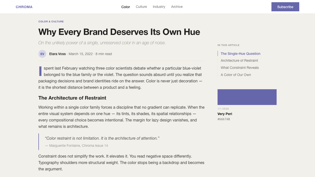
For editorial and marketing contexts, the style supports strong cover treatments and feature openers. A full-bleed periwinkle background with a short headline in white or near-white, a precise subhead in a smaller weight, and nothing else creates an immediately authoritative opening. Inside pages work best with a white ground and the primary hue used sparingly as section color or pull-quote accent — not as a background color for body text blocks. Marketing materials benefit from the color's dual nature: it reads as both innovative and trustworthy, which makes it effective for product launches, brand refresh campaigns, and thought-leadership content that wants to signal both expertise and forward vision.在编辑与营销场景中,这种风格支持强劲的封面处理与专题开篇。满幅长春花蓝紫底面配以白色或近白色的简短标题、更小字重的精确副标题,此外什么都没有,能创造出即时的权威感开场。内页最适合以白色为底面,将主色调谨慎地用作章节色或摘引强调色——而非正文文本块的背景色。营销物料受益于这种色彩的双重性质:它同时传递创新感与可信度,这使它在既想传递专业性又想传递前瞻愿景的产品发布、品牌焕新活动与思想领导力内容中十分有效。
A common mistake when applying Very Peri is treating it as a conventional accent color and pairing it with a contrasting warm tone — coral, gold, or amber — to create visual interest. This collapses the single-hue discipline and turns a system built on institutional authority into a color story built on complementary harmony. The second and more subtle mistake is importing the color without importing its system: placing Very Peri on a textured background, setting type in a humanist serif, or softening edges with diffuse shadows all work against the clinical precision that the color arrives with. Very Peri without its surrounding white space and typographic restraint is just a purple-blue — the authority comes from the complete system.应用 Very Peri 时最常见的错误,是将其作为常规强调色处理,配以对比暖色调——珊瑚色、金色或琥珀色——以创造视觉趣味。这瓦解了单色纪律,将一套建立在机构权威之上的系统变成了一个建立在互补和谐之上的色彩故事。第二个更隐蔽的错误是只引入色彩而不引入系统:将 Very Peri 置于有纹底面、以人文主义衬线字体排版、或以漫射阴影柔化边缘——这些做法都与这种色彩所携带的临床精确性背道而驰。没有周围留白与字体排印克制的 Very Peri,只是一种蓝紫色——权威来自完整的系统。
See the Pantone Very Peri (2022) design system查看 Pantone Very Peri (2022) 完整设计系统
Pantone Very Peri (2022) — FAQPantone Very Peri (2022) · 常见问题
Why was Very Peri invented rather than selected from existing Pantone formulas?为什么 Very Peri 是被发明出来的,而非从现有 Pantone 色号中遴选?
Pantone's team described the decision as a response to a genuinely unprecedented cultural moment: the merging of physical and digital life had reached a point where no existing color in the catalog felt adequate to capture it. Selecting an existing hue would have implied that the current era resembles a previous one closely enough to share its color. Inventing Very Peri was a formal claim that the present moment required its own visual vocabulary. It was also, practically, a demonstration of Pantone's core authority — the ability to create a new standard, not merely identify an existing one.Pantone 团队将这一决定描述为对真正前所未有的文化时刻的回应:实体与数字生活的融合已经到达这样一个程度,目录中现有的任何色彩都不足以捕捉它。选择一种现有色调意味着当前时代与某个过去时代的相似程度足以共用它的色彩。发明 Very Peri 是一项正式主张:当下时刻需要属于自己的视觉词汇。从实践角度,这也是 Pantone 核心权威的一次示范——创造新标准的能力,而非仅仅识别现有标准的能力。
How does Very Peri differ from earlier blue-based Colors of the Year?Very Peri 与早期以蓝色为基础的年度之色有何不同?
Earlier blue-based selections from the Pantone program have typically sat in the clear, recessive register — blues that suggest depth, calm, and reliability without projecting warmth or creative energy. Very Peri is a warmer blue, pushed toward the violet end of the spectrum in a way that introduces a sense of imagination and creative tension absent from its predecessors. The violet component also means it behaves differently in composition: it advances more than a pure blue, competes for attention more actively, and requires more careful management of surrounding achromatic tones to maintain legibility.Pantone 项目中早期以蓝色为基础的遴选,通常落在清冷内敛的色域——传递深度、平静与可靠感而不散发温暖或创造性能量的蓝色。Very Peri 是一种更温暖的蓝色,向色谱紫罗兰端推进,由此引入了其前辈所不具备的想象感与创造性张力。紫罗兰成分也意味着它在构图中的行为方式不同:它比纯蓝色更加向前推进,更主动地争夺注意力,需要对周围无彩色调进行更仔细的管理以维持可读性。
Can Very Peri work in a dark-background layout?Very Peri 能用于深色背景版面吗?
A dark inversion is possible but requires deliberate adjustment. The Pantone system is fundamentally a light-ground system — white paper is both the technical reference and the brand signal. On a dark ground, Very Peri loses some of its clinical authority and begins to feel more atmospheric, which can work for creative or editorial contexts but undermines the institutional precision that makes the color distinctive in professional applications. If a dark variant is needed, the most coherent approach is to treat the periwinkle as a luminous accent against near-black, keeping all type in white or pale achromatic tones and maintaining the same typographic restraint as the light version.深色反转版本是可能的,但需要刻意调整。Pantone 系统从根本上是一套浅色底面系统——白纸既是技术参照也是品牌信号。在深色底面上,Very Peri 失去了一些临床权威性,开始呈现出更具氛围感的特质,这在创意或编辑场景中可能有效,但会削弱使这种色彩在专业应用中显得独特的机构精确性。如果需要深色变体,最连贯的方式是将长春花蓝紫作为近黑背景上的发光强调色,将所有文字保持为白色或浅无彩色调,并维持与浅色版本相同的字体排印克制。
Is the Very Peri design system the same as Swiss International Style?Very Peri 的设计系统与瑞士国际主义风格是同一回事吗?
They share a common lineage but serve different purposes. Swiss International Style, as developed by figures like Müller-Brockmann and Armin Hofmann from the 1950s onward, is primarily a typographic and grid system — its color use is broad, including photography and multiple hues, but its organizing logic is the mathematical grid. The Pantone visual language is narrower and more color-centric: the dominant logic is single-hue authority, not grid mathematics. Very Peri's system is Swiss Style stripped to its most minimal expression and rebuilt around color as the primary carrier of meaning. Think of it as Swiss Style distilled through an industrial color-matching discipline.两者共享共同谱系,但服务于不同目的。瑞士国际主义风格——由米勒-布罗克曼和阿明·霍夫曼等人从1950年代起发展——本质上是一套字体排印与网格系统,其色彩使用范围宽泛,包括摄影与多种色调,但其组织逻辑是数学网格。Pantone 的视觉语言更窄而更以色彩为中心:主导逻辑是单色权威,而非网格数学。Very Peri 的系统是瑞士风格被剥离至最简表达,并以色彩作为意义主要载体重新构建的结果。可以理解为:瑞士风格经由工业色彩匹配纪律提炼后的产物。
What types of projects are a poor fit for Very Peri?哪些类型的项目不适合使用 Very Peri?
Very Peri carries institutional authority and a cool-warm ambiguity that is genuinely versatile, but it struggles in contexts requiring sensory warmth, organic texture, or cultural intimacy. Food and beverage branding, children's educational products, wellness and self-care applications, and any context where the user experience depends on approachable humanity rather than expert authority will find the color's clinical precision working against them. It also sits awkwardly in contexts with strong cultural color codes — for instance, financial products in East Asian markets where specific reds and golds carry established meaning — because its authority is Western and institutional rather than culturally embedded.Very Peri 携带机构权威与冷暖兼具的模糊性,具有真正的通用性,但在需要感官温暖、有机质感或文化亲密性的场景中表现欠佳。食品与饮料品牌、儿童教育产品、健康与自我关怀应用,以及任何用户体验依赖亲近的人文感而非专家权威的场景,都会发现这种色彩的临床精确性适得其反。它在拥有强烈文化色彩编码的场景中也显得格格不入——例如东亚市场的金融产品,那里特定的红色与金色承载着既定意义——因为它的权威是西方性的、机构性的,而非文化性地植根于特定社区。
Related design styles相关设计风格
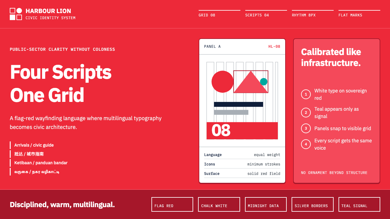 Singapore Merlion BrandPrecision with civic warmth. Flag red and geometric sans lock into a four-scr…克制而亲近:国旗红与几何无衬线锁入四语网格。
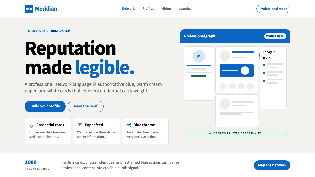 LinkedInCorporate trust, digitized. Authoritative blue frames white cards on warm cre…企业信任数字化:权威蓝框住暖奶油纸面上的白卡。
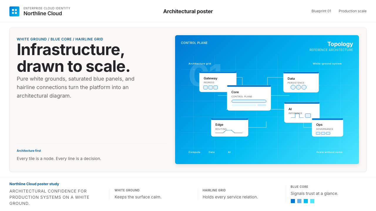 Microsoft AzureEnterprise calm, sharply diagrammed. White ground, saturated blue, hairline l…企业气质很稳。白底、饱和蓝和细线构成架构图。
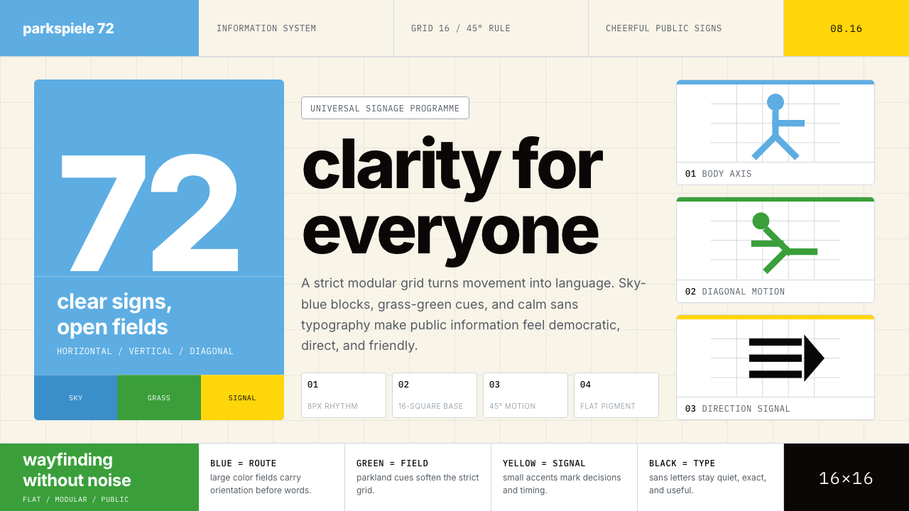 Otl Aicher Munich OlympicsFriendly rigor. Sky-blue grids and straight-line pictograms make public infor…友好的严谨:天蓝网格与直线图标,让公共信息普世清晰。
 Retool Internal-Tools RedPrecision ships fast. Electric blue panels, Inter type, and bordered UI mocku…精准而快速。电光蓝面板、Inter 字体和边框 UI 模型撑起气质。
 Tableau (Business Intelligence)Enterprise clarity. Navy workbook chrome, hairline panes, and 10-color marks…企业级清晰感:海军蓝工作簿框架、细线分栏与十色数据标记驯服密集信息。