Design style guide设计风格指南
What is Singapore Merlion Brand?什么是 Singapore Merlion Brand?
Singapore Merlion Brand forged fifty years of nation-building into one of the most precise multilingual visual systems in the world — flag red, chalk white, and a four-script grid that treats language equality as a design principle.新加坡鱼尾狮品牌将五十年国家建设提炼为世界上最精密的多语言视觉系统之一——国旗红、粉笔白,以及一套将语言平等视为设计原则的四语网格。
Singapore Merlion Brand in briefSingapore Merlion Brand 速览
The Singapore Merlion Brand is a city-state identity system unlike anything produced by conventional corporate branding. It is the accumulated visual output of a nation that has had to engineer its own cohesion — four official languages, three major ethnic communities, and a sovereign identity that was invented rather than inherited. The system does not merely present Singapore to the world; it argues, through every typographic and color decision, that this small, multilingual, postcolonial island can make a legible statement of who it is.新加坡鱼尾狮品牌是一套与传统企业品牌截然不同的城市国家识别系统。它是一个不得不主动建构自身凝聚力的国家所积累的视觉成果——四种官方语言、三个主要族群社区,以及一种被发明而非继承的主权身份。这套系统不仅仅是向世界展示新加坡;它通过每一个排印与色彩决策论证:这座小小的、多语言的、后殖民的岛屿,有能力清晰地陈述自己是谁。
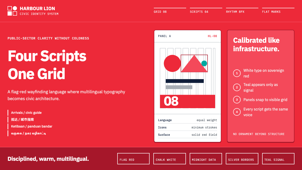
At its most visible, the brand is built on a bold national palette anchored by flag red — a saturated, civic-minded red that stops short of aggression — offset by chalk white that gives text and geometric icons room to breathe. Flat geometric forms, reduced to their minimum stroke count, appear throughout public communications: on transit signage, government brochures, tourism campaigns, and the environmental graphics of Changi Airport. The visual register is simultaneously official and approachable, a balance the system achieves through the strategic warmth of the red and the generous open spacing between elements.在最显眼的层面,这套品牌建立在一个以国旗红为锚点的大胆国家色板上——一种饱和而具有公民气质的红,克制在攻击性的边界之内——与粉笔白形成对位,让文字和几何图标有空间呼吸。扁平几何形态精简至最少笔画数,遍布公共传播的各个角落:交通指示牌、政府宣传册、旅游推广活动,以及樟宜机场的环境图形。视觉语调同时具备官方性与亲近感,这种平衡通过红色的策略性温度和元素间慷慨的开放留白得以实现。
What sets this system apart from other national identity programs is its treatment of multilingual typography as architecture rather than accommodation. Chinese, Malay, Tamil, and English do not compete for hierarchy; they are given parallel structural weight on every surface. A wayfinding panel in an MRT station does not privilege any one script. This commitment to typographic equity is not merely political — it is the design system's organizing aesthetic principle, and it gives the brand its distinctive quality of ordered abundance.这套系统有别于其他国家识别项目的,是它对多语言排印的处理方式——视之为建筑结构,而非将就与妥协。华文、马来文、淡米尔文与英文并不争夺层级地位;它们在每一个版面上被赋予平行的结构权重。地铁站的导视牌不偏袒任何一种文字。这种排印平等的承诺不仅仅是政治性的——它是设计系统的组织性美学原则,赋予了品牌那种独特的有序丰盛感。
See the Singapore Merlion Brand design system →查看 Singapore Merlion Brand 完整设计系统 →
Where does Singapore Merlion Brand come from?Singapore Merlion Brand 从何而来?
The story of the Singapore Merlion Brand begins not with a design brief but with a sculpture. In 1972, Lim Nang Seng — a Singaporean sculptor working in collaboration with the Singapore Tourism Board — completed the original Merlion statue at the mouth of the Singapore River. The creature itself, a hybrid of lion head and fish body, had been conceptualized earlier by Kwan Sai Kian, a fisherman-artist, drawing on two foundational myths: the Sanskrit name Singapura (Lion City) and the island's ancient fishing village origins. The Merlion was from the start a designed identity rather than an organic folk symbol — a deliberate act of nation-building through visual invention.新加坡鱼尾狮品牌的故事不是从一份设计简报开始的,而是从一座雕塑开始的。1972年,新加坡雕塑家林浪新与新加坡旅游局合作,在新加坡河口完成了最初的鱼尾狮雕像。这只生物本身——狮头鱼身的混合体——早年由渔民艺术家关四乾构想,汲取自两个奠基性神话:梵文地名「新加坡拉」(Singapura,即狮城)与这座岛屿的古老渔村起源。鱼尾狮从一开始就是一个被设计出来的身份,而非自然生长的民间符号——一次通过视觉发明进行国家建构的蓄意行动。
Through the 1980s and 1990s, Singapore's national brand expression was managed primarily by the Singapore Tourism Board (STB) in coordination with various government communications offices. The visual system of these decades was disciplined but eclectic, reflecting the pragmatic priorities of a rapidly industrializing city-state more concerned with economic positioning than with aesthetic coherence. The MRT opened in 1987, bringing with it one of the region's first large-scale multilingual wayfinding systems, which established practical conventions for rendering four scripts at equal scale and weight in the same field — a typographic discipline that would later inform the broader brand.在整个1980至90年代,新加坡的国家品牌表达主要由新加坡旅游局(STB)与各政府传播办公室协调管理。这几十年间的视觉系统有纪律性但又兼收并蓄,折射出一个快速工业化城市国家更关注经济定位而非美学连贯性的务实优先级。地铁于1987年开通,带来了该地区最早的大规模多语言导视系统之一,这套系统确立了在同一版面上以相同尺寸和字重呈现四种文字的实用惯例——这种排印纪律后来影响了更广泛的品牌系统。
The decisive modern moment came in 2017, when the STB launched the 'Passion Made Possible' campaign developed by BBH Asia-Pacific. This was not a cosmetic refresh. It was a fundamental repositioning of Singapore's identity for international audiences — shifting from a destination defined by efficiency and cleanliness toward a city-state characterized by ambition, creative energy, and the lived intensity of a place where multiple cultures co-exist at close quarters. The campaign introduced a sharper graphic system: the flag red and white elevated to primary brand colors, flatter and bolder iconography, and an explicit commitment to showing all four official languages as coequal visual elements rather than accommodated minorities.决定性的现代转折发生在2017年,旅游局推出了由BBH亚太公司开发的「心想狮城」(Passion Made Possible)品牌推广活动。这不是一次外观上的翻新,而是为国际受众对新加坡身份进行的根本性重新定位——从一个以高效与整洁为标签的目的地,转向一座以雄心、创造力以及多元文化近距离共存的生活强度为特征的城市国家。这次推广活动引入了一套更锐利的图形系统:国旗红与白被提升为主品牌色,图标更扁平、更大胆,并明确承诺将全部四种官方语言展示为视觉上平等的元素,而非被照顾的少数派。
The 2024 refresh built on the 2017 foundation by tightening the grid structure and extending the system's reach into digital environments. The eight-column layout grid — rigid as an MRT timetable, as the brand team described it — was formalized as the underlying armature for everything from social media assets to airport environmental graphics. The refresh also deepened the commitment to multilingual typographic equity, ensuring that the weight, scale, and spacing of Chinese, Malay, Tamil, and English characters were calibrated with equal care rather than defaulting to English as the structural anchor and adding other scripts as subordinate text layers.2024年的品牌更新在2017年基础上进一步收紧了网格结构,并将系统的触达范围延伸至数字环境。八栏版式网格——品牌团队形容它「刚性如地铁时刻表」——被正式确立为从社交媒体素材到机场环境图形的一切事物的底层骨架。这次更新也深化了对多语言排印平等的承诺,确保华文、马来文、淡米尔文与英文字符的字重、尺寸与间距均以同等细心加以校准,而非默认以英文作为结构锚点、将其他文字作为从属文字层添加。
What defines the Singapore Merlion Brand look?Singapore Merlion Brand 的视觉特征是什么?
Civic Red and White Palette公民红与白色系
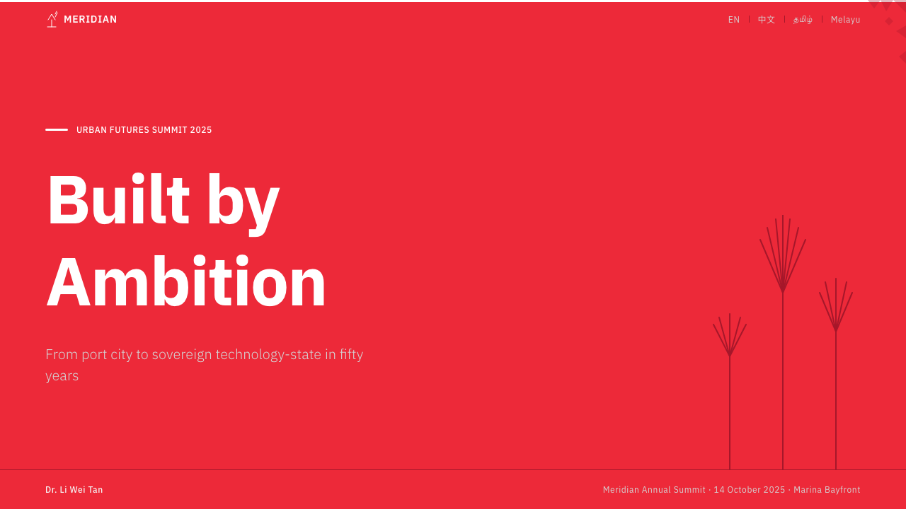
The brand's primary palette derives directly from the national flag: a warm, saturated red paired with pure white. The red is not corporate or aggressive — it carries civic warmth, the kind that reads as confidence rather than alarm. On white grounds, it commands attention without dominating; on red grounds, white type and icons achieve the same clarity. This disciplined two-color foundation gives the system unusual versatility across formats and scales, from a postage stamp to an airport terminal wall, while maintaining immediate recognizability.品牌的主色板直接源自国旗:一种温暖、饱和的红与纯白相配。这种红既非企业色也非攻击性的——它承载着公民的温度,传达的是自信而非警报。在白色底面上,它赢得注意而不压制;在红色底面上,白色文字和图标同样达到清晰。这一严格的双色基础赋予了系统在各种格式和尺寸上异常的灵活性,从邮票到机场候机厅的墙面,同时保持即刻可辨的识别度。
Four-Script Typographic Equity四语排印平等
The defining structural characteristic of this system is the treatment of Chinese, Malay, Tamil, and English as coequal visual presences rather than a hierarchy of primary and subordinate languages. On official signage, all four scripts occupy comparable scale and weight. This is not a technical compromise — it is the brand's central aesthetic argument. The visual effect of four scripts in equal balance creates a sense of ordered plurality that no single-language brand system can achieve. Designing within this constraint requires exceptional sensitivity to how different script systems interact optically at the same apparent size.这套系统最核心的结构特征,是将华文、马来文、淡米尔文与英文作为视觉上同等的存在来处理,而非主次语言的层级体系。在官方标识上,四种文字占据相近的尺寸与字重。这不是一种技术妥协——它是品牌的核心美学论点。四种文字平等并置的视觉效果,创造出一种任何单语言品牌系统都无法达到的有序多元感。在这一约束中进行设计,要求对不同文字系统在相同表观尺寸下如何产生视觉互动有极为精细的感知。
Flat Geometric Iconography扁平几何图标
Icons throughout the system are reduced to their minimum recognizable form: flat planes, consistent stroke economy, no drop shadows, no gradients. The Merlion mark itself follows this logic — a silhouette that balances symbolic complexity (lion and fish, heritage and sea-faring) with graphic simplicity (readable at the scale of a favicon or an airport billboard). Supporting icons for transit, tourism, and civic communication follow the same discipline: every element drawn at the fewest strokes required for recognition, nothing added for visual interest.系统中的图标均被简化至最低限度的可识别形态:扁平面、一致的笔画经济性、无投影、无渐变。鱼尾狮标志本身遵循这一逻辑——一个在象征复杂性(狮与鱼、文化传承与航海历史)与图形简洁性(在应用图标或机场广告牌尺寸下均可阅读)之间取得平衡的剪影。交通、旅游与公民传播的配套图标遵循同样的纪律:每个元素以识别所需的最少笔画绘制,不因追求视觉趣味而添加任何多余内容。
Rigid Grid Architecture刚性网格结构
The eight-column grid is not a loose guideline but a strict armature. Elements align to grid intersections with the precision associated with Singapore's urban planning culture — the same mindset that produced an MRT network without delays and housing towers where every unit meets a published specification. In practice, this means that every margin, column gutter, and content block sits in a mathematically determined relationship to every other. The grid accommodates the complexity of multilingual text without becoming chaotic because its underlying structure is firm enough to hold that complexity in place.八栏网格不是一条宽松的指引,而是一副严格的骨架。元素以与新加坡城市规划文化相关联的精确度对齐至网格交叉点——同样的思维方式造就了准点的地铁网络和每套单元均达到公布规格的组屋楼宇。在实践中,这意味着每一条页边距、栏间距和内容块都与其他所有元素处于经过数学计算的关系之中。网格能够容纳多语言文本的复杂性而不至于混乱,恰恰因为其底层结构足够坚实,能够将那种复杂性稳稳托住。
Geometric Sans Typography几何无衬线排印
The system's Latin and Malay text settings favor geometric sans-serif letterforms — constructed rather than calligraphic, modern rather than classical. This choice aligns with the flat-geometric aesthetic of the icons while maintaining legibility across the scale range required by a multilingual wayfinding system. The Chinese characters used in official materials follow a similar logic: clean, regularized forms preferred over brush-stroke expressiveness. Tamil text settings balance the inherent curvature of the script against the system's geometric preference, demonstrating that the brand's aesthetic can accommodate a script with radically different visual DNA without forcing it into an alien mold.系统的拉丁文与马来文排版倾向于几何无衬线字形——构造性而非书法性,现代而非古典。这一选择与图标的扁平几何美学保持一致,同时在多语言导视系统所需的尺度范围内保持可读性。官方材料中使用的中文字形遵循相似的逻辑:偏向干净、规整的字形,而非笔触书写的表现力。淡米尔文排版则在这种文字固有的弧线感与系统的几何偏好之间寻求平衡,表明这套品牌美学能够容纳一种具有截然不同视觉基因的文字,而不会将其强行纳入异己的模具之中。
Wayfinding Clarity as Aesthetic Ideal导视清晰度作为美学理想
The Singapore brand draws its visual logic from wayfinding culture rather than from advertising or editorial traditions. This means that every design decision is tested against the hardest use case: a traveler who does not read any of the four scripts, moving quickly through a crowded environment, needs to understand where to go. Out of this constraint emerges the brand's defining quality — it cannot be ambiguous. High contrast, generous spacing, flat iconography, and consistent grid alignment are not stylistic choices; they are functional requirements that have been elevated to aesthetic principles.新加坡品牌的视觉逻辑来源于导视文化,而非广告或编辑传统。这意味着每一个设计决策都要接受最严苛使用场景的检验:一位不识任何一种官方文字的旅行者,在嘈杂的环境中快速移动,需要知道该往哪里走。从这一约束中生长出品牌的定义性品质——它不允许歧义。高对比度、慷慨的间距、扁平图标与一致的网格对齐不是风格选择;它们是被提升为美学原则的功能要求。
Zero Decorative Excess零装饰冗余
Like the city-state itself — where land is finite and every square meter is accounted for — the brand tolerates no decorative surplus. No ambient textures, no illustrative border treatments, no gradient backgrounds softening the confrontation between element and ground. What exists is what functions. This quality gives Singapore Merlion Brand work an almost architectural cleanliness that ages well: a brochure designed in this system in 2010 does not look dated today because it never relied on the period's decorative conventions. The discipline is not austerity — it is the same precision that makes Singapore's public infrastructure feel both modern and enduring.如同这座城市国家本身——土地有限,每一平方米都被精打细算——品牌不容许任何装饰性冗余。没有环境纹理,没有插画式边框处理,没有用渐变背景软化元素与底面之间的对抗。存在的只有发挥功能的。这种品质赋予了鱼尾狮品牌作品一种近乎建筑般的干净,且经得起时间考验:一本2010年按这套系统设计的宣传册,今天看来并不过时,因为它从未依赖那个时代的装饰惯例。这种纪律不是简陋——它是同一种精密性,让新加坡的公共基础设施感觉既现代又持久。
See the Singapore Merlion Brand design system →查看 Singapore Merlion Brand 完整设计系统 →
Who shaped Singapore Merlion Brand?谁塑造了 Singapore Merlion Brand?
Lim Nang Seng was the sculptor commissioned to create the original Merlion statue, completed in 1972 at the mouth of the Singapore River. His execution of the Merlion — translating a conceptual hybrid creature into a monumental public sculpture — gave the brand its primary symbolic anchor. The statue became one of the most recognized emblems of Singapore globally, and its graphic abstraction into a flat silhouette mark has defined the visual identity of the nation's tourism and civic brand ever since.林浪新是受委托创作原版鱼尾狮雕像的雕塑家,该雕像于1972年在新加坡河口竣工。他将一种概念性混合生物转化为一座宏大公共雕塑的过程,为品牌奠定了主要的象征锚点。这座雕像成为新加坡在全球最具辨识度的标志之一,它被抽象为扁平剪影标志的图形化处理,此后持续定义着这个国家旅游与公民品牌的视觉识别。
A fisherman-artist whose conceptual contribution to the Merlion predates its sculptural realization, Kwan Sai Kian is credited with the mythological synthesis that the brand rests on: the fusion of the lion — drawn from the Sanskrit name Singapura — with the fish body, referencing the island's origins as a fishing village and its enduring relationship with the sea. His conceptual work demonstrates that the Singapore brand's visual power derives from a genuinely rooted symbolic act rather than a purely commissioned corporate exercise.关四乾是一位渔民艺术家,他对鱼尾狮的概念性贡献早于其雕塑实现。他被认为是这套品牌所依托的神话综合的创造者:将狮子——源自梵文地名「新加坡拉」(Singapura)——与鱼身相融合,指涉这座岛屿作为渔村的起源及其与大海的持久关系。他的概念工作表明,新加坡品牌的视觉力量来自一种真正扎根的象征行为,而非纯粹的委托企业操作。
The London-founded advertising and design agency Bartle Bogle Hegarty, through its Asia-Pacific studio, was responsible for the 2017 'Passion Made Possible' campaign that recast Singapore's global brand identity. BBH Asia-Pacific translated a national brief of considerable complexity — how to position Singapore as both a world-class city and a place of genuine cultural intensity, for audiences ranging from business travelers to leisure tourists — into a graphic system rigorous enough to serve as the foundation for subsequent years of brand evolution. Their work proved that a national tourism campaign could function as a coherent design system rather than an advertising burst.总部位于伦敦的广告设计公司Bartle Bogle Hegarty,通过其亚太工作室,负责了2017年「心想狮城」(Passion Made Possible)品牌推广活动,为新加坡的全球品牌形象进行了重塑。BBH亚太将一份具有相当复杂度的国家简报——如何将新加坡定位为既是世界级城市又是具有真实文化强度的地方,面向从商务旅行者到休闲游客的不同受众——转化为一套图形系统,严谨到足以成为此后多年品牌演进的基础。他们的工作证明了一次国家旅游推广活动可以作为一套连贯的设计系统来运作,而非一次广告爆破。
The Singapore Tourism Board's in-house design office represents the institutional continuity behind the brand's disciplined evolution. Unlike many national identity programs that are periodically handed to external agencies for wholesale reinvention, Singapore's brand has maintained its typographic equity principles and red-white palette through multiple campaigns and decades, suggesting a level of stewardship that only in-house institutional knowledge can provide. The STB design office functions less like a creative department and more like a constitutional body — defining and protecting the rules of the visual system across all government and tourism communications.新加坡旅游局内部设计团队代表着品牌自律演进背后的机构连续性。与许多国家识别项目定期将整体重塑委托给外部代理商不同,新加坡品牌的排印平等原则与红白色板在多次推广活动与数十年间保持了高度一致,这表明只有内部机构知识才能提供这种水准的守护。旅游局设计团队运作方式更像一个宪政机构,而非创意部门——在所有政府与旅游传播中定义并保护视觉系统的规则。
How do you use Singapore Merlion Brand today?今天怎么用 Singapore Merlion Brand?
The Singapore Merlion Brand system is one of the most instructive in the world for designers working on multilingual interfaces, civic products, or any project that must balance multiple cultural constituencies without creating visual hierarchy among them. Understanding what makes it work requires looking past the surface red-and-white palette to the structural commitments underneath: equal-weight type treatment, a non-negotiable grid, and the principle that no single language is the default.新加坡鱼尾狮品牌系统是世界上最具教学价值的系统之一,对于那些处理多语言界面、公民产品,或任何必须平衡多元文化群体而不在它们之间制造视觉层级的项目而言尤其如此。理解它为何有效,需要穿透表面的红白色板,看到其下的结构性承诺:等权重的文字处理、不可妥协的网格,以及没有任何一种语言是默认值的原则。
For presentation slides, the system's virtues translate directly. A cover slide built on this approach uses the civic red as a full-bleed background field, with the primary title in large white type set at generous scale — the kind of scale that makes the text function as a visual element before it functions as a text element. Content slides work best with a white background, a strict two-column organization, and text hierarchies defined purely by weight and size rather than by color or decorative rules. If the presentation is bilingual, the two languages should occupy parallel positions — side by side or stacked — rather than one presented as the main text and the other as a caption or footnote.对于演示文稿,这套系统的优点可以直接转化。基于这种方式构建的封面页,使用公民红作为满铺背景,主标题以大尺寸白色字体呈现——那种让文字在作为文本元素之前就作为视觉元素发挥作用的尺寸。内容页在白色背景上效果最佳,严格的两栏组织,文字层级完全通过字重和尺寸定义,而非通过色彩或装饰线条区分。如果演示文稿是双语的,两种语言应占据平行位置——并排或叠放——而非一种作为主体文本、另一种作为说明或脚注呈现。
For web interfaces, the system is exceptionally well-suited to civic and government platforms, multilingual dashboards, travel and hospitality booking flows, and any public-facing product where clarity is more important than personality. The approach: white or very light background, high-contrast body text, flat icon system using a limited palette, and a grid-aligned card structure with hard-shadow treatment rather than soft diffusion. Navigation should be typographic. If the product serves users in multiple languages, the type system should be audited to ensure that the selected typefaces perform equally across all scripts — a common oversight that this brand's history is specifically designed to address.对于网页界面,这套系统特别适合公民政务平台、多语言仪表板、旅游与酒店预订流程,以及任何清晰度比个性更重要的公众面向产品。方法如下:白色或极浅色背景,高对比度正文,使用有限色板的扁平图标系统,以及采用硬边投影而非柔和漫射的网格对齐卡片结构。导航应当是排印性的。如果产品服务多语言用户,字体系统应经过审核,确保所选字体在所有文字系统中表现同等出色——这是这套品牌历史专门针对的常见疏漏。
For editorial and marketing contexts, the brand's poster-like boldness is its most transferable quality. A marketing layout in this system uses the civic red sparingly but decisively: one full-bleed section anchors the composition, with the remainder in black on white or white on black. Call-to-action elements take the red as their color; informational elements use the neutral tones. The wayfinding discipline — high contrast, clear hierarchy, nothing ambiguous — applies to marketing as clearly as to signage. This is a system that never whispers; it states.对于编辑与营销场景,品牌的海报式大胆感是其最可移植的品质。基于这套系统的营销版面对公民红的使用克制而果断:一个满铺区块锚定构图,其余部分在白底黑字或黑底白字之间交替。行动号召元素以红色为色;信息性元素使用中性色调。导视纪律——高对比度、清晰层级、无歧义——在营销语境中与在标识语境中同样适用。这是一套从不低声细语的系统;它只做陈述。
A common mistake when referencing this system is treating the red-and-white palette as purely decorative while ignoring the typographic equity principle. This produces work that looks like Singapore branding but lacks its actual logic. The system's distinctiveness comes from the commitment to equal language treatment, not from the color combination. A design that presents one language prominently and others as decorative inclusions has misunderstood the source. Similarly, softening the grid — introducing rounded corners, gradient overlays, or organic shapes — undermines the brand's core commitment to the kind of legibility that works under pressure. This is a system that was designed to be read by a traveler who is tired, lost, and in a hurry; gentleness is not in its brief.参照这套系统时最常见的错误,是将红白色板视为纯粹的装饰,同时忽略排印平等原则。这会产生外观像新加坡品牌但缺乏其实际逻辑的作品。系统的独特性来自对语言平等处理的承诺,而非来自色彩组合。一个将某一种语言突出呈现、将其他语言作为装饰性补充的设计,是对源头的误读。同样,软化网格——引入圆角、渐变叠层或有机形态——会破坏品牌对那种能在压力下正常运作的可读性的核心承诺。这是一套为疲惫、迷路、匆忙的旅行者设计的系统;温柔不在其简报之内。
See the Singapore Merlion Brand design system →查看 Singapore Merlion Brand 完整设计系统 →
Singapore Merlion Brand — FAQSingapore Merlion Brand · 常见问题
How does Singapore Merlion Brand differ from Swiss International Style?新加坡鱼尾狮品牌与瑞士国际主义风格有什么不同?
Both systems prize grid discipline and typographic clarity, but their motivations and outputs are quite different. Swiss International Style emerged from a postwar European context that sought a universal visual language for global corporate communication — it aspired to neutrality and reproducibility across cultures. Singapore Merlion Brand is explicitly rooted in cultural specificity: it is not trying to transcend cultural particularity but to represent four distinct linguistic communities as coequal presences. Where Swiss Style's grid serves efficiency and universality, Singapore's grid serves political equity. The result looks similar at a glance — flat, geometric, rigorous — but the underlying argument is different. Swiss Style would never put Tamil and English in the same visual hierarchy; that structural commitment is uniquely Singapore's.两套系统都重视网格纪律与排印清晰,但它们的动机与产出相当不同。瑞士国际主义风格兴起于战后欧洲,寻求一种用于全球企业传播的普遍视觉语言——它追求跨文化的中性与可复制性。新加坡鱼尾狮品牌则明确植根于文化特殊性:它不是试图超越文化个别性,而是将四个截然不同的语言社群表达为平等共存的存在。瑞士风格的网格服务于效率与普遍性,新加坡的网格服务于政治平等。乍看之下结果相似——扁平、几何、严谨——但底层论点不同。瑞士风格绝不会将淡米尔文与英文置于同一视觉层级;那种结构性承诺是独属于新加坡的。
Can this system work for private-sector or commercial products?这套系统适用于私营部门或商业产品吗?
Yes, with appropriate adaptation. The system's core principles — civic-warmth color palette, multilingual typographic equity, rigorous grid, flat geometric iconography — transfer well to commercial contexts where trust, clarity, and multi-audience communication are priorities. Hospitality brands, financial services, civic-technology products, and logistics platforms have all used analogous systems to good effect. The key adaptation is that commercial applications can allow more flexibility in the secondary palette and can calibrate the warmth of the red toward their specific audience. What should not be adapted is the grid discipline and the equal treatment of languages — those are the system's functional core, not its decorative surface.可以,但需要适当调整。系统的核心原则——公民温度色板、多语言排印平等、严格网格、扁平几何图标——在信任度、清晰度与多受众传播是优先事项的商业场景中迁移良好。酒店品牌、金融服务、公民科技产品与物流平台都曾以类似系统取得良好效果。关键的调整在于:商业应用可以在辅助色板上允许更多灵活性,并可根据具体受众调整红色的温度。不应调整的是网格纪律与语言的平等处理——那些是系统的功能核心,而非其装饰表面。
What makes the Merlion mark so durable as a symbol?是什么让鱼尾狮标志作为符号如此经久不衰?
The Merlion's durability comes from the same quality that makes all enduring symbols work: it is legible at any scale, it carries multiple layers of meaning without requiring any of them to be decoded for the symbol to function, and it cannot be confused with anything else. The lion-fish hybrid is immediately strange enough to be memorable and specific enough to be unmistakable. Its silhouette translates cleanly into flat graphic form — the mark works as a stamp, a signage icon, a merchandise print, and a monumental sculpture because it was conceived with enough geometric simplicity to survive all those contexts. The fact that it also encodes two foundational Singapore myths — the lion of Singapura, the fish of a fishing island — gives it cultural depth that a purely invented logomark would lack.鱼尾狮的经久耐用,来自所有持久符号共有的品质:它在任何尺寸下都清晰可辨,它承载多个层次的意义而无需解码任何一层即可发挥功能,且无法与任何其他事物混淆。狮鱼混合体足够奇特因而令人难忘,足够具体因而无可混淆。其剪影能够清晰地转化为扁平图形形式——这个标志能作为印章、标识图标、商品印刷品和宏大雕塑使用,正是因为它在构想时具有足够的几何简洁性来承受所有这些语境。它还编码了两个新加坡的奠基神话这一事实——「新加坡拉」的狮子、渔岛的鱼——赋予了它一种纯粹发明的标志所缺乏的文化深度。
Is this a good system to reference for dark-mode or night-time interfaces?这套系统适合作为深色模式或夜间界面的参考吗?
The system is primarily a light-ground system — the canonical application places red and white on light backgrounds, which maximizes the civic warmth of the palette and maintains the high contrast required for multilingual legibility. A dark inversion is possible but requires care. On a dark ground, the flag red can read as aggressive rather than warm, and the careful spacing relationships that the light-ground version achieves may need to be recalibrated to prevent the composition from feeling crowded. The flat geometric iconography translates well to dark grounds, and white type on dark backgrounds remains within the system's logic. The key principle to preserve in any inversion: every language should remain equally legible. Dark-mode implementations that achieve this typically use the red very sparingly — as an accent or interactive-state color — rather than as a dominant field.这套系统主要是浅色底面系统——经典应用将红色与白色置于浅色背景上,从而最大化色板的公民温度,并保持多语言可读性所需的高对比度。深色反转是可能的,但需要谨慎。在深色底面上,国旗红可能被读作攻击性而非温暖,浅色底面版本所实现的精细间距关系可能需要重新校准,以防止构图感觉拥挤。扁平几何图标在深色底面上迁移良好,深色背景上的白色文字仍在系统逻辑范围之内。任何反转都应保留的关键原则:每种语言都应保持同等可读性。实现这一点的深色模式实现,通常将红色用得极为节制——作为强调色或交互状态色——而非作为主导色块。
How should a designer handle the tension between the system's rigidity and creative expression?设计师应如何处理这套系统的刚性与创意表达之间的张力?
The Singapore Merlion Brand is a civic system, not an expressive one, and treating it primarily as a constraint rather than a canvas is not a limitation — it is the correct relationship to have with it. The creative opportunity within the system lies in the intelligence of arrangement rather than the introduction of new elements. How the four scripts are positioned relative to each other within the grid, how the civic red is deployed to establish rhythm and hierarchy, how the flat icons are scaled and grouped to create visual interest without decoration — these are the decisions where creative judgment operates. Designers who find this frustrating are usually looking for a system that rewards self-expression; Singapore's brand rewards discipline and structural intelligence, which is a different creative challenge and, for certain designers, a more demanding one.新加坡鱼尾狮品牌是一套公民系统,而非表达性系统,将其主要视为约束而非画布不是局限——这是与它建立的正确关系。系统内的创意机会在于编排的智慧,而非引入新元素。四种文字在网格内如何相对定位,公民红如何被部署以建立节奏和层级,扁平图标如何在不添加装饰的前提下通过缩放与组合创造视觉趣味——这些才是创意判断发挥作用的决策。对此感到沮丧的设计师,通常在寻找一套奖励自我表达的系统;新加坡品牌奖励的是纪律与结构智慧,这是一种不同的创意挑战,对某些设计师而言,也是更高要求的挑战。
Related design styles相关设计风格
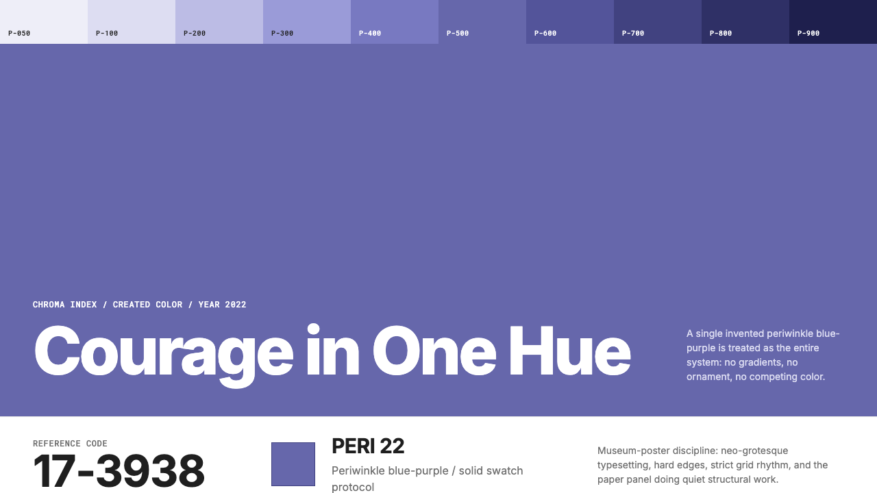 Pantone Very Peri (2022)Color becomes authority. Periwinkle field, reference codes, and white paper i…色彩即权威:长春花蓝紫色块、色号排版与白纸留白建立纪律。
 Adobe Creative CloudUnified, not uniform. Red anchor, white space, and saturated app tiles organi…统一而不单一:红色锚点、留白与高饱和应用方块组织整套工具。
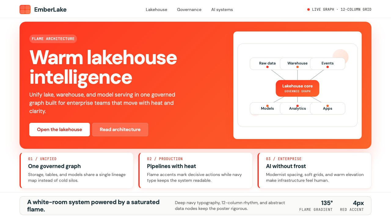 Databricks LakehouseWarm enterprise confidence. Flame red-orange gradients meet DM Sans and clean…温暖的企业信心:红橙火焰渐变配 DM Sans 与洁净数据图。
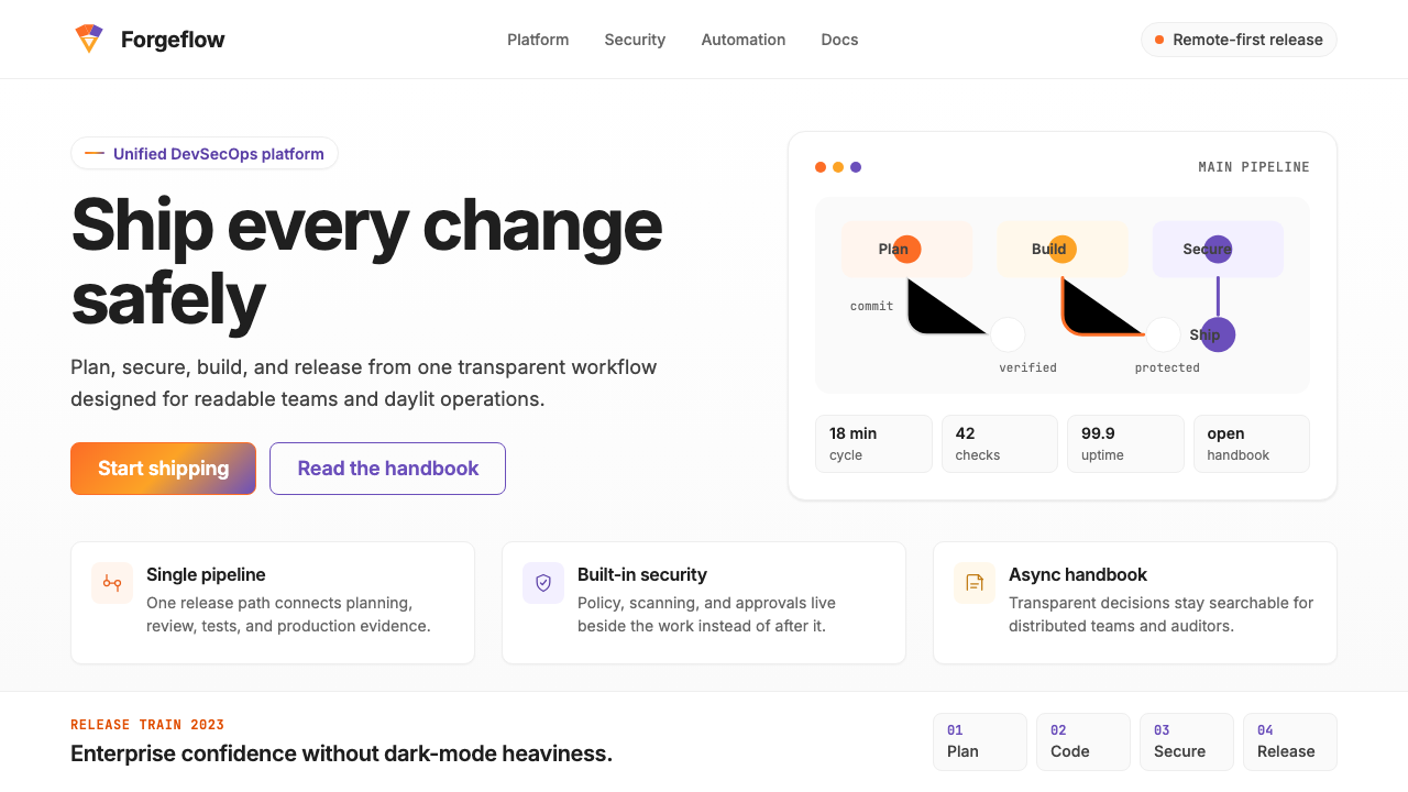 GitLab 2023DevOps in daylight. Tanuki orange-to-purple gradient, Inter, warm enough for…DevOps 走出暗色房间:标志性狸猫橙紫渐变、宽松行高、Inter 字体——…
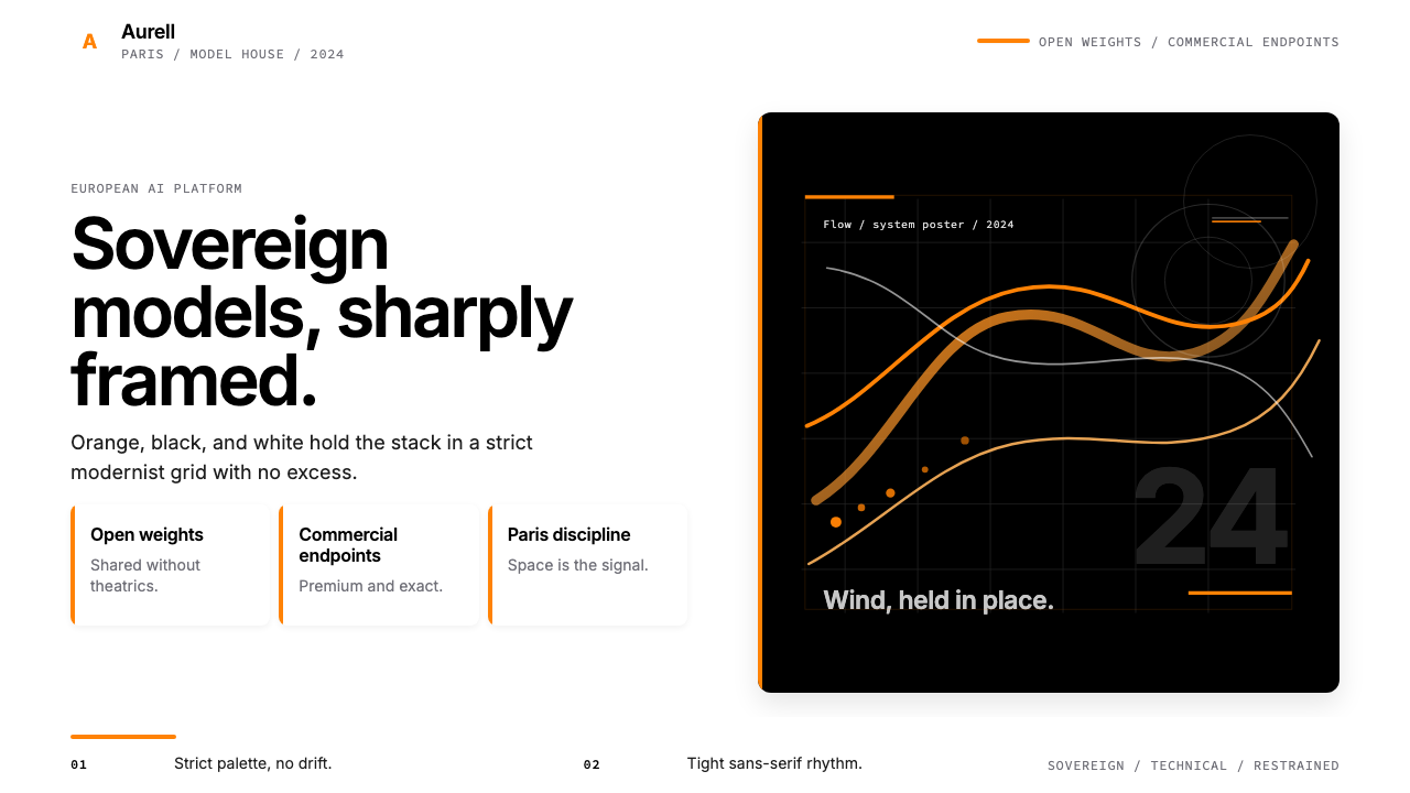 Mistral AI OrangeSovereign AI with restraint. Orange, black, and white lock the grid.主权AI很克制。橙黑白锁定网格。
 Oracle Corporate RedEnterprise certainty. Saturated red, tight sans, and white space do all the w…企业级确定感:饱和红、紧排无衬线与大留白撑起全部气场。