What is Mistral AI Orange?什么是 Mistral AI Orange?
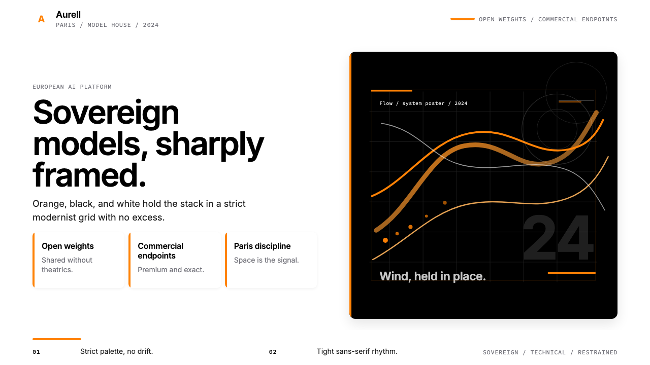
From a Paris garage to Europe's most-valued AI startup, Mistral built its entire brand identity on one unflinching orange, deep black, and the confidence to leave everything else out.从巴黎的一间车库到欧洲估值最高的 AI 独角兽,Mistral 用一抹决绝的橙色、纯黑,以及「其他什么都不加」的勇气,撑起了整个品牌。
Mistral AI Orange in briefMistral AI Orange 速览
Mistral AI Orange is the visual design system built around the brand identity of Mistral AI, the French large-language-model company founded in April 2023. The system is defined by a three-color discipline so strict it reads almost like a manifesto: a single vivid, warm orange functions as the sole accent and anchor; deep black carries structure and typography; pure white or very light cream provides the breathing ground. Almost nothing else is permitted.Mistral AI Orange 是围绕 Mistral AI 品牌形象建立起来的视觉设计系统。Mistral AI 是一家法国大型语言模型公司,于 2023 年 4 月创立。这套系统以近乎宣言式的三色纪律为核心:一抹鲜明而温暖的橙色充当唯一的强调色与锚点;深黑色承载结构与文字;纯白或极浅的奶油色提供呼吸的底面。除此之外,几乎什么都不被允许。
The aesthetic belongs to a lineage of European modernist corporate design — rigorous, technically self-confident, sovereign in its restraint. It does not borrow the warmer, friendlier palette conventions common in American consumer-technology branding, nor does it chase the maximalist chromatic energy of many AI competitors. Instead it conveys competence through economy: the fewer elements, the more weight each one carries.这套美学属于欧洲现代主义企业设计的谱系——严谨、技术上充满自信、在克制中彰显主权。它既没有借鉴美国消费科技品牌常见的那种温暖友好的配色惯例,也没有追逐许多 AI 竞争者的最大化色彩能量。它以经济的方式传达能力:元素越少,每一个元素的分量就越重。
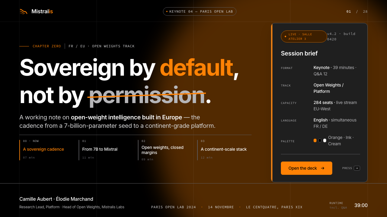
Distinct from a pure minimalism of absence, Mistral Orange includes a living decorative motif — flowing abstract curves that evoke the Mistral wind of southern France, the company's namesake. These curves are organic where the rest of the system is geometric, expressive where the rest is controlled, and they prevent the identity from collapsing into mere austerity. Used at large scale on covers or hero sections, they give the system a sense of movement and pride without violating its tonal discipline.区别于纯粹的缺席式极简主义,Mistral Orange 包含一个鲜活的装饰母题——流动的抽象曲线,令人联想到公司名称来源地南法的密史脱拉风。这些曲线在其余系统的几何感中显得有机,在其余系统的控制感中显得富有表现力,防止整个形象坍缩为单纯的苦涩。在封面或英雄区块大尺度使用时,它们赋予这套系统一种运动感与自豪感,而不破坏其整体的色调纪律。
See the Mistral AI Orange design system查看 Mistral AI Orange 完整设计系统
Where does Mistral AI Orange come from?Mistral AI Orange 从何而来?
Mistral AI was founded in Paris in April 2023 by Arthur Mensch, Guillaume Lample, and Timothée Lacroix — alumni of Meta AI Research and Google DeepMind. Their goal was explicit from the start: to build powerful open-weight language models in Europe, under European governance, and to make them genuinely competitive with the best proprietary systems in the world. Within eighteen months the company had raised hundreds of millions of euros and achieved a valuation that made it the most valuable AI startup on the continent.Mistral AI 于 2023 年 4 月由 Arthur Mensch、Guillaume Lample 和 Timothée Lacroix 在巴黎联合创立,三人均为 Meta AI Research 与 Google DeepMind 的校友。他们的目标从一开始就很明确:在欧洲、在欧洲治理框架下,构建强大的开源权重语言模型,并使其真正能与全球最佳专有系统抗衡。在十八个月内,公司累计融资数亿欧元,估值跃升为欧洲最高的 AI 创业公司。
The brand identity was developed alongside the company's technical ambitions and its political positioning. Mistral's founders were vocal proponents of European AI sovereignty — the idea that Europe needed its own AI infrastructure, its own models, and its own data governance, rather than dependence on American hyperscalers or Chinese state-backed systems. The visual language they built reflects this positioning precisely. Orange was chosen as an accent with national and emotional resonance: warm, confident, European in feeling, and distinct from the cool blues and grays common among English-speaking tech brands.品牌形象是与公司的技术雄心和政治立场同步建立的。Mistral 的创始人是欧洲 AI 主权理念的公开倡导者——他们主张欧洲需要自己的 AI 基础设施、自己的模型、自己的数据治理,而非依赖美国超大规模云厂商或中国国家支持的系统。他们所建立的视觉语言精准地反映了这一定位。橙色被选作强调色,带有国家与情感层面的共鸣:温暖、自信、欧洲气质,有别于英语科技品牌普遍使用的冷蓝与灰色。
The flowing-curve motif is a direct reference to the Mistral wind, the powerful, consistent northwesterly that sweeps down the Rhône valley of southern France. The wind is a defining feature of Provençal geography and culture — celebrated in literature and feared by farmers — and naming an AI company after it was a deliberate choice signaling speed, force, and rootedness in place. The visual translation of that wind into abstract curves gives the brand a natural, somewhat romantic counterweight to the otherwise rigorous typographic grid.那条流动的曲线母题是对密史脱拉风的直接指涉——那股强劲而稳定的西北风,穿越法国南部罗讷河谷,是普罗旺斯地理与文化的标志性特征,在文学中被颂扬,在农田里被敬畏。以此命名 AI 公司,是刻意为之的选择,传达速度、力量与地方根植感。将那阵风转化为抽象曲线的视觉处理,为品牌带来了一种自然的、略带浪漫气息的平衡,以抵消其余部分严谨排版网格的刚硬。
The design emerged in a moment when European technology identity was under active cultural negotiation. Mistral's public commitments to open-weight model releases, its challenges to American regulatory assumptions, and its public statements about digital sovereignty made it simultaneously a technical player and a political actor. The visual system supports both roles: it looks serious and credible enough for enterprise AI procurement discussions, and distinctive enough to carry a national identity argument. The orange in particular functions as a quiet assertion — this is not another grey Silicon Valley dashboard.这套设计诞生于欧洲技术身份正在被积极地文化协商的时刻。Mistral 公开承诺开源权重模型的发布,挑战美国监管预设,并就数字主权发表公开声明,使其同时成为技术参与者和政治行动者。这套视觉系统支撑了这两重角色:它足够严肃可信,适合企业 AI 采购场合,又足够独特,能承载一个国家身份主张。那抹橙色尤其发挥着一种安静的断言作用——这不是又一个灰色的硅谷仪表板。
What defines the Mistral AI Orange look?Mistral AI Orange 的视觉特征是什么?
Signature Orange Accent标志性橙色强调
The system's defining element is a single saturated, warm orange used as the universal accent: on logos, key interface controls, call-to-action buttons, chart highlights, and decorative motifs. It is never diluted into a pastel, never darkened into a rust, and never allowed to share the accent role with another hue. The orange functions as both a brand mark and a structural signal — wherever it appears, attention should follow.整套系统的定义性元素是一抹饱和、温暖的橙色,作为通用强调色使用:出现在标志、关键界面控件、行动号召按钮、图表高亮和装饰母题上。它从不被稀释为粉彩,从不被加深为锈色,也从不与另一种色调共享强调角色。这抹橙色既是品牌标记,也是结构性信号——它出现在哪里,注意力就应跟随到哪里。
Three-Color Discipline三色纪律
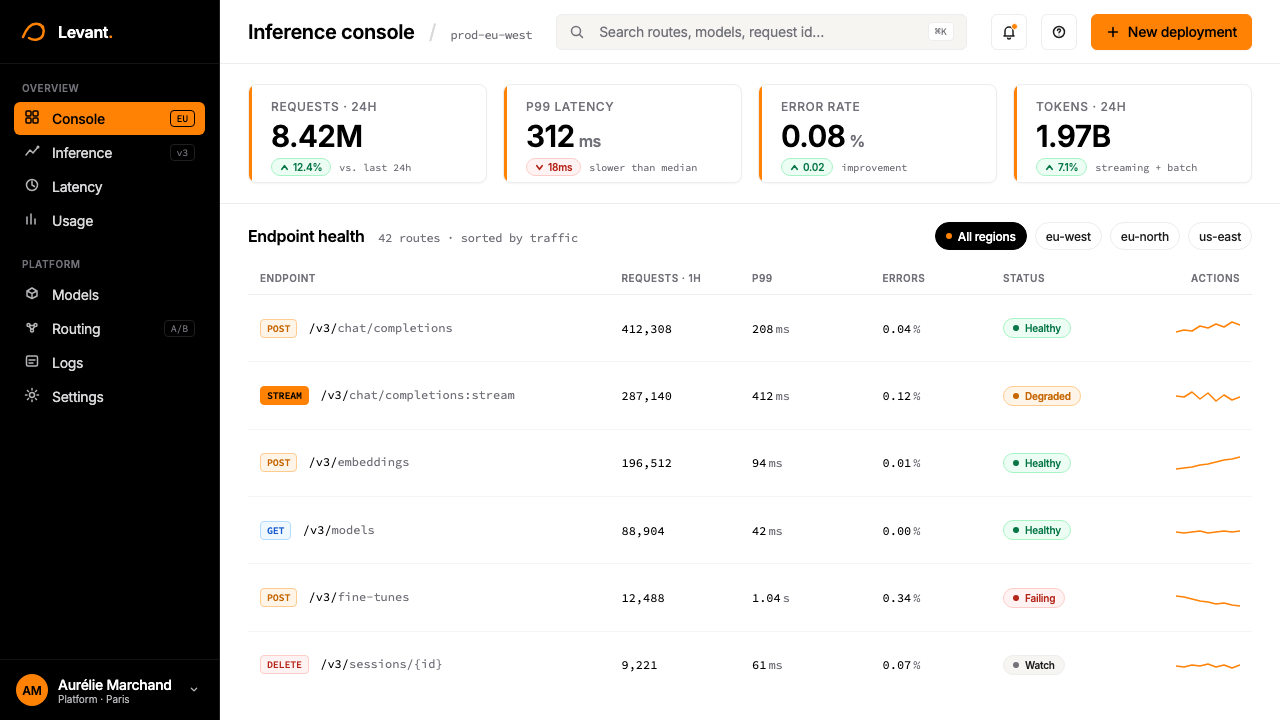
Beyond the orange, the palette is limited to deep black and pure white or near-white grounds, with occasional warm light grey used for secondary surface areas. No tertiary colors, no saturated blues or greens, no rainbow data-visualization palettes. When data requires multiple colors — as in a chart with several series — the system uses tints of the primary three rather than introducing new hues. This creates a coherence rare among AI products, which tend toward color proliferation.除橙色之外,色板仅限于深黑与纯白或近白的底面,偶尔使用温暖的浅灰作为次级界面区域。没有第三色,没有饱和蓝或绿,没有彩虹数据可视化色板。当数据需要多种颜色时——如多系列图表——系统使用主色三原的色调变体,而非引入新的色相。这创造了 AI 产品中罕见的统一感,因为 AI 产品通常倾向于色彩扩散。
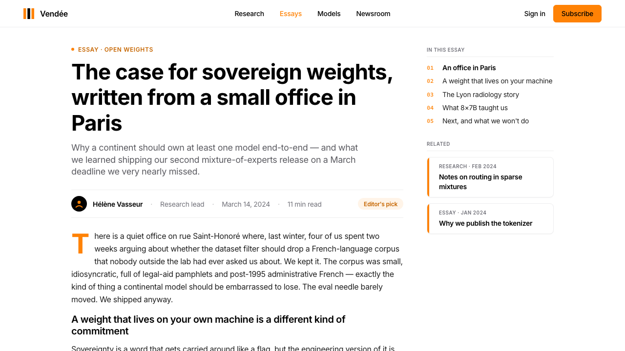
Modern Sans-Serif Typography现代无衬线排版
Text is set in refined, geometrically influenced sans-serif typefaces with tight letter-spacing at display sizes and generous line-spacing in body text. The system uses typeface scale — dramatic differences in size between levels — as its primary hierarchy device rather than color or decorative rules. Headlines are large and confident; body text is deliberately modest and readable. All-caps labels appear for secondary navigation and metadata, following European modernist typographic conventions.文字使用精炼的、受几何影响的无衬线字体排版,展示尺寸下字距收紧,正文行距留有充足呼吸感。系统以字体尺度——各级别之间显著的大小差异——作为主要层级手段,而非依赖色彩或装饰线条。标题大而自信;正文刻意低调且易读。大写标签用于次级导航和元数据,遵循欧洲现代主义排版惯例。
Generous Whitespace Grid慷慨留白网格
The layout system is built on a rigorous grid with wide margins and generous inter-element spacing. Content never crowds the edges; sections breathe. This whitespace is not decorative — it is structural, giving each visual element the isolation it needs to carry weight. The effect on screen is one of calm authority: the product appears unhurried, in control, and assured enough not to fill every pixel.版面系统建立在严格的网格上,配以宽阔页边距和充裕的元素间距。内容从不逼近边缘;各部分都有呼吸空间。这种留白不是装饰性的——它是结构性的,赋予每个视觉元素所需的独立感,以便承载分量。在屏幕上呈现的效果是一种平静的权威:产品显得从容、掌控,以及自信到不必填满每一个像素。
Flowing-Curve Wind Motif流动曲线风之母题
Abstract flowing curves — evoking the Mistral wind — appear as a decorative system distinct from everything else in the identity. They are smooth and organic against the otherwise rectilinear composition; they may occupy large areas as background illustration or appear as contained graphic elements. Their function is expressive and differentiating: they are the only element that does not conform to the geometric grid logic, and they prevent the system from reading as cold or purely corporate.抽象的流动曲线——令人联想到密史脱拉风——作为有别于形象中其他一切的装饰系统存在。它们在以直角为主的构图中显得流畅而有机;它们可以作为背景插画占据大面积区域,也可以作为独立的图形元素出现。它们的功能是表现性和差异化的:它们是唯一不遵从几何网格逻辑的元素,防止整个系统被解读为冷漠或纯粹企业化。
Flat Surfaces, No Decorative Depth平面界面,无装饰深度
Interface elements — cards, panels, buttons, inputs — are rendered with flat fills and clean borders rather than soft shadows, blur, or glassmorphism effects. Where depth is indicated at all, it is suggested through border contrast and layered flat planes rather than atmospheric shadow. The visual result is crisp and print-like, consistent with the European modernist tradition of treating the screen as a designed page rather than a simulated three-dimensional space.界面元素——卡片、面板、按钮、输入框——以平面填充和干净边框渲染,而非使用柔和阴影、模糊或玻璃形态效果。在表达深度时,也是通过边框对比和叠加的平面层次暗示,而非大气投影。视觉效果清晰、类似印刷,与欧洲现代主义将屏幕视为设计页面而非模拟三维空间的传统一脉相承。
Restrained Technical Iconography克制的技术图标语言
Icons and interface symbols are drawn with consistent, moderate stroke weight, remaining geometric and minimal in form. No skeuomorphic metaphors, no playful rounded characters, no gradient icon fills. Each symbol is legible at small scale and maintains tonal neutrality — it does not call attention to itself but serves the surrounding information. The icon language reads as a tool vocabulary, not an expressive one.图标与界面符号以一致、适中的线条粗细绘制,形式几何而简洁。没有拟物比喻,没有俏皮的圆润造型,没有渐变图标填充。每个符号在小尺寸下清晰可辨,并保持色调中性——它不吸引注意力于自身,而是服务于周围的信息。图标语言呈现出工具性词汇,而非表现性词汇。
See the Mistral AI Orange design system查看 Mistral AI Orange 完整设计系统
Who shaped Mistral AI Orange?谁塑造了 Mistral AI Orange?
Mensch is a co-founder and the CEO of Mistral AI. Before founding Mistral, he was a researcher at Google DeepMind in Paris, where he worked on large-scale model training and efficiency. His public positioning of Mistral as a European sovereign AI project — rather than merely a technical venture — gave the brand its explicit political dimension and shaped the seriousness and national confidence that run through the visual identity.Mensch 是 Mistral AI 的联合创始人兼首席执行官。在创立 Mistral 之前,他是 Google DeepMind 巴黎团队的研究员,专注于大规模模型训练与效率方向。他将 Mistral 公开定位为欧洲主权 AI 项目——而非单纯的技术创业——赋予了品牌明确的政治维度,并塑造了贯穿视觉形象的严肃感与国家自信。
Lample is a co-founder and Chief Scientist at Mistral AI, and was previously a researcher at Meta AI Research, where he co-developed the LLaMA family of open-weight language models. His commitment to open-weight model releases — making the model weights publicly accessible — became one of Mistral's most discussed brand positions. This openness philosophy influenced the visual identity's transparency and clarity: a system with nothing to hide has no need for obfuscation.Lample 是 Mistral AI 的联合创始人兼首席科学家,此前曾任 Meta AI Research 研究员,并在那里联合开发了 LLaMA 系列开源权重语言模型。他对开源权重模型发布的坚持——将模型权重公开——成为 Mistral 最受讨论的品牌立场之一。这种开放性哲学影响了视觉形象的透明与清晰:一个无所隐藏的系统不需要任何遮蔽。
Lacroix is a co-founder and Chief Technology Officer at Mistral AI, also formerly of Meta AI Research. His deep infrastructure expertise shaped the company's technical credibility, and by extension its brand posture: Mistral presents itself as a builder of serious, production-grade technology, and the uncompromising cleanness of the visual system — no flourishes, no apologies — mirrors that engineering culture.Lacroix 是 Mistral AI 的联合创始人兼首席技术官,同样来自 Meta AI Research。他深厚的基础设施专业知识塑造了公司的技术公信力,并进而影响了品牌姿态:Mistral 将自己呈现为严肃的、生产级技术的构建者,而视觉系统毫不妥协的干净——无花哨,无歉意——正是这种工程师文化的镜像。
The Mistral wind — a cold, powerful, and remarkably consistent northwesterly that scours the Rhône valley and the coasts of Provence — is not a person but a genuine conceptual co-author of the brand. The founders chose it as the company name deliberately: it implies force, constancy, and European geographic rootedness. In the visual system its legacy is the flowing abstract curve motif, the only organic element in an otherwise rectilinear design language. It is the brand's Mediterranean soul.密史脱拉风——一股寒冷、强劲、出奇稳定的西北风,横扫罗讷河谷与普罗旺斯海岸——不是一个人,却是品牌真正意义上的概念联合创作者。创始人刻意以它命名公司:意指力量、恒久,以及欧洲地理上的根植感。在视觉系统中,它的遗产是那条流动的抽象曲线母题——在其他一切直角设计语言中唯一有机的元素。它是这个品牌的地中海灵魂。
Not a single figure but a political and cultural context that is inseparable from the Mistral brand. The European Commission's AI Act, debates over data residency and model governance, and broader anxieties about dependence on American and Chinese AI infrastructure all form the backdrop against which Mistral positioned itself. The visual identity's refusal of Silicon Valley aesthetic conventions — its orange rather than blue, its restraint rather than exuberance — is as much a statement in this political conversation as a design choice.这不是一个具体人物,而是一个与 Mistral 品牌不可分割的政治与文化语境。欧盟《人工智能法》、关于数据存储和模型治理的辩论,以及对依赖美国和中国 AI 基础设施的更广泛焦虑,共同构成了 Mistral 自我定位的背景。这套视觉形象对硅谷审美惯例的拒绝——用橙色而非蓝色,用克制而非张扬——在这场政治对话中同样是一种表态,而不仅仅是一个设计选择。
How do you use Mistral AI Orange today?今天怎么用 Mistral AI Orange?
Mistral AI Orange is a high-discipline system: its power comes precisely from constraint. Applying it correctly requires resisting the temptation to supplement the palette, soften the edges, or add decorative variety for the sake of visual interest. The fewer liberties taken with the system, the more authoritative and coherent the output. Before beginning any composition, establish the hierarchy of three: which element carries the orange, which elements are black, which areas stay white.Mistral AI Orange 是一套高纪律的系统:它的力量恰恰来自约束。正确应用它,需要抵制补充色板、软化边缘或为视觉趣味增添装饰多样性的诱惑。对系统的自由发挥越少,输出就越权威、越连贯。在开始任何构图之前,先建立三元层级:哪个元素承载橙色,哪些元素用黑色,哪些区域保持白色。
For presentation slides, the system yields strong covers through a simple formula: large flowing-curve graphic in orange on a deep black or pure white field, company or project name in a single bold sans-serif treatment, and no other visual information on the page. Content slides should commit to the whitespace grid — one or two text hierarchy levels, a ruled horizontal line for structure, and orange reserved for one key number or label per slide. Data slides benefit from treating charts as objects: bar and line elements in orange against a white ground, with black axis labels, and no background grid lines competing with the data.在演示文稿中,这套系统以简单的公式产出强劲的封面:在深黑或纯白底面上,大面积的流动曲线图形以橙色呈现,公司或项目名称以单一粗体无衬线字体排印,页面上没有其他视觉信息。内容页应当坚守留白网格——一到两个文字层级,一条水平线用于结构,橙色保留给每张幻灯片上的一个关键数字或标签。数据页受益于将图表视为对象的处理方式:柱状和折线元素以橙色在白色底面上呈现,黑色轴标签,无背景网格线与数据竞争。
For web dashboards and product interfaces, the system maps cleanly to a dark or light mode. In the light variant, the page ground is white or very lightly warmed, primary text is near-black, and the orange appears on primary buttons, active states, progress indicators, and key metric values. In the dark variant, the ground shifts to a very deep neutral, text becomes white, and the orange retains its same structural role. Both variants must maintain the flat-surface logic: avoid blurred panel backgrounds, soft card shadows, and gradient fills, which visually conflict with the system's tonal authority. Pricing pages are particularly well served by this aesthetic — the restrained palette reads as premium and trustworthy, the whitespace signals that the product has nothing to hide.在网页仪表板和产品界面中,这套系统能干净地映射到深色或浅色模式。浅色变体下,页面底面为白色或极轻的暖调,主要文字接近黑色,橙色出现在主按钮、激活状态、进度指示器和关键指标值上。深色变体下,底面转为极深的中性色,文字变为白色,橙色保持同样的结构性角色。两种变体都必须维持平面界面逻辑:避免模糊的面板背景、柔和的卡片阴影和渐变填充,这些在视觉上与系统的色调权威相冲突。定价页面特别适合这种美学——克制的色板传达高端与可信,留白表明产品无所隐藏。
For editorial layouts, marketing pages, and conference materials, the system supports the kind of bold information hierarchy familiar from European modernist poster design. A cover treatment might use the flowing orange curves across the full width, with a large white headline reversed out of a black field. Section headers within a document should be typographically scaled rather than colored — large and heavy sans-serif, not orange text. Pull quotes and call-outs can use an orange left border rule as the sole color accent. The effect, sustained across a multi-page document, reads as serious and sophisticated rather than playful.对于编辑排版、营销页面和会议材料,这套系统支持欧洲现代主义海报设计中那种熟悉的大胆信息层级。封面处理可以让橙色流动曲线横跨全宽,配合大号白色标题从黑色底面反白而出。文档内部的章节标题应以排版尺度而非颜色区分——大而粗重的无衬线,而非橙色文字。引言和强调段落可以用橙色左边框线作为唯一色彩强调。这种效果在多页文档中持续呈现,读来严肃而精致,而非轻巧。
A common mistake when working with this system is treating orange as a fill color rather than an accent. When orange covers large background areas — full panels, section backgrounds, full-width bands — it becomes visually aggressive and loses its signal function. The palette works because orange is rare: it should appear on roughly ten to twenty percent of any given layout at most, with the remainder held by black, white, and negative space. A second frequent error is introducing a second accent color — a teal, a sage, a dusty purple — to 'warm up' or 'balance' what feels like a stark system. This always weakens the identity. The starkness is the point.使用这套系统时最常见的错误,是将橙色当作填充色而非强调色。当橙色覆盖大面积背景区域——整个面板、区域背景、全宽色带——时,它在视觉上变得激进,并失去其信号功能。这套色板之所以奏效,正因为橙色很稀少:在任何给定版面上,它最多应出现在约十到二十个百分点的面积中,其余由黑色、白色和负空间把持。第二个常见错误是引入第二种强调色——一抹青绿、一抹鼠尾草绿、一抹尘紫——来「温暖」或「平衡」感觉过于严苛的系统。这始终会削弱形象。严苛本身就是重点。
See the Mistral AI Orange design system查看 Mistral AI Orange 完整设计系统
Mistral AI Orange — FAQMistral AI Orange · 常见问题
Is this style suitable for non-AI products, or is it too tightly associated with Mistral?这种风格适合非 AI 产品吗?还是说它与 Mistral 的关联太过紧密?
The underlying visual system — orange-black-white discipline, generous whitespace, flat surfaces, modernist sans-serif — is a broadly applicable design language that predates Mistral and will outlast it. Mistral made a particularly clean and committed execution of it, but the principles are not proprietary. Products in enterprise software, fintech, data tooling, legal technology, and other credibility-first sectors can all benefit from the same discipline without reading as Mistral clones, provided the specific decorative motifs (particularly the flowing curves) are not directly copied.其底层视觉系统——橙黑白的纪律、慷慨的留白、平面界面、现代主义无衬线——是一套早于 Mistral 存在、也将超越它而长存的广泛适用设计语言。Mistral 对它的执行特别干净而坚定,但这些原则并非专有。企业软件、金融科技、数据工具、法律科技以及其他以公信力为先的行业产品,都可以从同样的纪律中获益,而不会被读作 Mistral 的克隆——只要不直接复制特定的装饰母题(尤其是那条流动曲线)。
How should the orange be used in dark-mode interfaces specifically?在深色模式界面中,橙色具体应该如何使用?
In a dark-mode implementation, the orange retains its accent role but demands slightly more care in proportion. Against a near-black ground, saturated orange is visually loud; it carries more perceptual weight than it does on white. The solution is not to change the hue but to use it more sparingly — reserve it for primary interactive elements (the main action button, the active navigation state, the current row highlight) and let the dark field carry the structural weight everywhere else. Avoid using orange for decorative fills or large graphic areas in dark mode; the contrast ratio becomes overwhelming and loses the signal quality that makes orange useful.在深色模式下,橙色保持其强调角色,但在比例上需要稍加注意。在近黑底面上,饱和橙色在视觉上更为响亮;它比在白色底面上承载更多的感知分量。解决方案不是改变色相,而是更节制地使用它——将其保留给主要交互元素(主行动按钮、激活导航状态、当前行高亮),让深色底面在其他所有地方承载结构分量。避免在深色模式下将橙色用于装饰性填充或大面积图形区域;对比度会变得压倒性,失去使橙色有用的信号质量。
Can the flowing-curve motif be removed without losing the style's identity?去掉流动曲线母题是否会失去这种风格的形象特征?
The curves are differentiating but not load-bearing. The core identity — the color discipline, the whitespace, the typographic hierarchy, the flat-surface logic — survives without them and remains visually coherent. The curves add expressive warmth and a natural, almost lyrical quality that prevents the system from reading as purely corporate modernism. Omitting them produces a cleaner, more austere system that is still recognizably within the same design family. Adding them in inappropriate contexts — very dense data tables, small-format cards, heavily technical documentation — would be a mistake; they are most effective at large scale on covers, heroes, and section transitions.这些曲线具有差异化价值,但并非系统的承重结构。核心形象——色彩纪律、留白、排版层级、平面界面逻辑——离开它们仍然完整,视觉上依然连贯。曲线添加了表现性的温暖感和一种自然的、近乎抒情的品质,防止系统被解读为纯粹的企业现代主义。省略它们会产生一个更干净、更简朴的系统,但它在视觉上仍然明确属于同一设计家族。在不适合的场合使用它们——密集数据表格、小尺寸卡片、高度技术性文档——将是一个错误;它们最有效的场合是在封面、英雄区块和章节过渡处的大尺度应用。
How does this style differ from other monochromatic tech-brand design systems?这种风格与其他单色调科技品牌设计系统有什么不同?
Many technology companies use a single-accent system, but most choose cool colors — blue, green, or purple — that align with associations of trust, growth, or intelligence in English-speaking market contexts. Mistral's choice of orange is unusual in enterprise AI, and its warmth gives the system a different emotional temperature: more confident than reassuring, more assertive than approachable. The European modernist typographic sensibility also distinguishes it from American tech brands, which tend toward a friendlier, more rounded sans-serif style. Mistral's type sits upright and tight; it does not smile.许多科技公司使用单一强调色系统,但大多数选择冷色——蓝色、绿色或紫色——这些颜色在英语市场语境中与信任、成长或智能的联想相吻合。Mistral 选择橙色在企业 AI 领域不同寻常,其温暖感赋予系统不同的情感温度:更偏自信而非安抚,更偏断言而非亲近。欧洲现代主义排版感性也将其与美国科技品牌区分开来——美国科技品牌倾向于更友好、更圆润的无衬线风格。Mistral 的字体端正而紧凑;它不会微笑。
What kinds of products or contexts should avoid this design system?哪些类型的产品或场景应该避免使用这套设计系统?
The system performs poorly in contexts where warmth, playfulness, or sensory richness are primary values. Consumer-facing wellness apps, children's educational products, food and beverage brands, and creative tools aimed at non-technical audiences will find the palette and structural discipline at odds with their communication goals. Similarly, the style is a poor fit for brands that need to convey community, informality, or accessibility — the visual gravity of deep black and saturated orange reads as professional authority, not openness. Contexts requiring diverse representation of joy, color, or cultural multiplicity are better served by a more expressive palette.在温暖感、趣味性或感官丰富性是主要价值的场景中,这套系统表现欠佳。面向消费者的健康应用、儿童教育产品、食品饮料品牌,以及面向非技术受众的创意工具,都会发现这套色板和结构纪律与其传播目标相悖。同样,这种风格也不适合需要传达社群感、非正式性或包容性的品牌——深黑与饱和橙色的视觉重力读作专业权威,而非开放。需要多元化表达喜悦、色彩或文化多样性的场景,更适合使用更具表现力的色板。
Related design styles相关设计风格
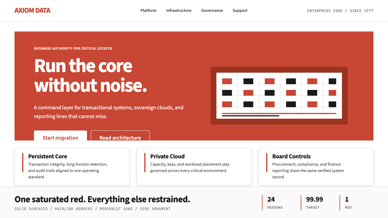 Oracle Corporate RedEnterprise certainty. Saturated red, tight sans, and white space do all the w…企业级确定感:饱和红、紧排无衬线与大留白撑起全部气场。
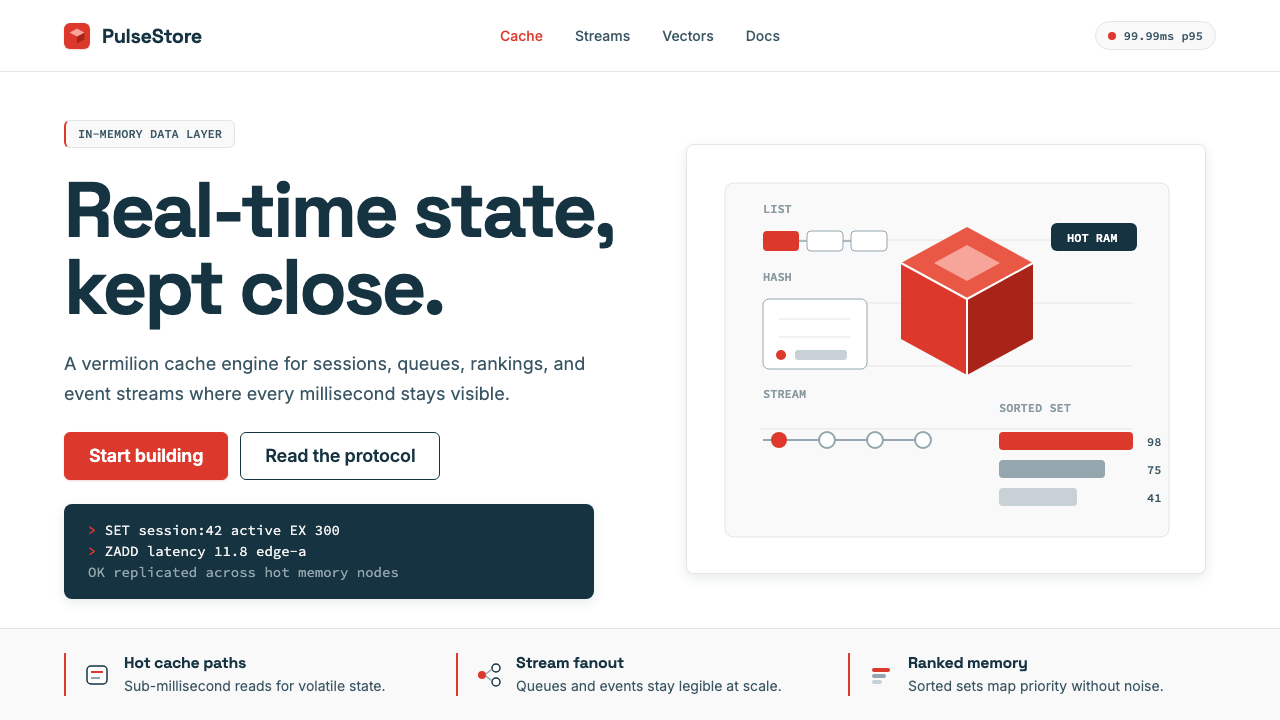 Redis Cache RedWarm database rigor. Vermilion cube, slate type, and white-space grids make s…温热的数据库秩序:朱红立方、板岩字色与留白网格,让速度可读。
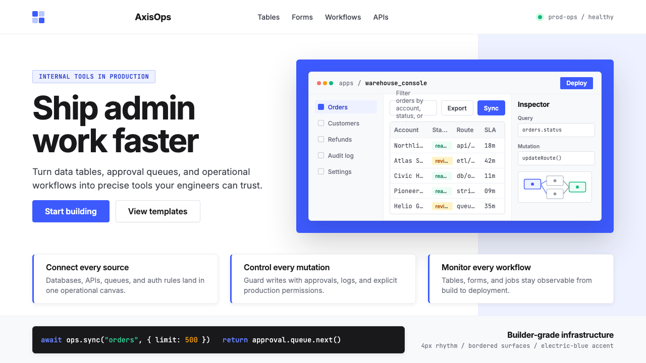 Retool Internal-Tools RedPrecision ships fast. Electric blue panels, Inter type, and bordered UI mocku…精准而快速。电光蓝面板、Inter 字体和边框 UI 模型撑起气质。
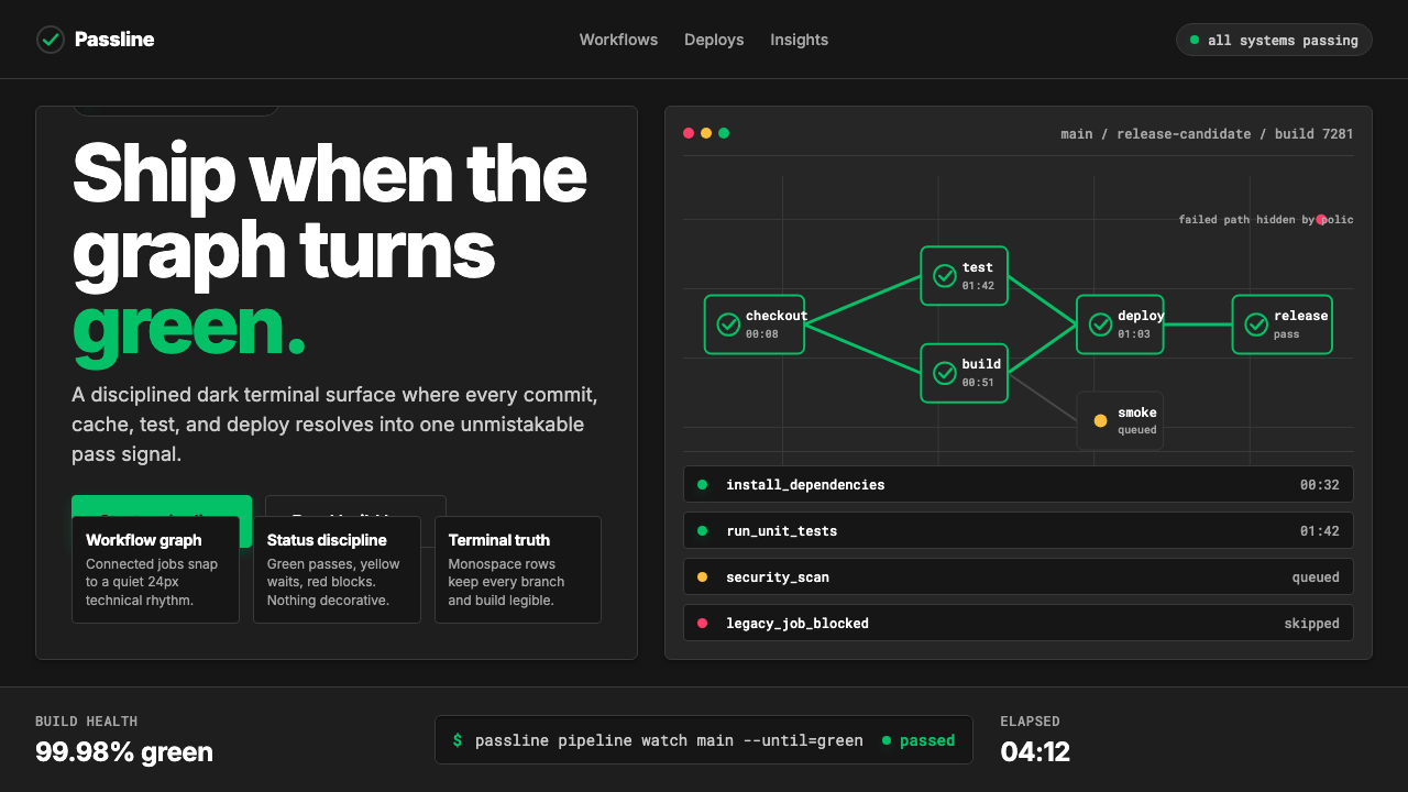 CircleCI Pipeline-GreenConfidence goes green. Emerald status lines cut through terminal-black pipeli…信心变绿。翠绿状态线切过终端黑流水线网格。
 Adobe Creative CloudUnified, not uniform. Red anchor, white space, and saturated app tiles organi…统一而不单一:红色锚点、留白与高饱和应用方块组织整套工具。
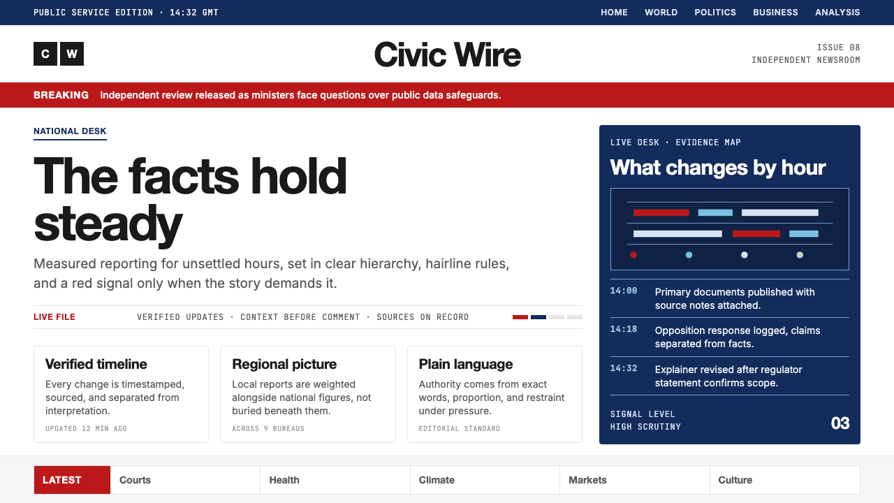 BBC NewsPublic trust, stripped bare. Red alerts, deep navy and hairline grids make ur…公共信任被剥至纯粹:红色警示、深海军蓝与发丝网格,让紧迫保持事实感。