What is Redis Cache Red?什么是 Redis Cache Red?
Redis Cache Red translates the world's fastest in-memory database into a visual identity — vermilion precision, slate discipline, and white-space generosity that make raw throughput feel designed.Redis Cache Red 将全球最快的内存数据库转译为一套视觉语言——朱红的精准、板岩的克制与留白的慷慨,让原始吞吐量变得可读、可感。
Redis Cache Red in briefRedis Cache Red 速览
Redis Cache Red is the visual design system that emerged from the redis.io brand: a tightly constrained palette anchored by a single saturated vermilion-red, balanced against deep slate-navy and generous expanses of pure white. The system is defined less by what it includes than by what it refuses — gradient fills, decorative illustration, competing accent colors, and any typographic flourish that cannot be justified by information hierarchy.Redis Cache Red 是从 redis.io 品牌中生长出来的视觉设计体系:色板极度克制,以单一饱和朱红为锚点,与深海军灰和大面积纯白形成平衡。这套系统的特征,与其说在于它纳入了什么,不如说在于它拒绝了什么——渐变填充、装饰性插图、相互竞争的强调色,以及一切无法以信息层级为由的字体修饰。
The aesthetic owes its character to the software it represents. Redis — Remote Dictionary Server — is an in-memory key-value store celebrated for sub-millisecond response times. Every visual decision in the Redis identity reflects this engineering culture: geometric sans-serif type conveys precision without warmth; the three-dimensional cube logo motif signals data structure and spatial reasoning; technical diagrams of lists, hashes, sorted sets, and streams replace representational imagery entirely. The design communicates that the product has been engineered, not merely built.这套美学的气质源自它所代表的软件。Redis——远程字典服务器——是一个以亚毫秒级响应时间著称的内存键值存储。Redis 视觉识别的每一个决定都折射出这种工程文化:几何无衬线字体传递精准而非温情;三维立方体 Logo 母题暗示数据结构与空间推理;列表、哈希、有序集合与流的技术示意图完全取代了具象图像。这套设计传达的信息是:这个产品是被精密工程化过的,而不仅仅是被构建出来的。
What sets Redis Cache Red apart from other developer-brand systems is its balance of warmth and rigor. The anchor red is not the cold red of a warning system or the corporate red of a financial institution — it is vermilion, a hue that carries historical associations with craft, urgency, and human attention. Paired with deep slate and open white space, it reads as both technically authoritative and approachable, a visual embodiment of open-source software that also runs enterprise infrastructure.Redis Cache Red 区别于其他开发者品牌体系的,是它在温度与严格性之间的平衡。那个锚点红不是预警系统的冷红,也不是金融机构的企业红——它是朱红,一个带有手工、紧迫感与人类注意力历史联想的色相。与深板岩和开阔的留白并置,它既传递技术权威,又透出亲和力,是开源软件同时承载企业级基础设施这一双重身份的视觉化身。
See the Redis Cache Red design system查看 Redis Cache Red 完整设计系统
Where does Redis Cache Red come from?Redis Cache Red 从何而来?
Redis was created in 2009 by Salvatore Sanfilippo, known online as antirez, a Sicilian programmer who initially built it to solve a performance problem with his own startup's real-time web log analysis tool. The original codebase, written in C, was published as open source almost immediately. Within months it had attracted contributors from across the internet, drawn by its elegant design: a small, fast, reliable store for data structures that other systems could not serve at comparable speeds.Redis 于 2009 年由萨尔瓦托雷·桑菲利波(网名 antirez)创建,这位西西里程序员最初是为了解决自己创业项目中实时网络日志分析工具的性能瓶颈。最初用 C 语言编写的代码库几乎立刻以开源形式发布。数月内,它已吸引来自世界各地的贡献者,原因在于其优雅的设计:一个小巧、快速、可靠的数据结构存储,能以其他系统无法比拟的速度提供服务。
The project's visual identity in its early years was minimal to the point of near-absence — a functional website, documentation, and a simple logo that communicated little beyond the name. The cube motif that would later anchor the brand appeared gradually as the community grew and Redis began to be used in production at major internet companies including Twitter, GitHub, and Stack Overflow. By 2011, when Yiftach Shoolman and Ofer Bengal founded Redis Labs (later renamed Redis Inc.) to build a commercial layer on top of the open-source project, the need for a more deliberate visual identity became apparent.项目早期的视觉识别几乎可以说是缺席的——一个功能性网站、文档,以及一个简单的 Logo,传达的信息仅止于名称本身。日后成为品牌核心的立方体母题随着社区的成长而逐渐浮现,彼时 Redis 已开始在推特、GitHub、Stack Overflow 等主要互联网公司的生产环境中运行。2011 年,伊夫塔赫·舒尔曼与奥弗·孟加拉创立 Redis Labs(后更名为 Redis Inc.),在开源项目之上构建商业层,更刻意的视觉识别体系的必要性由此变得清晰。
The brand that is now recognizable as Redis Cache Red took its mature form through a series of refinements across the 2010s, crystallizing with a significant visual refresh in the early 2020s. The decisions made in that refresh — committing to vermilion as the sole chromatic anchor, establishing the white-ground grid as the primary surface, adopting geometric sans-serif type for all interfaces — reflected both the design sensibilities of the era and the company's ambition to position Redis as infrastructure-grade software alongside products from major cloud vendors.如今可辨识为 Redis Cache Red 的品牌,经历了 2010 年代数轮打磨,在 2020 年代初的一次重大视觉刷新中定型。那次刷新中的决策——以朱红作为唯一色彩锚点,确立白底网格为主要载体,在所有界面上采用几何无衬线字体——既折射出那个时代的设计取向,也体现出公司将 Redis 定位为与主要云服务商产品并肩的基础设施级软件的雄心。
The movement that Redis Cache Red belongs to is broader than any single company: it is the visual language of the commercial open-source business, a category that includes Elastic, HashiCorp, Grafana, and MongoDB. These brands share a set of instincts — technical illustration over photography, monospace type for code, a bold single-color anchor, restrained secondary palettes — that signal authenticity to developer audiences. Redis Cache Red is a particularly pure example of this language, distinguished by the warmth of its anchor hue and the three-dimensional geometric confidence of its logo mark.Redis Cache Red 所属的运动比任何单一公司都更为宏观:那是商业开源企业的视觉语言,Elastic、HashiCorp、Grafana、MongoDB 都在其中。这些品牌共享一套直觉——技术插图优于摄影图片、代码用等宽字体、一个醒目的单色锚点、克制的辅助色板——这套直觉向开发者受众传递真实性。Redis Cache Red 是这套语言中尤为纯粹的范例,以锚点色相的温暖感与 Logo 标志的三维几何自信著称。
What defines the Redis Cache Red look?Redis Cache Red 的视觉特征是什么?
Vermilion Anchor朱红锚点
The entire Redis palette orbits a single saturated red that reads as warm rather than aggressive — closer to the red of a wax seal or a craftsman's tool handle than to a warning indicator. This hue appears in the logo, primary call-to-action elements, and key navigation highlights; everywhere else, the palette is deliberately neutral. The discipline of a single chromatic anchor gives every appearance of that red tremendous visual weight, making it impossible to overlook while remaining coherent across dark and light contexts.整套 Redis 色板围绕一个饱和红旋转,这个红读来温暖而非攻击性——更接近封蜡印章或工匠工具手柄的红,而非预警指示灯的红。它出现在 Logo、主要行动号召元素和关键导航高亮处;其余所有地方,色板刻意保持中性。单一色彩锚点的纪律使这个红每次出现都具有极强的视觉重量,令人无法忽视,同时在深色与浅色语境中均能保持一致。
Geometric Cube Motif几何立方体母题
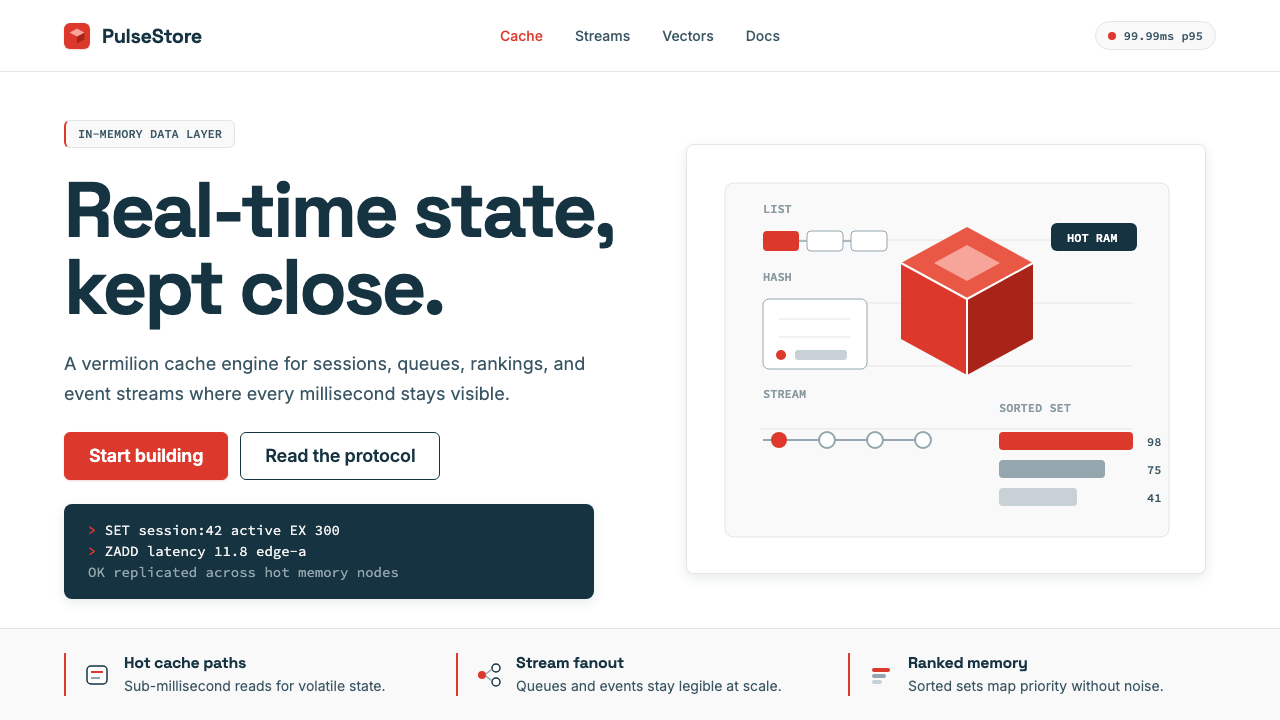
The three-dimensional cube that anchors the Redis logo is not decorative — it is a direct reference to the data structures that Redis stores and retrieves. In the wider design system, this geometric confidence extends to technical illustrations: data structures are rendered as clean isometric or axonometric diagrams, lists appear as stacked rectangles, streams as flowing sequences of blocks. The cube functions as a visual metaphor that bridges brand identity and product explanation.锚定 Redis Logo 的三维立方体并非装饰性的——它是对 Redis 存储和检索的数据结构的直接引用。在更宽泛的设计体系中,这种几何自信延伸至技术插图:数据结构以干净的等轴或斜投影图呈现,列表显现为堆叠的矩形,流呈现为连续流动的块状序列。立方体作为视觉隐喻,在品牌识别与产品说明之间架起了桥梁。
White-Ground Grid白底网格
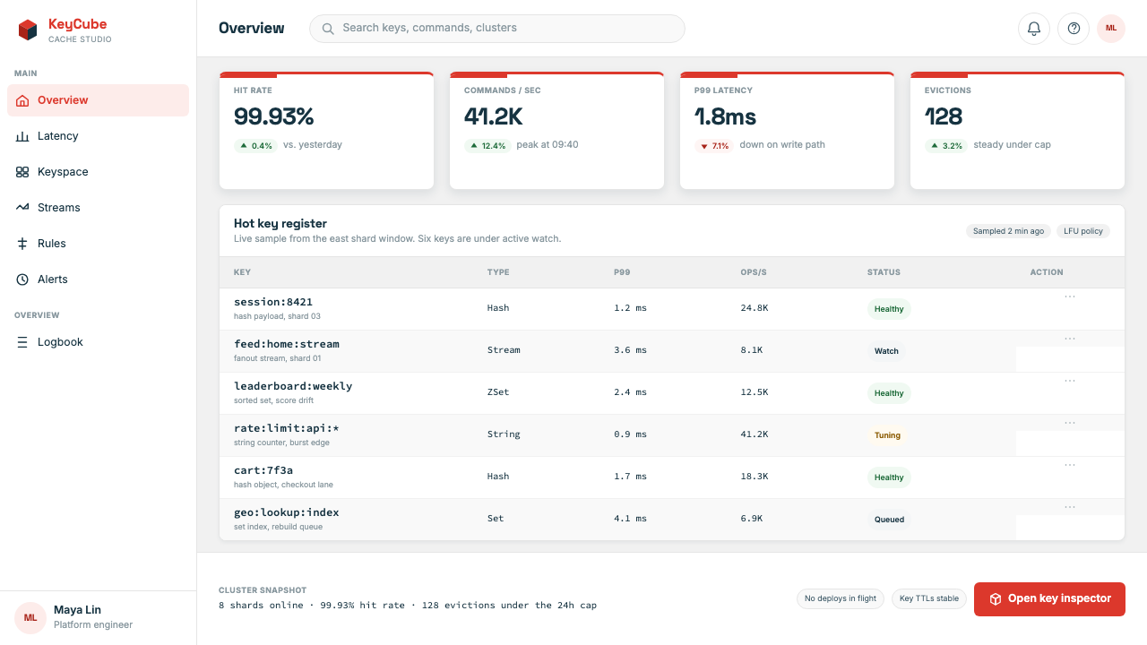
Pure white is the dominant surface across all Redis visual output — marketing pages, documentation, developer console, and presentation materials alike. This white-ground approach is not minimalism for its own sake but a functional choice: white maximizes the contrast of code snippets in monospace type, gives technical diagrams the breathing room they need to be readable, and ensures that the vermilion anchor color retains its full impact whenever it appears. The grid underlying this white space is strict, creating alignment so consistent that the layout itself becomes a signal of engineering discipline.纯白是 Redis 所有视觉输出的主导底面——营销页面、文档、开发者控制台与演示材料皆如此。这种白底方式并非为了极简而极简,而是功能性的选择:白色最大化等宽字体代码片段的对比度,给技术示意图以必要的呼吸空间使其可读,并确保朱红锚点每次出现都保有完整的视觉冲击力。白色空间之下的网格是严格的,形成如此一致的对齐关系,以至于版面本身就成为工程纪律的信号。
Technical Illustration over Photography技术插图优于摄影
Photographic imagery is largely absent from the Redis visual system. In its place, clean technical diagrams explain how data flows through the system: keys and values rendered as labeled blocks, replication topology shown as connected nodes, cluster architecture laid out as a spatial map. These illustrations are rendered in a flat or lightly dimensional style, using the brand palette with black type and restrained use of the anchor red for emphasis. The choice signals authenticity to developer audiences who are trained to read diagrams and are skeptical of stock photography.摄影图像在 Redis 视觉体系中几乎缺席。取而代之的是干净的技术图解,说明数据如何在系统中流动:键值对以带标签的块状图呈现,复制拓扑以连接节点展示,集群架构以空间地图铺陈。这些插图以平面或轻微立体的风格渲染,使用品牌色板、黑色字体,朱红锚点色克制地用于强调。这种选择向开发者受众传递真实性——他们被训练得善于阅读图解,对库存摄影持有警觉。
Monospace Code as Visual Element等宽代码作为视觉元素
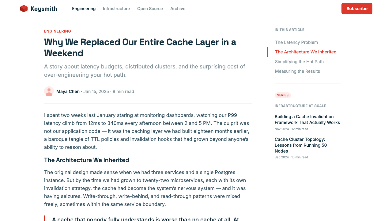
Code snippets in a monospace typeface are not merely functional inclusions in Redis design — they are treated as visual elements in their own right. Command syntax, output examples, and configuration snippets appear in lightly tinted code blocks that break the visual rhythm of prose, creating a distinctive alternation between explanation and demonstration. The monospace type signals technical seriousness, while the careful framing of code blocks within the wider white-space grid ensures they read as designed rather than dropped in.等宽字体的代码片段在 Redis 设计中不仅仅是功能性的插入——它们本身被当作视觉元素对待。命令语法、输出示例与配置片段出现在带有淡色调的代码块中,打破散文的视觉节奏,在解释与演示之间形成独特的交替。等宽字体传递技术严肃性,而代码块在更宽泛的留白网格中的精心取景,确保它们读来是被设计过的,而非随手丢进去的。
Slate Navy Secondary Palette板岩海军蓝辅助色板
Supporting the vermilion anchor is a deep slate-navy that appears in secondary navigation, footer regions, code block backgrounds in dark-mode contexts, and tier or category differentiation. This secondary color is dark enough to carry white type at full legibility and cool enough in tone to counterbalance the warmth of the red without competing for dominance. The relationship between the warm anchor and the cool secondary creates a quiet tension that keeps pages visually active without requiring additional hues.支撑朱红锚点的是深板岩海军蓝,出现在次级导航、页脚区域、深色模式下的代码块背景,以及层级或类别区分中。这个辅助色足够深,能让白色文字以完整可读性呈现,色调足够冷,能在不与红争夺主导权的情况下抗衡红的温暖感。温暖锚点与冷色辅助之间的关系制造出一种安静的张力,让页面在不需要额外色相的前提下保持视觉活力。
Geometric Sans-Serif Type Hierarchy几何无衬线字体层级
Typography in the Redis system is built on geometric sans-serif faces that echo the cube motif's rationalism. Headlines are set large and with deliberate weight contrast against body text; section labels and metadata are stepped down in scale but not in family, maintaining visual coherence across a page. The type hierarchy communicates through size and weight alone — no italic flourishes, no decorative capitals, no ornamental separators. This typographic restraint ensures that the vermilion anchor and the technical diagrams carry the expressive burden of the design, while type itself remains infrastructure.Redis 体系的排版建立在几何无衬线字体之上,与立方体母题的理性主义相互呼应。标题以大号字和刻意的字重对比置于正文之上;段落标签与元数据在尺度上降档但不换字族,在整个页面中维持视觉连贯性。字体层级仅通过大小和字重传达——无斜体花饰,无装饰性大写,无点缀性分隔符。这种排版克制确保朱红锚点和技术图解承担设计的表现负担,而字体本身则退守为基础设施。
See the Redis Cache Red design system查看 Redis Cache Red 完整设计系统
Who shaped Redis Cache Red?谁塑造了 Redis Cache Red?
The Sicilian programmer who created Redis in 2009 while solving a real-time performance problem for his own startup. Sanfilippo's instinct to build a small, elegant, purpose-specific tool rather than a general-purpose database shaped Redis's entire engineering philosophy — and, by extension, the visual identity that would eventually represent it. His decision to open-source the project immediately meant that the aesthetic of Redis grew alongside a global community rather than inside a single design department.这位西西里程序员于 2009 年为解决自己创业项目中的实时性能问题而创建了 Redis。桑菲利波选择构建一个小巧、优雅、专用工具而非通用数据库的直觉,塑造了 Redis 整个工程哲学——进而塑造了最终代表它的视觉识别。他立即将项目开源的决定意味着 Redis 的美学是随全球社区共同成长的,而非在单一设计部门内部孕育的。
Co-founder and former CTO of Redis Inc., Shoolman was instrumental in translating the open-source project into a commercial product with enterprise-grade visual presentation. The transition from community project to funded company required a more deliberate brand system — one that could speak to both developers downloading a free tool and enterprises negotiating multi-year contracts. The maturation of the Redis visual identity under the company's growth reflects decisions made at this organizational level.Redis Inc. 联合创始人兼前 CTO,舒尔曼在将开源项目转化为具有企业级视觉呈现的商业产品方面发挥了关键作用。从社区项目到获得融资的公司,这一转变需要一套更刻意的品牌体系——既能与下载免费工具的开发者对话,又能与签署多年合同的企业客户沟通。Redis 视觉识别在公司成长中的成熟,折射出这一组织层面所做的决策。
Co-founder and CEO of Redis Inc., Bengal's leadership shaped the commercial positioning of Redis at the intersection of open-source community and enterprise infrastructure. His direction informed the brand's ambition to present Redis as a credible infrastructure-grade product alongside offerings from major cloud providers — an aspiration that required a visual identity disciplined and confident enough to stand in that company. The warmth-plus-rigor tension in the brand personality reflects the dual audience Bengal's company needed to serve.Redis Inc. 联合创始人兼 CEO,孟加拉的领导力塑造了 Redis 在开源社区与企业基础设施交汇处的商业定位。他的方向影响了品牌的抱负:以媲美主要云服务商产品的可信基础设施级身份呈现 Redis——这一抱负需要一套足够有纪律且足够自信的视觉识别来支撑。品牌人格中温度与严格性的张力,折射出孟加拉的公司所需服务的双重受众。
As CEO who guided Redis Inc. through a significant period of growth and brand evolution, Trollope's tenure oversaw the visual refresh that consolidated the Redis Cache Red identity into its most recognizable form. Enterprise software brands that seek developer trust while also closing large sales cycles must manage a delicate balance in tone — technical enough to be credible, accessible enough to be bought. The coherent, mature visual system that Redis presents today reflects organizational commitment made at the executive level.作为引导 Redis Inc. 经历重大成长与品牌演进的 CEO,特罗洛普任期内主持了将 Redis Cache Red 视觉识别整合为最具辨识度形态的视觉刷新。寻求开发者信任同时又需要完成大型销售周期的企业软件品牌,必须在语调上保持微妙平衡——技术性足以令人信服,亲和性足以被采购。Redis 今天所呈现的连贯、成熟的视觉体系,折射出在高管层面做出的组织承诺。
How do you use Redis Cache Red today?今天怎么用 Redis Cache Red?
Redis Cache Red is a design system built around a single bold chromatic decision, which makes it both highly legible to apply and easy to misuse. The core principle is anchor discipline: the vermilion red is the only saturated hue in the palette, and it should appear sparingly — in logos, primary action elements, and navigational anchors — while the rest of the surface is white or near-white, with deep slate used only for secondary structure or dark-mode surfaces.Redis Cache Red 是一套围绕单一大胆色彩决策构建的设计体系,这使它既易于清晰应用,又容易被滥用。核心原则是锚点纪律:朱红是色板中唯一的饱和色相,应克制地出现——在 Logo、主要行动元素和导航锚点中——而其余所有底面为白色或接近白色,深板岩仅用于次级结构或深色模式底面。
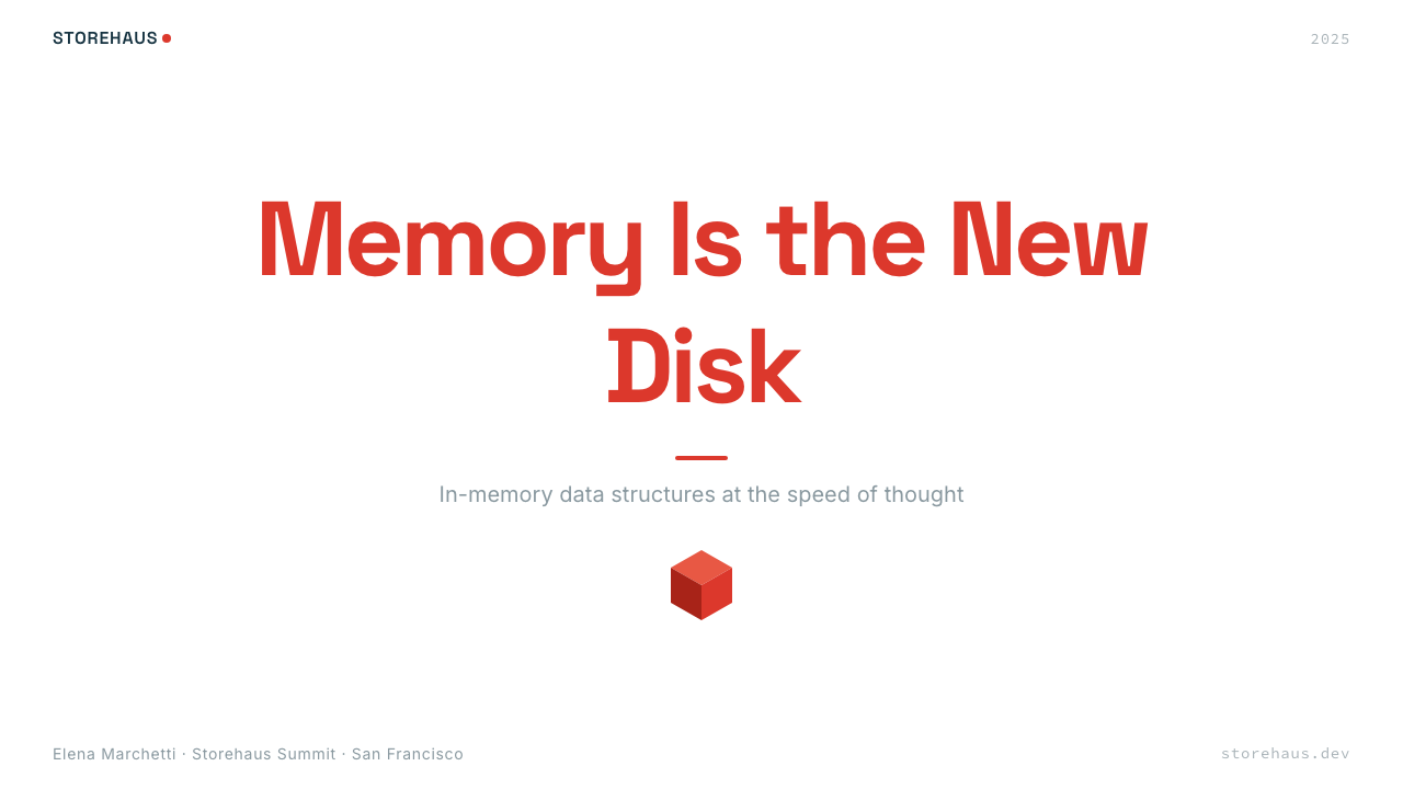
For presentation slides, Redis Cache Red performs best when the cover slide commits fully to the bold register of the brand: the cube motif at large scale, the title in a geometric sans-serif at generous weight, and the red used as a single accent against a pure white or deep slate ground. Content slides should be treated as documentation pages — white background, black body type, monospace blocks for any technical content, and the red reserved exclusively for the most important concept per slide. Data slides work especially well in this system: charts and diagrams rendered as clean geometric objects with bars and segments in the brand's neutral palette, with red used only to highlight the key data point the slide is making.在演示文稿中,Redis Cache Red 在封面页全力投入品牌大胆调性时表现最佳:大尺寸的立方体母题、几何无衬线字体以足够字重呈现的标题,以及红色作为单一强调色对比纯白或深板岩底面。内容页应当被当作文档页面处理——白色背景、黑色正文字体、技术内容使用等宽代码块,红色仅保留给每张幻灯片中最重要的概念。数据页在这套体系中格外出色:图表作为干净几何对象渲染,条形与扇区使用品牌中性色板,红色仅用于高亮幻灯片所表达的关键数据点。
For web interfaces, the system is particularly well suited to developer dashboards, API reference pages, and pricing pages. The approach is grid-first: establish a clean multi-column structure, keep background surfaces white, and let the typographic hierarchy do the organizational work. Card components should have subtle borders rather than soft shadows; interactive states should use the red sparingly and consistently. Navigation should be primarily typographic — the brand name or product wordmark carrying the identity without requiring icon-heavy decoration. Avoid the temptation to introduce additional accent colors for different product tiers; use the slate-navy and varying levels of opacity within the neutral palette to create differentiation instead.对于网页界面,这套体系特别适合开发者仪表板、API 参考页面和定价页面。方法以网格为先:建立干净的多列结构,保持底面白色,让字体层级承担组织工作。卡片组件应有细边框而非柔和阴影;交互状态应克制且一致地使用红色。导航应主要是字体性的——品牌名称或产品文字标识承载识别,无需图标重度装饰。避免为不同产品等级引入额外强调色的诱惑;改用板岩海军蓝以及中性色板内的不同透明度来创造区分。
For editorial and marketing work, the style supports a poster-like boldness that works well for feature announcements, conference materials, and social cards. A Redis Cache Red editorial layout uses generous white margins, one or two levels of typographic hierarchy defined purely by scale and weight, and the red as a single emphatic element — an underline on a key phrase, a background block behind a quoted statement, a border on a featured diagram. Marketing pages benefit from alternating full-width sections between white-ground and slate-ground treatments, with the red appearing at the intersection as a transitional accent.对于编辑与营销内容,这种风格支持一种适合功能发布公告、会议材料和社交卡片的海报式大胆感。Redis Cache Red 编辑版面使用宽阔的白色边距,字体层级仅通过比例和字重定义为一到两级,红色作为单一强调元素——关键词组下的下划线、引用陈述后的背景块、特色图解的边框。营销页面受益于在白底和板岩底处理之间交替的全宽段落区块,红色在交汇处作为过渡性强调色出现。
The most common mistake when applying this system is treating the vermilion red as a general-purpose color available throughout the layout. When the anchor color appears too frequently, it loses its weight and the system collapses into visual noise. A second common error is introducing soft shadows, gradient overlays, or organic shapes that soften the geometric precision the system depends on. Redis Cache Red is at its most convincing when it looks like it was designed by engineers who respect design — rational, precise, undecorated — not when it tries to appear warmer or more consumer-friendly than its engineering audience actually requires.应用这套体系时最常见的错误是把朱红当作在整个版面中通用的颜色。当锚点色出现过于频繁,它便失去重量,体系随之崩溃为视觉噪音。第二个常见错误是引入柔和阴影、渐变叠加或有机形状,软化这套体系所依赖的几何精准性。Redis Cache Red 在看起来像是由尊重设计的工程师所设计时最令人信服——理性、精准、无装饰——而非在试图表现得比其工程师受众实际所需要的更温暖或更面向消费者时。
See the Redis Cache Red design system查看 Redis Cache Red 完整设计系统
Redis Cache Red — FAQRedis Cache Red · 常见问题
Can Redis Cache Red work for non-technical products?Redis Cache Red 能用于非技术类产品吗?
The system can be applied beyond its origin context, but it carries strong associations that are difficult to suppress: precision, engineering rigor, developer culture, and infrastructure-grade reliability. Products that benefit from these associations — analytics tools, developer platforms, data-intensive enterprise applications, technical documentation systems — will feel authentic in this style. Products that need to lead with warmth, sensory richness, or emotional storytelling will find the style working against them. The vermilion anchor is warm for a developer-brand red, but it is still a red, and when combined with geometric type and white-ground grids it reads as technical before it reads as inviting.这套体系可以超越其起源语境应用,但它携带着难以压制的强烈联想:精准、工程严谨性、开发者文化,以及基础设施级可靠性。从这些联想中获益的产品——分析工具、开发者平台、数据密集型企业应用、技术文档系统——在这种风格中会感觉真实。需要以温暖感、感官丰富性或情感叙事为先的产品,将发现这种风格在与它们作对。朱红锚点对于一个开发者品牌红来说是温暖的,但它终究是个红,与几何字体和白底网格组合时,它读来先是技术性的,而后才是邀请性的。
How does Redis Cache Red differ from other developer-brand systems like Elastic or MongoDB?Redis Cache Red 与 Elastic 或 MongoDB 等其他开发者品牌体系有何不同?
All three belong to the same broader visual family — commercial open-source brands that use bold single-color anchors, technical illustration, monospace code blocks, and restrained secondary palettes. The distinctions are in the specific character of each anchor hue and the spatial personality of the layout system. Redis Cache Red's anchor is a warm vermilion with artisanal associations; Elastic's yellow is energetic and alert; MongoDB's green is ecological and growth-oriented. Redis's three-dimensional cube motif also gives it a more explicitly spatial, structural quality compared to the flatter mark-making of some peers. The warmth-plus-rigor combination in Redis is the system's most distinctive quality — it feels like a craftsman's tool rather than a corporate product.三者都属于同一个更宏观的视觉家族——使用大胆单色锚点、技术插图、等宽代码块和克制辅助色板的商业开源品牌。区别在于各自锚点色相的具体性格以及版面体系的空间个性。Redis Cache Red 的锚点是带有手工业联想的温暖朱红;Elastic 的黄色充满能量与警觉感;MongoDB 的绿色指向生态与成长。Redis 的三维立方体母题也赋予它比一些同类更为明确的空间性与结构性品质。Redis 中温度与严格性的组合是这套体系最独特的品质——它感觉像是工匠的工具,而非企业产品。
How should the cube motif be used in layouts beyond the logo?在 Logo 之外的版面中,立方体母题应如何使用?
The cube motif is most powerful when used sparingly and scaled deliberately. As a background element at very large scale — partially cropped, positioned at an edge or corner — it creates spatial depth without competing with foreground content. As a small repeated element in a pattern or texture context, it risks becoming decorative wallpaper that undermines the system's discipline. The most coherent extension of the motif is through the technical illustration system: data structure diagrams that use the same geometric, slightly three-dimensional language as the logo mark create a visual echo without literalizing the cube in ways that feel heavy-handed.立方体母题在克制使用和刻意缩放时最为有力。作为超大尺寸的背景元素——部分裁切,置于边缘或角落——它在不与前景内容竞争的情况下创造空间深度。作为图案或肌理语境中反复出现的小元素,它有沦为装饰壁纸的风险,从而削弱体系的纪律性。对这一母题最连贯的延伸,是通过技术插图体系实现的:使用与 Logo 标志相同几何、轻微三维语言的数据结构图,在不以显得笨重的方式将立方体字面化的前提下,制造视觉回响。
Does the system support a dark mode, and how does it change the character of the design?这套体系支持深色模式吗?深色模式如何改变设计的性格?
A dark-mode variant is both possible and in use across Redis developer tooling. The primary inversion swaps the white ground for a deep slate or near-black surface, promotes the slate-navy to a mid-tone structural layer, and allows white type to carry full legibility. The vermilion anchor in a dark context reads as brighter and more urgent than it does against white — the warm red on a cool dark ground creates stronger contrast and a more alert visual register. The character shifts from open and documentary to focused and immersive, which is appropriate for terminal-adjacent interfaces like command-line documentation or interactive API explorers. Code blocks become dominant rather than accented, which is well-suited to developer workflow contexts.深色模式变体不仅可行,也已在 Redis 开发者工具中付诸实践。主要的反转将白色底面换为深板岩或接近黑色的底面,将板岩海军蓝提升为中间调结构层,让白色字体以完整可读性呈现。朱红锚点在深色语境中读来比在白色底面上更明亮、更紧迫——温暖的红在冷色深底上产生更强的对比,呈现出更警觉的视觉调性。设计的性格从开放的文档式转向专注的沉浸式,这对于命令行文档或交互式 API 探索器等贴近终端的界面是恰当的。代码块从被强调的元素变为主导元素,非常契合开发者工作流场景。
What is the biggest risk when presenting Redis Cache Red to a non-developer audience?向非开发者受众呈现 Redis Cache Red 时,最大的风险是什么?
The system is calibrated for an audience that reads technical diagrams fluently, is skeptical of visual marketing, and interprets restraint as quality rather than poverty. For business decision-makers without a technical background, the same visual cues that signal credibility to engineers — the monospace code blocks, the absence of lifestyle imagery, the diagrammatic illustration — can read as incomplete, unfinished, or lacking in warmth. The mitigation is not to soften the system but to lead with the elements that bridge both audiences: the bold vermilion anchor is universally legible as a confident, distinctive brand color; the cube motif is visually interesting independent of its technical meaning; the generous white space reads as premium. Build the non-technical narrative on these elements and let the technical depth remain available without being foregrounded.这套体系是为能流畅阅读技术图解、对视觉营销持有警觉、将克制解读为品质而非贫乏的受众校准的。对于没有技术背景的业务决策者,同样的视觉线索——等宽代码块、生活方式图像的缺席、示意图式插图——可能读来不完整、未完成,或缺乏温度。解决之道不是软化这套体系,而是以能跨越两种受众的元素为先:大胆的朱红锚点作为自信而独特的品牌色是普遍可读的;立方体母题在其技术含义之外也具有视觉趣味性;宽阔的留白读来高端。在这些元素上构建非技术叙事,让技术深度保持可及但不被推到前台。
Related design styles相关设计风格
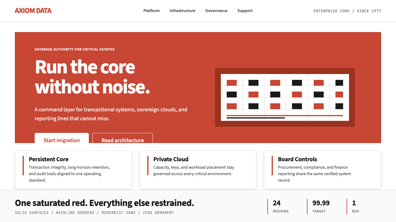 Oracle Corporate RedEnterprise certainty. Saturated red, tight sans, and white space do all the w…企业级确定感:饱和红、紧排无衬线与大留白撑起全部气场。
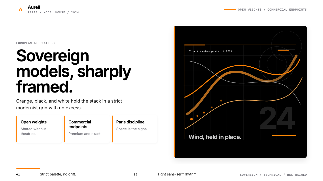 Mistral AI OrangeSovereign AI with restraint. Orange, black, and white lock the grid.主权AI很克制。橙黑白锁定网格。
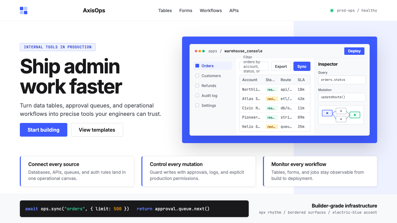 Retool Internal-Tools RedPrecision ships fast. Electric blue panels, Inter type, and bordered UI mocku…精准而快速。电光蓝面板、Inter 字体和边框 UI 模型撑起气质。
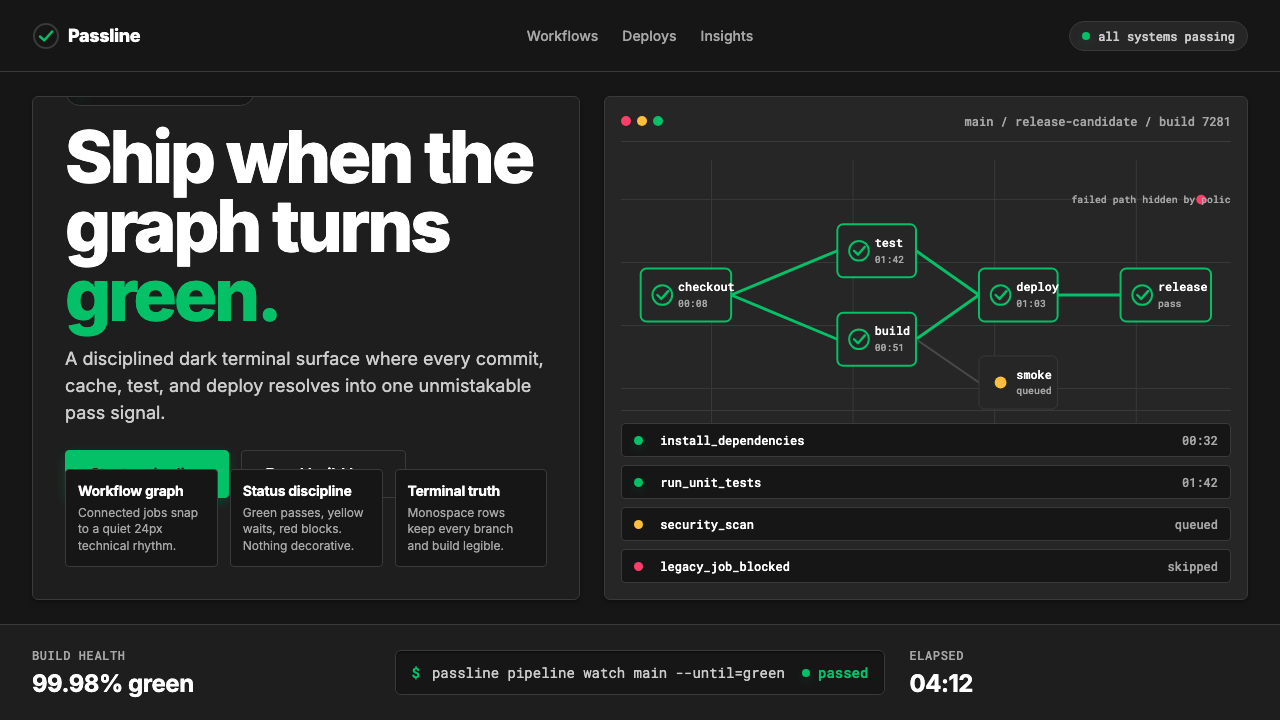 CircleCI Pipeline-GreenConfidence goes green. Emerald status lines cut through terminal-black pipeli…信心变绿。翠绿状态线切过终端黑流水线网格。
 Adobe Creative CloudUnified, not uniform. Red anchor, white space, and saturated app tiles organi…统一而不单一:红色锚点、留白与高饱和应用方块组织整套工具。
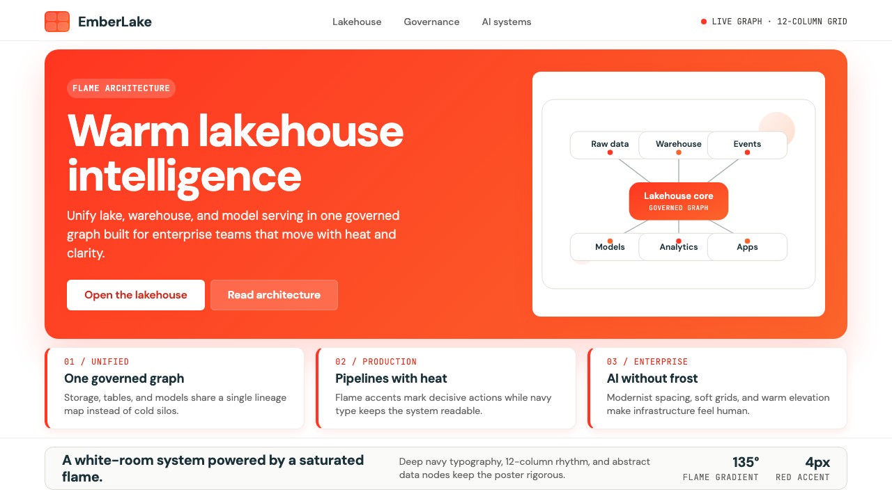 Databricks LakehouseWarm enterprise confidence. Flame red-orange gradients meet DM Sans and clean…温暖的企业信心:红橙火焰渐变配 DM Sans 与洁净数据图。