What is Retool Internal-Tools Red?什么是 Retool Internal-Tools Red?
Retool turned the unglamorous problem of internal tooling into a visual language — electric-blue saturation, sharp UI mockups, and Inter's clean strokes saying: precision ships fast.Retool 把内部工具这件不性感的事做成了一套视觉语言——电光蓝的饱和度、利落的 UI 截图、Inter 字体的干净笔画,共同传递一句话:精准,快速交付。
Retool Internal-Tools Red in briefRetool Internal-Tools Red 速览
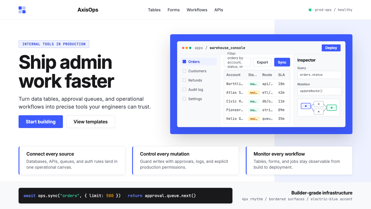
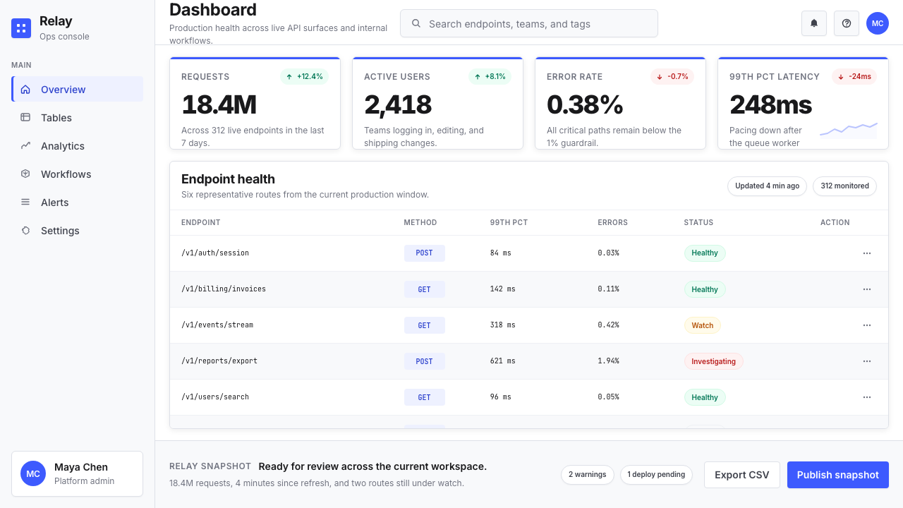
Retool Internal-Tools Red is the contemporary design language developed by and around Retool — a San Francisco low-code platform founded in 2017 — that has since become a recognizable visual signature for the broader developer-productivity and internal-tools category. The style combines an intensely saturated blue-violet accent, crisp white grounds, slate-gray body text, and an almost exclusive use of Inter, the humanist sans-serif designed for screen legibility. Its most distinctive element is the liberal use of real product screenshots — tables, forms, dashboards, workflow node diagrams — treated as primary visual assets rather than supporting decoration.Retool Internal-Tools Red 是由 Retool 及其所在的内部工具品类共同发展出的一套当代设计语言。Retool 是 2017 年在旧金山创立的低代码平台,其视觉风格已成为开发者生产力工具这一品类中辨识度极高的视觉符号。这套风格将高饱和蓝紫色强调、纯白底面、深石板灰正文,与几乎单一使用的 Inter(一款为屏幕易读性而设计的人文主义无衬线字体)结合在一起。它最具辨识度的元素,是大量使用真实产品截图——数据表、表单、仪表板、工作流节点图——将其作为主视觉资产而非配角装饰。
The aesthetic's organizing principle is clarity at the cost of warmth. Nothing in the visual system gestures toward playfulness, nostalgia, or organic texture. Every element earns its place by communicating something structural: a bordered table asserts data density, a workflow diagram maps system logic, a blue-accented button declares the primary action. The result is a style that signals serious engineering infrastructure to its target audience of developers and product managers.这套美学的组织原则是以温度换清晰。视觉系统中没有任何元素指向趣味性、怀旧感或有机质感。每个元素都通过传达某种结构信息来证明自己的存在:有边框的数据表宣示数据密度,工作流图表描绘系统逻辑,蓝色强调的按钮宣告主要操作。结果是一套对目标受众——开发者与产品经理——而言明确传递「严肃工程基础设施」信号的风格。
As a named design category, the style represents a broader 2020s movement in developer-tooling branding — companies like Linear, Vercel, PlanetScale, and Clerk adopted related vocabularies of technical precision — but Retool's version is distinguished by its specific reliance on UI mockup imagery and its willingness to let raw product screenshots carry marketing weight that other categories would give to illustration or photography.作为一个命名的设计品类,这套风格代表了 2020 年代开发者工具品牌的更广泛运动——Linear、Vercel、PlanetScale、Clerk 等公司都采用了相关的技术精准视觉词汇——但 Retool 的版本因特别依赖 UI 模型图像、并愿意让原始产品截图承担其他品类通常交给插图或摄影的营销重量,而自成一格。
See the Retool Internal-Tools Red design system查看 Retool Internal-Tools Red 完整设计系统
Where does Retool Internal-Tools Red come from?Retool Internal-Tools Red 从何而来?
Retool was founded in 2017 by David Hsu, then a Stanford student, through Y Combinator's Winter 2017 batch. The founding insight was blunt: software engineering teams at every company were spending weeks rebuilding the same category of internal tools — admin panels, data dashboards, approval workflows, inventory management interfaces — from scratch, every time. Retool's answer was a drag-and-drop builder for internal applications that connected directly to databases and APIs. The product's visual identity needed to speak immediately to engineers and technical founders, not to consumer-facing design sensibilities.Retool 由 David Hsu 于 2017 年在斯坦福就读期间创立,经 Y Combinator W17 批次孵化。创始洞察直接而清醒:每家公司的软件工程团队都在周而复始地从零构建同一类内部工具——管理面板、数据仪表板、审批工作流、库存管理界面。Retool 的答案是一个可以直接连接数据库与 API 的拖拽式内部应用构建器。产品的视觉身份需要立刻打动工程师和技术创始人,而非面向消费者的设计趣味。
The brand visual system that emerged by the early 2020s was a direct product of that constraint. Engineers are skeptical of marketing gloss; they trust legible data, coherent system diagrams, and evidence of real product capability. Retool's marketing materials leaned into raw interface screenshots — not cleaned-up illustrations of what a tool might look like, but actual Retool-built dashboards, with realistic data, exposed query panels, and component libraries visible in context. The blue-violet accent — the specific hue that anchors the palette — was consistent enough across touchpoints to become a brand recognition signal in its own right, even before a viewer registered the wordmark.2020 年代初成型的品牌视觉系统,正是这一约束的直接产物。工程师对营销光鲜持怀疑态度;他们信任清晰可读的数据、连贯的系统图表,以及真实产品能力的证据。Retool 的营销材料大量使用原始界面截图——不是工具可能长什么样子的精致插图,而是用 Retool 实际搭建的仪表板,带着真实数据、暴露的查询面板和在上下文中可见的组件库。那个蓝紫色强调——锚定整套色板的特定色相——在各个接触点上保持足够一致,本身就成为品牌识别信号,甚至早于观看者注意到品牌字标。
The years 2020 to 2022 marked the style's crystallization. Retool raised a Series C at a three-billion-dollar valuation in 2022, bringing the product into mainstream awareness among startup operators and enterprise engineering leadership. Marketing budgets expanded, but the visual language remained disciplined: Inter as the dominant typeface, white and near-white grounds, the single saturated accent, bordered UI components, and workflow diagrams as hero imagery. The restraint was not accidental — it was a deliberate signal that the company was a tool for builders, not a platform dressing itself in consumer-product aesthetics.2020 至 2022 年是这套风格的结晶期。Retool 于 2022 年完成 C 轮融资,估值达 32 亿美元,使产品进入初创公司运营者和企业工程领导层的主流视野。营销预算扩大,但视觉语言保持克制:Inter 作为主导字体,白色与近白色底面,单一饱和强调色,有边框的 UI 组件,工作流图表作为英雄图像。这种克制并非偶然——它是一个刻意的信号,表明公司是为构建者服务的工具,而非将自己包装成消费者产品美学的平台。
The broader context is the 2020s developer-tools design convergence. Tools like Vercel, Supabase, Railway, and Linear were simultaneously developing related vocabularies — technical, dark-mode-capable, grid-ordered, typographically driven — and the collective effect established a new category expectation: internal and developer tools should look like they were designed by engineers who care about design, not by marketing departments chasing consumer trends. Retool's contribution to this convergence was specifically the internal-tools variant: lighter background, more data-table imagery, more explicit UI-component illustration, and a saturated accent that reads as both professional and energetic.更广泛的背景是 2020 年代开发者工具设计的趋同。Vercel、Supabase、Railway、Linear 等工具在同一时期发展出相关的视觉词汇——技术感、深色模式兼容、网格有序、以排版驱动——集体效果确立了一种新的品类期望:内部工具和开发者工具应当看起来像由懂设计的工程师设计,而非由追逐消费者趋势的营销部门打造。Retool 对这一趋同的贡献,是其中特定的内部工具变体:更浅的背景、更多数据表图像、更明确的 UI 组件图示,以及一个既显专业又充满活力的饱和强调色。
What defines the Retool Internal-Tools Red look?Retool Internal-Tools Red 的视觉特征是什么?
Saturated Blue-Violet Accent高饱和蓝紫强调色
The palette anchors on a single, intensely saturated blue that tilts toward violet — a hue energetic enough to read as modern and technical, yet distinct from the pure primaries of earlier design movements. It appears on primary buttons, interactive states, selected rows in data tables, active navigation items, and key chart series. The rest of the palette is deliberately neutral: white or near-white backgrounds, dark slate for body text, light gray for borders and dividers. The single accent does all the chromatic work; no secondary accent competes with it.整套色板锚定于一个偏向紫调的高饱和蓝色——足够有活力,读来现代而技术感十足,又有别于早期设计运动中的纯原色。它出现在主要按钮、交互状态、数据表的选中行、活跃导航项和关键图表系列上。色板的其余部分刻意保持中性:白色或近白色背景、深石板灰正文、浅灰色边框与分割线。强调色独自承担所有色彩工作,没有第二种强调色与之竞争。
UI Mockup Imagery as Hero VisualUI 模型图像作为英雄视觉
Where other design styles use photography, illustration, or abstract shape-work as primary visual assets, the Retool aesthetic uses real or near-real product interface screenshots. Dashboard tables with realistic column headers, form builders with visible validation states, workflow diagrams with labeled connector lines — these function as both marketing evidence and aesthetic composition. The practice signals confidence: the product is the visual, and the visual is the product. Mockups are typically shown at a slight perspective angle or set inside a browser or app-frame chrome to ground them in context.其他设计风格以摄影、插图或抽象形态作为主视觉资产,而 Retool 美学使用真实或近似真实的产品界面截图。带有真实列标题的仪表板数据表、显示验证状态的表单构建器、带有标签连接线的工作流图——这些既是营销证据,也是美学构图。这种做法传递信心:产品即视觉,视觉即产品。模型图通常以轻微透视角度展示,或置于浏览器或应用框架之中,以赋予情境感。
Inter Typography as System VoiceInter 字体作为系统声音
The visual system relies almost exclusively on a single humanist sans-serif that was purpose-built for user interfaces: legible at small sizes, metrically consistent across weights, and carrying no historical period associations. Headlines are set large and relatively light in weight — confident rather than aggressive. Body text is set at a compact measure with controlled line spacing. Code and data values appear in a monospaced companion face. The typographic system communicates technical precision through its own regularity, without requiring decorative intervention.视觉系统几乎专门依赖一种为用户界面而生的人文主义无衬线字体:在小字号下清晰可读,各字重之间度量值一致,不携带任何历史时期的联想。标题设定为大号、字重相对轻——自信而非强硬。正文在紧凑行宽下设定,行距受控。代码与数据值以配套的等宽字体显示。这套排版系统通过自身的规整性传递技术精准感,无需任何装饰介入。
Bordered Components and Hard Grid有边框组件与硬网格
UI components — cards, input fields, table cells, modal dialogs — are defined by visible borders rather than shadow elevation. A one-pixel border in light gray is the standard separator; it reads as precise, not decorative. This choice is practical and aesthetic simultaneously: bordered components communicate data structure clearly at high density, without the blurring effect that soft shadows introduce at small scales. The underlying layout grid is strict and visible in negative space — columns align, gutters are consistent, nothing floats arbitrarily.UI 组件——卡片、输入框、表格单元格、模态对话框——以可见边框而非阴影高度来定义。浅灰色细线是标准分隔元素;读来精准,而非装饰性。这一选择同时兼顾了实用与美学:有边框组件在高密度信息下清晰传达数据结构,不会产生软阴影在小尺度下带来的模糊效果。底层布局网格严格,在负空间中清晰可见——列对齐,槽距一致,没有任何元素任意漂浮。
Workflow and System Diagrams工作流与系统图
Node-and-connector diagrams — representations of automated workflows, data pipeline routing, conditional logic branches — appear throughout the visual system as a secondary imagery type alongside data tables. These diagrams are rendered in the same restrained palette: white node cards with thin borders, the accent color for active or highlighted paths, and monospaced text for labels. They serve double duty: they communicate actual product capability (Retool can build workflow automations) while reinforcing the style's core message of systematic, engineered thinking.节点-连接线图——自动化工作流、数据管道路由、条件逻辑分支的视觉表达——作为与数据表并列的第二类图像类型贯穿整个视觉系统。这些图表采用同样克制的色板渲染:细边框白色节点卡片,强调色用于活跃或高亮路径,等宽文字用于标签。它们身兼二职:既传达真实的产品能力(Retool 可以构建工作流自动化),又强化这套风格的核心信息——系统性的、工程化的思维方式。
Controlled Density可控密度
Unlike minimalist design systems that use generous whitespace to signal premium positioning, the Retool aesthetic is comfortable with information density. A marketing screenshot might show a thirty-column data table, a sidebar of query parameters, and a header navigation bar simultaneously — and this density is presented as a feature, not a problem. Whitespace is used structurally, to separate major sections or establish component hierarchy, not as a luxury signal. The style communicates that it can handle serious data loads, which is precisely what its target users need to believe.与用大量留白来传递高端定位的极简设计系统不同,Retool 美学对信息密度感到自在。一张营销截图可能同时展示一个三十列的数据表、一个查询参数侧边栏和一个顶部导航栏——这种密度被呈现为特性,而非问题。留白被结构性地使用,用于分隔主要区块或建立组件层级,而非作为奢侈感信号。这套风格传递的信息是:它能够处理严肃的数据量——而这正是目标用户需要相信的。
Zero Decorative Illustration零装饰插图
Abstract blob shapes, character illustrations, isometric city scenes, hand-drawn icon sets — none of the decorative illustration vocabulary common in consumer SaaS appears here. When non-screenshot imagery is needed, it takes the form of geometric diagrams (architecture charts, feature comparison tables, icon-plus-label category blocks) rather than representational or expressive art. The discipline is deliberate: decorative illustration would signal that the brand is trying to appear approachable or playful, which is not the target positioning. The technical austerity is the warmth, for the right audience.抽象色块形状、人物插图、等距城市场景、手绘图标集——消费者 SaaS 中常见的装饰性插图词汇在此无处可寻。当需要非截图图像时,它以几何图表的形式出现(架构图、功能对比表、图标加标签的品类块),而非具象或表现性艺术。这种自律是刻意的:装饰性插图会释放品牌试图显得平易近人或活泼有趣的信号,而这并非目标定位。对正确的受众而言,技术上的严肃就是温度。
See the Retool Internal-Tools Red design system查看 Retool Internal-Tools Red 完整设计系统
Who shaped Retool Internal-Tools Red?谁塑造了 Retool Internal-Tools Red?
Hsu founded Retool in 2017 as a Y Combinator W17 company while still a student at Stanford. His framing of the core problem — that engineering teams were rebuilding the same internal tools repeatedly at enormous cost — defined the product category and, in turn, the brand's visual mission. By presenting the product as a serious engineering infrastructure decision rather than a productivity app, Hsu's positioning choices shaped the aesthetic imperative: the visual language had to speak engineer-to-engineer, foregoing consumer-product softness entirely. Under his leadership, Retool reached a three-billion-dollar valuation by 2022.Hsu 于 2017 年在斯坦福就读期间创立 Retool,经 Y Combinator W17 批次孵化。他对核心问题的定义——工程团队在周而复始地以极高成本重建相同的内部工具——界定了产品品类,也界定了品牌的视觉使命。通过将产品定位为严肃的工程基础设施决策而非生产力应用,Hsu 的定位选择塑造了美学命题:视觉语言必须工程师对工程师地说话,彻底放弃消费者产品的柔和感。在他的领导下,Retool 于 2022 年达到 32 亿美元估值。
Y Combinator's W17 batch — one of the accelerator's most consequential cohorts in developer tools — provided the initial context and peer network that validated Retool's approach. The YC ecosystem, with its strong orientation toward technical founder aesthetics (dense documentation, GitHub-first distribution, API-first product thinking), directly influenced the visual conventions that companies like Retool adopted: no-nonsense type, real product screenshots, minimal color, and an implicit distrust of anything that looked like it was designed for a non-technical buyer.Y Combinator W17 批次——孵化器在开发者工具领域影响最深远的批次之一——为 Retool 的路径提供了初始情境与同伴网络。YC 生态系统对技术创始人美学的强烈导向(密集文档、GitHub 优先分发、API 优先产品思维),直接影响了 Retool 等公司所采用的视觉惯例:不废话的字体、真实产品截图、最少色彩,以及对任何看起来面向非技术买家的事物的隐性不信任。
Sequoia's investment in Retool — part of its Series B and Series C rounds — brought the company into alignment with a portfolio of developer-infrastructure companies whose visual identities collectively reinforced similar conventions. The pattern across Sequoia-backed developer tools of the 2020s was a convergence toward technical austerity: companies learned from each other's brand signals, investor-facing materials shaped how founders thought about design legibility, and the resulting visual ecosystem created a strong category expectation that new entrants in the space felt pressure to match.红杉资本对 Retool 的投资——作为 B 轮和 C 轮的参与方——将公司带入了一批开发者基础设施公司的视觉身份集群,这些公司的视觉识别共同强化了相似的惯例。2020 年代红杉投资的开发者工具公司的共同规律是向技术简约收敛:公司相互学习彼此的品牌信号,面向投资人的材料塑造了创始人对设计易读性的思考方式,最终形成的视觉生态创造了强烈的品类期望,让这一领域的新进入者感到必须跟进。
Andersson designed Inter, the typeface that became nearly universal across developer-tools branding of the 2020s, releasing it as an open-source project. Inter was explicitly designed to maximize legibility in user interfaces at small sizes, with metrics optimized for digital rendering rather than print. Its adoption by Retool and subsequently by a significant portion of the developer-tools category made it the de facto voice of technical seriousness in that space — much as Helvetica became synonymous with modernist corporate identity in the twentieth century, Inter became the unmarked typeface of 2020s developer infrastructure.Andersson 设计了 Inter——这款字体以开源项目形式发布,成为 2020 年代开发者工具品牌中近乎通用的字体。Inter 的设计明确以最大化用户界面小字号下的易读性为目标,其度量值针对数字渲染而非印刷进行了优化。Retool 及随后大量开发者工具品类公司的采用,使其成为该领域技术严肃感的事实标准声音——就像 Helvetica 在二十世纪成为现代主义企业身份的同义词一样,Inter 成为 2020 年代开发者基础设施的默认字体。
The visual language of Retool did not develop in isolation — it was part of a broader cohort of developer-tools companies (Linear, Vercel, Supabase, Railway, Clerk, and others) that collectively defined a 2020s visual register for technical products. Each company's designers watched and influenced each other; design blogs, Twitter design circles, and portfolio sites created rapid cross-pollination. The collective effect was the establishment of what could be called the developer-tool design canon: dark-mode-capable, grid-rigorous, accent-minimal, typographically confident, and photographically or screenshot-driven rather than illustration-heavy.Retool 的视觉语言并非孤立发展——它是一批开发者工具公司(Linear、Vercel、Supabase、Railway、Clerk 等)共同构成的更广泛群体的一部分,这些公司集体界定了 2020 年代技术产品的视觉语域。各公司的设计师相互观察与影响;设计博客、推特设计圈和作品集网站促成了快速的交叉授粉。集体效果是建立了一套可称为「开发者工具设计典范」的标准:支持深色模式、网格严谨、强调色克制、排版自信,以截图或产品图驱动而非以插图为主。
How do you use Retool Internal-Tools Red today?今天怎么用 Retool Internal-Tools Red?
The Retool Internal-Tools Red aesthetic is highly transferable to any communication context where the intended audience is technical — developers, product managers, data analysts, engineering leaders — and where the goal is to project competence, precision, and infrastructure-grade reliability rather than delight or warmth. The core transfer principle is the same as the original brand's: let the product evidence do the visual work, and let the type and color system communicate seriousness without ornamentation.Retool Internal-Tools Red 美学对任何目标受众是技术人员的传播场景都具有高度可移植性——开发者、产品经理、数据分析师、工程领导——当目标是展示能力、精准和基础设施级可靠性,而非取悦或温暖时尤为适用。核心迁移原则与原品牌一致:让产品证据承担视觉工作,让字体与色彩系统在无装饰的情况下传递严肃感。
For presentation slides, the style works powerfully on both cover and content pages. A cover built in this aesthetic uses a white or very light ground, the saturated blue-violet accent reserved for a single title word or a thin horizontal bar, and a large UI mockup image — a dashboard screenshot, a workflow diagram, a data table — set at a slight perspective angle to suggest three-dimensionality without relying on illustrative artifice. Content slides adopt a strict two- or three-column grid: one organizing typographic hierarchy (one large weight for headings, one regular weight for body), no decorative dividers, and data visualizations rendered as if they were the product's own chart components — which, for internal-tools pitches, they often literally are.在演示文稿中,这套风格在封面页与内容页上都效果强劲。用这套美学制作的封面采用白色或极浅色底面,蓝紫强调色仅保留给单个标题词或一根细水平线,以及一张大号 UI 模型图像——仪表板截图、工作流图表、数据表——以轻微透视角度呈现,在不依赖插图技巧的情况下暗示立体感。内容页采用严格的两列或三列网格:一套组织性排版层级(标题用一种大字重,正文用常规字重),无装饰性分割线,数据可视化以产品自身图表组件的方式渲染——对内部工具提案而言,这些往往字面意义上就是产品本身的组件。
For web UI design — whether a dashboard product, an admin panel, a data tool, or a pricing page for a developer-facing service — the aesthetic translates directly. Use a white background with a near-white surface layer for cards and panels. Define borders using a fine, consistent line weight in light gray; avoid shadow-based elevation for primary components. Reserve the blue-violet accent for primary interactive elements only: the main call-to-action button, the active state of navigation items, the selected row highlight in a data table, and the primary chart series. All other elements — labels, metadata, secondary text, inactive states — use the neutral slate-gray palette. Navigation should be text-driven with no illustrative icons beyond simple geometric indicators.对于网页 UI 设计——无论是仪表板产品、管理面板、数据工具,还是面向开发者服务的定价页——这套美学可以直接迁移。使用白色背景,卡片与面板采用近白色表面层。使用浅灰色细线定义边框,主要组件避免阴影高度。将蓝紫强调色仅保留给主要交互元素:主要行动号召按钮、导航项的活跃状态、数据表的选中行高亮,以及主要图表系列。所有其他元素——标签、元数据、次要文字、非活跃状态——使用中性石板灰色板。导航应以文字驱动,除简单几何指示符外无图示图标。
For editorial and marketing applications — landing pages, feature announcement posts, company blog headers, social media graphics — the style supports strong hierarchy at large formats. Full-width sections alternate between white-ground layouts (with the blue accent for calls to action) and very-dark-ground layouts (where the UI mockup screenshot glows against the dark field). Product screenshots should be presented in a browser-chrome or device-frame container to anchor them in realistic context; avoid floating raw screenshots without framing. Marketing copy should be set in the same single typeface at high size contrast: a display heading at a much larger scale than subheadings, subheadings at a clearly larger scale than body text. The accent color touches one word or phrase per section only.对于编辑与营销应用——落地页、功能公告文章、公司博客头图、社交媒体图形——这套风格在大版面下支持强劲的信息层级。全宽区块在白底版面(蓝色强调号召行动)与极深色底版面(UI 模型截图在深色底面上发光)之间交替。产品截图应置于浏览器框架或设备边框容器内呈现,以锚定在真实场景中;避免在无框架的情况下悬浮原始截图。营销文案应以同一套单一字体在大尺度对比下排版:展示标题比副标题大得多,副标题比正文明显更大。强调色每个区块只接触一个词或短语。
A common mistake when applying this aesthetic is importing decorative illustration habits from consumer-product design. Abstract background shapes, gradient meshes, lottie animations of cartoon characters, hand-drawn connector lines, or pastel secondary palettes will break the style's logic immediately — they signal approachability when the style is deliberately not trying to be approachable. A second common mistake is treating the blue-violet accent as a general-purpose color rather than a precision instrument: if it appears on borders, backgrounds, text labels, icons, buttons, and chart bars simultaneously, it loses its ability to signal action and attention. Reserve it, use it once per visual unit, and let the neutrals carry the structural weight.应用这套美学时最常见的错误,是从消费者产品设计中引入装饰性插图习惯。抽象背景形状、渐变网格、卡通角色的 Lottie 动画、手绘连接线或粉彩二级色板,会立即打破这套风格的逻辑——它们在风格刻意不试图平易近人时发出了平易近人的信号。第二个常见错误是将蓝紫强调色当作通用色彩而非精准工具:如果它同时出现在边框、背景、文字标签、图标、按钮和图表条上,它就失去了传递行动与注意力的能力。保留它,每个视觉单元只用一次,让中性色承担结构重量。
See the Retool Internal-Tools Red design system查看 Retool Internal-Tools Red 完整设计系统
Retool Internal-Tools Red — FAQRetool Internal-Tools Red · 常见问题
Is this style only appropriate for developer tools, or can other product categories use it?这套风格只适合开发者工具吗,其他产品品类可以使用吗?
The style is not exclusive to developer tools, but it carries strong category signals. Any product positioning itself as infrastructure-grade — data tools, financial dashboards, analytics platforms, enterprise admin systems, operations software — can adopt the aesthetic credibly. It becomes inappropriate in consumer contexts that depend on warmth, sensory richness, or cultural resonance: food brands, wellness applications, children's products, luxury goods, or any product where the emotional register is the primary differentiator. The test is whether your audience reads technical precision as a positive signal or as a barrier. For technical buyers, the aesthetic's austerity is itself trustworthy. For general consumers, it can read as cold or unapproachable.这套风格并非开发者工具专属,但它携带强烈的品类信号。任何将自身定位为基础设施级别的产品——数据工具、金融仪表板、分析平台、企业管理系统、运营软件——都可以可信地采用这套美学。在依赖温暖感、感官丰富性或文化共鸣的消费者场景中,它则不合适:食品品牌、健康应用、儿童产品、奢侈品,或任何以情感语域作为主要差异化的产品。检验标准是:你的受众是否将技术精准读作正面信号。对技术买家而言,这套美学的严肃本身就是可信赖的;对普通消费者而言,它可能被解读为冷漠或难以接近。
How does this style relate to dark-mode design? Should it be dark or light?这套风格与深色模式设计是什么关系?应该用深色还是浅色?
The canonical Retool aesthetic is light-ground — white and near-white backgrounds are the system's default. This distinguishes it from peer styles like Vercel or Linear, which lean into dark modes as their primary presentation. The light-ground choice is functional for internal tools: data tables and form interfaces are more legible on light backgrounds at high information density. Dark-mode variants exist and work well for specific use cases — full-screen dashboards in operational contexts, marketing hero sections — but the full dark inversion requires care. The blue-violet accent can appear very aggressive against a very dark field, and bordered components need their border values recalibrated to maintain the same visual weight. If building a dark variant, treat it as a complementary mode rather than the default.Retool 美学的典范形态是浅色底——白色和近白色背景是系统的默认状态。这使其区别于 Vercel 或 Linear 等以深色模式为主要呈现方式的同类风格。浅色底的选择对内部工具具有功能意义:在高信息密度下,数据表和表单界面在浅色背景上可读性更强。深色模式变体存在,并在特定场景下效果良好——操作环境中的全屏仪表板、营销英雄区——但完整的深色反转需要谨慎处理。蓝紫强调色在极深色底面上可能显得非常强烈,有边框组件需要重新校准边框值以保持相同的视觉重量。如果构建深色变体,应将其视为补充模式而非默认状态。
What is the right way to handle data visualization in this aesthetic?在这套美学中,数据可视化应该如何处理?
Data visualization should feel like it belongs to the same component system as the rest of the UI — which, in Retool's case, it literally does. This means charts should use the same border conventions (thin light-gray borders around the chart container), the same typographic hierarchy (chart titles and axis labels in the same typeface, proportionally scaled), and the same limited color vocabulary. The primary accent color is the default series color for single-series charts. For multi-series charts, extend the palette with neutralized versions of the accent — desaturated variants and light grays — rather than introducing entirely new hues. Avoid gradient fills inside bars, slices, or areas; flat fills are correct. Grid lines inside the chart area should be hairline weight and very light — they should organize without competing with the data.数据可视化的观感应当像属于同一个组件系统的一部分——在 Retool 的案例中,字面意义上确实如此。这意味着图表应使用相同的边框惯例(图表容器周围的浅灰色细线边框)、相同的排版层级(图表标题和坐标轴标签使用同一字体,按比例缩放),以及相同的有限色彩词汇。主要强调色是单系列图表的默认系列色。对于多系列图表,以中性化的强调色变体——去饱和变体与浅灰色——扩展色板,而非引入全新色相。避免在条形、扇形或面积内使用渐变填充;平面填充是正确的。图表区域内的网格线应为发丝线宽度且颜色极浅——它们应当组织而不竞争数据本身。
How do you prevent the style from looking generic, given how many developer tools now use similar conventions?考虑到现在许多开发者工具都使用相似的惯例,如何防止这套风格看起来雷同?
The risk of category convergence is real — the visual conventions of developer-tools design have spread widely enough that a default implementation can now read as generic. Differentiation within the style comes from three levers: specificity of the product imagery (showing your actual product's distinctive UI rather than generic dashboard screenshots), tightness of the typographic hierarchy (a well-calibrated type scale has a precise personality that generic implementations lack), and the particular calibration of the accent color. Within the blue-violet range, there is meaningful variation — a hue that leans slightly warmer reads differently than one that leans cooler or more violet. None of these adjustments require abandoning the style's core conventions; they require executing those conventions with enough craft that the system feels native rather than borrowed.品类趋同的风险是真实存在的——开发者工具设计的视觉惯例已经传播得足够广泛,以至于默认实现现在可能读起来雷同。在这套风格内部的差异化来自三个杠杆:产品图像的特殊性(展示你实际产品的独特 UI,而非通用仪表板截图)、排版层级的精准度(经过良好校准的字体比例具有通用实现所缺乏的精确个性),以及强调色的特定校准。在蓝紫色范围内,存在有意义的变化——略偏暖调的色相与略偏冷调或更偏紫调的色相读来不同。这些调整都不需要放弃这套风格的核心惯例;它们需要以足够的工艺执行这些惯例,使系统感觉是原生的,而非借用的。
Can this aesthetic work for print or physical materials, or is it purely digital?这套美学适用于印刷或实体材料吗,还是纯粹是数字的?
The style transfers to print with some adaptation. Its core conventions — high contrast, strong typographic hierarchy, the single saturated accent, bordered layout structures — all reproduce cleanly in print. The primary challenge is that UI mockup screenshots, which carry much of the visual weight in the digital application, lose their legibility in small-format print or at low resolution. For print materials like conference handouts, pitch decks printed for in-person delivery, or white papers, the screenshot imagery needs to be either rendered at much larger scale, replaced with simplified diagrammatic versions, or supplemented with supporting labels. The typographic and color system transfers without modification. The overall effect in print reads as precise, technical, and confident — well-suited for enterprise sales materials, technical documentation covers, and event branding for developer-focused conferences.这套风格经过一定调整可以迁移至印刷。其核心惯例——高对比度、强排版层级、单一饱和强调色、有边框的版面结构——在印刷中都能清晰再现。主要挑战是 UI 模型截图——在数字应用中承载大部分视觉重量的元素——在小版面印刷品或低分辨率下会失去可读性。对于会议讲义、面对面交付的印刷提案,或白皮书等印刷材料,截图图像需要以更大比例渲染,或替换为简化的图表版本,或辅以支持性标签。排版与色彩系统无需修改即可迁移。整体在印刷中的效果读来精准、技术感十足、自信有力——非常适合企业销售材料、技术文档封面,以及面向开发者会议的活动品牌设计。
Related design styles相关设计风格
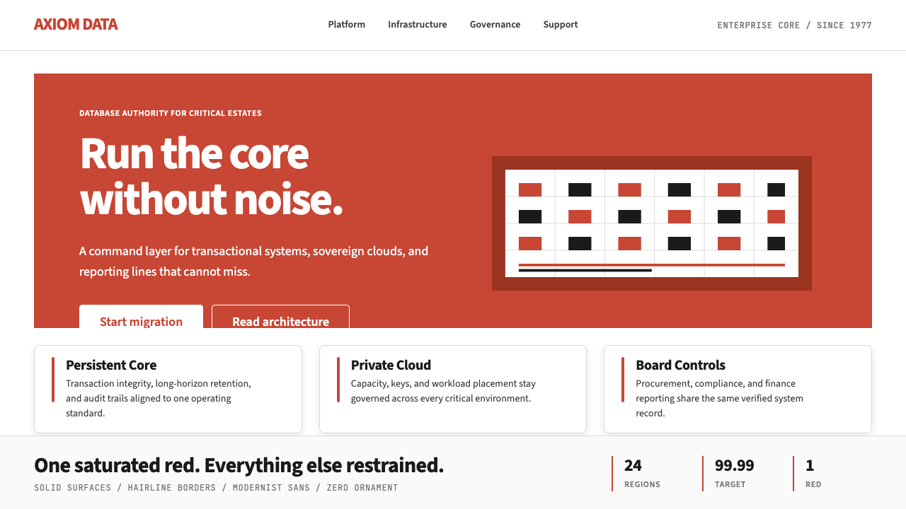 Oracle Corporate RedEnterprise certainty. Saturated red, tight sans, and white space do all the w…企业级确定感:饱和红、紧排无衬线与大留白撑起全部气场。
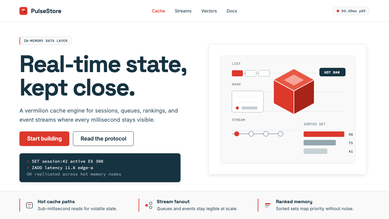 Redis Cache RedWarm database rigor. Vermilion cube, slate type, and white-space grids make s…温热的数据库秩序:朱红立方、板岩字色与留白网格,让速度可读。
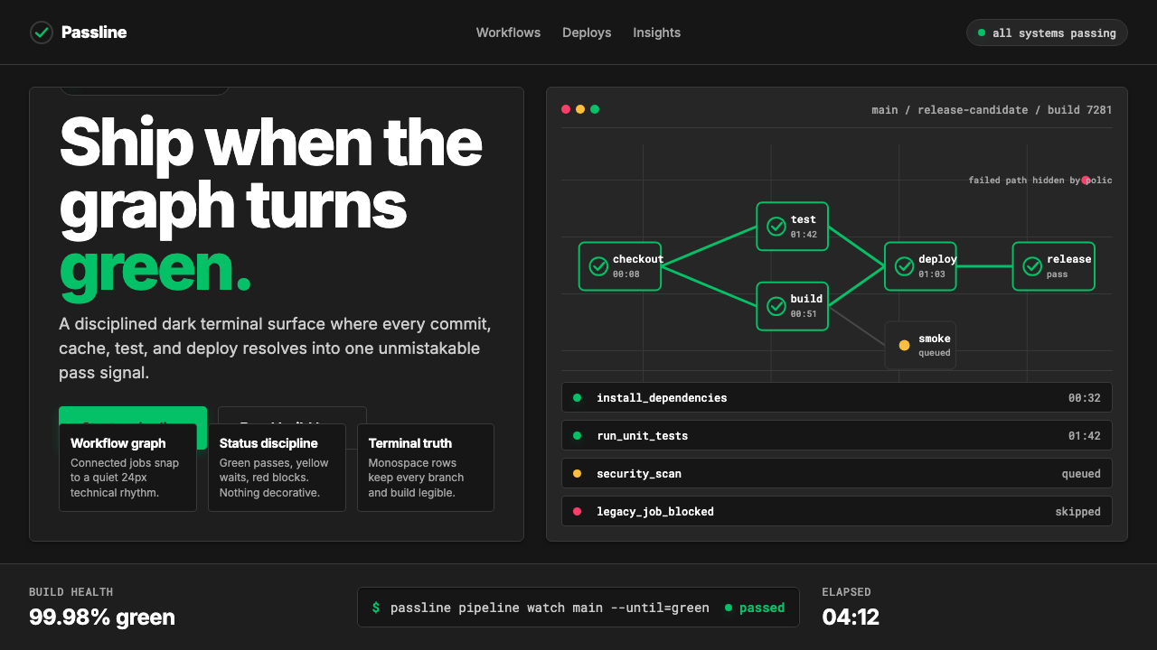 CircleCI Pipeline-GreenConfidence goes green. Emerald status lines cut through terminal-black pipeli…信心变绿。翠绿状态线切过终端黑流水线网格。
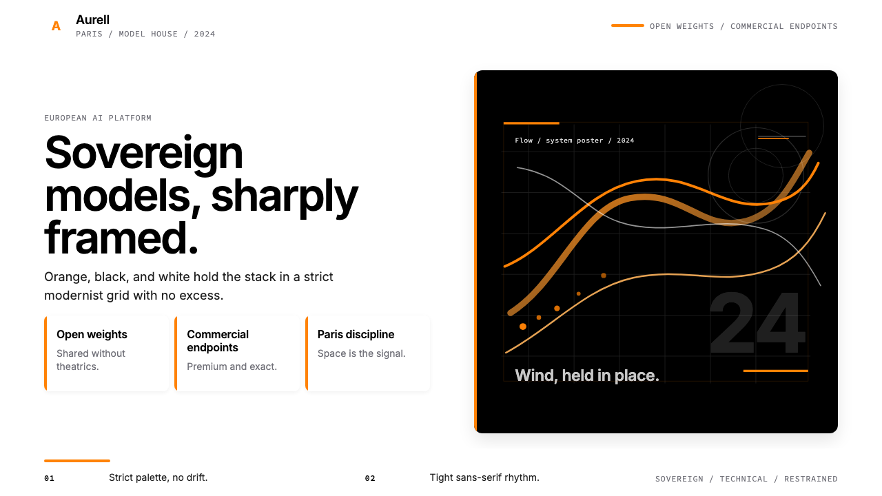 Mistral AI OrangeSovereign AI with restraint. Orange, black, and white lock the grid.主权AI很克制。橙黑白锁定网格。
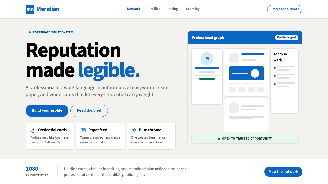 LinkedInCorporate trust, digitized. Authoritative blue frames white cards on warm cre…企业信任数字化:权威蓝框住暖奶油纸面上的白卡。
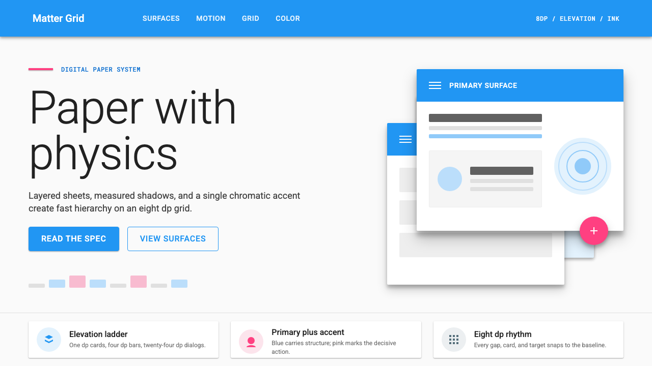 Material Design 1.0Depth made flat usable. Blue app bars, pink FABs, 8dp grids, and crisp paper…让扁平拥有深度:蓝色应用栏、粉色FAB、8dp网格与纸张投影。