About Retool Internal-Tools Red
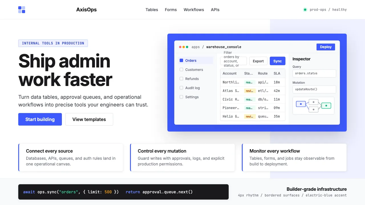
Retool's identity is electric-blue saturation laid over white developer-tool clarity. Founded in 2017 by David Hsu, the platform built the dominant "build internal tools fast" niche for engineering teams.
The brand voice is clean Inter typography, sharp UI-mockup imagery (tables, forms, dashboards, workflow diagrams), and saturated `#3D5AFE` accents. Everything reads as serious developer infrastructure — no whimsy, no decoration, just precision.
- Origin
- San Francisco, USA
- Era
- Founded 2017 (YC W17); current visual ~2022–2024
- Key figures
- David Hsu · Sequoia Capital · Y Combinator W17
- Movements
- low-code internal-tools SaaS · 2020s developer-productivity platforms · contemporary AI-feature integration
Retool Internal-Tools Red design spec
Colors
Background
Surface
Primary
Secondary
Accent
Text
Typography
InterHeadings
JetBrains MonoMono
Unlock for 1 credit
The other 11 sections — buttons, cards, spacing, motion, techniques and more — open once you unlock. Download the DESIGN.md or send it to your AI in one click. Unlock once, yours forever.
Sign up nowHave an account? Sign in
Styles similar to Retool Internal-Tools Red
Also inspired by brands & products, with a close feel.
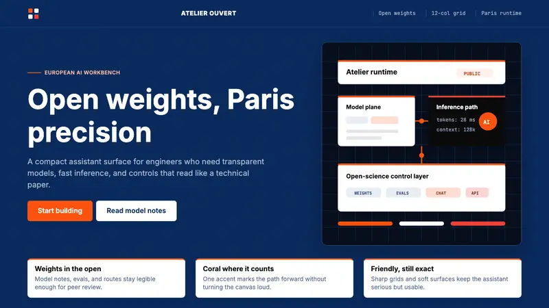 Mistral Le Chat French AIOpen science feels engineered. Navy panels, Inter grids, and coral stripes keep it exact.
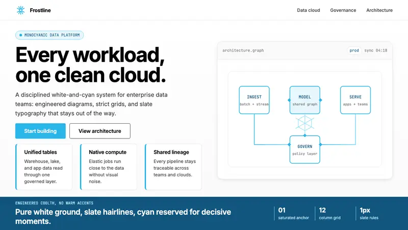 Snowflake Data CloudCool precision wins. Icy cyan, Inter grids, and hex data diagrams stay engineered.
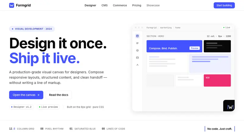 Webflow No-CodeA designer's tool, dressed like one. Saturated electric cobalt on pure white, Inter at tight tracking, abstract block-grid mockups.
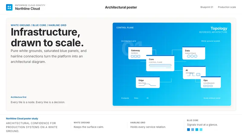 Microsoft AzureEnterprise calm, sharply diagrammed. White ground, saturated blue, hairline links.