What is Material Design 1.0?什么是 Material Design 1.0?
Material Design gave Google's fragmented digital world a single physical metaphor — surfaces that float, shadows that tell the truth, and color that earns its saturation.Material Design 为谷歌分散的数字世界赋予了一个统一的物理隐喻——会漂浮的界面层、诚实表达层级的投影,以及每一分饱和度都有所依凭的色彩。
Material Design 1.0 in briefMaterial Design 1.0 速览
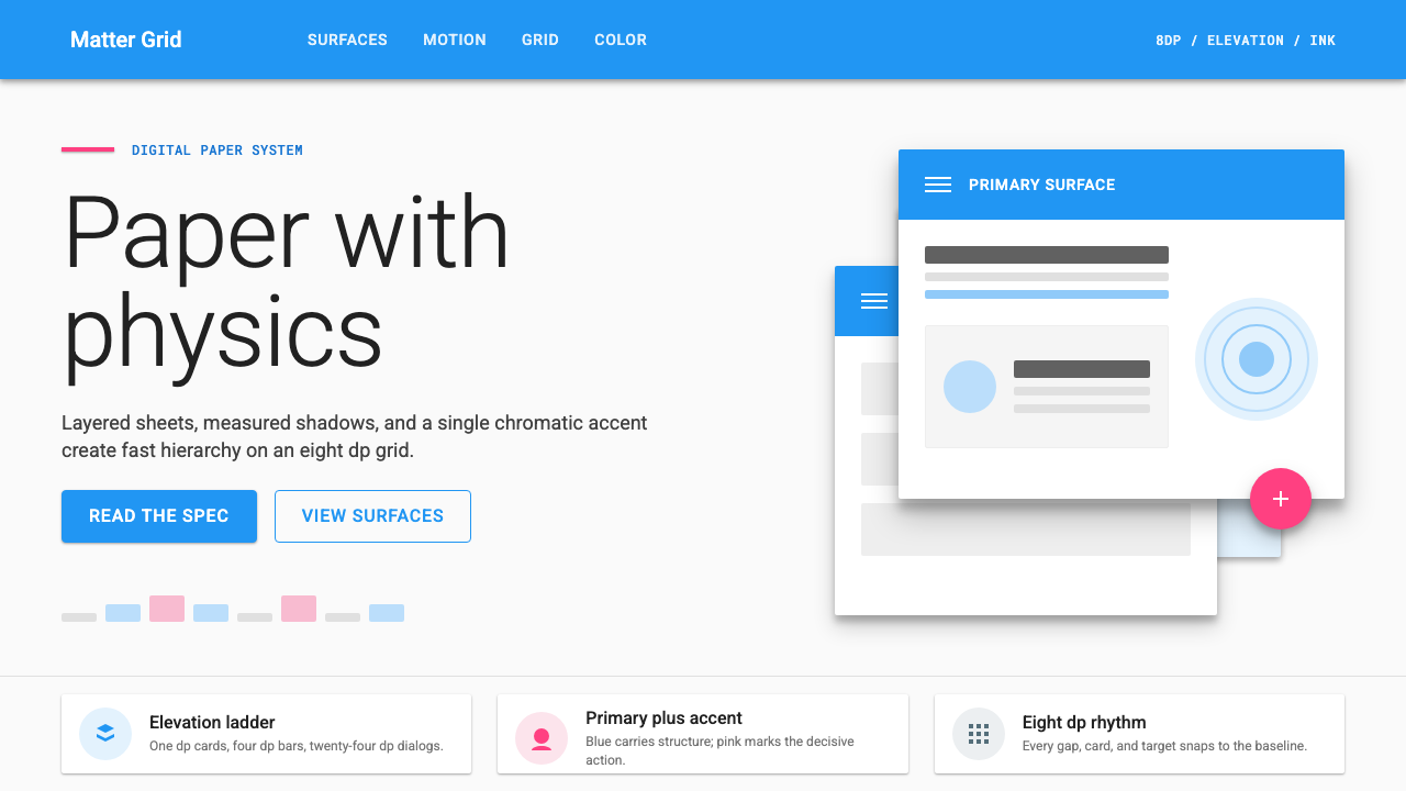
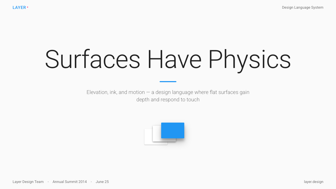
Material Design 1.0 is the design language Google introduced in 2014 to bring coherence to the sprawling ecosystem of Android, the mobile web, and Chrome OS. At its philosophical core is a single metaphor: the screen as a lit surface on which sheets of digital paper are arranged at different elevations. Those sheets — cards, app bars, sheets, dialogs — cast shadows proportional to how high they sit, creating a spatial hierarchy that users can read intuitively without needing to learn it explicitly.Material Design 1.0 是谷歌于 2014 年推出的设计语言,旨在为 Android、移动网页与 Chrome OS 构成的庞大生态带来视觉连贯性。其哲学核心是一个单一隐喻:屏幕是一个被照亮的表面,数字纸张在不同高度上层叠排布。这些纸张——卡片、应用栏、底部抬起层、对话框——投下与其所在高度相称的阴影,创造出用户无需刻意学习便能直觉感知的空间层级。
What made the system distinctive was its marriage of flat aesthetics with physical depth. The mid-2010s design world had largely abandoned the skeuomorphic textures of the iOS 6 era in favor of a flatter, more abstract visual language. Material Design accepted flatness but refused to make the screen feel weightless. Every surface has a place in a stack. Every elevation level casts a specific shadow. Touch interactions trigger an ink-ripple animation that radiates outward from the exact point of contact, reinforcing the metaphor that the user is pressing on a responsive material rather than clicking a button drawn on glass.这套体系的独特之处在于将扁平美学与物理深度融为一体。2010 年代中期的设计界已大体抛弃了 iOS 6 时代的拟物纹理,转向更为抽象的扁平视觉语言。Material Design 接受了扁平,却拒绝让屏幕感觉失重。每个界面层都有其在堆叠中的位置,每个高度层级投下特定的阴影。触摸交互触发的墨水涟漪动画从接触点向外扩散,强化了用户是在按压一种有回应的材料而非点击玻璃上所绘按钮的隐喻。
The system also introduced rigorous structural rules that extended far beyond metaphor. An eight-unit baseline grid governed spacing at every scale. A strict two-color model — one dominant primary color and one contrasting accent — kept interfaces focused without becoming visually noisy. A floating action button in the accent color anchored the single most important action on each screen. Typography was organized into a named scale from display sizes down to captions, each with a defined size relationship and weight, giving every application built on the system an immediate sense of order.这套体系还引入了远超隐喻层面的严格结构规则。一套以八为基本单位的基线网格在各个尺度上统御间距。严格的双色模型——一种主导性的主色与一种形成对比的强调色——让界面保持聚焦而不显嘈杂。以强调色呈现的悬浮操作按钮(FAB)将每个页面最核心的操作锚定于视觉焦点。字体系统从展示级标题到说明文字被组织为一套命名层级,每一级都有明确的尺寸关系与字重,使所有基于该体系构建的应用程序拥有立即可感的秩序感。
See the Material Design 1.0 design system查看 Material Design 1.0 完整设计系统
Where does Material Design 1.0 come from?Material Design 1.0 从何而来?
The story of Material Design begins at Google I/O in June 2014, when Matias Duarte — the Vice President of Design who had previously shaped the visual language of webOS and the early Android Holo theme — took the stage to announce a unified design system for the company's entire product range. The announcement came at a moment of genuine crisis for Google's visual identity. By 2013, Android had accumulated a patchwork of inconsistent interfaces: Gmail looked nothing like Google Maps, the Play Store had its own conventions, Chrome had others. On the web, Google's properties were equally fragmented. The need for a single, coherent, scalable system was urgent.Material Design 的故事始于 2014 年 6 月的 Google I/O 大会。Matias Duarte——这位曾塑造 webOS 视觉语言及早期 Android Holo 主题的设计副总裁——登台宣布了一套覆盖公司全系产品的统一设计系统。这一宣布发生在谷歌视觉形象陷入真实危机的时刻。到 2013 年,Android 已积累起一套拼凑而成的不一致界面:Gmail 与 Google 地图毫无视觉关联,Play 商店有自己的设计惯例,Chrome 又是另一套。在网页端,谷歌的各个产品同样四分五裂。建立一套单一、连贯、可扩展的系统的需求极为迫切。
Duarte and the Google Design team drew on several intellectual traditions to construct the system. The paper-and-ink metaphor was chosen deliberately to evoke physical legibility — paper is something humans have been reading for centuries, and the spatial relationships between stacked sheets are immediately intuitive. But the team pushed the metaphor further than simple analogy: they posited a kind of physics for the digital material, with rules about how surfaces could move, overlap, and transform. Surfaces could stretch and reshape; they could never pass through one another. Light came from above, casting shadows downward at a consistent angle, with a secondary ambient component to soften hard edges. These physics gave Material Design an unusual internal consistency: because behavior followed rules, designers working across different Google products could make locally correct decisions that would still feel globally coherent.Duarte 与谷歌设计团队从多个思想传统中汲取养分来构建这套系统。纸张与墨水的隐喻经过深思熟虑地选定,旨在唤起物理世界的可读性——人类阅读纸张已有数百年历史,层叠纸张之间的空间关系对人而言是直觉性的。但团队将隐喻推进得更远,超越了简单类比:他们为这种数字材料设定了一套物理规则,规定了界面层如何移动、叠加与变形。界面层可以伸展与重塑,但永远不能相互穿透。光线从正上方投射,阴影以一致的角度向下落,并附带柔化硬边的环境光分量。这套物理规则赋予了 Material Design 不寻常的内在一致性:因为行为遵循规则,在不同谷歌产品上工作的设计师能做出局部正确的决策,而这些决策在整体上仍然感觉连贯。
The color system grew from a different inspiration. Google's brand had long featured the four-color palette of its logo — red, blue, yellow, and green — but the Material Design color palette expanded this into a comprehensive swatch system with sixteen hues each available in ten tonal steps from near-white to near-black, plus an accent column of especially saturated tones intended for the floating action button and interactive highlights. The logic was explicit: applications should choose one primary color from the mid-range of a single hue family, one accent from a contrasting hue, and use no other colors for interface chrome. This restraint ensured that any app built within the system would look intentional rather than arbitrary, even if its development team had no dedicated design resources.色彩系统则来自不同的灵感。谷歌的品牌长期以来以其标志的红蓝黄绿四色为特征,而 Material Design 的色彩系统将其扩展为一套综合的色板体系:十六种色相,每种各有从近白到近黑的十个色调步级,外加一列饱和度极高的强调色,专用于悬浮操作按钮与交互高亮。其逻辑是明确的:应用程序应从某一色相家族的中间调中选取一种主色,再从对比色相中选取一种强调色,界面框架不使用其他任何色彩。这种克制确保了在该体系内构建的任何应用程序看起来都是有意为之的,而非随意拼凑的——即便其开发团队没有专职设计资源。
Christian Robertson's Roboto typeface, which had debuted with Android Ice Cream Sandwich in 2011, became the typographic foundation of Material Design. Robertson designed Roboto to be a mechanically legible geometric sans-serif with some of the warmth of a humanist face — a balance that allowed it to function clearly at small caption sizes while remaining readable in large display applications. Material Design organized Roboto into a named typographic scale with distinct roles for each level, from the bold, widely-spaced display style at the top to the compact, dense caption style at the bottom. This hierarchical organization meant that any interface following the system would have a consistent reading rhythm regardless of the content it contained.Christian Robertson 设计的 Roboto 字体于 2011 年随 Android Ice Cream Sandwich 首次亮相,成为 Material Design 的字体基石。Robertson 将 Roboto 设计为一款兼具机械易读性的几何无衬线字体,同时保留了人文主义字体的部分温度——这种平衡使其在小号说明文字中依然清晰可辨,在大号展示应用中同样易读。Material Design 将 Roboto 组织为一套带有命名层级的字体尺度体系,从顶部粗犷宽松的展示级风格到底部紧凑密集的说明文字级风格,每一级都有明确的角色定位。这种层级化组织意味着遵循该体系的任何界面都将拥有一致的阅读节奏,无论其承载的内容是什么。
What defines the Material Design 1.0 look?Material Design 1.0 的视觉特征是什么?
Elevation and Shadow高度与投影
Every surface in Material Design occupies a specific elevation in a shared z-axis space. The higher a surface sits above the background, the larger and more diffuse its shadow becomes. App bars float at a low elevation with a modest cast shadow; dialogs float high with a pronounced one. This shadow system is not decorative — it is a spatial communication tool that tells users at a glance which elements are interactive, which are contextual, and which are permanent. The shadows themselves are composed of two light components: a key light creating the main directional shadow and an ambient light softening the overall effect.Material Design 中的每个界面层都在共享的纵轴空间中占据特定的高度。一个界面层距背景越高,其投影就越大越漫散。应用栏以较低高度悬浮,投下适度的阴影;对话框以较高高度悬浮,投下更为显著的阴影。这套投影系统并非装饰性的——它是一种空间传达工具,让用户一眼便能分辨哪些元素可交互、哪些是上下文性的、哪些是永久存在的。投影本身由两种光线分量构成:产生主要方向性阴影的主光源,以及柔化整体效果的环境光。
Ink Ripple and Motion墨水涟漪与动效
Material Design treats motion not as embellishment but as information. The ink ripple — a circular wave that expands from the point of touch contact before fading — confirms to the user that their input was registered and identifies the precise location of that input. Beyond the ripple, the system defines motion curves and durations for common transitions: elements enter and exit along arcs rather than straight lines, shared elements between screens travel in consistent directions, and the duration of a transition is proportional to the distance traveled. All of this communicates spatial relationships between screens and states, making navigation feel oriented rather than arbitrary.Material Design 将动效视为信息而非点缀。墨水涟漪——从触摸接触点向外扩展随后消散的圆形波纹——向用户确认其输入已被捕获,并标识出该输入的精确位置。除涟漪之外,该体系为常见过渡定义了运动曲线与时长:元素沿弧线而非直线进场与退场,跨屏幕的共享元素朝一致的方向移动,过渡时长与移动距离成正比。这一切传达了屏幕与状态之间的空间关系,使导航感觉有方位感而非任意的。
Primary-plus-Accent Color Model主色加强调色的色彩模型
Material Design's color discipline is built on deliberate restraint: one primary color for toolbars, status bars, and large background areas; one accent color — typically vibrant and from a contrasting hue family — for floating action buttons, switches, sliders, and interactive highlights. No other colors should enter the interface chrome. The primary color carries the brand and provides overall tone; the accent color signals interactivity and draws the eye to the most important action on each screen. The palette extends this logic into light and dark variants of the primary for subtle depth within the same hue family.Material Design 的色彩规范建立在刻意克制之上:一种主色用于工具栏、状态栏与大面积背景区域;一种强调色——通常来自对比色相家族、饱和度较高——用于悬浮操作按钮、开关、滑块与交互高亮。界面框架中不应引入其他任何色彩。主色承载品牌特征并确定整体基调;强调色标示可交互性,并将视线引向每个页面上最重要的操作。色板将这一逻辑延伸为同一色相家族内的亮色与暗色主色变体,以实现界面内的微妙层次。
Eight-Unit Spatial Grid以八为基本单位的空间网格
All spacing in Material Design — between cards, inside component padding, between icons and labels, at screen edges — follows multiples of a single base unit. This consistency creates visual alignment that is felt even when it is not consciously noticed: related elements feel close, unrelated elements feel separated, and the overall layout has an internal logic that holds at every zoom level. Icons and touch targets follow their own consistent sizing rules derived from the same base, ensuring that interactive areas are always large enough for reliable finger activation while remaining visually proportionate.Material Design 中的所有间距——卡片之间、组件内边距、图标与标签之间、屏幕边缘——均遵循某一单一基本单位的整数倍。这种一致性创造出可被感知但无需刻意察觉的视觉对齐:相关元素感觉靠近,无关元素感觉分离,整体布局在每个缩放层级上都保持内在逻辑。图标与触控目标遵循源自同一基本单位的一致尺寸规则,确保交互区域始终大到足以可靠地被手指激活,同时在视觉上保持比例协调。
Typographic Hierarchy字体排印层级
Material Design organizes type into a named scale that covers every use case from full-screen display headings to dense caption text. Each level in the scale has a distinct size relationship to the levels above and below it, a specific weight, and a defined role. Display and headline styles use generous size and light or regular weight to create openness; body text uses a reading-optimized size and weight; caption and overline styles use compressed size and are reserved for supplementary information. The result is that any screen built within the system has an automatic reading hierarchy — the most important text is largest, the least important is smallest, and the steps between are consistent.Material Design 将字体组织为一套命名层级,覆盖从全屏展示级标题到密集说明文字的所有使用场景。层级中的每个级别与其上下相邻级别之间都有明确的尺寸关系、特定的字重,以及清晰的角色定位。展示与标题风格使用较大尺寸与细体或常规字重以创造开阔感;正文使用针对阅读优化的尺寸与字重;说明文字与上划线风格使用紧凑尺寸,专用于补充性信息。其结果是:在该体系内构建的任何页面都自动拥有阅读层级——最重要的文字最大,最不重要的最小,各级之间的步进是一致的。
Card-Based Content Surfaces基于卡片的内容界面
Cards — self-contained surfaces with rounded corners, consistent padding, and an elevation shadow — became the signature organizational unit of Material Design. A card groups related information and actions that belong together, separating them from adjacent cards by the background plane rather than by dividing lines. The card metaphor extends the paper analogy directly: each card is a discrete sheet containing one coherent piece of content. This approach made Material Design especially well-suited to feed-based and list-based interfaces, where the same structural pattern needed to accommodate text, images, actions, and metadata in variable combinations.卡片——具有圆角、一致内边距与高度投影的自包含界面层——成为 Material Design 的标志性组织单元。一张卡片将属于同一主题的相关信息与操作集合在一起,通过背景平面而非分割线将其与相邻卡片区隔。卡片隐喻直接延伸了纸张类比:每张卡片都是承载一段连贯内容的独立纸页。这一方式使 Material Design 尤其适合基于信息流和列表的界面——在这类界面中,同一结构模式需要以可变的组合方式容纳文字、图像、操作与元数据。
Floating Action Button悬浮操作按钮
The floating action button — a circular button in the accent color that hovers above the content at a consistently high elevation — is Material Design's most immediately recognizable innovation. Its purpose is structural: every screen has at most one primary action, and the FAB makes that action visually and spatially dominant. The circular form, the accent color, and the high elevation shadow together ensure that the FAB is always findable regardless of the content below it. In screens where no single primary action exists, the FAB is absent. This restraint distinguishes authentic Material Design application from superficial borrowing of the component.悬浮操作按钮(FAB)——一个以强调色呈现、始终以较高高度悬浮于内容之上的圆形按钮——是 Material Design 最具辨识度的创新。其作用是结构性的:每个页面最多只有一个主要操作,FAB 使这一操作在视觉与空间上占据主导地位。圆形形态、强调色与高度投影三者共同确保 FAB 无论其下方内容如何变化都能被轻易找到。在不存在单一主要操作的页面中,FAB 缺席。这种克制将对 Material Design 的真正运用与对这一组件的表面借用区别开来。
See the Material Design 1.0 design system查看 Material Design 1.0 完整设计系统
Who shaped Material Design 1.0?谁塑造了 Material Design 1.0?
Duarte is the designer most responsible for the concept and communication of Material Design. He joined Google in 2010 after shaping the visual language of Palm's webOS, which had already explored card-based spatial interfaces. At Google he led the team that produced the system, and his public articulation of the paper-and-physics metaphor — in keynotes, interviews, and the design guidelines themselves — gave the project a coherent philosophical identity that distinguished it from purely technical specification work. Duarte served as Google's VP of Design through the Material Design 1.0 era and continued to shape its evolution.Duarte 是在概念层面与传播层面对 Material Design 贡献最大的设计师。他于 2010 年加入谷歌,此前曾塑造 Palm webOS 的视觉语言——webOS 已经探索过基于卡片的空间界面。在谷歌,他领导了构建这套体系的团队,并通过主题演讲、访谈与设计规范本身,对纸张与物理隐喻进行了清晰的公开阐释,赋予了这个项目连贯的哲学身份,使其超越纯粹的技术规范工作。Duarte 在 Material Design 1.0 时代担任谷歌设计副总裁,并持续参与其演化。
Robertson designed Roboto, the typeface that underpins Material Design's typographic system. Roboto was initially created for Android 4.0 Ice Cream Sandwich in 2011 and was revised for Material Design in 2014. Robertson's design challenge was to create a typeface that would be legible at the full range of Android screen densities and sizes — from watch displays to tablet interfaces — while maintaining enough personality to feel distinctly Google rather than generically neutral. The typeface has since become one of the most widely served fonts on the web and a foundational element of how Material Design communicates at every scale.Robertson 设计了 Roboto——支撑 Material Design 字体系统的字体。Roboto 最初为 2011 年的 Android 4.0 Ice Cream Sandwich 而创作,并于 2014 年为 Material Design 修订。Robertson 的设计挑战是创造一款能在 Android 全系屏幕密度与尺寸范围内——从手表显示屏到平板界面——保持易读性,同时具备足够个性,让人感受到鲜明的谷歌气质而非中性通用的字体。这款字体此后成为网络上使用最广泛的字体之一,也是 Material Design 在各个尺度上进行视觉传达的基础性元素。
The Material Design specification was the work of a large cross-functional team at Google that included visual designers, interaction designers, engineers, and researchers. The team produced not only the visual guidelines but also a comprehensive component library, iconography guidelines, and motion specifications — all published as open documentation. The scale and openness of this documentation effort was itself significant: by publishing the full system as a public resource, Google made Material Design accessible to the vast ecosystem of third-party developers building on Android and the web, effectively spreading the visual language well beyond Google's own products.Material Design 规范是谷歌一个大型跨职能团队的成果,成员涵盖视觉设计师、交互设计师、工程师与研究员。团队不仅制定了视觉规范,还提供了全面的组件库、图标设计规范与动效规范——全部以开放文档形式发布。这一文档工作的规模与开放性本身意义重大:通过将整套体系作为公共资源发布,谷歌使 Material Design 能够被在 Android 与网页端构建应用的广大第三方开发者使用,有效地将这套视觉语言传播到谷歌自身产品之外。
While the design leadership defined the system's principles, the Android engineering team translated Material Design into the runtime components that shipped with Android 5.0 Lollipop in November 2014. This included the native implementation of elevation shadows, the ripple touch feedback system, and the transition framework that powered shared-element animations between screens. The technical implementation was as consequential as the design specification: by building the system into the platform layer rather than leaving it as a set of optional guidelines, Android ensured that any app targeting Lollipop would inherit the core behaviors without requiring each developer to rebuild them from scratch.在设计领导层定义体系原则的同时,Android 工程团队将 Material Design 转化为 2014 年 11 月随 Android 5.0 Lollipop 发布的运行时组件。这包括高度投影的原生实现、涟漪触摸反馈系统,以及驱动屏幕间共享元素动画的过渡框架。技术实现与设计规范同样至关重要:通过将系统构建在平台层而非仅作为一套可选指引,Android 确保了任何面向 Lollipop 的应用程序都能自动继承核心行为,而无需每位开发者从头重建。
The Material Design icon set — several hundred product and system icons drawn to a consistent geometric specification — was a critical component of the visual system that often goes unacknowledged. The icon guidelines defined a shared grid, consistent stroke weights, padding rules, and a construction vocabulary based on circles, squares, and diagonal geometry. Applied consistently, the icon set gave the system a visual coherence at small scale that complemented the type and color systems at larger scales. The full icon library was released as open source, making it a foundational resource for Android development and, through the web component libraries, for a generation of Material-influenced web interfaces.Material Design 图标集——数百个按照一致几何规范绘制的产品与系统图标——是这套视觉体系中常常被忽视的关键组成部分。图标规范定义了共享网格、一致的描边粗细、内边距规则,以及基于圆形、正方形与对角线几何的构建词汇。在各处统一应用时,图标集在小尺寸层面赋予了体系视觉连贯性,与字体和色彩系统在较大尺度上形成呼应。完整的图标库以开源形式发布,成为 Android 开发的基础性资源,并通过网页组件库,成为一代受 Material 影响的网页界面的共同基础。
How do you use Material Design 1.0 today?今天怎么用 Material Design 1.0?
Material Design 1.0 is one of the most immediately recognizable design systems in contemporary visual culture, and applying it well requires understanding its internal logic rather than just borrowing its most visible components. The system's recognizable elements — elevated cards, ink ripples, accent-color FABs, the named color palette — are outputs of a coherent philosophy about surfaces, depth, and hierarchy. When that philosophy is understood, the elements can be used or adapted with confidence. When it is borrowed without that understanding, the result is typically a layout that has the cosmetic appearance of Material Design without the spatial clarity that makes it legible.Material Design 1.0 是当代视觉文化中辨识度最高的设计系统之一,真正运用好它需要理解其内在逻辑,而不仅仅是借用最显眼的组件。该体系最具标志性的元素——高度卡片、墨水涟漪、强调色 FAB、命名色板——是一套关于界面层、深度与层级的连贯哲学的产物。当这套哲学被理解后,这些元素可以被自信地使用或改编。当它被借用而缺乏这种理解时,结果通常是一个具备 Material Design 外观但缺少其空间清晰度的布局。
For presentation slides, Material Design translates effectively to both cover and content pages. A cover benefits from the system's bold color logic: set the slide background to a mid-range primary hue, place the title in a contrasting light tone at a generous size, and use the accent color sparingly for a single supporting element such as a dividing line or a call-to-action label. Content slides should be treated as card surfaces: each slide is a single elevated sheet containing one main idea. Use the typographic hierarchy to differentiate heading from body from caption; avoid decorative borders or background textures. Data slides gain from the system's diagrammatic clarity — charts rendered in the primary and accent colors feel purposeful rather than decorative, and consistent grid alignment makes comparisons across slides feel coherent.在演示文稿中,Material Design 能有效转化应用于封面与内容页。封面可利用该体系大胆的色彩逻辑:将幻灯片背景设为中间调主色,将标题以对比明亮的色调在较大尺寸下呈现,并以强调色克制地用于单一支撑性元素,如分割线或行动号召标签。内容页应当被当作卡片表面处理:每张幻灯片是一张只承载一个核心概念的独立高度纸页。使用字体层级区分标题、正文与说明文字;避免装饰性边框或背景纹理。数据页从该体系的示意图式清晰度中获益——以主色和强调色呈现的图表感觉目的明确而非装饰性,一致的网格对齐使跨幻灯片的比较感觉连贯。
For web interfaces, Material Design is exceptionally well-suited to dashboards, admin tools, and enterprise software where hierarchy, scannability, and spatial orientation are primary concerns. Apply the two-color model strictly: one primary color for navigation chrome, headers, and dominant interactive states; one accent for the single highest-priority action on each view. Use elevation shadows on cards and modals to communicate which content is above the base plane. Reserve the FAB pattern for screens with a genuinely singular primary action — adding it to every page without that discipline undermines its communicative value. Navigation drawers, bottom navigation bars, and app bars should follow the system's proportioning rather than being freely resized.对于网页界面,Material Design 尤其适合层级、可扫描性与空间定向感是首要关切的仪表板、管理工具与企业软件。严格应用双色模型:一种主色用于导航框架、标题栏与主导性交互状态;一种强调色用于每个视图上优先级最高的单一操作。在卡片与模态框上使用高度投影来传达哪些内容处于基础平面之上。将 FAB 模式保留给确实只有一个主要操作的页面——将其添加到每个页面而缺乏这种原则,会削弱其传达价值。导航抽屉、底部导航栏与应用栏应遵循体系的比例规范而非随意调整尺寸。
For editorial layouts and marketing materials, the system's card structure and bold color fields translate well to section-based page designs. A landing page built in the Material Design idiom uses full-width colored bands alternating with white card surfaces, places the accent-color call-to-action button consistently at the end of each section, and uses the typographic hierarchy to distinguish section headings from body text without relying on decorative type treatments. The system's strong grid alignment supports multi-column layouts on wider screens while degrading gracefully to single-column on mobile — a practical quality for editorial content that must function across breakpoints.对于编辑版面与营销材料,该体系的卡片结构与大胆色块在基于章节的页面设计中效果良好。以 Material Design 语汇构建的落地页使用全宽彩色带与白色卡片表面交替排列,在每个章节末尾以一致的强调色行动号召按钮收尾,并以字体层级区分章节标题与正文,而无需依赖装饰性的字体处理。该体系强劲的网格对齐在较宽屏幕上支持多列布局,同时能优雅降级为移动端单列——对于需要跨断点运行的编辑内容,这是一个实用的品质。
A common mistake when applying Material Design 1.0 is treating the component library as the system itself. Developers who adopt the Material component implementations without internalizing the elevation and color rules often produce interfaces where every component looks correct in isolation but the screen as a whole lacks spatial coherence — surfaces appear to float at arbitrary heights, the primary and accent colors are used interchangeably, and the typographic scale is applied inconsistently. The system's components are expressions of its rules; the rules must be understood first. A second common error is extending the color model beyond the intended two-color constraint — introducing a third or fourth independent color for different content types typically produces an interface that feels decorative rather than structured.应用 Material Design 1.0 时最常见的错误,是将组件库当作体系本身。在未内化高度与色彩规则的情况下采用 Material 组件实现的开发者,往往会产出这样的界面:每个组件单独看起来是正确的,但整体页面缺乏空间连贯性——界面层似乎以任意高度悬浮,主色与强调色被互换使用,字体尺度的应用也前后不一致。体系的组件是其规则的表达;规则必须首先被理解。另一个常见错误是将色彩模型扩展超出既定的双色约束——为不同内容类型引入第三种或第四种独立色彩,通常会产出一个感觉装饰性而非结构性的界面。
See the Material Design 1.0 design system查看 Material Design 1.0 完整设计系统
Material Design 1.0 — FAQMaterial Design 1.0 · 常见问题
How is Material Design 1.0 different from Material Design 2 and Material You?Material Design 1.0 与 Material Design 2 及 Material You 有何不同?
Material Design 1.0, released with Android 5.0 Lollipop in 2014, established the paper-physics metaphor, the elevation shadow system, the two-color model, and the FAB pattern. Material Design 2, introduced in 2018, refined the system toward a lighter, more open aesthetic — surfaces became more white, shadows became subtler, and rounded corners became more prominent. Material You, announced in 2021, made the most radical change: it introduced dynamic color extraction from the user's wallpaper, allowing the system palette to be personalized rather than fixed. The core spatial logic — surfaces, elevation, shadow — persists across all three versions, but Material You significantly loosened the strict two-color discipline of the original.2014 年随 Android 5.0 Lollipop 发布的 Material Design 1.0 建立了纸张物理隐喻、高度投影系统、双色模型与 FAB 模式。2018 年推出的 Material Design 2 将体系精炼为更轻盈、更开阔的美学——界面层更趋近白色,阴影更为微妙,圆角更为突出。2021 年发布的 Material You 带来了最为根本的变化:引入了从用户壁纸中动态提取颜色的机制,使系统色板可以被个性化而非固定不变。核心空间逻辑——界面层、高度、投影——在三个版本中一以贯之,但 Material You 大幅放宽了原版严格的双色约束。
Can Material Design 1.0 work for non-Google products, or does it feel brand-specific?Material Design 1.0 能用于非谷歌产品吗,还是感觉过于品牌专属?
The system was designed to be customizable at the color level precisely so that non-Google products could adopt the structural logic without looking like Google applications. The two-color model allows any brand palette to be slotted in as primary and accent, and the component shapes, elevation system, and typographic hierarchy are neutral enough to carry different brand identities. The risk of brand association is real but manageable: the FAB, the navigation drawer, and the bottom navigation bar are so strongly associated with Android that using them outside a mobile context can feel derivative. On web products and in presentation contexts, the structural elements — cards, elevation, typographic scale — transfer well without triggering the Android brand association.这套体系在色彩层面被有意设计为可定制的,正是为了让非谷歌产品能够采用其结构逻辑而不显得像谷歌的应用程序。双色模型允许将任何品牌色板作为主色和强调色代入,组件形态、高度系统与字体层级足够中性,能够承载不同的品牌身份。品牌关联的风险是真实存在的,但可以管控:FAB、导航抽屉与底部导航栏与 Android 的关联如此强烈,以至于在移动场景之外使用这些元素会显得生搬硬套。在网页产品与演示场景中,结构性元素——卡片、高度、字体尺度——能够很好地迁移,而不会触发 Android 品牌联想。
Why did Material Design 1.0 use such saturated accent colors?Material Design 1.0 为何使用如此高饱和度的强调色?
The accent colors in Material Design 1.0 — pinks, teals, limes, ambers at their most vivid — were chosen to perform a specific communicative function: they needed to be identifiable as interactive affordances regardless of which primary color they were paired with, and they needed to remain visible against both light and dark background surfaces. A less saturated accent would risk being absorbed into the primary color or losing contrast against light backgrounds. The system also reflected the screen technology of 2014: OLED and AMOLED displays, increasingly common in Android devices of that era, render highly saturated colors with particular vibrancy, and the palette was calibrated with those displays in mind. On contemporary calibrated displays, the original accents can appear aggressive; reducing their saturation slightly while keeping the hue family intact is a common and defensible adaptation.Material Design 1.0 中的强调色——最为鲜艳的粉红、蓝绿、黄绿、琥珀——被选定以执行特定的传达功能:它们需要在与任何主色配对时都能被识别为可交互的可供性标志,并且需要在浅色与深色背景表面上均保持可见度。饱和度较低的强调色可能会被主色吸收,或在浅色背景上失去对比度。这套体系也反映了 2014 年的屏幕技术:OLED 与 AMOLED 显示屏在那个时代的 Android 设备中日益普及,对高饱和度色彩的渲染具有特别的鲜艳度,色板的校准就是以这些显示屏为参照的。在当代经过校准的显示屏上,原版强调色可能显得过于强烈;在保持色相家族不变的前提下略微降低饱和度,是一种常见且合理的改编方式。
Is the ink ripple animation essential to the system, or can it be omitted?墨水涟漪动画对这套体系是否不可或缺,还是可以省略?
The ripple is structurally important in touch-first contexts where it confirms input registration — on mobile, where users cannot rely on hover states to preview interactivity, the ripple provides feedback that the interface has responded. In pointer-based contexts — desktop web, presentation software — hover states and cursor changes perform a similar function, and the ripple is less necessary. Omitting it on the web is common and generally acceptable. What cannot be omitted without abandoning the system's spatial logic is the elevation shadow structure: the ripple is a feedback mechanism, but the shadows are the fundamental spatial communication tool that tells users where surfaces sit relative to one another.在以触摸为主的场景中,涟漪在确认输入捕获方面具有结构性的重要意义——在移动端,用户无法依赖悬停状态来预览可交互性,涟漪提供了界面已作出响应的反馈。在基于指针的场景中——桌面网页、演示软件——悬停状态与光标变化执行着类似的功能,涟漪的必要性因此降低。在网页端省略它是常见的,通常也是可以接受的。但在不放弃体系空间逻辑的前提下不可省略的,是高度投影结构:涟漪是一种反馈机制,而投影才是向用户传达界面层相对位置的根本性空间传达工具。
How should Material Design 1.0 handle dark-mode interfaces, given it was designed for light backgrounds?鉴于 Material Design 1.0 是为浅色背景设计的,它应如何处理深色模式界面?
Material Design 1.0 was designed with light backgrounds as the canonical surface, and the elevation shadow system — which relies on dark shadows on light backgrounds — does not invert cleanly. In the original system, dark surfaces were used only selectively for app bars and status bars to reinforce the primary brand color. Material Design 2 later addressed dark mode explicitly with a surface tinting approach: surfaces at higher elevations lighten by a small amount rather than casting darker shadows, and the accent colors are desaturated slightly to reduce glare. Applying this logic retrospectively to Material Design 1.0 work — replacing shadow-based elevation with subtle surface lightening, using the dark variant of the primary color for headers — is the most coherent approach to dark-mode adaptation within the original system's spatial framework.Material Design 1.0 以浅色背景作为标准界面层设计,而依赖浅色背景上深色阴影的高度投影系统不能直接反转。在原版系统中,深色表面仅选择性地用于应用栏与状态栏以强化主品牌色。Material Design 2 后来通过界面层着色方案明确应对了深色模式:较高高度的界面层略微变亮而非投下更深的阴影,强调色也略微降低饱和度以减少刺眼感。将这一逻辑回溯应用于 Material Design 1.0 的工作中——以微妙的界面层变亮取代基于投影的高度表达,使用主色的暗色变体作为标题背景——是在原版体系空间框架内进行深色模式适配最为连贯的方式。
Related design styles相关设计风格
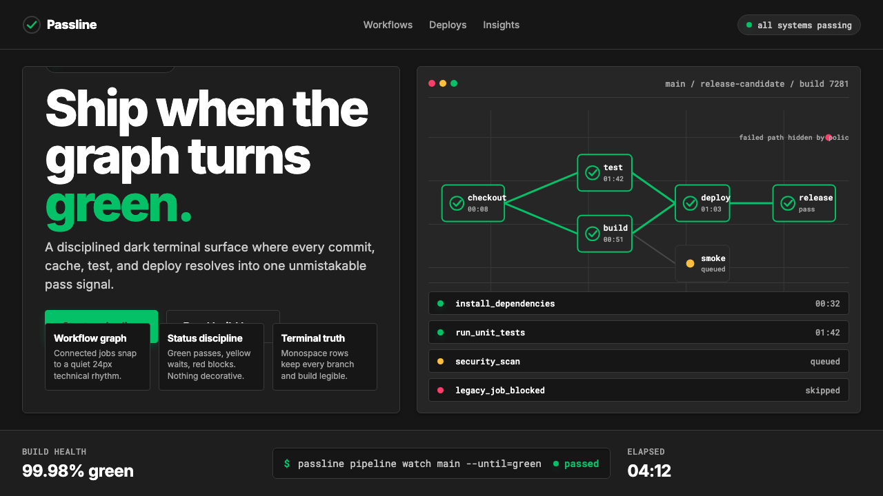 CircleCI Pipeline-GreenConfidence goes green. Emerald status lines cut through terminal-black pipeli…信心变绿。翠绿状态线切过终端黑流水线网格。
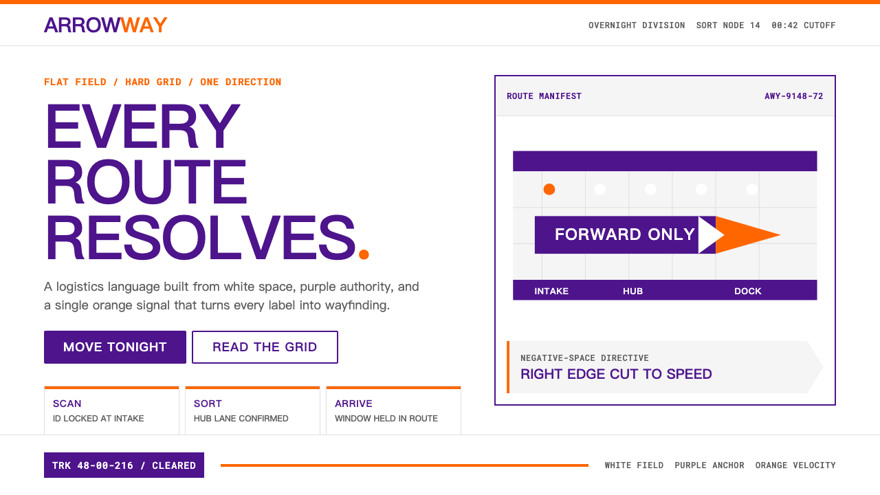 FedExDirections, not decoration. Purple authority and one orange bar organize a fl…只做指引不装饰:紫色权威与橙色单条信号,压在纯白硬网格上。
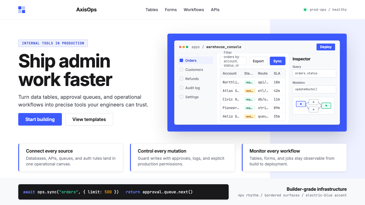 Retool Internal-Tools RedPrecision ships fast. Electric blue panels, Inter type, and bordered UI mocku…精准而快速。电光蓝面板、Inter 字体和边框 UI 模型撑起气质。
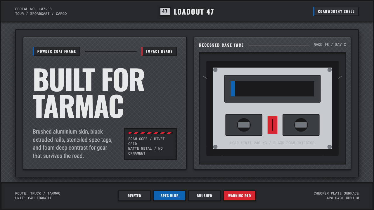 Aluminium Flight CaseRoadproof and exact. Diamond-plate gray, stencil type, black frames, blue-red…坚硬精确:菱形铝纹、模版字、黑框与蓝红规格标签。
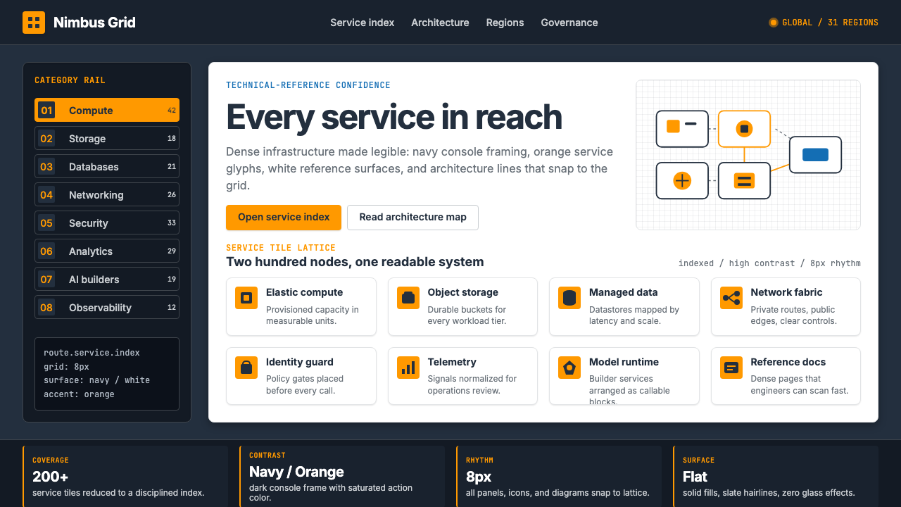 Amazon Web Services (AWS)Enterprise cloud made legible. Orange-on-navy service tiles lock to an 8px gr…企业云变得可读:橙色服务瓦片锁进深蓝 8px 网格。
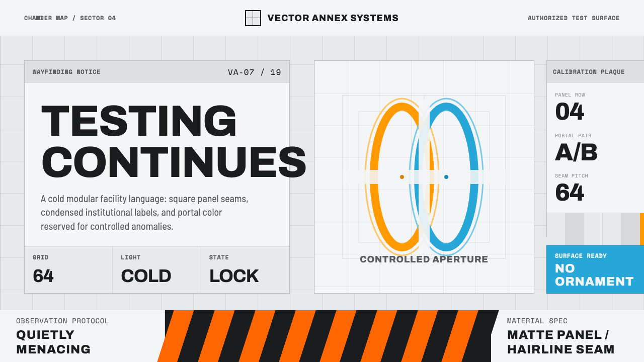 Aperture ScienceSterile authority. Cool panel seams, Archivo signage, and sparse orange-blue…冷峻权威:冷灰板缝、Archivo 标识与稀疏橙蓝光环。