What is FedEx?什么是 FedEx?
Two colors, one hidden arrow, and a flat white grid built the most recognized logistics identity on the planet.两种颜色、一个隐藏的箭头和一张纯白网格,构建了全球辨识度最高的物流视觉系统。
FedEx in briefFedEx 速览
FedEx's visual identity is a study in purposeful restraint. Purple signals institutional authority and global reach; orange signals speed and urgency. Together they work not as decoration but as a wayfinding system — the visual equivalent of an airport terminal sign that tells you exactly where to go without asking you to admire it first.联邦快递的视觉识别系统是目的性克制的一堂课。紫色传达机构权威与全球触达;橙色传达速度与紧迫。两者并非装饰,而是一套导视系统——如同机场航站楼的指示牌,准确告诉你该去哪里,不要求你先驻足欣赏。
The most celebrated feature of the identity is the negative-space arrow hidden between the capital E and the lowercase x in the wordmark. Invisible until noticed, impossible to unsee thereafter, it became the most-discussed piece of negative-space design in twentieth-century corporate identity. But the arrow is not a trick — it is the philosophy made visible: the system is always pointing forward, always in motion, always delivering.这套识别体系中最广为称道的特征是隐藏于字标中大写E与小写x之间的负空间箭头。发现之前形同隐形,发现之后再也无法视而不见,它成为二十世纪企业视觉识别史上被讨论最多的负空间设计案例。但箭头并非视觉把戏——它是哲学的可见化:这套系统永远指向前方,永远在运动,永远在交付。
What unifies the FedEx visual system beyond the wordmark is a disciplined set of structural rules. Flat white fields provide a neutral stage. Hard-edged rectangular containers organize content with the clarity of a label on a package. A single divisional accent color — drawn from a family of hues, one per service brand — appears at a time, never competing with the purple foundation. Everything directs; nothing decorates.将联邦快递视觉系统统一起来的,是一套严格的结构性规则。纯白底面提供中性的舞台;硬边矩形容器以包裹标签的清晰度组织内容;每次只出现一种分部强调色——来自一个色系家族,每个服务品牌各占一色——从不与紫色基础色竞争。一切都在指引;没有任何东西在装饰。
Where does FedEx come from?FedEx 从何而来?
The company began as Federal Express, founded by Frederick W. Smith in Memphis, Tennessee in 1971. Smith had outlined the hub-and-spoke overnight delivery concept in a Yale undergraduate paper that, depending on the telling, received either a mediocre grade or a moderate one — a mythologized origin story the company has never entirely discouraged. What is certain is that Smith raised the capital, built the network, and launched operations in 1973 with a fleet of small aircraft radiating out from Memphis International Airport.公司起源于联邦快递,由弗雷德里克·W·史密斯于1971年在美国田纳西州孟菲斯创立。史密斯曾在耶鲁大学的一篇本科论文中描述了轮毂辐条式隔夜配送概念——这篇论文究竟得了一个平庸的分数还是中等的分数,各方说法不一,公司也从未真正澄清这段神话化的创业传说。可以确定的是,史密斯募集了资本,搭建了网络,并于1973年以一支从孟菲斯国际机场向外辐射的小型机队正式开始运营。
For its first two decades, the company operated under a logotype that was workmanlike but unremarkable — the kind of corporate type treatment common to American freight companies of the era. By the early 1990s, Federal Express had grown into a global logistics giant and was preparing to shorten its operating name to FedEx, the nickname customers had already adopted. The rename prompted a wholesale identity redesign, commissioned through Landor Associates, one of the most respected identity consultancies in the world.在最初的二十年间,公司使用的字体标识务实而平庸——与那个时代美国货运公司的企业字体处理并无二致。到1990年代初期,联邦快递已成长为一家全球物流巨头,并准备将运营名称缩短为FedEx——这个客户早已自发采用的昵称。更名促成了一次全面的识别系统再设计,委托对象是全球最受尊崇的品牌咨询公司之一:朗涛设计公司(Landor Associates)。
The design was led by Lindon Leader, a senior designer at Landor's San Francisco office. Leader's process was exhaustive — reportedly more than two hundred wordmark iterations were developed and discarded before the final solution emerged. The choice of a single unified wordmark rather than separate logotype and symbol was deliberate: it concentrated all visual equity into one mark, made reproduction simpler across every surface from an aircraft fuselage to a shipping label, and created the conditions for the hidden arrow to function as an internal reward for attentive observers.设计工作由朗涛旧金山办公室的高级设计师林顿·里德(Lindon Leader)主导。里德的过程极为深入——据报道,超过两百个字标方案被开发并放弃,最终方案才得以浮现。选择单一整合字标而非分开的字体标识与符号,是经过深思熟虑的:这将所有视觉资产集中于一个标记,使其在飞机机身到快递标签的任何表面上都能简洁再现,同时为隐藏箭头创造了条件——作为给细心观察者的内在奖赏。
The 1994 identity launched to immediate professional acclaim. The hidden arrow was not publicized at launch — it circulated quietly among designers before becoming general public knowledge years later, by which point it had already been written into design school curricula as a canonical example of negative-space thinking. The divisional color system, which assigns a distinct secondary color to each service brand (orange for Express, green for Ground, red for Freight, and others), allowed the corporation to expand its service portfolio while keeping every touchpoint instantly recognizable as FedEx.1994年发布的这套识别系统立即在专业圈内广受称赞。隐藏箭头在发布时并未被公开宣传——它在设计师群体中悄然流传,多年后才成为大众常识,而那时它已作为负空间思维的经典案例被写入设计学院的课程。分部色彩系统为每个服务品牌分配了独特的辅助色(快递部门为橙色、陆运为绿色、货运为红色,以及其他颜色),使集团在扩展服务组合的同时,保持每个触点都能被即时识别为联邦快递。
What defines the FedEx look?FedEx 的视觉特征是什么?
Two-Color Foundation双色基底
The identity rests on deep purple and vivid orange as its irreducible foundation. Purple occupies the dominant role — it reads as institutional permanence, reliability, and scale, the color of a company that will still be there when your package needs to arrive. Orange is the accent and counterweight — kinetic, urgent, directional. Neither color is soft or ambiguous; both are saturated to the edge of their useful range without tipping into garishness. The pairing works because purple and orange sit at opposite poles of the visible spectrum, creating a contrast that is immediately legible across every medium.这套识别体系以深紫色和鲜亮的橙色作为不可再约减的基底。紫色占据主导地位——它传达出机构的恒久性、可靠感与规模感,是一家能确保在你的包裹需要送达时依然存在的公司的颜色。橙色是强调色与对衬——动感、紧迫、具有方向性。两种颜色都不柔和、不含糊;两者的饱和度都被推至可用范围的边缘而不滑向俗艳。这一色彩搭配之所以有效,是因为紫色与橙色位于可见光谱的对立两极,在任何媒介上都产生即时可读的对比。
Divisional Color Architecture分部色彩架构
Beyond the core purple-and-orange pairing, the FedEx system deploys a family of secondary colors — one per service division — that replace orange as the accent while keeping purple as the constant spine. This architecture allows a single parent identity to parent dozens of sub-brands without diluting recognition. Each divisional mark is immediately legible as FedEx and simultaneously as a specific service tier. The discipline is strict: only one secondary color appears per touchpoint, and the background remains flat white or the purple-and-accent pair.在紫橙核心配色之外,联邦快递系统部署了一套辅助色家族——每个服务分部各占一色——在保持紫色作为恒定主轴的同时替换橙色作为强调色。这套架构允许单一母品牌统领数十个子品牌,而不稀释识别度。每个分部标识都能被即时识别为联邦快递,同时也能被识别为特定的服务层级。规则严格:每个触点只出现一种辅助色,背景保持纯白或紫色加强调色的双色搭配。
Negative Space as Meaning负空间即意义
The arrow embedded in the letterspace between E and x is not a gimmick appended to the wordmark — it is native to the letterform proportions Lindon Leader selected. The arrow points forward and to the right, the direction of reading in Latin script and the conventional visual metaphor for progress and delivery. Once perceived, it is not possible to look at the wordmark and not see it. This is the mechanism that elevates a competent logotype into a cultural artifact: the mark rewards attention with a second layer of meaning that advertising alone cannot supply.嵌入E与x字间距中的箭头并非附加于字标之上的噱头——它原生于林顿·里德所选择的字母形态比例之中。箭头指向右前方,即拉丁字母书写的阅读方向,也是进步与交付的惯常视觉隐喻。一旦被感知,便再也无法在看到字标时视而不见。这正是将一个称职的字体标识提升为文化人工物的机制:这个标记以第二层含义奖赏注意力,而这是广告本身无法单独供给的。
Flat White Ground纯白底面
Every application of the FedEx system operates on a clean white field. There are no textured backgrounds, no gradient fills, no atmospheric washes. The white is not neutral by accident — it functions like the white of a shipping label or an airport sign, a surface whose sole purpose is to make the information on it maximally legible. Against this ground, the purple wordmark and the accent color perform with the precision of ink on paper. Any deviation from flat white — a tinted background, a photographic ground — immediately softens the system's directional authority.联邦快递系统的每个应用场景都在洁净的白色底面上运行。没有纹理背景,没有渐变填充,没有氛围渲染。这片白色并非偶然中性——它的功能如同快递标签或机场指示牌的白色底面,其唯一目的是使上面的信息达到最高可读性。在这片底面上,紫色字标与强调色以纸上油墨的精准度呈现。任何对纯白底面的偏离——有色调的背景、摄影底图——都会立即软化系统的导视权威感。
Rectangular Containment矩形容器逻辑
The FedEx visual language favors hard rectangular containers over any other compositional device. Type sits in defined zones. Color blocks have clean, unornamented edges. The divisional color typically appears as a solid bar, band, or rectangular field rather than as a free-floating shape. This container logic mirrors the physical reality of the company's core product: a package has edges, dimensions, and defined contents. The visual language translates that physical precision into every designed surface.联邦快递的视觉语言偏好硬边矩形容器,而非其他构图手段。文字处于明确划定的区域。色块拥有干净、无装饰的边缘。分部色彩通常以实色条带、色带或矩形色块呈现,而非自由漂浮的形状。这套容器逻辑映射了公司核心产品的物理现实:包裹有边缘、有尺寸、有明确的内容物。视觉语言将那种物理精确性转化进每一个被设计的表面。
Functional Typography功能性排印
The wordmark's letterforms are custom — slightly compressed, with generous spacing and a geometry that was calibrated to produce the negative-space arrow as a structural byproduct rather than an addition. In supporting typography, the system favors clean, upright sans-serif forms with no decorative variation. Text is sized for legibility at the distances relevant to each touchpoint — large and bold on vehicles and buildings, precise and tight on label copy. There are no calligraphic flourishes, no decorative display faces, no ornamented numerals. Information is the content.字标的字母形态是定制设计的——略微压缩,间距宽裕,几何比例经过精心校准,使负空间箭头作为结构性副产品自然生成而非外加。在辅助排版中,系统偏好干净、直立的无衬线字形,无任何装饰性变化。文字按每个触点相关距离的可读性定尺——在车辆和建筑上大而粗重,在标签文字上精确而紧凑。没有书法性花饰,没有装饰性展示字体,没有装饰性数字。信息即内容。
Motion and Direction运动感与方向感
Every element of the FedEx system implies movement rather than static presence. The arrow in the wordmark points forward. The divisional color bars terminate cleanly, suggesting a trajectory. Vehicles and aircraft are treated as moving billboards: the identity is designed to read at speed, from a distance, in poor light, and in motion. This is not a system designed for lingering contemplation. It is designed for instant recognition — the way a signal on a runway or a marker on a highway must communicate without demanding the viewer slow down.联邦快递系统的每个元素都暗示运动而非静止存在。字标中的箭头指向前方。分部色彩条带以干净的方式终结,暗示一条轨迹。车辆与飞机被当作移动的广告牌:这套识别系统被设计为能在高速移动中、从远处、在昏暗光线下、在运动状态中被读取。这不是一套为驻足凝视而设计的系统,而是为即时识别而设计的——就像跑道上的信号或高速公路上的标识,必须在不要求观看者放慢脚步的前提下完成传达。
Who shaped FedEx?谁塑造了 FedEx?
Smith founded Federal Express in 1971 after writing the hub-and-spoke delivery concept as an undergraduate thesis at Yale. He raised the capital, assembled the aircraft fleet, and launched overnight operations from Memphis in 1973. His conviction that reliable speed was itself a competitive product — not merely a service feature — shaped the company's identity requirements from the start. The visual system that Landor eventually created is a direct translation of his operational philosophy: no ambiguity, no delay, no wasted motion.史密斯于1971年创立联邦快递,此前他在耶鲁大学的本科论文中描述了轮毂辐条式配送概念。他募集资本、组建机队,并于1973年从孟菲斯发起隔夜运营。他坚信可靠的速度本身就是一种竞争性产品——而非仅仅是服务特性——这从一开始就塑造了公司的视觉识别需求。朗涛最终创建的视觉系统,是他运营哲学的直接转译:无歧义、无延误、无多余动作。
A senior designer at Landor Associates' San Francisco office, Leader led the team that created the 1994 FedEx wordmark. The design process reportedly involved more than two hundred iterations before the solution with the embedded arrow was identified and refined. Leader's insight was that the arrow should not be applied to the letters but should emerge from the negative space that correctly proportioned letters naturally produce — making it structural rather than decorative. The mark earned numerous awards, including recognition by Rolling Stone as one of the eight best logos in the preceding thirty-five years.作为朗涛旧金山办公室的高级设计师,里德领导了创建1994年联邦快递字标的团队。据报道,设计过程历经逾两百个迭代方案,才确定并打磨出嵌入箭头的最终解决方案。里德的洞见在于:箭头不应被施加于字母之上,而应从比例正确的字母自然产生的负空间中涌现——使其成为结构性的而非装饰性的。该标记获得了众多奖项,包括被《滚石》杂志评为过去三十五年间最佳标志之一。
Founded by Walter Landor in San Francisco in 1941, Landor Associates was one of the most influential identity consultancies of the twentieth century. The firm developed corporate identities for major brands across aviation, finance, and consumer goods before taking on the FedEx project. Their approach emphasized that an identity system must function across every touchpoint in a brand's environment — not just printed collateral but aircraft, vehicles, uniforms, and architectural signage. The FedEx identity remains one of the studio's most-studied case studies in identity systems design.朗涛设计公司由沃尔特·朗涛于1941年在旧金山创立,是二十世纪最具影响力的品牌识别咨询公司之一。在承接联邦快递项目之前,公司已为航空、金融、消费品领域的主要品牌开发了企业识别系统。其方法论强调:识别系统必须在品牌环境的每个触点上有效运作——不仅是印刷物料,还包括飞机、车辆、制服和建筑标识。联邦快递识别系统至今仍是该工作室在识别系统设计领域被研究最多的案例之一。
The founder of Landor Associates, Walter Landor was a German-born designer who emigrated to the United States and established his practice aboard a converted ferryboat in San Francisco Bay — a piece of studio mythology that became inseparable from the firm's identity. His broader contribution was to professionalize the discipline of corporate identity as a strategic business function rather than a purely aesthetic one. The rigor and systems-thinking that Landor Associates brought to the FedEx project reflected principles Landor himself had articulated decades earlier: that identity must be coherent across every scale and every surface.朗涛设计公司创始人沃尔特·朗涛是一位出生于德国的设计师,移居美国后在旧金山湾的一艘改建渡船上建立了他的事务所——这段工作室神话成为公司身份不可分割的一部分。他更广泛的贡献在于将企业识别学科专业化为一种战略性商业功能,而非纯粹的美学事务。朗涛公司在联邦快递项目中带入的严谨性与系统性思维,折射出朗涛本人数十年前就已阐明的原则:识别必须在每个尺度和每个表面上保持连贯。
Not a person but a place: Memphis, Tennessee, where FedEx established its global SuperHub in 1973. The choice of Memphis — centrally located within the continental United States, with a major airport capable of handling large aircraft in the early hours of the morning — was a structural decision that shaped what the brand needed to communicate. A company whose entire value proposition depends on overnight delivery to any point on the map must have a visual identity that reads as reliable, systematic, and universal. The FedEx identity is, in this sense, a portrait of its own logistics infrastructure.这不是一个人名,而是一个地名:田纳西州孟菲斯,联邦快递于1973年在此建立全球超级枢纽。选择孟菲斯——位于美国本土中心、拥有一座能在清晨处理大型飞机的主要机场——是一个塑造了品牌传达需求的结构性决策。一家整个价值主张都依赖于向地图上任意一点隔夜送达的公司,必须拥有一套能传达可靠、系统性与普遍性的视觉识别。从这个意义上说,联邦快递的识别系统是其自身物流基础设施的肖像。
How do you use FedEx today?今天怎么用 FedEx?
The FedEx visual system is one of the few corporate identities whose structural logic transfers cleanly to presentation design, interface work, and editorial contexts. Its power comes not from surface color — applying purple and orange to a slide deck without adopting the underlying discipline produces something garish rather than authoritative — but from its commitment to flat grounds, hard containment, single-accent logic, and directional composition. Understanding these structural principles is what separates an authentic FedEx-influenced design from a costume.联邦快递视觉系统是少数几套结构逻辑能清晰迁移至演示设计、界面工作和编辑场景的企业识别之一。它的力量并非来自表面色彩——将紫色和橙色套用到幻灯片而不吸收底层规律,只会产生俗艳而非权威感——而是来自对纯白底面、硬边容器、单一强调色逻辑和方向性构图的坚守。理解这些结构性原则,才是将真正受联邦快递影响的设计与一套外观服装区分开来的关键。
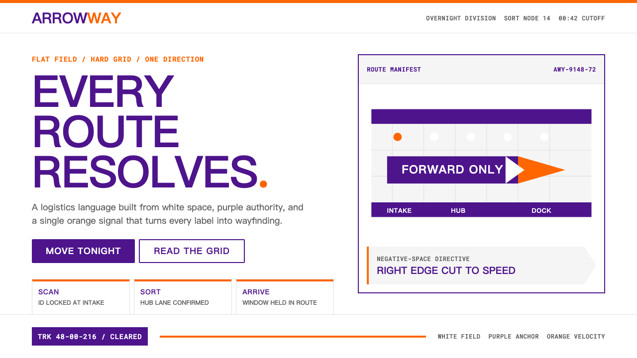
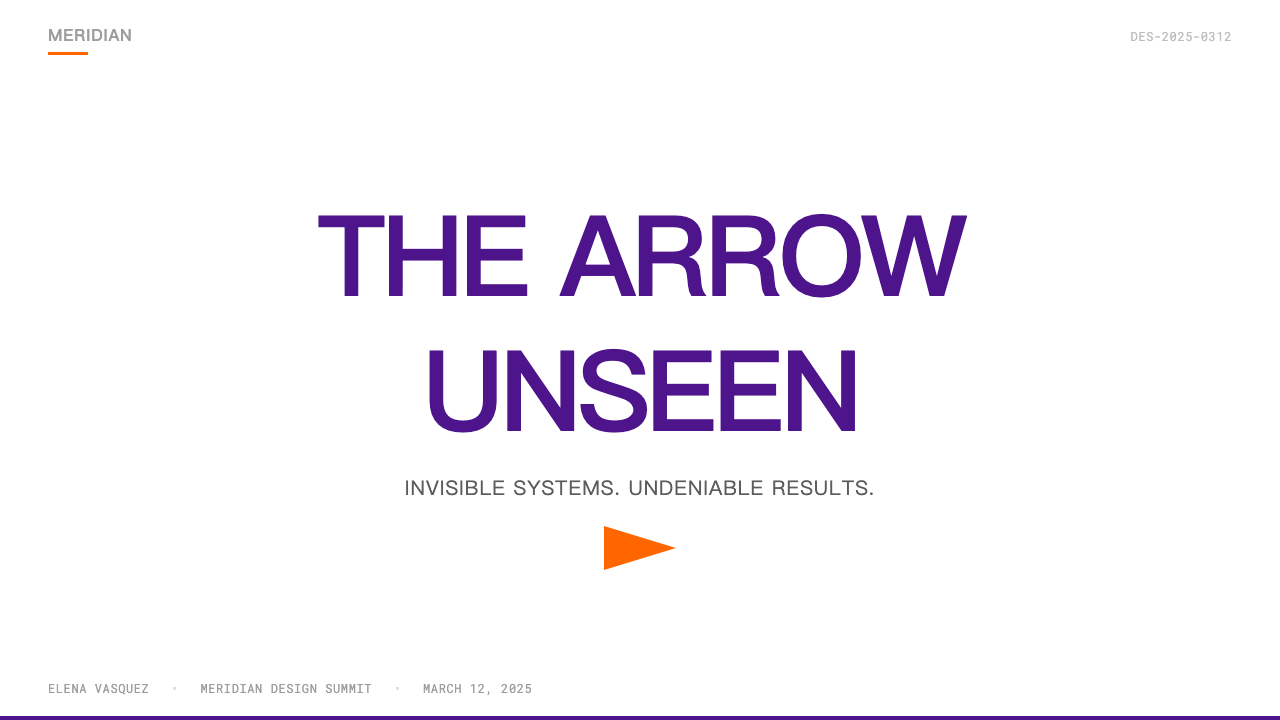
For presentation slides, the FedEx approach produces exceptionally clear cover and content pages. A cover built in this system uses deep purple as a full-bleed background or as a dominant rectangular block, with the title in clean white type and a single orange or divisional-color bar as the only accent. No gradients, no decorative textures, no secondary illustration. Content slides treat each slide as a label: information in defined zones, with hierarchy established purely through typographic scale and weight. Data slides work particularly well — bar charts become pure rectangular forms, colored according to the accent logic (one color per data series, no decorative fills), plotted against a flat white ground that makes every value instantly readable.在演示文稿中,联邦快递风格能产生清晰度极高的封面页和内容页。在这套系统中构建的封面使用深紫色作为全出血背景或主导矩形色块,标题以干净的白色字体呈现,仅以一条橙色或分部色条带作为唯一强调元素。无渐变、无装饰纹理、无辅助插图。内容页将每张幻灯片当作标签处理:信息处于明确划定的区域,层级完全通过字体尺度和字重建立。数据页尤为出色——柱状图成为纯矩形形态,按强调逻辑着色(每个数据系列一种颜色,无装饰性填充),绘制于纯白底面上,使每个数值即时可读。
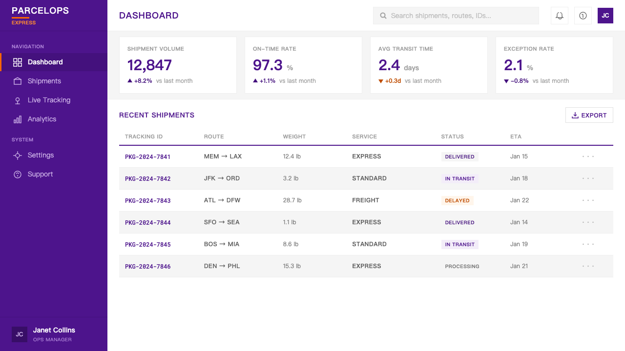
For web interfaces and dashboards, the system's container logic and single-accent-color discipline translate directly into clean component design. Navigation bars in deep purple with white type, content areas on white with orange accent states, status indicators using the divisional color logic — these produce interfaces with the immediacy of a logistics tracking screen. Pricing pages benefit from the system's tier-differentiation logic: each plan gets one accent color from a family, the neutral container remains white, and hierarchy is established through color rather than decoration. Avoid softening the system with rounded corners, soft shadows, or background tints — each of these undermines the directional clarity that makes the original identity work.对于网页界面和仪表板,这套系统的容器逻辑和单一强调色规律直接转化为干净的组件设计。深紫色导航栏配白色字体、白色内容区域配橙色交互状态、使用分部色彩逻辑的状态指示器——这些组合产生出具有物流追踪界面即时感的用户界面。定价页面受益于系统的层级区分逻辑:每个方案从同一色系家族中获得一种强调色,中性容器保持白色,层级通过色彩而非装饰建立。避免用圆角、柔和阴影或背景色调来软化系统——这些做法都会削弱让原始识别系统生效的方向性清晰度。
For editorial and marketing applications, the FedEx visual logic supports strong full-bleed layouts with a poster-like quality. Feature spreads alternate between purple-ground-white-type and white-ground-purple-type, with orange or the relevant accent used exclusively for callouts, pull quotes, or calls to action. Marketing pages built in this system should resist the temptation to add photographic backgrounds — a flat white or purple field with high-contrast type performs with more authority than any atmospheric image. When photography is necessary, treat it as a flat element: crop to a hard rectangle, silhouette against white, or convert to a high-contrast duotone using purple and white rather than full-color naturalistic imagery.对于编辑和营销应用,联邦快递视觉逻辑支持具有海报品质的强烈全出血版面。特写版面在紫底白字与白底紫字之间交替,橙色或相关强调色仅用于引用语、摘要或行动号召。在这套系统中构建的营销页面应抵制添加摄影背景的诱惑——纯白或紫色底面配高对比度字体,比任何氛围性图像都更具权威感。当摄影不可或缺时,将其当作平面元素处理:裁切为硬边矩形、在白底上做轮廓剪影,或使用紫色与白色转为高对比度双色调,而非全色彩自然主义图像。
The most common mistake when applying the FedEx visual language is treating its two core colors as equally available simultaneously. In the original system, purple is always the ground or structural element; orange (or the relevant divisional accent) appears once, as a signal. Reversing this — an orange ground with purple accents, or both colors competing at equal weight — collapses the hierarchy and loses the wayfinding clarity that is the system's entire purpose. A second common error is softening the hard containment logic with rounded shapes, feathered edges, or gradient fills. The system's authority comes precisely from its unwillingness to soften. Treat every container edge as a decision, not a default.应用联邦快递视觉语言时最常见的错误,是将两种核心色彩视为可同等使用的并列存在。在原始系统中,紫色始终是底面或结构性元素;橙色(或相关分部强调色)只出现一次,作为信号。颠倒这一关系——橙色底面配紫色强调,或两种颜色以相等分量竞争——会瓦解层级,失去导视清晰度,而那正是这套系统的全部目的。第二个常见错误是用圆角形状、羽化边缘或渐变填充来软化硬边容器逻辑。这套系统的权威感恰恰来自它拒绝软化的态度。将每一条容器边缘都视为一个决定,而不是一个默认值。
FedEx — FAQFedEx · 常见问题
Is the hidden arrow in the FedEx wordmark intentional or accidental?联邦快递字标中的隐藏箭头是有意为之还是偶然?
Intentional, and the result of an extensive design process. Lindon Leader and his team at Landor Associates reportedly tested more than two hundred wordmark variations before identifying the letterform proportions that produced the negative-space arrow between the E and the x as a structural byproduct of correct spacing and form. The decision to keep it subtle — not to publicize it, not to outline it, not to color it differently — was equally deliberate. The arrow is not announced; it is discovered. That mechanism of discovery is what gives it lasting cultural weight.有意为之,且是大量设计过程的结果。据报道,林顿·里德和他在朗涛的团队测试了逾两百个字标方案,才确定了能将E与x之间的负空间箭头作为正确间距和字形的结构性副产品自然生成的字母比例。保持其微妙——不公开宣传、不加轮廓线、不以不同颜色标注——同样是经过深思熟虑的决定。箭头不被宣告;它被发现。这种发现的机制,正是它拥有持久文化重量的原因。
Can the FedEx color system work for a brand that is not in logistics?联邦快递色彩系统能用于非物流领域的品牌吗?
The purple-and-orange pairing is strongly associated with FedEx at this point — using both simultaneously in a logotype context risks immediate brand confusion. However, the structural principles of the FedEx system — single-accent logic, flat white grounds, hard containment, directional composition — are transferable to any context where institutional authority, speed, and clarity are desired values. Financial services, healthcare systems, transportation platforms, and enterprise software all benefit from these structural principles applied thoughtfully. The lesson to take is not the colors themselves but the discipline with which they are deployed.紫橙配色在目前已与联邦快递产生强烈关联——在字标场景中同时使用两者有立即引发品牌混淆的风险。然而,联邦快递系统的结构性原则——单一强调色逻辑、纯白底面、硬边容器、方向性构图——可迁移至任何机构权威、速度与清晰度是期望价值的场景。金融服务、医疗系统、交通平台和企业软件都能从这些结构性原则的审慎应用中获益。应该学习的不是色彩本身,而是部署色彩的规律。
Why does the FedEx system use flat white rather than off-white or cream?为什么联邦快递系统使用纯白而非米白或奶油色?
The choice of flat white rather than tinted white is a functional one rooted in the company's operational context. FedEx identity must perform on aircraft fuselages, vehicle panels, shipping labels, cardboard boxes, and digital screens — all of which have different base whites. Using a specific off-white tone would create inconsistency across substrates; pure white is the common denominator that reads as intentional on any surface. There is also a wayfinding logic: the clinical white of an airport sign or a customs form is a deliberate signal of seriousness and authority, distinct from the warmer whites of consumer goods packaging.选择纯白而非带色调的白色,是一个植根于公司运营场景的功能性决定。联邦快递识别系统必须在飞机机身、车辆面板、快递标签、纸板箱和数字屏幕上有效呈现——所有这些基底白色各不相同。使用特定的米白色调会在不同基材上产生不一致;纯白是在任何表面上都能被读作有意设计的最大公约数。其中也有导视逻辑:机场指示牌或海关表格的临床用白,是一种严肃性与权威感的刻意信号,有别于消费品包装更温暖的白色系。
How does the FedEx system handle the tension between a single parent identity and many sub-brands?联邦快递系统如何处理单一母品牌与众多子品牌之间的张力?
The divisional color architecture resolves the tension elegantly. Every sub-brand — Express, Ground, Freight, Office, and others — shares the purple wordmark and the white ground. What changes is only the secondary accent color beside or beneath the wordmark. This means a customer looking at any FedEx vehicle, envelope, or digital touchpoint can identify the parent brand in under a second and the service tier in the second second. The system is additive: new service lines can receive new accent colors without requiring any redesign of the core mark. The parent identity gains sub-brands; it does not fragment.分部色彩架构优雅地化解了这一张力。每个子品牌——快递、陆运、货运、商务中心等——共享紫色字标和白色底面。变化的仅是字标旁边或下方的辅助强调色。这意味着客户看到任何一辆联邦快递车辆、信封或数字触点,能在一秒内识别母品牌,在下一秒识别服务层级。这套系统是累加式的:新服务线路可以获得新的强调色,而无需对核心标记进行任何重新设计。母品牌获得子品牌;它不会分裂。
Is the FedEx visual system appropriate for warm or consumer-facing contexts?联邦快递视觉系统适合温暖或面向消费者的场景吗?
The FedEx system was built for institutional authority and operational clarity, not warmth. Deep purple reads as serious, reliable, and scaled — virtues in logistics but potentially distancing in contexts where emotional connection, playfulness, or sensory pleasure are primary values. Applied directly to a food brand, a children's product, or a wellness application, the system's severity would work against the user experience. The better framing is to ask what values the visual system communicates and whether those values match the product's promise. Where reliability, speed, and systematic clarity are genuinely what the user needs — enterprise tools, financial dashboards, medical record systems — the structural discipline of the FedEx approach is a powerful asset rather than a liability.联邦快递系统是为机构权威和运营清晰度而建,不是为温暖感。深紫色传达严肃、可靠与规模——这在物流领域是美德,但在情感联结、趣味性或感官愉悦是主要价值的场景中可能产生疏离感。直接应用于食品品牌、儿童产品或健康应用,这套系统的严肃性会与用户体验相悖。更好的思考框架是:问这套视觉系统传达了哪些价值,以及这些价值是否与产品的承诺相匹配。在可靠性、速度和系统性清晰度确实是用户真正需要的场景中——企业工具、金融仪表板、医疗记录系统——联邦快递方法的结构性规律是一种强大的资产而非负担。
Related design styles相关设计风格
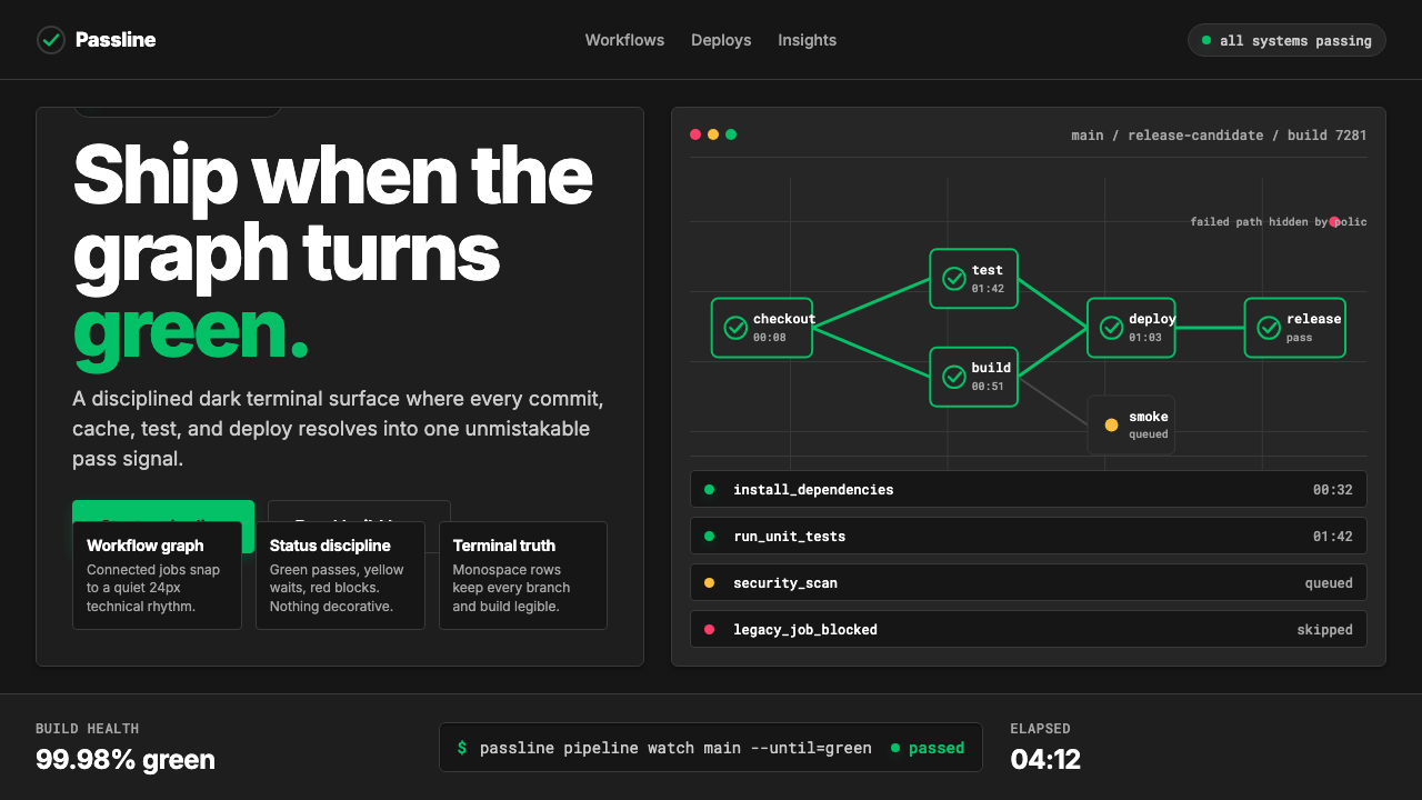 CircleCI Pipeline-GreenConfidence goes green. Emerald status lines cut through terminal-black pipeli…信心变绿。翠绿状态线切过终端黑流水线网格。
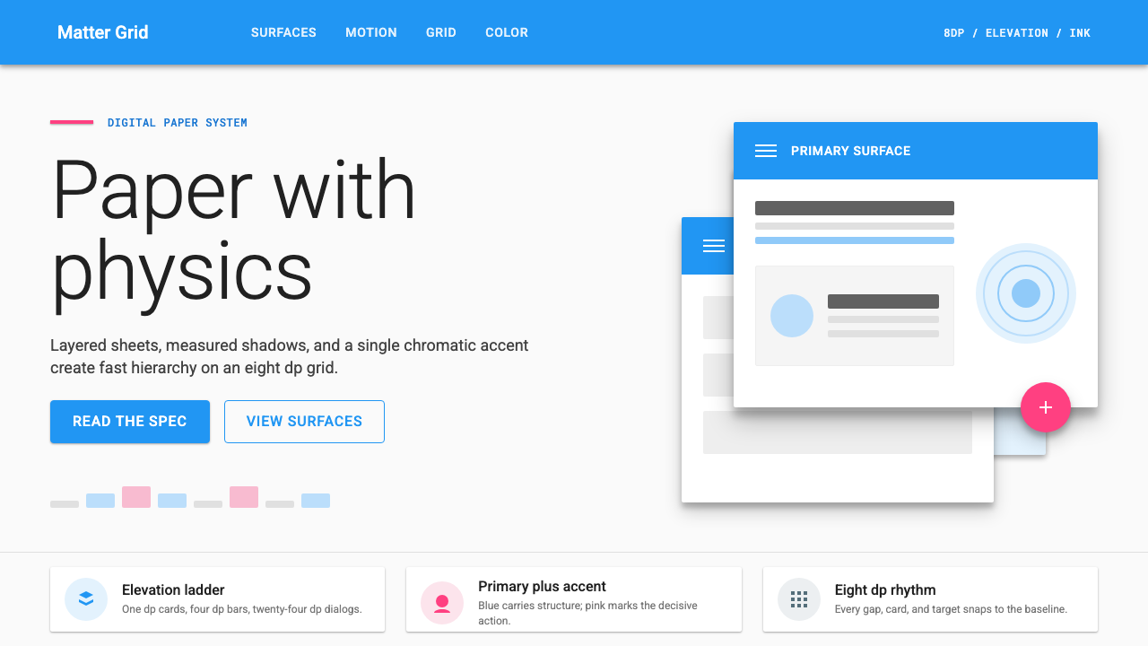 Material Design 1.0Depth made flat usable. Blue app bars, pink FABs, 8dp grids, and crisp paper…让扁平拥有深度:蓝色应用栏、粉色FAB、8dp网格与纸张投影。
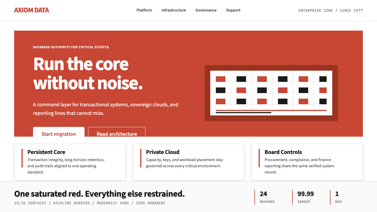 Oracle Corporate RedEnterprise certainty. Saturated red, tight sans, and white space do all the w…企业级确定感:饱和红、紧排无衬线与大留白撑起全部气场。
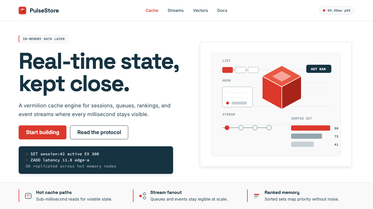 Redis Cache RedWarm database rigor. Vermilion cube, slate type, and white-space grids make s…温热的数据库秩序:朱红立方、板岩字色与留白网格,让速度可读。
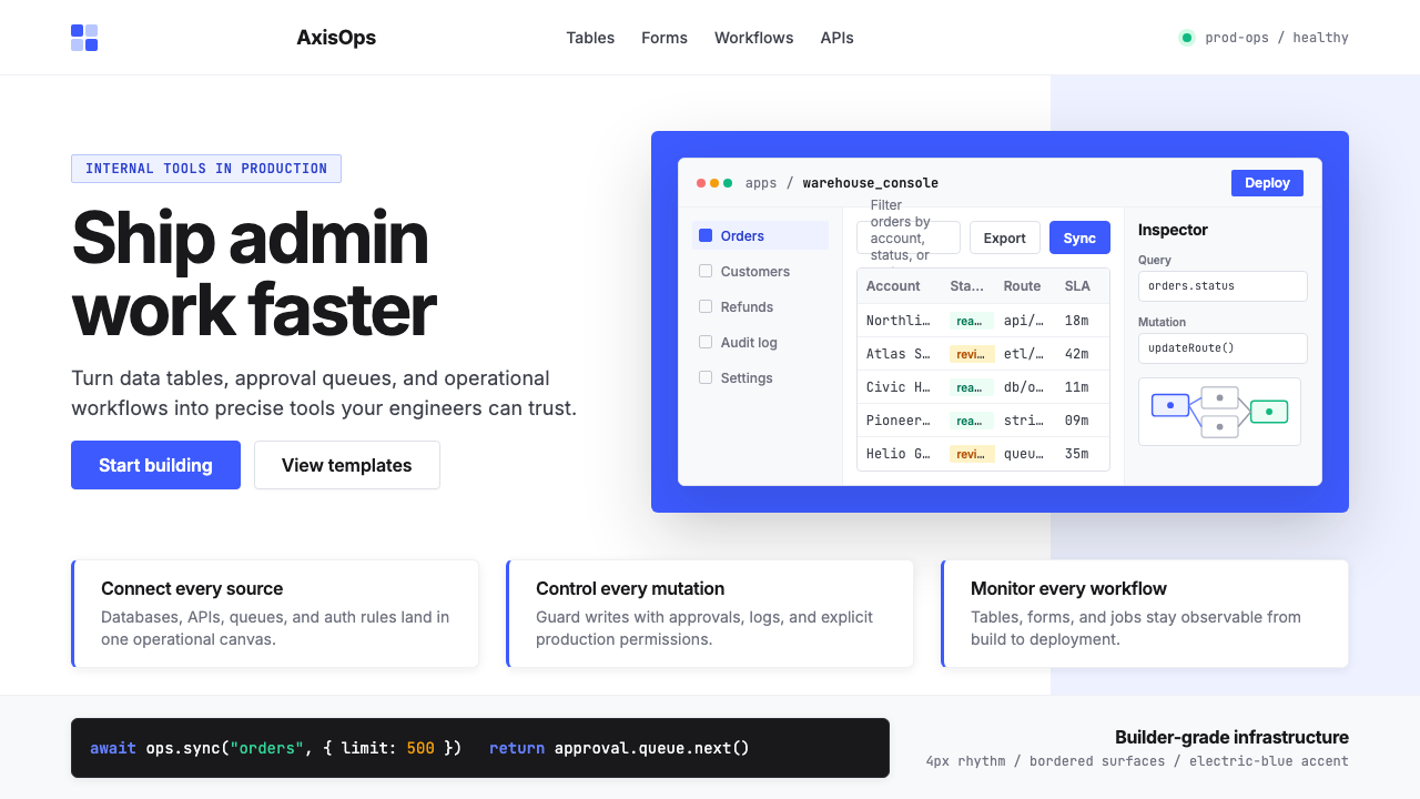 Retool Internal-Tools RedPrecision ships fast. Electric blue panels, Inter type, and bordered UI mocku…精准而快速。电光蓝面板、Inter 字体和边框 UI 模型撑起气质。
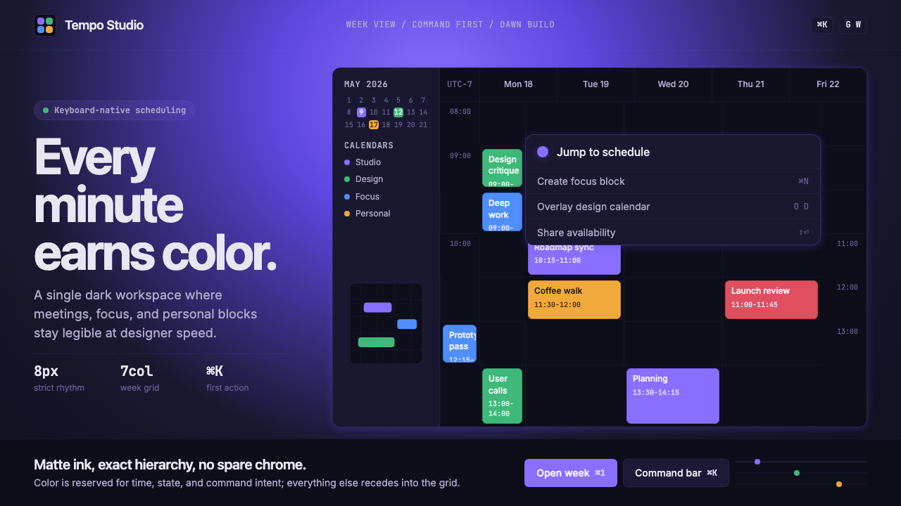 Cron CalendarDesigner-tech restraint. Purple wash, ink grid, mono shortcuts, surgical even…设计师科技的克制:紫色光晕、墨色网格、等宽快捷键与精准色块。