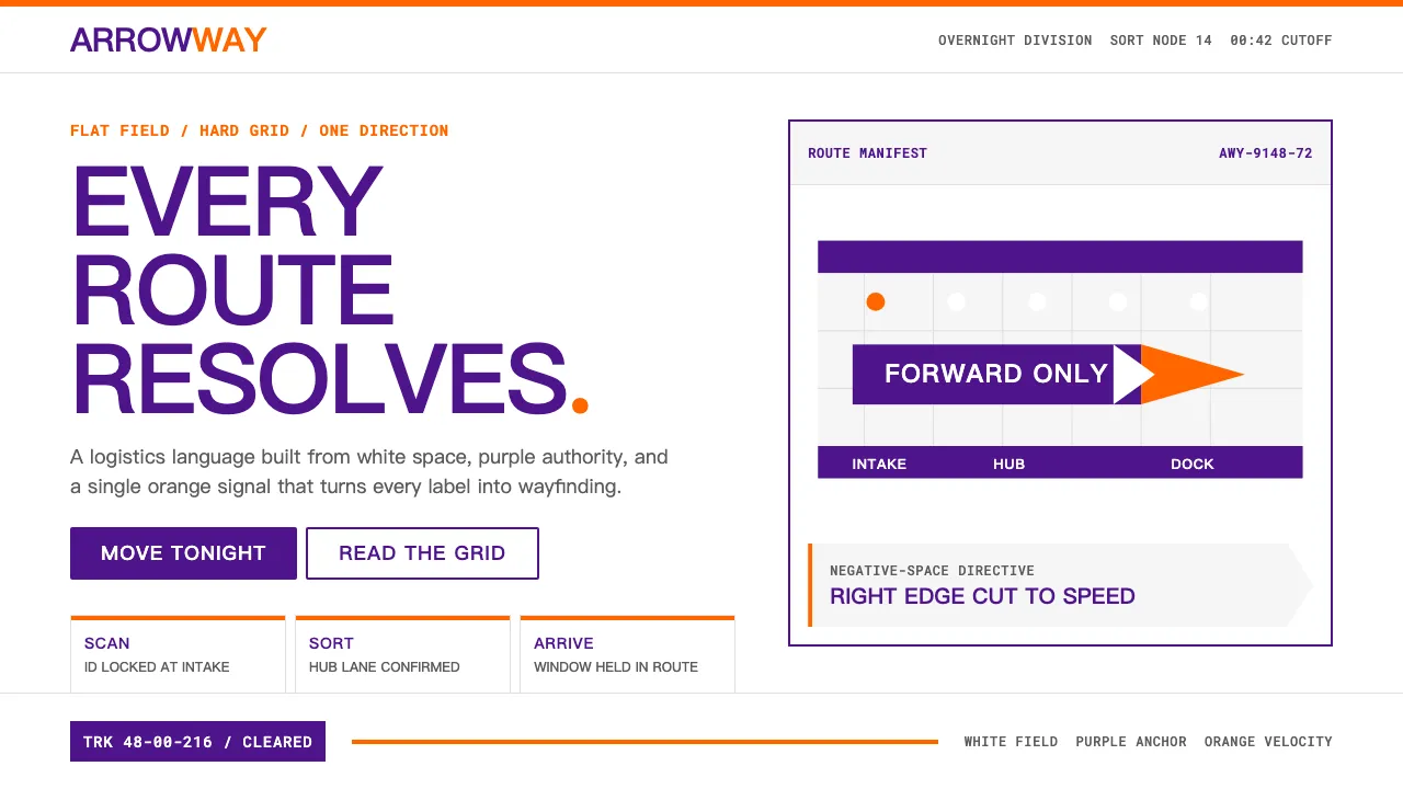
About FedEx
FedEx's visual identity is a masterclass in restraint — purple for authority, orange for speed, and a hidden arrow that became the most-discussed negative-space device in design history. Lindon Leader's 1994 wordmark for Landor Associates distilled an entire logistics empire into two colors and one invisible arrow.
The system operates as wayfinding, not marketing. Flat white fields, hard rectangular containers, and a single divisional accent color at a time give every touchpoint the clarity of an airport sign. Nothing decorates; everything directs.
- Origin
- Memphis, Tennessee, United States
- Era
- 1971 founded; current visual identity since 1994 (Lindon Leader)
- Key figures
- Frederick W. Smith · Lindon Leader · Landor Associates
- Movements
- Late-20th-century corporate identity · Post-Vignelli logistics-system design
FedEx design spec
Colors
Typography
The other 11 sections — buttons, cards, spacing, motion, techniques and more — open once you unlock. Download the DESIGN.md or send it to your AI in one click. Unlock once, yours forever.
Sign up nowStyles similar to FedEx
Also inspired by brands & products, with a close feel.
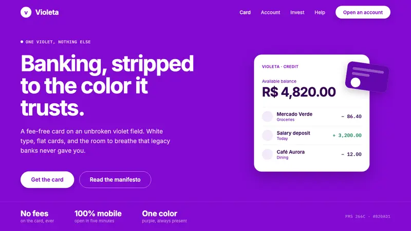 Nubank PurpleBanking stripped to one color. Full-bleed Nupurple ground, white type, generous negative space.
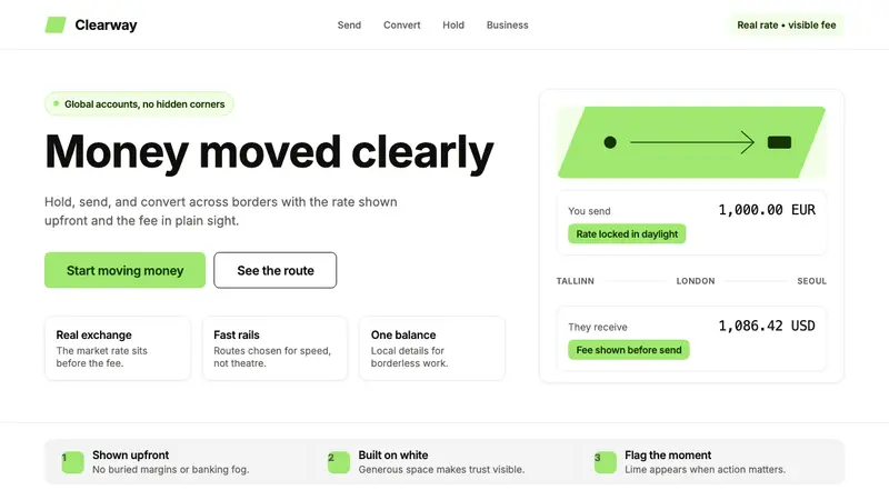 Wise (TransferWise)Clarity feels bankable. Lime flag on white, Inter geometry, quiet fee cards.
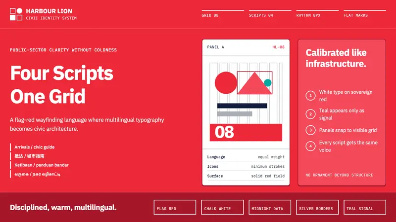 Singapore Merlion BrandPrecision with civic warmth. Flag red and geometric sans lock into a four-script grid.
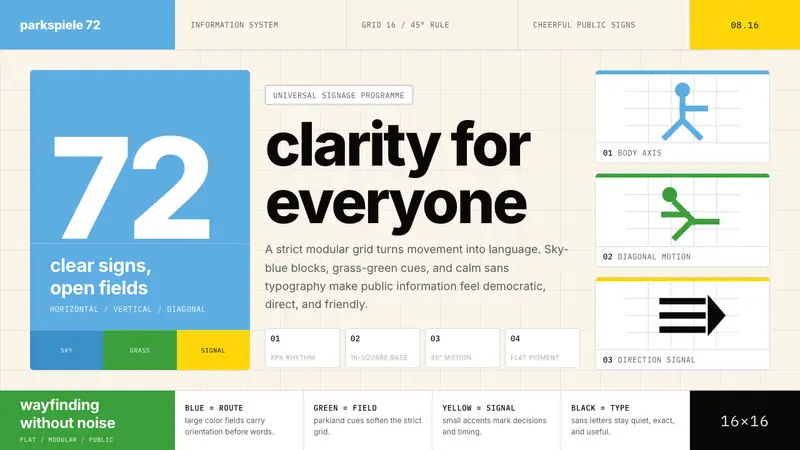 Otl Aicher Munich OlympicsFriendly rigor. Sky-blue grids and straight-line pictograms make public information universal.