关于 FedEx
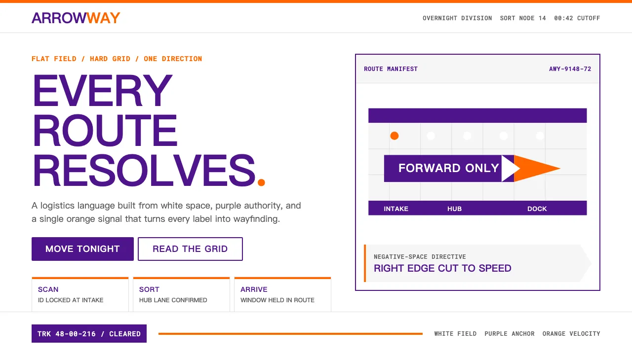
联邦快递的视觉系统是克制美学的典范——紫色代表可靠,橙色代表速度,而字母E与x之间隐藏的箭头成为设计史上最经典的负空间案例。1994年,Lindon Leader为朗涛设计公司创作的标识将一个物流帝国浓缩为两种颜色和一个看不见的箭头。
这套系统以导视逻辑运作,而非营销语言。纯白底色、硬朗的矩形容器、每次仅使用单一分部色彩——每个触点都具备机场标识般的清晰度。没有装饰,只有指引。
- 来源
- 美国田纳西州孟菲斯
- 年代
- 1971 founded; current visual identity since 1994 (Lindon Leader)
- 代表人物
- Frederick W. Smith · Lindon Leader · Landor Associates
- 所属运动
- Late-20th-century corporate identity · Post-Vignelli logistics-system design
FedEx 的设计规格
和 FedEx 相似的风格
同样来自品牌与产品,气质相近。