What is Aluminium Flight Case?
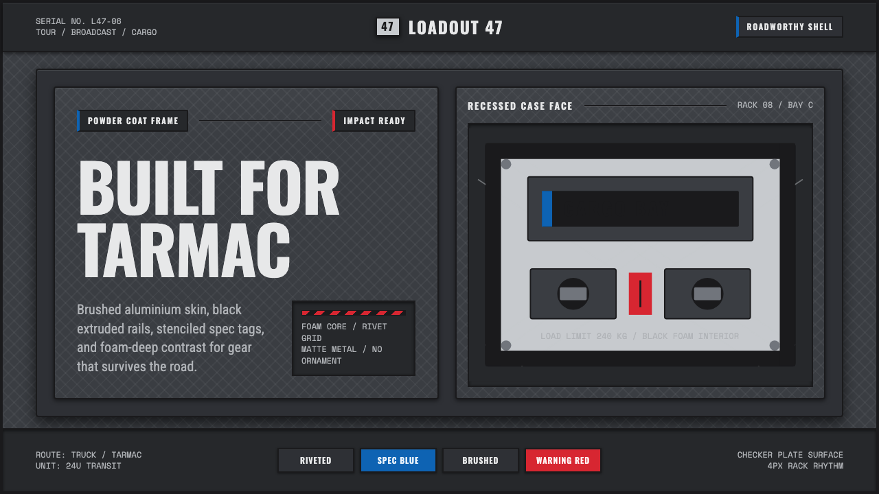
A brushed diamond-plate shell, riveted black frames, and stenciled spec tags — the road's exoskeleton, built to survive trucks and tarmac.
Aluminium Flight Case in brief
Aluminium Flight Case is a design system drawn from the touring and broadcast production hardware of roughly 1990 to 2010 — the road cases that carried lighting rigs, mixing consoles, and stage equipment from venue to venue across decades of live production. Its identity is entirely industrial: a brushed diamond-plate metal shell framed by powder-coated black edge profiles, sealed with butterfly latches and reinforced ball corners, and packed inside with dense black foam.
The style's governing principle is that the case itself is the object of design — not a container hiding something else, but a riveted, purpose-built skin whose every feature exists to survive impact, weather, and repeated handling. There is no decoration here that does not also serve a structural or informational purpose: every rivet holds something together, every stenciled label identifies contents or handling instructions, every edge profile protects a corner from impact.
Visually, this translates into charcoal anodized grounds, brushed-metal highlights that catch light in long streaks rather than soft glows, stencil-cut sans-serif type, and small blocks of warning blue and red used exclusively for functional spec tags — voltage ratings, weight limits, handling icons. Nothing is rounded for softness; every corner is either a rectilinear edge or a deliberately reinforced ball-corner fitting.

Where does Aluminium Flight Case come from?
The aluminium flight case descends from mid-century aviation and military transit case design, where the requirement to protect delicate or valuable equipment during air transport and field deployment produced a design vocabulary built entirely around impact resistance: riveted aluminum shells, reinforced corners, and foam-lined interiors. This military and aerospace lineage gave the form its inherent seriousness — these were never consumer objects, but functional equipment built to specification.
This vocabulary migrated into the touring music and broadcast industries as live production scaled dramatically from the 1970s onward. As concert tours grew larger and more technically complex — carrying lighting rigs, sound consoles, backline instruments, and increasingly sophisticated video equipment across national and international touring circuits — the equipment itself needed cases that could survive being loaded and unloaded from trucks, dropped on loading docks, and stacked in trailers night after night for months at a stretch.
Companies including Anvil Cases, Calzone Case Co., the Adam Hall Group, and Cases By Source became the defining manufacturers of this hardware between roughly 1990 and 2010, the peak era of large-scale touring production. Each developed proprietary variations on the same core vocabulary: diamond-plate or brushed aluminum shells, powder-coated black edge trim, butterfly latches that could be operated quickly by roadies working under time pressure, and reinforced ball corners designed specifically to absorb impact when a case was dropped or dragged.
This hardware also became deeply embedded in broadcast touring — the trucks and equipment cases that follow television production crews, sports broadcasts, and traveling news operations. The visual language of stenciled ownership labels, handling icons, and blue-and-red spec tags emerged from practical necessity: on a loading dock at 3am, with dozens of identical-looking cases stacked together, clear stenciled identification was the only way crews could reliably match cases to their contents and destinations. This practical stenciling culture became, over decades, a recognizable aesthetic in its own right — one that design work now borrows specifically to evoke the road-tested, no-nonsense authority of professional touring and broadcast production.
What defines the Aluminium Flight Case look?
Color
The ground is charcoal-anodized gray, punctuated by black powder-coated framing and small, deliberate blocks of warning blue and warning red reserved exclusively for spec tags and handling labels. There is no decorative color; every hue on the surface signals function.
Typography
Type is stenciled sans-serif — letterforms with the characteristic breaks and gaps of a spray-stencil cut, evoking hand-labeled equipment rather than a designed brand identity. Labels should feel applied with a stencil and spray can, not set in a polished typesetting system.
Diamond-Plate Texture
The dominant surface pattern is a brushed diamond-plate texture — a repeating raised geometric pattern that catches light in long metallic streaks. This texture should read as a real material surface, not a flat decorative pattern, and it dominates large panel areas.
Rectilinear Framing
Edge profiles are rectilinear and rigid, framed in black, with corners either sharply squared or reinforced with a distinct rounded ball-corner fitting — never a soft, uniformly rounded edge in between. Every corner treatment reads as a functional impact-protection decision.
Riveted Construction
Visible rivets and fasteners run along seams and edge profiles, signaling that the surface is mechanically assembled rather than molded as a single smooth piece. This riveted quality reinforces the sense of durable, field-serviceable industrial equipment.
Spec Tags and Handling Icons
Small rectangular tags in warning blue or red carry spec information — weight, voltage, handling icons — set in stenciled type. These tags are compact, functional, and placed at logical points such as corners or latch areas, never scattered decoratively.
Foam-Lined Interior Logic
Where interiors are shown, dense black foam with cut-out compartments signals protective packing rather than open storage. This interior logic can inform how content is 'nested' within a layout — organized into distinct protected zones rather than flowing freely.

Who shaped Aluminium Flight Case?
One of the defining manufacturers of professional touring flight cases, whose diamond-plate aluminum shells and reinforced ball corners became a widely recognized standard in live-production and broadcast equipment transport during the 1990–2010 touring boom.
A touring-industry case manufacturer whose products contributed to the standardization of butterfly latches, stenciled labeling conventions, and rectilinear black edge framing across the broadcast and live-production world.
A major European manufacturer of touring hardware and flight cases whose products helped establish the powder-coated black frame and diamond-plate shell combination as an industry-wide visual standard across Western Europe and beyond.
A touring and broadcast case manufacturer whose work contributed to the practical stenciling and spec-tag culture — clear, functional labeling designed to let crews identify contents quickly under time pressure at loading docks and venues.
How do you use Aluminium Flight Case today?
Applying this style well starts with treating every visual element as if it must survive being dropped, stacked, and hauled across a loading dock — nothing decorative should appear that couldn't also be justified as functional hardware.
For presentation slides, the style makes a strong cover treatment built from a diamond-plate texture panel framed in black, with stenciled title type and a small spec-tag-style subtitle in warning blue or red. Content slides work well organized as distinct 'compartments' — bordered rectilinear blocks echoing the foam-cut interior of a case — with data presented in blunt, stenciled labels rather than decorative charts.
For web interfaces, the style suits technical dashboards, equipment-management tools, and B2B products where ruggedness and reliability are desired brand qualities — diamond-plate texture can frame headers or section dividers, black rectilinear borders can define card edges, and small blue or red spec-tag badges can flag status or alerts. Interactive elements should feel mechanical — latches and toggles rather than soft rounded switches.
For editorial and marketing contexts, the style rewards a blunt, unglamorous confidence — full-width sections in charcoal gray with stenciled headline type, spec-tag-style call-out boxes for key facts, and imagery of riveted, worn hardware rather than pristine studio photography. The style communicates competence and durability rather than luxury.
A common mistake is softening the corners or adding gradient sheen to suggest 'premium metal,' which undermines the blunt, functional honesty at the style's core. Another mistake is scattering the blue-and-red accent colors decoratively rather than confining them strictly to spec-tag and warning-label contexts, which dilutes their meaning.

Aluminium Flight Case — FAQ
Why does the style insist on stenciled type instead of a clean, modern sans-serif?
Because stenciled type carries the physical evidence of how touring equipment was actually labeled — spray-painted through a cut stencil by hand, under time pressure, at loading docks. A clean modern sans-serif reads as designed branding, which contradicts the style's core premise that the case itself, not a marketing layer, is the object of interest.
Are the blue and red accent colors interchangeable, or do they mean specific things?
In the source material they function as functional warning and specification colors — the specific meaning (voltage, weight limit, fragile handling) varies by manufacturer, but the principle holds across the style: these colors should always appear in small, tag-like blocks that communicate information, never as broad decorative fills.
Can this style work in a lighter color scheme instead of charcoal gray?
It resists this. Charcoal anodized gray is central to the style's industrial, road-worn identity — a lighter ground would read as cleaner and more consumer-facing, undermining the sense of rugged, professional-grade equipment the style is built to evoke. If a lighter variant is needed, it should still favor a cool, metallic gray rather than a warm or pastel tone.
What kind of imagery pairs well with this style?
Photography or illustration of riveted metal surfaces, worn latches, stacked road cases, and loading-dock scenes reinforces the style's identity. Polished studio product photography or soft lifestyle imagery works against the grain — the style depends on visible wear and function, not aspirational gloss.
Does this style suit consumer products, or is it limited to B2B/technical contexts?
It suits products and brands that want to communicate ruggedness, reliability, and no-nonsense competence — technical tools, equipment rental platforms, professional-grade gear, and B2B services in logistics or production. It struggles in contexts that call for warmth, softness, or approachable friendliness, since its entire visual logic is built around impact resistance rather than comfort.
Related design styles
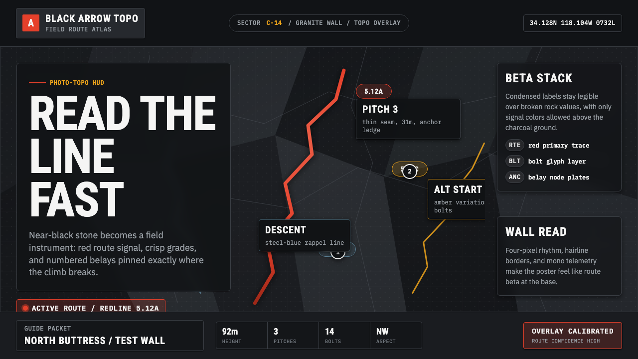 Climbing Topo GuideBeta at a glance. Red route telemetry cuts across near-black stone and conden…
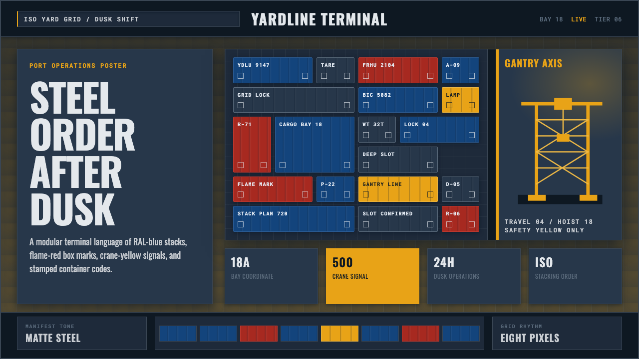 Container PortIndustrial dusk, standardized. Slate grid, RAL-blue stacks, and crane-yellow…
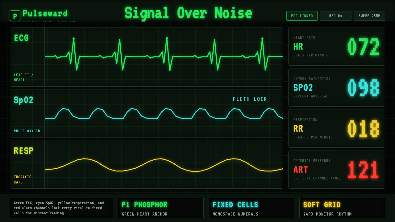 EKG Vital MonitorClinical clarity glows. Phosphor ECG green, cyan and yellow channels lock to…
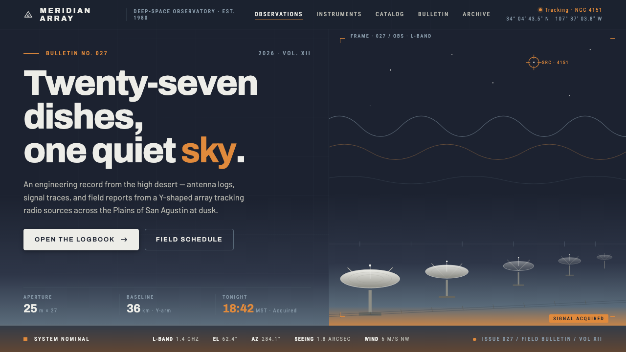 Radio Telescope ArrayEngineering at dusk. Steel-white dishes tilt against a twilight sky bleeding…
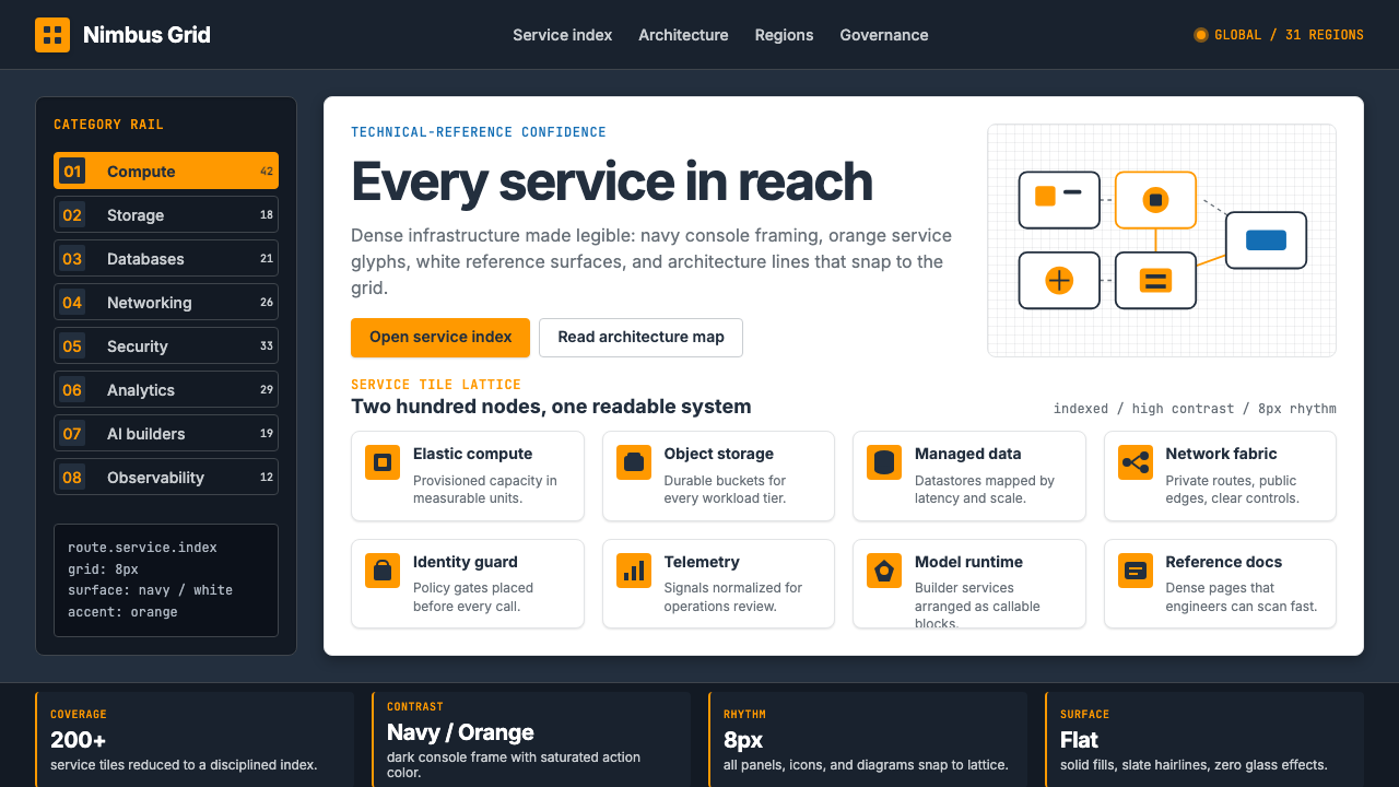 Amazon Web Services (AWS)Enterprise cloud made legible. Orange-on-navy service tiles lock to an 8px gr…
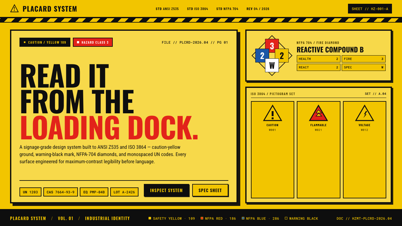 Hazmat SignageRead it from the loading dock. Caution-yellow ground, NFPA diamonds, monospac…