What is EKG Vital Monitor?
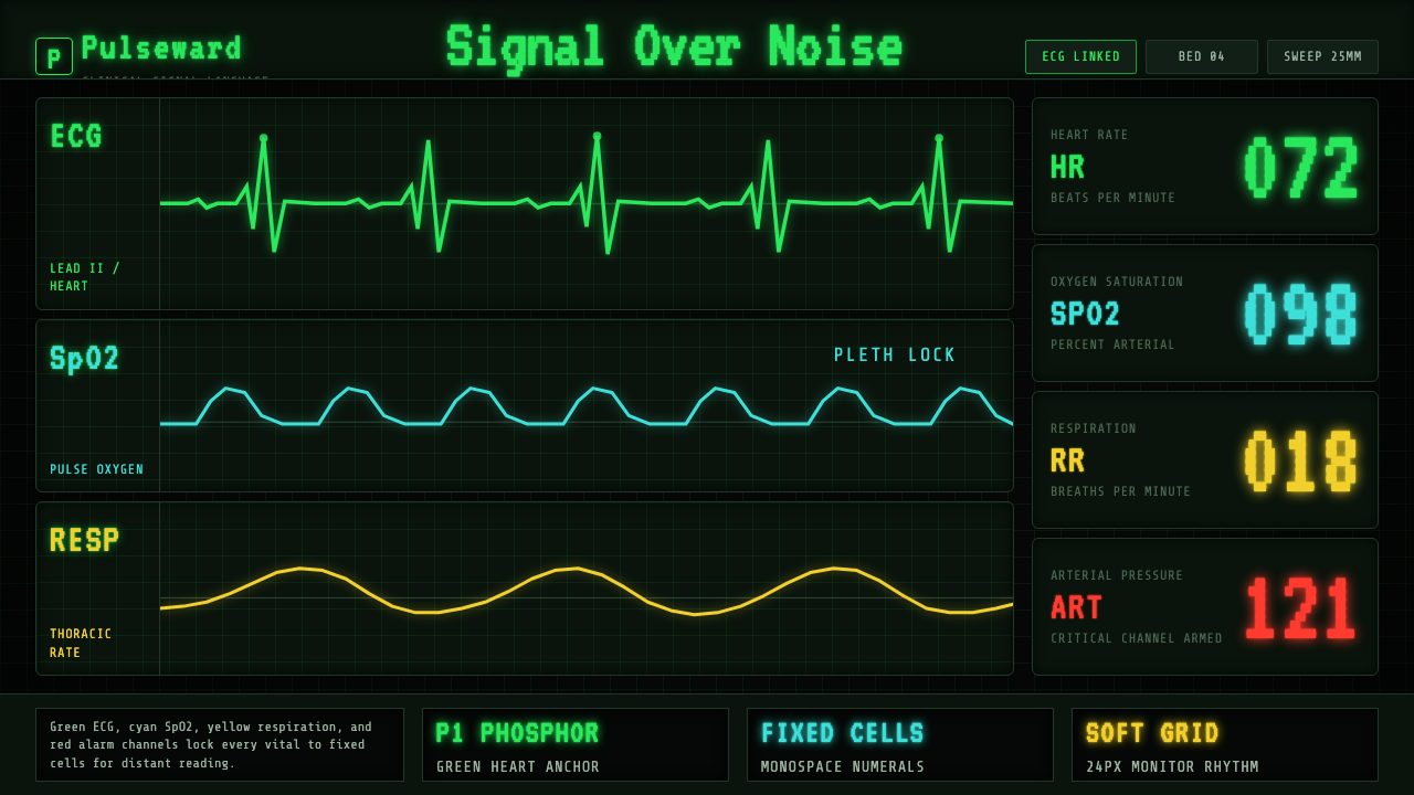
EKG Vital Monitor turns the bedside screen into a language of vigilance — luminous signals, disciplined channel colors, and numbers designed to be read before they are admired.
EKG Vital Monitor in brief
EKG Vital Monitor is a dark clinical interface style derived from North American patient-monitor conventions of the 1990–2010 era. Its defining image is a phosphor-green ECG waveform traveling across a pure-black field, accompanied by cyan, yellow, white, and red vital channels. Monospace seven-segment numerals, a restrained grid, and instrument-like labeling make the display feel continuously active even when its composition remains visually sparse.
The system is organized around channel identity. Green belongs to the heart, cyan separates oxygen-related information, yellow distinguishes respiration, white carries temperature or neutral readings, and red is reserved for arterial pressure and critical alarm conditions. These colors are not a decorative palette applied after layout; they are part of the information architecture. A user learns to recognize the meaning of a signal before reading its label.
Its aesthetic power comes from clinical clarity rather than cinematic futurism. Saturated traces appear to glow against darkness, while terminal-grade lettering and fixed-width numbers keep columns stable as values change. The faint suggestion of phosphor persistence gives the screen an analog memory, but the overall discipline belongs to contemporary biomedical-device UI: constant monitoring, immediate comparison, and no ambiguity about which reading belongs to which channel.
Where does EKG Vital Monitor come from?
The style emerged from the practical conventions of North American clinical patient monitors during the 1990–2010 era. Bedside displays had to present several kinds of physiological information at once without allowing one stream to become confused with another. The solution was a stable visual grammar: a black screen reduced ambient distraction, luminous traces preserved visibility, fixed-width numerals made changing values easier to compare, and each vital signal received a persistent channel color.
One historical root lies in monochrome CRT readouts. Their green traces were associated with P1 phosphor, producing the familiar impression of a bright signal suspended in darkness. That green was particularly suited to the visual identity of an ECG waveform: continuous, precise, and unmistakably electronic. As monitor interfaces gained additional channels, the monochrome language expanded rather than disappearing. Green remained the cardiac anchor while cyan, yellow, white, and red created a broader system of differentiated readings.
The modern system also reflects the alarm logic represented by IEC 60601-1-8. In the supplied convention, green remains assigned to the heart, while red carries the strongest association with danger and critical alarm states. This relationship between ordinary channel identity and exceptional alarm emphasis is central to the style. Most information glows with controlled intensity; red interrupts that equilibrium. The palette therefore communicates both category and urgency without requiring ornament or illustrative explanation.
Contemporary biomedical-device UI preserved these conventions while sharpening their typographic and organizational discipline. Seven-segment numerals evoke dedicated instruments, monospace text prevents columns from shifting, and a dark grid gives waveforms a measured field without competing with them. What began as a display solution became a recognizable visual language: part CRT inheritance, part medical-device standardization, and part enduring belief that a monitored body should be represented through signals that remain legible at a glance.
What defines the EKG Vital Monitor look?
Channel Color
Color identifies physiological channels before it decorates the interface. Phosphor green anchors the ECG and heart rate, cyan distinguishes oxygen-related information, yellow carries respiration, white supports temperature or neutral data, and red marks arterial pressure or critical alarm states. Each hue should remain loyal to its assigned category. Reusing a channel color for unrelated emphasis weakens the learned association and makes the display less clinically convincing.
Luminous Black Field
Pure black is not merely a fashionable dark theme; it is the field that allows every signal to appear optically active. Bright traces and numerals seem illuminated from within, recalling phosphor on a CRT rather than ink on a page. Large dark areas are therefore functional negative space. They separate channels, reduce visual noise, and make a single warning color capable of changing the emotional state of the entire screen.
Waveform Rhythm
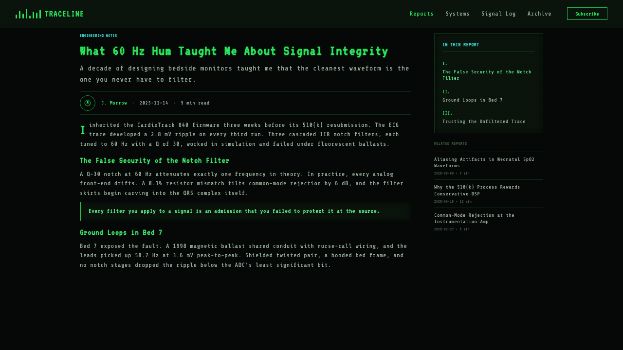
The ECG trace is the principal moving motif: a continuous horizontal signal whose peaks, intervals, and returns create the composition's rhythm. Supporting channels should feel synchronized with the same monitoring field, not arranged as unrelated illustrations. Even in a static design, cropped traces and repeated waveform segments can imply ongoing measurement, but they should remain precise and restrained rather than becoming expressive decoration.
Instrument Typography
Monospace and seven-segment forms dominate because changing values must occupy predictable space. Large readings act as visual anchors, while compact labels identify the corresponding channel without competing for attention. The typography should feel generated by a dedicated instrument: direct, narrow in purpose, and indifferent to editorial flourish. Alignment matters more than typographic variety, and stable columns matter more than expressive letterforms.
Measured Grid
A faint dark grid gives the waveforms a clinical field of reference. It should be present enough to suggest measurement, interval, and calibration, yet quiet enough that the luminous signals remain dominant. The grid organizes without enclosing every item in a box. When made too bright or too dense, it ceases to be a measuring ground and turns into visual interference.
Alarm Hierarchy
Red is the palette's exceptional state. Because ordinary channels already use saturated luminous color, urgency cannot depend on brightness alone; it depends on preserving red for information that must interrupt routine scanning. A critical state should alter hierarchy decisively through placement, repetition, or contrast, while the rest of the interface remains controlled. If red appears everywhere, the monitor loses its ability to sound a visual alarm.
Who shaped EKG Vital Monitor?
Monitor manufacturers collectively shaped the practical convention from which the style derives. By repeatedly pairing black display fields with luminous traces, fixed-width readings, stable channel labels, and persistent color assignments, they turned individual interface decisions into a recognizable clinical grammar. Their importance lies less in a single authored artifact than in the consistency of devices built for continuous bedside observation.
IEC 60601-1-8 represents the modern alarm framework within the supplied history of the style. Its relevance is conceptual as well as regulatory: a monitor must distinguish routine physiological information from conditions that demand immediate attention. The resulting hierarchy gives color an operational role, supporting a visual system in which green anchors the heart and red carries exceptional urgency rather than casual emphasis.
Monochrome CRT readouts supplied the visual ancestor of the glowing green signal on black. Their P1-phosphor character established an image of electronic information as light rather than surface pigment. Later multichannel monitors expanded this vocabulary with additional colors, yet the cardiac green trace retained the authority of the earlier display and remained the central visual signature.
Contemporary biomedical-device UI carried the inherited monitor language into more complex information environments. It preserved channel color, waveform continuity, monospace alignment, and dark-field contrast while organizing a larger range of simultaneous readings. In doing so, it transformed a recognizable display appearance into a broader interaction system built around scanning, comparison, persistence, and alarm recognition.
How do you use EKG Vital Monitor today?
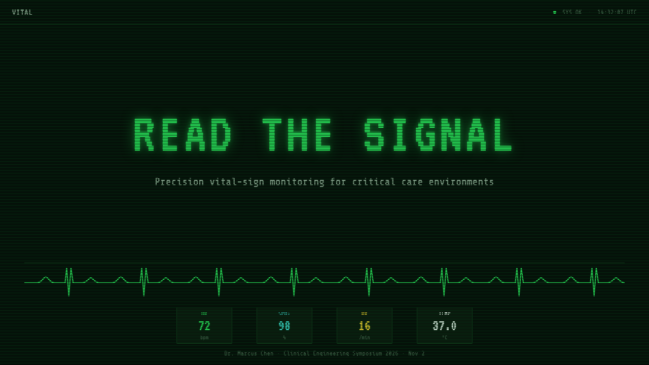
For presentation slides, the style is strongest when the cover behaves like a live instrument rather than a decorated title page. A single green ECG trace can cross the black field while the title occupies a disciplined terminal-like block. Content slides should divide information into distinct channels, using restrained colored labels and stable monospace alignment. Generous darkness between sections preserves the sense that every illuminated element has an operational reason to exist.
Data slides can borrow the monitor's hierarchy without pretending that every chart is a medical reading. Use channel colors consistently across a series, keep chart structures quiet, and allow one dominant value or trace to carry attention. Tables benefit from fixed-width numerals because columns remain visually stable. Alerts or exceptional findings may use red, but only when they genuinely interrupt the normal reading sequence; routine emphasis should remain within the color assigned to its channel.
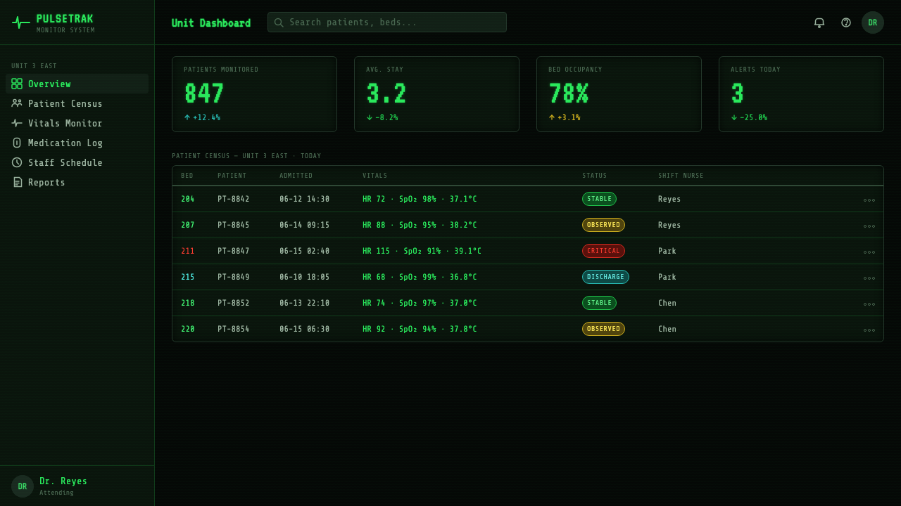
For web interfaces, EKG Vital Monitor is especially effective for dashboards, observability tools, status consoles, and pricing pages that need strong comparison. Dashboard modules can pair a large reading with a compact label and a thin ongoing trace. Pricing tiers may be treated as monitored channels, each retaining one identifying color while neutral details remain white. Navigation should feel like instrument control: concise, typographic, and clearly separated from live status information.
Editorial and marketing applications should use the language selectively. An article can open with a luminous waveform, then shift into narrow, highly legible text zones interrupted by channel-colored annotations. A campaign page can alternate quiet black fields with concentrated clusters of readings, allowing copy to feel like evidence emerging from a monitor. The style works best when the subject supports precision, vigilance, performance, or continuous observation; otherwise its clinical authority can feel unearned.
The most common mistake is converting the monitor into generic neon science fiction. Excessive glow, decorative grids, arbitrary cyan borders, and red accents on every interactive control destroy the channel logic. Another error is placing several competing numeric styles on the same screen. Preserve one instrument-like typographic system, keep each signal tied to a stable color, and let darkness do most of the separating. The result should feel monitored and consequential, not merely futuristic.
EKG Vital Monitor — FAQ
Is EKG Vital Monitor simply a neon dark theme?
No. A generic neon theme treats bright colors as atmosphere, while EKG Vital Monitor treats them as channel identifiers. Green, cyan, yellow, white, and red have differentiated jobs, and the black field exists to support rapid recognition rather than visual drama alone. Remove the stable mapping between color and information, and the result may still look luminous, but it no longer carries the logic of a clinical monitor.
Why is green central to the style?
Green connects both sides of the style's source material. Historically, P1 phosphor established the familiar green-on-black character of monochrome CRT readouts. In the modern clinical convention represented here, green is also assigned to the heart. That overlap gives the ECG trace unusual authority: it feels historically electronic and functionally meaningful at the same time.
Can the style be adapted to a light background?
It can borrow certain elements, but the black field is fundamental to the full expression of the style. On a light background, the traces cease to feel self-luminous, the CRT association weakens, and channel colors may begin to resemble ordinary infographic accents. A light adaptation should therefore preserve the channel discipline, monospace alignment, waveform logic, and alarm hierarchy even though it will no longer produce the same phosphor-monitor atmosphere.
How should red be used outside an actual medical product?
Red should still represent an exceptional state: failure, danger, a breached threshold, or information requiring immediate review. It should not become the default color for links, decorative borders, or routine selection. The style depends on users sensing that red changes the operational condition of the display. Preserving that scarcity gives even a nonmedical dashboard a convincing alarm hierarchy.
What kinds of products suit this style best?
It suits products centered on live state, repeated measurement, comparison, vigilance, or technical performance. Dashboards, observability tools, status consoles, data presentations, and campaigns built around measurable evidence can use its language naturally. It is less convincing when applied to experiences that depend on softness, informality, or decorative abundance. The style communicates that the screen is watching something consequential, so the product should be able to support that promise.
Related design styles
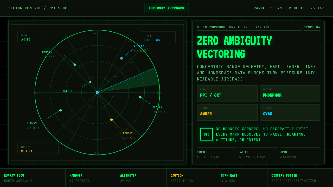 Air Traffic Control RadarOperational gravity. Phosphor green rings, sweep wedges, and monospace blips…
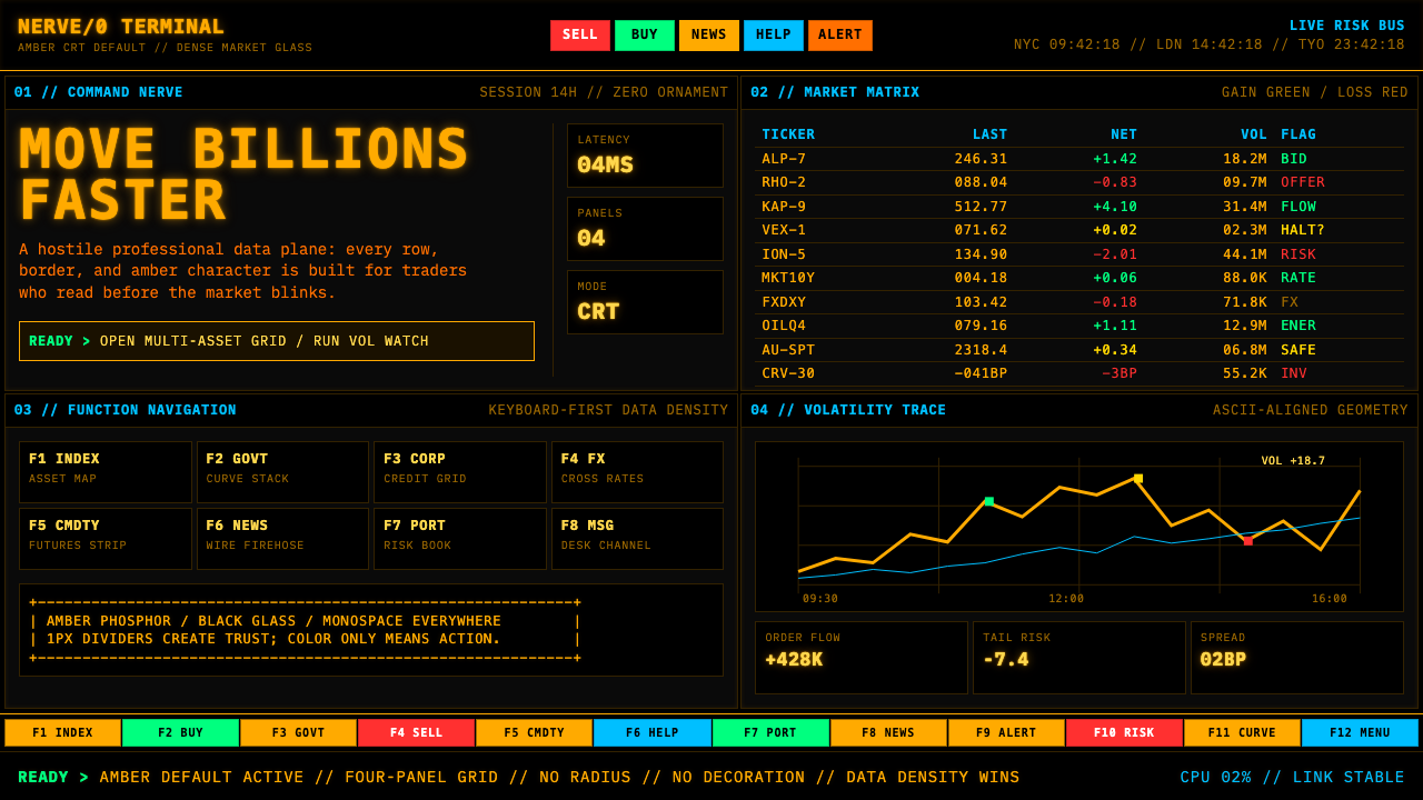 Bloomberg Terminal (Amber CRT)Hostile data authority. Amber mono grids and four hard panels make black glas…
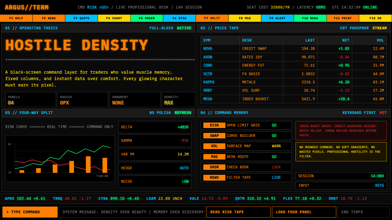 Bloomberg Terminal (CRT Green)Hostile density wins. Orange CRT mono, black grids, and four-panel data walls.
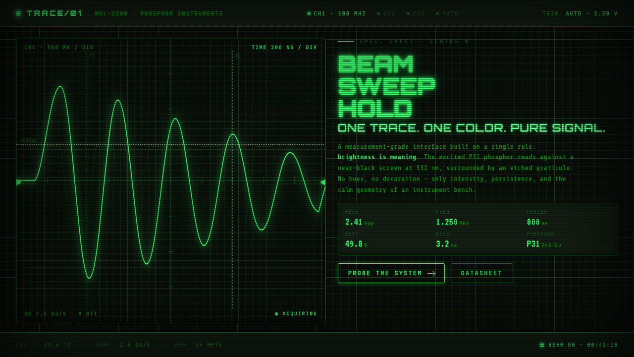 Oscilloscope WaveformBrightness is meaning. One P31 phosphor trace glowing across an etched gratic…
 Aluminium Flight CaseRoadproof and exact. Diamond-plate gray, stencil type, black frames, blue-red…
 Climbing Topo GuideBeta at a glance. Red route telemetry cuts across near-black stone and conden…