What is Bloomberg Terminal (CRT Green)?什么是 Bloomberg Terminal (CRT Green)?
For over four decades, Wall Street's most powerful interface has deliberately looked like a relic — and that hostility is entirely by design.四十余年来,华尔街最强大的界面始终刻意保持着古董机器的外观——而这种敌意,完全是设计使然。
Bloomberg Terminal (CRT Green) in briefBloomberg Terminal (CRT Green) 速览
Bloomberg Terminal style is a visual language born from the demands of professional financial trading: maximum information density, zero decorative distraction, and a color vocabulary drawn from the phosphor glow of cathode-ray tube monitors. The aesthetic is defined by its dark ground — deep black or near-black — against which a saturated green or amber primary text color vibrates with high contrast. Secondary information tiers are rendered in dimmer variations of the same hue, or in cool whites and muted grays, creating a strict luminance hierarchy without any use of conventional typographic ornamentation.彭博终端风格是一套为专业金融交易需求而生的视觉语言:信息密度最大化、装饰性干扰归零、色彩词汇取自阴极射线管显示器的磷光余晖。这套美学以深色底面为核心——深黑或近黑——在此之上,饱和的绿色或琥珀色主文字以高对比度振荡发光。次级信息层次以同一色相的更暗变体呈现,或以冷白与静灰表达,从而在不借助任何传统排版装饰的前提下,建立起严格的亮度层级体系。
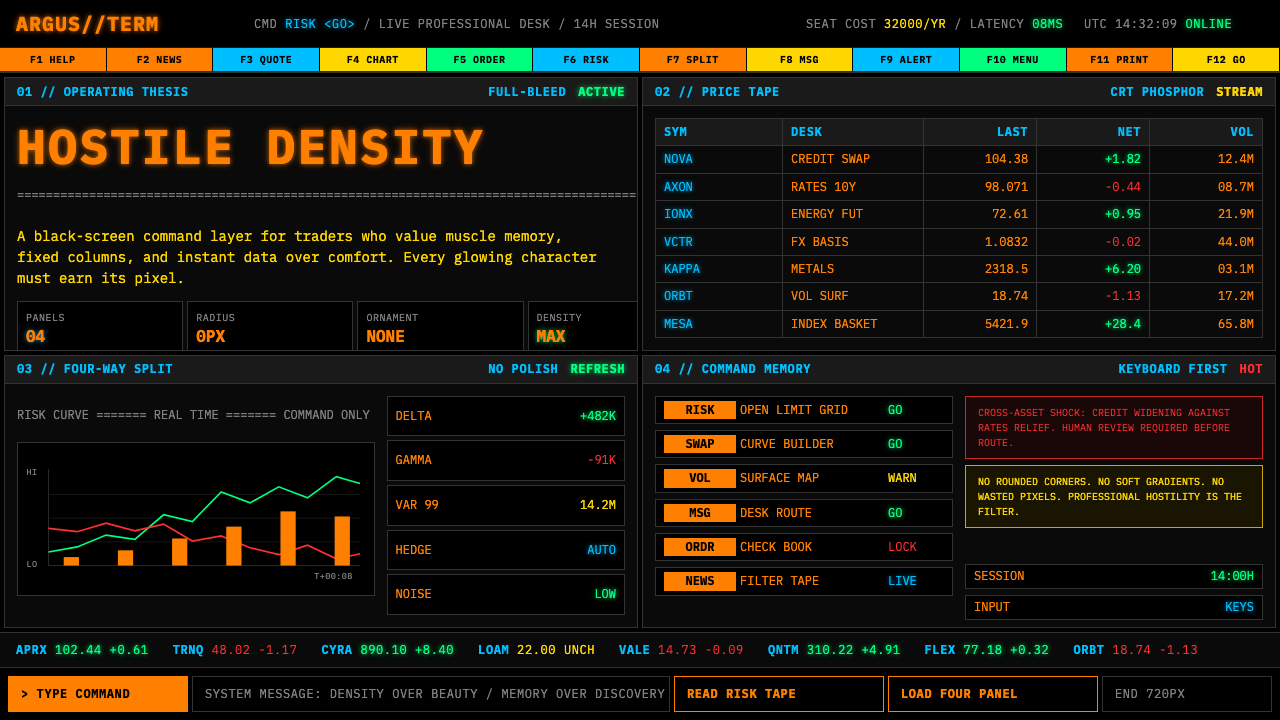
The layout system is relentlessly functional. The screen is divided into rigid panels — typically four quadrants — each packed with dense monospaced text, live numerical feeds, and labeled data fields. Nothing is centered for aesthetic effect; everything is left-aligned and tabular. Headers are distinguished from body data not by decorative styling but purely by intensity of color and positional convention. The total effect is less like a designed interface and more like a purpose-built instrument — closer in spirit to an aircraft cockpit than to a consumer app.布局系统毫无妥协地以功能为先。屏幕被划分为若干刚性面板——通常是四个象限——每个面板密密麻麻地塞满等宽字体文本、实时数字流和标签化数据字段。没有任何元素为美观而居中;一切左对齐、表格化。标题与数据体的区分不依赖装饰样式,而纯粹依靠色彩强度和位置惯例。整体效果与其说像一个被设计过的界面,不如说像一件专门制造的仪器——在精神气质上更接近飞机驾驶舱,而非消费类应用程序。
What makes Bloomberg Terminal style culturally significant is not just its look but what that look communicates. The deliberate rejection of modern consumer interface conventions — rounded corners, gentle gradients, soft iconography, friendly whitespace — signals expertise and exclusivity. The style says, implicitly, that the person using this tool does not need hand-holding. Beauty is irrelevant. Precision, speed, and information completeness are everything.彭博终端风格在文化上的重要性,不仅在于其外观,更在于这种外观所传达的意涵。对现代消费界面惯例的刻意拒绝——圆角、柔和渐变、友好图标、亲切留白——传递出专业性与排他性的信号。这种风格在隐性地说:使用这个工具的人,不需要被引导着走。美观无关紧要。精确、速度与信息完整性,才是一切。
See the Bloomberg Terminal (CRT Green) design system查看 Bloomberg Terminal (CRT Green) 完整设计系统
Where does Bloomberg Terminal (CRT Green) come from?Bloomberg Terminal (CRT Green) 从何而来?
The Bloomberg Terminal traces its origin to 1981, when Michael Bloomberg was dismissed from the investment bank Salomon Brothers following a management restructuring. Bloomberg had spent his career in the firm's information systems division and left with a severance that he used to found Innovative Market Systems — later renamed Bloomberg L.P. — with partners Tom Secunda, Duncan MacMillan, and Charles Zegar. Their first product, shipped to Merrill Lynch in 1982 under the name Market Master, was not primarily a piece of software design; it was a data distribution system. The visual interface was a byproduct of technical constraints: monospaced text because proportional rendering was computationally expensive, green on black because that was the output of the phosphor-coated CRT screens that dominated professional computing at the time.彭博终端的起源可追溯至1981年。彼时,迈克尔·彭博因管理层重组被投资银行所罗门兄弟解雇。彭博职业生涯中一直在公司的信息系统部门任职,他用离职补偿金与汤姆·塞昆达、邓肯·麦克米伦和查尔斯·泽加尔共同创立了「创新市场系统公司」——后更名为彭博有限合伙公司。1982年以「市场大师」为名交付给美林证券的第一款产品,其本质并非软件设计作品,而是一套数据分发系统。视觉界面不过是技术约束的副产品:等宽字体,是因为比例渲染在计算上代价高昂;绿字黑底,是因为那正是当时主导专业计算领域的磷光涂层阴极射线管屏幕的输出形态。
Through the 1980s, the terminal's user base grew within institutional trading desks, fixed-income analysis, and central bank operations. The interface accumulated functions organically — analytics, news, messaging, pricing models — through a system of short function codes typed at a keyboard rather than navigated through menus or graphical affordances. The keyboard itself became a design artifact: Bloomberg's custom keyboards featured dedicated colored keys for different function categories, color-coded to the terminal's own palette. The entire interaction model was built on the assumption that users would invest months learning the system, after which speed of access would far exceed any graphical navigation alternative.整个1980年代,终端的用户群在机构交易台、固定收益分析和央行操作领域持续扩张。界面通过有机积累的方式增添功能——分析工具、新闻、消息系统、定价模型——全部通过在键盘上键入简短功能代码来操控,而非依靠菜单或图形化控件导航。键盘本身成为一件设计物件:彭博的定制键盘配备了为不同功能类别专设的彩色按键,颜色与终端自身的色彩体系保持一致。整套交互模型建立在一个前提之上:用户愿意投入数月时间学习系统,之后的操作速度将远超任何图形化导航方案。
The 1990s and early 2000s brought a critical design decision. As Windows-based interfaces and then the web established the visual conventions that would become consumer UI norms, Bloomberg made a deliberate choice not to follow. The reasoning was practical and philosophical simultaneously. Practically, migrating a complex proprietary function-code system to a graphical paradigm risked alienating an installed base of expert users who had internalized thousands of commands. Philosophically, the aesthetic distance from consumer software was itself a signal: this was not a product for casual users. The CRT-green palette was retained and even reinforced as other industries moved to softer, more approachable visual languages.1990年代至21世纪初,一个关键的设计决策出现了。随着基于Windows的界面乃至互联网确立了后来成为消费端界面规范的视觉惯例,彭博刻意选择不跟随。这一选择在实用层面与哲学层面同时成立。在实用层面,将复杂的专有功能代码系统迁移至图形化范式,有疏远已内化了数千条命令的专业用户群的风险。在哲学层面,与消费软件的审美距离本身就是一种信号:这不是面向普通用户的产品。当其他行业纷纷转向更柔和、更易接近的视觉语言时,CRT绿色调色板被保留,甚至得到了刻意强化。
By the 2010s, the Bloomberg Terminal had become something rarer than a useful tool: it had become an icon. The interface appeared in films and television as a visual shorthand for financial expertise. Design communities began studying it not as an example of good UX practice but as a case study in how a sufficiently entrenched professional tool can define its own aesthetic norms entirely independent of mainstream design trends. Designers working in fintech, data infrastructure, and developer tooling began deliberately invoking the Bloomberg aesthetic — dark grounds, monospaced typography, high-density tabular layouts — as a signal of seriousness and technical depth, even in products that had no connection to financial markets.进入2010年代,彭博终端已演变为某种比实用工具更为罕见的存在:一个图腾。该界面频繁出现于电影与电视之中,作为金融专业能力的视觉速记符号。设计界开始将其作为研究对象——不是作为优秀用户体验实践的范例,而是作为一个案例:一个足够根深蒂固的专业工具,如何能够完全独立于主流设计潮流,自行定义一套美学规范。金融科技、数据基础设施和开发者工具领域的设计师,开始刻意援引彭博美学——深色底面、等宽排版、高密度表格布局——作为严肃性与技术深度的信号,即便这些产品与金融市场毫无关联。
What defines the Bloomberg Terminal (CRT Green) look?Bloomberg Terminal (CRT Green) 的视觉特征是什么?
Dark Ground with Phosphor Primaries深色底面与磷光原色
The defining visual foundation is a near-absolute dark background — not a softened charcoal or a dark navy, but a black that reads as terminal void. Against this ground, the primary foreground color is a phosphor-saturated green or amber, evoking the literal emission of light from a cathode-ray tube rather than reflected ink on paper. This inversion of the conventional light-on-dark reading model was a technical necessity in the original CRT era and has been preserved as a deliberate identity marker ever since. The darkness is not decorative darkness — it is operational darkness, tuned for prolonged screen use in low-light trading environments.最核心的视觉基础是一个近乎绝对的深色底面——不是柔化的炭灰或深海军蓝,而是一种读来如同终端虚空的黑。在这片底色之上,前景主色是磷光饱和的绿色或琥珀色,唤起的是阴极射线管实际发光的物理感,而非纸面反射的墨水感。这种深底浅字的阅读模式颠覆了传统惯例,在CRT时代是技术必要之举,此后则被刻意保留为身份标志。这里的暗,不是装饰性的暗——它是操作性的暗,为在低光交易环境中长时间盯屏而调校。
Monospaced Typography as Information Grid等宽字体作为信息网格
Every character of text occupies exactly the same horizontal width, allowing numerical data to align perfectly in columns regardless of the digits displayed. This is not a typographic choice made for visual style — it is a structural requirement for reading financial tables at speed. In the Bloomberg aesthetic, monospaced type carries a secondary meaning: it signals machine origin, data precision, and the absence of human editorial softening. Text that is monospaced looks like it came from a system, not from a designer. Type size is used only functionally: headers are larger or brighter than data fields, and data fields are larger than labels or metadata — never for decorative hierarchy.每一个字符占据完全相同的水平宽度,使得数字数据无论显示何种数位都能在列中完美对齐。这不是出于视觉风格的排版选择——它是以速度阅读金融表格的结构性必要条件。在彭博美学中,等宽字体还承载着第二重含义:它标志着机器来源、数据精确性,以及人工编辑润色的缺席。等宽排版的文字,看起来像是从系统中输出的,而非出自设计师之手。字号的运用纯属功能性:标题比数据字段更大或更亮,数据字段比标签或元数据更大——绝非出于装饰性层级考量。
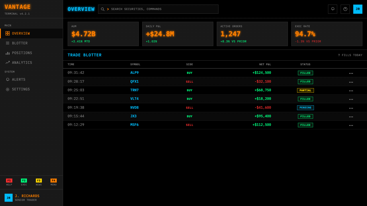
Multi-Panel Grid Splitting多面板网格分割
The screen is treated not as a canvas but as a tiled workspace, divided into a fixed number of information panels — the canonical form is four quadrants, though configurations with more panels are common in high-density professional setups. Each panel operates independently, displaying a different data stream, chart, or function. Dividing lines between panels are sharp and visible but carry no weight beyond functional separation: a single pixel-width line in a dim color, not a border with decorative treatment. This panel architecture is one of the most frequently borrowed elements of the Bloomberg aesthetic in contemporary data interfaces.屏幕被视为一个铺砖式工作空间,而非画布,被分割成固定数量的信息面板——标准形态是四个象限,但在高密度专业配置中,更多面板的布局也十分常见。每个面板独立运作,显示不同的数据流、图表或功能。面板间的分割线清晰可见,但除功能性分隔外不承载任何额外重量:一条以暗色呈现的单像素宽细线,没有任何装饰性处理。这种面板架构是当代数据界面中被借用最频繁的彭博美学元素之一。
Color as Semantic Encoding色彩作为语义编码
Color in Bloomberg Terminal style is never decorative — every color assignment carries a fixed meaning that expert users read instantly. Green indicates a positive change or live data feed. Red signals a decline or alert condition. White or bright text marks current focus or most critical data. Dimmer text in the same hue recedes to context or secondary reference. This semantic color system means that a user's eye can extract directional information — up, down, alert, normal — from the screen's color field without reading individual characters. The palette is deliberately small: to expand it with additional colors is to dilute the semantic system.彭博终端风格中的色彩从不用于装饰——每一次颜色分配都承载着专业用户能够即时读取的固定含义。绿色表示正向变动或实时数据流。红色标志下跌或警示状态。白色或高亮文字标记当前焦点或最关键数据。同一色相中的较暗文字退入背景,充当上下文或次级参考。这套语义色彩系统意味着,用户的眼睛能够在不逐字阅读的情况下,仅凭屏幕色场就提取出方向性信息——上涨、下跌、警示、正常。调色板被刻意控制得极小:引入更多颜色,就是在稀释这套语义系统。
Zero Roundness and Zero Softness零圆角与零柔化
Every corner is a right angle. Every border is a hard line. Every transition between states — hover, focus, active — is instantaneous rather than animated. There are no soft shadows suggesting depth, no hover glows warming the interface, no gentle fade-ins easing the user into a new screen. This absolute hardness is not carelessness — it is a design statement about what the interface values: speed and clarity over comfort and welcome. Rounded corners and smooth transitions are human-friendly affordances; their absence communicates that the interface is built for a professional who does not need to be welcomed.每一个角都是直角。每一条边框都是硬线。每一次状态切换——悬停、聚焦、激活——都是即时发生的,而非动画过渡。没有柔和阴影暗示深度,没有悬停光晕温暖界面,没有轻柔淡入引导用户进入新屏幕。这种绝对的硬朗并非疏于设计——它是一种关于界面价值取向的设计声明:速度与清晰优先于舒适与欢迎感。圆角和流畅过渡是面向普通人的友好设计语言;它们的缺席传达出一个信号:这个界面是为不需要被欢迎的专业人士而建的。
Function-Code Navigation Culture功能代码导航文化
The Bloomberg Terminal is navigated primarily through typed commands — short alphanumeric codes that call up specific functions — rather than through menus, search bars, or visual wayfinding. This keyboard-primary interaction model has a visual consequence: the interface does not need to expose navigational affordances to the eye. There are no hamburger menus, no breadcrumb trails, no sidebar trees. What is visible on screen is content, not navigation. The visual field is therefore maximally dense with information. Interfaces that adopt the Bloomberg aesthetic often invoke this principle by reducing navigation chrome to near-zero and filling the viewport with data.彭博终端主要通过键入命令来导航——调取特定功能的简短字母数字代码——而非依靠菜单、搜索栏或视觉导向系统。这种以键盘为主的交互模型带来了直接的视觉后果:界面无需向眼睛暴露导航性控件。没有折叠菜单,没有面包屑路径,没有侧边栏树状结构。屏幕上可见的是内容,而非导航。视觉空间因此被信息最大化地填满。采用彭博美学的界面,往往通过将导航装饰削减至近乎为零、以数据填满视口来援引这一原则。
Density as Trust Signal密度作为信任信号
Consumer interfaces are typically designed to present manageable amounts of information at a time, using whitespace, progressive disclosure, and onboarding flows to prevent overwhelming the user. Bloomberg Terminal style inverts this logic entirely. Maximum information at all times is the default state; the density is not a bug to be solved but a feature to be read. For professional users, a screen that shows little information is a screen that is hiding something, whereas a screen that shows everything simultaneously communicates that nothing is being filtered or withheld. Density, in this context, becomes a form of transparency and trust.消费类界面通常被设计为一次呈现适度的信息量,借助留白、渐进式披露和新手引导流程来防止用户感到不知所措。彭博终端风格将这一逻辑彻底颠覆。随时呈现最大信息量是默认状态;密度不是有待解决的问题,而是有待解读的特性。对专业用户而言,显示信息少的屏幕就是在隐藏某些东西;而同时显示一切的屏幕,则传达出没有任何信息被过滤或保留的信号。在这个语境中,密度成为了一种透明度与信任的形式。
See the Bloomberg Terminal (CRT Green) design system查看 Bloomberg Terminal (CRT Green) 完整设计系统
Who shaped Bloomberg Terminal (CRT Green)?谁塑造了 Bloomberg Terminal (CRT Green)?
Bloomberg founded the company in 1981 after leaving Salomon Brothers with a severance payment and the conviction that financial professionals were chronically underserved by the data tools available to them. His decision to price the terminal at a premium — and to keep it priced at a premium through subsequent decades — was itself a design decision: it defined the user base, shaped the interface's tone, and prevented the product from competing on consumer terms. Bloomberg later served as Mayor of New York City from 2002 to 2013, but his lasting design legacy is an interface philosophy that equated hostility to casual users with professional credibility.彭博于1981年带着一笔离职补偿金和一个信念——金融专业人士长期缺乏足够好用的数据工具——离开所罗门兄弟,创立了公司。他将终端定价于高端、并在此后数十年坚持高价策略的决定,本身就是一个设计决策:它定义了用户群体,塑造了界面的基调,并阻止了产品在消费品层面展开竞争。彭博后来于2002至2013年担任纽约市市长,但他持久的设计遗产是一套将对普通用户的敌意等同于专业可信度的界面哲学。
Secunda was a co-founder of Bloomberg L.P. and the primary architect of the terminal's underlying data and analytics systems. His background was in computer science and financial mathematics, and his priorities shaped the interface more profoundly than any visual designer's decisions. The terminal's function-code navigation system, its analytical depth, and its real-time data architecture were all products of Secunda's engineering vision. The visual aesthetic — dense, fast, unornamented — followed directly from the data model he built.塞昆达是彭博有限合伙公司的联合创始人,也是终端底层数据与分析系统的主要架构师。他的背景是计算机科学与金融数学,他的优先取向对界面的塑造远比任何视觉设计师的决策更为深远。终端的功能代码导航系统、其分析深度、其实时数据架构,都是塞昆达工程愿景的产物。那套密集、快速、无装饰的视觉美学,直接跟随他所构建的数据模型而来。
MacMillan, another co-founder, was instrumental in building out the business and client operations of Bloomberg in its early years. His work in establishing relationships with major financial institutions — beginning with Merrill Lynch as the first client — determined the professional context in which the terminal's aesthetic would be evaluated and normalized. Because the terminal's first users were professional traders and analysts at major institutions, the interface never had to justify its density or its learning curve to a general audience, which in turn freed the design to optimize entirely for expert use.麦克米伦是另一位联合创始人,在彭博早期建立业务和客户运营方面发挥了关键作用。他与主要金融机构建立关系的工作——从美林证券作为第一个客户开始——决定了终端美学将在其中被评判和规范化的专业语境。因为终端最初的用户是大型机构的专业交易员和分析师,界面从来不需要向普通受众为其密度或学习曲线进行辩护,这反而使设计得以完全为专家用途优化。
Zegar, the fourth co-founder, focused on the technical infrastructure and database architecture that made real-time financial data distribution possible at scale. The visual characteristics of Bloomberg Terminal style — the relentless updating of numerical fields, the simultaneous display of multiple live data streams, the absence of static imagery — are direct consequences of the data infrastructure Zegar helped build. A style that looks like it is always live and always moving is an accurate reflection of the system underneath it.泽加尔,第四位联合创始人,专注于使实时金融数据大规模分发成为可能的技术基础设施和数据库架构。彭博终端风格的视觉特征——数字字段的持续刷新、多条实时数据流的同步显示、静态图像的缺席——都是泽加尔参与构建的数据基础设施的直接后果。一种看起来始终在线、始终流动的风格,是其底层系统的精确倒影。
By the 2010s, a generation of interface designers working in fintech, developer tooling, and data infrastructure began consciously adopting Bloomberg aesthetic codes — dark grounds, monospaced fonts, phosphor-tinted primaries, high-density layouts — as a visual argument that their products were serious professional instruments rather than consumer applications. This collective reappropriation transformed the Bloomberg look from a legacy interface convention into an active design choice with specific cultural connotations. Products from trading platforms to CLI tools to server monitoring dashboards now use the aesthetic deliberately, citing its associations with precision, speed, and technical authority.到2010年代,一代在金融科技、开发者工具和数据基础设施领域工作的界面设计师,开始有意识地采用彭博美学代码——深色底面、等宽字体、磷光色调原色、高密度布局——作为视觉论证,声称他们的产品是严肃的专业仪器,而非消费类应用。这种集体性的再挪用,将彭博外观从一套遗留界面惯例转化为一种具有特定文化内涵的主动设计选择。从交易平台到命令行工具,从服务器监控仪表板,如今众多产品有意援引这套美学,援引其与精确、速度和技术权威的关联。
How do you use Bloomberg Terminal (CRT Green) today?今天怎么用 Bloomberg Terminal (CRT Green)?
Bloomberg Terminal style is one of the most legible signals in contemporary interface design — when applied correctly, it immediately positions a product as a professional instrument built for expert users who prioritize information density over ease of onboarding. The key requirement for applying this style is that the content must genuinely warrant the density: if a screen contains only three pieces of information, forcing them into a Bloomberg aesthetic will read as costume rather than design. The style earns its authority when the interface has real information complexity to manage.彭博终端风格是当代界面设计中可读性最强的信号之一——正确应用时,它能立刻将一款产品定位为专为信息密度优先于入门便捷性的专业用户而建的仪器。应用这种风格的关键前提是:内容必须真正值得这种密度。如果一个屏幕只包含三条信息,却强行套入彭博美学,呈现出来的将是服装道具,而非设计。只有当界面拥有真实的信息复杂度需要管理时,这种风格才能赢得其权威性。
For presentation slides, Bloomberg style works most effectively on data-heavy content pages rather than narrative slides. A cover slide in this aesthetic should commit fully: a deep black ground, a single high-contrast title in a monospaced or slab typeface, and perhaps one or two small supplementary data points in a dimmer tint of the primary color — no photography, no decorative shapes, no gradient backgrounds. Content slides treat each data series, chart, or metric as a terminal panel: bordered, labeled with short all-caps headers, and densely packed. Data visualization in this style uses hard-edged bars and lines with no area fills or soft glows; chart labels sit directly adjacent to data points rather than in legends. Transition animations, if used at all, should be instantaneous or nearly so — cuts, not dissolves.在演示文稿中,彭博风格在数据密集的内容页面上最为有效,而非叙事性幻灯片。这套美学下的封面页需要彻底贯彻:深黑底面,等宽或板衬字体呈现的单一高对比度标题,也许加上一两个以主色更暗色调呈现的小型补充数据点——无摄影图像,无装饰性形状,无渐变背景。内容页将每一组数据序列、图表或指标当作终端面板处理:带边框,以简短全大写标题标注,密集填充。这种风格下的数据可视化使用硬边条形图与折线图,无面积填充或柔和光晕;图表标签直接紧邻数据点,而非放在图例中。过渡动画(若使用)应当即时或近乎即时——切换,而非淡化。
For web interfaces, Bloomberg style is best suited to dashboards, trading platforms, server monitoring tools, analytics products, and developer portals where the user is a professional returning to the same tool many times per day. The layout should commit to a strict multi-column grid with hard dividers — borders expressed as lines, not whitespace. Navigation should be minimal and typographic: short function labels in small caps or monospaced type, no icon-primary navigation. Primary interactive elements — buttons, active states — use the phosphor primary color at full intensity against the dark ground; inactive or secondary elements recede to a much dimmer version of the same hue. For pricing pages, the style communicates premium and precision: a dark-ground table with bright tier labels and hard horizontal dividers reads as authoritative rather than friendly.对于网页界面,彭博风格最适合仪表板、交易平台、服务器监控工具、分析产品和开发者门户——用户是每天多次返回同一工具的专业人士。布局应当采用严格的多列网格配以硬分割线——边界以线条而非留白表达。导航应当简约且字体性:以小型大写或等宽字体呈现的简短功能标签,无以图标为主的导航。主要交互元素——按钮、激活状态——在深色底面上以磷光主色满强度呈现;非激活或次级元素则退至同一色相的暗淡版本。对于定价页面,这种风格传递出高端与精准的信号:深色底面的价格表配以明亮的层级标签和硬水平分割线,读来权威而非友好。
For editorial and marketing work, Bloomberg style is most effective for content that wants to position itself as analytical, data-authoritative, or technically expert. A report cover in this style uses a wide monospaced title, a short subtitle in smaller monospaced type below it, and a single line of metadata — date, organization, document type — in the dimmest foreground tint. Inside pages treat pull quotes and data callouts as terminal panels: bordered rectangles with a short label header and a large monospaced number or short quoted fragment inside. Marketing pages for data products or professional tools can use the style's poster-like directness: a full-viewport dark hero with the primary product claim set in large monospaced or terminal-adjacent type, followed by alternating dark and slightly less dark content sections, with the phosphor accent used sparingly on calls to action.对于编辑与营销内容,彭博风格在希望将自身定位为分析性、数据权威性或技术专业性的内容中最为有效。这种风格下的报告封面使用宽幅等宽标题,其下以更小等宽字体排列简短副标题,再加一行以最暗前景色调呈现的元数据——日期、机构、文档类型。内页将引文和数据标注作为终端面板处理:带边框的矩形,配以简短标签标题,内部是大型等宽数字或简短引用片段。数据产品或专业工具的营销页面可以利用这种风格的海报式直接感:一个全视口深色英雄区,以大型等宽或近终端字体呈现核心产品主张,随后交替排列深色与略浅深色的内容区块,磷光强调色克制地用于行动号召。
The most common mistake when applying Bloomberg Terminal style is treating it as a color-scheme choice rather than a structural commitment. Applying a dark background and green text to an otherwise conventional consumer interface — with rounded card corners, soft drop shadows, friendly iconography, and centered hero copy — produces an incoherent result: the surface signals professional density while the structure signals consumer ease. A genuine Bloomberg aesthetic requires zero rounding, hard borders, typographic navigation, and content density that actually earns the dark ground. The second common mistake is decorating with the phosphor color — using it for backgrounds, large color blocks, or decorative accents rather than reserving it strictly for data, labels, and active states. In the original system, the glowing color means something; diluting it into decoration empties the semantic system that gives the aesthetic its authority.应用彭博终端风格时最常见的错误,是将其视为配色方案选择而非结构性承诺。将深色背景和绿色文字应用于一个在其他方面仍是传统消费界面的产品——保留圆角卡片、柔和阴影、友好图标和居中主标语——会产生不连贯的结果:表层传递专业密度的信号,结构却在传递消费端便捷的信号。真正的彭博美学要求零圆角、硬边框、字体性导航,以及真正撑得起深色底面的内容密度。第二个常见错误是将磷光色用于装饰——用它填充背景、制造大面积色块或装饰性点缀,而非将其严格保留给数据、标签和激活状态。在原始系统中,那个发光的颜色承载着含义;将它稀释为装饰,就是在清空赋予这套美学权威性的语义系统。
See the Bloomberg Terminal (CRT Green) design system查看 Bloomberg Terminal (CRT Green) 完整设计系统
Bloomberg Terminal (CRT Green) — FAQBloomberg Terminal (CRT Green) · 常见问题
Is Bloomberg Terminal style the same as general dark-mode design?彭博终端风格和一般的深色模式设计是同一回事吗?
No — they share a dark background but differ fundamentally in intent, color logic, and information density. General dark mode is a user preference accommodation: it takes a design originally built for light backgrounds and inverts the luminance relationship to reduce eye strain in low-light conditions. The color palette in dark mode is typically softer — deep grays rather than near-black, muted accents rather than phosphor-saturated primaries — and the layout density stays the same as the light version. Bloomberg Terminal style is not an accommodation; it is the original design intention. The near-black ground, the glowing primaries, the maximum density, the absence of softening — these are not adjustments to an existing system. They are the system.不是——两者共享深色背景,但在意图、色彩逻辑和信息密度上存在根本差异。一般深色模式是一种用户偏好适配:它将原本为浅色背景设计的界面,通过反转亮度关系来减少在低光环境下的视觉疲劳。深色模式的调色板通常更柔和——深灰而非近黑,柔和强调色而非磷光饱和原色——且布局密度与浅色版本保持一致。彭博终端风格不是一种适配;它是原始的设计意图。近黑底面、发光原色、最大密度、柔化元素的缺席——这些不是对既有系统的调整,它们就是这个系统本身。
Can Bloomberg Terminal style be used for consumer-facing products?彭博终端风格可以用于面向消费者的产品吗?
It can be invoked, but it will consistently communicate professional seriousness and complexity — which works for some consumer contexts and actively damages others. Consumer products where users expect warmth, approachability, or sensory pleasure — food, wellness, lifestyle, children's products, social applications — will feel cold and alienating in a Bloomberg-adjacent aesthetic. Consumer products where a subset of users wants to be signaled as sophisticated or expert — investment apps, hardware monitoring tools, coding environments, weather or financial data apps aimed at enthusiasts — can use the aesthetic selectively and effectively. The key question is whether the product's value proposition benefits from the connotations of professional seriousness or is undermined by them.可以援引,但它始终会传递出专业严肃性与复杂性的信号——这在某些消费场景中有效,在另一些场景中则会造成损害。用户期待温暖感、亲近感或感官愉悦的消费产品——食品、健康、生活方式、儿童产品、社交应用——在接近彭博的美学中会显得冷漠而疏离。部分用户希望被标识为成熟或专家的消费产品——投资应用、硬件监控工具、编程环境、面向爱好者的天气或金融数据应用——可以有选择地、有效地使用这套美学。关键问题是:产品的价值主张是因专业严肃性的内涵而受益,还是因此而受损。
How does Bloomberg Terminal style handle data visualization?彭博终端风格如何处理数据可视化?
With deliberate austerity. Charts in the Bloomberg aesthetic are stripped of everything that does not encode data: no background fills, no decorative grid lines, no gradient area fills, no rounded bar corners, no soft drop shadows on chart elements. The chart frame, if present, is a hard border in the panel style. Axes are thin lines in a dim foreground tint; labels are small monospaced type placed directly adjacent to values. Color in charts encodes meaning — up versus down, one series versus another, alert versus normal — and is used at full phosphor intensity only for the most critical data points. Secondary series recede in brightness. The effect is that the chart looks like it came out of the data rather than being designed around it.以刻意的克制处理。彭博美学中的图表剥除了所有不对数据进行编码的元素:无背景填充,无装饰性网格线,无渐变面积填充,无圆角柱条,无图表元素上的柔和投影。图表框架(若存在)是以面板风格呈现的硬边边框。坐标轴是以暗淡前景色调呈现的细线;标签是直接紧邻数值放置的小型等宽字体。图表中的色彩编码含义——上涨对下跌,一组数列对另一组,警示对正常——且仅对最关键的数据点使用全磷光强度。次级数列在亮度上后退。效果是:这张图表看起来像是从数据中生长出来的,而非围绕数据设计而成的。
What is the difference between Bloomberg Terminal style and hacker or cyberpunk aesthetics?彭博终端风格和黑客或赛博朋克美学有何不同?
They share surface elements — dark grounds, glowing text, monospaced type — but their underlying logics are opposite. Hacker and cyberpunk aesthetics are expressive and theatrical: they use the visual language of the terminal to create atmosphere, communicate rebellion, or suggest technical mastery through visual drama. They typically mix terminal elements with grunge textures, distortion effects, neon color layering, or ASCII art decoration. Bloomberg Terminal style is anti-theatrical: it uses the same visual elements not for expression but for function, and any theatrical addition — a glow effect, a texture, a color that exists for mood rather than data — contradicts the style's logic. Cyberpunk uses terminal aesthetics to look dangerous; Bloomberg Terminal style uses them to look precise.两者共享表层元素——深色底面、发光文字、等宽字体——但底层逻辑截然相反。黑客与赛博朋克美学是表达性和戏剧性的:它们使用终端的视觉语言来营造氛围、传递反叛感,或通过视觉戏剧性暗示技术掌控力。它们通常将终端元素与垃圾质感、失真效果、霓虹色彩叠加或ASCII艺术装饰混合在一起。彭博终端风格是反戏剧性的:它使用相同的视觉元素,不为表达,而为功能——任何戏剧性的添加——光晕效果、质感、一种为情绪而非数据而存在的颜色——都与这种风格的逻辑相悖。赛博朋克用终端美学来看起来危险;彭博终端风格用它来看起来精确。
Does applying Bloomberg Terminal style require actual monospaced type for all text?应用彭博终端风格是否要求所有文字都使用等宽字体?
For data fields, numerical values, and code-adjacent content, monospaced type is close to mandatory — its absence reads as a failure of commitment to the aesthetic's core logic. For longer-form prose content — descriptive labels, help text, multi-sentence explanations — a narrow proportional typeface can be used without breaking the aesthetic, provided it is set tightly, left-aligned, and in a color that sits clearly within the foreground luminance hierarchy. The key is that monospaced type should dominate the visual field: if a viewer's eye lands on proportional type first, the Bloomberg illusion breaks. In practice, the most successful Bloomberg-adjacent interfaces use monospaced type for all visible information and reserve proportional type, if used at all, for help panels or documentation that operates outside the main data view.对于数据字段、数值和接近代码的内容,等宽字体几乎是强制性的——其缺席会被解读为对这套美学核心逻辑的承诺失败。对于较长篇幅的散文内容——描述性标签、帮助文本、多句话的解释说明——可以使用窄幅比例字体而不打破美学,前提是排列紧凑、左对齐,且颜色清晰处于前景亮度层级之内。关键在于:等宽字体必须主导视觉场;如果观看者的眼睛首先落在比例字体上,彭博感觉就会破裂。在实践中,最成功的近彭博界面对所有可见信息使用等宽字体,比例字体(若使用)仅保留给在主数据视图之外运作的帮助面板或文档内容。
Related design styles相关设计风格
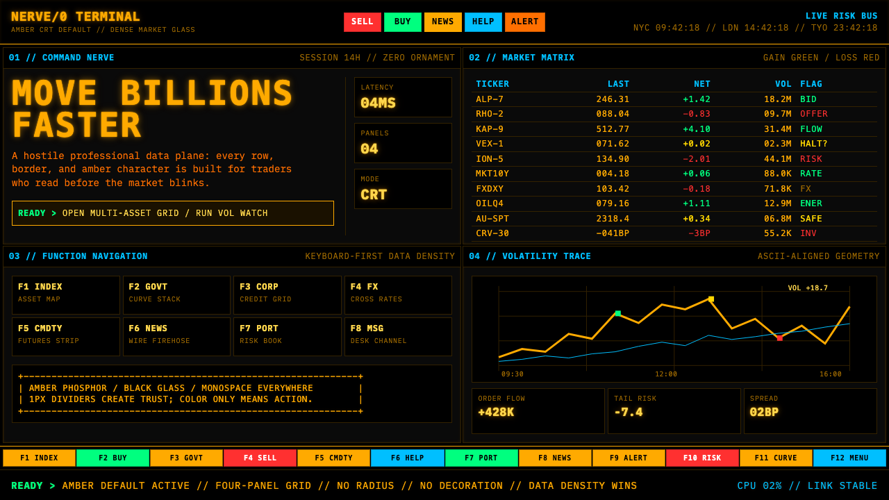 Bloomberg Terminal (Amber CRT)Hostile data authority. Amber mono grids and four hard panels make black glas…强硬的数据权威。琥珀等宽字与四格硬边框,让黑玻璃像市场神经。
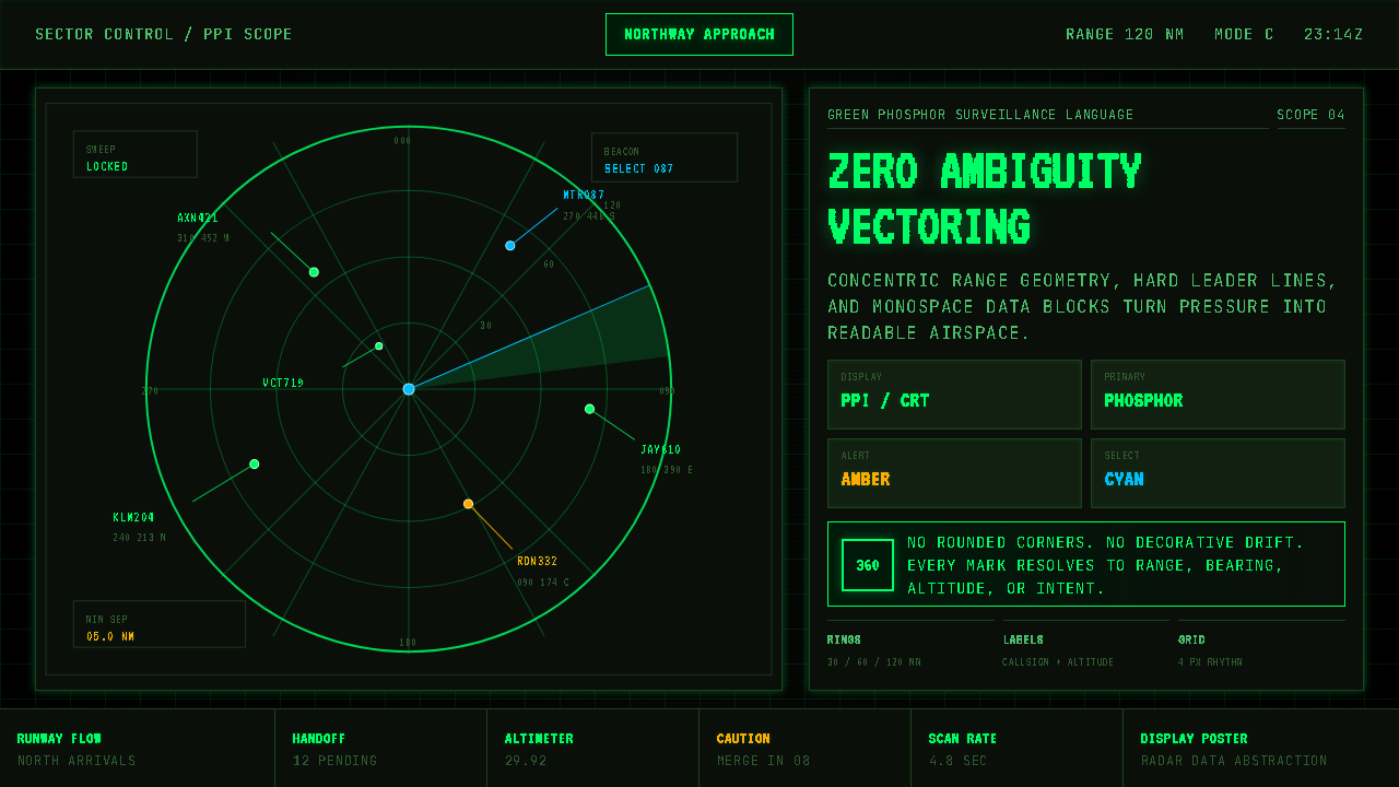 Air Traffic Control RadarOperational gravity. Phosphor green rings, sweep wedges, and monospace blips…军工级冷静:磷光绿同心环、扫描扇面与等宽光点建立零歧义。
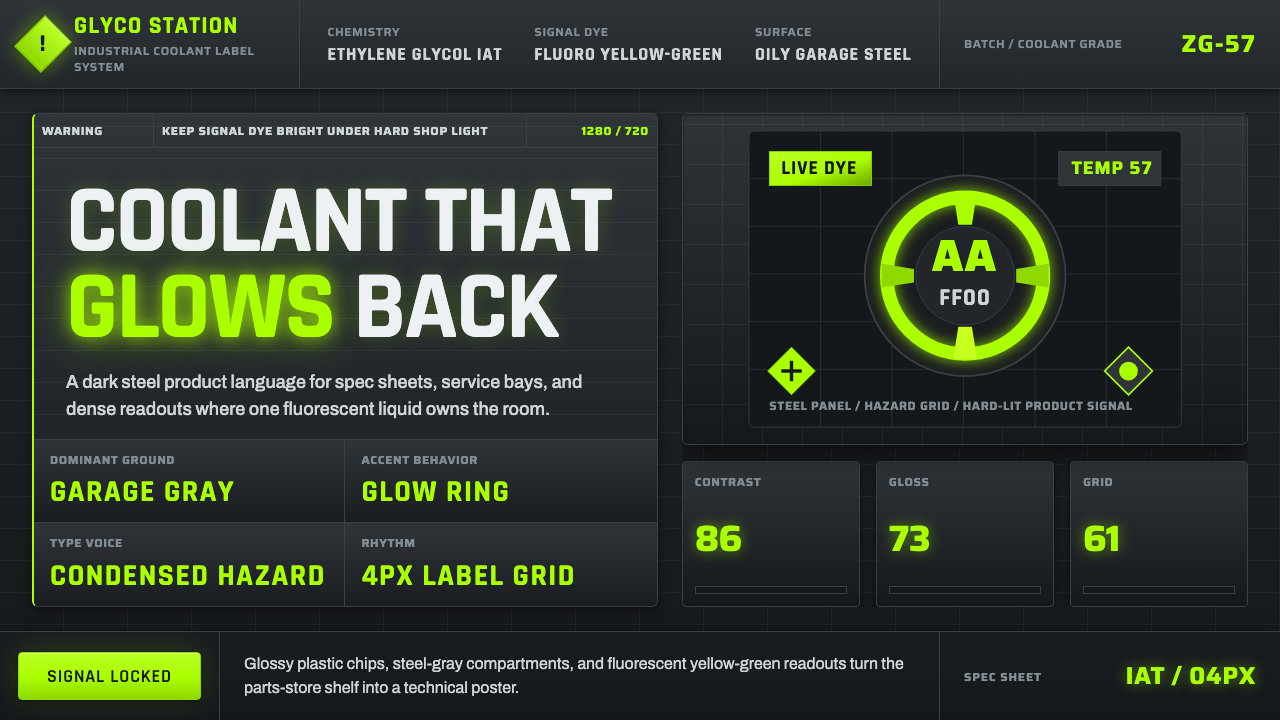 Fluorescent Antifreeze GreenCoolant becomes hazard signal. Fluoro green burns through steel-gray label gr…冷却液成为危险信号。荧光绿刺穿钢灰标签网格。
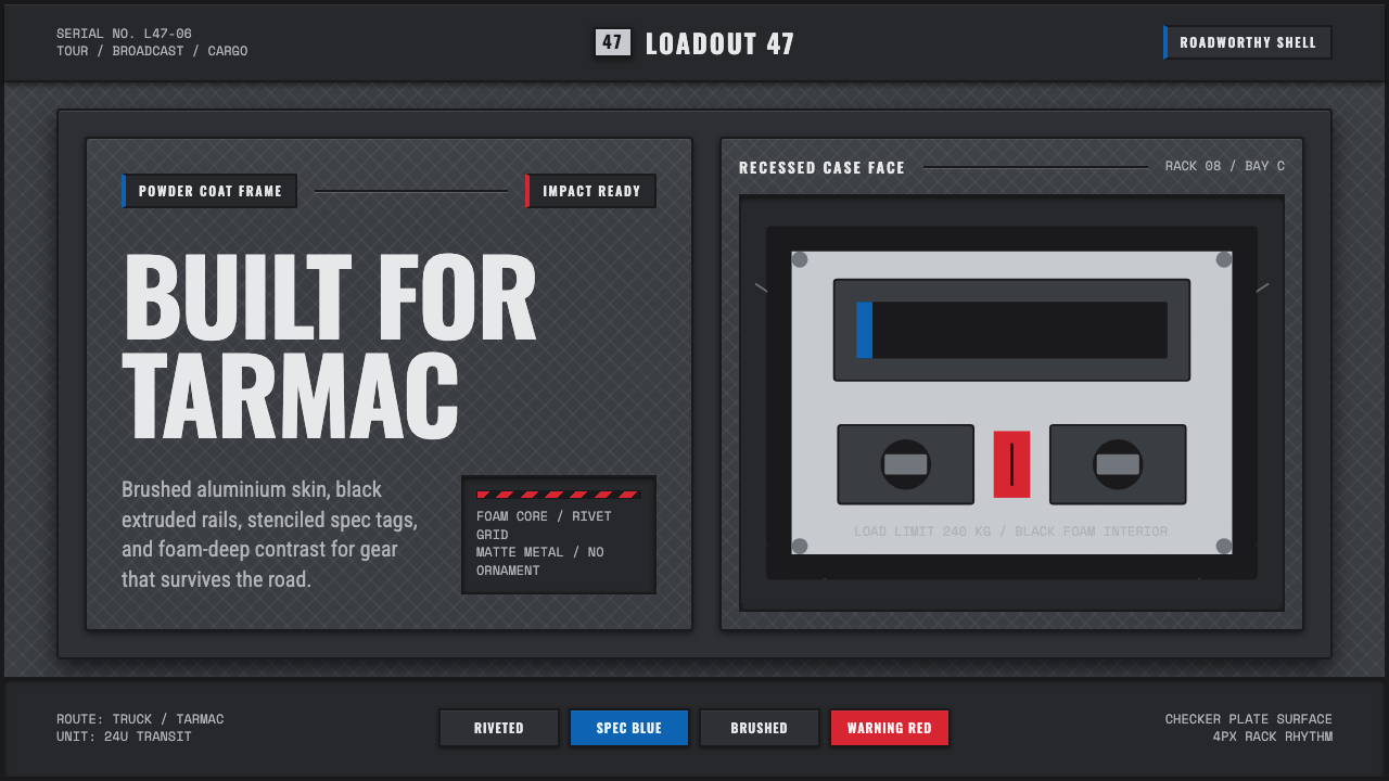 Aluminium Flight CaseRoadproof and exact. Diamond-plate gray, stencil type, black frames, blue-red…坚硬精确:菱形铝纹、模版字、黑框与蓝红规格标签。
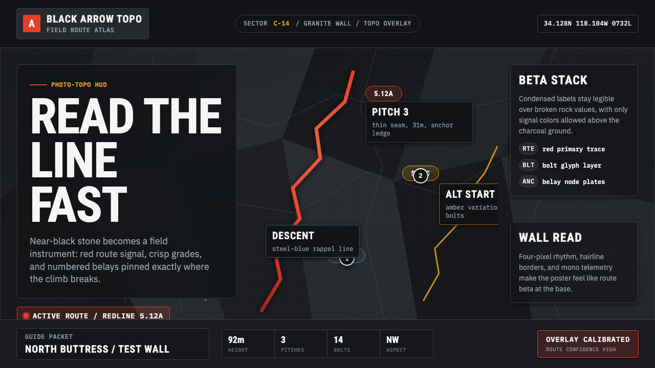 Climbing Topo GuideBeta at a glance. Red route telemetry cuts across near-black stone and conden…一眼读懂路线。红色拓扑线切过近黑岩面,紧缩标签如仪表读数。
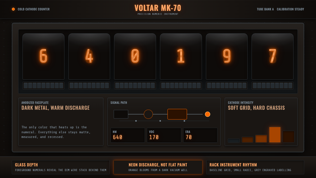 Nixie Tube DisplayHeat inside the machine. Neon-orange digits glow over black metal gridwork.机器里的热光:霓虹橙数字浮在黑色金属栅格上。