What is Climbing Topo Guide?
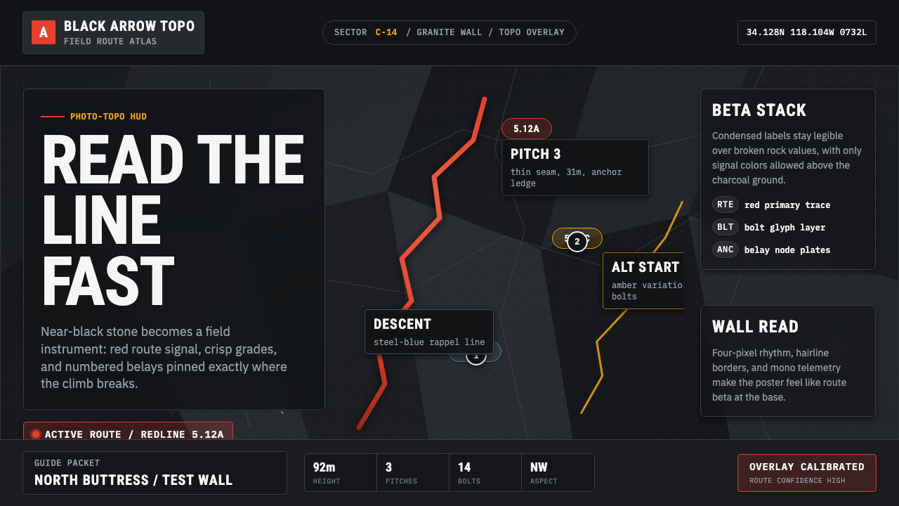
Climbing Topo Guide is the visual language of the crag: a near-black rock face becomes a precision instrument, with a bright route line and HUD-grade labels telling you exactly where to go and what to expect before you leave the ground.
Climbing Topo Guide in brief
Climbing Topo Guide is a data-rich, photo-based visual dialect developed by outdoor route platforms such as Mountain Project, theCrag, and Rakkup after 2010. It encodes everything a climber needs — pitch numbers, grade ratings, bolt placements, anchor positions, and line-of-weakness geometry — into a single photographic image that can be read on a small screen under bright sunlight at the base of a cliff.
The system's visual hierarchy is built on extreme contrast. A real rock-face photograph is desaturated to charcoal or near-black, stripping the scene of all ambient warmth and color noise. Against that compressed, almost abstract background, a saturated route line — almost always red — traces the actual climb. Overlaid labels use condensed, high-legibility sans-serif type at sizes and weights calibrated for fast reading under stress. Every element is purposeful and tightly constrained: nothing decorative, nothing ambient, nothing that might compete with the safety-critical information.
Aesthetically, the style sits at the intersection of outdoor photography, aviation HUD design, and technical cartography. It borrows the photographic realism of the base image, the overprinted annotation logic of aeronautical charts, and the color-signal economy of emergency instrumentation. The result is a visual system that feels simultaneously documentary and synthetic — a controlled technical overlay on an uncontrolled natural surface.

Where does Climbing Topo Guide come from?
Before digital platforms, climbing route information lived in printed guidebooks. These contained hand-drawn topos — simple line diagrams sketched over photographs or blank outlines, indicating the route with arrows or dashed lines and annotating pitches with handwritten grades and notes. The hand-drawn topo was intimate and imprecise, shaped by the individual author's style and the constraints of offset printing. It was understood as an approximation: you still needed someone who had done the route to translate the diagram into reality.
The shift to digital photo-topos accelerated after 2010 as smartphone cameras improved and GPS-tagged outdoor photography became practical. Mountain Project, launched in 2005 and expanded through crowdsourcing, became the de facto database for North American climbing routes. Contributors uploaded photographs and drew route lines directly on images using web tools. This introduced a new visual problem: hand-drawn lines on raw color photographs were muddy and ambiguous. The solution was systematic — desaturate the background to create contrast, use a specific high-saturation line color (red won out for its visibility against both light and dark rock), and develop a consistent glyph set for bolts, anchors, and belay stations.
theCrag, operating globally and particularly strong in Europe and Australia, refined the system further toward standardized notation. Rakkup introduced layered interactive topos that could display or hide individual pitches. The collective effect of these platforms converging on similar visual conventions produced what amounts to an industry standard — an unwritten specification for how a route image should look, understood by climbers worldwide regardless of which platform they use.
The style draws on deeper traditions. Cartographic annotation — the practice of overprinting legible information on a photographic or topographic base — is as old as military aerial photography. Aviation sectional charts use similar logic: suppress ambient visual noise, encode specific data in high-contrast overlays, use a shared symbol set that every pilot learns to read at a glance. Climbing Topo Guide applied this cartographic intelligence to vertical terrain, inheriting the seriousness and precision that safety-critical visual communication demands.
What defines the Climbing Topo Guide look?
Desaturated Base Image
The rock-face photograph is the canvas, but it is never shown as the camera captured it. The image is desaturated — pulled toward charcoal or near-black — to create a unified, low-noise background against which all overlaid information can be read at a glance. The desaturation depth varies by platform and photographer, but the intent is always the same: suppress the visual complexity of real stone so the annotation layer can dominate. Occasionally a slight warm tone is retained to preserve a sense of depth, but the rock itself becomes secondary — a textured stage rather than a subject.
Route Line and Color Signal
The route line is the primary visual element and is drawn in high-saturation red in the overwhelming majority of cases. Red was selected not for brand reasons but for practical ones: it reads against dark rock, it reads against light rock, and it reads at the small sizes a phone screen imposes. When multiple routes appear on a single image — common on busy sport crags — secondary lines may be differentiated with contrasting hues such as yellow or white, but red remains the default and its primacy is understood across platforms as an identifier for the main or most significant route.
Condensed Technical Typography
Labels are set in condensed sans-serif typefaces — narrow letterforms that fit maximum information into minimum horizontal space. The model is instrument telemetry: everything a pilot or operator needs is within the field of view, with nothing wasted. Pitch numbers appear in bold circles or rectangular badges; grade ratings sit in capsule-shaped containers that function as visual anchors on the route line; crack and feature names appear as brief all-caps call-outs. The type must be legible at the size a phone renders it and at the viewing distance of someone standing at the base with sunglasses on.
Glyph Set for Safety Information
Bolts, anchors, belay stations, rappel points, and crux sections are encoded in a shared glyph vocabulary that climbers learn to read the way pilots learn chart symbols. A bolt is typically a small filled circle or a cross; an anchor is a larger shape, often differentiated with a chain or ring icon; a crux is marked with an asterisk or a star. These glyphs are not decorative — they are safety information encoded visually because text would be too slow to read and too large to place precisely on a photograph. Their stylistic character is entirely determined by legibility and platform convention.
Pitch Segmentation and Vertical Reading
Multi-pitch routes divide the climbing into numbered segments called pitches, each ending at an anchor where the leader belays the follower. On a topo, each pitch is numbered sequentially from the ground up, and the route line is broken at each anchor to signal the transition. This vertical reading direction — bottom to top — mirrors the actual experience of climbing and is the opposite of most Western reading conventions. The visual grammar of the topo trains the eye to travel upward through the image, following the route line toward the summit or exit point.
Informational Economy
Every element on a topo exists to answer a specific question: Where does the route go? How hard is each pitch? Where are the protection points? Where do I stop? Anything that does not answer one of these questions is not present. There is no branding beyond a platform logo in a corner, no decorative frame, no ambient graphic interest applied to the background. This extreme economy is what gives the style its HUD-like quality — the visual field is cleared of everything except the data the user needs at that moment.
Technical Darkness
The overall palette is dark by necessity, not by aesthetic preference. The near-black or deep charcoal background created by desaturating the rock is a functional decision: it maximizes the contrast available for overlaid annotations and reduces the visual complexity that would distract from reading. This darkness gives the style an industrial, technical character — it resembles the interface of a night-mode application, a terminal display, or an instrument cluster. On a phone screen in bright sunlight, this contrast profile is a usability requirement; as a design aesthetic it reads as purposeful, serious, and technically sophisticated.

Who shaped Climbing Topo Guide?
Founded in 2005 and headquartered in the United States, Mountain Project became the largest crowdsourced climbing route database in the world. Its photo-topo contribution tools effectively standardized the visual conventions for digital route annotation in North America. The platform's scale — hundreds of thousands of routes documented by tens of thousands of contributors — meant that its interface decisions about line color, label style, and glyph placement propagated across the climbing community as a de facto visual standard. REI acquired Mountain Project in 2016, adding institutional backing to what had been a community-built resource.
theCrag, operating from Australia with a global remit, developed a more formally standardized approach to topo annotation and introduced rigorous grade conversion systems that allowed routes rated in different national systems to be compared directly. Its geographic breadth — covering crags across Europe, Asia, Australia, and the Americas — meant that it had to develop visual conventions legible across cultural contexts and rock types. theCrag's annotation style tends toward greater formalism than Mountain Project's, with more consistent glyph sizing and placement logic.
Rakkup focused on interactive, layered topos that could be navigated pitch by pitch on a smartphone, allowing a climber to tap a pitch number and see that segment of the route highlighted in isolation. This interaction model influenced how subsequent platforms thought about topo design — not as a static annotated image but as a navigable data layer over photography. Rakkup's visual language emphasized the interactive affordance of each pitch indicator, making button-like tap targets out of elements that had previously been purely diagrammatic.
Before digital platforms, European alpine publishers — particularly those producing guides to the limestone crags of France, Spain, and the Dolomites — had developed sophisticated photo-topo conventions in print. Publishers such as Rockfax and Panico Alpinverlag used high-contrast black-and-white or muted-color photographs with overprinted red or yellow route lines, establishing many of the visual grammar conventions that digital platforms would later automate and democratize. These print guides demonstrated that the photo-topo format could achieve both technical precision and a compelling visual object — a quality that the digital style retains.
The deep ancestor of the climbing topo visual system is the aeronautical sectional chart — a standardized map format developed for pilots that overlays navigational data on topographic or photographic basemaps using high-contrast symbols, condensed type, and a carefully managed visual hierarchy. Aviation charts demonstrated that life-critical information could be reliably encoded in a layered visual format, that symbol sets could be standardized across agencies and nations, and that contrast management was the primary tool for ensuring legibility under adverse conditions. Climbing topo designers absorbed these lessons, whether consciously or not, producing a visual grammar that shares much of aviation's informational DNA.
How do you use Climbing Topo Guide today?
Climbing Topo Guide is a highly specific functional visual system, but its core logic — precision annotation on a compressed photographic ground, high-contrast information hierarchy, dark backgrounds with bright signal elements — transfers powerfully to any interface that needs to communicate technical data quickly under demanding viewing conditions. The key to applying it correctly is understanding that every convention exists for a reason, and that convention should only be borrowed when the same reason applies.
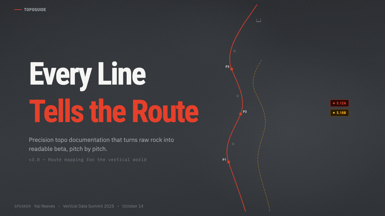
For presentation slides, the style works best for technical or data-heavy contexts where authority and precision are the desired tone. A cover slide can use the approach's characteristic contrast: a near-black desaturated background with a single high-contrast headline and a bright accent element — a colored line, a numbered badge — positioned like a route annotation. Content slides should treat information as HUD overlays: label everything precisely, use condensed type for dense callouts, and resist any decorative fill. Data visualization slides take on a topo quality when chart elements are rendered with crisp, high-contrast strokes against a dark field — think schematic rather than glossy.
For web interfaces and dashboards, the style's informational economy and dark-field contrast make it well-suited to monitoring tools, developer consoles, mapping interfaces, and any product where the user is reading data under time pressure. The approach: use a very dark near-black background as the canvas, reserve bright accent colors exclusively for active states and critical indicators, keep typography tightly condensed and hierarchically clear, and use glyph-level icons rather than illustrated images for status indicators. This is a system that rewards restraint — every element that exists should earn its place by communicating something specific.
For editorial and marketing work, the style is a strong signal of technical rigor and outdoor authenticity. Adventure-brand communications, technical product launches, and anything positioned at the intersection of expertise and physical world engagement can benefit from its visual grammar. Bleed-edge dark photographs with minimal annotation-style type overlays read as authoritative and uncompromising. The style struggles in warm, approachable, or lifestyle-oriented contexts — its compression and darkness push against softness and hospitality.
The most common mistake when borrowing from Climbing Topo Guide is treating the dark background as a stylistic choice rather than a functional one, then filling that dark space with decorative elements that have nothing to do with information delivery. The authentic system is dark because it has to be, and it is sparse because every added element competes with safety-critical data. When the style is used as decoration — dark-and-neon without the underlying informational logic — it reads as pastiche. The discipline is: if an element does not communicate something specific, it should not be there.
Climbing Topo Guide — FAQ
Is this style only appropriate for outdoor or adventure brands?
No — the climbing topo aesthetic is rooted in functional HUD and technical annotation logic that translates to any high-density information environment. Developer tools, monitoring dashboards, mapping platforms, and technical documentation interfaces all share the same underlying requirement: communicate precise data on a visually compressed background with maximum legibility. The outdoor origin is a cultural signal, not a functional constraint. That said, using the style in a context with no connection to technical or precision work — a bakery, a children's product, a wellness app — would create a tonal mismatch significant enough to undermine the communication.
How does this style handle color when the base image is already dark?
The style's color logic is entirely contrast-driven, not palette-driven in the conventional sense. The base image is reduced to near-black specifically so that any color placed on top of it reads as signal rather than environment. Red works because it has no close neighbor in the near-black and charcoal range. When additional colors are needed — for secondary routes, warning indicators, or status differentiation — they must each be sufficiently saturated and distinct from one another to remain individually readable at small sizes. The rule is: every color present must justify itself by carrying unique information, not by adding variety.
What is the difference between this style and a conventional dark-mode interface?
Dark-mode interfaces are typically UI systems built on a dark color scale — they replace white backgrounds with dark grays and adjust text and component colors accordingly. Climbing Topo Guide's darkness is photographic in origin: it comes from the compressed rock-face image that serves as the base layer. This means the darkness is textured, variable, and alive — it shifts in density and value across the image — rather than flat and uniform. Annotations exist in tension with an underlying photographic reality, which gives the style a layered quality that flat dark-mode interfaces lack. The closest analog in digital design is a satellite map view with data overlays, not a themed UI color scheme.
How do you handle legibility when the rock background is light instead of dark?
Light-rock crags — white limestone slabs, granite in high alpine environments — present a real challenge because the high-contrast dark-on-light inversion breaks the standard formula. Platforms handle this in two main ways: either the image is still darkened toward a neutral middle gray (sacrificing some of the photographic realism), or the annotation color is shifted from red to a dark or black line with white outline. Some contemporary topo tools allow the line color to be toggled by the contributor based on background luminosity. The core principle holds regardless: the route line must have sufficient contrast against whatever the base image provides. This is a usability constraint, not an aesthetic preference.
Can the style be applied to indoor climbing or gym contexts?
Indoor climbing wall topos exist but have a substantially different visual character from outdoor photo-topos, for a structural reason: indoor walls are artificially lit, brightly colored, and geometrically regular in ways that outdoor rock is not. The visual compression that defines the outdoor topo depends on starting from a complex, variable natural surface and simplifying it. Indoor wall diagramming tends toward schematic plans or rendered illustrations rather than photographic bases. If you are working on indoor climbing visual communication, the outdoor topo's photographic language should be set aside in favor of a more diagrammatic or instructional visual system. The shared elements — condensed type, glyph-coded holds, numbered sequences — can migrate, but the photographic base and dark-field contrast cannot.
Related design styles
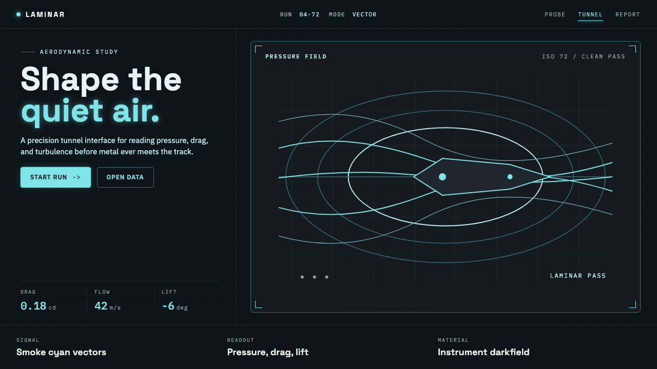 Wind TunnelMakes darkness feel measurable. Cyan-white streamlines and monospace ticks gl…
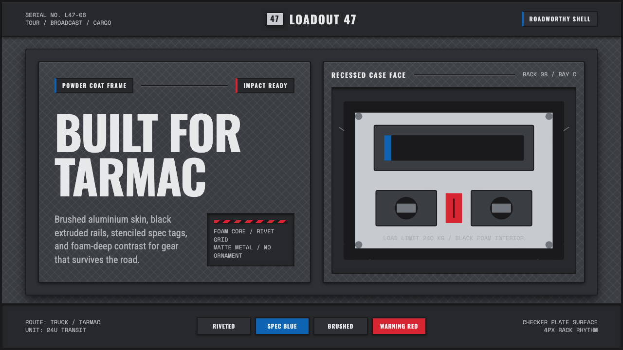 Aluminium Flight CaseRoadproof and exact. Diamond-plate gray, stencil type, black frames, blue-red…
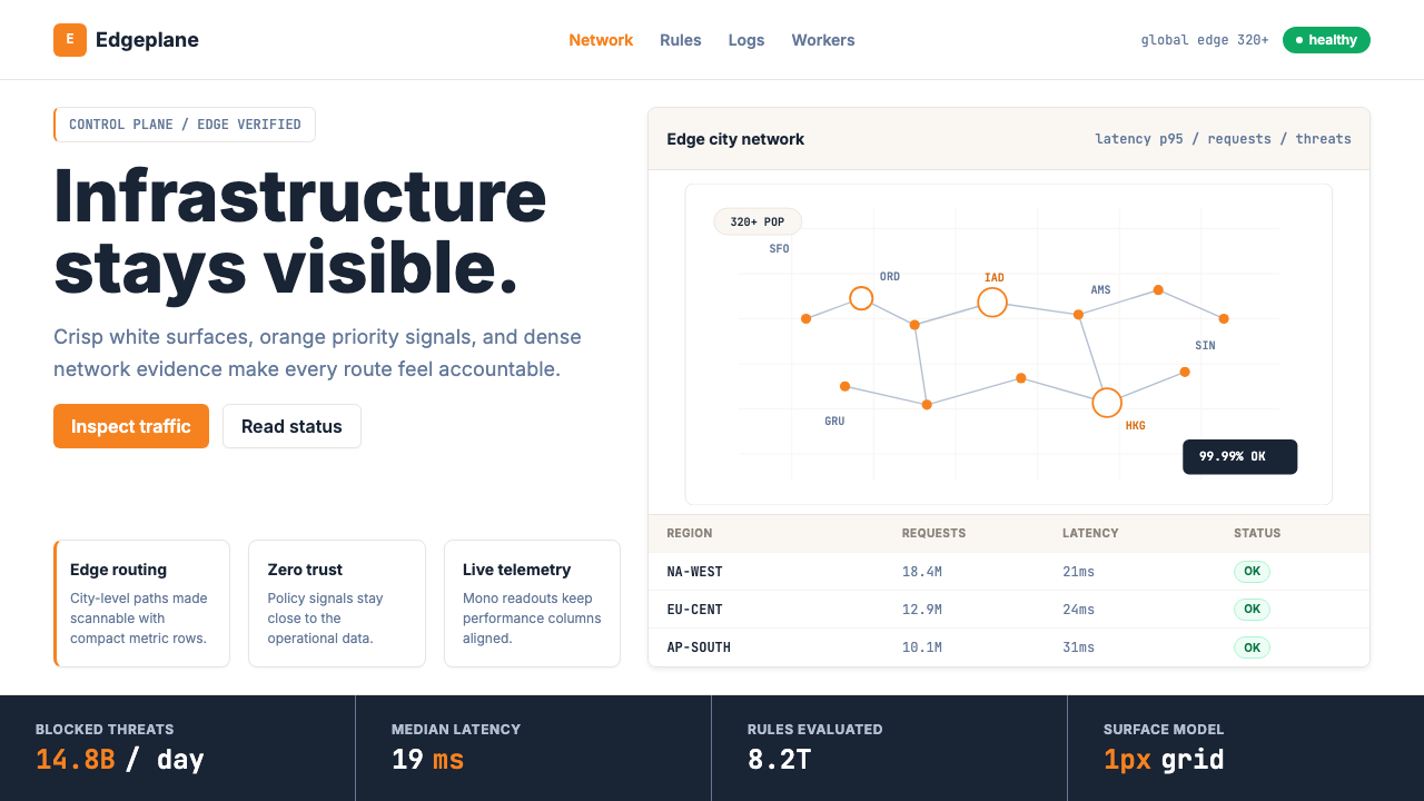 Cloudflare Orange EdgeOperational clarity wins. Orange accents, hairline grids, and mono metrics ma…
 EKG Vital MonitorClinical clarity glows. Phosphor ECG green, cyan and yellow channels lock to…
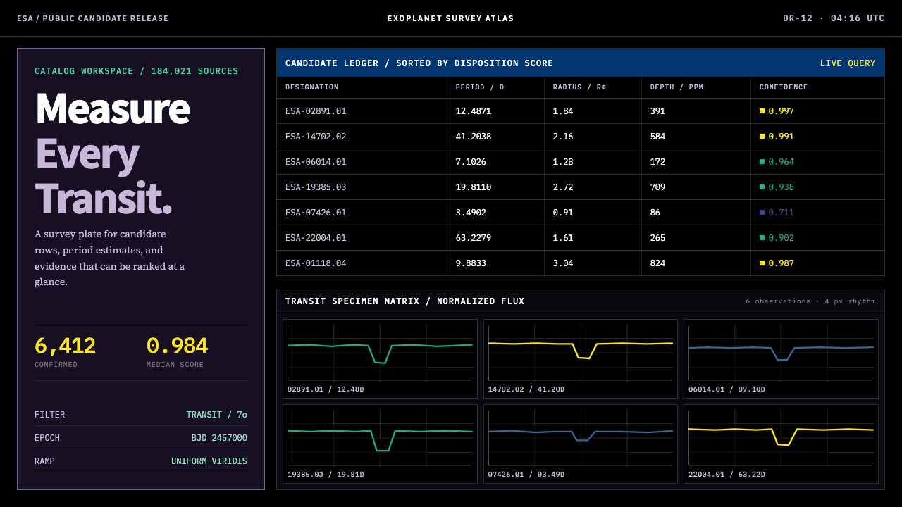 Exoplanet Survey AtlasNumbers stay legible at survey scale. Viridis ranks dense mono tables and tra…
 Financial Terminal MonoMaximum signal per pixel. Pure black, IBM Plex Mono, green-red ticks, amber-b…