What is Bitcoin Maximalist Orange?什么是 Bitcoin Maximalist Orange?
Bitcoin Maximalist Orange collapses the entire language of money into a single visual conviction: one sovereign orange on terminal black, where every pixel is signal and nothing is decoration.比特币极端主义橙将货币的全部语言压缩为一个视觉信念:终端黑上唯一的主权橙,每一个像素都是信号,没有任何装饰。
Bitcoin Maximalist Orange in briefBitcoin Maximalist Orange 速览
Bitcoin Maximalist Orange is a design ideology translated into a visual system. Its palette — a single vivid orange on pure black grounds, accented by the cool glow of monospace type — does not aspire to beauty in the conventional sense. It aspires to legibility under conditions of maximum information density, the same legibility demanded by a price terminal at 3 a.m., a block explorer refreshed in real time, or a hardware wallet confirming a transaction worth years of savings.比特币极端主义橙是一种被翻译为视觉系统的设计信仰。它的色板——纯黑底色上唯一的强烈橙色,辅以等宽字体的冷冽光感——并不追求通常意义上的美观。它追求的是在最大信息密度下的可读性:凌晨三点价格终端的那种可读性,实时刷新的区块浏览器的那种可读性,或是硬件钱包在确认一笔价值数年积蓄的转账时所要求的那种可读性。
The system is built around refusal. No gradients. No ambient shadows. No rounded corners that signal friendliness. No secondary brand colors admitted into the composition. Every element that survives the editing process does so because it carries information — price movement, block height, mempool depth, confirmation count — and not because it improves the emotional experience of the viewer. This is design as proof-of-work: only the essential survives.这套系统建立在拒绝之上。没有渐变。没有环境投影。没有传达友好感的圆角。没有任何第二品牌色被允许进入构图。每一个在编辑过程中存活下来的元素,都是因为它承载着信息——价格波动、区块高度、内存池深度、确认数量——而不是因为它改善了观看者的情感体验。这是作为工作量证明的设计:只有本质的东西才能存活。
What makes the aesthetic distinctive is not minimalism in the contemporary sense, which often prioritizes comfort and soft negative space. Bitcoin Maximalist Orange prioritizes density and signal. A well-executed screen in this style is saturated with monospace numerals, sparse labels in neutral gray, and orange used exclusively at moments of salience — a confirmed transaction, a live price, an alert threshold crossed. The darkness of the ground is not mood; it is contrast engineering.使这种美学与众不同的,不是当代意义上的极简主义——后者往往优先考虑舒适感与柔和的留白。比特币极端主义橙优先考虑密度与信号。一个执行良好的界面充满了等宽数字、中性灰色的简短标签,以及橙色仅在关键时刻使用——一笔已确认的交易、一个实时价格、一个警报阈值被触发。黑色背景不是在制造氛围;它是对比度工程。
See the Bitcoin Maximalist Orange design system查看 Bitcoin Maximalist Orange 完整设计系统
Where does Bitcoin Maximalist Orange come from?Bitcoin Maximalist Orange 从何而来?
The visual roots of Bitcoin Maximalist Orange trace to 1970s and 1980s computing culture — the green phosphor glow of early terminals, the amber displays of IBM PC monitors, the command-line interfaces that required operators to think in structured text rather than spatial metaphor. When Satoshi Nakamoto published the Bitcoin whitepaper in October 2008, no visual identity accompanied it. The whitepaper was a technical document, typeset plainly, circulated on a cryptography mailing list. Visual identity accrued slowly, organically, as developers, node operators, and forum participants built the infrastructure around the protocol.比特币极端主义橙的视觉根源可追溯至1970至80年代的计算机文化——早期终端的绿色磷光辉光、IBM PC显示器的琥珀色屏幕、要求操作员以结构化文本而非空间隐喻思考的命令行界面。当中本聪于2008年10月发布比特币白皮书时,没有任何视觉标识随之而来。那份白皮书是一份技术文件,排版朴素,在密码学邮件列表上流传。视觉标识随着开发者、节点运营者和论坛参与者围绕协议构建基础设施,缓慢而有机地积累。
The orange now universally associated with Bitcoin — a warm, saturated amber-orange — emerged gradually through community consensus rather than deliberate brand design. Early Bitcoin forums used orange avatars and header graphics almost reflexively, partly because the hue stood out against the dark backgrounds common to developer-culture websites, and partly because it read as energetic and valuable without mimicking the gold tones that would have felt derivative of traditional finance. By 2014, the orange had become canonical enough to anchor the Bitcoin Foundation's visual materials and the growing ecosystem of exchanges, wallets, and explorers.如今与比特币普遍关联的橙色——一种温暖、饱和的琥珀橙——是通过社区共识而非刻意的品牌设计逐渐形成的。早期比特币论坛几乎是本能地使用橙色头像和标题图形,部分原因是这种色调在开发者文化网站常见的深色背景上格外突出,部分原因是它传达出一种充满能量且有价值的感觉,同时又不模仿那些让人联想到传统金融的金色调。到2014年,这种橙色已足够经典,成为比特币基金会视觉材料以及不断成长的交易所、钱包和浏览器生态系统的视觉锚点。
The terminal-black ground has a parallel and equally important genealogy. Cypherpunk culture — the movement that provided the ideological soil for Bitcoin through figures like Timothy May, whose 1992 Crypto Anarchist Manifesto preceded the whitepaper by sixteen years — operated aesthetically in the register of command-line computing. Dark terminals, monospace fonts, and information-dense layouts were not stylistic choices so much as the natural visual output of a community that worked in Unix shells and IRC channels. When Bitcoin's visual identity crystallized between 2017 and 2024, this heritage was absorbed wholesale.终端黑色背景有着同样重要的平行谱系。密码朋克文化——通过蒂莫西·梅等人物为比特币提供意识形态土壤的运动,梅1992年的《密码无政府主义宣言》比白皮书早了十六年——在命令行计算的美学维度中运作。深色终端、等宽字体和信息密集的布局与其说是风格选择,不如说是一个在Unix shell和IRC频道中工作的社区的自然视觉输出。当比特币的视觉标识在2017年至2024年间结晶时,这一遗产被全盘吸收。
The ideological intensification of Bitcoin maximalism — the conviction that Bitcoin is the only legitimate cryptocurrency and that all others are noise or fraud — hardened the aesthetic simultaneously. Saifedean Ammous's 2018 book 'The Bitcoin Standard' gave the movement a theoretical framework rooted in Austrian economics, and its influence is legible in the design language: zero tolerance for visual complexity mirrors zero tolerance for monetary inflation. Michael Saylor's MicroStrategy communications, Nic Carter's data journalism, and the block explorer aesthetic pioneered by sites like Blockchair and mempool.space all contributed to the codification of the style as it exists today — dense, dark, orange, and uncompromising.比特币极端主义的意识形态强化——相信比特币是唯一合法的加密货币,其他一切都是噪声或欺诈——同时也强化了这种美学。赛费迪安·阿摩斯2018年出版的《比特币本位》为这一运动提供了植根于奥地利经济学的理论框架,其影响在设计语言中清晰可见:对视觉复杂性的零容忍,映照着对货币通胀的零容忍。迈克尔·塞勒的MicroStrategy传播材料、尼克·卡特的数据新闻写作,以及Blockchair和mempool.space等网站所开创的区块浏览器美学,共同推动了这种风格的体系化——密集、深暗、橙色、不妥协。
What defines the Bitcoin Maximalist Orange look?Bitcoin Maximalist Orange 的视觉特征是什么?
Color色彩
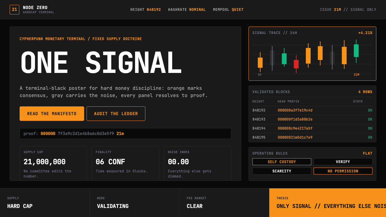
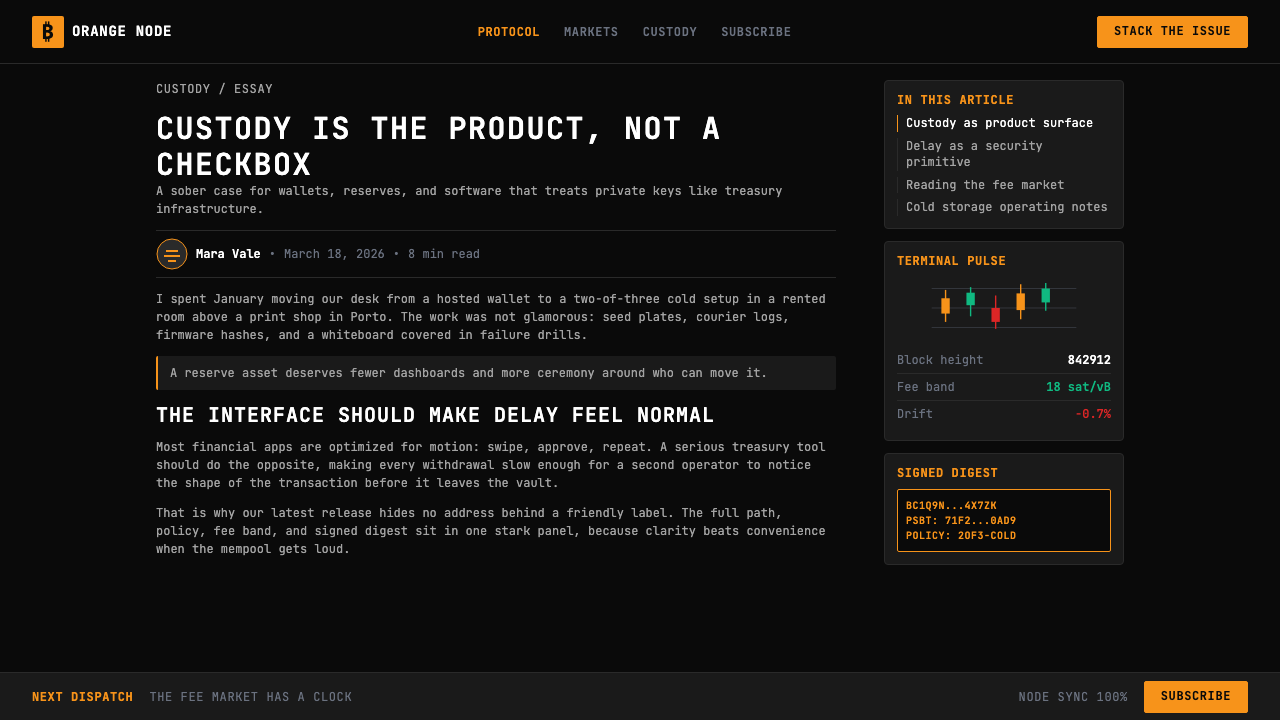
The palette is built around a single vivid orange — warm, saturated, and unambiguous — deployed against a pure black or near-black ground. This is a monochromatic system in practice: the orange functions as the sole accent, while neutral grays of varying lightness handle secondary information and structural division. No secondary brand colors are admitted. The orange does not shift across the composition; it appears at full intensity or not at all, reserving its visual weight for moments of genuine salience: live prices, confirmed states, alert thresholds. The black ground is chosen not for moodiness but for maximum contrast, reducing eye strain during extended screen sessions in low-light environments typical of traders and node operators.色板围绕唯一的鲜艳橙色构建——温暖、饱和、毫不含糊——铺设于纯黑或接近纯黑的底面上。这在实践中是一个单色系统:橙色充当唯一的强调色,而不同明度的中性灰色处理次要信息与结构划分。没有任何第二品牌色被允许进入。橙色在构图中不会偏移;它以完整强度出现,或根本不出现,将其视觉重量保留给真正显著的时刻:实时价格、已确认状态、警报阈值触发。黑色背景的选择不是为了制造情绪,而是为了最大对比度,在交易员和节点运营者典型的低光环境中长时间盯屏时减少眼睛疲劳。
Typography字体排印
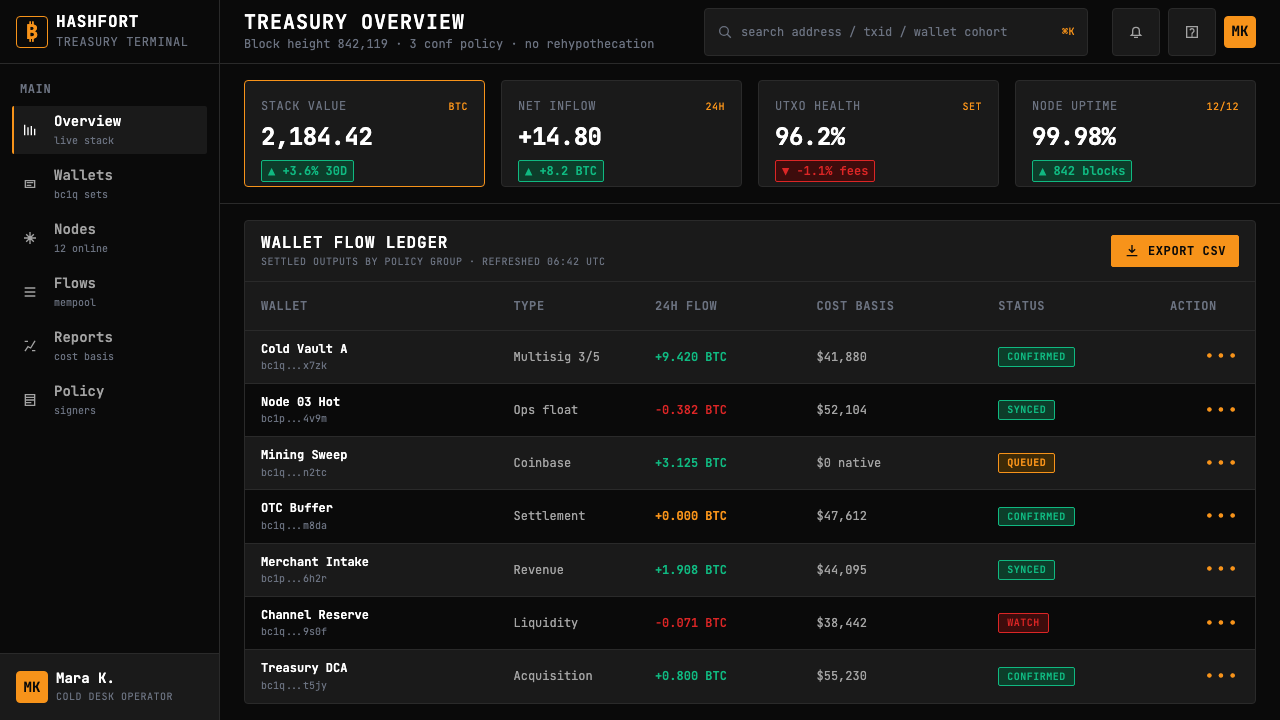
Monospace typefaces dominate, chosen for their precision and their visual alignment with terminal and code aesthetics rather than for warmth or personality. Every character occupies the same horizontal width, which means columns of numbers align vertically without manual adjustment — a property that is functionally critical when displaying price tables, block data, or transaction histories. Proportional typefaces, when they appear at all, are reserved for explanatory prose or navigational labels; they are kept subordinate and are rarely set at display scale. The type system enforces a clear hierarchy through scale and weight alone, never through color variation or decorative styling.等宽字体占主导地位,选择它是因为其精确性以及与终端和代码美学的视觉契合,而非出于温暖感或个性表达。每个字符占据相同的水平宽度,这意味着数字列可以垂直对齐而无需手动调整——这是在显示价格表、区块数据或交易历史时在功能上至关重要的特性。比例字体(如果出现的话)仅用于说明性段落或导航标签;它们保持从属地位,很少以展示尺寸呈现。字体系统仅通过尺寸和字重建立清晰的层级,从不依赖色彩变化或装饰性样式。
Density and Grid密度与网格
Where most contemporary design systems optimize for spaciousness and breathing room, Bitcoin Maximalist Orange optimizes for information throughput. Layouts are dense: tight line spacing, narrow gutters, small but legible type at body scale. The underlying grid is rigid and columnar, derived from the tabular structures of spreadsheets and trading terminals rather than the editorial grids of magazine design. Negative space is not generous; it appears only where content genuinely ends, not as padding inserted for aesthetic relief. This density is a deliberate argument: unnecessary whitespace is waste, and waste is ideologically inconsistent with the hard-money philosophy the system embodies.大多数当代设计系统优化的是宽敞感和呼吸空间,而比特币极端主义橙优化的是信息吞吐量。布局密集:紧凑的行距、窄小的装订线、正文尺寸上小但清晰的字体。底层网格严格而柱状,源自电子表格和交易终端的表格结构,而非杂志设计的编辑网格。负空间并不慷慨;它仅在内容真正结束的地方出现,而非作为美学缓冲插入的留白。这种密度是一种刻意的表达:不必要的留白是浪费,而浪费在意识形态上与该系统所体现的硬货币哲学相悖。
Zero Decoration零装饰
Gradients, soft shadows, rounded corners beyond functional minimum, illustration, photography, and any element whose primary purpose is visual pleasure rather than information delivery are absent. Card components, when used, have hard edges or thin border lines — not the diffuse glows that signal friendliness in consumer app design. Dividers are structural lines, not decorative ornaments. Icons, where they appear at all, are reduced to the simplest geometric form capable of carrying the required meaning, and they are never animated for engagement purposes. The restraint is not accidental or lazy; it is the visual counterpart of the monetary thesis that all additions beyond the minimum viable protocol introduce attack surface and fragility.渐变、柔和阴影、超出功能最小限度的圆角、插图、摄影,以及任何主要目的是视觉愉悦而非信息传递的元素,一律缺席。卡片组件(如果使用的话)有硬边或细边框线——而非在消费应用设计中传达友好感的漫射光晕。分隔线是结构性线条,不是装饰性装饰物。图标(如果出现的话)被简化为能够承载所需含义的最简几何形式,且绝不为增加参与感而添加动画。这种克制不是偶然的或懒惰的;它是货币论点的视觉对应物——所有超出最小可行协议的添加都引入了攻击面和脆弱性。
Data as Aesthetic数据即美学
Charts, tables, and numerical displays are not utility elements subordinated to a visual design system — they are the design system. Candlestick charts, block height counters, fee rate histograms, and mempool visualizations are treated as visual compositions in their own right, not as data visualizations inserted awkwardly into a polished interface. The orange accent color, when applied to a live price or a chart line, is not decoration; it is a data encoding choice. This inversion of the typical design hierarchy — where visual form is primary and data display is a necessary functional intrusion — is what gives the style its distinctive character and separates it from both conventional fintech design and from the broader crypto aesthetic.图表、表格和数值显示不是从属于视觉设计系统的实用元素——它们就是设计系统。蜡烛图、区块高度计数器、手续费率直方图和内存池可视化被视为独立的视觉构图,而非尴尬地插入精致界面的数据可视化。橙色强调色应用于实时价格或图表线条时,不是装饰;它是一种数据编码选择。这种对典型设计层级的倒置——在典型设计中视觉形式是首要的,数据展示是一种必要的功能性入侵——赋予了这种风格其独特的性格,并将其与传统金融科技设计和更广泛的加密货币美学区别开来。
Ideological Legibility意识形态的可读性
The style communicates a position before any content is read. A dark-ground, orange-accent, monospace interface signals: this is infrastructure, not entertainment; this is for operators, not consumers; this system will not compromise its precision for your comfort. This ideological legibility is intentional and valued within the maximalist community — the visual language functions as a form of self-selection, filtering for users who share the underlying convictions about monetary hardness, censorship resistance, and the subordination of UX polish to protocol integrity. In this sense, the aesthetic is not just a design choice; it is a declaration of values.这种风格在任何内容被阅读之前就传达了一种立场。深色背景、橙色强调、等宽界面传达的信号是:这是基础设施,不是娱乐;这是为运营者准备的,不是为消费者;这个系统不会为了你的舒适而妥协其精确性。这种意识形态的可读性是有意为之的,在极端主义社区中受到重视——视觉语言作为一种自我选择的形式发挥作用,筛选出与底层信念相契合的用户:对货币硬度、抗审查性的信念,以及将用户体验打磨从属于协议完整性的信念。从这个意义上说,这种美学不仅仅是一种设计选择;它是一份价值观宣言。
Consistency Over Expression一致性胜于表现性
Individual expressive variation is suppressed in favor of systematic consistency. A designer working within this style does not introduce a second accent color to create visual interest on a particular page, does not vary the typeface to signal a different section's tone, and does not add illustration to lighten a dense information block. Consistency is the primary value: across screens, across context, across time, the system presents the same austere face. This is analogous to the Bitcoin protocol itself, which changes through consensus only and resists modification for the sake of convenience. The design system enacts the same logic.个体表现性变化被压制,以系统一致性为优先。在这种风格中工作的设计师不会引入第二种强调色来在特定页面上创造视觉趣味,不会变化字体以传达不同章节的基调,也不会添加插图来减轻密集信息块的负担。一致性是首要价值:跨屏幕、跨情境、跨时间,系统呈现相同的简朴面貌。这类比于比特币协议本身——它只通过共识进行变更,并抵制为便利而进行的修改。设计系统执行着相同的逻辑。
See the Bitcoin Maximalist Orange design system查看 Bitcoin Maximalist Orange 完整设计系统
Who shaped Bitcoin Maximalist Orange?谁塑造了 Bitcoin Maximalist Orange?
The pseudonymous creator of Bitcoin, whose 2008 whitepaper and subsequent code established the protocol that the aesthetic ultimately serves. Nakamoto's communications — technical, spare, and free of promotional language — set a stylistic precedent for Bitcoin culture that persists in the visual language: nothing is asserted without evidence, and nothing is added without function. The minimalism of the whitepaper itself — plain text, numbered sections, no visual branding — is a kind of ur-document for the aesthetic.比特币的化名创始人,其2008年白皮书和后续代码建立了这种美学最终服务的协议。中本聪的通讯——技术性的、简洁的、没有促销语言——为比特币文化设定了一种风格先例,在视觉语言中持续存在:没有证据不做主张,没有功能不做添加。白皮书本身的极简主义——纯文本、编号章节、没有视觉品牌——是这种美学的某种原始文件。
The economist whose 2018 book 'The Bitcoin Standard' gave the maximalist movement its most rigorous theoretical articulation, grounding Bitcoin's value proposition in Austrian monetary theory and the concept of stock-to-flow hardness. Ammous's framework — which explicitly positions Bitcoin against central bank monetary policy and all other cryptocurrencies — provided the ideological vocabulary that the visual style encodes visually: severity, focus, rejection of ornament as monetary and aesthetic corruption.经济学家,其2018年著作《比特币本位》为极端主义运动提供了最严格的理论表述,将比特币的价值主张建立在奥地利货币理论和存量-流量硬度概念上。阿摩斯的框架——明确将比特币对立于中央银行货币政策和所有其他加密货币——提供了视觉风格在视觉上编码的意识形态词汇:严肃性、专注性、将装饰拒绝为货币和美学腐败。
The MicroStrategy executive whose aggressive corporate Bitcoin accumulation strategy, beginning in 2020, brought the maximalist thesis to mainstream financial attention and produced a body of visual communications — presentations, charts, data slides — that embody the aesthetic at institutional scale. Saylor's presentation style, which favors dense data graphics, dark backgrounds, and orange accents, helped legitimize the terminal-and-data aesthetic as appropriate for boardroom contexts and not merely developer communities.MicroStrategy高管,其从2020年开始的激进企业比特币积累策略将极端主义论点带入了主流金融视野,并产生了一批视觉传播材料——演示文稿、图表、数据幻灯片——在机构规模上体现了这种美学。塞勒的演示风格偏爱密集的数据图形、深色背景和橙色强调,帮助合法化了终端和数据美学,使其适合董事会环境,而不仅仅是开发者社区。
A partner at Castle Island Ventures and one of Bitcoin's most prolific data journalists, Carter co-created Coinmetrics and has produced influential on-chain analytics, essays, and visualizations that demonstrate how financial data can be made beautiful without departing from functional rigor. His work represents the sophisticated pole of the aesthetic — where density and precision produce something that functions like art without pursuing it — and has influenced how the broader community thinks about data presentation within the Bitcoin context.Castle Island Ventures的合伙人,比特币最多产的数据新闻记者之一,卡特共同创立了Coinmetrics,并制作了有影响力的链上分析、文章和可视化,展示了金融数据如何在不偏离功能严格性的情况下变得美观。他的工作代表了这种美学的精致极——在那里密度和精确性产生了类似艺术的东西,但并不追求艺术——并影响了更广泛社区对比特币语境中数据呈现的思考方式。
How do you use Bitcoin Maximalist Orange today?今天怎么用 Bitcoin Maximalist Orange?
Bitcoin Maximalist Orange is among the most legible design systems available for financial data products, but it is also among the most demanding to apply without either diluting its character or tipping into caricature. The key discipline is treating the orange as a sparse signal rather than a brand color to be applied liberally. In a well-calibrated implementation, the orange appears on perhaps five to ten percent of visible surface area — live price tickers, active state indicators, primary call-to-action elements — and nowhere else. The moment the orange begins appearing on headers, card backgrounds, or decorative borders, the system loses its signal-to-noise logic and becomes merely a dark theme with orange elements.比特币极端主义橙是可用于金融数据产品的最易读的设计系统之一,但也是最难在不稀释其性格或滑向漫画化之间取得平衡的系统之一。关键纪律是将橙色视为稀疏信号而非可以自由应用的品牌色。在一个校准良好的实现中,橙色可能出现在可见表面积的百分之五到十——实时价格行情、激活状态指示符、主要行动号召元素——而不在其他任何地方。一旦橙色开始出现在标题、卡片背景或装饰边框上,系统就会失去其信噪比逻辑,变成一个仅仅带有橙色元素的深色主题。
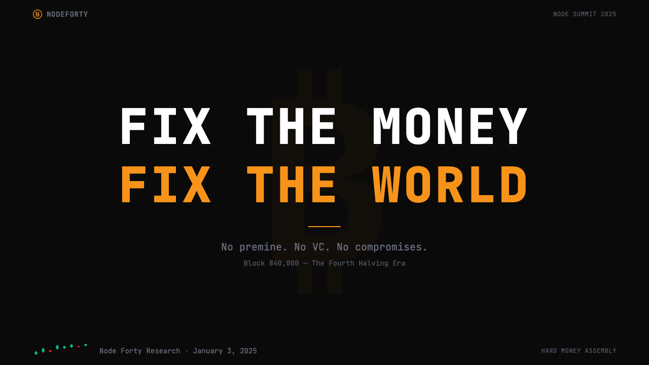
For presentation slides, the style works powerfully on both cover and content pages, but each requires a different approach. A cover should be treated like a terminal awakening: dark ground, the title in large monospace type, a single data point or orange accent element that anchors the composition. Content slides should commit fully to the tabular and data-grid logic — information organized in columns, numbers right-aligned, labels in neutral gray, with orange reserved for the single most important figure on the slide. Data slides — charts showing price history, stock-to-flow models, on-chain metrics — should be treated as primary compositions, not as supporting graphics inserted into slide templates. The chart is the slide.在演示文稿中,这种风格在封面页和内容页上都效果强劲,但每种都需要不同的方法。封面应该像一个终端唤醒那样处理:深色背景,大号等宽字体的标题,一个锚定构图的单一数据点或橙色强调元素。内容页应完全遵循表格和数据网格逻辑——信息按列组织,数字右对齐,标签用中性灰色,橙色保留给幻灯片上最重要的那个数字。数据幻灯片——显示价格历史、存量-流量模型、链上指标的图表——应被视为主要构图,而非插入幻灯片模板的支撑图形。图表就是幻灯片。
For web interfaces — dashboards, node monitoring tools, portfolio trackers, exchange pricing pages — the style is at its native home. The approach: commit to a dark ground throughout, use a strict columnar grid derived from tabular data rather than editorial layout principles, set all numerical data in monospace type, and keep the orange accent to interactive states, live-updating values, and alert conditions. Navigation should be typographic, not iconographic; borders on interactive elements should be thin and hard rather than soft or glowing; loading states should avoid spinners in favor of progress bars or flashing cursor conventions borrowed from terminal culture.对于网页界面——仪表板、节点监控工具、投资组合追踪器、交易所定价页面——这种风格处于其天然的主场。方法是:始终保持深色背景,使用源自表格数据而非编辑版面原则的严格柱状网格,所有数值数据使用等宽字体,将橙色强调保留给交互状态、实时更新值和警报条件。导航应该是字体性的而非图标性的;交互元素上的边框应该细而硬,而非柔软或发光;加载状态应避免使用旋转图标,而倾向于进度条或借鉴终端文化的闪烁光标约定。
For editorial and marketing work — long-form essays, research reports, data journalism, conference materials — the style supports strong information hierarchy with an unusual ability to make density readable rather than oppressive. A report layout in this style uses a narrow body measure, wide margins for data call-outs and annotations, section breaks marked by a thin horizontal rule, and no decorative imagery. Marketing materials benefit from the poster-like boldness of the full-width dark ground: a large orange number or data point as the hero element, a supporting statement in smaller neutral-gray type, and nothing else. The restraint is the message.对于编辑和营销工作——长篇文章、研究报告、数据新闻、会议材料——这种风格支持强劲的信息层级,具有使密度可读而非压迫的非凡能力。这种风格的报告版面使用窄正文行宽,为数据引用和注释保留宽阔的页边距,以细水平线标记章节分隔,没有装饰性图像。营销材料受益于全宽深色背景的海报式大胆感:一个大型橙色数字或数据点作为主角元素,一个较小中性灰色字体的支撑声明,仅此而已。克制即是信息。
The most common mistake when applying this aesthetic is treating it as a dark mode with orange accents — adding rounded corners, soft shadows, gradient backgrounds, and multiple typefaces because they feel modern and polished, while keeping only the dark ground and orange as tokens of the style. This produces work that has the surface appearance of the aesthetic without its internal logic, and it reads as superficial to anyone familiar with the genuine article. A second common mistake is deploying the orange too broadly — on section headers, decorative borders, background tints — until it loses its salience function entirely. The style's power depends entirely on restraint; without it, what remains is simply a dark interface with aggressive coloring.应用这种美学时最常见的错误是将其视为带橙色强调的深色模式——添加圆角、柔和阴影、渐变背景和多种字体,因为它们感觉现代而精致,同时只保留深色背景和橙色作为风格的标记。这产生的作品具有这种美学的表面外观,却没有其内在逻辑,对于熟悉真品的任何人来说都显得肤浅。第二个常见错误是过于广泛地部署橙色——在章节标题、装饰边框、背景色调上——直到它完全失去其显著性功能。这种风格的力量完全依赖于克制;没有克制,剩下的只是一个具有攻击性色彩的深色界面。
See the Bitcoin Maximalist Orange design system查看 Bitcoin Maximalist Orange 完整设计系统
Bitcoin Maximalist Orange — FAQBitcoin Maximalist Orange · 常见问题
Is Bitcoin Maximalist Orange only appropriate for Bitcoin-specific products?比特币极端主义橙只适合比特币相关产品吗?
Not strictly, but its ideological associations are strong enough that using it in non-Bitcoin contexts requires deliberate handling. The style is well-suited to any product that values information density, operator-grade precision, and the deliberate rejection of consumer-friendly softness: high-frequency trading tools, network infrastructure dashboards, cybersecurity monitoring interfaces, or any product whose users are domain experts who distrust ornament. It performs poorly for products that need to communicate warmth, approachability, or cultural breadth — financial planning tools aimed at general consumers, for instance, or platforms serving multiple asset classes where the orange would impose a Bitcoin-specific reading that the product does not intend.并非严格如此,但它的意识形态关联足够强烈,以至于在非比特币语境中使用它需要刻意处理。这种风格非常适合任何重视信息密度、操作员级精确性和对消费者友好柔和感的刻意拒绝的产品:高频交易工具、网络基础设施仪表板、网络安全监控界面,或任何用户是不信任装饰的领域专家的产品。它对于需要传达温暖感、亲近感或文化广度的产品表现不佳——例如面向普通消费者的财务规划工具,或服务于多种资产类别的平台,在那里橙色会强加一种产品并不打算传达的比特币特定解读。
How does this style relate to broader crypto or Web3 aesthetics?这种风格与更广泛的加密货币或Web3美学有什么关系?
Bitcoin Maximalist Orange and the broader crypto or Web3 aesthetic are almost opposites. Web3 visual design — particularly in the NFT and DeFi space — tends toward gradients, iridescent color, animated backgrounds, glassmorphism, and expressive typography that signals novelty and cultural energy. Bitcoin Maximalist Orange is defined precisely by its rejection of all of these elements. Where Web3 aesthetics celebrate abundance and spectacle, Bitcoin Maximalist Orange enforces scarcity and signal. The ideological divergence between Bitcoin maximalism and the broader crypto ecosystem is perfectly reflected in the visual divergence: you can almost identify a project's monetary philosophy by looking at its design language.比特币极端主义橙与更广泛的加密货币或Web3美学几乎是对立的。Web3视觉设计——特别是在NFT和DeFi领域——倾向于渐变、彩虹光泽色彩、动态背景、玻璃拟态和传达新颖性和文化能量的表现性字体。而比特币极端主义橙恰恰是通过拒绝所有这些元素来定义自身的。Web3美学庆祝丰盛和奇观,比特币极端主义橙则强制执行稀缺性和信号。比特币极端主义与更广泛的加密货币生态系统之间的意识形态分歧在视觉分歧中得到了完美反映:你几乎可以通过观察一个项目的设计语言来识别其货币哲学。
Can the style work in a light or white-ground version?这种风格能以浅色或白色背景版本呈现吗?
A light-ground inversion is technically possible but practically challenging and ideologically awkward. The dark ground is not incidental to Bitcoin Maximalist Orange — it is the condition that makes the orange's salience function work. On a white or light ground, the orange shifts from a glowing signal against darkness to an accent color that must compete with other elements, and its intensity can tip into aggression rather than precision. The terminal metaphor, which underpins the entire aesthetic, depends on the dark ground. A light-ground version of this style tends to read as generic financial design with orange accents rather than as a coherent expression of the underlying ideology. If a light ground is necessary for accessibility or context reasons, treat it as a variant rather than the primary expression, and reduce the orange to a more restrained accent.浅色背景反转在技术上是可能的,但在实践上具有挑战性,在意识形态上也显得不自然。深色背景对比特币极端主义橙来说不是偶然的——它是使橙色显著性功能发挥作用的条件。在白色或浅色背景上,橙色从黑暗中的发光信号转变为必须与其他元素竞争的强调色,其强度可能从精确感滑向攻击感。支撑整个美学的终端隐喻依赖于深色背景。这种风格的浅色版本往往读起来像带橙色强调的普通金融设计,而非底层意识形态的连贯表达。如果出于可及性或情境原因必须使用浅色背景,请将其视为变体而非主要表达,并将橙色减少为更克制的强调色。
What is the right way to handle photography or imagery within this style?在这种风格中处理摄影或图像的正确方式是什么?
Authentic Bitcoin Maximalist Orange interfaces contain almost no photography or representational illustration, and this is not a limitation — it is a design choice consistent with the system's logic. When imagery is used at all, it tends to be functional: screenshots of block explorers, terminal output, or hardware wallet interfaces. Where portrait photography appears — for team pages or conference materials — it is typically treated in high contrast, desaturated to near-monochrome, often duotone in black and orange. Lifestyle photography, product photography styled for aspiration, and any image whose purpose is emotional atmosphere rather than information are incompatible with the system's values. A designer tempted to add imagery to 'humanize' a Bitcoin Maximalist Orange interface should ask whether the underlying product actually needs humanizing, or whether the austere character of the style is itself the appropriate signal.真实的比特币极端主义橙界面几乎不包含摄影或具象插图,这不是一个限制——它是与系统逻辑一致的设计选择。如果使用图像,它往往是功能性的:区块浏览器的截图、终端输出或硬件钱包界面。当肖像摄影出现时——用于团队页面或会议材料——它通常以高对比度处理,去饱和至接近单色,通常是黑色和橙色的双色调。生活方式摄影、为渴望感而设计风格的产品摄影,以及任何目的是情感氛围而非信息的图像,都与系统的价值观不相容。一个想要添加图像来「人性化」比特币极端主义橙界面的设计师,应该问问底层产品是否真的需要人性化,或者这种风格的简朴特质本身是否就是适当的信号。
How do you avoid the style feeling dated or overly niche?如何避免这种风格感觉过时或过于小众?
Bitcoin Maximalist Orange feels dated when it is applied to problems that the aesthetic was not designed to solve — consumer onboarding flows, general-public financial education, or brand contexts where approachability and warmth are primary values. In those contexts, the style does not feel current; it feels like a costume. Applied to its native territory — infrastructure dashboards, data-dense analytical tools, operator-grade interfaces — the style feels timeless rather than dated because it is governed by functional logic rather than trend. The risk of feeling niche is real, but it is managed by executing the system at high resolution: dense data that is genuinely readable, orange that is genuinely salient, type that is genuinely precise. Poor execution of this style feels niche and amateurish; expert execution feels authoritative and inevitable.当比特币极端主义橙被应用于它的美学并非为之设计的问题时,它会感觉过时——消费者引导流程、面向大众的金融教育,或亲近感和温暖感是主要价值的品牌语境。在那些语境中,这种风格感觉不够当代;它感觉像一件戏服。应用于其天然领域——基础设施仪表板、数据密集的分析工具、操作员级界面——这种风格感觉是永恒的而非过时的,因为它受功能逻辑而非潮流支配。感觉小众的风险是真实存在的,但通过以高精度执行系统来管理:真正可读的密集数据,真正显著的橙色,真正精确的字体。这种风格的拙劣执行感觉小众而业余;专家级执行感觉权威而必然。
Related design styles相关设计风格
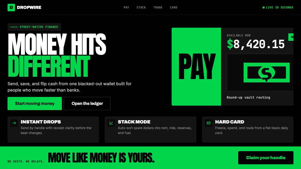 Cash App 2024Fintech that talks like a record label. Pure black, dollar-bill green, type a…像嘻哈厂牌的金融科技:纯黑底色、美钞绿、广告牌尺寸的超粗字体——不再是安全蓝衬…
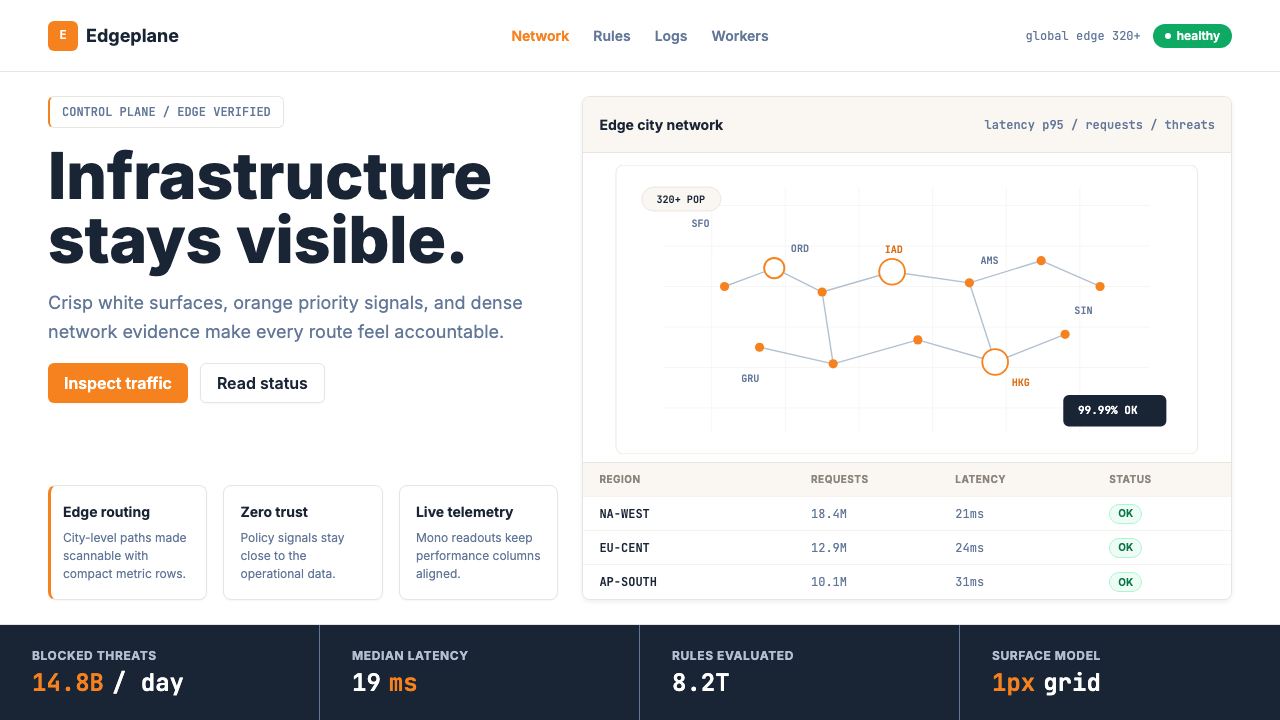 Cloudflare Orange EdgeOperational clarity wins. Orange accents, hairline grids, and mono metrics ma…运维清晰取胜。橙色强调、发丝网格与等宽指标让边缘数据利落。
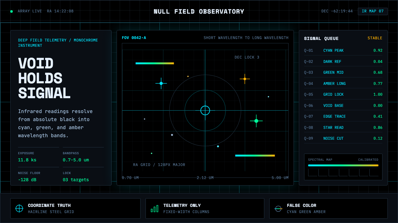 Deep Space ObservatoryTrust the void. Cyan telemetry and amber wavelength bars lock to a steel grid.信任虚空:青色遥测与琥珀波段锁定钢性网格。
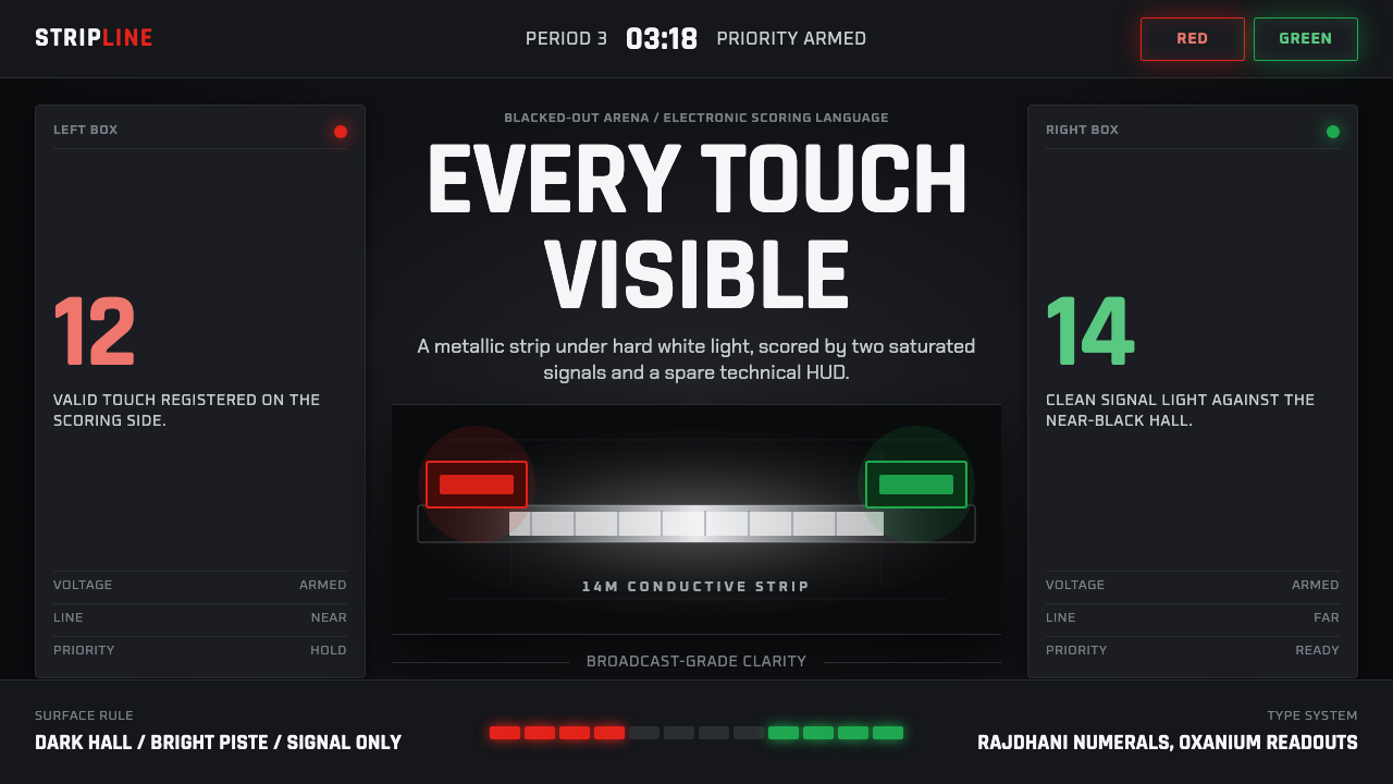 Fencing PisteTurns darkness into signal. Rajdhani HUD type frames a white piste and red-gr…黑场化为信号:Rajdhani HUD、白色剑道与红绿计分灯。
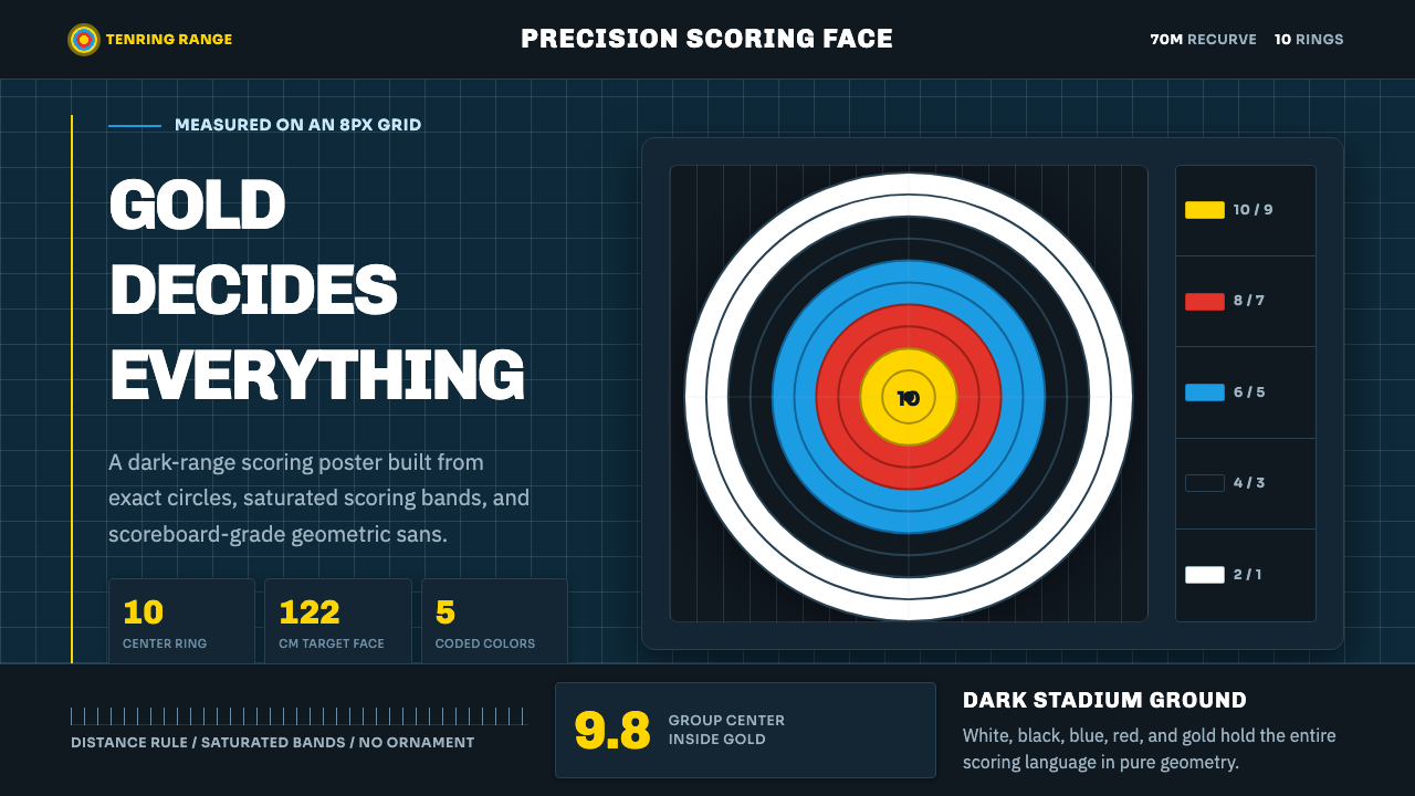 Olympic ArcheryPrecision is the drama. Gold-red-blue rings snap from a dark stadium grid.精准就是戏剧:金红蓝环从深色赛场网格中跃出。
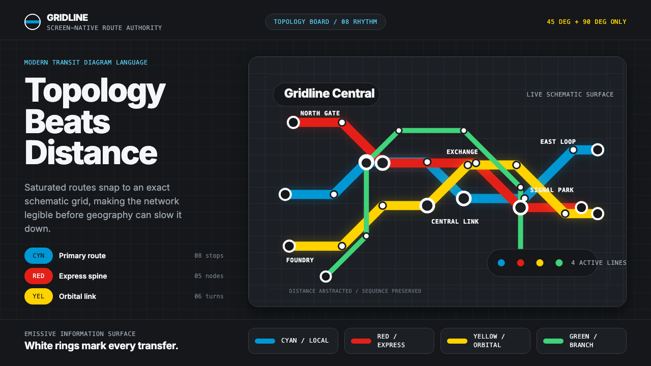 Transit Diagram (modern)Topology over geography. Cyan, red and yellow routes lock to 45-degree angles…拓扑胜过地理:黑底上青红黄线路锁定45度角。