What is Transit Diagram (modern)?
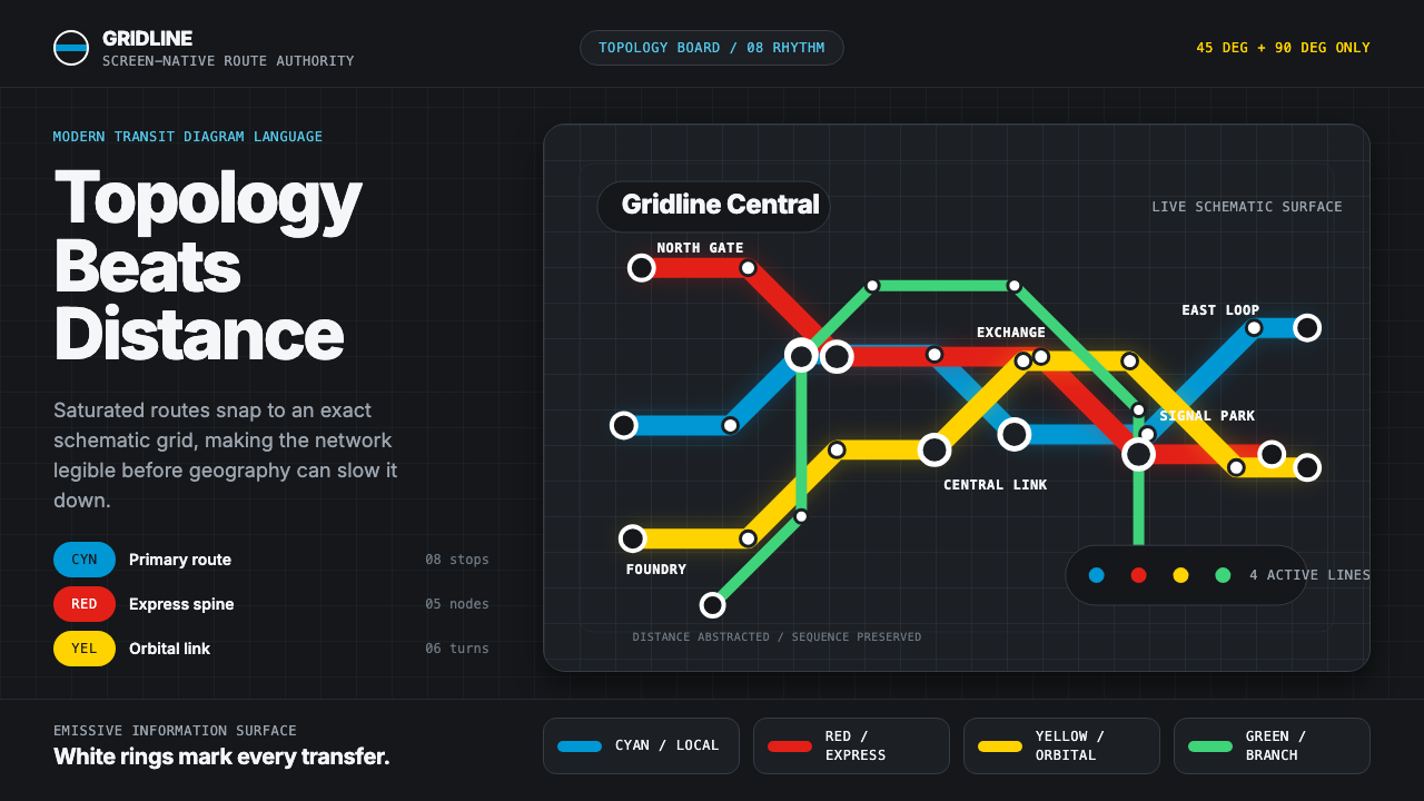
The modern transit diagram throws away real geography so a whole city's network can be read in a single glance, glowing on black like a station sign after dark.
Transit Diagram (modern) in brief
Transit Diagram (modern) is the screen-native descendant of the schematic transit map — the tradition that treats a subway or metro network as pure topology rather than accurate geography. Route lines run only at 45- and 90-degree angles, stations are spaced evenly regardless of their true physical distance apart, and each line is given its own saturated, individually assigned color so a rider can trace a route by color alone.
This particular contemporary variant renders that logic on a near-black digital ground rather than the cream or white paper of its printed ancestors. Route lines in cyan, red, and yellow glow with a flat, emissive quality against the dark field, interchange stations are marked by crisp white rings, and station names sit in a humanist sans-serif chosen for legibility at small sizes on a screen rather than on paper.
The underlying principle is abstraction in service of comprehension: distance, curvature, and true compass direction are all sacrificed so that the rider's actual question — which line do I take, and where do I change — can be answered instantly. Nothing on the diagram represents the city as it truly is; everything represents the city as a rider needs to navigate it.

Where does Transit Diagram (modern) come from?
The lineage begins in 1933, when Harry Beck, a London Underground electrical draughtsman working outside his official job description, proposed replacing the geographically accurate Underground map with a schematic diagram modeled on electrical circuit drawings. Beck's insight was that a rider deep underground has no way to perceive true distance or direction anyway, so the map might as well optimize for something else entirely: clarity of connection. He straightened every line to 45- or 90-degree angles, spaced stations evenly, and distorted the outer suburbs inward so the whole network fit into a compact, legible frame. London Underground management was initially skeptical, but the public adopted it immediately and it has barely changed in structural logic since.
Beck's diagram became the template that every subsequent metro system, consciously or not, measured itself against. Vienna's Massimo Vignelli-designed proposals and the wider mid-century embrace of Swiss-influenced modernist information design carried the same logic — that a diagram's job is to communicate structure, not to mimic terrain — into wayfinding systems worldwide. This lineage is closely tied to the broader ISOTYPE movement of the 1920s and 1930s, associated with Otto Neurath, which pursued the idea that visual, pictorial, and symbolic systems could convey complex statistical and structural information faster than text, a philosophy that transit diagrams embody in miniature.
The specific dark-ground, glowing-route variant described here is a more recent, digital-era development, emerging as transit information moved from printed pocket maps and station-wall posters onto phone screens and dark-mode interfaces from roughly the 2010s onward. A dark background reduces screen glare in low-light conditions such as underground platforms and evening commutes, and saturated, individually colored route lines read with more contrast against black than they ever could against white paper — an adaptation of Beck's paper-era logic to a genuinely new medium rather than a simple recoloring of the original.
Transport for London itself, along with transit authorities in cities that later commissioned their own Beck-influenced diagrams, treated the schematic map as core brand infrastructure rather than incidental signage — proof that a purely functional information design decision, made to solve a specific legibility problem, could become one of the most recognized pieces of graphic design of the twentieth century and continue evolving into new media formats decades later.
What defines the Transit Diagram (modern) look?
Color
Each route line is assigned one saturated, individually distinct hue — cyan, red, yellow, and others as needed — set against a near-black ground so the colors read with a glowing, emissive quality rather than sitting flat on paper. Color here is purely functional identification, not decoration: it exists so a rider can say 'follow the red line' without reading a single label.
45- and 90-Degree Geometry
Every route line is constrained to horizontal, vertical, or exact 45-degree diagonal segments — no curves, no arbitrary angles. This constraint, inherited directly from Beck's original diagram, is what gives the whole system its calm, engineered regularity and makes a tangled real-world rail network look like a piece of circuit-diagram logic.
Equal-Spacing Abstraction
Stations are spaced evenly along a line regardless of the true physical distance between them — two stops that are a mile apart and two stops that are ten miles apart occupy the same visual length. This is the diagram's central act of abstraction: it prioritizes the rider's mental model of sequence and connection over any claim to represent real-world scale.
Interchange Rings
Stations where a rider can change between lines are marked by a crisp white ring or circle, distinct from the smaller tick marks used for ordinary single-line stops. This visual hierarchy — plain stops versus interchange rings — lets a rider's eye jump straight to the decision points on a journey without scanning every station name.
Typography
Station labels use a humanist sans-serif chosen specifically for small-size legibility on illuminated screens, sitting horizontally wherever possible for fast reading even when the line itself runs diagonally. Weight stays light to medium so labels never overpower the route lines they identify, and no decorative or display lettering appears anywhere on the diagram.
Dark Emissive Ground
The near-black background is not merely an aesthetic choice but a functional one, reducing glare in low-light viewing conditions and making saturated route colors appear to glow rather than sit as flat ink. Surfaces are treated as flat and emissive throughout — there is no simulated depth, texture, or gradient anywhere on the diagram.
Rounded Route Strokes
Route lines are drawn with a thick, consistently rounded stroke weight and rounded terminals at endpoints and bends, giving the diagram a calm, tactile, almost tangible quality rather than a thin, wiry, purely diagrammatic feel. The uniform stroke weight across the entire network reinforces the sense of a single coherent system rather than a patchwork of separately drawn lines.

Who shaped Transit Diagram (modern)?
An electrical draughtsman for London Underground who, in 1933, proposed the schematic diagram that replaced the geographically accurate map with one modeled on circuit drawings — straightened angles, evenly spaced stations, and a compact frame. His diagram became the direct ancestor of every schematic transit map since, including the dark-mode digital variants of today.
An Italian-born designer whose mid-century work on transit diagrams, most famously an early proposal for the New York City subway, extended Beck's schematic logic with a Swiss-modernist rigor toward color-coding, grid discipline, and typographic restraint. His broader body of work on wayfinding systems helped establish the schematic diagram as a serious discipline within information design rather than a one-off London curiosity.
As the institution that commissioned, refined, and has continuously updated Beck's diagram for nearly a century, Transport for London effectively made the schematic map into core brand infrastructure rather than incidental signage — treating it with the same design discipline as a corporate identity system, a model later transit authorities around the world explicitly followed.
How do you use Transit Diagram (modern) today?
Transit Diagram (modern) transfers well beyond actual maps because its underlying skill is representing any complex, interconnected system as clear, colored, angle-constrained paths against a dark ground — a pattern that suits network diagrams, process flows, and status dashboards just as well as subway lines.
For presentation slides, the style is strong for cover pages that need to signal a networked or systems-thinking narrative: a stylized web of 45-degree route-like lines in two or three saturated colors, converging on a title, sets an immediately confident tone. Content slides work well when a process or architecture is literally redrawn as a schematic diagram — steps as stations, decision points as interchange rings — turning an abstract flow into something a reader's eye can trace the way a commuter traces a route. Data slides benefit from the style's native color-coding logic: assign one saturated hue per category and let route-like connecting lines show relationships, all on a dark ground for contrast.
For web interfaces, the aesthetic suits dashboards and network-status pages especially well, where system components can be shown as nodes connected by thick, rounded, color-coded lines on a dark background, with interchange-ring styling marking key junction points or alerts. Pricing pages can borrow the dark ground and emissive accent-color treatment to make a single highlighted tier glow against otherwise muted competitors, though restraint is needed — this is a utilitarian aesthetic, not a decorative one.
For editorial and marketing work, the style is well suited to explaining any system, journey, or roadmap — a product roadmap redrawn as a schematic 'line map' with milestones as stations reads instantly and memorably. Marketing pages for developer tools, infrastructure products, or anything with a genuine network topology can use the diagram literally rather than as pure metaphor.
The most common mistake is applying the dark ground and glowing colors purely for visual flair without the underlying angle discipline and equal-spacing logic — a dark background with soft gradients and curved lines is a different aesthetic entirely, closer to generic 'neon dashboard' styling. The style's authority comes specifically from its rigid 45-/90-degree geometry and its refusal to represent literal scale; losing either principle collapses it into decoration.

Transit Diagram (modern) — FAQ
Why do transit diagrams distort real geography instead of showing it accurately?
Because a rider's actual question is almost never 'where exactly is this station in physical space' — it is 'which line do I take and where do I change.' Harry Beck's founding insight in 1933 was that a passenger underground has no perceptual access to true distance or direction anyway, so distorting geography to make the network's structure clearer is not a loss of information, it is a gain in the information that actually matters for navigation.
Why does the dark-ground digital version work differently from the classic paper map?
A printed map on cream or white paper relies on ink density and hue against a bright, reflective ground, viewed under ambient light. A dark-ground digital diagram is instead viewed on a self-illuminated screen, often in low-light conditions like an underground platform or a phone in a pocket at night — so saturated colors are rendered as emissive light against black rather than as pigment against paper, which is why they read as glowing rather than simply printed.
What is the connection between this style and the ISOTYPE movement?
ISOTYPE, developed by Otto Neurath and collaborators in the 1920s and 1930s, pursued the broader idea that visual and symbolic systems could communicate complex statistical or structural information faster and more universally than text or realistic imagery. Schematic transit diagrams embody the same philosophy in miniature — a network's structure, which would take paragraphs of text to describe accurately, becomes instantly legible as a set of colored lines and rings.
Can this style work for something other than literal transportation networks?
Yes — the underlying skill is representing any system with nodes and connections as a clear, color-coded, angle-constrained diagram, which applies equally well to organizational charts, process pipelines, dependency graphs, or product roadmaps. Anywhere a viewer needs to trace a path through a network of connected points benefits from the same schematic logic, regardless of whether the network is physically real.
Where does this style struggle or feel out of place?
It struggles for content that is inherently unstructured, emotional, or narrative-driven — a brand story, a lifestyle product, or anything where the point is warmth and feeling rather than legibility of structure will find the rigid geometry and utilitarian dark ground work against the desired tone. It also fails when applied to data or systems that genuinely have only one or two categories, since the style's visual interest depends on multiple distinctly colored lines interacting — a single route on a dark ground reads as sparse rather than elegant.
Related design styles
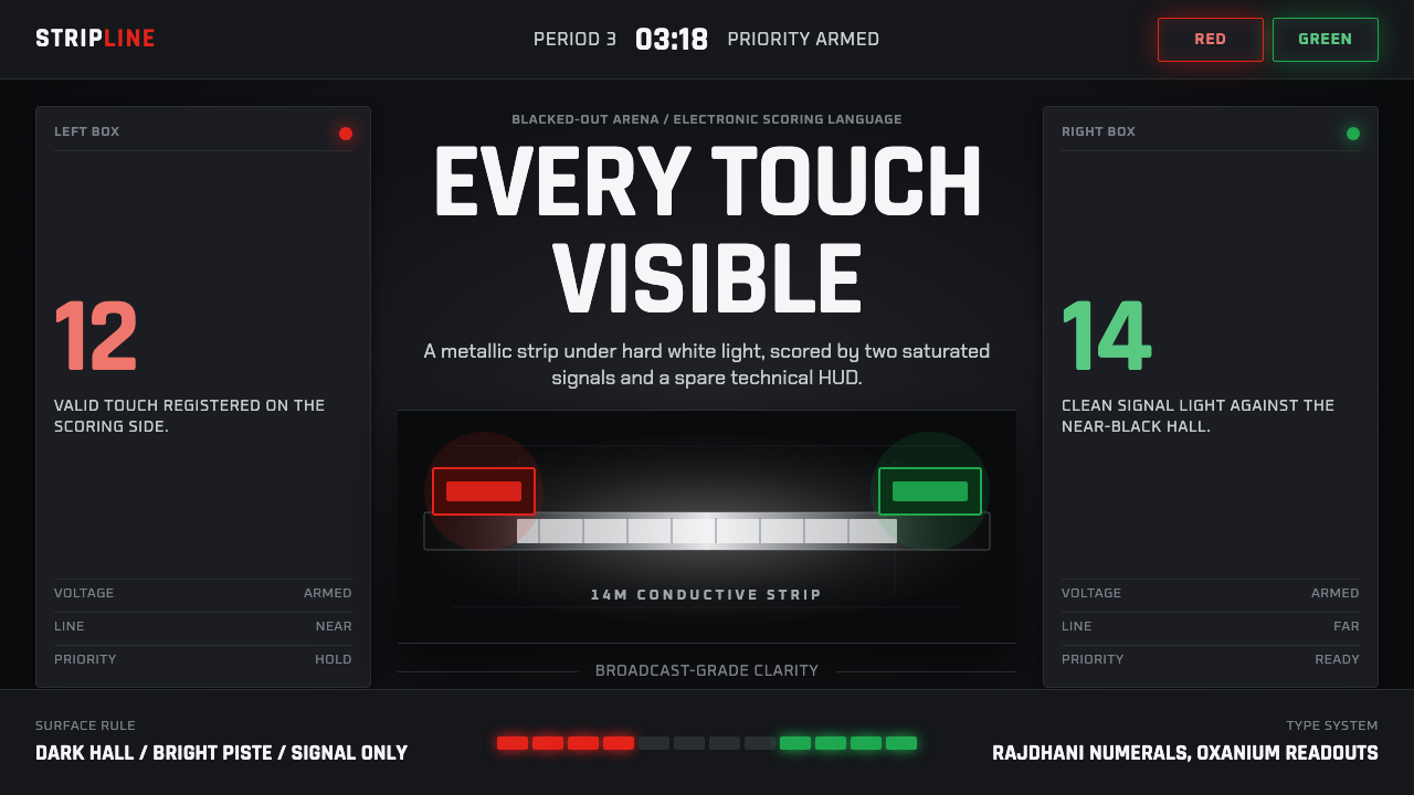 Fencing PisteTurns darkness into signal. Rajdhani HUD type frames a white piste and red-gr…
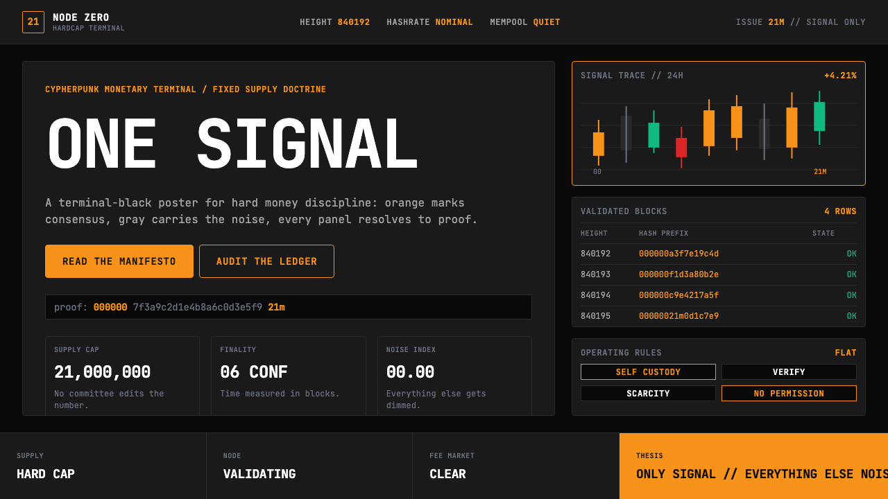 Bitcoin Maximalist OrangeOnly signal, zero spectacle. Orange mono data grids on terminal black enforce…
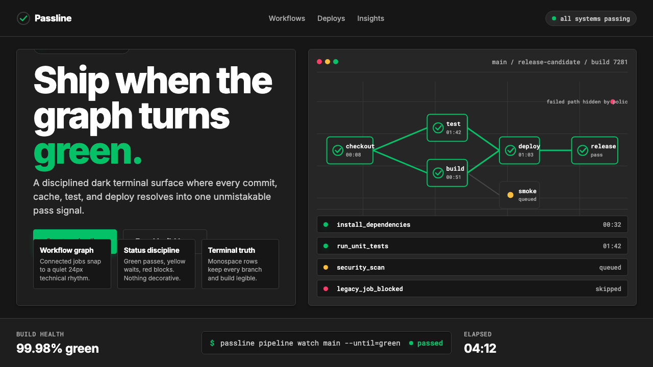 CircleCI Pipeline-GreenConfidence goes green. Emerald status lines cut through terminal-black pipeli…
 Container PortIndustrial dusk, standardized. Slate grid, RAL-blue stacks, and crane-yellow…
 Deep Space ObservatoryTrust the void. Cyan telemetry and amber wavelength bars lock to a steel grid.
 Feather MicroscopyPhysics glows in the dark. Cyan filaments and mono scale bars cut a black ima…