What is Feather Microscopy?
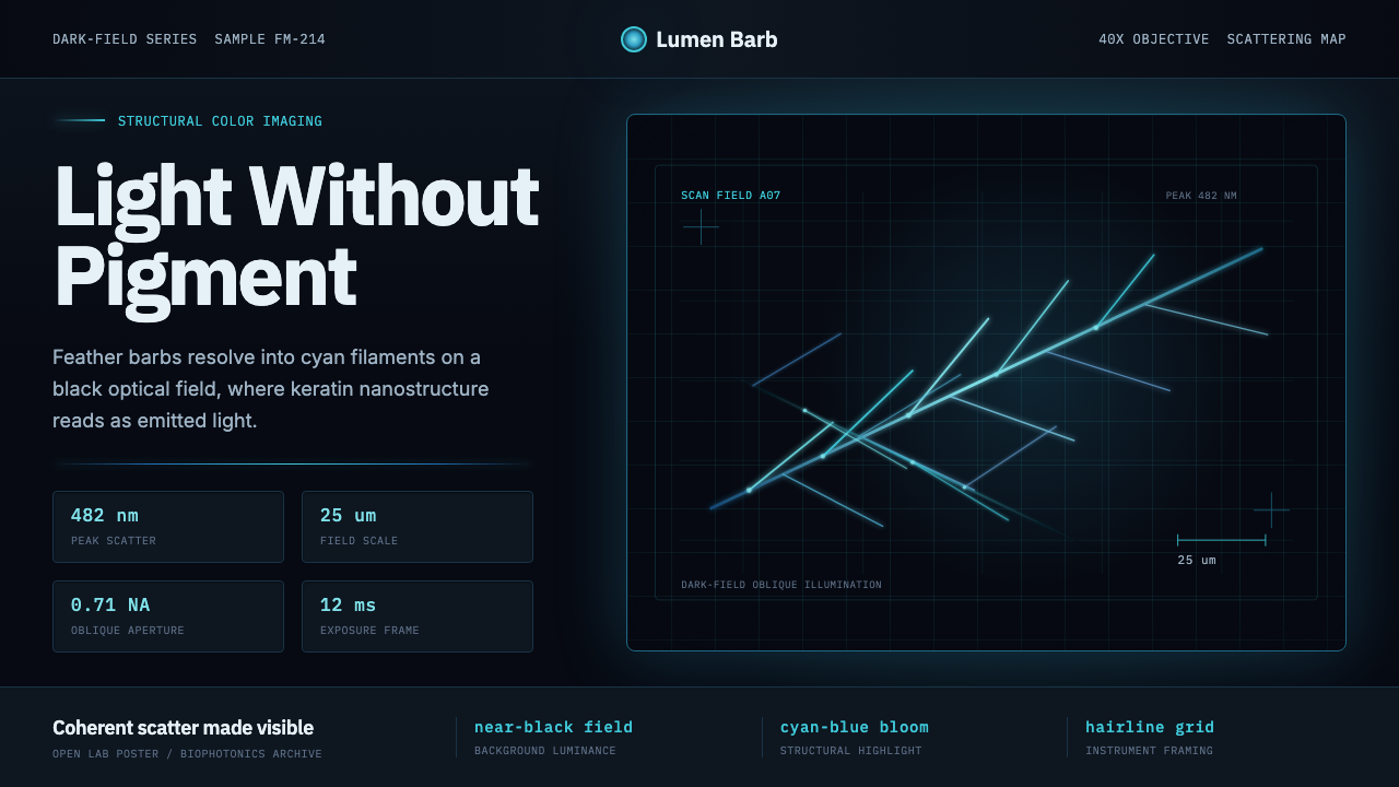
Feather Microscopy renders color as physics, not pigment — cyan light scattered off nanostructure inside a single bird feather, framed the way a dark-field microscope frames a specimen.
Feather Microscopy in brief
Feather Microscopy is a design system built around a single visual conceit: a bird feather seen through a dark-field microscope, its barbs and barbules branching across a field of near-total black, each filament glowing with color that has no pigment behind it. What you are looking at, in the source phenomenon, is structural color — light interacting with a physical nanostructure rather than light being absorbed and reflected by a dye. It is the same optical mechanism that makes a kingfisher's back look impossibly saturated, that gives a blue jay's wing its color even though blue jay feathers contain no blue pigment at all, and that produces the shifting iridescence of a Morpho butterfly's wing.
The system translates that phenomenon into a visual language borrowed from contemporary biophysics and optical imaging labs: a clean technical sans for labels and captions, scale bars and measurement annotations sitting quietly at the edge of the frame, high luminance contrast, and an overall sense of instrumentation. Nothing about the aesthetic is invented for decorative effect; every convention traces back to how dark-field microscopy images are actually captured, calibrated, and published.
Because the visual field is dark, structural color in this system does not behave like color applied to a surface. It behaves like emitted light. A cyan filament against black reads as luminous rather than painted, the way a coal reads as glowing rather than colored orange. That distinction — emission versus application — is the aesthetic's organizing idea, and it is what separates authentic uses of the style from a generic 'dark mode with a blue accent.'
Where does Feather Microscopy come from?
Structural color is not a modern discovery in nature — birds, beetles, and butterflies have used it for tens of millions of years — but the ability to explain why it happens is recent, and it is the imaging technology, not the biology, that gives this design system its look. Dark-field microscopy is an older optical technique, developed to make transparent or low-contrast specimens visible by illuminating them from angles that keep direct light out of the lens, so that only light scattered by the specimen reaches the eye. Applied to feather barbules, the technique turns an ordinary object into something that looks like it is generating its own light.
The scientific unpacking of why feathers do this belongs to a wave of structural-coloration research that gathered pace from the early 2000s onward. The materials scientist Andrew Parker spent years cataloguing structural color across the animal kingdom and helped popularize the idea that this class of color is a distinct optical phenomenon worth studying in its own right, not an oddity. The biophysicist Shinya Yoshioka and the optical physicist Pete Vukusic each did detailed work on the photonic nanostructures inside feather barbules and butterfly wing scales, using electron microscopy and optical modeling to show precisely how spongy keratin architectures scatter light coherently to produce saturated, non-fading color. The ornithologist Richard Prum extended this into a broader account of how such color evolved and what it signals in birds, tying the physics back to biology and behavior.
What unites this generation of research is that it happened inside a culture of open, image-heavy publication: papers built around annotated micrographs, scale bars, and false-color renderings meant to make an invisible mechanism visible to a reader. That publishing convention — dark backgrounds, luminous data, restrained technical labeling — is the direct visual ancestor of this design system. It did not originate in a design studio; it originated in the practical requirement that a scientific image be legible to other scientists.
The system sits at the intersection of two lineages: a natural phenomenon (structural color in feathers, beetle shells, and butterfly wings) and an imaging convention (dark-field photomicrography as practiced across contemporary biophotonics labs, largely open-science and global rather than tied to any single institution). It borrows the credibility of laboratory observation and applies it as a design language — precise, luminous, unornamented, legible.
What defines the Feather Microscopy look?
Field and Ground
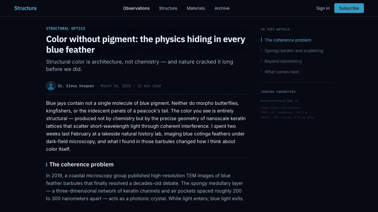
The ground is a near-total black, functioning less like a background color and more like the absence of light in an optical instrument — the dark-field void that direct illumination never reaches. Nothing sits on this ground casually; every element that appears against it reads as something the instrument is actively detecting. This is the opposite of a decorative dark theme: the black is not chosen for mood, it is chosen because it is what makes structural color visible in the first place.
Color as Emission
The palette centers on cyan-blue tones that behave like emitted light rather than applied pigment, echoing the physics of coherent scattering off keratin nanostructure. Because the eye reads luminous color differently from painted color, saturation and glow take the place of flat fills — a filament or a highlighted data point should look like it is producing light, with a soft luminous halo rather than a hard-edged block of hue. Secondary color, where it appears at all, stays cool and restrained so the cyan retains its sense of being the one thing in the frame that is truly glowing.
Technical Sans Typography
Labels, captions, and annotations use a clean, low-personality sans typeface, the kind found on instrument readouts and scientific figure captions rather than editorial display type. Letterforms stay upright, evenly weighted, and highly legible at small sizes, since in the source material this type is doing real informational work — identifying a scale, a magnification, a specimen ID — rather than expressing a mood. Numerals in particular should look precise and monospaced-adjacent, reinforcing the sense of measurement.
Scale Bars and Measurement Marks
A defining motif borrowed directly from microscopy publication: a short ruled line paired with a small numeric label, indicating scale, sitting quietly at a corner or edge rather than competing for attention. These marks are functional artifacts of scientific imaging, not ornament, and they should always look like they are reporting a real measurement — evenly spaced tick marks, a consistent stroke weight, placement that never overlaps the subject itself. Their presence is what most immediately signals 'this is an instrument's view,' rather than an illustration.
Branching Linework
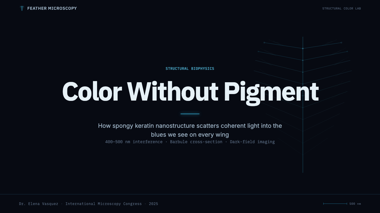
Structure in this system reads as organic branching — barbs radiating from a central shaft, barbules forking from barbs — rather than as a rigid grid. Lines taper, cross at natural angles, and vary in density the way a real biological structure does, which is what gives the system its sense of having been observed rather than drawn from a template. Any layout borrowing this motif should let structure fan outward from a spine or axis instead of arranging elements in even rows.
High-Contrast Luminance
Because the ground is dark, hierarchy is carried almost entirely by luminance rather than hue variety: the brightest, most saturated element in a composition is automatically the focal point, exactly as a scientist's eye is drawn to the brightest region of a dark-field image. Dimmer, desaturated cyan or gray-blue elements recede into the field, doing the work that muted background color would do in a light-ground system. This creates a strong, almost inevitable sense of what to look at first.
Instrument-Grade Restraint
Nothing in the system is decorative for its own sake — no gradients applied for mood, no illustrative flourishes, no soft ambient glow beyond what the scattering phenomenon itself would produce. The restraint mirrors the discipline of scientific figure-making, where every visual choice must be defensible as a faithful representation of what the instrument recorded. This is what keeps the aesthetic reading as credible and precise rather than as a generic sci-fi or cyberpunk dark theme.
Who shaped Feather Microscopy?
A materials scientist who spent much of his career cataloguing structural color across the animal kingdom, from fossilized trilobites to living beetles and butterflies. His comparative work helped establish structural color as a distinct field of study — a physical phenomenon worth investigating on its own terms rather than a curiosity footnote in zoology — and shaped the vocabulary later researchers used to describe how nanostructure, rather than pigment, produces some of the most saturated colors in nature.
A biophysicist known for detailed structural analysis of the photonic nanostructures inside bird feathers and insect exoskeletons. His work used high-resolution imaging and optical modeling to connect the microscopic architecture of keratin — its spongy, quasi-ordered arrangement — directly to the specific wavelengths of light it scatters, giving the field a rigorous, quantitative account of why certain feathers produce such stable, saturated blues.
An optical physicist whose research on butterfly wing scales and other biological photonic structures helped popularize the idea that living organisms had, through evolution, arrived at nanostructures functionally equivalent to engineered photonic crystals. His imaging work — precise, high-contrast, often set against dark fields to isolate the scattered color — is among the most direct visual ancestors of this design system's aesthetic.
An ornithologist who extended the physics of structural color into a broader evolutionary and behavioral account — asking not just how feathers produce color but why that mechanism was favored by selection, and what it signals in courtship and display. His work ties the optical phenomenon back to the living bird, grounding the aesthetic's imagery in an actual animal rather than an abstract pattern.
How do you use Feather Microscopy today?
Feather Microscopy transfers well to any context where the goal is to make something look precise, examined, and technically credible — but it depends entirely on committing to the dark-field logic rather than borrowing only the cyan-on-black color pairing.
For presentation slides, a cover page works best as a single dramatic specimen shot: one branching structure glowing against black, a scale bar in the corner, the title set in restrained technical type off to one side rather than centered over the image. Content and data slides should lean into the instrument metaphor directly — bar charts and line graphs rendered as if they were photonic readouts, luminous where a value is highlighted and dim where it recedes, with measurement-style captions doing the labeling instead of decorative chart titles. Avoid busy multi-color charts; the system reads best when only the data point that matters is the brightest thing on the slide.
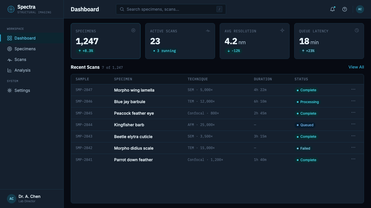
For web interfaces, the aesthetic suits dashboards and technical pricing pages that want to project rigor rather than warmth — analytics tools, scientific or lab-facing SaaS, developer consoles. A dark near-black canvas, a single glowing accent color reserved for active states and key metrics, and technical-sans labels throughout make the interface feel instrument-grade. Branching linework can inform navigation or data-visualization motifs, but should never be so decorative that it competes with the actual content the instrument is meant to reveal.
For editorial and marketing work — science communication, biotech branding, imaging-adjacent products — the style's credibility comes from restraint. A magazine-style feature can use the dark field as a canvas for a single striking image with scale-bar-style captions; a marketing page can borrow the glow-on-black palette for a hero section but should let the product itself, not decorative effects, be the brightest element on the page.
The most common mistake is treating this as generic 'dark mode with a glow effect.' Authentic use requires the discipline of an actual scientific figure: a clear focal point, honest scale indicators, luminance doing the work of hierarchy, and color used to represent something detected rather than something merely styled. Piling on multiple glowing hues, decorative particle effects, or unrelated iconography breaks the illusion that you are looking through an instrument at something real.
Feather Microscopy — FAQ
Is Feather Microscopy the same as a generic 'dark mode' or 'cyberpunk' theme?
No, and the distinction matters. A generic dark theme picks a dark background for contrast or mood, and a cyberpunk theme piles on saturated neon for maximal visual energy. Feather Microscopy is built on a specific optical logic — the dark field exists because it is what makes structural color visible in real dark-field microscopy, and the glowing cyan is meant to read as light being scattered, not as a stylistic accent. Strip that logic out and you are left with a generic dark theme wearing this system's color palette.
Why is scale so important to this style — can it work without scale bars or measurement marks?
Scale indicators are what separate an instrument's view from an illustrator's view. In real microscopy, a scale bar is the only thing that tells a viewer how big the subject actually is, since a glowing filament could otherwise be anything from a strand of keratin to a highway seen from orbit. Removing scale bars entirely does not break the style outright, but it weakens its central credibility claim — that what you are looking at was observed and measured, not merely imagined.
Does this style require a literal feather or biological subject, or can the motif be abstracted?
The feather itself is the originating subject, but the transferable idea is the branching, dark-field, instrument-view logic more than the literal bird anatomy. The motif generalizes well to any subject with a natural branching structure — root systems, neural networks, river deltas — as long as it is rendered with the same dark-field discipline: glowing linework against near-black, honest scale indication, restrained technical labeling. What should not be abstracted away is the sense that something specific and real is being examined.
How much color variety does the palette actually allow?
Very little, by design. The palette is meant to feel like a single detected phenomenon, and structural color in nature typically presents as one dominant hue family per specimen — a feather that glows cyan does not also glow magenta. Introducing multiple saturated glowing hues into one composition undercuts the sense that you are looking at one coherent, physically real thing; it starts to look like several different specimens layered together, or worse, arbitrary decoration. The disciplined version of this system leads with one glowing hue family and lets everything else recede into dim blues, grays, and black.
What kinds of products or brands should avoid this style?
The style struggles wherever warmth, approachability, or casual friendliness are the desired tone — consumer lifestyle apps, children's products, hospitality, or anything meant to feel inviting rather than examined. Its dark, high-precision register can also feel like overkill for simple content that has nothing technical or scientific to communicate; applying an instrument aesthetic to a product with no underlying complexity to reveal reads as affectation rather than authenticity. It suits contexts where the audience already expects — or wants — a sense of rigor: research tools, data-heavy dashboards, science communication, and brands whose actual substance is technical enough to reward this level of scrutiny.
Related design styles
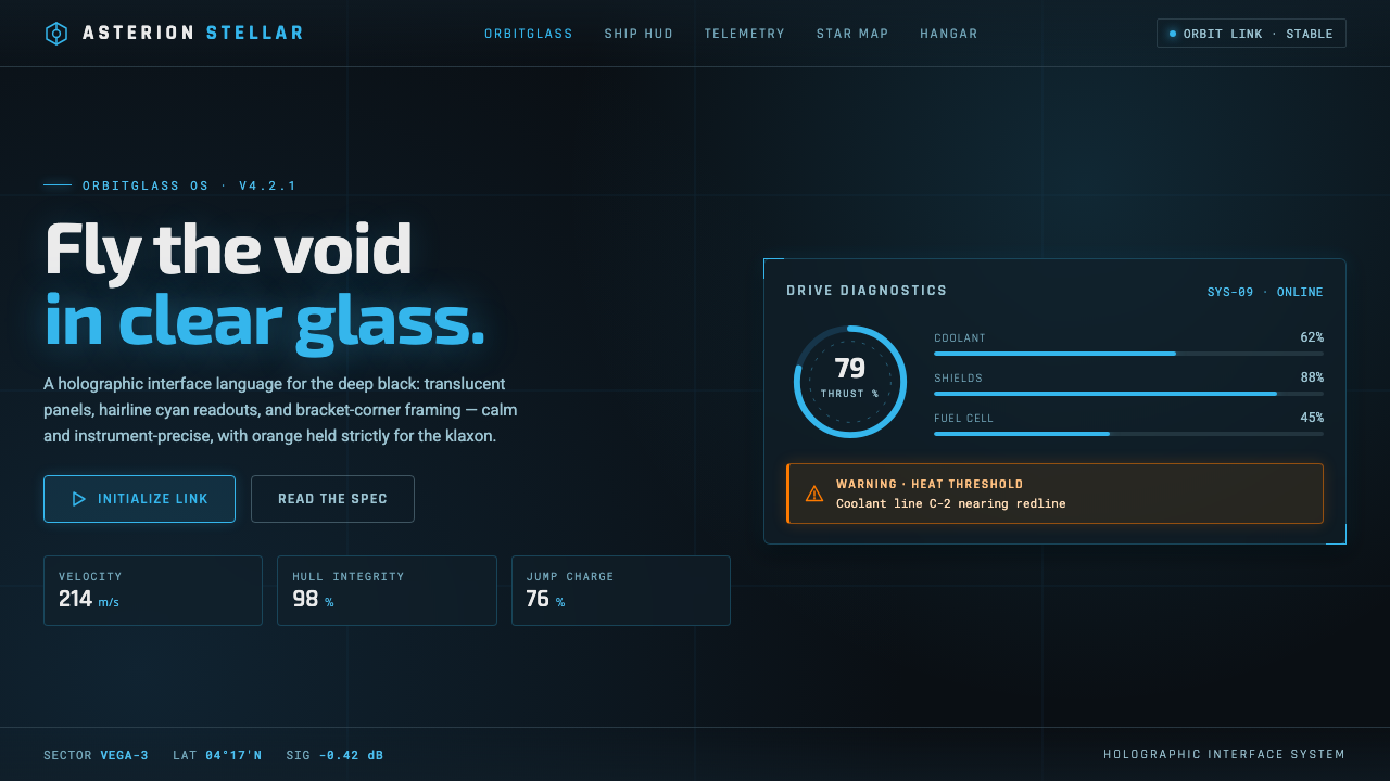 Star CitizenDisciplined holographic HUD. Cyan readouts on glass over a black void, orange…
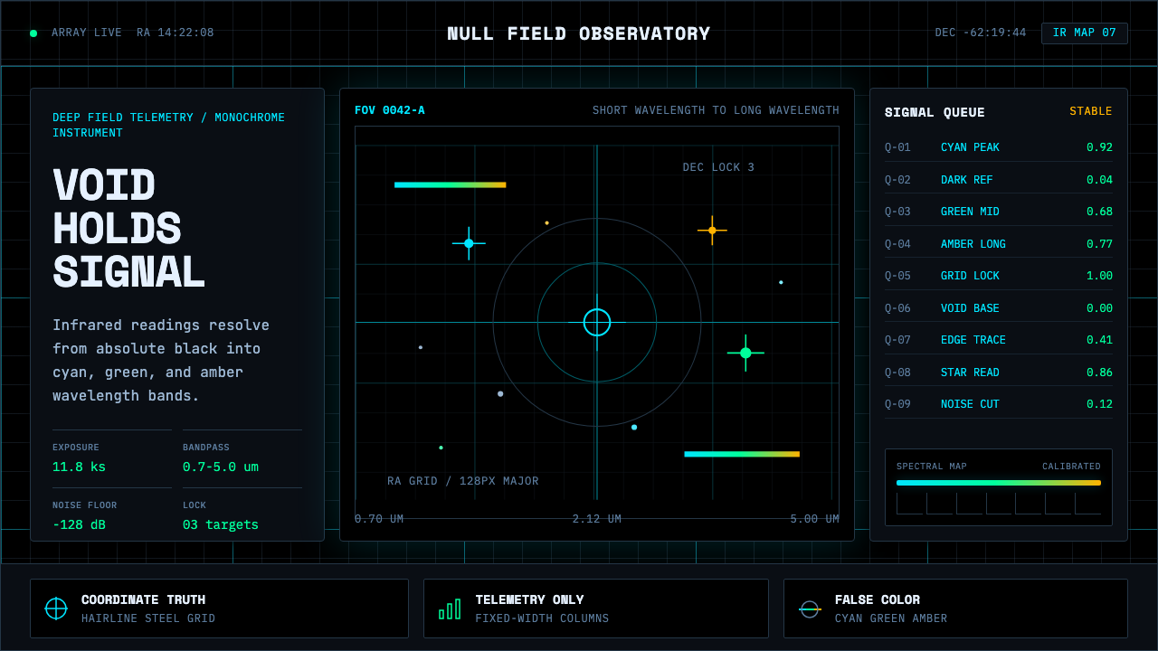 Deep Space ObservatoryTrust the void. Cyan telemetry and amber wavelength bars lock to a steel grid.
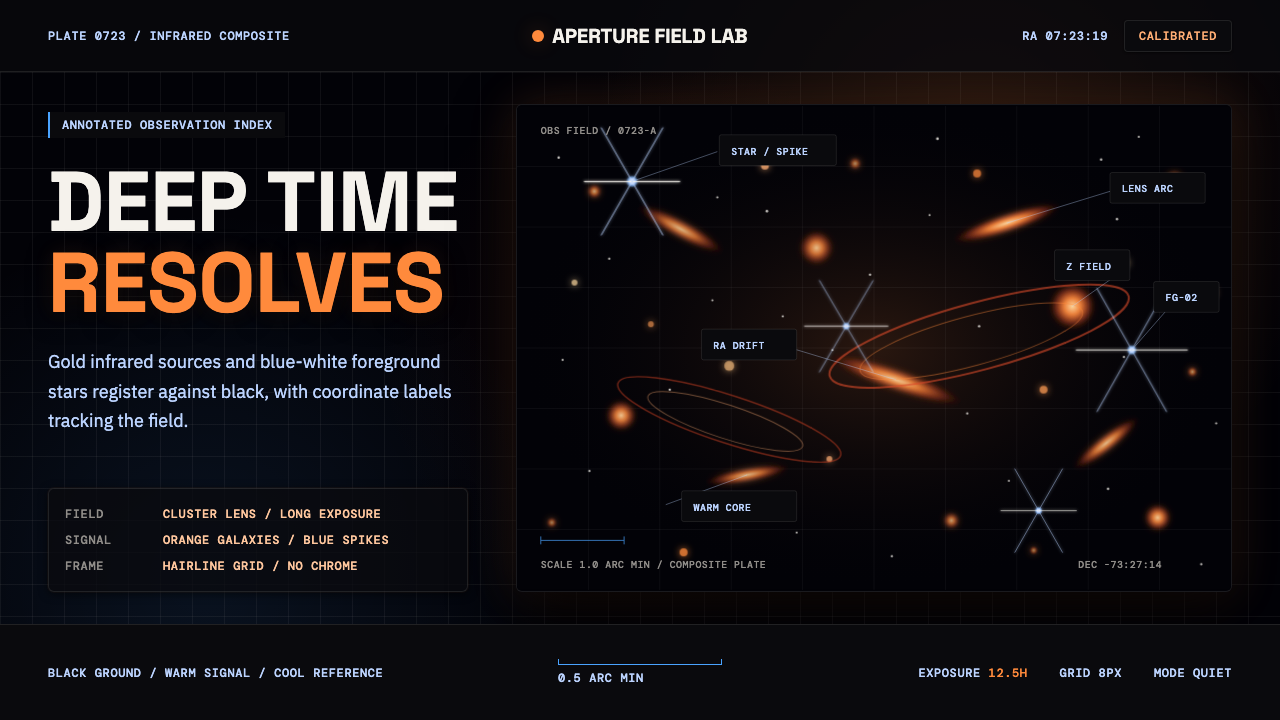 JWST Deep FieldPrecision in deep black. Orange galaxies, blue spikes, and DM Mono callouts m…
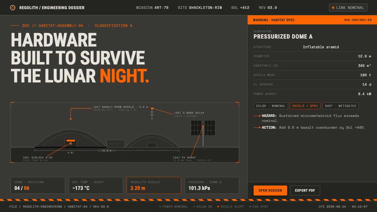 Lunar Base 2030Hardware built to survive the lunar night. Regolith gray, ANSI hazard orange,…
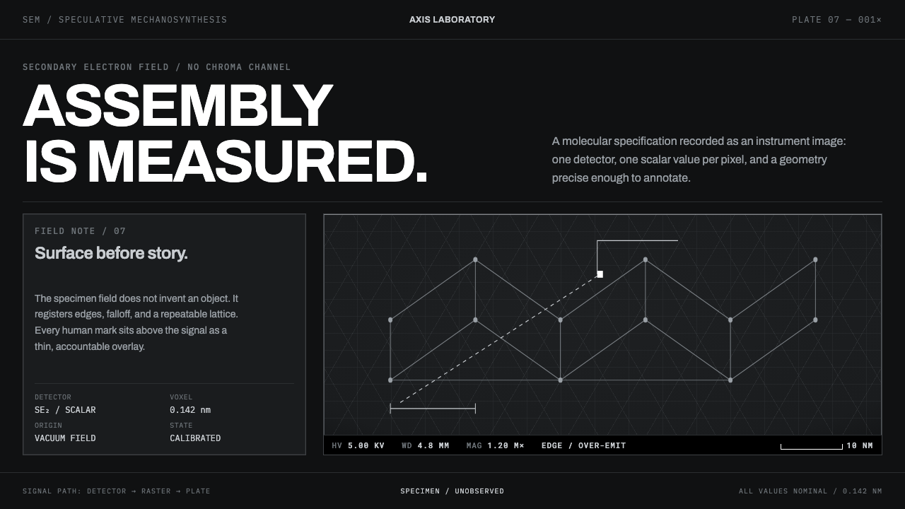 Nanotech AssemblerNothing is illustrated. Grey micrograph fields and hairline measurement overl…
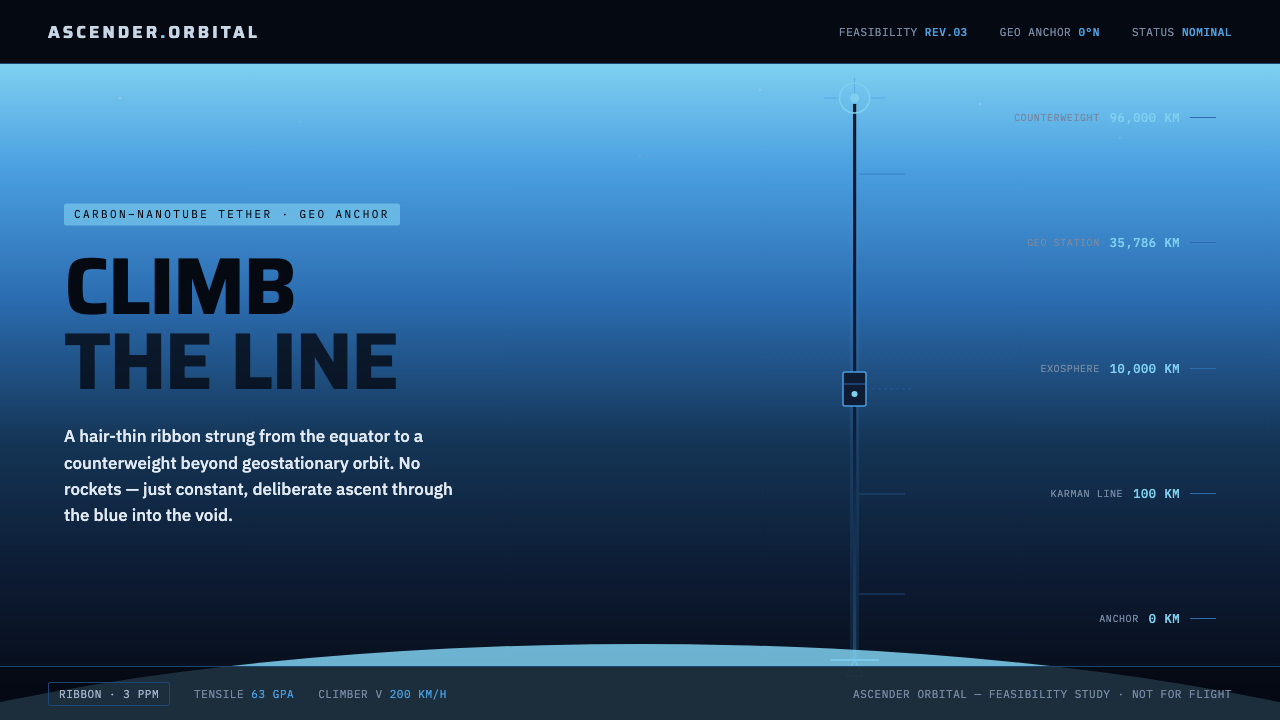 Space ElevatorClimb the line, no rockets. Carbon ribbon rises through atmosphere blue into…