What is Fencing Piste?
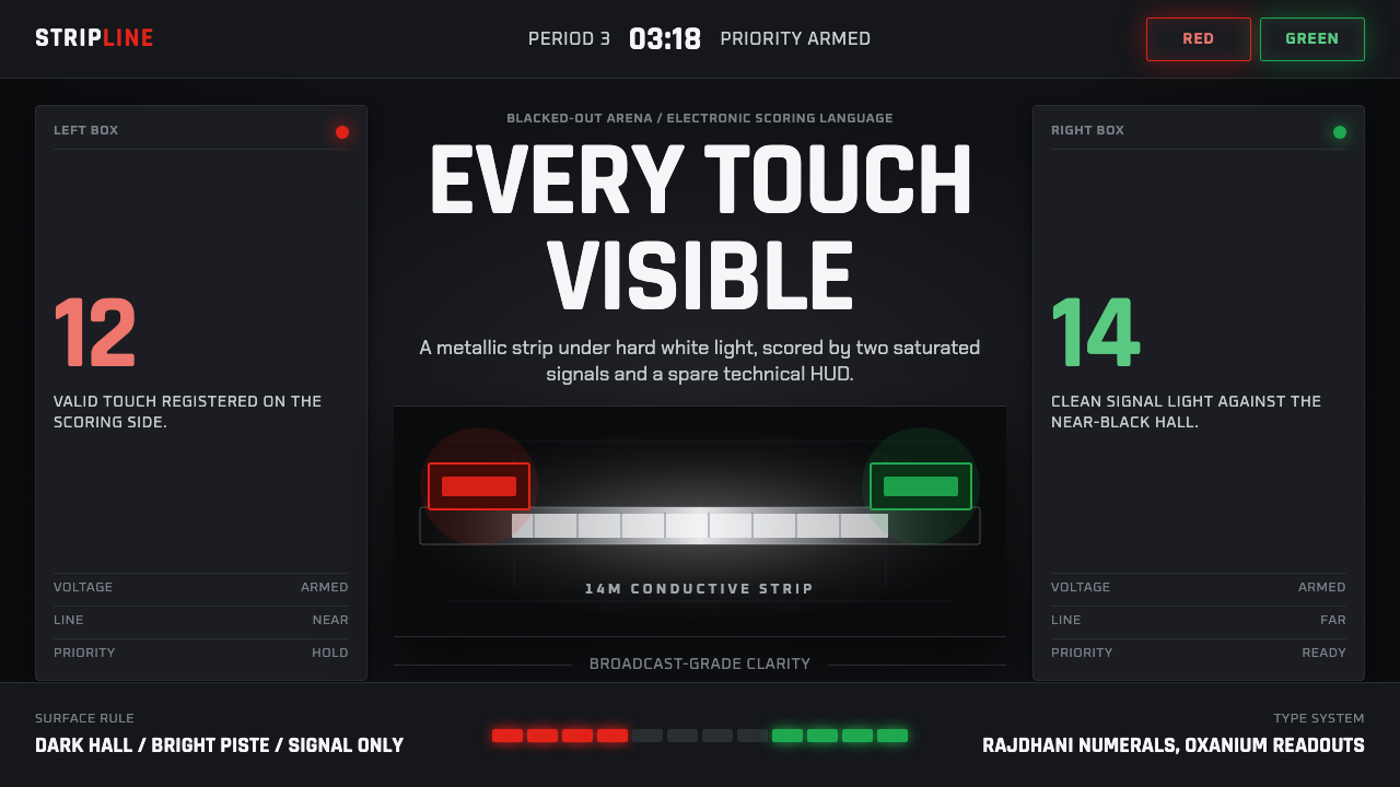
Fencing Piste turns a blacked-out arena into a screen — one white strip of light, and the only color allowed is the verdict.
Fencing Piste in brief
Fencing Piste is the broadcast visual language that has defined televised Olympic fencing since 2010: a single conductive strip lit stark white inside an otherwise blacked-out hall, with every other surface — walls, stands, ceiling rig — pushed to near-total darkness. The only color permitted to interrupt that darkness comes from the electronic scoring apparatus itself. When a valid touch lands, a box beside the piste flashes red for one fencer or green for the other, two signal lights cutting through the black like a verdict being read aloud.
This is a style built entirely around a single design decision: subtract everything except the strip and the signal. There is no ambient lighting to soften the hall, no color grading to warm the picture, no decorative graphics competing for the eye. The blackout is not a lighting failure to be corrected — it is the entire point. It converts a fencing bout, which to an untrained eye can look like a blur of footwork too fast to parse, into something legible at a glance: bright track, dark void, colored verdict.
The HUD layer that overlays this stage is just as disciplined. Score, clock, and priority indicators are rendered in geometric technical sans-serif type, set in sharp uppercase, sized and weighted for a TV feed or a scoreboard glanced at from the stands. Nothing about the typography asks to be admired. It exists to be read in under a second, from a distance, while the actual contest is still moving. High contrast, zero ornament, broadcast-grade clarity — every pixel in the frame is doing exactly one of three jobs: dark hall, bright piste, or scoring signal.
Where does Fencing Piste come from?
Fencing's move toward electrified, high-contrast presentation did not begin with television — it began with a problem of officiating. Foil and épée touches can land in a fraction of a second, often too fast and too light for a human referee positioned at the side of the piste to call reliably. The sport adopted electrical scoring apparatus as early as the mid-twentieth century (épée in 1936, foil in 1956, sabre only in 1988, the last weapon to convert), wiring fencers' weapons and jackets so that a valid touch would trigger a colored light and an audible tone. Long before any broadcast designer thought about a blackout arena, the red-and-green light pairing already existed as the sport's ground truth: it was how a touch was proven, not just seen.
What changed in the run-up to the 2010s was how that existing signal got staged for an audience that had never held a foil and could not parse the footwork on sight. Olympic and world-championship broadcasts, working with the sport's international governing body, the FIE (Fédération Internationale d'Escrime), began treating the arena itself as a production tool rather than a neutral backdrop. Killing the house lights and spotlighting only the strip borrowed a trick familiar from theater: remove every visual competitor to the action, and the eye has nowhere else to go. Fencing, uniquely among Olympic sports, could do this because its entire contest is confined to a strip roughly two meters wide — there was no need to light a field or a pool, only a corridor.
The graphics layer grew up around that staging choice rather than before it. Once the hall was dark and the strip was the only bright surface, broadcast graphics teams needed a HUD that could survive being read against a black field from a stadium seat or a small screen: no soft grays, no subtle color-on-color labels, nothing that could wash out. Geometric, technical, uppercase sans-serif type — already common in sports-timing and motorsport telemetry displays — was the obvious fit, since it had already been battle-tested for exactly this problem: maximum legibility at speed, at distance, under compression.
The result, refined across successive Olympic cycles from Beijing 2008 through London 2012 and beyond, is now the default global grammar for how fencing is presented on screen, largely independent of host broadcaster or country. It is a rare example of a competition-sport visual identity that was not designed top-down by a single studio, but converged on through a shared, practical constraint: make an extremely fast, extremely subtle sport legible to a mass audience using only light, dark, and two colors that already meant something.
What defines the Fencing Piste look?
Ground and Void
The foundational move is total value contrast: one bright, near-white surface — the piste — surrounded by a field pushed as close to pure black as the medium allows. There is no midtone hall visible behind it, no gradient fade at the edges of the light. The darkness is not atmospheric; it is a wall. Every other design decision in the style exists downstream of this one choice.
Signal Color
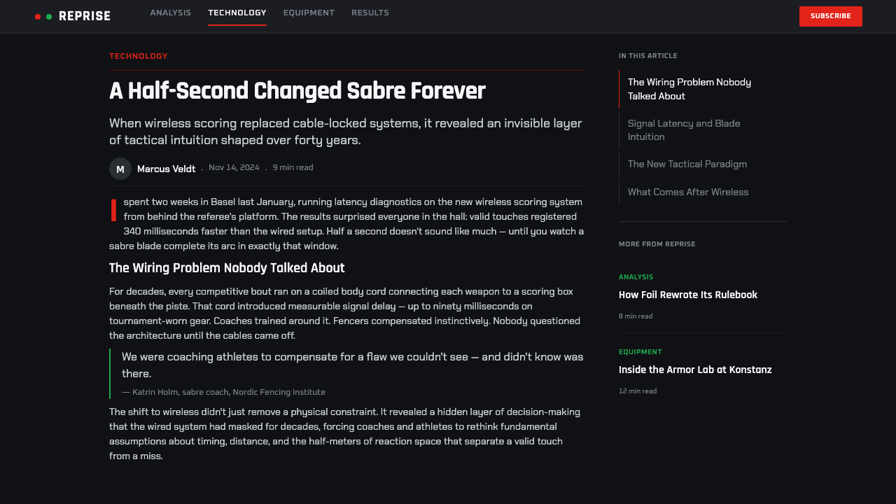
Color is rationed to exactly two hues, red and green, and both are reserved entirely for the scoring apparatus. Neither appears anywhere else in the frame — not in the HUD, not in wayfinding, not as brand decoration. Because the palette is otherwise black and white, red and green read as pure event markers rather than as part of a color scheme; the eye is trained to treat any appearance of them as news, not as background.
HUD Typography
Score, clock, and priority indicators are set in geometric, technical sans-serif letterforms, held in uppercase for maximum consistency of stroke width and counter shape. The type is chosen for legibility under compression and at a distance — the same requirement that governs motorsport telemetry and stadium timing boards — rather than for any expressive quality. It should look instrumented, not authored.
The Strip as Frame
The piste itself functions as the composition's organizing line: a long, narrow, rigidly rectilinear corridor that gives every camera angle a built-in horizon and vanishing point. Because the strip's proportions and boundary lines are fixed by competition regulation, the frame is never arbitrary — the sport's own geometry supplies the grid, and the graphics layer simply respects it rather than imposing a separate one.
Flat, Instrument-Grade Surfaces
Every rendered surface — scoreboards, indicator boxes, on-screen overlays — is flat and hard-edged, with no soft glow, no bevel, no simulated depth. This mirrors the logic of cockpit and control-room instrumentation: a light is either on or off, a number is either current or it is not, and any softness in the rendering would only introduce ambiguity into a system whose entire job is to remove ambiguity.
Motion as Punctuation
Against the otherwise static darkness, motion is used sparingly and always to mark an event: a light flashing on at the instant of a touch, a clock digit changing, a priority arrow appearing. There is no ambient animation, no idle shimmer, no looping decorative motion. Anything that moves on screen is moving because something just happened in the bout — motion itself becomes a form of punctuation rather than texture.
Negative Space as Focus Tool
The blacked-out surround is not empty by accident; it is the single largest area in the frame and functions purely as negative space that directs attention. Nothing is placed in it — no logos, no sponsor tiles, no crowd shots layered in — because doing so would reintroduce the visual noise the entire staging was built to eliminate. Restraint in the void is what makes the strip and the signal lights legible in the first place.
Who shaped Fencing Piste?
The FIE is fencing's international governing body and the entity responsible for competition regulations, including the specifications for electrical scoring apparatus and the piste itself. Because the strip's dimensions, the weapon-and-jacket wiring standard, and the red/green touch-light convention are all defined at the federation level, the FIE effectively supplies the fixed geometry and color logic that broadcast design later staged rather than invented.
The blackout-arena, single-strip staging and its accompanying HUD were developed collectively by the broadcast graphics units working on Olympic and world-championship fencing coverage across the 2008–2012 cycle and after, rather than by any single named designer. Their contribution was to recognize that fencing's existing electrical scoring signal could be staged as a total lighting design, converting a hard-to-parse sport into something legible to a first-time viewer at a glance.
Though not fencing specialists, the broader lineage of geometric, uppercase, high-legibility instrument typography that fencing's HUD draws on comes from motorsport telemetry and stadium timing boards, where the same problem — numbers read correctly, instantly, from a distance, under time pressure — had already been solved. Fencing's broadcast designers adapted rather than reinvented that vocabulary.
How do you use Fencing Piste today?
Fencing Piste is a niche-broadcast style with unusually strong transfer potential, because its underlying logic — one bright signal against total darkness — is a genuinely universal attention mechanism, not a decoration tied to the sport. Applying it well means preserving that void-to-signal ratio rather than simply switching a layout's background to black.
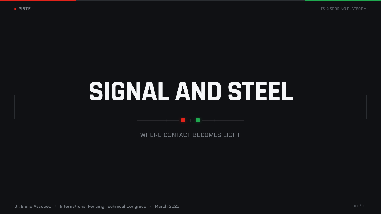
For presentation cover slides, the style produces an immediately dramatic effect: a near-black field with a single bright rectangular or corridor-shaped element holding the title, echoing the strip against the dark hall. Content and data slides should treat the dark background as the default canvas and reserve any accent color — a single red or green, never both competing for the same weight — strictly for the one number or status the slide wants the audience to register first. A data slide built this way should have exactly one thing that reads as 'urgent,' the same way a touch light is the only colored object in an otherwise black frame.
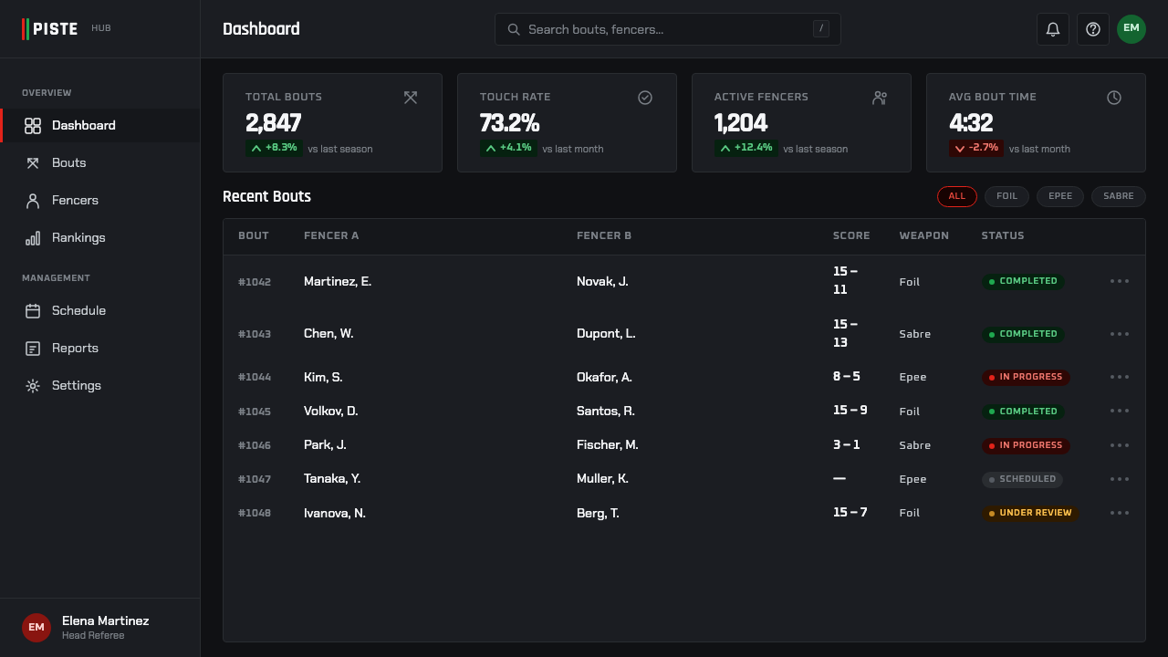
For web interfaces, this register suits dashboards and monitoring-style products particularly well — anything where a user needs to scan a mostly-quiet dark screen and have their eye pulled instantly to whichever state just changed. Pricing pages can use the same restraint: a black or near-black background, uppercase geometric type for plan names and prices, and a single accent color reserved for the recommended tier or the call-to-action button, never spread across multiple UI elements at once.
For editorial and marketing work, the style reads as high-stakes and competition-grade — well suited to sports content, live-event promotion, or any brand wanting to signal precision and real-time judgment. A marketing page can stage a hero section as void-and-signal: dark field, one bright focal element, and a single accent color used only for the primary action, with body copy kept in plain white or light gray rather than introducing a third hue.
The most common mistake in applying this style is treating 'dark mode with some red and green' as sufficient. The style's actual discipline is ratio and restraint: the dark field must dominate overwhelmingly, the bright element must be singular and rare, and the two signal colors must never appear as decoration, only as event markers tied to a specific state change. Diluting the darkness with secondary grays, or scattering the accent colors across icons and badges throughout a layout, collapses the exact contrast the style depends on.
Fencing Piste — FAQ
Is Fencing Piste just 'dark mode' with red and green accents?
No — the darkness has to be near-total and the bright signal has to stay singular and rare for the style to work. Ordinary dark mode typically still has visible mid-tone panels, secondary grays, and multiple accent colors scattered across a layout for different UI states. Fencing Piste instead asks for one dominant void, one bright focal surface, and exactly two reserved colors that only ever mean 'a specific event just happened.' Treating it as generic dark mode with a color tweak loses the contrast ratio that makes the style legible at a glance.
Why does the style use uppercase geometric type instead of something more expressive?
Because the HUD's job is identical to a stadium timing board's job: convey a number or status correctly, instantly, and at a distance, often to someone glancing at a small screen mid-action. Geometric, uppercase, technical sans-serif type has already been proven in motorsport telemetry and sports timing displays to hold up under exactly those conditions — consistent stroke widths and simple counter shapes stay legible when compressed or viewed from far away. An expressive or decorative typeface would trade away that legibility for a personality the format has no use for.
Can this style work with a light or white background instead of black?
Not without losing what makes it work. The mechanism depends on maximum value contrast between an overwhelming dark field and a single bright, rare element — that is what trains the eye to treat any appearance of the signal colors as an event rather than decoration. On a light background, red and green immediately start reading as an ordinary two-color scheme, because there is no darkness left for them to interrupt. The style's identity is the blackout, not the color pairing on its own.
Does this style require an actual sports or competition context to make sense?
No. The underlying pattern — a mostly dark canvas, one bright focal surface, and a strictly rationed accent color reserved for state changes — is a general-purpose attention mechanism that transfers cleanly to monitoring dashboards and any interface where a user needs to notice one changed value in an otherwise calm field. The competition framing explains where the style came from; it does not limit where it can be used.
What is the most important thing to get right when adapting Fencing Piste?
The ratio of void to signal. The dark field must dominate the composition, the bright element must be singular rather than one of several competing highlights, and the accent colors must mark a specific event rather than serve as general-purpose brand color. Get that ratio right and the style reads as precise and dramatic even with minimal effort elsewhere; get it wrong and the composition collapses into an ordinary dark theme with no particular tension.
Related design styles
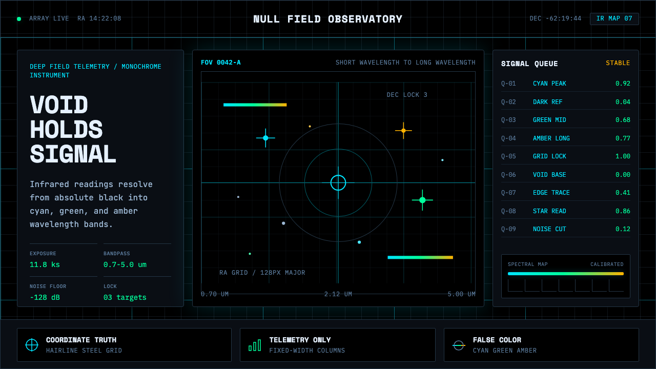 Deep Space ObservatoryTrust the void. Cyan telemetry and amber wavelength bars lock to a steel grid.
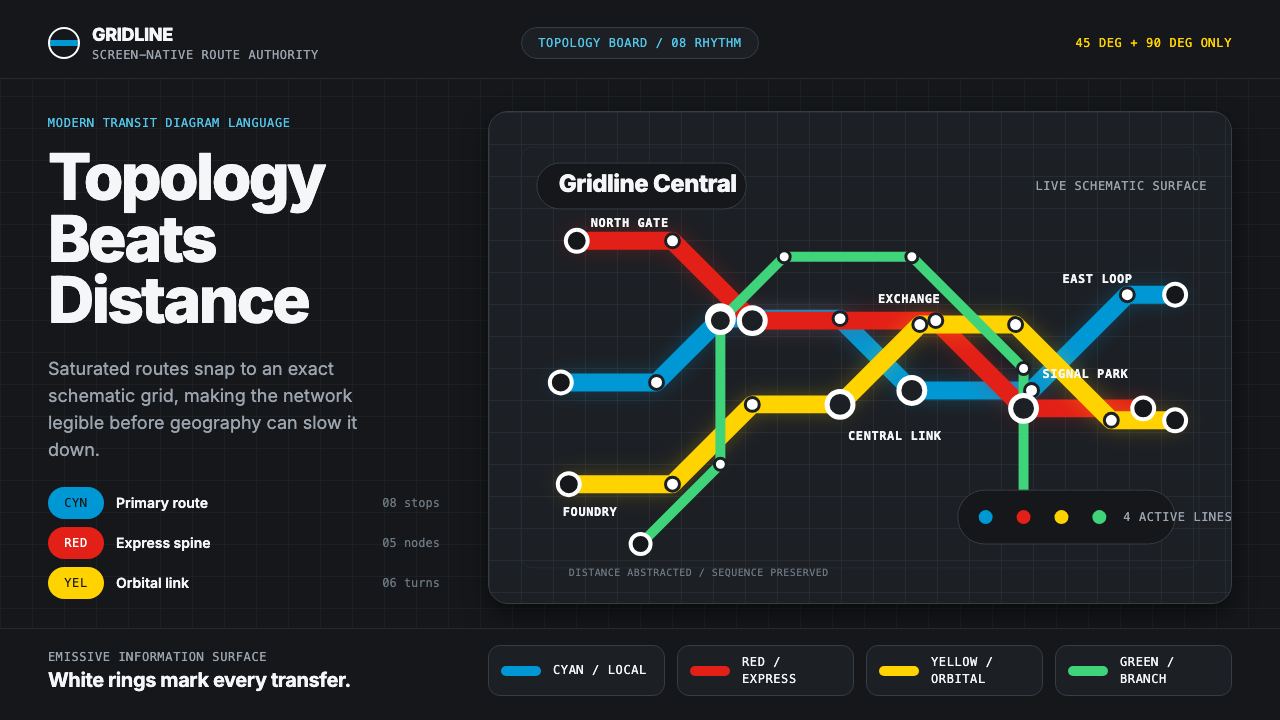 Transit Diagram (modern)Topology over geography. Cyan, red and yellow routes lock to 45-degree angles…
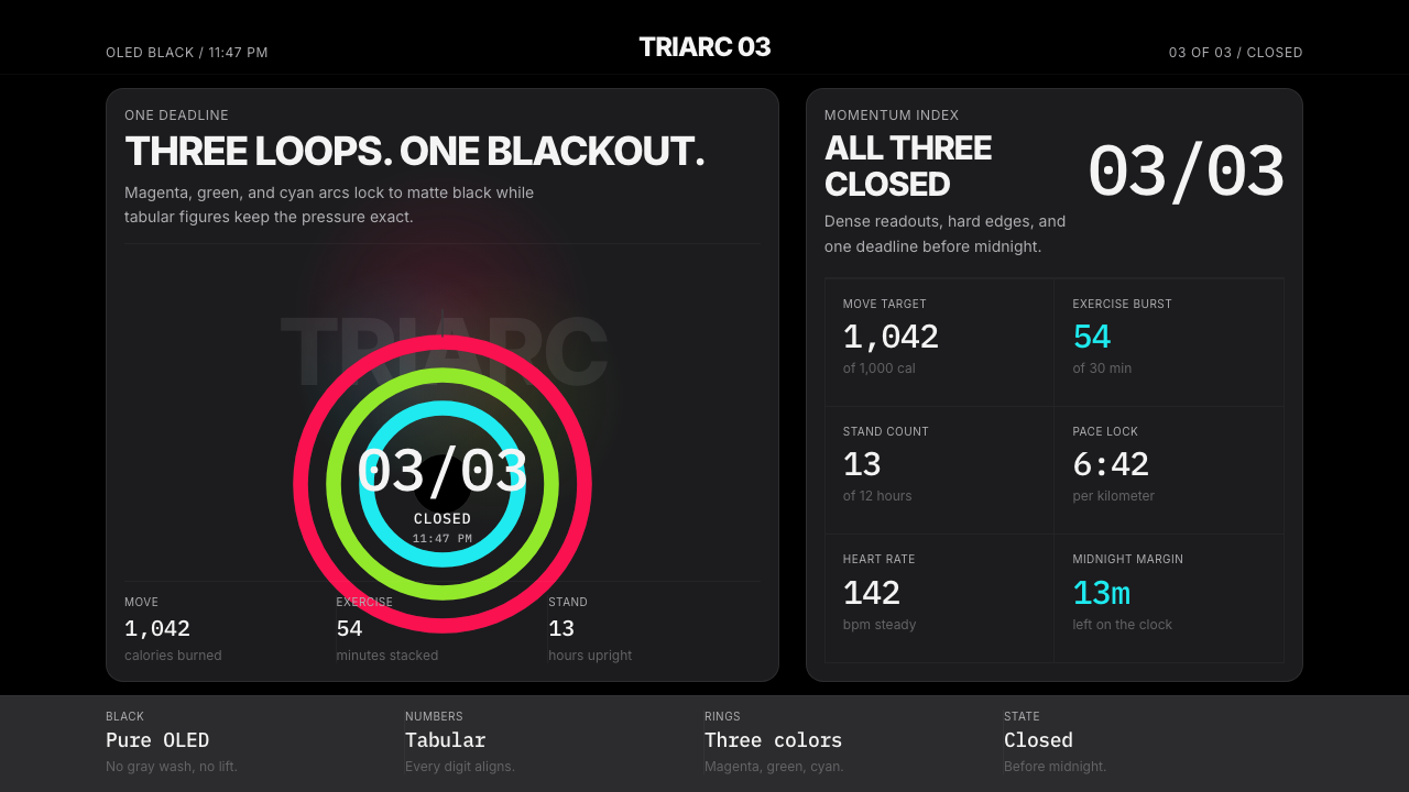 Apple Fitness Rings Closed (2024)Midnight feels exact. Magenta, green, and cyan rings lock onto OLED black.
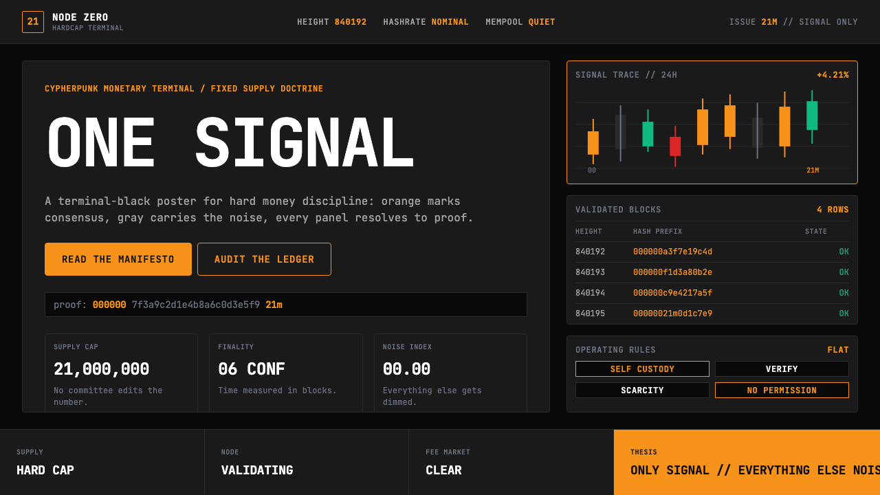 Bitcoin Maximalist OrangeOnly signal, zero spectacle. Orange mono data grids on terminal black enforce…
 Elite DangerousOne amber instrument. Star-orange wireframes, mono numerics, and black-glass…
 Feather MicroscopyPhysics glows in the dark. Cyan filaments and mono scale bars cut a black ima…