What is Cloudflare Orange Edge?
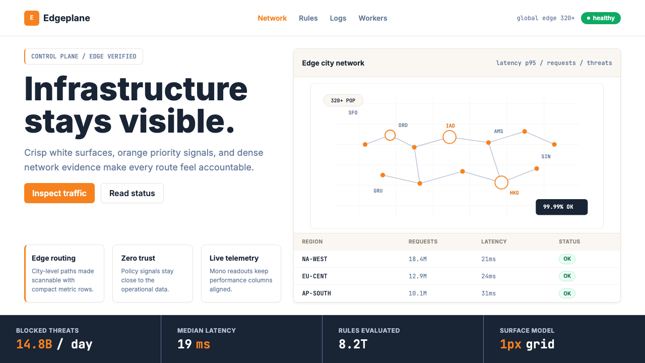
Cloudflare Orange Edge proves that a single brand color, wielded with conviction across every surface of a product, can make infrastructure data feel as sharp and decisive as the network it monitors.
Cloudflare Orange Edge in brief
Cloudflare Orange Edge is the visual design system that emerged from Cloudflare's product identity between roughly 2020 and 2025 — a system built around one of the most recognizable single-color commitments in the technology industry. Against clean white and near-white backgrounds, a vivid, warm orange anchors every primary action, every key status indicator, and every piece of branding that the product places before a user. Everything else is disciplined restraint: near-black body text, hairline borders that suggest structure without weight, and data-grid tables that read like printed engineering documents.
The aesthetic is sometimes described as 'infrastructure made visible.' Cloudflare's products surface the hidden plumbing of the internet — DNS requests, DDoS mitigation events, edge cache ratios, zero-trust access logs — and the design system takes this operational character seriously. Status badges use controlled color coding. World maps dotted with edge point-of-presence markers reinforce the sense of a genuinely global network. Data visualizations behave like instruments, not infographics. The visual language says: this is a control room, not a marketing brochure.
What distinguishes the Cloudflare Orange Edge style from generic 'tech dashboard' aesthetics is the rigor with which the orange is rationed. It appears on primary buttons, on brand-level page headers, on the Cloudflare logo itself. It does not drift into backgrounds, chart fills, or decorative accents. That restraint is what gives each orange element its authority — the color signals action and importance precisely because it is used nowhere else.
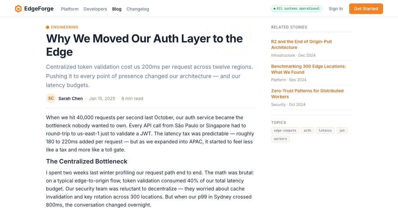
Where does Cloudflare Orange Edge come from?
Cloudflare was founded in 2009 by Matthew Prince, Michelle Zatlyn, and Lee Holloway, emerging from a Harvard Business School project to track the origins of spam email. The company launched publicly at TechCrunch Disrupt that year, offering a reverse proxy service that could protect websites from attacks and accelerate their delivery through a distributed edge network. The orange logo was present from the beginning — a stylized cloud shape in a vivid amber-orange — and it would prove remarkably durable through the company's rapid growth from a San Francisco startup into a publicly traded infrastructure giant.
The visual system that became recognizable as 'Cloudflare design' consolidated gradually through the early 2010s as the product surface area expanded. The original interface served individual website owners configuring basic DNS and security settings; by the mid-2010s, the dashboard had grown to encompass dozens of product lines — Workers serverless compute, R2 object storage, Access zero-trust, Stream video, Pages hosting. Maintaining visual coherence across that breadth required systematic thinking: a defined color hierarchy, a shared typographic approach, and component-level consistency that could be applied across product teams working in parallel.
John Graham-Cumming, Cloudflare's chief technology officer, has been a public voice for the principle that technical infrastructure can be communicated clearly without sacrificing accuracy. This attitude permeates the design: dense data tables are embraced rather than hidden, network maps are genuinely geographic rather than decorative, and status indicators use precise language alongside color cues. The design philosophy is shaped by the company's belief that its users — security engineers, IT administrators, developers — can handle complexity if it is organized well.
The broader context is the post-AWS era of cloud infrastructure, in which a generation of infrastructure companies — Cloudflare, Vercel, Fastly, Stripe, PlanetScale — developed design systems sophisticated enough to compete with consumer-grade software in terms of visual quality. Cloudflare's edge network, which grew to over three hundred twenty cities globally by the mid-2020s, became a concrete subject for the design system: the world map widget and the edge POP visualization are among the most replicated UI patterns in the infrastructure-as-a-service space, not because they are decorative but because they answer an actual user question ('where is my traffic being handled?') with a direct visual answer.
What defines the Cloudflare Orange Edge look?
The Anchor Orange
A single vivid warm orange dominates the entire visual hierarchy as the sole primary action color. It appears on primary buttons, brand headers, the product logo, and critical interactive states. Its power derives entirely from its scarcity — the color is withheld from backgrounds, chart fills, and secondary elements so that every orange surface signals something actionable or brand-defining. The orange reads as authoritative rather than decorative because it never competes with itself.
White and Near-White Ground
The background system is built on pure white and extremely light warm gray surfaces, never on dark or tinted backgrounds in the primary interface context. This choices serves the data-heavy use case: text and numerical values at multiple hierarchical levels need maximum contrast, and light grounds preserve legibility even when density is high. The whiteness also gives the orange its maximum impact — on a cream or dark background, the same orange would read differently.
Ink-Navy Typography
Body text, labels, and secondary interface copy lean toward a deep navy-tinged near-black rather than pure black, which reduces optical harshness on the white ground while maintaining strong contrast. A neutral, geometrically constructed sans-serif handles all reading-weight text, paired with a monospaced typeface for metric readouts, IP addresses, code blocks, and any value that must be compared character by character. The two typeface families never compete in the same block — they alternate according to whether the content is human language or machine data.
Hairline Borders and Near-Invisible Shadows
Where separation between interface regions is needed, the system uses borders at the thinnest visually perceivable weight rather than gutters, gradients, or elevated shadows. Card components and panel dividers are defined by these hairline strokes in a light gray, creating structure that is felt without being seen. Drop shadows, where they appear at all, are so subtle as to add only the faintest sense of lift — the aesthetic goal is data legibility, not the illusion of physical depth.
Operational Data Density
The design system is engineered to accommodate information density that would break most consumer-facing interfaces. Data tables with dozens of rows, dashboards with twelve or more metric panels, log streams updating in near-real-time — the layout system handles these without resorting to visual tricks. Spacing is generous enough to prevent crowding but not so generous as to waste vertical screen real estate. The result is an interface that engineers and administrators can scan rapidly without losing context.
Geographic Instrument Panels
One of the most distinctive recurring elements in the Cloudflare visual language is the world map rendered as an operational instrument — a dark or neutral base map dotted with markers indicating edge points of presence, request origins, or threat sources. This pattern treats geography as data rather than decoration: the map communicates the actual physical reality of a distributed system. It has become associated with Cloudflare's visual identity as strongly as the orange itself.
Controlled Status Color Vocabulary
Beyond the signature orange, the system employs a small, tightly defined vocabulary of status colors: a clean green for healthy or active states, an amber or yellow for warnings and degraded performance, a red for errors and outages, and an occasional blue for informational states. These colors appear almost exclusively in status badges, alert banners, and chart segments — never as decorative background fills or typographic accents. The vocabulary is legible because each color maps to exactly one semantic category.

Who shaped Cloudflare Orange Edge?
Prince co-founded Cloudflare and serves as its CEO. He has shaped both the product direction and the public-facing communication style of the company — a combination of technical depth and accessibility that is reflected in the design system's dual commitment to dense data and legible interfaces. His background in law and business, combined with a deep engagement with internet infrastructure policy, influenced Cloudflare's positioning as a company that takes both engineering precision and public communication seriously.
Zatlyn co-founded Cloudflare and served as President and COO. She was central to shaping the company's brand identity and go-to-market strategy during the formative years when the visual identity was being established. Her emphasis on making complex internet infrastructure comprehensible to a non-specialist audience directly informed the design system's legibility goals — the idea that security and performance data should be understandable not just to engineers but to the business owners and teams who rely on those engineers.
Graham-Cumming is Cloudflare's CTO and a prolific technical writer whose blog posts and public communications demonstrate the company's commitment to explaining infrastructure concepts in plain terms without sacrificing accuracy. His presence has shaped an engineering culture in which documentation, transparency, and clear communication are treated as design problems with correct and incorrect solutions. The hallmark technical depth of Cloudflare's status pages, post-mortems, and product announcements reflects this culture, and that culture is in turn reflected in the design system.
Holloway was the third co-founder of Cloudflare and its original chief technical architect, responsible for many of the foundational systems on which the company's edge network was built. Though he stepped back from the company in the mid-2010s due to illness, his engineering philosophy — a bias toward systems that handle adversarial conditions gracefully and log everything with precision — is embedded in the product DNA. The design system's emphasis on operational data, error states, and real-time status reflects the kind of infrastructure thinking that Holloway's early work established.
The consolidation of Cloudflare's visual language into a coherent system was the work of a growing internal design organization through the 2020s, as the company expanded from a handful of products to a platform covering dozens. The team's work involved systematizing component libraries, establishing the color role hierarchy that governs the orange's usage, and developing the operational UI patterns — data tables, status badges, world map visualizations — that became recognizable as distinctly Cloudflare. Their choices made operational density feel purposeful rather than cluttered.
How do you use Cloudflare Orange Edge today?
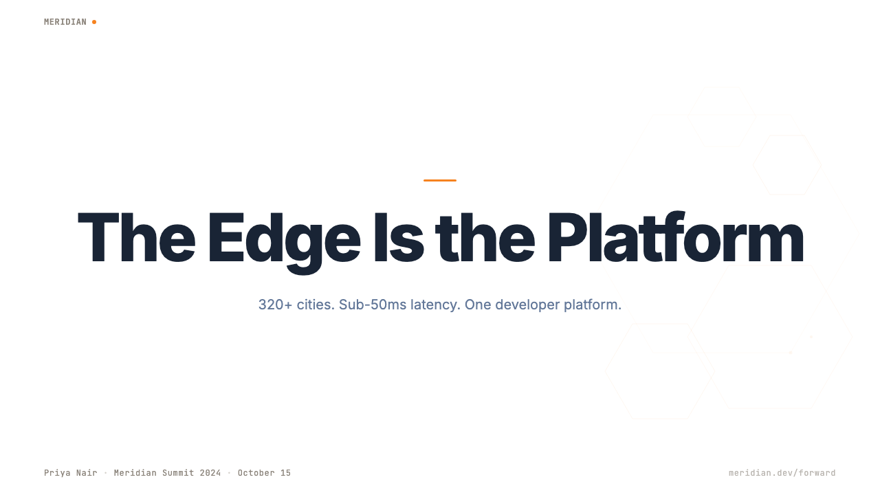
Cloudflare Orange Edge translates naturally to presentation slides when the subject matter involves infrastructure, technical products, security, or any kind of operational data. For cover slides, the system's power comes from restraint: a near-white or pure white background, a single large typographic element in near-black or dark navy, and the orange used only for the product name, a key metric, or a logo. Avoid filling large areas with orange — the color works because it is rare. Content slides should be treated as data panels: table-heavy layouts with clear hierarchical type scales, minimal decorative elements, and ample white space around each data group.
For data-heavy slides — charts, metrics dashboards, performance benchmarks — the style is particularly well suited. Bar charts and line charts should use the orange for the primary series or the most important metric, with neutral grays or a controlled secondary palette for supporting data. Avoid using multiple vivid colors across different chart series; the operational visual vocabulary gains clarity from chromatic restraint. Percentage readouts, uptime figures, and latency numbers benefit from the monospaced display treatment — a fixed-width numeric presentation makes comparison across rows effortless.
In web interface design, the Cloudflare Orange Edge approach is most directly applicable to dashboards, control panels, admin interfaces, and pricing pages where scannability and data density are primary requirements. The approach calls for a strict grid, near-white backgrounds, near-black text for all body copy, and the signature orange reserved exclusively for primary call-to-action buttons and brand-level elements. Secondary interactions — table row highlights, hover states, focus rings — can use a light orange tint, but the full saturated orange should appear only where action is being invited. Hairline borders define panels and cards; shadows are either absent or so light as to be felt rather than seen.
For editorial and marketing applications — product landing pages, technical blog post illustrations, conference presentation slides, sales decks — the style projects authority and engineering credibility. A strong visual pattern is to alternate full-width sections between white-on-near-black and black-on-white, with orange used consistently as a single accent across both inversions. This binary rhythm, familiar from infrastructure company marketing, communicates seriousness without rigidity. Pull quotes and callout boxes should use a simple ruled left border in orange rather than filled background color blocks.
The most common error when applying this style is treating the orange as a general-purpose accent color rather than a primary action color. Designers unaccustomed to the system sometimes use the orange for all emphasis — highlighted text, icon fills, chart series, decorative borders, background sections — which dilutes the orange's signal and produces an interface that reads as merely orange-themed rather than operationally clear. The discipline of the style is precisely that the orange appears in very few places, and everywhere it appears it means the same thing: this element deserves your primary attention.
Cloudflare Orange Edge — FAQ
Is Cloudflare Orange Edge suitable for consumer-facing products, or only for technical audiences?
The style was developed for and is most naturally suited to technical audiences — engineers, IT administrators, developers, and security professionals who value operational clarity over emotional warmth. Its density, precision, and functional severity can feel cold or clinical in consumer contexts where users expect organic texture, soft transitions, and visual warmth. That said, certain consumer products with a technical or performance-oriented identity — developer tools marketed to indie builders, personal finance dashboards, fitness tracking apps — can adopt elements of the system selectively. The key is matching the style's values to the product's values: if your product says 'we take reliability and transparency seriously,' the Cloudflare aesthetic reinforces that message. If your product says 'we help you relax,' it works against you.
How does this style differ from other infrastructure company design systems like Stripe or Vercel?
Stripe, Vercel, and Cloudflare represent three distinct strategies for infrastructure product design that are often grouped together. Stripe's system is characterized by deep typographic sophistication, a gradients-and-glass aesthetic in its marketing surfaces, and an emphasis on brand polish that targets finance-adjacent professional buyers. Vercel's system is defined by high contrast dark mode, sharp geometric edges, and a developer-culture spareness that reads as deliberately minimal. Cloudflare's system is the most operationally minded of the three: it prioritizes data density and functional legibility over aesthetic sophistication, it stays resolutely light-background rather than embracing dark mode as a brand identity, and it builds its entire visual hierarchy around one high-frequency color. The commonality is functional design for technical audiences; the differences are in what each company considers the primary design value.
Can the orange be swapped for another brand color while keeping the rest of the system?
Structurally, yes — the system's logic (one high-frequency anchor color against a near-white ground, hairline borders, operational data density, monospaced numerics) can be rebuilt around a different primary accent. Practically, the choice of anchor color matters enormously. The Cloudflare orange is effective because it occupies a perceptual niche that few other elements in the interface inhabit — it is warm, vivid, and distinct from both the near-black text and the near-white background. A blue anchor risks blending into browser defaults and link conventions; a green anchor risks being read as a status color. The colors most likely to work in the same structural role are those with high saturation and a warm or neutral-warm hue that sits clearly apart from both ends of the value scale — a strong amber, a warm coral, a vivid teal, or a deep orange-red.
How should this style handle dark mode?
Cloudflare's own dashboard has offered a dark mode in certain product contexts, and dark mode is a reasonable extension of the system — but it requires rebuilding the ground rather than simply inverting it. The challenge is that the orange anchor color behaves very differently against dark backgrounds: it can read as harsh or overwhelming if used at full saturation in contexts where white space has been replaced by deep gray or near-black. A successful dark mode variant of this style typically desaturates the orange slightly, uses it more sparingly than in the light version, and relies more heavily on the monospaced blue-gray numeric typography as the primary visual texture. Hairline borders lighten to medium gray; card backgrounds lift to a slightly lighter shade than the page background rather than adding shadows. The design priority remains legibility of operational data, not the visual drama of the dark inversion itself.
Is this style appropriate for a startup that wants to signal technical credibility but does not build infrastructure products?
It can work, with caveats. The Cloudflare aesthetic signals a specific kind of technical seriousness — operational, data-rich, engineer-facing — and that signal is most credible when the product actually is data-rich, operationally significant, or engineer-facing. For a developer tool, a data analytics product, a security startup, or a technical SaaS platform, adopting the system's logic (white grounds, single anchor color, hairline structure, dense tables) projects genuine alignment with the aesthetic's values. For a startup in a field that is technical by association but not by nature — a productivity app with an AI feature, a consumer fintech with a sophisticated backend — the style can feel like a costume: technically correct but incongruent with the product experience. The honest test is whether your product's actual interface is more data-dense and operational than narrative and sensory. If yes, the style fits. If no, it risks signaling seriousness you haven't yet earned.
Related design styles
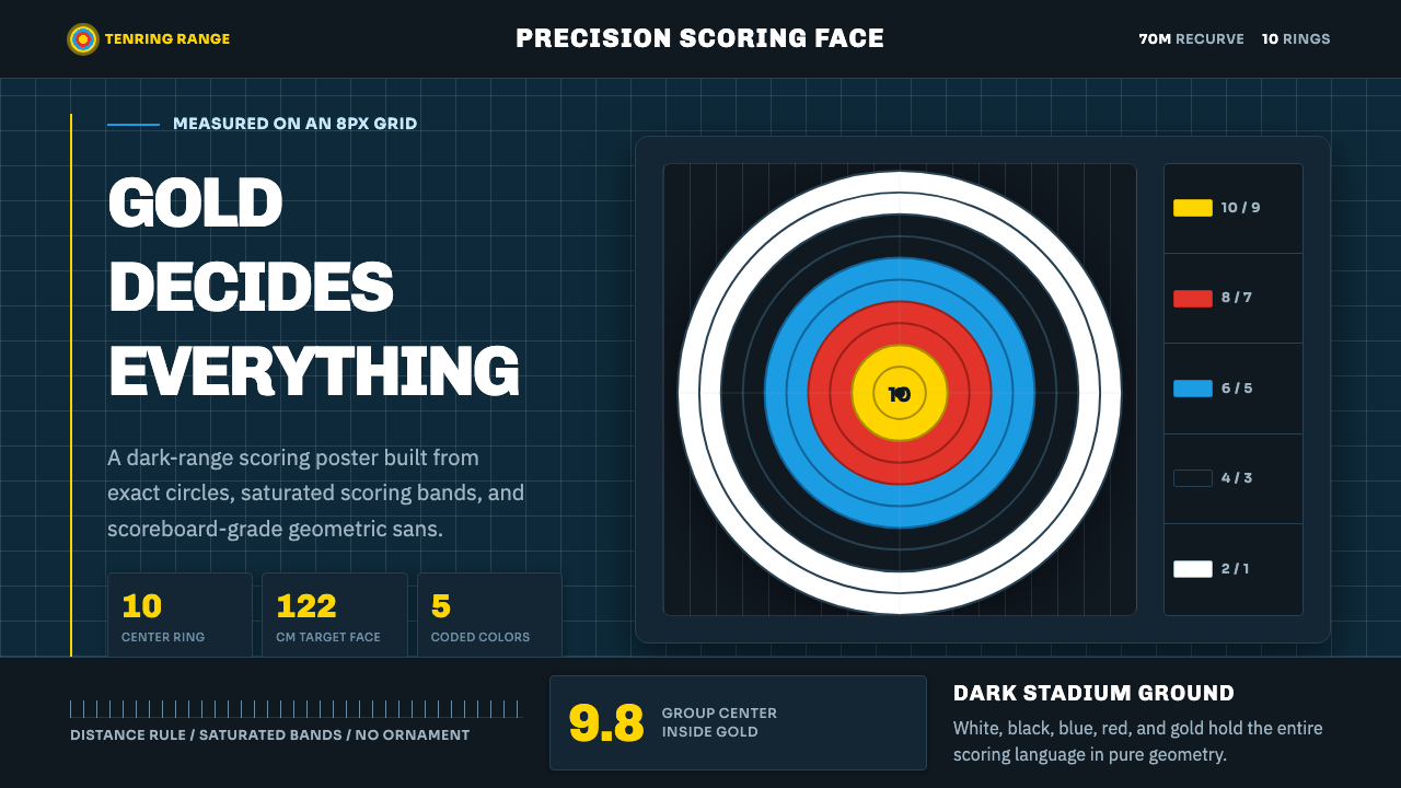 Olympic ArcheryPrecision is the drama. Gold-red-blue rings snap from a dark stadium grid.
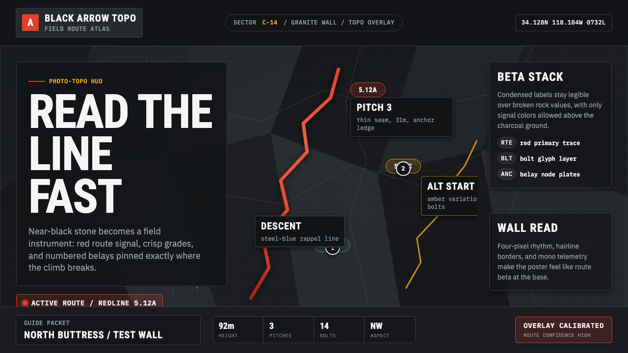 Climbing Topo GuideBeta at a glance. Red route telemetry cuts across near-black stone and conden…
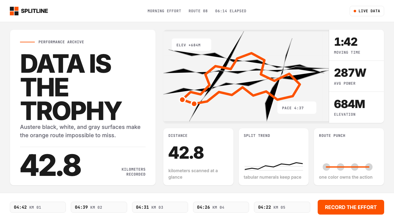 Strava Orange FitnessData becomes trophy. Inter numerals, gray metric grids, and one orange route…
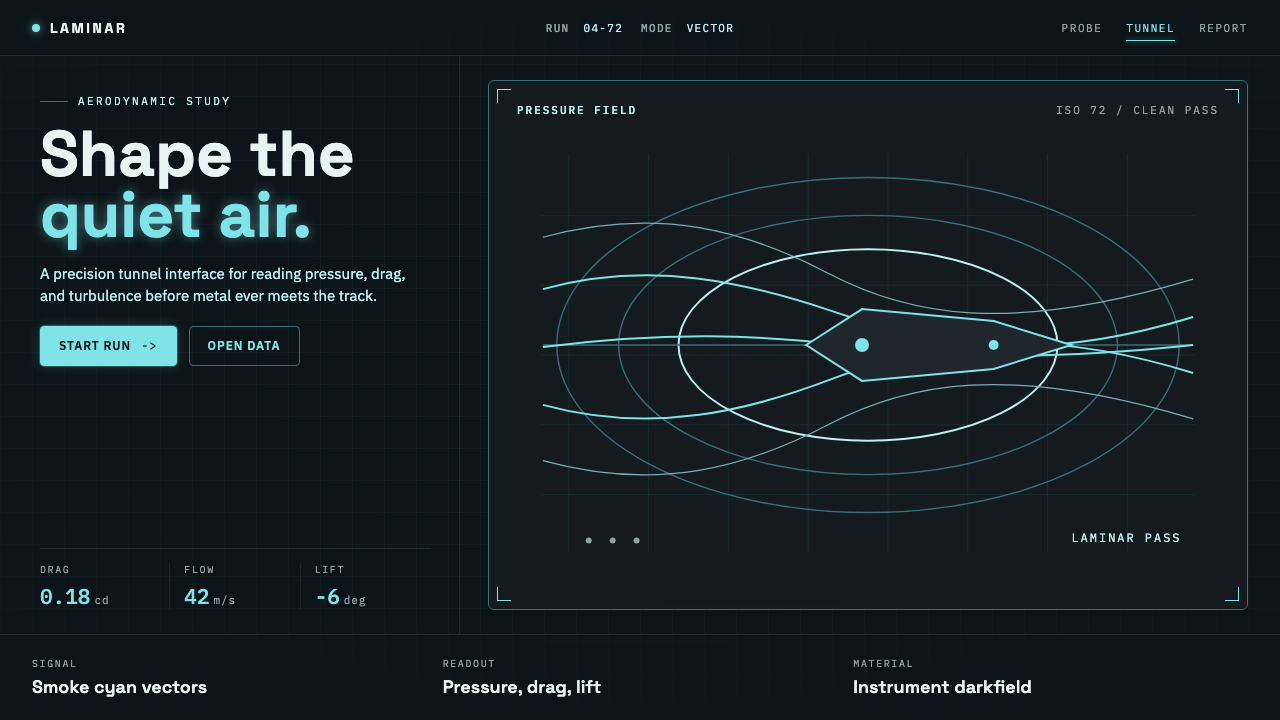 Wind TunnelMakes darkness feel measurable. Cyan-white streamlines and monospace ticks gl…
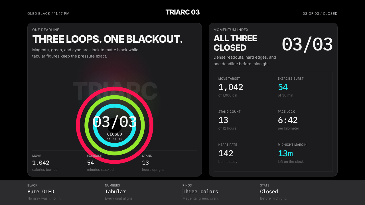 Apple Fitness Rings Closed (2024)Midnight feels exact. Magenta, green, and cyan rings lock onto OLED black.
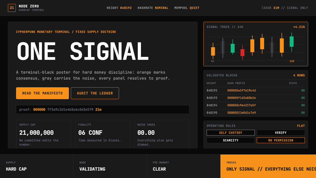 Bitcoin Maximalist OrangeOnly signal, zero spectacle. Orange mono data grids on terminal black enforce…