What is Wind Tunnel?
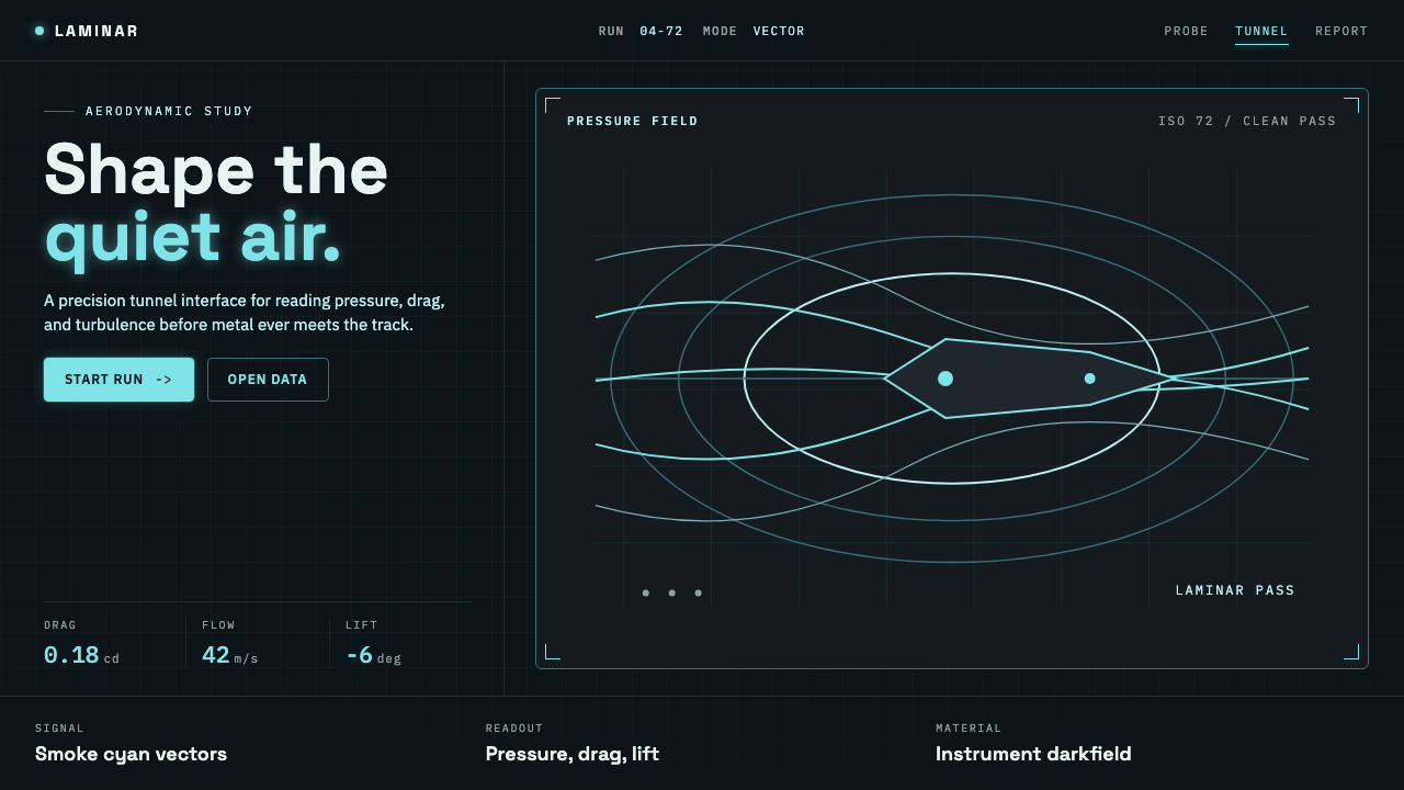
Wind Tunnel makes darkness feel measurable: cool-white cyan flow lines, instrument ticks, and technical type turn a black field into an aerodynamic test section.
Wind Tunnel in brief
Wind Tunnel is a dark technical visual language derived from aerospace flow visualization. It imagines an airfoil inside a blackened test section, where pale smoke filaments or laser-sheet-illuminated seed particles reveal the otherwise invisible path of moving air. The visual drama comes from contrast: the environment recedes, while the measured flow becomes legible.
Its central image is not a decorative wave but a streamline. Lines bend around a profile, compress near an edge, separate into layers, or extend into darkness with the calm logic of observed motion. This gives the style an unusual emotional character: it is cinematic, but never sentimental; futuristic, but grounded in the practical culture of experiment and measurement.
The system combines technical monospace annotation with a precise grotesque sans-serif. Readouts, angle-of-attack labels, crosshair-like marks, and measurement ticks behave like parts of an instrument panel. Against the near-black ground, cool-white-cyan lines carry almost all the visual energy, making every illuminated detail feel intentional.
Where does Wind Tunnel come from?
Wind Tunnel draws directly from the visual conditions of North American aerospace research tunnels, especially the classic NACA and NASA tradition of flow visualization. From 1950 to 1990, dark test interiors made illuminated smoke and seeded particles easier to observe. Darkness was not theatrical styling; it was an operational condition that maximised contrast around the object under study.
Smoke flow visualization supplied the style’s most recognizable image: fine pale filaments passing across an airfoil and bending in response to its shape. These traces turned air from an abstract engineering variable into something visible and spatial. A viewer could read direction, curvature, compression, and disturbance through lines that appeared delicate but carried analytical meaning.
Laser-sheet flow visualization extended that logic by selectively illuminating particles in the flow. The bright plane of information against a dark surrounding volume established the language that Wind Tunnel adopts: a controlled field, a precisely lit signal, and minimal annotation that helps the observer interpret rather than compete with the phenomenon.
NASA Glenn, formerly known as Lewis Research Center, and NACA wind-tunnel programs anchor the reference world of the style. Wind Tunnel does not imitate a historical control room as nostalgia. Instead, it translates the research environment’s disciplined contrast, technical labeling, and focus on observed behavior into a reusable visual system for contemporary information surfaces.
What defines the Wind Tunnel look?
Dark Test Section
The background should feel like tunnel interior rather than generic dark mode: deep, enclosing, and visually quiet. It creates a field in which illuminated information appears observed rather than merely placed. Bright surfaces are avoided, because they weaken the sense that the signal has emerged from darkness.
Cool Luminous Flow
Cool-white-cyan streamlines are the visual protagonist. Their glow should read as illumination from smoke or seed particles, not as neon ornament. Lines may sweep, converge, or wrap around a profile, but their purpose is to describe force, direction, and changing conditions.
Instrument Annotation
Technical monospace text supports readings, identifiers, and compact observations. It should feel calibrated and procedural, as though the interface is recording a test condition. Annotation stays secondary to the flow image and is best used in restrained clusters rather than as continuous dense copy.
Precise Grotesque
A precise grotesque sans-serif gives headlines and primary labels clarity without softening the system. Its role is structural: to establish hierarchy, frame the technical layer, and retain readability at a glance. Rounded or expressive display lettering introduces a warmth that belongs outside this visual environment.
Ticks and Reference Marks
Measurement ticks, fine rules, and reference marks turn empty space into an analytical field. They should imply calibration without becoming a decorative grid. Used well, they make the page feel like a captured slice of a larger instrument, extending beyond the visible frame.
Signal over Atmosphere
The style is atmospheric because it is selective, not because it piles on effects. Glow, line density, and labels all serve the readable signal. Warm accents, creamy grounds, and unrelated luminous colors break that discipline by introducing mood where the system calls for measured contrast.
Who shaped Wind Tunnel?
NASA Glenn, formerly Lewis Research Center, is named in the source tradition of Wind Tunnel. It represents the aerospace research setting in which a dark test section, a measured object, and illuminated flow could form one coherent visual and analytical scene.
NACA wind-tunnel programs provide the classic research reference behind the style. Their relevance is not a single image or artifact, but the method of making airflow visible through controlled observation and presenting the result with technical restraint.
Laser-sheet flow visualization is a key visual mechanism in the source material. By illuminating seed particles within a selected plane, it creates the sharp bright trace against darkness that defines Wind Tunnel’s balance of scientific precision and visual intensity.
How do you use Wind Tunnel today?
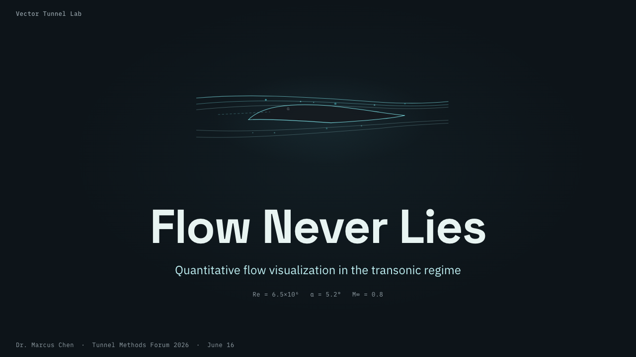
For presentation slides, treat the cover as a test image: a single airfoil-like profile or field of streamlines can establish the subject, while a compact technical identifier anchors the composition. Content slides should preserve the same dark field but prioritize hierarchy. Data slides work especially well when charts, trajectories, and comparisons are framed as measured signals rather than colorful business decoration.
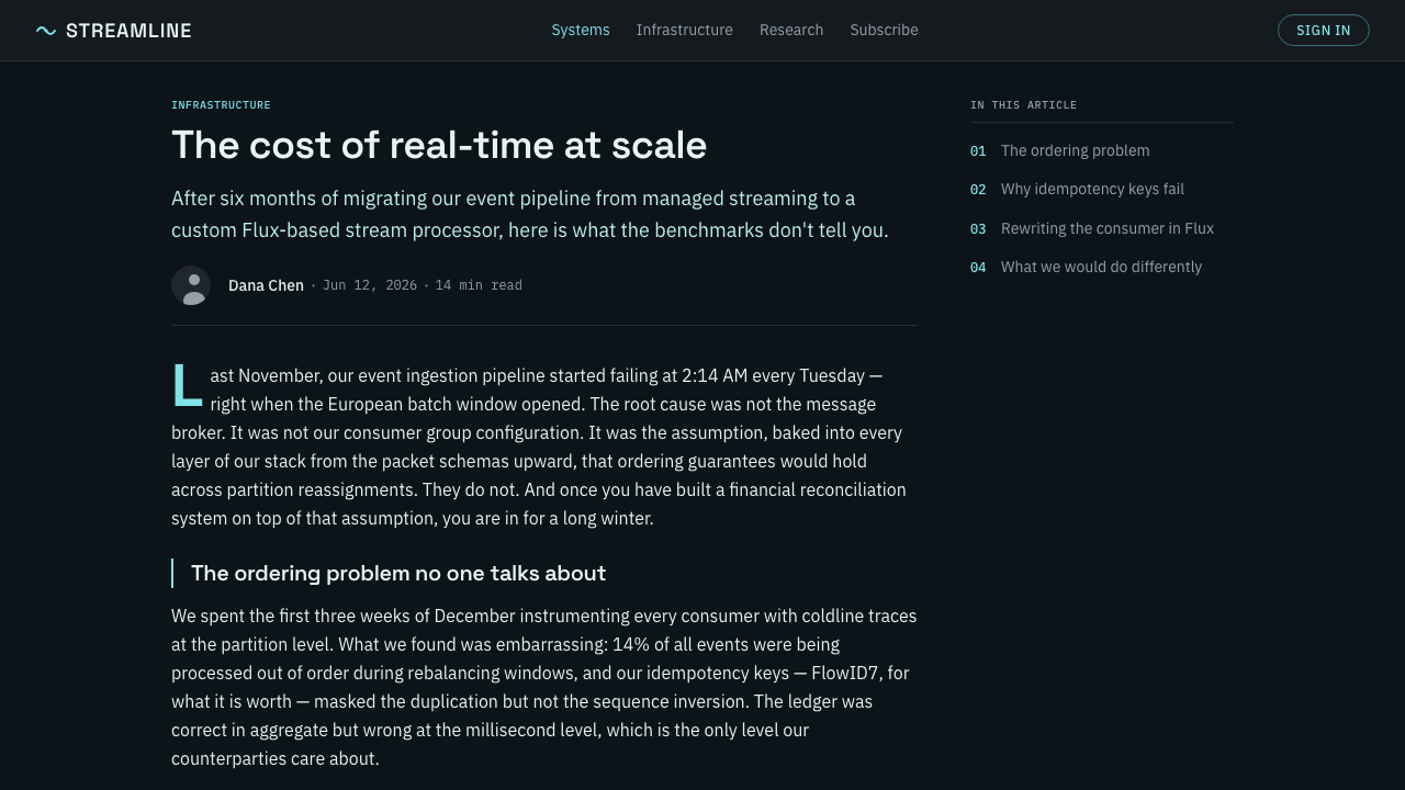
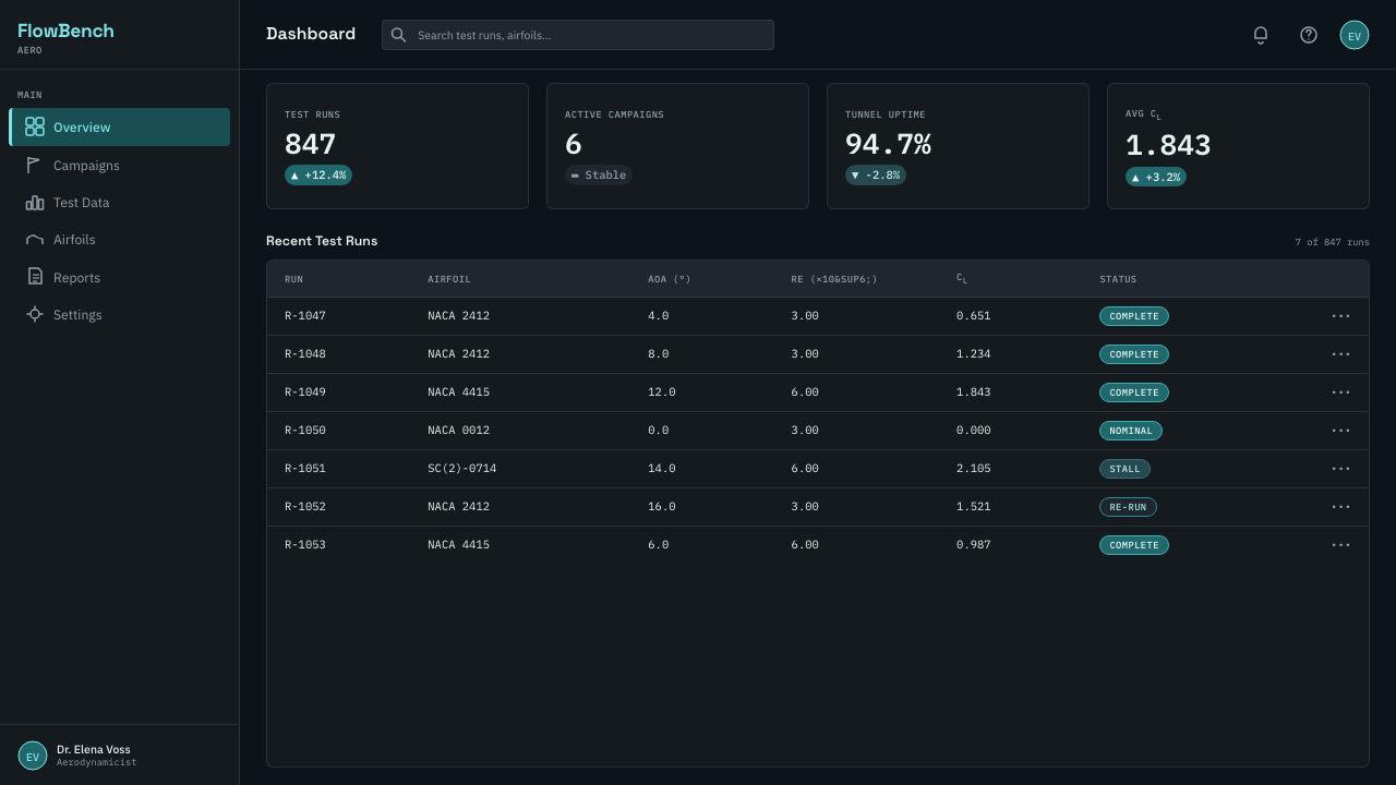
For web interfaces, Wind Tunnel suits dashboards, monitoring surfaces, analytical tools, and pricing pages for technical products. A dashboard can use streamlines to frame a system overview while monospace labels identify states and readings. A pricing page can borrow the same severity through dark panels, measured dividers, and cool accent signals, provided that choices remain immediately legible.
For editorial and marketing work, the style is most effective when the subject genuinely involves performance, systems, motion, research, or precision. An article can use flow diagrams as section transitions and reserve luminous lines for key claims or image captions. Marketing compositions benefit from the sense of controlled energy, but should keep copy and calls to action more prominent than the atmospheric treatment.
The common mistake is to reduce Wind Tunnel to black background plus cyan glow. That misses the style’s research logic. Flow lines need a reason to move, annotations need a reason to exist, and brightness needs to identify information. Overusing glow, filling every area with decoration, or introducing warm colors turns an instrument-like surface into generic science-fiction imagery.
Wind Tunnel — FAQ
Is Wind Tunnel simply a dark science-fiction style?
No. Its visual intensity can feel futuristic, but its source is aerospace research flow visualization. The important distinction is purpose: streamlines, ticks, and labels describe observed or measured conditions. If those elements are used only as decoration, the result may look sci-fi, but it no longer carries the Wind Tunnel logic.
Can the style use warm colors or light backgrounds?
The source system explicitly avoids them. Wind Tunnel depends on a near-black ground and cool-white-cyan illumination because that contrast recalls the dark test section. Warm accents or cream-like surfaces redirect the visual temperature and weaken the sense that bright flow has been isolated for study.
When should streamlines be used instead of ordinary abstract lines?
Use them when the content involves direction, change, performance, movement, or relationships passing around a central object. A streamline should imply a field and a response to conditions. For purely decorative layouts with no underlying system to describe, quieter structural rules and annotation may be more faithful than invented flow.
How should typography divide between monospace and grotesque text?
Use the grotesque face for primary hierarchy: titles, section labels, and concise statements that must be read immediately. Use monospace for readings, identifiers, short technical notes, and small evidence-like details. This division lets the interface feel instrumented without making every sentence look like raw telemetry.
Related design styles
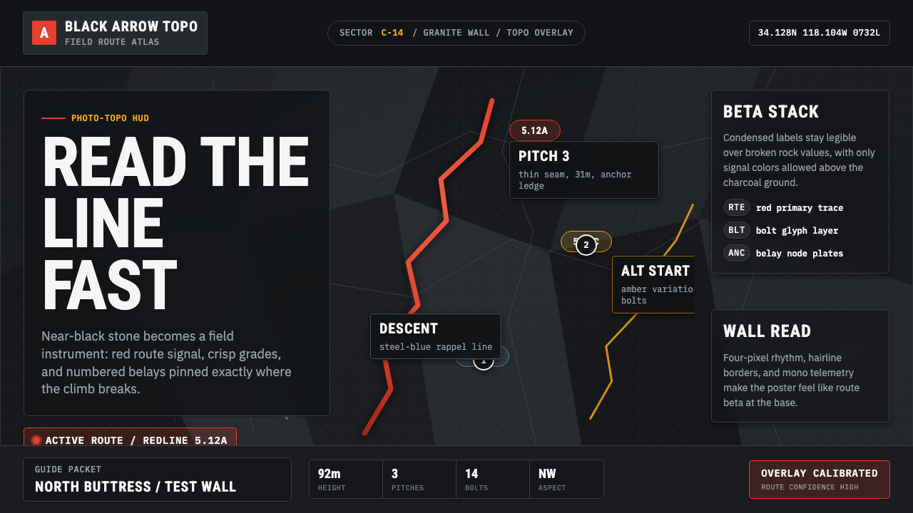 Climbing Topo GuideBeta at a glance. Red route telemetry cuts across near-black stone and conden…
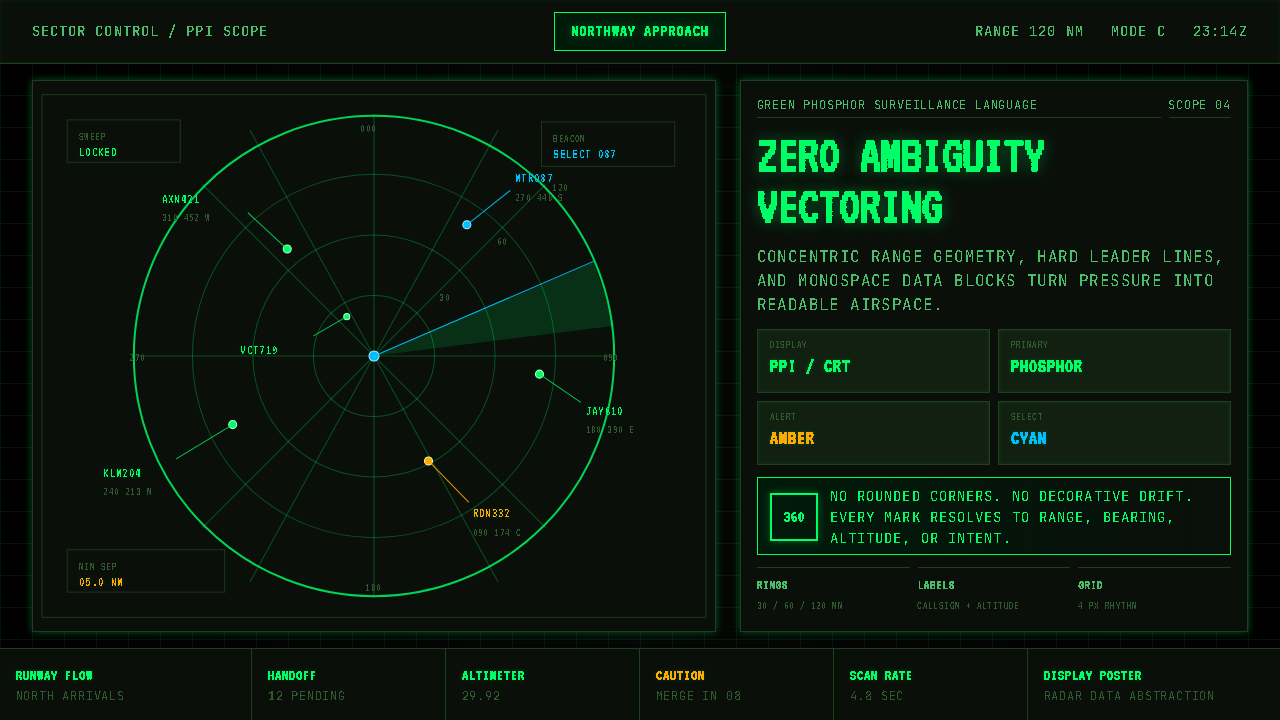 Air Traffic Control RadarOperational gravity. Phosphor green rings, sweep wedges, and monospace blips…
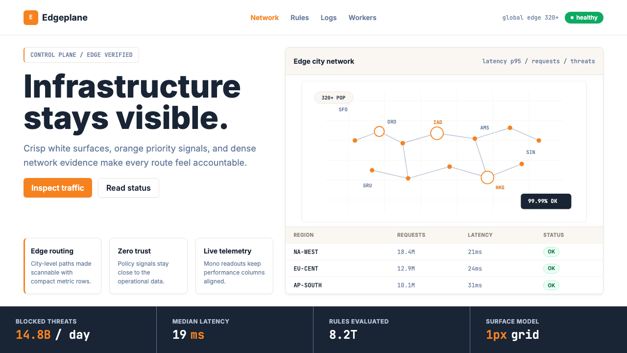 Cloudflare Orange EdgeOperational clarity wins. Orange accents, hairline grids, and mono metrics ma…
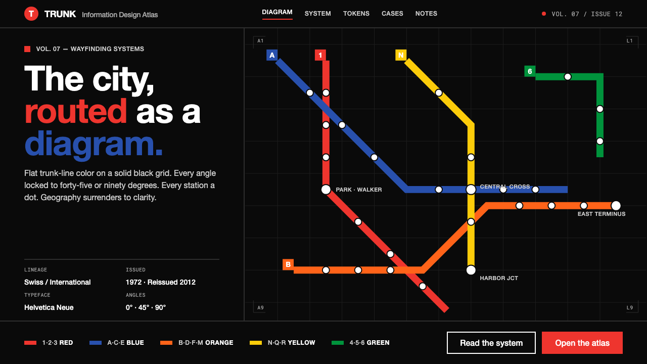 NYC Subway VignelliThe city as a circuit diagram. Flat trunk-line color on black, angles locked…
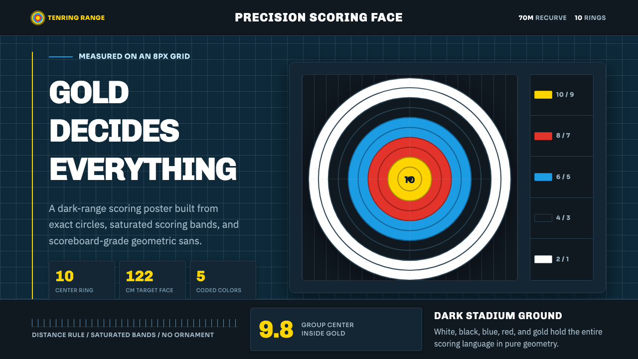 Olympic ArcheryPrecision is the drama. Gold-red-blue rings snap from a dark stadium grid.
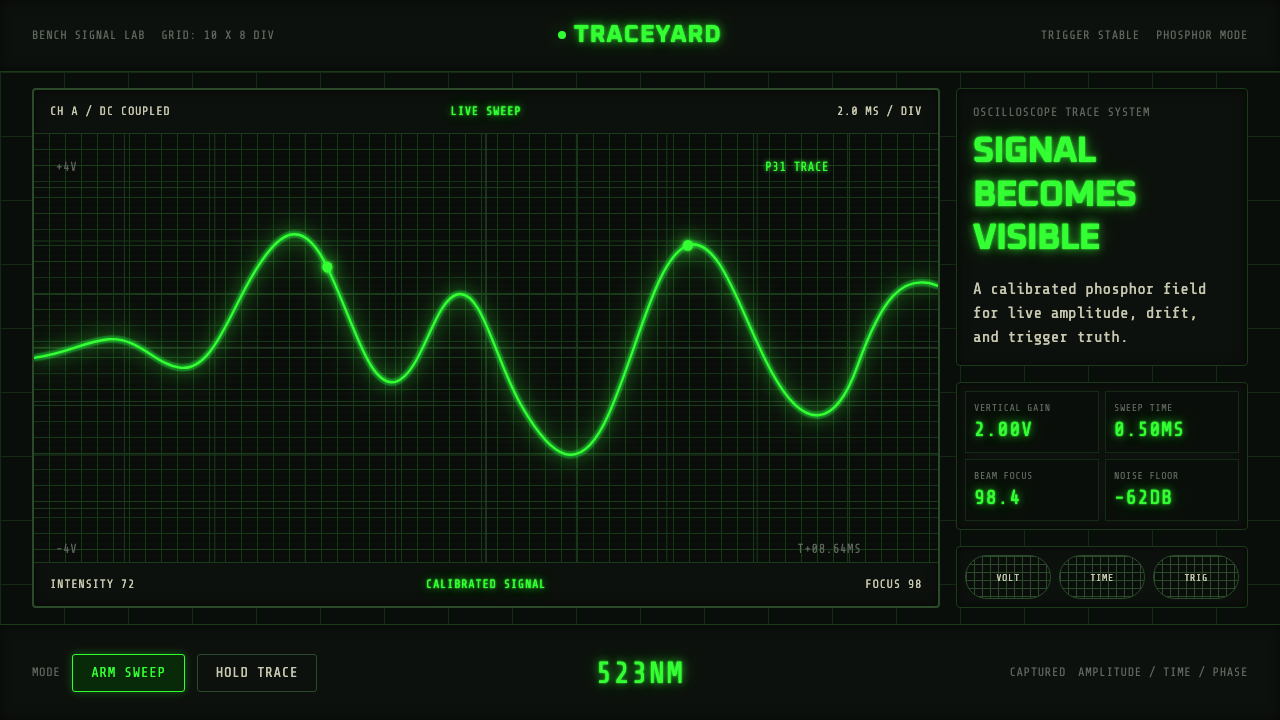 Oscilloscope TraceMeasurement glows. P31 green waveforms burn through a black graticule.