What is Olympic Archery?
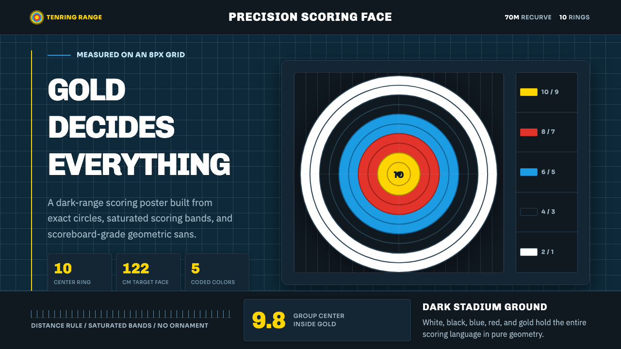
Ten concentric rings, scored from a single perfect center, turn precision itself into the drama of Olympic archery.
Olympic Archery in brief
Olympic Archery distills the sport of target archery to its single most recognizable object: the World Archery 122cm target face, ten concentric rings scored outward from the exact center in gold, red, blue, black, and white. There is no other object in sport as purely diagrammatic — the target is simultaneously the equipment, the scoring system, and the visual identity of the discipline.
This design language sets that bullseye against a dark stadium-range ground, so the concentric bands snap forward with maximum contrast, and leads with gold as the dominant color — the color of the innermost, highest-scoring ring, and of Olympic achievement more broadly. Everything about the system communicates exactness: no soft edges, no gradients, no ornamental flourish competing with the rings themselves.
Typography follows the same logic. A crisp geometric grotesque carries labels and data, reading like a scoreboard rather than an editorial voice — numbers and short labels rendered with the same cold precision as the ring geometry they accompany.

Where does Olympic Archery come from?
Target archery is among the oldest competitive disciplines to survive into the modern Olympic program, but its current visual and scoring identity is a comparatively recent standardization. The governing body World Archery — historically known by its French acronym FITA — codified the modern 122cm target face used in Olympic recurve competition: ten concentric rings, each pair of rings sharing a color, scored from ten points at the exact center down to one point at the outermost ring, with a miss recorded as zero.
The five-color scheme itself long predates modern Olympic competition, tracing back to earlier international target-archery standards, but its current application in Olympic recurve competition is the version most visible to a global audience: gold for the two highest-scoring inner rings, red for the next pair, blue, black, and finally white at the outer edge. The color coding exists purely for functional legibility — officials and spectators need to identify scoring zones instantly from a distance, and the concentric color bands make that possible without any numerals visible on the target face itself.
In the modern Olympic era, South Korea has become the dominant force in recurve archery, particularly in team and individual women's competition, a dominance built on rigorous training systems and deep institutional investment in the sport. This is not a stylistic influence on the target's design — the target face itself is internationally standardized and unrelated to any single nation's aesthetic — but it is the cultural context in which this particular design system situates the sport: East Asia, and Korea specifically, as the modern home of Olympic archery excellence.
The stadium environment in which Olympic archery is contested — a controlled, often shaded or covered range, with the target face isolated against a comparatively dark and neutral backdrop — is itself a design decision made for the sake of visibility and fairness, minimizing glare and background distraction so that archers, officials, and broadcast cameras can read the target with maximum clarity. This dark-ground, high-contrast staging is where this system's own visual logic originates: the target as a bright, precise object isolated against a controlled dark field.
What defines the Olympic Archery look?
Color
The palette leads with gold as the dominant, highest-value color, drawn directly from the innermost scoring rings and reinforced by its association with Olympic achievement. Red and blue follow as secondary ring colors, with black and white completing the outer bands. All colors appear at full, flat saturation — there is no muted or pastel variation, mirroring the target face's need for instant legibility at distance.
Concentric Geometry
The ring structure is the system's organizing principle: perfectly concentric circles, evenly spaced, scored from a precise center outward. This geometry appears not only as literal target imagery but as a compositional device — content organized in radiating or nested circular structures that echo the scoring logic of the target itself.
Dark Ground
The system is built on a dark, near-black or deep neutral background against which the bright ring colors and gold accents pop with maximum contrast — a direct reference to the shaded, controlled stadium range where the sport is actually contested. Light or bright grounds would flatten this contrast and undercut the system's core visual logic.
Typography
Type is a crisp geometric grotesque, used primarily for scores, labels, and data — a scoreboard voice rather than an editorial one. Numerals in particular carry the system's precision: clean, unadorned, and legible at a glance, matching the exactness of the scoring system they represent.
Zero Ornament
There is no decorative flourish anywhere in this system — no texture, no gradient, no illustrative embellishment. Every visual element exists to communicate scoring, precision, or structure, mirroring the target face's own total absence of decoration.
High Contrast
Every color relationship in the system is built for maximum legibility from a distance — bright, saturated ring colors against a dark ground, high-contrast typography against flat fields. This is a functional inheritance from a sport where scoring accuracy depends on instant visual clarity for officials and spectators alike.
Diagrammatic Minimalism
The overall aesthetic is closer to an information diagram than a sport aesthetic in the conventional sense — every element is legible, measured, and purposeful, treating the visual system as a precision instrument rather than a display of athletic drama.

Who shaped Olympic Archery?
As the sport's international governing body, World Archery — historically known by its French acronym FITA — codified the standardized 122cm target face and its five-color, ten-ring scoring system used in Olympic recurve competition, the direct visual source for this design system's entire color and geometry vocabulary.
Korea's sustained dominance in Olympic recurve archery, built through rigorous training systems and institutional investment, has made the country the sport's most visible modern home. This system situates its cultural context accordingly, positioning East Asia as the discipline's contemporary center of excellence.
The technical committees responsible for standardizing the target face's color coding and ring proportions prioritized functional legibility at distance above any decorative concern — a design philosophy this system inherits directly in its flat, high-contrast color treatment.
How do you use Olympic Archery today?
This system rewards content where precision, competition, and measurable achievement are the core message — it is one of the strongest matches in the library for anything data- or scoring-related.
For presentation slides, the style suits sports, competition, and performance-metrics content especially well. A cover slide can use a large concentric-ring graphic against the dark ground with a gold accent title, while content slides work well as scoreboards — data organized in radiating or ringed structures, numerals in the geometric grotesque, minimal supporting text.
For web interfaces, the palette is well suited to dashboards, leaderboards, and any product built around ranking or scoring. Dark backgrounds should dominate, with gold reserved for top scores, achievements, or primary calls to action; red and blue can differentiate secondary states or categories, echoing the ring hierarchy of the target itself.
For editorial and marketing work, the style is a strong fit for sports journalism, Olympic coverage, and competition-driven brand campaigns. Feature layouts can use the concentric-ring motif as a structural device — pull quotes or key statistics nested within ring-like framing — while keeping photography high-contrast and dramatically lit against dark grounds.
A common mistake when applying this system is softening the ring colors into pastel or gradient variants to feel more 'modern' — this directly undercuts the target face's actual function, which depends on flat, maximally distinct color bands. Similarly, placing the bright palette against a light or white ground removes the contrast that gives the system its stadium-range intensity.

Olympic Archery — FAQ
Why does the palette lead with gold rather than red or blue?
Gold marks the two innermost, highest-scoring rings on the target face — the zone every archer is aiming for — and it carries the additional cultural association of Olympic gold-medal achievement. Leading with gold reflects both the literal scoring hierarchy of the sport and its broader symbolic weight in Olympic competition.
Is the five-color ring system unique to the Olympics, or older?
The color scheme predates its current Olympic application, tracing back to earlier international target-archery standards codified by the sport's governing bodies. What the Olympic stage does is give that existing standard its widest global visibility, making it the version most people recognize as the archery target.
Why is the background dark rather than a neutral white or grey?
The dark ground directly references the shaded, controlled stadium range where Olympic archery is actually contested — a staging choice made to minimize glare and maximize the target face's contrast for archers, officials, and cameras. A light background would flatten that contrast and lose the specific visual intensity the sport's real staging produces.
Does this style work for content unrelated to sport or competition?
It can extend well to any content built around precision, ranking, or measurable achievement — data dashboards, performance reviews, or scientific instrumentation branding, for example — because its core visual logic is about legibility and exactness rather than sport specifically. It is a poor fit, however, for content emphasizing warmth, informality, or organic texture.
Related design styles
 Cloudflare Orange EdgeOperational clarity wins. Orange accents, hairline grids, and mono metrics ma…
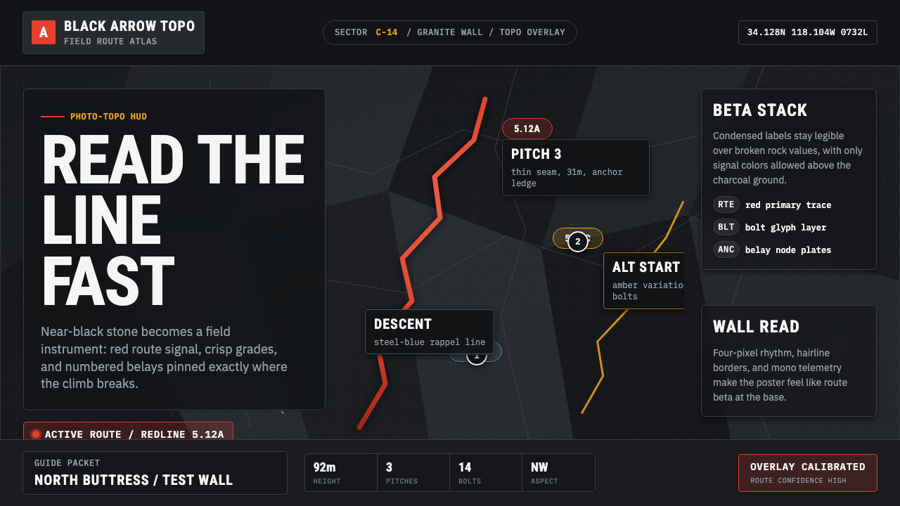 Climbing Topo GuideBeta at a glance. Red route telemetry cuts across near-black stone and conden…
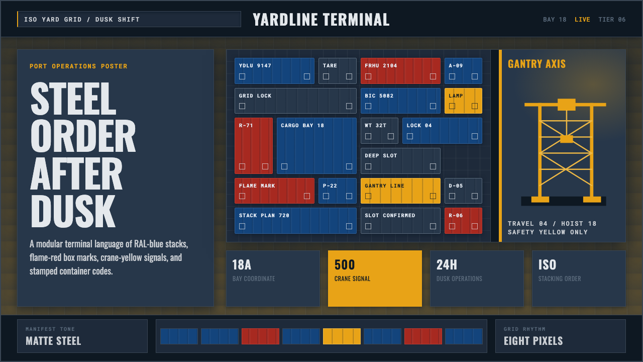 Container PortIndustrial dusk, standardized. Slate grid, RAL-blue stacks, and crane-yellow…
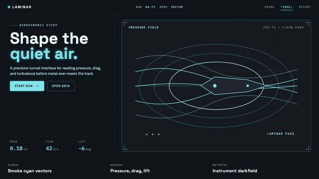 Wind TunnelMakes darkness feel measurable. Cyan-white streamlines and monospace ticks gl…
 Apple Fitness Rings Closed (2024)Midnight feels exact. Magenta, green, and cyan rings lock onto OLED black.
 Attio CRMCRM stripped to its data layer. Single-pixel borders, monospaced IDs, violet…